
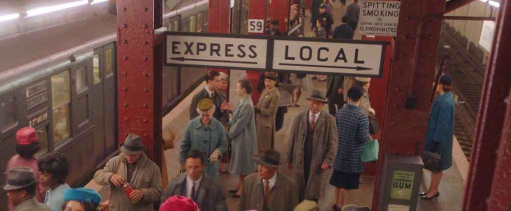
“The Marvelous Mrs. Maisel,” Season 5, Episode 2.
The Job
As a Graphic Designer for Film & TV, I work in the art department and create anything that is seen on screen with text and or imagery, such as storefront signs, food packaging, patterned wallpaper, stacks of bills, newspapers, lost cat flyers, or even children’s drawings. The range of items we create is incredibly broad, and the cool thing about that is it reframes graphic design from an exclusive, professional pursuit into a universal human activity. If everything is design, everyone is a designer. So instead of creating as “Leah Spencer, graphic designer,” I have to create as a shopkeeper, as a sign painter, as a college student, as an accountant, and so on.
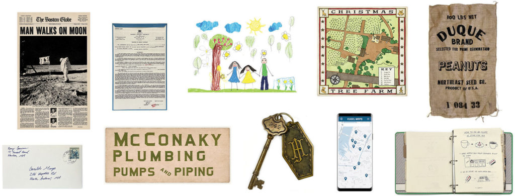
Some of the many items considered graphic design in the context of film and TV. In addition to designing these items, the graphics team is also responsible for physically making them in-house or sending them out to a vendor for fabrication.
Considerations for Typography
In addition to the challenges of forgery, I specialize in graphic design for period productions, and when you approach period typography, you wind up with several restrictions. Firstly, many typefaces that were used for letterpress or used in typewriters were never digitized and only survive today in their original forms or in their printed materials. Secondly, there are lots of existing digital period typefaces like Futura or Garamond, but they too have issues. We lack (or are logistically unable to use) historical production methods, such as mimeograph, Letraset, offset printing, Linotype, etc., so the kind of roughness you expect of period graphics is lost. We also have legal restrictions on font foundry use, so each production’s clearance team will tell you, for example, “you can only use Adobe fonts on this movie.” This can be restrictive, particularly for period or highly stylized productions where only a small portion of the available fonts are appropriate. And thirdly, there are lots of instances of lettering that were never a typeface in any sense, such as sign painting or handwriting.
Work in film and TV also has its own restrictions, the most prevalent one being time. Especially in today’s streaming landscape, where a high quantity of content is expected with the same high level of quality (previously only expected of feature films), speed and efficiency are paramount. Production schedules are primarily built around actor and location availability – not how long a nice hand-painted sign might take the art department. In typical graphic design, you might have a month to design a storefront sign, but in film and TV, you’d typically have a few hours. Also, even productions with very high budgets don’t often prioritize spending on graphics. It would be amazing to hire professional sign painters or get posters screen printed, but the reality is that is not how most productions want to or are able to allocate their funds.
We’d all love to sit around with gold leaf and Letraset, but logistical and budgetary constraints usually necessitate alternatives.
The Solution: Type Revival
Type revival involves recreating period lettering and typography as digital typefaces. Although it requires an up-front time investment, it later makes the graphics process as quick as typing, selecting the font, and making any adjustments. And when replicates need to be made of that graphic (always needed for props for multiple takes and occasionally needed for sets to be rebuilt), it is far faster and more accurate to reprint a digital file than to hand-create copies. Also, particularly for sign painting, every region and every period has a distinct visual identity, and so converting specific source material into a font for its original use maintains historical and local faithfulness.
In the case of sign painting, we do have scenic artists who, in special circumstances, are able to do bits of sign painting. When it isn’t logistically possible, I either print signage as a flattened image on adhesive vinyl, as die cut vinyl, or direct to surface printing on signage material. When it is possible though, this font work is still valuable because the graphics team always needs to provide the scenics with a pounce (a to-scale print with perforations following the text outlines through which chalk or graphite dust can pass through). Creating pounces with text set in a sign painting font allows the scenics to paint authentic lettering with the correct surface texture.
I always do my type revival work outside of work hours because I want these fonts to belong solely to me. They are essentially assets that come with me onto every job at no additional cost to the production and that only I use. I have been asked before by other Graphic Designers for Film & TV if I’d license a font to their production, and my answer is always, “I don’t license them, but you can hire me for a day and I’ll complete the work it’s needed for.” A day’s work for me is worth more than a license sale – both monetarily and with the value of working with new people for connections. And, once digital font files are out there, it’s difficult to prevent them from being shared for free. In film and TV, we are expected to show up with our own kit and are compensated for it, so I view my fonts as part of my kit and as an incentive for art departments to hire me.
Doing type revival as a Graphic Designer for Film & TV is unconventional, but it’s something I really enjoy and I feel it’s made my work stronger. And just like doing master copies as a painter, copying text stroke by stroke is a really effective way to understand the inner workings of type and lettering.
The Process
To begin the process, I collect period type specimen books, ephemera, and photographs showing lettering. Having physical resources is great so you can create your own high resolution scans, but there are also amazing sources online such as archive.org, Letterform Archive, and Typographica Library that have vast amounts of public domain materials. I try to select source images that have as many characters as possible, and even better, multiple instances of characters. It is possible to work with, for example, a photo of a sign that only has 18 letters out of the English alphabet – it just requires some additional work to create the missing characters from elements of the existing characters.
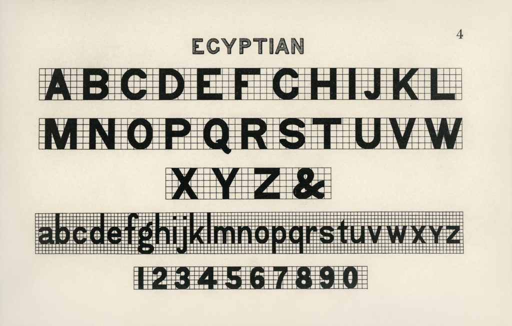
Egyptian style lettering from “Draughtsman’s Alphabets,” an instructional book by Hermann Esser (1877).
Once I have selected an image to work from, I bring it into Photoshop to remove any extraneous lines, signs of damage, dust, etc. I also remove any coloration and create a solid black mask over the characters to make everything black and white. And if the image is small and pixellated, I typically enlarge it and use sharpening filters.
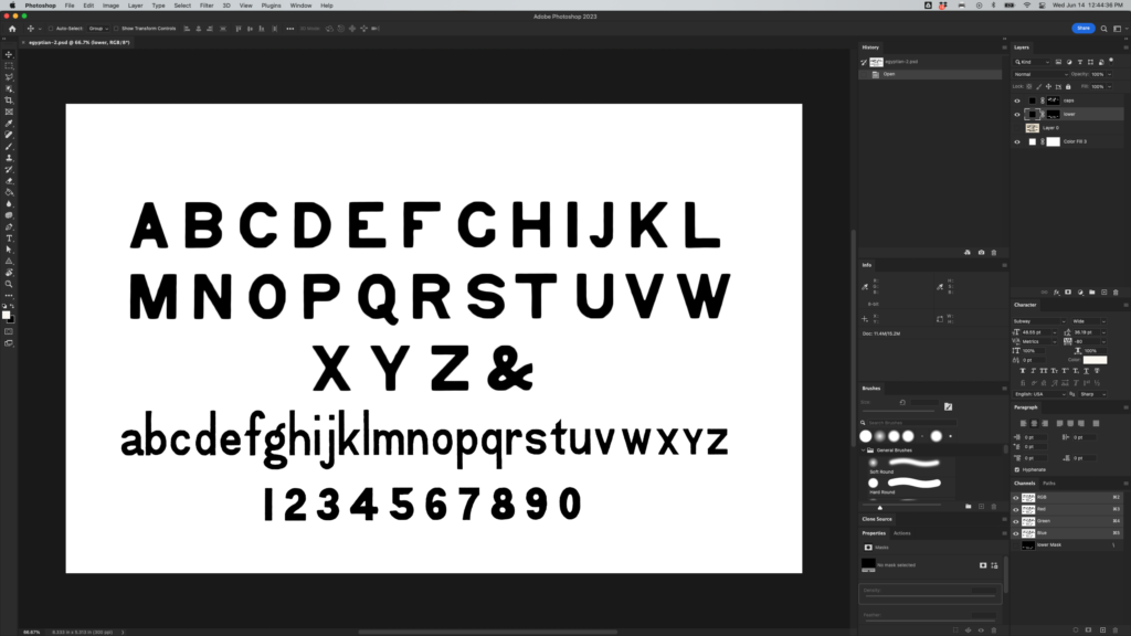
Lettering sample cleaned up in Photoshop so it can be image traced in Illustrator.
From there, I bring the cleaned up image into Illustrator and open up the Image Trace toolbar with advanced options open. To get my first vector iteration, I adjust the sliders (typically with paths increased, noise decreased, and “ignore white” turned on), make it, and expand it. From there, with a semi-transparent copy of the original image layered on top, I make adjustments to each vector character to be as accurate as possible. Removing issues created by image tracing while maintaining organicness and not refining it too much can be a fine balance.
You’ll also notice in the original source that the lowercase letters are proportionally lighter than the uppercase letters and the numerals are proportionally heavier. This is a common issue in lettering books. It is generally frowned upon to add or subtract weight with an outer stroke, but in this case, it is a decent starting point to make them equal in weight. You do have to be particularly careful to then restore any counters that may have closed in and to maintain the same amount of corner rounding.
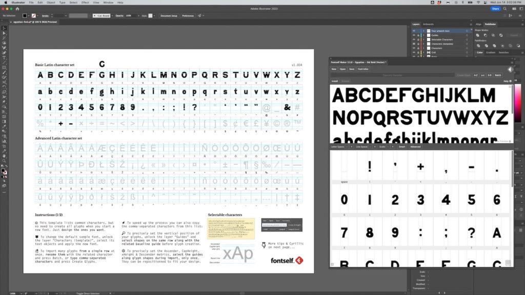
Vector forms arranged onto Fontself’s template and dragged into the extension window. There is a certain amount of artistic license you can take with period graphics, and in this case, I didn’t like how similar the G was to the C, so I altered it.
When I first started out doing type revival, I used FontForge, but eventually found there was just too much to mess with, so I started using Fontself Maker (*not sponsored). Fontself is an extension that can be used with Illustrator, Photoshop, and Procreate to easily create vector and raster fonts. For my purposes, quick and dirty is perfect, as not only do these fonts not need to be perfect, but I don’t want them to be perfect so that they reflect the organicness of the human hand and of period printing methods. (If anyone needs a reason to love making period typography, I’d say almost never having to make your tracking “correct” is a good one.)
Once I’ve dragged my vectors into the extension window, I adjust the baselines closely but not absolutely perfectly, make the word spacing wider (a common hallmark of period typography), add in extra instances of characters for contextual alternates (seeing multiples of the exact same letterform is a giveaway of a digital font), and make sure that the letter spacing and kerning matches my source. Then I just name the font descriptively, export, and install.
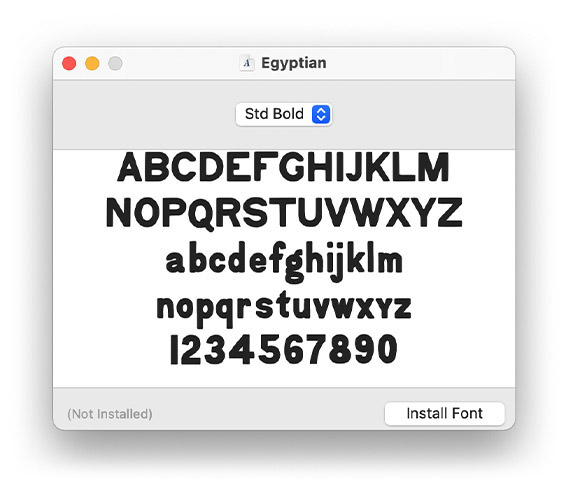
The final typeface exported and ready for use.
For raster/bitmap fonts, I use a similar process, just all in Photoshop. Raster fonts are great because by not vectorizing, you don’t lose tiny details or color. This is ideal for realistic typewriter fonts that maintain variations in tone and all of the tiny ribbon texture dots around each letter, for calligraphy where thin strokes are not just thinner but also lighter in color, and for sign painting where you want to maintain subtle brush strokes found in the original source. The downside to raster fonts though is that because each character is stored as its full-size bitmap image, it can create very heavy files. So using it for a few sentences is generally fine, but full pages of a typewritten letter is not something most computers like dealing with.
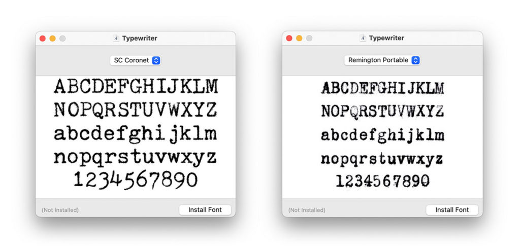
Raster fonts created from two of my typewriters: a 1970 Smith Corona Coronet Electric 12 and a 1924 Remington Portable. The fine detail and variation in tone would not be possible in vector form. The text size, kerning, and leading are to-scale when set at 12 pt.
Use in The Marvelous Mrs. Maisel
Subway Signage
For my work on Season 5 of The Marvelous Mrs. Maisel, we had a big subway sequence in Episode 2. The old hand-painted signage in New York’s subway system had a look that was very specific to New York and that was not represented in any typefaces I could find, and since I knew we’d be making a lot of signage for this, creating fonts was a suitable solution for speed and historical accuracy. We also were informed about the subway sequence while we were still in pre-production, so it was a good time to do this before things got crazy.
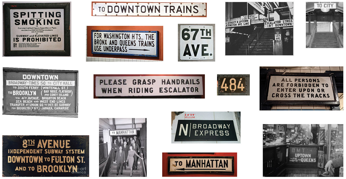
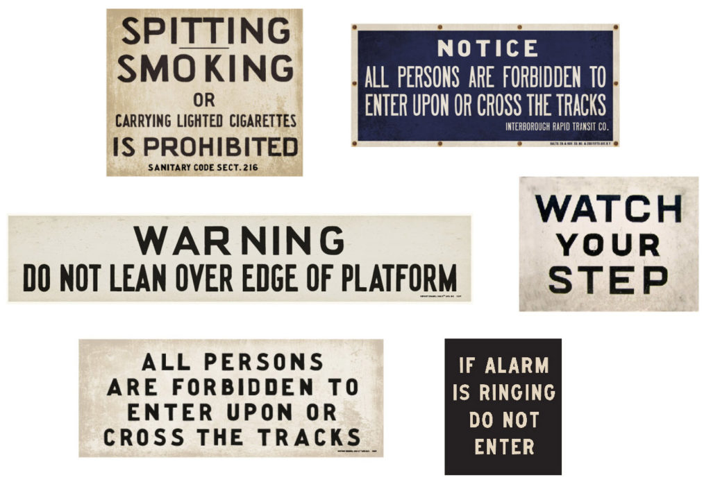
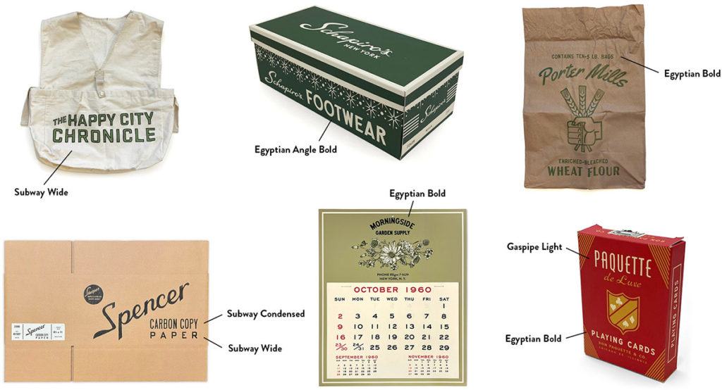
A selection of source images for the subway typefaces. Because each sign only had a limited number of characters and because each sign is written slightly differently, it took several combinations of source signs to create each typeface.
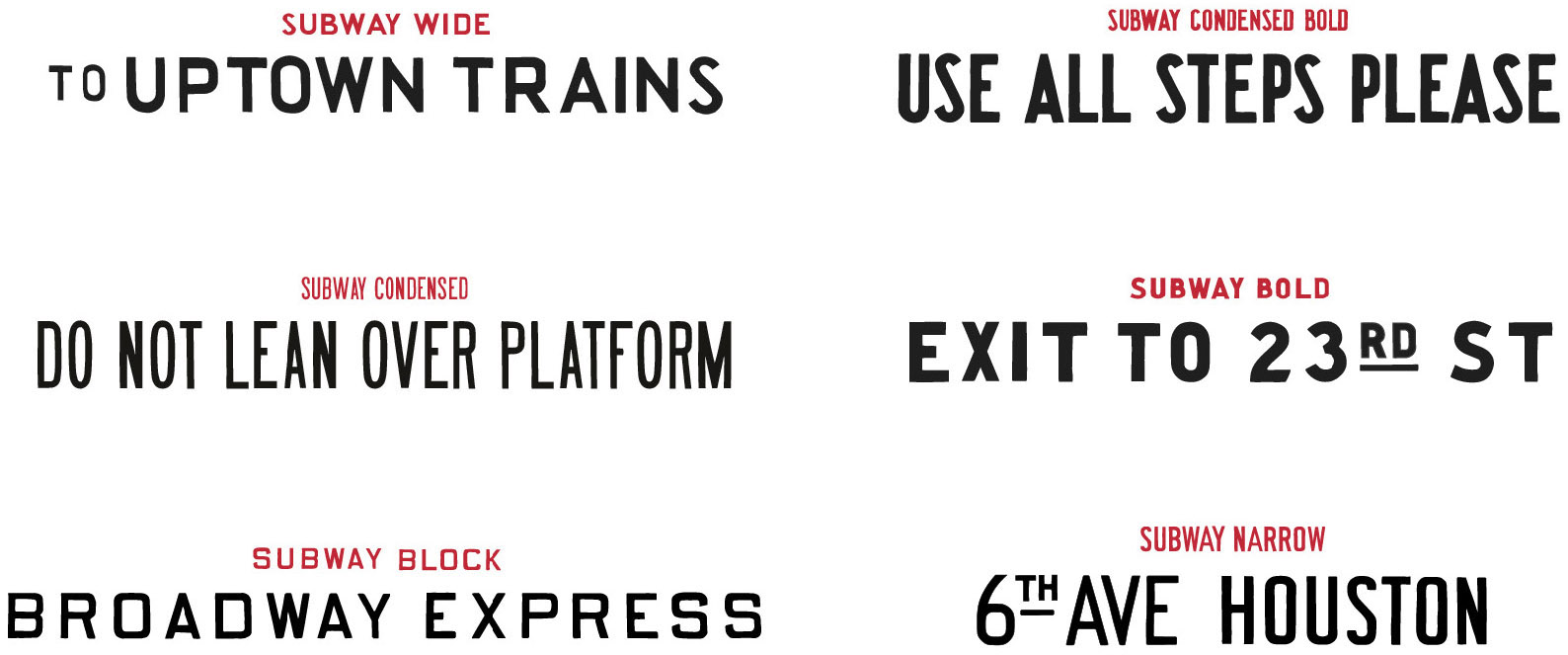
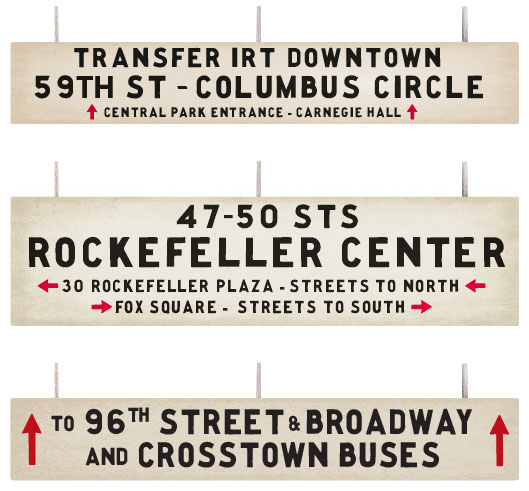
The resulting six typefaces designed from the source images.
I collected many images of period subway signage primarily from the New York Transit Museum, and from those, went through the above vector font process to create a series of six typefaces that reflected various lettering styles used. When it came time to actually design the signs, all I had to do was type and select a font. Our scenic artists handle aging signage, so I added in a bit of digital grunge, but left most of the aging work to them since analogue texture is always better than digital.
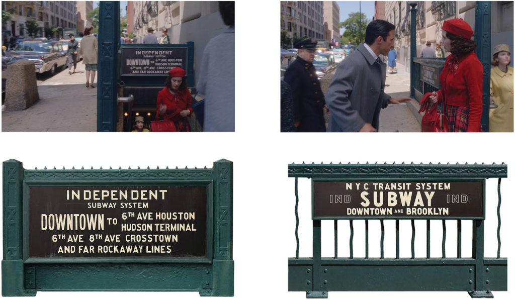
In 1960, the New York subway system had yet to be unified and ran as independent private companies/routes. Subway signs at this time were famously confusing, and part of designing signage is figuring out what to write on them, so a huge part of this was examining period subway maps to pair the scripted action with historically accurate stations and routes.
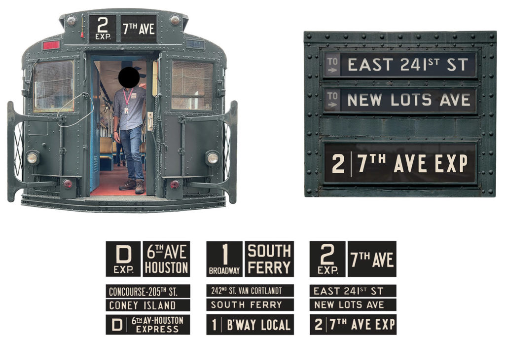
Before computerized screens, NY’s subway cars used rotating fabric scrolls with stations printed on them inside illuminated windows to display the train’s route. These were made out of frosted plexiglass plates though for simple installation.
Automat Signage
Type revival also came in handy in Episode 9, where we see Midge and Susie go to an Automat. Automats were incredibly cool restaurants popular in the early to mid 20th century that sold hot food out of vending machines, and they were commonly decorated in an art deco style.
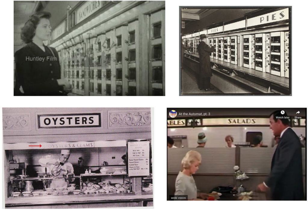
Every Automat was decorated a little differently, but art deco elements were common among them. These four photographs depict similar lettering styles which I copied for this typeface.
From reference photos of Automats, I found a beautiful lettering style on food category signs that was reminiscent of Peignot’s uppercase letters. So to create our food category signs, I outlined Peignot Bold and adjusted it to fit my reference photos by further thinning the thin strokes and tailoring the “S” and ampersand. I named this new version Peignot Deco, not as an intention for anyone to consider it part of the Peignot family, but just to describe it.
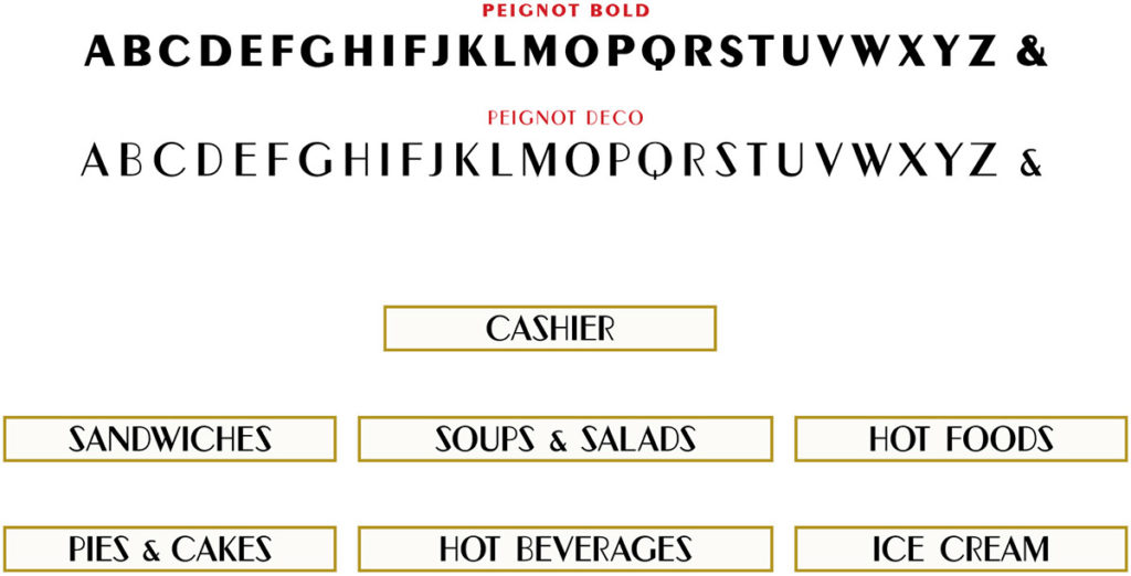
Top: comparison between the source alphabet (Peignot Bold) and the resulting alphabet reflecting letterforms in my reference photos (Peignot Deco). Bottom: previews of all of the food category signs.
I then cut the lettering out of adhesive black vinyl on my Cricut, and our scenic artists applied the vinyls to backlit milk plexiglass plates. To preemptively defend my typographic choices, there was an ampersand between “pies” and “cakes” when I sent the vinyl to set, but at some point, it disappeared. We do everything we can to ensure graphics will be applied exactly to plan, but sometimes things like this happen and we don’t find out until it’s already been shot.
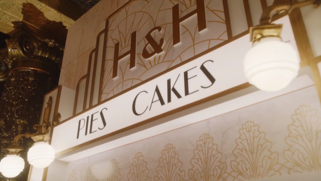
“The Marvelous Mrs. Maisel,” Season 5, Episode 9. A case of the sad missing ampersand.
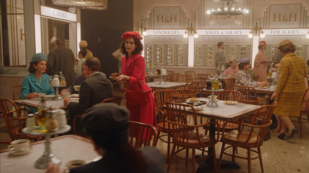
All of the food category signs and individual food window cards had to correctly identify all of the foods scripted (purchased by the props department) and all of the filler unscripted food (purchased by set decoration).
Being a Recreator
Often in this role, you have to think of yourself less as a “creator” and more as a “recreator.” Period typography has such beauty in the way it captures the human hand. It’s imperfect, and in being imperfect, it has character, and it has a story. It tells you about who made it, how they made it, and what happened to it after they made it. Representing periods and settings not your own is a complex undertaking, but with the remnants of creators before us and with contemporary digital tools, we’re enabled to create as authentically as possible.
Miscellaneous items from Season 5 of “The Marvelous Mrs. Maisel” with other type revival bits.
___
Current Context
As of the time this article is being published, the Writers Guild of America and the Screen Actors Guild are on strike. The AMPTP, which represents 350+ American film and TV production companies (including Amazon), has refused to accept contract points such as livable wages, access to health insurance, protections from A.I., and fair residuals. In this age of streaming, studio executives are making increasingly exorbitant amounts of money, while 95% of union actors make less than $25,000 annually and writers are paid 23% less (when adjusting for inflation) than they were a decade ago. As a member of IATSE, I am not on strike, but am unemployed due to the industry shutdown. We all — cast and crew — want to get back to work and to make great storytelling, but what the writers and actors are fighting for is vital and must be met first.
___
To Learn More
For more nerdy film and TV design content, follow along on Instagram @byleahspencer
And if Graphic Design for Film & TV sounds like a fitting career for you and you’d like to learn more, I have an info session on my website. Film and TV is a traditionally walled-off industry, and entry can be exceptionally difficult for newcomers without inside connections. This is something I and many others would like to see change, so this info session is aimed at giving newcomers the fundamental knowledge they need to make decisions and to take first steps towards this career.
What a great insight into all the hard work and creativity details that make Mrs Maisel a delight to watch! Are there plans for a book on the shows awesome production and art design?
Thank you! I’m not aware of any plans for a book on Maisel’s production design, but there is one out on its costume design published by Donna Zakowska.
SO cool. I worked as a graphic designer for some years and know how important the right font is. I saw the subway scene in Marvelous Mrs Maisel and was blown away by the art direction. Thanks for sharing your process!
Beautiful work! This was such a fun read and look-through. I find myself fixating on all the props of Movies & TV…especially in grocery stores of a bygone era. Sometimes so much so that I need to do back track on the film or episode because I’ve missed key parts of the storyline. Great work here– thanks so much for sharing.
I LOVE your Subway lettering!!!!!!!!!