Figure 6.1.1 Neudeutsch typeface and illustration by Otto Hupp
Genzsch & Heyse, 1903 or 1904
�Chapter 6
Type design in German foundries from 1871 to 1914
6.1
Introduction
Between 1871 and 1914, it was more common for new typefaces to be produced by
independent typefoundries than by dependent foundries inside printing houses. This
trend was already implied in the narrative I used for the last chapter regarding the
Midolline types. While the Midolline, Schmale Midolline, Magere Bastard, and Fette Bastard
were products of dependent typefoundries developed inside Berlin printing houses
between about 1850 and 1871, later Midolline types were developed at independent
typefoundries. Most came from Flinsch, but J. John Söhne and (probably) C.F. Rühl
created new Midollines, too. Collaboration with external designers was a practice
independent typefoundries engaged in far more often than their in-house counterparts would. Of the foundries I discuss in this chapter in the context of their collaborations with specific designers who were external individuals and not typefoundry
employees, almost all were independent firms. One of the two dependent typefoundries I mention was the in-house operation within the Reichsdruckerei at Berlin, and the
specific collaboration I refer to pertains to a typeface designed after 1914.1 A good deal
of this chapter reproduces surviving drawings made for typefoundries by three
external collaborators – Peter Behrens, Otto Eckmann, and Otto Hupp – which were
drawn between 1880 and 1915.
In my primary and secondary sources from and on the German typefoundries that
operated between the 1870s and the 1890s, I have found mentions of several instances
where external individuals provided a foundry with the design for either a new
printing type or a font of ornaments/initial letters/border-printing elements/etc. In
comparison with the decade and a half between 1899 and 1914, the number of
instances from 1871 to 1898 for which I found mentions are far fewer.2 Often, a
foundry’s type specimens or other publications only mentioned the roles these
individuals played decades after the fact.
This chapter includes two sections chronicling collaborations of German typefoundries with external individuals for the development of new typefaces between
about 1870 and the beginning of the twentieth century. The two chronicles overlap.
My second discusses typefaces with abundant sources available. Therefore, it is longer
and includes more details. It is also illustrated. The examples mentioned in my first
chronicle are not illustrated. I could reproduce how the typefoundries presented these
works in their type specimens; however, no drawings made as part of their production
survive. Since I cannot compare drawings with the final typefaces for these products
– as I do in my second chronicle – I have opted to present my first chronicle without
any images.3
1
Later, in chapters eight and nine below, I do mention Reichsdruckerei typefaces
developed during the late 1890s and early 1900s. These were designed by Georg Schiller,
an in-house engraver at the establishment, and Joseph Sattler. The other in-house
typefoundry I mention in this chapter – in terms of an external collaboration – is that
from W. Drugulin’s printing house at Leipzig.
2
A chart listing most typefaces made as results of German foundry collaborations
with external designers between 1899 and 1914 is printed in chapter eight.
3
This decision, I must admit, also has my finances in mind. Having specimens of the
typefaces mentioned in this section photographed or scanned – and then purchasing
reproduction rights for those images – would not have amounted to a trivial cost. Since I
�266
Schriftkünstler
6.2
The small chronicle
Although dozens of foundries operated in Germany between the 1870s and 1890s, I
have only found mentions of ten that collaborated with external individuals. In
chapter eight, where I look at the presentation of German typeface design in 1914 at
the Internationale Ausstellung für Buchgewerbe und Graphik (Bugra) in Leipzig and the
Deutscher Werkbund-Ausstellung in Cologne, I list about twice as many independent
foundries who engaged in this kind of collaboration over the years leading up to those
exhibitions. This difference between the 1870s through the 1890s on the one hand and
the years between 1899 and 1914 on the other leads me to believe that the practice of
collaborating with external individuals for the design of new products was still
exceptional during the late nineteenth century. The ten firms for which I found
mentions of collaboration between the 1870s and 1890s were the typefoundries of
Wilhelm Woellmer in Berlin, Julius Klinkhardt at Leipzig, Genzsch & Heyse of
Hamburg and their Munich subsidiary E.J. Genzsch – which I treat here as a single
entity – Ferdinand Flinsch in Frankfurt am Main, the J.G. Schelter & Giesecke typefoundry of Leipzig, Otto Weisert of Stuttgart, W. Drugulin at Leipzig, A.W. Kafemann
of Danzig, Ferd. Theinhardt in Berlin, and Gustav Reinhold at Berlin. After the term
»Schriftkünstler« became established in the German printing-trade media at the
beginning of the twentieth century, these nineteenth-century collaborators would
generally not be referred as Schriftkünstler, unlike most of the people in the larger
“grand” chronicle that runs through this chapter’s next section.
6.2.1 Wilhelm Woellmer, Berlin (circa 1877)
An 1877 notice in the Archiv für Buchdruckerkunst mentioned that a punchcutter named
Franz Schnögula had engraved a set of border-printing elements that the Woellmer
foundry was distributing.4 These Einfassungen, which initially did not have a particular
name,5 had been commissioned from Schnögula by the Gebr. Grunert printing house
in Berlin.6 Woellmer likely carried the product because a printing house without an
in-house typefoundry needed someone to cast the sorts. Gebr. Grunert presumably had
no objections to other printers buying and using “their” design. Gebr. Grunert had
desired that a particular set of Einfassungen be made in the first place so that they could
use it in an 1877 wall calendar they intended to print.7 The Einfassungen allowed for
polychromatic printing. According to the notice, one of the Grunert brothers prepared
a sketch that Schnögula carried out. At least some of the “Grunert/Schnögula”
Einfassungen remained in Woellmer’s product portfolio for half a century: two of its six
pieces were included in the foundry’s 1926 type specimen catalogue.8 The Grunert/
Schnögula Einfassungen were not Woellmer’s only collaboration with a printing house
on a series of ornaments; an 1899 article in Deutscher Buch- und Steindrucker mentioned
another series designed by a man with by the last name of Röhn, who was the foreman at the Büxenstein printing house.9 That article did not state who cut the ornajudge this chronicle to be less significant to this book’s narrative as a whole than the one
following it, I have opted to put my total available funds towards other images.
4
See AfB 1877, col. 49
5
One of the loose type specimen sheets that Woellmer provided to the Archiv für
Buchdruckerkunst displayed these, and they are simply identified as having the product
identification »Ecken No. 45 a (Umfassung) und 45 b (Sterneneindruck), sowie die
Einfassungen No. 46, 47, 48 und 48 a.« Ibid., Woellmer supplement following col. 64
6
According to the 1877 Berlin address book, the »Buchdruckerei« Gebr. Grunert was
located in Junkerstraße 16; see Berliner Adreßbuch 1877, p. 393
7
See AfB 1877, col. 49
8
These were pieces 46 and 47; see Woellmer 1926, p. 417
9
See Deutscher Buch- und Steindrucker 1899b. According to the 1892 Berlin address
book, the »W. Büxenstein Buchdruckerei u. Steindruckerei, Kunstanstalt, Offizin z.
Herstell. v. Werthpapieren, Schriftgießerei, Stereotypie, Galvanoplastik u. Buchbinderei« was located at »SW Zimmerstr. 40. [und] 41.« It was owned by »Georg W. Büxenstein u. Otto Benstein.« See Berliner Adreßbuch 1892, p. 169
�Chapter 6: Type design in German foundries from 1871 to 1914
ments, but they could not have been engraved by Schnögula. He had died five years
earlier.
6.2.2 Julius Klinkhardt, Leipzig (circa 1877)
Klinkhardt also collaborated with external designers on a few occasions.10 According
to Friedrich Bauer, Ferdinand Karl Klimsch11 – who also delivered designs to the
Flinsch foundry in Frankfurt – designed at least one set of ornaments for Klinkhardt:
the Künstler-Einfassung, which they published in 1877. Klimsch may have also been
responsible for Klinkhardt’s Schildeinfassung, from 1880.12 Additionally, Klinkhardt
published decorative border-printing elements designed by Prof. Hugo Ströhl of
Vienna. These were featured in two fold-out supplements accompanying the Archiv für
Buchdruckerkunst’s October 1881 issue, entitled »Auswahl von Initialen, Zier-Leisten und
Schluss-Stücken«, and were captioned »entw. v. Prof. Ströhl in Wien«.13 This is likely
the same Hugo Ströhl I mention in chapter eight for advertising in the Leipzig-based
Artur Seemann publishing house’s Deutsche Kunstgewerbe-Zeichner address book series
in the 1890s.
Ströhl created more products for Klinkhardt. For instance, Bauer wrote that:
»Anfangs der achtziger Jahre stellte sich Professor Hugo Ströhl, der bekannte
Wiener Heraldiker und Zeichner, in den Dienst der Firma. Der auch im Kunstgewerbe sich stark ausbreitende Renaissancestil spiegelt sich wider in der 1885
entstandenen, von Ströhl entworfenen, aus über 400 Figuren bestehenden Germania-Einfassung, durch die die architektonisch Satzrichtung ihre vollkommenste
Durchführung erfahren konnte.«14
I have not found any evidence to suggest whether Klinkhardt solicited new designs
from, Klimsch and Ströhl, or if those men created their respective designs first, before
pitching them to Klinkhardt.
6.2.3 The Genzsch firms in Hamburg and Munich (circa 1878)
The Genzsch & Heyse typefoundry collaborated with external designer-punchcutters
at least once: in 1878, they published the Kinder-Alphabete initials, which were cut by
Adolf Closs in Stuttgart, who presumably also designed them.15 Genzsch & Heyse and
its Munich subsidiary E.J. Genzsch collaborated with two external design on a
long-term basis, which I describe in more detail in this chapter’s grand chronicle
below. Aside from this relationship with Heinz König and Otto Hupp, the Genzsch
firms collaborated with a few external artists between 1871 and 1899 on a short-term
basis, too. For example, they published a series of border elements in 1889 called the
Hammonia-Einfassungen, which had been designed for the firms by Leonard Hellmuth.16 Ferdinand Mahl drew their Pompadour-Ornamente, published in 1892,17 and
E. Eickhoff drew a typeface for jobbing printing called Pioner, published in 1893.18
10 As I mentioned in chapter three, the foundry had also collaborated with at least one
independent designer-punchcutter: Theodor Friebel, who cut Liliput-Grotesk, probably
in or before 1904.
11 Ferdinand Karl Klimsch (1812–1890) founded the Klimsch-lithographische Kunst-Anstalt
in Frankfurt am Main in 1858.
12 See the Reichardt 2011 edition of Bauer 1914/1928, p. 91
13 See AfB 1881, supplements to the October issue. No page numbers.
14 See the Reichardt 2011 edition of Bauer 1914/1928, p. 91. See also Deutscher Buchund Steindrucker 1899b
15 See Genzsch & Heyse 1908a, p. 23
16 Ibid., p. 34
17 Ibid., p. 36. According to Genzsch & Heyse 1893 (no page numbers), “Ferdinand Mahl
jun.” was from Bruneck, which is in South Tyrol.
18 See Genzsch & Heyse 1908a, p. 37
267
�268
Schriftkünstler
6.2.4 Flinsch, Frankfurt am Main (circa 1880)
An 1880 article in the Correspondent für Deutschlands Buchdrucker und Schriftgießer on the
Flinsch typefoundry’s exhibit at that year’s Gewerbe- und Kunstausstellung in Düsseldorf
mentioned three »Zeichner« with which that firm had worked, presumably all during
the 1870s.19 These were the Düsseldorf painter Gustav Süs,20 the Munich painter
Rudolf Seitz,21 and the already-mentioned Frankfurt lithographer Ferdinand Karl
Klimsch. The article did not mention any specific typefaces or fonts of ornaments that
these artists had been responsible for designing, and neither Wetzig 1926 nor the
Vereinigung »Freunde des Klingspor Museums« online lists of type designers22 and Flinsch
foundry typefaces23 include any mentions of Seitz or Süs. I suspect that each designed
border-printing elements, initial letters, or ornaments, and that these were all discontinued by the early twentieth century, which might explain their lack of inclusion in
those lists. For Klimsch, however, there is more information available, because he
designed at least one alphabetic typeface for text-setting that Flinsch published. This
was a decorative blackletter called Germanisch.24 According to Wetzig 1926, Germanisch
was published in 1876.25
As I mention in this chapter’s next chronicle, Otto Hupp moved to Munich in 1878,
just before his nineteenth birthday. There he met Rudolf Seitz, who became his
mentor and life-long friend.26 While working in Seitz’s workshop, probably in 1880,
Hupp met Emil Julius Genzsch. Afterwards, Hupp began designing printing ornaments and eventually designing typefaces for Genzsch.27 Since I come back to that
later in this chapter, it should suffice here to write that Hupp implied in his 1927
autobiography that Seitz essentially “passed him off” to Genzsch. Genzsch had visited
Seitz’s workshop because he hoped that Seitz might be won over into doing some
work for his foundry.28 Perhaps by 1880, having already collaborated with Flinsch,
Seitz was no longer interested in designing any more fonts of ornaments, but Hupp
was up to the assignment.
Flinsch continued to collaborate with external individuals in the 1880s. For
instance, Friedrich Bauer recounted the release of their Mediaeval-Schreibschrift,29
writing that is was »von Domek in Wien gezeichnet und 1881 im Haus geschnitten«
and that it »wirkte bahnbrechend; sie ist in den Besitz der meisten deutschen Schriftgießereien, teils durch Kauf, teils durch Nachgalvanisieren übergegangen, welcher
Freibeuterei damals noch nicht zu begegnen war.«30 Vienna’s address book for 1881
includes three entries for men with “Domek” as their last name; the Domek in
question is probably Victor Domek, who is listed as having a »Lithographie u. Drucke-
19 See KfD 1880, p. 1
20 Gustav Süs (1823–1881). Ibid. does not give Süs’s first full name, but only mentions a
»G. Süß« from »hier«, implying Düsseldorf. There is only one Süs in the 1880 Düsseldorf address book whose first name begins with “G” – Gustav Süs is listed there as a
»Maler«, living in Rosenstraße 28; see Düsseldorfer Adreßbuch 1880, p. 161
21 Rudolf Seitz (1842–1910)
22 See Hoefer/Reichardt (undated)
23 See Reichardt 1 (undated)
24 See Hoefer/Reichardt (undated) and Flinsch 1898, p. 62–63
25 See Wetzig 1926, p. 27
26 See Hupp 1927, p. 3–4
27 Ibid. Since one of Otto Hupp’s drawings for the Deutsche Renaissance-Initialen that
would be published by Genzsch’s firms, kept in Hupp’s Nachlass, has the date 1880
written on it, his working relationship with Genzsch must have started by this point.
See Bayerisches Hauptstaatsarchiv, NL Hupp 2.1.1.1., folder 105, sheet 35
28 See Hupp 1927, p. 3–4
29 See Flinsch 1898, p. 239
30 See the Reichardt 2011 edition of Bauer 1914/1928, p. 53
�Chapter 6: Type design in German foundries from 1871 to 1914
rei« at Siebensterngasse 46, in the city’s seventh district.31 The second 1880s typeface
for which Flinsch collaborated with an external person was what Friedrich Bauer called
a »Kursiv-Griechisch«; he attributed its design to a »Professor Kirchhoff in Berlin«.32
That man is almost certainly Adolf Kirchhoff,33 who had been named professor of
classical philology at Berlin’s Friedrich-Wilhelms-Universität in 1865.34 While MediaevalSchreibschrift was an eye-catching design, likely produced for use in jobbing printing,35
Kursiv-Griechisch must have been made for setting long passages of Greek text intended
for reading, almost certainly in scholarly publications. The Kursiv-Griechisch was
produced in four small sizes – 6, 8, 10, and 12 Didot points36 while the Mediaeval-Schreibschrift was cast in eight sizes ranging from 10 through 60 Didot points.37
Flinsch’s collaborations with Domek and Kirchhoff were surely driven by similar
motivations. As a lithographer, Domek was likely seen as capable of delivering a new
typeface in a specific style, one that Flinsch would not have been able to conceptualise
in-house, or which would have taken its employees longer to design on their own.
Similarly, collaborating with Kirchhoff on the design of a new scholarly typeface for
Greek composition allowed Flinsch to add a new product to its palette that it likely
could not have produced as easily without a knowledgeable consultant. A Greek
typeface bearing the imprimatur of a recognised member of the scholarly community
would also make Flinsch’s Kursiv-Griechisch seem like a sensible choice for academic
printers to buy.38 It is possible that the typeface had a built-in market from its
moment of production, i.e., it could be sold to the printers responsible for producing
Kirchhoff’s publications.
6.2.5 J.G. Schelter & Giesecke, Leipzig (circa 1883)
Founded in 1819, Schelter and Giesecke published its first company history on the
occasion of its seventy-fifth anniversary in 1894.39 While that publication did not
describe any collaborations the firm had made with external artists or designers, a
31 See Lehmann 1881, p. 268
32 See the Reichardt 2011 edition of Bauer 1914/1928, p. 53
33 Johann Wilhelm Adolf Kirchhoff (1826–1908)
34 See Kirchhoff (undated)
35 German: Akzidenz-Druck.
36 See Flinsch 1897 (no page numbers). The SMB-PK gives this item the approximate
date of 1897. It is a bound volume of type specimen sheets – with product numbers, but
without page numbers. One of the volume’s first pages includes a dedication handwritten by Heinrich Flinsch from March 1897. The page of unnamed »Griechische Schriften« that contains the product numbers 1555, 1556, 1557 and 1558 has the following line
of text toward the bottom: »Begutachtet und empfohlen von Herrn Prof. A. Kirchhoff in
Berlin.«
37 See Flinsch 1898, p. 239. The SMB-PK gives this catalogue the approximate date of
1898. The book contains a handwritten dedication by the company to the »Bibliothek
des Kgl. Kunstgewerbe-Museums Berlin« on the first recto after the title page, dated
February 1899.
38 At some point before 1851, the in-house typefoundry at the printing house of the
»Königlich-preußischen geheimen Ober-Hofbuchdrucker« Rudolf Decker in Berlin had
also consulted with a scholar for the design of Greek typefaces. For example, in a type
specimen catalogue the firm printed for the 1851 Great Exhibition in London, a line of
text at the foot of the last four pages displaying four similar Greek types – two designs
each in about 10 and 12 Didot-point sizes – reads: »Diese griechischen Antiqua-Schriften sind nach Angabe des Herrn Dr. Pinder geschnitten.« That Dr Pinder was almost
certainly Moritz Eduard Pinder (1807–1871), a Prussian Royal Academician who worked
in Berlin’s libraries and museums; see Decker 1851 (no page numbers) and
Friedlaender 1888
39 See Schelter & Giesecke 1894
269
�270
Schriftkünstler
later corporate history – published in 1914 to coincide with the Bugra – would include
brief mentions of such activity. The first typeface that Schelter & Giesecke 1914
attributed to a specific designer was a series of border-printing elements that had been
published in 1883. These were called the Holbeineinfassungen, and they had been
produced from drawings provided by Heinrich Mai.40 Friedrich Bauer wrote that these
were drawn »im Stile der deutschen Renaissance«,41 and they were likely intended for
use in Münchner Renaissance style printing. As Monika Estermann writes, the Münchner
Renaissance was an applied arts movement that was underway at the time in Munich;
in part, it had been inspired by the German Renaissance items on display at an
exhibition of »Werke älterer Meister« – entitled Unserer Väter Werke42 – which had been
a section of the 1876 Münchner Kunstgewerbeausstellung.43 As I mention below, Genzsch
& Heyse and its Munich-subsidiary E.J. Genzsch also began to produce Münchner
Renaissance-style typefaces and printing ornaments during the early 1880s. The name
of Schelter & Giesecke’s Holbeineinfassungen must have referred to the German Renaissance painter Hans Holbein the Younger;44 the term »Einfassung« was used in
German printing to connote fonts of border-printing elements. Already in 1881,
Schelter & Giesecke had published a series of ornaments entitled Renaissance-Ornamente; in 1884, they published three more typefaces with German Renaissance-themed
names: Albrecht-Dürer-Gotisch, Renaissance-Gotisch, and Renaissance-Kanzlei.45 An 1899
article in Deutscher Buch- und Steindrucker, however, mentioned a collaboration with an
external artist from almost a decade before the Holbeineinfassungen’s release. That
article’s anonymous author writes that Heinrich Hoffmeister designed a series of
border-printing elements that Schelter & Giesecke published around 1874 under the
name Kartuschen-Einfassung.46 Hoffmeister later opened a typefoundry of his own in
Leipzig. The next typeface that Schelter & Giesecke 1914 attributed text attributed to a
specific designer was a Rundgotisch designed by Albert Knab,47 which the foundry
published in 1901.48
6.2.6 Otto Weisert, Stuttgart (circa 1885)
Either in 1885 or slightly before, the Weisert foundry of Stuttgart produced sorts for
border printing called the Römische Einfassungen. According to Archiv für Buchdruckerkunst, these border-printing elements, as well as a series of initials, were based on
designs from a »Herr Baumeister Leitzen« in Braunschweig.49 This is likely Johannes
Leitzen,50 mentioned in the Braunschweig address book for 1885 as »Leitzen, Joh.,
Baumstr., Vorsteher d. Zeichenschule des Vereins zur Förderung des Kunstgewerbes,
Privatdocent an d. Herzogl. techn. Hochschule, Privat-Architekt, Rebenstr. 14.«51
According to Claudia bei der Wieden, Leitzen played a leading role as a teacher and
administrator in the shaping of several predecessor-institutions of the Braunschweig
40 Ibid., p. 8
41 See the Reichardt 2011 edition of Bauer 1914/1928, p. 94
42 See Kuhn 1876
43 See Estermann/Schmidt 2016, p. 47–54
44 Hans Holbein the Younger (circa 1497–1543)
45 See Schelter & Giesecke 1914, p. 7–8
46 See Deutscher Buch- und Steindrucker 1899b. The same article mentions that the
Emil Berger foundry – also of Leipzig – published Hoffmeister’s Renaissance-Einfassung
around the same time (circa 1874).
47 Albert Knab (1870–1948)
48 Schelter & Giesecke 1914, p. 9
49 For the Römische Einfassungen, see AfB 1885, col. 45–46 and 148; Baumeister’s initials
are discussed in col. 85
50 Johannes Karl Friedrich Leitzen (1848–1922)
51 See Braunschweigisches Adreß-Buch 1885, p. 103
�Chapter 6: Type design in German foundries from 1871 to 1914
University of Art, where I wrote this dissertation.52 In addition to heading up the
drawing school, he became the first director of its immediate successor-institution –
Braunschweig’s Kunstgewerbeschule – in 1886. He was made a professor in 1899 and he
held the directorship post until 1917.53 Leitzen created at least one other set of borderprinting elements for Weisert: a two-sheet, fold-out specimen of Deutsche Schildeinfassung »entworfen von Baumeister Leitzen in Braunschweig« accompanied the July 1887
of the Archiv für Buchdruckerkunst.54 Aside from these, I have not found any suggestion
that Leitzen collaborated with typefoundries to develop more products. According to
Friedrich Bauer 1914/1928, the only typefoundry that would still have operated in
Braunschweig in 1885 was Vieweg’s in-house unit, which by that point may have only
been casting type for its internal needs.55 So Leitzen would have needed a typefoundry further afield to partner with.
6.2.7 W. Drugulin, Leipzig (circa 1886)
The practice of having academics consult on the designs of new Greek typefaces was
probably quite common. Indeed, there are other examples. For instance, the typefoundry inside the W. Drugulin printing house ran a specimen of two sizes of its
Mediæval Griechisch typeface as a supplement to the 9 June 1886 issue of the Journal für
Buchdruckerkunst.56 This was for the sizes Petit and Corpus, or 8 and 10 Didot-points.
Captions at the top of the sheets read »Geschnitten unter Mitwirkung von hervorragenden neugriechischen Gelehrten und Autoren von Th. Friebel in Leipzig« and
»Original-Ereignis unseres Hauses. Eingetragen in die Musterschutz-Register von
Deutschland und Oesterreich-Ungarn.«57 The types’ punchcutter, Gottfried Wilhelm
Theodor Friebel, ran an independent punchcuttery in Leipzig, at least according to the
design patent registrations he filed.58
52 See Bei der Wieden 2013, p. 76–77, 82, 94, 98, 100–107, and 481
53 Ibid., p. 74 and 496
54 See AfB 1887, supplements to the July issue (no page numbers).
55 See the Reichardt 2011 edition of Bauer 1914/1928, p. 36–39
56 James Mosley also mentions this typeface in Mosley 1990, p. 22
57 See Journal für Buchdruckerkunst 1886, supplements to the 9 June 1886 issue (no
page numbers).
58 See Reichsanzeiger 1883 for notice of an 11 December 1882 design patent registration
Friebel filed. Friebel may have been a mobile worker; Friedrich Bauer mentioned that he
cut the punches for the Bauer & Co. typefoundry of Stuttgart’s Gutenberg-Gotisch typeface,
together with that firm’s founder, the punchcutter Friedrich Wilhelm Bauer; see the
Reichardt 2011 edition of Bauer 1914/1928, p. 134. I have not found mention of whether
he did that work in Leipzig or Stuttgart. Another punchcutter named Hugo Friebel
owned and operated a factory in Leipzig for poster-printing typefaces cast in copper;
Ibid., p. 103 and 109. I do not know if these two Friebels were related. In or about 1889,
Theodor Friebel cut a Schlanke Cursiv-Grotesque for the Vienna-based foundry J.H. Rust &
Co.; see Reynolds 2019c. An 1899 article on designers of typefaces in Deutscher Buch- und
Steindrucker mentioned a series of ornamental printing rules from Theodor Friebel
called the Accidenzverzierungen, but did not state which typefoundry published them. The
anonymous author did mention that they were about twenty years old; see Deutscher
Buch- und Steindrucker 1899b. Both the Oskar Laessig typefoundry in Vienna and the
Emil Gursch typefoundry in Berlin had products with similar names in their catalogues;
see Reynolds 2019a. As I mentioned in chapter three, Friebel cut Liliput-Grotesk for the
Leipzig-based foundry of Julius Klinkhardt at some point before his death in 1905;
Klinkhardt published the single-sized typeface in 1906 or 1907.
271
�272
Schriftkünstler
6.2.8 A.W. Kafemann, Danzig (circa 1886)
Scholarly collaborations were not just limited to typefoundries production of typefaces
for foreign writing systems. For instance, the Danzig typefoundry of A.W. Kafemann
published a typeface named Danziger Fraktur in 1886 that was designed by an ophthalmologist named Dr Schneller. The loose specimen sheets Kafemann produced to
advertise this typeface state that the foundry was then in the process of producing an
accompanying roman typeface, which was also designed by Schneller.59 This was
published in 1891 as the Danziger Schrift. Collaborating with the scholarly community
had always been a part of printing. The Venetian printer Aldus Manutius engaged
many scholars at his press,60 and Erasmus of Rotterdam61 spent time at the Basel
printing house of Johann Froben.62
6.2.9 Ferd. Theinhardt, Berlin (circa 1886)
Collaborations like Flinsch’s with Kirchhoff seem to me to be a direct analogue to the
scholarly collaborations for which the punchcutter and typefoundry owner Ferdinand
Theinhardt had been engaged by various members of the Prussian Academy of
Sciences decades earlier. Although I will eventually come to a set of initials published
by the Ferd. Theinhardt foundry around 1886 in this small chronicle, I want to break
the chronology for a moment, because that firm’s founder was probably the punchcutter an typefounder in nineteenth-century Germany to work most closely with
academics on typefaces like Kirchhoff’s Greek.
Beginning in the 1850s, Theinhardt cut the punches for several scholarly typefaces;
most were commissioned to compose texts in other writing systems. These types
were for Avestan, Chinese characters, cuneiform, Cypriot, Demotic, Egyptian hieroglyphs, Hebrew, Tibetan, or Devanagari63 – the script with which Sanskrit, Hindi, and
other Northern Indian languages are written.64 These types were then cast at Theinhardt’s foundry and sold to academic printers. In the same vein, Theinhardt produced
Monumental – a series of scholarly types commissioned by the Prussian Academy of
Sciences for composing the inscriptional texts65 in Theodor Mommsen’s Corpus
inscriptionum latinarum.66
I am not sure what the exact nature of the collaboration between Theinhardt and
his academic counterparts was, or how the design and making of those typefaces
unfolded. The process by which his hieroglyphic types were produced was hinted at in
a specimen of those types in his foundry produced in 1875. This included a foreword
from Karl Richard Lepsius,67 who had given him the commission for the types in the
first place. On an expedition to Egypt in 1842–1846, Lepsius had been accompanied by
59 See Kafemann (undated; no page numbers)
60 Aldus Pius Manutius (1449–1515)
61 Desiderius Erasmus Roterodamus (1466–1536)
62 Johann Froben (1460–1527)
63 See Theinhardt 1880 (no page numbers) and the Reichardt 2011 edition of Bauer
1914/1928, p. 25
64 In his autobiography, Ferdinand Theinhardt recalled the circumstances leading to
his Devanagari commission – the types were needed for a Sanskrit dictionary; see
Theinhardt 1899/1920, p. 16–17
65 See Theinhardt 1880 (no page numbers) and Theinhardt 1899/1920, p. 17. This series
of types included seven sizes of capital letters for Latin inscriptions, two sizes of Greek,
and more fonts for setting Archaic Latin.
66 These were published between 1863 and 1893; see the Reichardt 2011 edition of Bauer
1914/1928, p. 25
67 See Theinhardt 1875, p. iii–vi
�Chapter 6: Type design in German foundries from 1871 to 1914
the draughtsman68 Ernst Weidenbach.69 Lepsius wrote that Weidenbach prepared
detailed drawings of each hieroglyphic character, which were provided to the punchcutters. The first of Lepsius’s hieroglyphic sorts were cut by Augustus Beyerhaus,70 but
the project was transferred to Theinhardt in 1851.71 Theinhardt, who had only started
to work independently in 1849, had begun fulfilling orders for the Preußische Staatsdruckerei in 1851,72 which could have led to his receiving the hieroglyphs commission.
Beyerhaus, who had begun the project, seems to have closed his typefoundry down
around 1850.73
For several of Theinhardt’s other scholarly types, he likely based the design of his
punches on letters manuscripts and other artefacts he examined himself, and not on
interpretations made by intermediary draughtsmen like Weidenbach. For example, in
his autobiography, Theinhardt wrote:
Ein über 3000 Jahre altes Manuscript [sic], auf einem etwa 5 cm breiten und 25 cm
langen schwarzen Streifen von Palmblatt mit einer weißen silberartigen Farbe mit dem
Pinsel geschrieben oder gemalt, das sich im Besitz der Berliner Königlichen Bibliothek
befindet, diente mir als Vorlage [für meine tibetischer Schrift].74
68 In his autobiography, Theinhardt called Ernst Weidenbach a painter and lithographer; see Theinhardt 1899/1920, p. 15
69 Ernst Weidenbach (1818–1882)
70 See Theinhardt 1875, p. v
71 See the Reichardt 2011 edition of Bauer 1914/1928, p. 25
72 Ibid. See also Theinhardt 1899/1920, p. 12–13. A text on the first sheet after the title
page of a circa 1880 Theinhardt foundry volume of specimen sheets mentions that »für
die Königliche Staatsdruckerei hat die Firma seit fünfundzwanzig Jahren viele, in ihr
Fach einschlagende Arbeiten, u.a. Diamantschriften zu Strafandrohungen …«. The
term »Diamantschriften« refers to exceptionally small typefaces, which were only about
3 or 4 Didot-points in size. Theinhardt 1800 does not include any typefaces that small.
The Preußische Staatsdruckerei was eventually joined with the Decker family’s printing
house in Berlin to form the imperial printing house (Reichsdruckerei). The punch
collection at the Reichsdruckerei passed from the West German Bundesdruckerei in West
Berlin to the Museum für Verkehr und Technik Berlin in the 1980s. Today, this is the Stiftung
Deutsches Technikmuseum Berlin. That collection includes the original steel punches for
two Diamant-sized roman typefaces, and several Diamant-sized blackletters; perhaps one
or both were cut by Theinhardt. See Stiftung Deutsches Technikmuseum Berlin
(Außendepot) 1/2018/0443, drawer 37, punches labelled 1./A. 458/N.– and 2./A. 459/N.
301, Stiftung Deutsches Technikmuseum Berlin (Dauerausstellung Schreib- und
Drucktechnik) and Theinhardt 1880 (no page numbers).
73 Friedrich Bauer 19194/1928 only has information for Augustus Beyerhaus’s typefoundry from the year 1840; see the Reichardt 2011 edition of Bauer 1914/1918, p. 24–25.
In the early 1840s, Beyerhaus is listed in the Berlin address books as a typefoundry
owner, living at Spandauer Straße 30 with his place of business being at Spandauer
Straße 53. Beginning in 1845, the address books describe him as a »Hofgraveur, Wappenstecher, Steinschneider und Schriftgießerei-Besitzer«, now at Oberwallstraße 6. From
1850, the term »Schriftgießereibesitzer« is no longer part of his entries; see Berliner
Adreßbuch 1844, p. 33, as well as Berliner Adreßbuch 1845, p. 33, and Berliner Adreßbuch
1850, p. 35. In Berliner Adreßbuch 1849, Beyerhaus’s name is also included in the list of
»Schriftgießerei-Besitzer«, but that is no longer the case for the year 1850 onward; see
Berliner Adreßbuch 1849, p. 231 and Berliner Adreßbuch 1850, p. 239
74 See Theinhardt 1899/1920, p. 18. The manuscript that Theinhardt consulted could
not have been three thousand years old; this was verified for me by Jo De Baerdemaeker.
As of this writing, De Baerdemaeker is preparing a book for Brill Publishers in Leiden on
he history of Tibetan typefaces, which will include a chapter on Theinhardt’s Tibetan
typeface. According to De Baerdemaeker, the Tibetan script itself was only developed
273
�274
Schriftkünstler
Similarly, after Eberhard Schrader75 commissioned Theinhardt to create a font of
cuneiform type, he was provided with »Abzeichnungen der in Granit gehauenen
Inschriften der großen Stelen, die im assyrischen Saal des hiesigen Alten Museums
sich befinden [zur Erleichterung der Arbeit und zur Vergleichung].«76 Alternatively,
certain academics could have prepared written samples of the writing system to follow
themselves. On a specimen sheet from the Theinhardt foundry showing the Tibetan,
Avestan,77 and Devanagari types includes a footer describing the typefaces’ respective
commissions.78 For Avestan [here, Zend], it reads »Zend, das ursprüngliche Zend-Alphabet von R. Lepsius.« The word »von« [from] does not necessarily imply that
Theinhardt cut the type after a design drawn or written by Lepsius himself, but it is
not inconceivable that Lepsius could have been involved in the type’s design in that
way, too.
The Ferd. Theinhardt foundry’s collaborations were not limited to Ferdinand
Theinhardt collaborating with academics. The company published at least a few
typefaces that were designed by men who were presumably external artists/designers.
The H. Berthold AG foundry – who acquired Ferd. Theinhardt in 1908 – listed two
handwriting-style typefaces that they adopted into their product range after acquiring
the Ferd. Theinhardt foundry in 1908 in their 1921 corporate history that must fall into
this category. These are the Deutsche Schreibschrift and the Titelschreibschrift, which were
designed by a person named »Wilke« who I have not yet been able to identify.79 Since
the book does not give dates for these typefaces’ releases, I cannot say whether they
were produced while Ferdinand Theinhardt still owned the Ferd. Theinhardt foundry,
or after he had sold it. In the July 1886 issue of the Archiv für Buchdruckerkunst, the
foundry ran a supplementary specimen showing a series of two-colour initials
designed by Albert Hoffmann, who may have been the same Alfred Hoffmann who
prepared the written version of a type-making lecture by Franz Schnögula’s that was
printed in the Journal für Buchdruckerkunst in 1883, which I discuss at the end of this
section.80 Ferd. Theinhardt’s publication of the specimen showing Hoffmann’s initials
only took place about a year and a half after Ferdinand Theinhardt had sold his
company off, which must have been enough time for those initials to have been
designed and produced. Nevertheless, I cannot rule out that Ferdinand Theinhardt had
established the company collaboration with Hoffmann himself, before 1885. Perhaps
he even engraved the initials, too.
Regarding Flinsch’s Kursiv-Griechisch, where did the impetus for the typeface come
from? Did Flinsch decide to add a new Greek typeface to its portfolio, and then
approach Kirchhoff to ask for help? Or did Kirchhoff need a new typeface for use in a
specific publication, and went looking for a foundry who could produce it? Although
several of Kirchhoff’s colleagues at the university and the Academy of Sciences had
previously commissioned Theinhardt in similar circumstances, that route would not
during the seventeenth century; see this author’s correspondence with De Baerdemaeker from 22 December 2017
75 Eberhard Schrader (1836–1908)
76 Ibid., p. 19. Schrader means the Altes Museum that is still on the Museumsinsel in
Berlin today, although this stele might be in one of the neighbouring museums now.
77 The Avestan alphabet – or rather for the Pahlavi script – must have been going by
the historical name »Zend« in Germany during the second half of the nineteenth
century. The Pahlavi script is now used for certain Zoroastrian texts, although it once
was a writing system actively used for over a millennium to write Middle Persian and
other languages.
78 See Theinhardt 1880 (no page numbers). The sheet is titled »Tibetisch, Zend,
Sanskrit«.
79 See Hoffmann 1921, p. 49 and Hoffmann/Schnögula 1883
80 See AfB 1886, col. 208 and the supplements to the July 1886 issue, which have no
page numbers.
�Chapter 6: Type design in German foundries from 1871 to 1914
have been available to Kirchhoff in 1886, since Theinhardt was in retirement by
then.81
6.2.10 Gustav Reinhold, Berlin (circa 1892)
The first corporate history of the H. Berthold AG typefoundry, published in 1921,
included brief portraits of the various foundries Berthold had acquired. The first of
these had been Gustav Reinhold’s.82 As I mentioned in chapter three, the acquisition
of Reinhold’s foundry marked the beginning of Berthold’s typefounding activity,83 At
some point in or before 1892, the pre-acquisition Reinhold foundry published a series
of border-printing elements that they called the Rokoko-Einfassungen.84 According to
Heinrich Hoffmann in that 1921 Berthold history, the Rokoko-Einfassungen had been
designed »im Stil des 18. Jahrh. vom Maler G. Koch in Berlin«.85 By this, Hoffmann
was likely referring to Georg Carl Koch,86 a Berlin painter elected to the Prussian
Academy of Art in 1896 and made a professor in 1899. The 1892 Berliner Adreßbuch
includes an entry for a »Koch, G.«, who was listed as a »Geschichtsmaler« and who
then resided at Gneisenaustraße 55, with an atelier in the Anhaltstraße 14.87 Hoffmann did not give any details about Koch’s design process, but – unusually for a
typefoundry company-history – he named the punchcutter who had engraved the
Rokoko-Einfassungen. This was a »Meister F. Schnögula«;88 which must have been a
reference to the punchcutter and engraver Franz Schnögula, already mentioned
above.89 An »F. Schnögula«, who was a »Graveur u. Stempelschn.«, can be found in
the 1892 Berliner Adreßbuch as well.90 At that time, he was living at Belle-Alliance-Straße
54; however, he died not long after the Rokoko-Einfassungen had been completed; a
September 1894 article in the Buchgewerbeblatt trade journal mentioning the Rokoko-Einfassungen’s publication stated that Schnögula had recently passed away and that
the border-printing elements had been his last project.91
In an 1883 article in the Journal für Buchdruckerkunst, Albert Hoffmann recounted a
lecture on type making that Franz Schnögula had presented to the Berliner Typographische Gesellschaft. While most of what Schnögula explained was more relevant to the
cutting of alphabetic punches, he also spoke about his process for engraving ornaments. According to Hoffmann, Schnögula stated that:
Beim Schnitt von Einfassungen kann vom Punzen nicht die Rede sein, sie werden stets
gravirt. Nach Uebertragung der Zeichnung auf die erwähnte Lackschicht zieht man auf
der Schnittfläche ein feines Liniennetz in Nonpareille oder Viertelcicero-Carrés, fixirt
mittels der Radirnadel unter genauer Beachtung namentlich der für den Anschluss
bestimmten Stellen die Contour und beginnt dann bei den schwierigsten Stellen mit
dem Ausstechen.92
81 See Theinhardt 1899/1920, p. 20 as well as the Reichardt 2011 edition of Bauer
1914/1928, p. 25
82 Gustav Reinhold had only established his firm in 1889; in 1890, he acquired Emil
Berger’s typefoundry in Leipzig; see the Reichardt 2011 edition of Bauer 1914/1928, p. 34
83 With their 1893 purchase, Reinhold became one of Berthold’s co-directors; the other
co-director was »Balth. Kohler«; see Hoffmann 1921, p. 31
84 Ibid.
85 Ibid., p. 31 and 32 (illustration)
86 Georg Carl Koch (1857–1927)
87 See Berliner Adreßbuch 1892, p. 653
88 See Hoffmann 1921, p. 31 and 32 (illustration)
89 Franz Schnögula’s first name was mentioned in the 1879 Berliner Gewerbe-Ausstellung
catalogue; see Maurer 1879, p. 106
90 See Berliner Adreßbuch 1892, p. 1194
91 See Buchgewerbeblatt 1894, col. 944
92 See Hoffmann/Schnögula 1883, col. 494
275
�276
Schriftkünstler
Albert Hoffmann’s article may describe the process that Schnögula had used to
engrave the Einfassungen for Gebr. Grunert that Woellmer sold, and/or the process he
would later use to engrave the Rokoko-Einfassungen. Already in 1883, it was common for
Schnögula to interpret designs provided by others, but – according to Hoffmann’s text
– Schnögula seems to have expressed scepticism about the design quality many of
those resulting products exhibited:
In neuerer Zeit [kommen die Zeichnungen für neue Schriften oft von] namhaften
Malern und Architecten oder im Zeichnen geübten Buchdruckern … Einheitliche
Durchführung der für Schrift wie Ornament characteristischen Merkmale, genaue
Beachtung von Proportion und Symmetrie, strenges Einhalten der typographischen
Masse sind dabei Hauptbedingungen, welche nicht ganz leicht zu erfüllen sind und an
welchen oft die an und für sich treffliche Arbeit der unserm Beruf fern stehenden
Künstler scheitert. Der Maler wie der Architect sind gewöhnt, ohne allzupeinliche
Rücksicht auf die Schranken des Raumes zu arbeiten, sie lassen ihrer Phantasie
allzuleicht die Zügel schiessen, und daher kommt es, dass die oft angeregte Mitwirkung
solcher Künstler an Erzeugnissen des Buchdrucks verhältnissmässig selten von Erfolg
gekrönt ist. Man kann bei ihren Producten oft erkennen, dass der Erzeuger kein
Fachmann war, man findet sie schön, aber nicht practisch.93
6.2.11 The limitations of this chronicle’s sources
No archival information for the typefaces created by external actors named in this
section has survived. For instance, later typefoundry collaborations I discuss in this
chapter have surviving drawings from their designers available or correspondence
between the designers and the foundries producing and publishing them. For the
typefaces I have just mentioned, I cannot speculate on how much of the products’
appearance can be attributed to the external actors, and how much was contributed by
workers inside the respective typefoundries. In the definition of design I put forward
in chapter three, I wrote that I view designers as people who specified products’
appearances through drawings. The drawings I reproduce later in this chapter from
Peter Behrens and Otto Eckmann do not exactly match the respective Behrensschrift
and Eckmannschrift typefaces. I see that as an implication that additional design
decisions about the typefaces attributed to them were made by the typefoundry’s
type-making staff _ particularly by the punchcutters. Even though no drawings from
these punchcutters survive, I suspect that some specification also came from them.
When it comes to fonts of ornaments, initials, or border-printing elements – which
had less total parts than alphabetic typefaces intended for setting passages of text, and
which were usually produced in a narrower range of sizes, if they were produced in
multiple printing sizes at all – it may be that designers’ drawings were followed more
directly. For instance, there seem to be no differences between the drawings for fonts
of initials designed by Otto Hupp I reproduce later in this chapter and the appearance
of those initials in print; Hupp even made the drawing for these initials at actual size.
When it comes to those initials, I see no possibility for a design role with the foundry’s
type-making staff to have been played. Similar scenarios could also apply to the fonts
of ornaments, initials, and border-printing elements mentioned above, meaning that
they could have been designed entirely by the above-named external designers
without design input from the typefoundry workers. Nevertheless, I can not definitively conclude that without having more source material available.
6.3
Background: Figures for the German book trade’s size around 1900
At the beginning of the twentieth century, Germany had about fifty-five and a half
million inhabitants. There were another thirteen million people in the Empire’s
overseas colonies, “of which 5,000 [were] Europeans, and of these 3,400 [were]
93 Ibid., col. 491–492
�Chapter 6: Type design in German foundries from 1871 to 1914
Germans.”94 The population
of the territory within
Berlin
541
11 687
21.6
Germany’s internal borders
Leipzig
70
5 641
80.6
was twice as high as it had
Hamburg
193
2 187
11.3
been at the close of the
Dresden
104
1 957
18.8
Napoleonic Wars. Prussia was
Munich
99
1 791
18.1
Germany’s largest state,
Cologne
89
1 731
19.4
making up “more than three
Nuremberg
67
1 659
24.7
fifths (sixty-one per cent) of
Stuttgart
67
1 659
24.7
the entire population [around
Hanover
60
1 358
22.6
the year 1900] … [at the same
Breslau
81
1 326
16.4
time] 11 per cent [of Germans
Frankfurt
100
1 250
12.5
were] Bavarians, seven per
Strasbourg
20
774
38.7
cent Saxons, and four per cent
Bremen
40
586
14.6
Wurttembergers.”95 Monika
Estermann reports that
Figure 6.3.1 Letterpress printing statistics in Germany for
ninety-nine per cent of
the year 1895. These thirteen cities had the highest
Prussians around the year
concentration of firms. The chart is sorted by the number of
1890 were literate.96
total people employed in each city. The data in the left-most
In a series of charts
three columns comes from Paris 1900a, p. 72. In the
prepared by Arthur Woernlein
right-most column, I have added average numbers of the
for the catalogue accompanypeople per firm each firm; however, some firms may have
ing Germany’s exhibits at the
been very large, in terms of their staff size, while others may
1900 World’s Fair in Paris,
only have had headcounts in the single digits.
there is a table of “the 13 Great
Printing Centres of the
German Empire with a List of the Book Industry Establishments, and the Persons
occupied in it, for the Year 1895.” [see fig. 6.3.1]97 Woernlein’s data indicates that, in
1895, the German book trades were particularly centred on Berlin, although other
cities employed significant numbers of workers in the sector. Although Berlin had 541
letterpress printing operations, there were a total of 3,384 firms in the city, which – in
one way or another – were engaged in the book trades. These other 2,843 firms
included bookbinderies, copperplate engravers, lithographers, photographers, steel
engravers, typefoundries, wood engravers, and zincographic printers, etc. In total,
28,280 people worked in Berlin’s various printing trades. By comparison, there were
1,482 book-trades businesses operating in Leipzig in 1895, employing 19,796 people.
Frankfurt am Main had 556 such businesses, who employed 4,512.98
Between 1895 and 1907, the number of letterpress printing houses (Buchdruckereien)
in Germany increased from 6,303 to 8,949.99 Correspondingly, the number of people
employed in letterpress printing grew from 80,942 to 134,211 during that time.100 The
number of colour-printing offices using other techniques than letterpress – such as
chromolithography, etc. — more than doubled between 1895 and 1907, growing from
317 businesses that employed 6,794 people to 707 employing 14,725.101 While existing
letterpress-printers would have at least periodically needed to buy new stocks of type,
the thousands of new printing offices opening up would need to acquire a significant
amount of type to begin performing work for customers.102
Location
Firms
Workers
Employees/firm
(average)
94 See Paris 1900a, p. 2–3
95 Ibid., p. 3
96 See Estermann/Schmidt 2016, p. 12
97 See Paris 1900a, p. 72–73
98 Ibid.
99 See Brussels 1910, p. 107
100 Ibid.
101 Ibid.
102 Although he does not give exact figures, Walter Wilkes discusses the significant
277
�278
Schriftkünstler
As I mentioned in the introduction to the previous chapter, there were forty-six
independent typefoundries active in German-speaking Europe in 1870, according to
the information in Friedrich Bauer 1914/1928. Inside the territories that unified in 1871
to form the German Empire, there were forty-one independent typefoundries.103
Germany at that time had a population of about forty-one million people,104 which,
for example, was slightly larger than that of the United States in 1870.105 According to
Patricia Cost, forty typefoundries operated in the United States during the late
1870s.106 She describes “the American typefounding industry” of that time as
“congested” and “highly competitive.” Surely the same could be said, then, for typefounding in Germany in the late nineteenth century; German typefoundries operated
in a marketplace of significant internal competition. They also attempted to sell as
much on the export marketplace as possible. The United States’s population growth
quickly outpaced Germany’s; in 1910, it had ninety-two million inhabitants;107 in 1930,
one hundred twenty-three million.108 Germany, on the other hand, grew from
forty-one million to 64.9 million during the years between 1871 and 1910109 – but in its
1925 census, Germany only counted 62.3 million residents (the decrease must have
been due to the number of deaths caused by the First World War, as well as the
territories Germany lost afterwards).110 Cost writes that, by the late 1920s, there were
only fourteen typefoundries in the United States.111
Germany, which by that time only had about half the United States’s population,
still had twenty-two active independent typefoundries in 1928,112 although that figure
costs that fonts of printers’ type represented, especially for smaller printing offices; see
Bertheau 1995, p. xxxiii–xxxiv
103 Together, the neighbouring cities of Frankfurt am Main and Offenbach am Main
had eleven typefoundries between them in 1871. Leipzig had seven at that time, and
Berlin six. Reading Friedrich Bauer 1914/1928, I have compiled the following list of
German typefoundries in operation in 1871, sorted by location: J.D. Trennert & Sohn of
Altona; J.G. Francke, Emil Gursch & Co, Lehmann & Mohr, Ferdinand Theinhardt,
Wilhelm Woellmer, and Gustav Zechendorf of Berlin; Christoph Richter of Cologne;
Gebrüder Klingenberg of Detmold; Ludwig Junge of Erlangen; Bauer, Claus, Flinsch,
Benjamin Krebs Nachfolger, Nies, and Rohm of Frankfurt am Main; Genzsch & Heyse
and J. John Söhne of Hamburg; Böttger, Julius Klinkhardt, Kloberg, Ferdinand Rösch,
Rühl & Koch, J.G. Schelter & Giesecke, and Zierow of Leipzig; Albert Falckenberg &
Comp. of Magdeburg; Jani, Lorenz, and Thoma of Munich; Zanker of Nuremberg; Claus
& van der Heyden, Huck, Roos & Junge, Rudhard, and J.H. Rust & Co. of Offenbach am
Main; Brandt of Quedlinburg; Berge, Von Maur, and Stieß of Stuttgart; and A. Kahle
Söhne and Seyfarth of Weimar.
104 See Volkszählung 1871
105 See Census 1870
106 See Cost 2011, p. 35
107 See Census 1910
108 See Census 1930
109 See Bevölkerung 1913, p. 1
110 See Bevölkerung 1926, p. 1; this figure does not include the population of the
Saarland.
111 See Cost 2011, p. 35
112 From my reading of the information in Friedrich Bauer 1914/1928, the 22 typefoundries in operation in Germany during 1928 were J.D. Trennert & Sohn of Altona;
Gebr. Arndt, H. Berthold AG, and Wilhelm Woellmer of Berlin; the Kölner Schriftgießerei Witwe Sostmann & Fröbus in Cologne; Schriftguß AG, vorm. Brüder Butter of
Dresden; Bauer, Benjamin Krebs Nachfolger, Ludwig & Mayer, and D. Stempel AG of
Frankfurt am Main; Genzsch & Heyse and J. John Söhne of Hamburg; J.G. Schelter &
Giesecke, Ludwig Wagner, and Zierow & Meusch of Leipzig; Dornemann, Magdeburg;
the Magdeburger Gravieranstalt vorm. Edm. Koch & Co. mbH of Magdeburg; Zanker of
�Chapter 6: Type design in German foundries from 1871 to 1914
was down from the thirty-seven firms that had been in business before the outbreak
of war in 1914.113 Walter Wilkes writes that the first nationwide »Delegierten-Tagung«
of German typefoundry workers took place in 1889.114 According to him, there were
seventy-three dependent and independent typefoundries in the country at that time,
which altogether employed 1,100 people.115 The total number of typefoundries
remained relatively unchanged over the next twenty-five years; Friedrich Bauer
reported that there were seventy-four in operation in 1914 (taking dependent and
independent foundries into account).116 By that time, the number of typefoundry
workers had more than doubled, encompassing about 2,680 people, which included
»1,300 Schriftgießer-Faktore und Gehilfen und 200 Lehrlinge, 110 Stempelschneider
und Graveure, 170 Messinglinienarbeiter und 900 Hilfsarbeiter und Arbeiterinnen«.117
I discuss the organisation of labour within German typefounding between 1871 and
1914 in the next chapter.
A “grand chronicle” of Schriftkünstler active between 1871 and 1914, for whose
typeface designs sufficient source material is available
In chapter 1.4, I cited Robin Kinross’s description of typographic history, in which he
stated that “this … is the only [kind of history] to recognize the aesthetic factor in
printing, but it has had the tendency to do little else but view.”118 One criticism of my
research may be that I do not focus on aesthetics – even though I wrote this book as a
doctoral candidate at an arts university. This section, the bulk of this chapter, is a
chronicle of typefaces published by German typefoundries as a result of their collaborations with external designers, for which the most abundant amount of sources have
survived. This degree of available sources pertains to typefaces designed by Peter
Behrens, Otto Eckmann, Otto Hupp, and Heinz König. I explicitly do not address the
“appearances” of their typefaces here. Although I have written short descriptions
briefly summarising the appearances of the typefaces I discuss, and reproduce
surviving drawings to compare with samples of how they appeared when printed, I do
not ask what viewers or readers of documents printed in those types might have
“thought” or “felt” about their appearances. My concern with these typefaces is who
might have been responsible for their designs, and which parts those people would
have been responsible for, as well as why that might have been the case. I do not
6.4
Nuremberg; the Aktiengesellschaft für Schriftgießerei und Maschinenbau, and Gebr.
Klingspor of Offenbach am Main; and C.E. Weber and Otto Weisert of Stuttgart.
113 Based on my reading of Friedrich Bauer 1914/1928, I count 37 independent
typefoundries in operation in Germany in 1914. These were J.D. Trennert & Sohn of
Altona; Gebr. Arndt, F.W. Aßmann, H. Berthold AG, Wilhelm Gronau, Emil Gursch & Co,
A. Reimann, Otto Tech, and Wilhelm Woellmer of Berlin; the Kölner Schriftgießerei
Witwe Sostmann & Fröbus in Cologne; Brüder Butter of Dresden; Bauer, Flinsch,
Benjamin Krebs Nachfolger, Ludwig & Mayer, and D. Stempel AG of Frankfurt am Main;
Genzsch & Heyse and J. John Söhne of Hamburg; Böttger, Heinrich Hoffmeister, Julius
Klinkhardt, Kloberg, C.F. Rühl, J.G. Schelter & Giesecke, Ludwig Wagner, and Zierow &
Meusch of Leipzig; Dornemann and the Magdeburger Gravieranstalt vorm. Edm. Koch
& Co. MbH of Magdeburg; Zanker of Nuremberg; the Aktiengesellschaft für Schriftgießerei und Maschinenbau, Gebr. Klingspor, and Roos & Junge of Offenbach am Main;
Ungerer of Straßburg; Von Maur, C.E. Weber, and Otto Weisert of Stuttgart; and A. Kahle
Söhne of Weimar. However, in Friedrich Bauer 1914b, he wrote that there were 38. Since
that article did not provide a list, I cannot say where the discrepancy lies; see Friedrich
Bauer 1914b, p. 214
114 See Bertheau 1995, p. viii
115 Ibid.
116 Friedrich Bauer 1914b, p. 214
117 Ibid.
118 See Kinross 1992/2004, p. 17
279
�280
Schriftkünstler
believe that their appearance – the result of their design – is particularly applicable to
these questions. I take it as self-evident that the designers of these typefaces had
specific aesthetic desires, which they hoped the products would encapsulate, and I will
readily admit that the particular aesthetics of each, or all, of these collaborative
typefaces’ appearances may have evolved in discussions their designers had with the
owners of the typefoundries publishing them, and/or with the workers of those
foundries producing them, yet those are not the questions I ask.
Kinross continued his description by concluding that “one may deride printing
history for its blindness to the visual and its fixation on details of machinery, but it
has at least done its time in the archives; typographic history has tended not to get
beyond the reproduction of products…”119 I mention this because the details in the
following chronicle contain long descriptions of the Schriftkünstler covered therein as
well as of their activities for particular clients. The following chronicle is of type
designers, not typefaces. For this reason, I do not address the typefaces’ aesthetics, and I
think that typographic history and design history – at the time of my writing – would
be better served by methods similar to the meticulous tendencies Kinross ascribed to
historians of printing.
1881
Genzsch & Heyse at Hamburg seems to me to have been the foundry that collaborated
with external individuals on the design of new printing types and ornaments most
often, at least between 1871 and about 1900. Of their collaborators, the most wellknown are Otto Hupp and Heinz König, who as young men were each engaged by
Emil Julius Genzsch to work for the firm. Reflecting in 1933 on the work that Hupp
and König had done for the foundry decades earlier,120 Heinz Beck described those
two individuals as »die ersten Schriftkünstler im heutigen Sinne«.121 Despite the
designers I mentioned in chapter five and in this chapter’s earlier, smaller chronicle, I
agree with Beck and consider Hupp and König to be the first “professional type
designers” to have worked in Germany. While they were not the first external artistic
personalities a German typefoundry collaborated with for the design of new typefaces
or typographic ornaments, none of their predecessors – or contemporaries in the
1880s – seems to have engaged with such work for long. Hupp and König would each
continue to design type into the 1920s. While neither ever worked primarily as a type
designer, type design remained a regular element of their bodies of work.
When Hupp and König began collaborating with Genzsch & Heyse in the 1880s, the
typefoundry’s relationship with them was atypical; however, in the years between
1899 and 1914, such relationships became commonplace. Indeed, it was only from
about 1899 on that typefoundries began to consistently mention their external
collaborators by name in company publications (Genzsch & Heyse included). I
consider Hupp and König’s work for Genzsch & Heyse to be different from those
typefaces created for the same firm by the few collaborators who worked with them
that I mentioned in this chapter’s small chronicle – or those from Albert Anklam122
– their chief punchcutter during the 1870s and 1880s, which I mention in the next
chapter. König, who was just three years older than Hupp, began to deliver designs to
Emil Julius Genzsch at around the same time that Hupp did: either in 1881, or just
before. During his lifetime, König was a more prolific type designer than Hupp, and he
collaborated with more typefoundries. König began designing alphabetic typefaces
intended for text composition earlier than Hupp, too; Genzsch published the Münchner
Renaissance-Fraktur typeface – based on drawings provided by König – in 1885. Their
first such typefaces from Hupp were published in 1899/1900.
119 Ibid.
120 The Genzsch & Heyse typefoundry celebrated its hundredth anniversary in 1933.
121 See Beck 1933, p. 186
122 Carl Hermann Albert Anklam (1842–circa 1931)
�Chapter 6: Type design in German foundries from 1871 to 1914
König’s father Heinrich was a lithographer and a letterpress printer. According to
Bertheau 1995, Heinrich König began working independently in Lüneburg in 1839.123
As the Stern’sche Buchdruckerei had been granted a local privilege, he was not able to open
his own printing house there, so he opened one in Danneberg instead, in 1855. In 1872,
when König was sixteen years old, he began a three-year apprenticeship as a typesetter
in his father’s office.124 As an adolescent, König became interested in the Lüneburg
Ratsbücherei’s manuscript collection.125 After his apprenticeship, König worked as a
journeyman in Braunschweig and Stuttgart; this would have been in the second half
of the 1870s.126 By 1880, he was working for the printer Ferdinand Schlotke in
Hamburg.127 It was likely there that he came into contact with Emil Julius Genzsch –
the owner/director of Genzsch & Heyse – who commissioned him to design two
alphabets of initials in 1881.128 These designs were published by Genzsch & Heyse as
the Nordische Initialen and Gothische Initialen [see figs. 6.4.1–6.4.2]. Both were designed
in the style of the decorative initials commonly found in medieval illuminated
manuscripts and early printed books. It is unclear to me if König might have based
these on specific works he might have seen in the Ratsbücherei, or elsewhere.
The Nordische Initialen were a series of twenty-six Lombardic-style initials, produced
at 72-point size.129 The initials themselves were two-colour, giving the font a total of
fifty-two sorts; for each letter, one of the two sorts contained the shape of the letterform, while the other was square and contained a decorative background around the
letter’s shape. Each letter’s sorts could be printed together, creating a two-colour effect,
or one or the other sort could be used on its own. The Gothische Initialen were similar in
their design to the Nordische Initialen but were produced at a larger size – 84 pt – and
each of the initials could be printed in up to three colours, instead of two.130
1883
Otto Hupp was one of four sons of the Düsseldorf engraver Carl Heinrich Hupp.131
Based on Hupp’s description of his father in his autobiography,132 it seems that Carl
Hupp only achieved limited success; Hupp wrote that this was due to his preference
for the styles of previous centuries over mid-nineteenth-century tastes.133 Carl Hupp’s
engraving studio was probably not as unsuccessful as Hupp made it out to be. In 1872,
when Hupp was about thirteen years old, his older brother Matthias Hupp moved to
Haarlem to work as a punchcutter at the typefoundry inside the Joh. Enschedé en
Zonen printing house – a firm I mentioned in chapter four in conjunction with the
German punchcutters Joan Michaël Fleischman in the eighteenth century and Paul
Helmuth Rädisch in the twentieth. Unfortunately, Matthias Hupp fell ill and only
stayed at Enschedé until 1874, after which he was replaced by another German
punchcutter named Gottlieb Schlegelmilch.134 According to James Mosley, Schlegelmilch135 had been “taught by Carl Hupp.”136 Otto Hupp must have framed his father’s
relative success negatively so that he could contrast it with his career. Indeed, by many
123 See Bertheau 1995, p. 588
124 Ibid.
125 See Rodenberg 1940, p. 35
126 See Bertheau 1995, p. 588
127 Ibid.
128 See Rodenberg 1940, p. 36
129 See Genzsch & Heyse 1908b, p. 339, Garnitur 455
130 Ibid., p. 398, Garnitur 456
131 Carl Heinrich Hupp (1823–1906)
132 See Hupp 1927
133 Ibid., p. 1
134 See Mosley 1990, p. 31 and 51, as well as De Baerdemaeker 2012, p. 1–2
135 Carl Schlegelmilch (born 1858)
136 See Mosley 1900, p. 51
281
�Figure 6.4.1 Nordische Initialen
E.J. Genzsch / Genzsch & Heyse, 1881
�Figure 6.4.2 Gothische Initialen
E.J. Genzsch / Genzsch & Heyse, 1881
�284
Schriftkünstler
professional and societal metrics, Hupp was likely seen as more successful than
anyone else in his family.137
After completing a five-year apprenticeship in engraving – which included a year
of afternoon classes at the Düsseldorf Academy – Hupp moved to Munich in 1878.138
He believed that Munich had a larger, more thriving commercial art community.139
Hupp established himself relatively quickly and began working in Rudolf Seitz’s
studio. As I mentioned earlier, this is where he met Emil Julius Genzsch, probably in
the year 1880.140 Genzsch had taken over the directorship of the Genzsch & Heyse
typefoundry in Hamburg from his father, Johann August Genzsch,141 in 1866.142 The
Munich dependency that operated under his name (E.J. Genzsch) was founded in
1881.143 The Genzsch foundries produced several typefaces – as well as fonts of
border-printing elements, initials, and ornaments – in the style of the Münchner
Renaissance, many of which were based on designs provided by Hupp and König.144
Hupp’s Nachlass in the Bayerisches Hauptstaatsarchiv includes drawings and prints of
two series of ornaments and four series of initials that he drew for Genzsch during the
early 1880s.145 The two ornament-series designs were named the Renaissance-Ornamente146 and the Neue Ornamente;147 the fonts of initials were the Münchner Renaissance-Initialen,148 Deutsche Renaissance-Initialen,149 Renaissance-Initialen,150 and a series
that E.J. Genzsch specimen catalogues just refer to with by name Initialen [see figs.
6.4.3–6.4.23].151 Hupp’s drawings for these ornaments and initials are detailed pencil
137 Otto Hupp and his wife Fanny Eilhammer adopted a daughter. They did not have
any natural children. Perhaps Carl Hupp’s having fathered four sons would have been
seen as something of a personal “achievement” during his and Hupp’s lifetimes.
138 See Hupp 1927, p. 3
139 Ibid., p. 6
140 Ibid., p. 16–17. One of Hupp’s drawings for the Deutsche Renaissance-Initialen
published by Genzsch’s firms is dated 1880; see Bayerisches Hauptstaatsarchiv, NL Hupp
2.1.1.1., folder 105, sheet 35 [see fig. 6.4.10].
141 Johann August Genzsch (1800–1869)
142 See the Reichardt 2011 edition of Bauer 1914/1928, p. 70
143 Ibid.
144 See Lange 1939
145 See Bayerisches Hauptstaatsarchiv, NL Hupp 2.1.1.1., folders 105 and 106
146 Drawings for Hupp’s Renaissance-Ornamente are in Ibid., folder 105; prints of some
of those are in Ibid., folder 106
147 Genzsch 1890 (no page numbers) includes a specimen of Hupp’s Neue Ornamente;
the product numbers of these ornaments range from 187 through to 199. The drawings
for those ornaments may be found on Bayerisches Hauptstaatsarchiv, NL Hupp 2.1.1.1.,
folder 105, sheet 25. Figure 6.4.5 reproduces these same ornaments as shown in Genzsch
1902, p. 426 [see also figs. 6.4.3 and 6.4.4].
148 For prints of some of the Münchner Renaissance-Initialen, see Ibid., folder 106; these
include an alphabet of letters combined with beasts that are devouring things, a motif
that is particularly visible in the P, Q, R and S.
149 Genzsch 1890 (no page numbers) includes Hupp’s Deutsche Renaissance-Initialen; the
product numbers of this series are XXIII, XXIV, XXV, XXVI, XXX, XXXI, XXXII and XXXIII.
For drawings of these initials, see Bayerisches Hauptstaatsarchiv, NL Hupp 2.1.1.1., folder
105. Prints of some of the initials are in Ibid., folder 106. Figure 6.4.7 reproduces twenty
of these initials from Genzsch 1902, p. 374; cf. figure 6.4.6
150 Genzsch 1890 (no page numbers) includes Hupp’s Renaissance-Initialen; the product
numbers of this series are XXXVI, XXXVII, XXXVIII and XXXIX. For drawings of these
initials, see Bayerisches Hauptstaatsarchiv, NL Hupp 2.1.1.1., folder 105. Prints of some of
these are in Ibid., folder 106
151 For example, see Genzsch 1890 (no page numbers). This includes Hupp’s Initialen;
the product numbers of this series are XLII and XLIII. For drawings of these initials, see
�Chapter 6: Type design in German foundries from 1871 to 1914
and ink-on-paper renderings. I suspect that Genzsch’s punchcutting staff photographed them as they were, made very minor corrections,152 and then transferred the
designs directly to blocks of steel or type metal, after which the “white” or negative
spaces in the design of the initials and ornaments would be engraved away. Based on
the materials in Hupp’s Nachlass, it seems that he made one final ink drawing for each
ornament or initial design. The Genzsch foundries produced types in the same size as
Hupp’s drawings, but also in other sizes. I suspect that they used photographic
enlargement and/or reduction to achieve them. Hupp also made several small books
of his initial letters and other ornaments for commercial artists to copy into their
work; the first of these – Alphabete und Ornamente – was published in Munich by
Bassermann in 1883.153 I suspect, in fact, that Hupp designed his initials for Genzsch
and his copybook pages at the same time; i.e., that he knew from the beginning of that
work that his same drawings would be used for two different purposes. Unfortunately,
Hupp’s Nachlass does not contain any correspondence or other documents pertaining
to these drawings.
In my opinion, these fonts of initials/ornaments – together with König’s Nordische
Initialen and Gothische Initialen – are the first typefoundry products that can be described
as being designed by an external artistic personality: a Schriftkünstler. Although I
named a number of people that had collaborated with the ten German foundries
mentioned in this chapter’s last section – my “small chronicle” – who worked in one
way or another with typefoundries directly on indirectly on the development of new
products, sources do not survive that help me understand exactly how those typefaces
were designed. The drawings reproduced in this section – as well as the correspondence cited and the number of secondary works that discuss them – are sources that do
help me understand how they may have been developed by their designers and
respective typefoundries.
Before industrial techniques were applied to making type – i.e., until the mid-nineteenth century – the preparation of detailed letter-drawings would not have been a
necessary (or even useful) step in the making of a typeface. By industrial techniques, I
mean the ability to enlarge or reduce a drawing by mechanical or photographic
means. Because of this, I believe that detailed drawings, or what I refer to below as
“production drawings,” only became a part of type design and the type-making
process after typefounding’s mechanization. A few type designers’ initial drawings for
individual typefaces from the late nineteenth and early twentieth centuries are
archived. For example, Otto Hupp’s Nachlass in the Bayerisches Hauptstaatsarchiv at
Munich also includes several likely production drawings, which I reference and
reproduce later in this section. I also analyse and reproduce drawings from Otto
Eckmann and Peter Behrens in this chapter, and those drawings are part of the
collection of the Klingspor Museum in Offenbach am Main. I believe that these
drawings could also be described as “process” drawings, because they show the
designer’s intent, as they tried to find what forms certain letters for a new typeface
should take. The drawings communicated a designer’s intentions to the typefoundry
– and particularly to a typefoundry’s type-making staff. Those foundry employees
Bayerisches Hauptstaatsarchiv, NL Hupp 2.1.1.1., folder 105. Prints of some of the initials
are in Ibid., folder 106
152 When comparing e.g., the A in figures 6.4.8 and 6.4.9, the thin lines are thiner
and more even in the printed type than in Hupp’s drawing.
153 See Hupp 1883. The following text appears twice in the book, at its beginning on
page 3 and its end on page 24: »Galvano’s von sämmtlichen, in diesem Hefte enthaltenen Alphabeten und Ornamenten sind in den verschiedensten Größen von der
Schriftgießerei E.J. Genzsch in München zu beziehen.« These were not the only
copybooks that Hupp prepared: almost thirty years later – between 1911 and 1914 – a
series of four booklets entitled Zeichnungen von Otto Hupp was published by G.J. Manz in
Munich; see Hupp 1911–1914
285
�286
Schriftkünstler
Figure 6.4.3 (top) Drawing by Otto Hupp for
Figure 6.4.4 Comparison of ornaments from
thirteen of the Neue Ornamente
the drawing above with their printed form, as
E.J. Genzsch, circa 1883
seen in figure 6.4.23 to the right.
Design
figure 6.4.3
Product
figure 6.4.4
Design
figure 6.4.3
Product
figure 6.4.4
�Figure 6.4.5 Renaissance-Ornamente, as the Neue Ornamente had been renamed by 1902
E.J. Genzsch, published circa 1883 but shown above on a page printed in 1902
�Figure 6.4.6 (top) Drawing by Otto Hupp for the
Figure 6.4.7 Lower half of a type specimen
Deutsche Renaissance-Initialen, erste Serie,
catalogue page showing Garnitur 425 from the
Garnituren XXIII–XXVI; E.J. Genzsch, circa 1883
Renaissance-Initialen, which was originally
published by E.J. Genzsch as the
Deutsche Renaissance-Initialen, erste Serie,
Garnitur XXVI; E.J. Genzsch, 1902
�Figure 6.4.8 (top) Drawing by Otto Hupp
Figure 6.4.9 Lower half of a type specimen
for the Deutsche Renaissance-Initialen,
catalogue page showing Garnitur 431 from the
zweite Serie, Garnituren XXIX–XXXII
Renaissance-Initialen, which was originally
E.J. Genzsch, circa 1883
published by E.J. Genzsch as the Deutsche
Renaissance-Initialen, zweite Serie, Garnitur
XXXI; E.J. Genzsch, 1902
�290
Schriftkünstler
Figure 6.4.10 (top) Drawing by Otto Hupp for
Figure 6.4.11 Top half of a type specimen
the Deutsche Renaissance-Initialen, dritte Serie,
catalogue page showing Garnitur 433 from the
Garnitur XXXIII; E.J. Genzsch, circa 1883
Renaissance-Initialen, which was originally
published by E.J. Genzsch as the Deutsche
Renaissance-Initialen, dritte Serie, Garnitur
XXXIII; E.J. Genzsch, 1902
�Chapter 6: Type design in German foundries from 1871 to 1914
Figure 6.4.12 (top) Drawing by Otto Hupp for
Figure 6.4.13 Top half of a type specimen
the Renaissance-Initialen, A through U,
catalogue page showing eight initials from
Garnituren 449–452; E.J. Genzsch, circa 1883
Garnitur 451 of the Renaissance-Initialen
E.J. Genzsch, 1902
291
�Figure 6.4.14 (top) Rough pencil drawing by
Figure 6.4.15 Top half of a type specimen
Otto Hupp for the Renaissance-Initialen,
catalogue page showing eight initials from
Garnituren 449–452; E.J. Genzsch, circa 1883
Garnitur 451 of the Renaissance-Initialen
E.J. Genzsch, 1902 (repeat of fig. 6.4.13)
�Figure 6.4.16 (top) Clean ink drawing by Otto
Figure 6.4.17 (bottom) The drawing’s top
Hupp for the Renaissance-Initialen, A through U,
row has Otto Hupp’s designs for the letters
Garnituren 449–452; E.J. Genzsch, circa 1883
V through Z for the Renaissance-Initialen,
(repeat of fig. 6.4.12)
Garnituren 449–452; E.J. Genzsch, circa 1883
�Figure 6.4.18 (top) Drawing by Otto Hupp for
Figure 6.4.19 Top half of a type specimen
the Renaissance-Initialen, Garnituren XXXVI–
catalogue page showing Garnitur 438 from the
XXXIX; E.J. Genzsch, circa 1883
Renaissance-Initialen, originally published as
Garnitur XXXVIII; E.J. Genzsch, 1902
�Figure 6.4.20 (top) The top row of the above
Figure 6.4.21 (bottom) Comparison of
image is a drawing by Otto Hupp for the
drawings for four initials from fig. 6.4.18 with
Renaissance-Initialen, Garnituren XXXVI–
finished initials produced in the same size
XXXIX; this sheet also contains drawings for two
(Garnitur 438, from fig. 6.4.19). Note that the
of the Renaissance-Ornamente (the long
B and the E in the second row were printed
horizontal ornaments underneath the lowercase
two-colour in this specimen.
alphabet); E.J. Genzsch, circa 1883
Design, figure 6.4.18
Product, figure 6.4.19
�Figure 6.4.22 Drawing by Otto Hupp for the
Figure 6.4.23 Bottom half of a type specimen
Initialen, Garnituren XLII–XLIII
catalogue page showing Garnitur 443 from the
E.J. Genzsch, circa 1883
Renaissance-Initialen, originally published as
Garnitur XLIII; E.J. Genzsch, 1902
�Chapter 6: Type design in German foundries from 1871 to 1914
would still need to interpret these drawings somewhat before the finished products
could be arrived at. An idea of the size of the degree of interpretation is visible when
finished, the printed type is compared with the original drawings. The differences
brought about by that kind of comparison are best summarised by Walter Wilkes, who
writes that:
Wenn Künstler [z.B. Maler, Architekten, Plakatkünstler und Kunstgewerbler] Entwürfe
an die Schriftgießerei lieferten, waren es in der Regel mehr oder weniger saubere
Zeichnungen, die den Grundcharakter der neuen Schriften zeigten. Sie ließen sich
nicht wie eine Reproduktionsarbeit direkt in Lettern umwandeln, sondern es bedurfte
dafür weiterhin der einschlägigen Erfahrung und der mühseligen Detailarbeit von
Stempelschneidern. Vergleiche zwischen Entwurf und Endprodukt belegen das.154
Early freelance designers’ drawings were rarely accurate enough to be photographically transferred as-is onto a blank punch for engraving. That changes were necessary
does not surprise me; the designers hired by German typefoundries to develop new
types in the 1880s, 1890s, and during the first years of the twentieth century rarely had
previous experience designing printers’ types. Although many of them had been
active as commercial letterers, they were not as familiar with the production process
of printing types as foundry-trained punchcutters.
1885
König moved to Munich in 1881, where he would work until 1887. According to Julius
Rodenberg, he was close to Otto Hupp during those years – and like Hupp, to Georg
Hirth and Rudolf Seitz.155 In 1885, Genzsch’s firms published the Münchner Renaissance-Fraktur [see fig. 6.4.24],156 an ornamental Fraktur typeface that was the first of at
least seventeen typefaces intended for text composition that König would design in
his career.157 Its decorative aspects are visually similar to the style of book illustration
practised by Hupp and Seitz in the early and mid-1880s. As a product, it was likely for
printers who also wanted to produce work in the Münchner Renaissance style. According
to Hendlmeier 2014, König based the design of Münchner Renaissance-Fraktur on a Fraktur
that Gustav Lorenz had designed and cut around 1850, which he published through his
own Munich foundry.158 In turn, Lorenz based his design on the early sixteenth
century Fraktur from Johann Schönsperger159 used to set “the Gebetbuch for Maximilian I. in 1508–13.”160
Presuming that this is indeed how the Münchner Renaissance-Fraktur came about,
perhaps the first typeface that König designed for text composition was an adaptation
of an existing product because revising a preexisting design could have been easier for
him than to start “from scratch.” Before Münchner Renaissance-Fraktur, König had not
designed a typeface for text composition, but he designed several more afterwards. I
believe that he would have learned how to make his later typefaces through the
154 Ibid., p. xxviii–xix
155 See Rodenberg 1940, p. 36
156 See Genzsch & Heyse 1908a, p. 32
157 Süß 1999 (no page numbers) includes a list of eighteen typefaces designed by
Heinz König between 1881 and 1928. The first entry of that table is »2 Initial-Alphabete«;
although he does not give their names, these are the Nordische Initialen and Gothische
Initialen mentioned above. I do not consider these sets of initials to be “typefaces,” since
they were not intended for use in compose continuous text, which would have been the
case for the remaining seventeen entries on the list.
158 See Hendlmeier 2014, p. 62–63. For details on Lorenz, see the Reichardt 2011 edition
of Bauer 1914/1928, p. 112
159 Johann Schönsperger (1455–1521)
160 See FontsInUse (undated); Maximilian I (1459–1519) became Holy Roman Emperor
in 1493
297
�298
Schriftkünstler
Figure 6.4.24 Münchner Renaissance-Fraktur
E.J. Genzsch / Genzsch & Heyse, 1885
�Chapter 6: Type design in German foundries from 1871 to 1914
experiences he gained in his first. Perhaps revising an older Fraktur type allowed him
to learn the process easily and more quickly. Revising an existing typeface in this way
seems similar to me to how the Halbfette Midolline, published by Flinsch in 1874, must
itself have also been developed. As I illustrate in figure 5.12.2, that typeface seems to
have mixed traits from Trowitzsch & Sohn’s 1854 Schmale Midolline with the Fette Bastard
that Haenel/Gronau published between about 1868 and 1871.
1888
König also collaborated with Genzsch on the design of two typefaces published in
1888: Römische Antiqua – for which he only drew the lowercase letters – and Deutsche
Druckschrift [see figs. 6.4.25–6.4.26]. Römische Antiqua was an old-style serif intended
for use as book text. Its capital letters had been published on their own in 1885; they
had been designed – and probably also cut – by Genzsch & Heyse’s punchcutter Albert
Anklam, before Anklam returned to Berlin.161 The Deutsche Druckschrift letterforms
seem to combine Fraktur and Schwabacher features; Genzsch & Heyse’s catalogues
promoted it as a particularly legible typeface, claiming that it was a »Beitrag zur
Augen-Hygiene.«162 Catalogue pages displaying specimen of the typeface include the
sub-heading »Versuch einer gut lesbaren Deutschen Schrift verglichen mit gewöhnlicher moderner Fraktur-Schrift.«163 This sort of claim – or any statement about a
typeface’s particular usefulness was an uncommon feature in German type specimen
catalogues from the late nineteenth and early twentieth centuries, but not an entirely
isolated one. As I mentioned in this chapter’s “small chronicle,” the Danzig-based
Kafemann foundry published two typefaces designed by the ophthalmologist Dr
Schneller in 1886 and 1891, which were also supposed to be easy on the eyes.
As König had returned to Lüneburg in 1887 to take over his father’s printing
house,164 I am not sure if he designed the Römische Antiqua lowercase and Deutsche
Druckschrift while still in Munich, in Lüneburg, or if their processes were long enough
that they occupied time on both ends of his move. I have not found any mention of
typefaces by König being published over the decade following these two typefaces’
release, either at Genzsch’s firms or elsewhere. Perhaps the running of his family’s
printing business was so time-consuming that it left him with no time for type
design, or perhaps no typefounders were interested in collaborating with him.
1899
Hupp’s artistic career began in the late 1870s and lasted until the 1940s. In that more
than a half-century, he worked in many media, from decorative wall-painting to
metalwork, and from designing brewery symbols to liturgical books for state churches.
This breadth of his work was presented most-recently in a 1984 catalogue for a solo
exhibition at the Bayerisches Hauptstaatsarchiv.165 He must have been one of the most
prolific craftsmen working in the Kunstgewerbe sector in Germany during his lifetime.
Heraldic illustrations were his primary focus, and from 1885 until 1936, he produced
fifty issues of the Münchner Kalender, his illustrated heraldic-calendar series. His
seven-volume illustrated journal, Die Wappen und Siegel der deutschen Städte, Flecken und
Dörfer, was published between 1896 and 1928. In the 1890s, he designed the first two of
his twelve alphabetic typefaces.166 He would use his typefaces in many of the later
161 See Bertheau 1995, p. 5, 10, and 579
162 See Genzsch & Heyse 1908b, p. 318–321
163 Ibid.
164 See Rodenberg 1940, p. 36
165 See Korn/Schmeißer 1984
166 These were Neudeutsch and Numismatisch. According to Hoefer/Reichardt
(undated), the twelve alphabetic typefaces of Hupp’s design published between 1900 and
1922 were, in alphabetical order, Heraldisch, Hupp-Antiqua, Hupp-Fraktur, Hupp-Schrägschrift,
299
�300
Schriftkünstler
Figure 6.4.25 (top) Römische Antiqua
Figure 6.4.26 Deutsche Druckschrift, originally
Genzsch & Heyse, 1888
published by the Genzsch foundries in 1888
E.J. Genzsch catalogue, 1902 (with attribution!)
�Chapter 6: Type design in German foundries from 1871 to 1914
books that he designed. These tended to be liturgical books, such as the 1902 Evangelisches Gesangbuch für Elsaß-Lothringen, or the above-mentioned heraldic publications.
Hupp’s first two designs for typefaces intended to be used for text composition
were released by Genzsch & Heyse and E.J. Genzsch around the year 1899; these were
Neudeutsch and Numismatisch [see figs. 6.4.27–6.4.30]. The firm would release a third
typeface of Hupp’s in 1907 – Heraldisch – but by that time, he had switched his representation to the Rudhard/Klingspor typefoundry of Offenbach am Main. Hupp’s
Nachlass in the Bayerisches Hauptstaatsarchiv does not contain any preliminary or
production drawings for these typefaces.167 For Neudeutsch, I think it is very likely that
Hupp provided Genzsch’s employees with rough pencil and ink drawings of most
letters in the fonts’ character sets, and that the typefoundry’s staff punchcutters
interpreted how the forms of each character in the typeface would exactly appear on
their own, referring these drawings. Since Hupp’s Nachlass does not contain any
drawings for this typeface, perhaps those were all kept by Genzsch; as I mentioned in
chapter two, Genzsch & Heyse’s corporate archive was destroyed during a 1943 bombing of Hamburg.168 If he had made production drawings for the typeface to send to
Genzsch instead, he might have kept and archived the looser preliminary sketches.
Genzsch & Heyse only distributed one font of Numismatisch, in 8-point size. The
typeface was intended for use in scholarly publications where medieval inscriptions
would be transcribed;169 it would give the text a more proper form for those transcriptions than standard printing types could. Since Numismatisch was limited to this small
area of intended use, the number of sorts in its fonts was lower than average. Numismatisch shipped with only one hundred two sorts, instead of a number closer to two
hundred.170 Hupp’s Neudeutsch is a hybrid design, mixing elements of gothic, Schwabacher, and roman letters. Many of the typefaces published around the year 1900 would
for decades afterwards be called neudeutsche Schriften,171 especially because another
typeface designed and cut by Georg Schiller at the Reichsdruckerei for the composition
of the catalogue for the German exhibits at the 1900 Paris World’s Fair172 had also been
named Neudeutsch. Both Schiller and Hupp’s Neudeutsch designs were blackletter/
roman hybrids – not dissimilar to the Midolline types I discussed in chapter five.
Although created at the Reichsdruckerei, whose typefoundry cast for the printing house’s
internal needs,173 Schiller’s Neudeutsch was made available for any printer who wanted
Hupp-Unziale, Huppschrift, Kegelschrift, Keilschrift, Liturgisch, Neudeutsch, Numismatisch, and
Tam-Tam.
167 In his monograph on Hupp, William H. Lange reproduced what was obstensibly
an 1894 drawing by Hupp for his Numismatisch typeface [see fig. 6.4.29]; however, I have
not been able to locate this drawing in Hupp’s Nachlass. See Lange 1940, p. 54
168 Genzsch & Heyse closed their Munich dependency in 1930.
169 In his autobiography, Hupp wrote that »[die Numismatisch] hat lediglich den
Zweck, zur Wiedergabe mittelalterliche Münz-, Siegel- und Steininschriften zu dienen,
konnte also von vornherein keine weitere Verbreitung finden.« See Hupp 1927, p. 18
170 See Genzsch & Heyse 1908b, p. 491
171 For example, see the section of Neudeutsche Schriften in Wetzig 1926, p. 67–72, which
lists sixty-four different typefaces.
172 See Paris 1900a
173 Unlike as was the case for so many of Germany’s commercial foundries, the
Reichsdruckerei type-making materials survived the Second World War. The foundry’s
matrices are part of the collection at the Museum für Druckkunst Leipzig, but I have not
inquired there about this typeface’s matrices. The Reichsdruckerei punches are at the
Stiftung Deutsches Technikmuseum Berlin. As of this writing, I have begun to catalogue that
collection of punches (see Reynolds 2019e); Schiller’s Neudeutsch punches are in the
museum’s collection, but not in a cabinet I have finished cataloguing yet; see Stiftung
Deutsches Technikmuseum Berlin (Dauerausstellung Schreib- und Drucktechnik)
1/2018/0342
301
�Figure 6.4.27 Neudeutsch
Genzsch & Heyse 1899/1900
Figure 6.4.28 Numismatisch
Genzsch & Heyse 1899/1900
Figure 6.4.29 (top) Drawing by Otto Hupp for
Figure 6.4.30 Numismatisch
Numismatisch; Genzsch & Heyse 1899/1900
Genzsch & Heyse 1899/1900
�Chapter 6: Type design in German foundries from 1871 to 1914
to buy it. The J. John Söhne and C.F. Rühl typefoundries of Hamburg and Leipzig
must have been permitted to buy duplicate matrices for the design, as they began
distributing it. Hupp was not pleased that another typeface could come on the market
under the Neudeutsch name, and he complained to Genzsch about the matter.174
Did Hupp write out Neudeutsch’s letterforms with a broad pen or brush while he
was designing the typeface? Although later typographic authors like Rodenberg and
Schauer used calligraphic terminology to describe the typeface,175 it seems unlikely to
me that this was the case. If process drawings from Hupp for Neudeutsch had survived,
it would be easier to compare its development with that of Eckmann’s Eckmannschrift
and Behrens’s Behrensschrift, which each came out relatively shortly after Neudeutsch,
and which I discuss at more length below. Although Hupp’s Nachlass does not contain
any drawings for Neudeutsch, it does contain process drawings for lettering jobs that he
performed. In those cases, his letterforms are drawn, not written; for instance, a sheet
in his Nachlass illustrates a lettering technique he may have used in multiple commercial projects.176 This shows two lettering attempts for the words »Internationale
Kunstausstellung« [see fig. 6.4.31]. In the top row, most of the letters have not been
filled in. Only their outlines – in red-coloured pencil – are visible. While the letters that
have been filled in do seem to have been slowly and evenly written with a flat brush, a
close look at the sheet shows that the letter outlines have been filled or drawn in. A
drawing like this would surely have been intended to be photographed and then
reduced before the design would be reproduced as an etching for the printer. Another
sheet in the same archival folder has what appears to be “camera-ready artwork” for
the title of Hupp’s 1921 book Runen und Hakenkreuz: Archäologische Studie mit heraldischen
Schlußfolgerungen [see fig. 6.4.32].177 The two sheets I have just described seem to
illustrate the same working process that Hupp’s early 1880s drawings for Genzsch
initials and ornaments suggest. Finally, in a draft for a 1914 letter to Privy Councillor
Heinrich Görte, director of the Reichsdruckerei – written fourteen to fifteen years after
Neudeutsch was released – Hupp wrote that he was not a calligrapher.178
Hupp had some experience cutting punches of letters for use in seal-making in his
father’s workshop. In his autobiography, Hupp wrote:
Wenn es im elterlichen Haus an Aufträgen fehlte, dann mußte ich die Buchstaben des
Alphabets auf einzelne Stahlstempel (Punzen) schneiden und die härten, um damit die
Umschriften in die Siegelstempel einzuschlagen. … das Schneiden, Härten und
Einschlagen der Stahlstempel des Graveurs war ja ganz das Gleiche, was der Schriftgießer macht, um so die Matrizen zum Gießen seiner Lettern zu bekommen. So kam ich
schon mit einem gewissen Verständnis dessen, was der Schriftgießer und damit der
Buchdrucker braucht, nach München.179
Mentions of his family’s connections to actual typographic punchcutting – be they his
brother Matthias’s two years in Haarlem or anything else – are not part of the narrative
in Hupp’s autobiography.
174 See the draft of his letter to Emil Julius Genzsch on the matter in Bayerisches
Hauptstaatsarchiv, NL Hupp 3, item 1989, p. 20–21. Today, font makers can register their
typeface names as trademarks. For an example, see Monotype Trademarks (no page
numbers).
175 See Rodenberg 1940, p. 61 and Schauer 1963, p. 41
176 See Bayerisches Hauptstaatsarchiv, NL Hupp 2.1.1.1., folder 105, sheet 38
177 Ibid., sheet number 40
178 See Bayerisches Hauptstaatsarchiv, NL Hupp 3, item 1990, p. 327–328
179 See Hupp 1927, p. 12–13
303
�304
Schriftkünstler
Figure 6.4.31 Untitled sketches
Otto Hupp, undated
�Chapter 6: Type design in German foundries from 1871 to 1914
305
�306
Schriftkünstler
Figure 6.4.32 Larger than final-print-size drawing; camera-ready artwork for the title of Hupp 1921;
Otto Hupp, undated
1900 (König)
According to Rodenberg, it was Karl Klingspor who first encouraged König to begin
designing typefaces again, during the late 1890s.180 In 1900, the Rudhard/Klingspor
typefoundry published König’s Walthari, a decorative Schwabacher typeface, accompanied by a series of ornaments [see fig. 6.4.33].181 Rudhard/Klingspor was the second
of eight typefoundries that König would collaborate with throughout his career.182 He
designed a second typeface for Rudhard/Klingspor, his König-Antiqua, which was
released in 1905 [see fig. 6.4.34]. Rodenberg called this an »eine im modernen Sinn
umgestaltete Unziale«,183 which I find interesting in light of the Hupp-Unziale typeface
the same firm would publish four years later [see fig. 6.4.35]. Rodenberg stated that
the development time for König-Antiqua had taken six years, which he explained as
»wieder ein Beispiel für die sorgfältige und unermüdliche Arbeit, die die [Rudhard/
180 See Rodenberg 1940, p. 37
181 See Walthari 1900
182 Aside from Genzsch’s firms and the Rudhard/Klingspor typefoundry, König
designed typefaces published by J.D. Trennert & Sohn of Altona, H. Berthold AG and
Emil Gursch of Berlin, D. Stempel AG of Frankfurt am Main, Julius Klinkhardt of
Leipzig, and the Aktiengesellschaft für Schriftgießerei und Maschinenbau in Offenbach
am Main. Two typeface families of his design were also produced in matrices for
machine-typesetting with the Linotype; see Hoefer/Reichardt (undated)
183 See Rodenberg 1940, p. 38
�Chapter 6: Type design in German foundries from 1871 to 1914
Klingspor] Schriftgießerei ihren Erzeugnissen angedeihen ließ.«184 That amount of
time was almost three times the length the foundry needed to produce Walthari;
perhaps it took several years for König to deliver letterforms that Klingspor was
satisfied enough with to publish. In fact, around the mid-point of those six years,
König would collaborate with another Offenbach typefoundry – the Aktiengesellschaft
für Schriftgießerei und Maschinenbau – who published his Germania typeface in 1903.185
Was König already frustrated with Klingspor after just a few years of collaboration? In
his In der Schmiede der Schrift, Rodenberg wrote that Klingspor and König had a friendly
relationship, which they kept up by mail (presumably for years, if not decades).186 Yet,
by the time that book was published, König was already dead; the Klingspor Museum’s
collection does not contain correspondence between Klingspor and König, with which
Rodenberg’s assertion might be verified.
Although König did not publish any more typefaces with Rudhard/Klingspor after
König-Antiqua, Rodenberg wrote that he contributed to the design of two other
Rudhard/Klingspor typefaces: Offenbacher Fraktur and Offenbacher Kursiv, which were
intended to match the firm’s Offenbacher Schwabacher, a typeface that the foundry had
published around 1900 [see figs. 6.4.36–6.4.37].187 Frustratingly, Rodenberg’s text
does not give any details on the nature of König’s role in those typefaces’ design; he
only wrote that »die Offenbacher Fraktur gehört … zu den Schriften, die mehrere Male
neu geschnitten wurden, bis sie eine Klingspor ganz befriedigende Form angenommen hatten«.188 Few Rudhard/Klingspor foundry publications mention König’s role
in the design of either of those typefaces or even attribute them to him.189 The
Klingspor Museum’s collections do not include drawings for Walthari, König-Antiqua,
Offenbacher Fraktur, Offenbacher Kursiv, or any of König’s typefaces.
Rodenberg’s four-page summary of König’s type-design work primarily focuses on
his collaboration with Karl Klingspor and the Rudhard/Klingspor foundry;190 aside
from the König-Type published by Emil Gursch of Berlin (beginning in 1907)191 and
König-Schwabacher (1912, also through Gursch; see figure 6.4.38), Rodenberg did not
discuss any typefaces based on König’s designs produced after his period of collaboration with Rudhard/Klingspor had ended. No similar accounts of König’s work with
more information have yet been published; Harald Süß’s six-page article on König
repeats many of the details from Rodenberg 1940; for its text on König’s work after
1906, it merely offers the release dates and foundry attributions.192
184 Ibid.
185 See Süß 1999 (no page numbers)
186 Ibid.
187 See Rodenberg 1940, p. 38
188 Ibid.
189 To date, I have seen one Rudhard/Klingspor specimen attributing the Offenbacher
Kursiv design to König. An undated specimen, its title page reads: »Offenbacher Kursiv
nach Zeichnung von Heinz König Rudhardsche Gieszerei in Offenbach am Main«. See
Rudhard (undated).
190 See Rodenberg, p. 35–38
191 Curiously, a 9-Cicero sized font of the König-Type (schmalhalbfett style) may be found
in the letterpress printing workshop at the Braunschweig University of Art. It is the
only font of type from the Emil Gursch foundry in the school’s collection.
192 See Süß 1999 (no page numbers)
307
�Figure 6.4.33 (top) Walthari
Figure 6.4.34 (bottom left) König-
Figure 6.4.35 (bottom right)
Rudhard/Klingspor, circa 1900
Antiqua; Rudhard/Klingspor, 1905
Hupp-Unziale; Rudhard/Klingspor 1910
�Figure 6.4.36 Offenbacher Fraktur
Figure 6.4.37 Offenbacher Schwabacher; Leipzig
Rudhard/Klingspor, circa 1902
punchcuttery of Kurt Wanschura and Rudhard/
Klingspor, circa 1902
Figure 6.4.38 König-Schwabacher
Emil Gursch, 1910
�310
Schriftkünstler
Figure 6.4.39 Eckmannschrift
Rudhard/Klingspor, 1900
Figure 6.4.40 Cover of Die Woche
Verlag von August Scherl, 1899
�Chapter 6: Type design in German foundries from 1871 to 1914
1900 (Eckmann)
The story of Klingspor’s commissioning of the Eckmannschrift [see fig. 6.4.39] from
Otto Eckmann during the spring of 1899 has been published multiple times.193
According to Hans Adolf Halbey’s retelling, the cover of the weekly magazine Die Woche
caught Klingspor’s attention before he embarked on a trip to Magdeburg. Die Woche’s
cover design centred around an illustrated seven [see fig. 6.4.40]. Once Klingspor
arrived in Magdeburg, the printer Paul Wohlfeld provided him with Eckmann’s address
in Berlin. Eckmann was a painter, interior decorator, and printing-ornament designer.
Klingspor tracked him down in Berlin in person.194 Although Eckmann had already
created sketches of alphabets in 1895 [see figs. 6.4.41–6.4.43],195 there is no evidence
that he had shown these to any typefounders. Indeed, they may have only been
preparatory sketches for his lettering work, such as an 1896 piece he designed for the
magazine PAN [see figs. 6.4.44–6.4.45];196 nor is there any evidence that he had
even shown a particular desire to one day design a typeface. The initiative was with
Klingspor, and Klingspor came to him.197 Dagmar Welle sees Klingspor’s commissioning of the Eckmannschrift as nothing less than a complete roll-reversal, writing that,
»die wichtige Person für die Entstehung der Eckmann-Schrift war nicht, wie man
erwarten möchte, der Künstler selbst, sondern der Auftraggeber«.198 Halbey,199 who
had briefly worked as the last marketing director of the Gebr. Klingspor typefoundry
in the 1950s, and who later became the Klingspor Museum’s director, assigned a
significant creative role to Karl Klingspor in the typeface’s development, too. Halbey
viewed Klingspor as an artist, as well as a businessman, writing that »insofern ist Karl
Klingspors persönlicher Anteil am Gelingen der bald berühmten Schriften ein
durchaus künstlerischer … das gesamte von ihm initiierte und geleitete Schriftenprogramm [trägt] seinen persönlichen Stempel.«200 While I agree with Welle and Halbey,
I do not consider Klingspor to have been the only German typefoundry director
around the beginning of the twentieth century to have played such an active “designing” role in their companies’ product development. Andreas Hansert’s 2009 biography
of Georg Hartmann, who became the owner and director of the Bauer typefoundry in
Frankfurt am Main in 1898, portrays Hartmann as a businessman who modelled
himself on Karl Klingspor directly, and who also cultivated working relationships with
artists for the benefit of his business.201 Although no secondary sources portray Emil
Julius Genzsch as having played as direct of a designing role in his firms’ typefaces as
Klingspor or Hartmann might have, I believe that his relationships with Hupp and
193 For example, see AfB 1902, p. 323; Rodenberg 1926, p. 7–9; Lange 1938b, p. 426;
Rodenberg 1940, p. 39; Klingspor 1949, p. 17–18; Tiemann 1950, p. 302; Leitmeier 1959, p.
187–188; Savigny 1993, p. 77–82; and Welle 1997, p. 80–82
194 See Halbey 1991, p. 31–32
195 See Simmen 1982, p. 19, 36, 56, and 74; see also Welle 1997, p. 74–75. The Museum für
Kunst und Gewerbe Hamburg has a set of alphabet drawings by Eckmann in its collection,
too. These seem similar to the SMB-PK Kunstbibliothek’s drawings reproduced in Simmen
1982, p. 74 than to the Eckmann drawing for the Eckmannschrift in the Klingspor Museum
[see fig. 6.4.46]. Nevertheless, the Museum für Kunst und Gewerbe Hamburg views their
drawings as being »Vorformen der ›Eckmann‹-Schrift« and dates them to circa
1899/1900; see Spielmann et al 1979, vol. 1, p. 416. In the SMB-PK’s copy of Ibid., a
handwritten note in pencil (from a curator?) dates those to 1895–1900 instead.
196 See Eckmann 1896
197 Similarly, in the mid-1920s, Stanley Morison convinced the English sculptor Eric
Gill to begin designing typefaces for the British Monotype Corporation; see Barker 1972,
p. 196–197
198 See Welle 1998, p. 80
199 Hans Adolf Halbey (1922–2003)
200 See Halbey 1991, p. 31
201 See Hansert 2009, p. 47–49
311
�312
Schriftkünstler
Figure 6.4.41 (top left) Design for an alphabet
Figure 6.4.42 (top right) Design for an
Drawing by Otto Eckmann, 1895
alphabet; drawing by Otto Eckmann, 1895
Figure 6.4.43 Design for an alphabet
Drawing by Otto Eckmann, 1895
�Chapter 6: Type design in German foundries from 1871 to 1914
König from the 1880s on may have been like Klingspor’s with Behrens, Eckmann,
Hupp, and König twenty years later.
Eckmann had been born in 1865 into a Hamburg patrician family. Against his
father’s wishes, he enrolled first at the local Kunstgewerbeschule, and later at the Nuremberg Kunstgewerbeschule and Munich Kunstakademie. Eckmann was able to start a
successful career as a painter in Munich, winning a gold medal at the 1895 Münchner
Glaspalastausstellung for his 1894 painting Die vier Lebensalter.202 Like Peter Behrens,
whose type designs are discussed below, Eckmann was a founding member of the
Munich Secession. Also like Behrens, he began moving away from painting in the
mid-1890s, toward Kunstgewerbe work – particularly interior decoration and the design
of ornaments and illustrations for books and magazines.203 In 1897, Eckmann left
Munich for Berlin; he had been named professor for Wanddekoration at the Unterrichtsanstalt des Kunstgewerbemuseums, the city’s Kunstgewerbeschule.204 Eckmann married into
the Prussian aristocracy in 1888;205 his wife Marie Else206 was one of two daughters of
General Hans von Kretschmann and Jenny von Gustedt.
In his Kunstgewerbe work, Eckmann employed a formal language informed by
natural elements, and not mimicking earlier Western European historical styles; he
was inspired by Japanese woodcut prints, and his works bear similarities to those of
other artists who worked in a curvilinear art nouveau style, such as Alfons Mucha or
Henry van de Velde.207 Having accepted Klingspor’s typeface commission, Eckmann
prepared a design in the same style as the ornaments he had created for his book and
periodical clients. The letters in his design for the Eckmannschrift featured undulating
curves that seem to have been written with a brush, and not a pen or other drafting
instrument.208 Nevertheless, I do not believe that this was the result of any particular
belief about a proper tool, with which all letters should be designed; instead, having
come from a painting background, he may have just felt particularly adept at brushwriting. After all, in the introduction to the brochure that the Rudhard/Klingspor
typefoundry published in 1900 to promote the Eckmannschrift, Eckmann wrote that
»unsere Lettern werden geschnitten und nicht geschrieben. Für die künstlerische
Arbeit, welche als Muster dient, ist es durchaus gleichgültig, ob sie mit Hülfe der Feder
oder des Pinsels hergestellt ist.«209
Eckmann seems to have used roman letterforms as a starting point for his design,
rather than Fraktur – although there are roman, Fraktur, and uncial-style letters side-byside in the typeface. For example, the capital letters A B and K, as well as the lowercase
d and k seem to me to be more inspired by roman type. C G H I and S, as well as a b c e
and g, use forms that are more common to Fraktur letters, while the capital D E N T
and U may have been inspired by uncial forms. The finished typeface was almost
certainly seen as being too exotic for long passages of texts intended for reading and
books; however, the Eckmannschrift seems to have been picked up for use in advertising
and jobbing printing. While the Eckmannschrift is one of the few artistic typefaces from
this period to have never fallen out of use completely – Monotype distributes a digital
version of the typeface today – its initial popularity with printers was probably
short-lived. Looking back on it in 1940, Rodenberg wrote that, »so ist es nicht verwunderlich, daß der Eckmannschrift nur eine kurze Ruhmeszeit beschieden war und sie
bald durch andere Schriften, die vielleicht ebenso originell waren, aber auf die Bedürf202 See Savigny 1993. p. 7–10
203 Ibid., 12–15, as well as Schauer 1969, p. 317–318
204 See Savigny 1993, p. 21–23
205 Ibid., p. 24–25
206 »Marie Else von Kretschmann (1878–1920) gen. Mascha«; Ibid., p. 176
207 See Rodenberg 1940, p. 41 as well as Cho 1988 and Studer 2016
208 As early as 1900, the year of the Eckmannschrift’s release, trade press authors
reported on Eckmann’s use of a brush to design the letters; see Kühl 1900, p. 239
209 See Eckmann 1900 (no page numbers)
313
�314
Schriftkünstler
Figure 6.4.44 »Heimweh«, a poem by Hans Bruckner
Lettering and border drawn by Otto Eckmann, 1896
�Chapter 6: Type design in German foundries from 1871 to 1914
Figure 6.4.45 »Heimweh«, a poem by Hans Bruckner
Lettering and border drawn by Otto Eckmann, 1896
315
��Chapter 6: Type design in German foundries from 1871 to 1914
nisse der Drucker und Leser mehr Rücksicht nahmen, verdrängt wurde.«210 Welle,
however, wrote in 1997 that the Eckmannschrift experienced a »beispiellosen Erfolg«.211
Rodenberg and Welle’s comments are not mutually exclusive: the unprecedented
success was indeed probably short-lived, as other artistic typefaces came into fashion
later.
The Eckmannschrift was published in sixteen sizes, from Nonpareille through
8-Cicero.212 Today, the Klingspor Museum in Offenbach has one large process drawing
for the Eckmannschrift in its collection [see fig. 6.4.46].213 This drawing was almost
certainly made by Eckmann himself; it is signed with his initials and dated the sixth of
November 1899. A 41.5 × 29.5 centimetre board, several strips of ink drawings on paper
have been pasted on it. On these, there are drawings for the uppercase and lowercase
letters of the alphabet, as well as a long-s, the numerals zero through nine, punctuation marks, several ligatures, and alternate versions for a few of the letters, too. The
capital letters are drawn at about a forty-millimetre height. It would seem that each
letterform was painted in black ink, with a brush. Afterwards, it seems that each letter
was outlined with a darker black ink; these outlines may have been applied with a
pointed pen. The museum’s collection also has three sheets of sketches for a handful
of letters. On these, E, F, H, Q, SCH, ST, SZ, and ß are drawn in ink and A, B, CK, E, F,
M, R, T, S, U, and t are drawn in pencil.214 On these single sheets, some characters are
only drawn with loose pencil strokes, while others have had black outlines applied
around pencil sketches, and some have also been filled in with ink, seemingly applied
with a brush. There are many subtle differences in the letter shapes between
Eckmann’s drawings and the forms present in the Eckmannschrift [see fig. 6.4.47]. The
lines along the horizontals have been straightened out in the final type; in the drawings, more rounded and arched elements are visible. The general rectilinearity of the
typographic forms helps the Eckmannschrift’s characters harmonise with one another in
texts; more so than what would have been the case if the original drawings had been
directly translated into metal.
A half-century after the production of the Eckmannschrift, Karl Klingspor reflected
on the difficulties that he had with his employees, as they attempted to realise the
typeface’s design. He wrote:
In der eigenen Firma … stießen meine Absichten auf starken Widerspruch, und auch
die Durchführung der Eckmann gestellten Aufgabe ergab recht erhebliche Schwierigkeiten. Auf der einen Seite die Eigenwilligkeit des Künstlers, der ohne jede Kenntnis der
technischen Möglichkeiten und Bedingungen des Schriftschaffens zunächst nur darauf
hinarbeitete, jeden einzelnen Buchstaben so originell wie möglich zu gestalten. Es war
nicht leicht, ihn zu überzeugen, das noch wichtiger als besonders charakteristische
Einzelformen deren Zusammenpassen zu einem harmonischen Gesamtbild ist, und
schönen Wort- und Satzbildern unter Umständen recht eigenartige Buchstaben
geopfert werden müssen zugunsten weniger eigenartiger. Auf der anderen Seite
Stempelschneider, technisch geschickt, aber so an schablonenhafte Arbeit gewöhnt und
unter dem Einfluß hemmender Regeln stehend, dazu sehr geneigt, an jeder Form so
lange herumzufeilen und zu glätten, bis ihr die letzte persönliche Note genommen war.
So ward es schwer für sie, Form unbefangen zu sehen und die Absichten des Künstlers
210 See Rodenberg 1940, p. 43–44
211 See Welle 1997, p. 131
212 The Eckmannschrift’s sixteen type sizes ranged from 6 through 96 Didot points.
213 See Klingspor Museum 2004134-1. Some of the letters and numerals from this
drawing are reproduced in a retouched-etching shown on Klingspor 1949, p. 18
214 See Klingspor Museum 2004134-2, 2004134-3 and 2004134–4
Figure 6.4.46 (left) Drawing for the Eckmannschrift
Otto Eckmann, 1899
317
�318
Schriftkünstler
Figure 6.4.47 Comparison of Otto Eckmann’s drawn letters
for the Eckmannschrift with the letteforms from the final typeface
Rudhard/Klingspor, 1900
�Chapter 6: Type design in German foundries from 1871 to 1914
zu erkennen. Zwei der besten deutsche Schriftschneider scheiterten dann auch an der
gesteckten Aufgabe. Erst kurzes Arbeiten eines Offenbacher Stempelschneiders mit
Eckmann in Berlin und ein umfangreicher Briefwechsel mit dem Offenbacher Hause
brachten allmählich das gegenseitige Verständnis für die weiteren Schnitte.215
From Klingspor’s statement, it is clear that he did not consider his punchcutters to be
artists themselves. Eckmann’s introduction to the Rudhard/Klingspor type specimen
brochure for the Eckmannschrift thanks the typefoundry staff for their »unermüdliche
Bereitwilligkeit, mit der sie in jahrelanger Arbeit die schier zahllosen Versuche mit
jedem einzelnen Buchstaben ermöglichte.«216
While it would have been the typefoundry’s punchcutters who undertook the
»zahllosen Versuche« for each letter, I have the impression from Klingspor’s account of
the Eckmannschrift’s manufacture that he was the one driving them to “get it right.”
From an economic perspective, »zahllosen Versuche« also sounds like an expensive
prospect. If a punchcutter would cut an average of one punch per day, and many of
these punches did not meet with Klingspor’s approval, Klingspor would presumably
have still had to pay his punchcutters for all that labour.
In Halbey’s 1991 monograph on Klingspor, he reproduced details about the interpretations of drawings by Eckmann (and other designers) into type at Rudhard/
Klingspor that Ernst Engel had written in 1967.217 According to Engel:
Der Schnitt neuer Schriften war die langwierigste und kostspieligste Angelegenheit bei
der Herausgabe neuer Schriften. Die ersten neuen Schriften von Eckmann und Behrens
waren nicht nach den Zeichnungen im Schnitt durchzuführen. Eine größere Anzahl
der Buchstaben mußte mehrmals geschnitten werden, ehe die endgültige Formen
gefunden und die Wortbilder als gelungen gelten konnten. Auch bei den ersten
Schriften von Otto Hupp waren manche Formenversuche nötig, ehe die Schrift
durchgeschnitten werden konnte. Der erste, der sich mit den Stempelschneidern
verständigte und auf ihren Rat neue Formenversuche anstellte, wäre Rudolf Koch. Seine
„Fette deutsche Schrift“ zeichnete Koch vorher so durch, daß dem Stempelschneider
manche Schriftversuche erspart blieben. Auch Tiemann und Behrens ([bei der]
Behrens-Mediäval) gaben ihren Buchstabenformen endgültige Fassung, die mit
geringsten Änderungen geschnitten werden konnten.218
Of the punchcutters mentioned in Klingspor’s account – the later individual who
successfully interpreted Eckmann and Klingspor’s intentions – was Louis Hoell, who
was employed at Rudhard/Klingspor between about 1900 and 1904. It is not clear to
me who the two unsuccessful punchcutters were. One of them may have been a man
named Ferdinand Muntermann. According to a typewritten list of Rudhard/Klingspor
employees, Muntermann was employed in the firm’s punchcutting department from
1898 until 1954, which must have been his entire working life.219 That typewritten
Rudhard/Klingspor employee list – twenty pages in length – was prepared by Halbey,
and is kept today in the Klingspor Museum’s collections. It is a summary of the
information from the Gebr. Klingspor Mitarbeiterkarteien, which themselves are not
part of the museum’s holdings.220 Halbey’s list has the names of twenty-one men who
215 See Klingspor 1949, p. 18–20
216 See Eckmann 1900 (no page numbers)
217 Ernst Engel (1879–1967); from 1905 through 1924, he directed the Rudhard/
Klingspor foundry’s in-house printing unit.
218 See Halbey 1991, p. 36–37
219 See Halbey (undated), p. 8
220 In a 1 February 2017 discussion I had with Martina Weiß, one of the Klingspor
Museum librarians, the Mitarbeiterkarteien remains in the possession of the family of Karl
Hermann Klingspor, the Gebr. Klingspor typefoundry’s last director.
319
�320
Schriftkünstler
were employed in Rudhard/Klingspor’s punchcutting department between 1898 and
1956 – when the firm closed – as well as the period in which each had been
employed.221 That list includes both Hoell and Muntermann’s names.
Louis Hoell was born in Herrenbreitungen in 1860. As an adolescent, he had
apprenticed as an engraver in Zelle-Mehlis.222 John Lane writes that, during what
might have been his Wanderjahre (or something like it), Hoell “worked in Berlin,
Stuttgart, Vienna, Budapest, Prague, and Leipzig, and gradually came to focus on
typographic punchcutting.”223 Lane surmises that Hoell “worked in foundries where
it was still normal to cut whole series of types by hand, most sizes in steel. … By 1930,
he was said to have cut more than 10,000 punches – about one punch per day for
thirty-five years.”224 When Karl and Wilhelm Klingspor’s father Carl purchased the
Rudhard typefoundry for the Klingspor family in 1892, the company did not have any
punchcutters on its small staff. Of the first years in which he worked at managing the
business, Karl Klingspor later wrote that he tried to grow the firm enough for it to be
able to attract a punchcutter.225 Nevertheless, by the time that Hoell arrived, the
foundry already had at least two other punchcutters, making him the third.226
The divergence between Eckmann’s drawing for the Eckmannschrift and the typeface’s final letterforms are likely the result of a personal collaboration that took place
between Eckmann and Hoell in Berlin. According to Rodenberg, Klingspor sent »Hoell
›um sehen zu lernen‹ für mehrere Wochen zu Eckmann … damit in engster Zusammenarbeit von Künstler und Handwerker eine auch technisch vollkommene Schrift
entstände.«227 Klingspor also mentioned this step from the typeface’s manufacturing
process in his own 1949 recollections, although he did not mention Hoell by name in
that account.228 According to Heinrich Bachmair and John Lane, Hoell also cut the
Behrensschrift and a typeface from Hupp,229 but he was not an employee of Klingspor’s
for very long. In 1904, he left to become the »Faktor der Schriftschneiderei« at the
Flinsch typefoundry in Frankfurt am Main.230 Flinsch was acquired in 1916 by the
Bauer typefoundry, also of Frankfurt, after which Hoell became responsible for that
firm’s punchcutters. He continued to work at Bauer until his death in 1935.231
1901
Hupp was displeased by the success Eckmann and the Rudhard/Klingspor typefoundry enjoyed with the Eckmannschrift. He proposed that Genzsch publish an
improved-upon version of the typeface, which he would design.232 In the draft of a
letter about this, Hupp’s tone about the Eckmannschrift is bitter; he was jealous of its
reception compared to that of his own just-released Neudeutsch. Hupp wrote that the
Eckmannschrift’s popularity was due to the amount of advertising Rudhard/Klingspor
had purchased to promote it, and not the merits of its design. He agreed with a
statement of Heinrich Wallau’s in Archiv für Buchgewerbe that the typeface would not
have been successful if it had been produced as Eckmann had drawn it; Wallau gave
the credit for its success to the typefoundry that produced the final types, rather than
to the designer who inspired their forms. Hupp referred to his newly planned project
221 See Halbey (undated), p. 8
222 See Volke/Zeller 1966, p. 35
223 See Lane 1991, p. 11
224 Ibid.
225 See Halbey 1991, p. 60–61
226 See Halbey (undated), p. 8
227 See Rodenberg 1940, p. 44
228 See Klingspor 1949, p. 20
229 See Bachmair 1936, p. 205 and Lane 1991, p. 11
230 See Bachmair 1936, p. 205
231 See Lane 1991, p. 11–12
232 See Bayerisches Hauptstaatsarchiv, NL Hupp 3, item 1989, p. 97–99
�Chapter 6: Type design in German foundries from 1871 to 1914
Figure 6.4.48 Reduced photograph of a design for an unrealised cursive typeface
Otto Hupp, undated
as the Dreikönigsschrift. Interestingly, he asked Genzsch whether it was really necessary
to release a new typeface in thirteen sizes all at once; that represented a lot of punches
to cut, increasing Genzsch’s business risk. Hupp proposed that Genzsch try three
different new typefaces instead – each of which would only have been produced in
four sizes.233
The Dreikönigsschrift is one of two unpublished submissions to Genzsch that are
referenced in Hupp’s Nachlass. Indeed, it is probably because the Dreikönigsschrift was
not produced that so much material about Hupp’s design for it survived. I assume that
the drawings for it in Hupp’s Nachlass were returned to him by Genzsch. Since his
Nachlass has no Neudeutsch drawings, I presume that those were kept by the foundry,
and destroyed during the fire after its factory was bombed in 1943. For the second
unpublished design Hupp submitted to Genzsch referenced in his Nachlass – a cursive
design – I have found little information [see fig. 6.4.48];234 however, Hupp’s Nachlass
does include some large drawings for certain letters of the Dreikönigsschrift design [see
figs. 6.4.49–6.4.51]. These letters were drawn in pencil on thin board and then inked
in. Figure 6.4.51 could have been Hupp’s final drawing for the design.235 The quality
233 Ibid.
234 See Bayerisches Hauptstaatsarchiv, NL Hupp 2.1.1.1., folder 112. Lange 1940, p. 53
states that Hupp prepared this for Genzsch & Heyse; however, Hupp may have drawn
this instead for the in-house typefoundry of the Leipzig printing house of B.G. Teubner,
at some point between 1913 and 1915; see Bayerisches Hauptstaatsarchiv, NL Hupp 3,
item 1990, p. 422–423. Or this could have been a design he submitted to Rudhard/
Klingspor; his Nachlass has a draft letter stating that a »Cursiv-Entwurf« had been
delivered to Klingspor on 6 October 1915. Ibid, p. 474–476
235 Bayerisches Hauptstaatsarchiv, NL Hupp 2.1.1.1., folder 105, sheets 14, 16, and 18. In
the draft of the letter that Hupp sent to Genzsch where he proposed the new Dreikönigsschrift typeface, he drew thumbnail sketches, which unlike his larger Dreikönigsschrift
drawings, I have not reproduced here. Presumably, he re-drew those thumbnail sketches
in the draft of the letter mailed to Genzsch, too; see Bayerisches Hauptstaatsarchiv, NL
Hupp 3, item 1989, p. 111–117. On p. 111, the letters i n n o have been drawn in pencil; on p.
115, the letters i i e r n e u e s t have been drawn in pencil and ink. In a draft for a later letter
321
�322
Schriftkünstler
Figure 6.4.49 Drawing of a series of majuscules called
Schmale Uncial. This could have been a sketch from Hupp’s
development of the Dreikönigsschrift, which was never
published. Otto Hupp, undated; possibly from 1900 or 1901
Figure 6.4.50 Drawing for the Dreikönigsschrift majuscules
Otto Hupp, undated; possibly from 1900 or 1901
�Chapter 6: Type design in German foundries from 1871 to 1914
Figure 6.4.51 Drawing for the Dreikönigsschrift majuscules
Otto Hupp, undated; possibly from 1901
323
�324
Schriftkünstler
of its letters are not enough that, if they had been transferred to blank punches or
patrices, or used by the foundry to create patterns for matrix-engraving, the punchcutter or matrix-engraver would have had to make some changes in order for a working
typeface to be produced – see the comparisons between Otto Eckmann’s drawing for
the Eckmannschrift and Peter Behrens’s drawings for the Behrensschrift in this chronicle;
changes to each of those designs occurred between the drawing and the production
phase. Figure 6.4.51 leads me to believe that Hupp was not likely to have provided
Genzsch with drawings for Neudeutsch that required no changes, either. Hupp may not
have been as proficient in drawing production-ready letter-drawings as he was in
drawing ornaments, at least not initially. The drawings for his early initials and
ornaments, which are also among the papers of his to be preserved, are of such
high-quality in terms of sharpness of line and richness of detail that Genzsch could
likely have created photographic etchings of them for his punchcutters, rather than
relying on his punchcutters to transfer the images to the punches by means of their
drafting abilities.
It is not clear why the Dreikönigsschrift was never put into production or released.
Perhaps Genzsch found the Dreikönigsschrift design to be too derivative.236 Whatever
the cause, most of Hupp’s subsequent typefaces were released through the Rudhard/
Klingspor foundry, instead of through Genzsch’s firms. Perhaps Karl Klingspor was
willing to pay more than Genzsch, or to pay Hupp in a way he found more agreeable.
At least eventually – if not also from the beginning – Klingspor paid Hupp royalties
from the sales of the typefaces he designed for his firm. Yet Genzsch and Hupp do not
seem to have disagreed about payment, even though Hupp requested new terms for
Dreikönigsschrift than what he had presumably received for Neudeutsch. Hupp’s Nachlass
includes a draft of a letter to Genzsch where he proposed being paid a percentage from
each sale the foundry would make of the new typeface, and not receiving an up-front
design fee.237 While Hupp’s Nachlass does not include the letters that Genzsch sent to
him, a slightly later draft letter Hupp wrote for Genzsch, dated 14 February 1901,
implies that Genzsch had been willing to accept Hupp’s suggestion; Hupp wrote that
he accepted Genzsch’s offer of an eight-per-cent royalty on the Dreikönigsschrift’s
earnings for the first five years of its sale, and five per cent afterwards.238
Hupp’s Nachlass includes one hundred fifty-two pages of correspondence from the
Gebr. Klingspor foundry.239 Although most of these letters are royalty-payment
statements from the 1920s and 1930s,240 some are letters from Karl Klingspor himself.
Most of these date from the late 1930s and the 1940s and many were written during
the Second World War. At some earlier point in their professional relationship, Hupp
was given shares in Gebr. Klingspor, instead of cash payment.241 Since the company
records from Rudhard/Klingspor did not survive the Second World War, and Hupp’s
to Genzsch, Hupp wrote that he was sending more drawings for the new typeface, whose
letters he considered to be more legible than the Eckmannschrift’s; Ibid., p. 144–147
236 Similar typefaces were certainly released by other typefoundries in the wake of the
Eckmannschrift’s release. J.G. Schelter & Giesecke’s Edelgotisch, drawn by Albert Knab in
1901, is a typeface whose design is quite close to Eckmann’s; see Schelter & Giesecke 1912,
p. G43–44 and G66–69
237 See Bayerisches Hauptstaatsarchiv, NL Hupp 3, item 1989, p. 111–117
238 Ibid., p. 144–147
239 See Bayerisches Hauptstaatsarchiv, NL Hupp 3, folder 2333
240 The Klingspor Museum also has a »Conto-Buch für Künstler Gebr. Klingspor
Offenbach a.M., um 1914ff., handschriftl.«; see Klingspor Museum Slg. KHK and Halbey
1991, p. 119. This records a payment of 915.28 Marks that was made to Otto Hupp on
5 July 1915. 507.50 of those Marks were for the second half of 1913, 290.4 for the first half
of 1914, and 117.74 Marks for the second half of 1914
241 Hupp mentioned this in a draft for a letter to Karl Klingspor, written in either 1938
or 1939; see Bayerisches Hauptstaatsarchiv, NL Hupp 3, item 1994, p. 42–44
�Chapter 6: Type design in German foundries from 1871 to 1914
Nachlass does not contain Konzeptbücher with drafts for his correspondence from across
his entire career, nor does it contain all the correspondence he received, I do not know
when Hupp’s relationship with Rudhard/Klingspor actually began. I assume that it
was after 1902, but before 1904.242 The last draft letters to Genzsch in Hupp’s Nachlass
are from 1901 (Hupp’s Nachlass has no Konzeptbücher with draft correspondence text for
the years between 1902 and 1912). Whenever it began, the professional relationship
between Hupp and Klingspor remained intact for the rest of their lives; Hupp died in
1949, Klingspor in 1950.
1902 (Behrens)
While many positive reports were published about the Eckmannschrift in the wake of its
release,243 Hupp was not the only Kunstgewerbler to not like it. Peter Behrens did not
approve of its design direction, either. In a 24 August 1900 letter to his publisher Eugen
Diederichs, Behrens – who was then also working on a design for a new typeface of his
own – expressed scepticism about the concept of a typeface whose design was made
up of brush-drawn letters, writing that:
Wenn Sie mich nach der Eckmanntype fragen und mein wirkliches Urteil hören wollen,
so muß ich sagen, daß ich sie wohl leserlich (was zu schätzen ist), aber unschön finde
durch das darin liegende Princip. Es ist eine Schrift, die aus dem Pinselstrich entwickelt
ist. Dieses, in seiner reinen Art ist schön im chinesischen und japanischen Schriftcharakter, doch zugerichtet auf unserer Formtradition verliert man nicht den Eindruck
einer originellen Zeitungsannonce. Und ich meine gerade ein sehr ernster Stil in der
Schrift für sehr ernste Bücher thut uns not. Dann werden wir auch in das tägliche
Leben diesen schönen Stil hineintragen, und auch unsere Zeitungen werden ein
anderes Gepräge tragen.244
Like Eckmann, Peter Behrens was born in Hamburg. During his lifetime, Behrens
engaged in a variety of professional activities. At various points in his career, he was
active as a painter, industrial designer, architect, teacher, and school administrator.
Because of his work as the creative director for AEG,245 as well as his role in the
foundation of the Deutscher Werkbund, art and design historians often credit him as
being a pioneer both in the fields of industrial design and corporate design.246
Behrens’s parents died while he was still a child, leaving him with significant financial
means; as a young man, he enrolled at the Hamburg Kunstgewerbeschule (as had
Eckmann) before moving to Karlsruhe and eventually to Munich to study art.247 In
1899, Behrens accepted an invitation to take part in Grand Duke Ernst Ludwig of Hesse
242 At some point in 1904, the punchcutter Louis Hoell left the Rudhard/Klingspor
foundry to work at the larger Flinsch foundry in Frankfurt am Main. According to
Hoell’s obituary in the Gutenberg-Jahrbuch 1936, he had cut types of Hupp’s design while
working at Rudhard/Klingspor (see Bachmair 1936, p. 205 [see fig. 6.5.3]). While the
obituary does not go into detail, I assume that this implies that Hoell worked on Hupp’s
Liturgisch design, a series of types and printing ornaments that Rudhard/Klingspor
published in 1906. The Klingspor Museum’s collections contain correspondence
between Hupp and Klingspor that begins in 1904, so work on those products may have
begun while Hoell was still at the foundry; see Klingspor Museum Slg. KHK and Halbey
1991, p. 36, 129, and 130
243 See Kühl 1900, for example.
244 See Windsor 1981 Deutsch, p. 44
245 His role, in German, was called the Künstlerischer Beirat.
246 For example, see Campbell 1978, p. 98; Buddensieg/Rogge 1979; Windsor 1981, p. 2
and 77–105; Heskett 1986, p. 140; Föhl/Pese 2013, p. 7; and Ruppert (undated)
247 See Windsor 1981, p. 4
325
�326
Schriftkünstler
Figure 6.4.52 Behrensschrift
Rudhard/Klingspor, circa 1901
and by Rhine’s Künstlerkolonie on the Mathildenhöhe in Darmstadt.248 The house that he
built for the colony’s first exhibition in 1901 still stands today, although it was heavily
restored after being damaged during the Second World War. By the time he joined the
colony, Behrens had already begun to design ornaments for the book trade, and book
design was among the variety of kunstgewerbliche projects he undertook after beginning his engagement in Darmstadt.249
In a 17 May 1900 letter that Behrens sent to Diederichs, he mentioned that he had
already begun working on the design for a new printing type.250 Behrens had been in
discussion with a typefoundry in Stuttgart, but he was not pleased with their relationship. He asked Diederichs for advice, hoping that he could recommend a typefounder
with “an open eye to the stylistic period.” Because of this, Windsor believes that it was
likely that Diederichs was the person to introduce Behrens and Karl Klingspor to one
another.251 Unlike Eckmann – who designed the Eckmannschrift in response to a
commission from Klingspor – Behrens had already developed a typeface concept and
shopped it around until he found a foundry that was interested.
Much more so than had been the case with the Eckmannschrift, the Behrensschrift – as
the finished typeface published by the Rudhard/Klingspor typefoundry was called –
attempted to combine both roman and Fraktur elements in a single design [see fig.
6.4.52]. According to Rodenberg:
Eckmann und Behrens hatten sich … als Ziel gesetzt, eine deutsche Schrift zu schaffen,
die frei von den Schnörkeln und dem überladenen Zierat der Fraktur wäre. Eckmann
ging von der Antiqua, Behrens von der gotischen Schrift aus. Schon Heinrich Wallau
hatte in den achtziger Jahren erklärt, daß man auf diese als die Wurzel der Fraktur
zurückgehen müsse, wenn man zu einer Erneuerung der Fraktur gelangen wolle. Die
Grundlage der Behrensschrift ist die mit der Kielfeder geschriebene gotische Schrift. In
dem klaren Aufbau der Buchstaben erkennt man den Architekten, der zielbewusst und
nur mit wenigen Mitteln arbeitet. Jeder unnötige Zierat ist vermieden; die Horizontalen und die Vertikalen sind gleich stark betont, und die Verlegung der Querbalken der
verlassen A, E, F, G, H auf die obere Linie der Gemeinbuchstaben verstärkt den Eindruck
des Regelmäßigen und jeder Laune Abgeneigten.252
248 See Halbey 1991, p. 197
249 For details about Behrens’s career until 1914, I have relied on Alan Windsor’s 1981
monograph, which briefly summarises Behrens’s career, beginning with his artistic and
kunstgewerbliche activities in Munich during the 1890s, as well as Gisela Moeller’s 1991
monograph focusing on the years between 1901 and 1907, which describes almost all of
his professional activities from that time in detail, and a 1992 article by Christopher
Burke that examines Behrens’s type design and architectural lettering. See Windsor 1981
and Windsor 1981 Deutsch, as well as Moeller 1991 and Burke 1992
250 See Windsor 1981, p. 38–39
251 Ibid.
252 See Rodenberg 1940, p. 46–47
�Chapter 6: Type design in German foundries from 1871 to 1914
Klingspor wrote that the Eckmannschrift had been designed (gestaltet) with a brush,
while the Behrensschrift had been written.253 In the introduction to the Rudhard/
Klingspor type specimen brochure for the Behrensschrift, Behrens himself wrote:
Zu jenen Zeiten, als die Buchdruckerkunst noch nicht erfunden war, wurde die Schrift
mit der Kielfeder geschrieben, und die Formen der einzelnen Buchstaben tragen,
technisch betrachtet, den markanten Charakter ihrer Entstehung, und nicht nur die
Buchstaben, sondern oft auch der Schmuck, der der Schrift reich zugefügt wurde.254
Behrens explicitly referenced a kind of broad-pen (a Kielfeder):
Für die eigentliche Form meiner Type nahm ich das technische Prinzip der gotischen
Schrift, des Striches der Kielfeder. Auch waren mir, um einen deutschen Charakter
noch mehr zu erreichen, die Verhältnisse, die Höhe und Breite der Buchstaben und die
Stärke der Striche der gotischen Buchstaben maßgebend. Dadurch, daß alles Unnötige
vermieden ist, daß das Konstruktions-Prinzip der schräg gehaltenen Feder streng
durchgeführt ist, war am ersten ein zusammenhaltender Charakter zu erhoffen und das
ästhetische Moment zu gewinnen, wodurch die Type für allen Text, sowohl für den, der
Würde verlangt als für populären Inhalt und zum Dienst des Gewerbes geeignet würde,
in ihr sowohl die hoheitsvolle Sprache Nietzsches, als auch Journal-Berichte zu lesen,
und wenn zugleich ihre Buchstaben ein gutes Bild im Satz geschäftlicher Anzeigen
ergeben würden.255
Christopher Burke believes that Behrens had at least investigated broad-pen writing,
even if he did not practice it himself. He writes that “Behrens was always searching for
principles behind styles, and here he astutely latched onto broad-pen calligraphy for
the derivation of his letters.”256 Having examined the four process drawings for the
typeface in the Klingspor Museum’s collection – presumably drawn by Peter Behrens,
although they are not signed or dated – it is clear to me that their letters are drawn,
and not written out with a pen, which Burke himself also states.257 Those four
drawings are the only artefacts from the Behrensschrift’s design and production in the
museum’s collection; it is possible that they were preceded by earlier “drawings” of
Behrens’s, in which the letterforms had been written out with a broad pen. Indeed, I
find it difficult to imagine how exactly Behrens could have incorporated so many
pen-stroke-like elements into the design of his letters without having written with
broad pens before. Therefore, I believe that it is safe to assume that Behrens did create
earlier preparatory “drawings” for the Behrensschrift, which were indeed “written,” and
not drawn. That is also Burke’s view; in his opinion, Behrens “wanted the aesthetic of
the pen … he created his own gothic hand.”258 Behrens wanted his typeface to look as
if it had been written, and in the end, it was probably the appearance of the finished
typeface that counted for him, rather than the exact methods used to achieve that.
The Klingspor Museum collection’s four large process drawings for the Behrensschrift are similar to the above-mentioned drawing by Eckmann for the Eckmannschrift.259 As physical objects, these each have slightly different dimensions, ranging
from to 43 × 26.5 to 55.5 × 39 centimetres in size. The letters on the four drawings are
similar-sized; majuscules range from 30 to 40 millimetres in height, while the
x-height of the minuscules is between 25 and 30 millimetres [see figs. 6.4.53–
6.4.56]. Three of the drawings are each made up of four boards of differing sizes that
253 See Klingspor 1949, p. 20–21
254 See Behrens 1902, p. 6
255 Ibid.
256 See Burke 1992, p. 20
257 Ibid., p. 22
258 Ibid.
259 See Klingspor Museum 2004138-1, 2004138-2, 2004138-3, and 2004138-4
327
�Figure 6.4.53 (above) Drawing for the
Figure 6.4.54 (right) Drawing for the Behrens-
Behrensschrift; Peter Behrens, circa 1900
schrift; Peter Behrens, circa 1900
��Figure 6.4.55 (above) Drawing for the
Figure 6.4.56 (right) Drawing for the Behrens-
Behrensschrift; Peter Behrens, circa 1900
schrift; Peter Behrens, circa 1900
��Figure 6.4.57 Comparison of Peter Behrens’s drawn letters for the
Behrensschrift from figure 6.4.53 with the letteforms from the final typeface
Rudhard/Klingspor, circa 1901
�Chapter 6: Type design in German foundries from 1871 to 1914
have been attached to another; the fourth drawing is on a single board. Each of the
drawings displays alphabets of uppercase and lowercase letters, a few ligatures and
punctuation marks, the figures zero through nine, and alternate versions of a few
letters. One of the boards also includes a test word (»Hameln«). The letters in the
illustration of Behrens’s drawings for the Behrensschrift in Klingspor’s 1949 book are an
etching made from one of the four process drawings.260 The characters in the
museum collection’s drawings were first drawn rather precisely in pencil; inked
versions of the letterforms were then drawn over those pencil renderings. In some
places, the pencil and ink versions of the letters diverge from one another. For example, the bottom-left curve of the lowercase w has not been inked in. In essence, this
drawing offers two possibilities that this letter could take. This may also be seen with
the q in figure 6.4.53. There, the drawing has a “standard” lowercase q, but over top of
the bottom right-hand corner of the lowercase o, a diagonal stroke has been drawn in.
This creates a lowercase q variant that appears more like the typical majuscule form of
the letter. The final typeface’s forms seems quite divergent from Behrens’s production
drawings [see fig. 6.4.57]. The letterforms in the Behrensschrift printing type have
thicker strokes and are more rectilinear in their forms. This sort of change was also
performed in the Eckmannschrift, but in the Behrensschrift’s case, the degree of the
changes appears to have been more drastic. The foundry must have learned from the
experience of translating Eckmann’s drawings into type the year before.
For the introductory brochure that Rudhard/Klingspor produced for the Behrensschrift, Behrens himself wrote of these significant changes to the typeface’s design,
between his very first preliminary sketches and the final product:
Wenn ich nun meine ersten, vor drei Jahren entstandenen Entwürfe mit der fertigen
Druckschrift vergleiche, so muß ich bekennen, dass ein tüchtiges Stück Arbeit dazwischen liegt, und die fertige Schrift von anfangs ziemlich groß gezeichneten Buchstaben
oft recht abweicht. Bei den ersten einzeln gezeichneten Buchstaben war noch nicht auf
die Gesamtwirkung zu schließen, und auch ganze in der neuen Schrift zusammengezeichnete Sätze ergaben nicht die Übersicht, die zu einer wirklichen Beurteilung
ausgereicht hätte. Diese war erst möglich nach dem Schnitt der Buchstaben in einem
kleineren Grade und im Druck dieser Buchstaben zu Worten und Sätzen. Da wurde mir
erst ganz klar, daß es wohl gut ist, wenn ein einzelner Buchstabe eine schöne Form hat,
es das Wesentliche aber ist, wie sich die einzelnen Buchstaben zu einander verhalten,
wie sie sich zusammenschließen, ohne Löcher zu lassen, und daß sich die einzelnen
Buchstaben unterordnen unter das Wort- und Satzbild. Es stellte sich die Notwendigkeit
heraus, manche an sich gute Form zu Gunsten des Satzbildes zu vereinfachen und,
wenn auch oft mit schwerem Herzen, zu ändern.261
In Behrens’s description of the changes to the Behrensschrift’s design, his learning
process as a designer is clear.
Thanks to Rodenberg’s 1940 Klingspor monograph, as well as Klingspor’s own later
recollections, we know that Louis Hoell had been sent to Berlin to collaborate on the
final forms of the Eckmannschrift as Hoell would engrave them, as I mentioned above.
This direct, personal collaboration between the artist Eckmann and the craftsman
Hoell may explain why no other drawings documenting the intermediate stages in the
Eckmannschrift’s development, between the one process drawing in the museum today
and the letterforms visible in the final fonts of type. If Hoell worked directly in steel or
a softer metal (depending on whether the punches for the Eckmannschrift’s first size
were smaller steel punches or larger soft-metal patrices) then no physical drawings
from his side would strictly have been necessary. Hoell could have engraved forms
with Eckmann’s direct input, while the engraving process was ongoing. Even though
260 See Klingspor 1949, p. 21 and Klingspor Museum 2004138-1
261 See Behrens 1902, p. 10
333
�Figure 6.4.58 Test print of a trial-cutting for one size of the Wodan typeface
F. Schweinemanns / D. Stempel GmbH, circa 1902
�Chapter 6: Type design in German foundries from 1871 to 1914
there is no record of a similar collaboration between Behrens and Hoell having
occurred, it is not out of the question. If no such direct face-to-face collaboration
between the two individuals took place, it is possible that Hoell arrived at the final
forms of the Behrensschrift’s letters himself. I suspect that Karl Klingspor and Peter
Behrens would have had ample opportunity to amend Hoell’s interpretation, if need
be. Therefore, I find it conceivable that Hoell was given a wide latitude on the degree
of interpretation he could bring to Behrens’s process drawings.
As a possible alternative hypothesis, Dagmar Welle proposes that not Hoell, but
Karl Klingspor himself was responsible for all the changes in the Behrensschrift design,
between that which is visible in the drawings and the final typeface.262 Of the account
of the Behrensschrift’s design in her dissertation, this hypothesis is the only part for
which she does not cite a source. Just as Welle cannot base her assumption that
Klingspor was responsible for the changes to the final details of the Behrensschrift’s
design on any specific account, I cannot base my hypothesis for Hoell’s responsibility
on any, either. Nevertheless, in 1900 or 1901 – while the Behrensschrift was being cut
– Hoell was forty years old. He may have already had about twenty years of experience
engraving punches.263 Karl Klingspor would not have been inexperienced in typographic matters by 1900, having worked in the business since 1892. I believe a convincing argument could be made for either person. Instead of attributing the Behrensschrift
typeface to a design by Peter Behrens, produced by the Rudhard/Klingspor typefoundry, I propose that texts about the Behrensschrift should state that Behrens’s design
was realised at the Rudhard/Klingspor foundry by the punchcutter Louis Hoell, who
worked under the creative direction of Karl Klingspor.
1902 (Schweinemanns)
Otmar Hoefer and Hans Reichardt – two former D. Stempel AG employees – published
a PDF on the Vereinigung »Freunde des Klingspor Museums« website displaying samples of
typefaces designed by F. Schweinemanns, a commercial artist who designed several
typefaces for Stempel between about 1900 and 1914.264 Their PDF includes a photocopy of a collage of test prints for the uppercase letters, lowercase letters, numerals,
and characters !, ?, and & of one unspecified size of Schweinemanns’s Schmale fette
Künstlerschrift Wodan typeface, published by Stempel in 1902 [see fig. 6.4.58]. According to Reichardt, he made this photocopy himself, from a stack of materials from the
old Stempel foundry donated to the Klingspor Museum.265 Those Stempel materials
have not yet been catalogued by the museum; however, Stephanie Ehret-Pohl was able
to find a cassette of items from those materials, which contained items from various
Schriftkünstler Stempel collaborated with. This includes a folder for Schweinemanns.
Nevertheless, that folder did not have any original items in it, only photocopies.266
Aside from figure 6.4.58, I reproduce a second of the four photocopies of Wodan
test prints below, as figure 6.4.59. That was also photocopied from a collage of test
prints for characters from the typeface’s 5-Cicero size (60 Didot-points). Unlike the
other test sheets, this one includes a drawing of a capital L and K, which were probably
added as corrections (or at least as suggestions by either Schweinemanns or someone
on Stempel’s type-making staff). Like the drawings from Eckmann and Behrens for
the Eckmannschrift and the Behrensschrift I reproduce in this chapter, the letterforms on
especially the first of these Wodan test-print collages do not match those of the final
typefaces exactly [see fig. 6.4.60].
262 See Welle 1997, p. 88–90
263 See Bachmair 1936 and Lane 1991, p. 11–12
264 See Hoefer/Reichardt (undated)
265 See Hans Reichardt’s e-mail to me from 10 November 2019
266 She mentioned that »Leider sind in dieser Mappe ausschließlich Kopien, zur
Wodan, Graziella und anderen Schriften.« See Stephanie Ehret-Pohl’s e-mail to me from
12 November 2019.
335
�336
Schriftkünstler
Figure 6.4.59 Test print of a trial-cutting for the 5-Cicero size of the Wodan typeface
F. Schweinemanns / D. Stempel GmbH, circa 1902
�Chapter 6: Type design in German foundries from 1871 to 1914
Figure 6.4.60 Schmale fette Künsterschrift Wodan
D. Stempel GmbH, circa 1902
337
�Figure 6.4.61 Drawing or test print appearing to fall in weight between Magere Regina-Kursiv and
Fette Regina-Kursiv; F. Schweinemanns (?) / D. Stempel AG, circa 1905
In the same folder as figures 6.4.58 and 6.4.59, there are photocopies of two items
that seem to have been made during the development of Stempel’s Magere Regina-Kursiv typeface. One of those items – which I have not reproduced here – is a collage of
test-printed letterforms from one size of the typeface. The second item seems to be a
drawing for letterforms in the style of Magere Regina-Kursiv [see fig. 6.4.61]. However,
its stokes are noticeably thicker than those in the Magere Regina-Kursiv’s letters, but
thinner than those in Fette Regina-Kursiv [see fig. 6.4.62]. Was this one drawing made
for Stempel’s type-making staff to interpret both typeface weights from? Also unclear
is why those two photocopies were filed in an F. Schweinemanns folder, and who may
have filed them there. Stempel publications do not attribute the Magere and Fette
Regina-Kursiv to Schweinemanns, although those types do almost look like italic
versions of Künstlerschrift and Halbfette Künstlerschrift, two typefaces Hoefer and
Reichardt do attribute to him.267 Schweinemanns seems to have designed the Künstlerschrift and Halbfette Künstlerschrift as products similar to the Eckmannschrift in appearance. Rudhard/Klingspor had published the Eckmannschrift about a year beforehand. As
I mention in the next section, Otto Eckmann worked on an Eckmann-Kursiv, but the
267 See Hoefer/Reichardt (undated)
�Figure 6.4.62 Magere Regina-Kursiv and Fette Regina-Kursiv types
D. Stempel AG, circa 1905
�340
Schriftkünstler
Figure 6.4.63 Annotated print of etching made from reduced photographs
of figs. 6.4.64–6.4.66 for the unrealised Eckmann-Kursiv design
Rudhard/Klingspor, 1901 or 1902
�Chapter 6: Type design in German foundries from 1871 to 1914
typeface was never finished. Magere and Fette Regina-Kursiv could almost be the italic
versions of the Eckmannschrift that Rudhard/Klingspor never produced.
1902 (Eckmann)
Eckmann himself died of lung disease in 1902, when he was only thirty-seven. This
was only about two years after his Eckmannschrift had been published. Before his death,
Eckmann had begun working on an italic companion to his eponymous typeface,
which the Klingspor museum’s collections refer to as the Eckmann-Kursiv [see figs.
6.4.63–6.4.66]. Although this was never completed and issued in type, the museum
also holds inked-drawings of upper and lowercase letters, presumably made by
Eckmann, in its collections.268 Also in the Klingspor Museum’s collections are drawings from Eckmann for the initials and the ornaments that accompanied the Eckmannschrift,269 which in their final forms are displayed on ten pages of the second brochure
that the Rudhard/Klingspor typefoundry produced to advertise the Eckmannschrift, in
circa 1902 (Walthari, the Eckmannschrift, and the Behrensschrift were each released along
with a suite of ornaments and initial letters).270
Although Heinz König had designed the first of the artistic typefaces, or so-called
Künstlerschriften, that Rudhard/Klingspor released, it must have been the Eckmannschrift
and the later Behrensschrift that solidified the practice and set the future trend for the
foundry. Over the next fifty years, the Rudhard/Klingspor foundry would be wellknown in the printing and design communities for the designers they worked with –
especially Rudolf Koch, who became an employee of the firm in 1906, and Walter
Tiemann (who like Behrens, Eckmann, Hupp, and König was an external collaborator).
The first of Karl Klingspor’s changes to how his foundry released new products in 1900
was to name them after their designers. This was part of an international trend; at
about the same time, the Parisian typefoundry of G. Peignot et Fils published Grasset,
a typeface that Georges Peignot had commissioned from the artist Eugène Grasset.271
It would not be the case that every future Klingspor release would include a reference
to the designer in its name, but the practice would be repeated many times, not least
with all four of Peter Behrens’s typefaces and three typefaces of Otto Hupp’s. Other
German foundries quickly followed suit,272 although Klingspor would later write that
owners of competing typefoundries initially criticised him for his naming practice.273
Klingspor’s competitors also criticised him for raising the fees paid to external designers for their work, fearing it would eventually encourage typefoundries to bid against
each other for designers, who would sign with the firm that would pay them the
highest fees. In a 1909 letter to Walter Tiemann, Klingspor discussed these fees
directly, stating that designers before Eckmann not much had been paid very highly
for their work. For instance, he cited a common range of between fifty and one
hundred marks, and stated that »für die erfolgreiche ›Römische Antiqua‹ erhielt
H. König M. 100,–.«274
268 See Klingspor Museum 2004135
269 See Klingspor Museum 2004136 and 2004137
270 See Eckmann 1902, p. 10–20
271 The American Type Founders Co. in the United States published a typeface
named Bradley – sometimes called Bradley Text – in 1894/1895. This was based on
lettering from the American illustrator Will H. Bradley (1868–1962); Paul Shaw called
my attention to it in an e-mail on 26 August 2018. I cannot say how likely Georges
Peignot of Karl Klingspor were to have known about the typeface name’s reference.
However, by 1900, Klingspor must have been familiar with at least the typeface’s design,
as it was carried by several German typefoundries under various names. See Bradley
(undated)
272 For example, see fig. 8.3.1 in chapter eight below.
273 See Halbey 1991, p. 40
274 Ibid. On Ibid., p. 119, Halbey compiled a list displaying all surviving records in the
Klingspor Museum’s collection of payments made by the Gebr. Klingspor typefoundry
to type designers for their work. The figures come from a handwritten Conto-Buch in the
341
�342
Schriftkünstler
Figure 6.4.64 (top) Drawing for the unrealised
Figure 6.4.65 Drawing for the unrealised
Eckmann-Kursiv; Otto Eckmann, 1901 or 1902
Eckmann-Kursiv; Otto Eckmann, 1901 or 1902
�Chapter 6: Type design in German foundries from 1871 to 1914
Figure 6.4.66 Drawing for the unreleased Eckmann-Kursiv
Otto Eckmann, 1901 or 1902
1904
One of the main differences between Liturgisch – the first typeface of Hupp’s published
by Rudhard/Klingspor – and earlier typefaces that foundry had produced in the time
since Karl Klingspor’s co-directorship had begun was that Liturgisch’s design called for
the gradual introduction of greater amounts of detail as one moved from the smallest
to the largest point sizes. In a letter that Hupp wrote to Klingspor on 2 September 1904,
he compared the amount of detail in the various type sizes with the degree of architectural decoration in church buildings of differing dimensions, stating:
Der Größenunterschied zwischen dem größten und den kleinsten Grad entspricht, ins
architektonische übersetzt, dem Größenunterschied zwischen einem Dom und einer
Kapelle. Ein Baumeister, der eine Kapelle zu bauen hat, dürfte noch nicht auf den Einfall
kommen, die Formen eines Domes in zwanzigfacher Verkleinerung auszuführen? Es
würde keine Kapelle sondern ein Puppendom werden. Ebenso wenig kann die schönste
Kapelle in zwanzigfacher Vergrößerung einen Dom geben. Mit einer Schrift ist es nicht
anders; auch da darf man nicht alles können, was man kann; bestimmte Größen
fordern bestimmte Konstruktionen.275
museum’s collection (Slg. KHK), and the list itself is rather incomplete. Otto Hupp’s
Nachlass has several royalty statements sent to him by Gebr. Klingspor; see Bayerisches
Hauptstaatsarchiv, Hupp Nachlass 3, folder 2333. Copies of those letters are not present
in the Klingspor Museum’s collections; their figures from that correspondence could be
used to add more information to Halbey’s table, for instance.
275 See Halbey 1991, p. 36; see also figure 6.4.67
343
�344
Schriftkünstler
Figure 6.4.67 Reverse of figure 6.4.68; drawings of majuscules, possibly for Liturgisch
Otto Hupp, circa 1904
�Chapter 6: Type design in German foundries from 1871 to 1914
That letter to Klingspor was not the only time Hupp expressed this concept; his
Nachlass has a draft for a letter to Heinrich Görte, director of the Reichsdruckerei, from 18
November 1915, where he wrote:
Ihrem Wunsche, die Schrift nicht nur für die drei gebräuchlichsten Grade sondern für
die ganze Skala von 10 Graden durchzuarbeiten komme ich gern entgegen. Es erfordert
das aber einen nicht geringen Mehraufwand an Arbeit. Denn ich darf doch annehmen,
dass Ihr nicht eine einfache mechanische Vergrößerung bezw. Verkleinerung
vorschreibt. Es ist mit einer Schrift ja nicht anders als mir der Architektur: ein stimmungsvolle kleine Kapelle gibt in mechanischer Vergrößerung ebensowenig einen
stimmungsvollen Dom, wie ein solcher bei der Verkleinerung auf ein Zehntel eine
hübsche Kapelle abgibt. Ebenso muss auf eine Schrift nicht eben von Grad zu Grad,
welche aber in Abständen von etwa 3 bis 4 Graden einer Vereinfachung oder Bereicherung unterzogen werden.276
(The typeface that Görte had commissioned from Hupp for the Reichsdrückerei is
discussed below.)
Reflecting on Liturgisch’s optical sizes, Julius Rodenberg wrote in 1940 that:
Bei [der Liturgisch] wurde zuerst ein neuer Gedanke durchgeführt, der zwar in der
Behrens- und Eckmannschrift schon angestrebt, aber noch nicht ganz verwirklicht
worden war, nämlich jeden Schriftgrad seiner Größe entsprechend selbstständig zu
gestalten. Heinrich Wallau hat darauf hingewiesen, wie verfehlt da Verfahren seien, die
kleinen Schriftgrade durch mechanische Verkleinerungen auf photographischem Wege
zu gewinnen. Die bei einem großen Schriftgrade wohl angebrachten Verzierungen,
Häkchen, Schnörkel und Verbindungsstriche wirken, in einen kleinen Grad übertragen,
nur störend, weil sie nicht nur die schöne Klarheit der Formen, sondern auch die
Lesbarkeit beeinträchtigen. So erwies es sich, nachdem man erkannt hatte, daß man
sich der Hilfe der Photographie in zu weitgehendem Maße bedient hatte, als nötig, die
Schriftgrade zwar in den gleichen Grundformen, aber doch noch mit den durch die
Größe erforderlichen Abweichungen einzeln zu entwerfen. Bei der ›Liturgisch‹ ist das
nun durchgeführt worden. In den kleinen Graden sind die Versalien viel einfacher
gehalten: Doppellinien und Verzierungen, die in den großen Graden unbedenklich und
mit unbefangener Freude am Zierat verwendet werden konnten, fehlen hier, und die
Gemeinbuchstaben sind breiter gehalten um ihre charakteristische Form deutlich
hervortreten zu lassen. Diese individuelle Behandlung der einzelne Schriftgrade ist ein
bedeutender Fortschritt; Rudolf Koch hat sie später noch weiter ausgebaut [vor allem
bei der Wilhelm-Klingspor-Schrift].277
While the Klingspor Museum does not contain process drawings for Liturgisch – as it
does for Otto Eckmann’s Eckmannschrift and Peter Behrens’s Behrensschrift – Hupp must
have provided Rudhard/Klingspor with detailed letter drawings for the typeface,
which at some later point were either lost or destroyed. His Nachlass does include
sketches that Hupp must have made as he was designing the typeface [see figs.
6.4.68–6.4.70]. Liturgisch was published with a significant amount of initials and
ornaments, likely far more than Rudhard/Klingspor had cast over the previous decade
for Heinz König’s Walthari, the Eckmannschrift, or the Behrensschrift, and Hupp’s Nachlass
does contain drawings for several of the Liturgisch initials,278 as well as test prints of
the initials, and test prints for a few sizes of the typeface.279 These drawings seem to
have been executed by Hupp like those he made for his other projects that I
mentioned above.
276 See Bayerisches Hauptstaatsarchiv, Nachlass Hupp 3, item 1990, p. 500–501
277 See Rodenberg 1940, p. 62–65
278 See Bayerisches Hauptstaatsarchiv, Nachlass Hupp 2.1.1.1., folder 198
279 Ibid., folder 107, sheets 1–3 and 5
345
�346
Schriftkünstler
Figure 6.4.68 Untitled drawing, probably for Liturgisch
Otto Hupp, circa 1904
�Chapter 6: Type design in German foundries from 1871 to 1914
Figure 6.4.69 Liturgisch
Rudhard/Klingspor 1906
347
�348
Schriftkünstler
Figure 6.4.70 Karl Klingspor’s explanation of the size-specific changes
to the Liturgisch and Wilhelm-Klingspor-Schrift typefaces
Karl Klingspor, 1949
�Chapter 6: Type design in German foundries from 1871 to 1914
Many of Liturgisch’s ornaments were designed to take advantage of multi-colour
printing, which would have required extra work from typesetters and printers, as
every page printed in multiple colours was essentially an entirely new print run for
each added colour that was to be added. In terms of the iconography of the Liturgisch
initials and ornaments, many featured either Christian or heraldic imagery. To
present all of Liturgisch’s initials and ornaments, Rudhard/Klingspor published a
specimen for them that was more opulent in terms of its design than anything else
the firm had yet had printed. At one hundred forty-eight pages in length, the Liturgisch
catalogue is one of the longest type specimens ever printed for a single typeface.280
Although Rudhard/Klingspor had added an in-house printing department in 1902, the
Liturgisch catalogue was too complicated for the foundry to produce internally.281
1907
Behrens-Kursiv, Behrens-Antiqua, and Behrens-Mediäval – might look as if their letterforms
had been designed by their being written out with broad pens [see figs. 6.4.71–
6.4.74]. However, the process drawings for these typefaces in the Klingspor Museum’s
collection indicate otherwise. While the museum does not hold any drawings by Peter
Behrens for Behrens-Kursiv and Behrens-Antiqua – the second and third of his typefaces
to be released (in 1907 and 1908, respectively), their collection does have photographic
reductions of four of Behrens’s drawings for Behrens-Kursiv.282 Based on those photographs, the process drawings created for the typeface seem to be similar to those
Behrens created for the Behrensschrift; most of the letters seem to have been drawn in
ink on board. Some other letter sketches appear only in pencil. Looking at the drawings in the Klingspor-Museum’s Behrens-Mediäval folder – as well as the folder for the
unfinished and unrealised Behrens-Reklame typeface and the two drawings and letter
from Behrens for his unfinished and unrealised Behrens-Grotesk typeface – it seems to
me that Behrens designed all of his typefaces according to the same process. Initial
letter sketches were made in pencil on paper, followed by more exacting drawings
made in ink [see figs. 6.4.75–6.4.79].283
Behrens-Kursiv could be described as a companion italic design to the Behrensschrift;
its letterforms are made up of strokes that look more fluid – perhaps because its
letterforms contain more curved elements when contrasted with the Behrensschrift’s
rectilinearity. Behrens-Kursiv and Behrens-Antiqua were both developed during the years
in which Behrens conducted calligraphy courses – together with Anna Simons and
Fritz Helmuth Ehmcke – at the Kunstgewerbeschule in Düsseldorf. There were three such
courses in total; one was held each year in 1905, 1906, and 1907.284 In 1909, Behrens
conducted a last course with Simons in Neubabelsberg;285 by that time, he had already
left his post in Düsseldorf. Simons, who had been a pupil of Edward Johnston’s in
London, introduced the Johnston method of teaching writing with a broad pen to
designers in Germany. She initially did this via her co-teaching of Behrens’s calligraphy courses, and later through her independent teaching as well as through her
280 See Liturgisch 1908. This catalogue’s pages measure 22 × 28 centimetres; they are
printed with multiple coloured inks. The catalogue was designed by »Reinhold Bauer …
Angestellter der Firma Schwann in Düsseldorf«; see Halbey 1991, p. 128
281 Hans Halbey explained that »die Hausdruckerei von Gebr. Klingspor [konnte] den
Druck der Probe nicht allein schaffen … [also] druckten Druckereifirmen in Gießen,
Hanau u.a.a.O. mit, oft besucht vom Druckermeister der Firma Gebr. Klingspor«; Ibid.
282 See the first two boards inside the Behrens-Kursiv folder in Klingspor Museum,
Dauerleihgabe Behrens. The Behrens-Antiqua folder, also in Ibid., has neither process
drawings nor photographs of drawings, but rather pencil-annotated test prints
presumably made by Gebr. Klingspor staff, from the typeface’s production phase.
283 See Klingspor Museum, Dauerleihgabe Behrens (no inventory numbers).
284 See Moeller 1991, p. 135–139
285 Ibid., p. 139
349
�350
Schriftkünstler
Figure 6.4.71 Behrensschrift
Rudhard/Klingspor, circa 1901
Figure 6.4.72 Behrens-Kursiv
Rudhard/Klingspor, 1907
Figure 6.4.73 Behrens-Antiqua
Rudhard/Klingspor, 1908
Figure 6.4.74 Behrens-Mediäval
Rudhard/Klingspor, 1914
Figure 6.4.75 (right) Photographs of drawings
for Behrens-Mediäval halbfett
Peter Behrens / Rudhard/Klingspor, circa 1908–1914
��352
Schriftkünstler
Figure 6.4.76 Drawing for Behrens-Mediäval halbfett
Peter Behrens, circa 1908–1914
Figure 6.4.77 Test print of three Behrens-Mediäval halbfett
words, together with a Behrens-Mediäval text;
Peter Behrens / Rudhard/Klingspor, 1914
�Chapter 6: Type design in German foundries from 1871 to 1914
Figure 6.4.78 Drawing for the unrealised Behrens-Grotesk
Peter Behrens, circa 1914
Figure 6.4.79 Drawing for the unrealised Behrens-Grotesk
Peter Behrens, circa 1914
353
�354
Schriftkünstler
Figure 6.4.80 Codex Argenteus, Speyer Fragment
Sixth century A.D.
�Chapter 6: Type design in German foundries from 1871 to 1914
writing and translation work. The calligraphy courses at the Kunstgewerbeschule
Düsseldorf were not conducted for that institution’s pupils, but rather for drawing
teachers from other Prussian Kunstgewerbeschulen. Several of these teachers would also
go on to design typefaces that would be published by various German typefoundries.
According to Burke, “Behrens equated pen-derivation with the integrity and formality
of letterforms, an opinion which links him to leading exponents of British Arts and
Crafts philosophy such as Morris and, with particular regard to letterforms, Edward
Johnston.”286 Because of Behrens’s teaching-collaboration with Simons, as well as the
general calligraphic appearance of Behrens-Kursiv, Behrens-Antiqua, and Behrens-Mediäval,
I had assumed that Behrens’s writing-out of the letterforms of those typefaces must
have played a role in the process of their development. Nevertheless, the artefacts
from these typefaces’ design and production at the Klingspor Museum did not bear
out my first assumption. Behrens’s process was almost certainly a drawing one, and
not a writing one.
In Edward Johnston’s early years as a teacher – while Simons had been his student
– his teaching method had made great use of uncial-style letters.287 Simons may have
instructed her students in uncial models while she was working with Behrens. There
are practice sheets with uncial letters written by Simons, for instance, among Ehmcke’s papers in the Klingspor Museum’s collection.288 For the Behrens-Antiqua typeface,
both Behrens and Klingspor mentioned that Behrens had been inspired by manuscript uncials, particularly those seen in the sixth-century Codex Argenteus, a bible in
the Gothic language kept in Uppsala, Sweden [see fig. 6.4.80]. While Behrens may
have been inspired by that historic model during his design process for the Behrens-Antiqua, the typeface is not a direct adaptation of those manuscript forms, but rather a
loose, personal interpretation. According to Burke, “[Behrens] did let the unmediated
result of calligraphy shine through … he transformed the uncial calligraphic influence
with a notion of primary geometry and rationalization.”289 Perhaps Behrens used a
letterform associated with an ancient Germanic language as a means to further
contribute to the discussion of the ideal script-form for the German language of his
own time. The Behrensschrift, after all, had been a hybrid Fraktur/roman design;
Behrens-Antiqua was a hybrid of uncial and roman. Rodenberg also believed that uncial
styles had exerted a mild influence on some of letters in Behrens’s later BehrensMediäval typeface.290
Behrens was not the only designer in Germany to be looking at uncial-style letters
during the second half of the twentieth century’s first decade. Shortly after Klingspor’s
release of the Behrens-Antiqua typeface, they published a trio of typefaces designed by
Otto Hupp. Those three typefaces – Hupp-Antiqua, Hupp-Fraktur, and Hupp-Unziale,
discussed below – were roman, Fraktur, and uncial designs, respectively. The Emil
Gursch typefoundry of Berlin also published its Unziale typeface around this time,
which had been designed by Ludwig Sütterlin (a participant in the 1905 calligraphy
course that Behrens, Ehmcke, and Simons had organised in Düsseldorf) [see fig.
6.4.81–6.4.83].291
286 See Burke 1992, p. 21
287 See Johnston 1906, whose illustrations contain many uncials.
288 See Klingspor Museum, Nachlass Ehmcke, Schriftkunst cassette (no inventory
numbers)
289 See Burke 1992, p. 31
290 See Rodenberg 1940, p. 50
291 See Moeller 1991, p. 136–137
355
�356
Schriftkünstler
Figure 6.4.81 Behrens-Antiqua
Rudhard/Klingspor, 1908
Figure 6.4.82 Hupp-Unziale
Rudhard/Klingspor, 1909–1910
Figure 6.4.83 Unziale
Emil Gursch, 1909
�Chapter 6: Type design in German foundries from 1871 to 1914
1910
After Liturgisch, the next text typefaces of Hupp’s to be published by Rudhard/Klingspor were a pair of related designs named Hupp-Antiqua and Hupp-Unziale [see figs.
6.4.84 and 6.4.85]. These were presented together in a joint specimen-brochure the
typefoundry published in 1910.292 Around that time Rudhard/Klingspor also released
three eclectic typefaces of Hupp’s design, which unlike Hupp-Antiqua and Hupp-Unziale
were solely intended for use in larger-sized printing. These were called Kegelschrift,
Keilschrift, and Tam-Tam. In 1911, Hupp-Antiqua and Hupp-Unziale were joined by another
text typeface that Klingspor published as Hupp-Fraktur [see figs. 6.4.86 and 6.4.87].
Of all of Hupp’s designs for Rudhard/Klingspor, this typeface may have been the one
that Karl Klingspor had been the most interested in producing; however, Hupp had
been reticent about designing it, at least in the earliest years of their collaboration. In
an 18 September 1905 letter to Klingspor, Hupp wrote:
Was nun die Fraktur betrifft, so fürchte ich sehr, Ihnen vergebliche Arbeit gemacht zu
haben. Für jede andere Schriftgießerei wäre es mir leicht, eine neue Fraktur zu zeichnen
– ich täts natürlich nicht, – aber für Sie, der Sie bereits zwei Frakturschriften besitzen,
ein drittes Wörmchen zu zeichnen, das erscheint mir schwierig und eigentlich
überflüssig.293
In 1939, William H. Lange reflected that Hupp-Antiqua, Hupp-Fraktur, and Hupp-Unziale
had not been received as favourably as the comparable typefaces that had been
released in years leading up to the First World War designed by individuals like Fritz
Helmuth Ehmcke, Rudolf Koch, Walter Tiemann, and Emil Rudolf Weiß. He wrote that
those other typefaces »waren wohl zeitnäher als die von Hupp«.294 Those three
typefaces, as well as Liturgisch, were each representative of the visual style of that Hupp
had practised in his other design work for decades. By 1910, Hupp was already fifty
years old. Perhaps his style was no longer one that spoke to as many book designers,
printers, and typographers as it had a decade earlier. While Hupp’s Rudhard/Klingspor
typefaces did sell, they did not do as well as he had hoped.295 The sales of his types
would fluctuate over the next few decades. Nevertheless, he did continue to develop
concepts for new typefaces. For example, at some point in late 1921, he seems to have
sent a proposal for a new typeface to Karl Klingspor, likely in part because of his
disappointment with the sales figures for his existing-work there. I do not know what
sort of typeface Hupp proposed, or how it may have looked; however, Klingspor
declined it. In a 30 December 1921 letter to Hupp, he wrote:
Dass der Verkauf Ihrer Schriften zurückging, kann Ihnen nicht schmerzlicher sein als
uns, zumal wir von fast allen anderen Schriften gewaltig gesteigerten Umsatz haben.
Was die vorgeschlagene neue Schrift betrifft, so hätte ich sie nicht empfohlen, wenn ich
an dem entsprechenden Absatz zweifelte. Die Schrift-Schnittkosten sind so hoch und
die Stempelschneider so gesucht und für die dringende Arbeiten nötig, dass ich nicht
daran denken kann, jetzt eine neue Type nur aus Repräsentations-Gründe zu schaffen.
Dass Sie lieber der einzige Künstler einer kleinen Schriftgießerei sein wollen, kann ich
gefühlsmäßig verstehen, aber der Standpunkt trifft, glaube ich, auch für Sie nicht das
Richtige. Wer für Ihre Arbeiten ist, die außerhalb dessen, was der Durchschnitt als
Zeitgeiste ansieht, liegen, muss schon etwas von Schrift verstehen, und unter den
292 See Hupp 1910
293 See Halbey 1991, p. 130
294 See Lange 1939
295 Hans Halbey reported that neither Hupp’s Liturgisch nor the Rudhard/Klingspor
typefaces designed by Heinz König – which I discuss in this chapter’s next section – sold
as well as the Eckmannschrift and Behrensschrift typefaces published at the beginning of
the decade; see Halbey 1991, p. 74–75
357
�Figure 6.4.84 Hupp-Antiqua
Rudhard/Klingspor 1910
Figure 6.4.85 Hupp-Unziale
Rudhard/Klingspor 1910
Figure 6.4.86 (above) Hupp-Fraktur
Figure 6.4.87 (below) Drawing for Hupp-
Rudhard/Klingspor 1911
Fraktur; Otto Hupp, 1906
�Chapter 6: Type design in German foundries from 1871 to 1914
kleinen Gießereien kenne ich keine, der ich das auch bei wohlwollendster Beurteilung
nachsagen kann. Die großen Firmen, besonders diejenigen, die einen Namen habe,
können sich nicht auf einen Künstler einstellen. Das wäre etwa so, als wenn eine
Möbel-Firma oder eine Tapeten- oder Lampen-Fabrik nur Muster und Arbeiten eines
Künstlers brächte. Der Käufer geht lieber dahin, wo er eine Auswahl an guten Sachen
findet.296
According to Halbey, Klingspor did publish another Hupp typeface in 1922; this was
the Hupp-Schrägschrift, an oblique version of the foundry’s earlier Hupp-Fraktur.297
Circa 1911
Hoell only remained at Rudhard until 1904. Presumably, he found Flinsch – where he
was next employed – a better place to work. In 1916, Flinsch was acquired by the Bauer
typefoundry. Beginning at Flinsch, and later at Bauer, Hoell cut the typefaces for Willy
Wiegand’s Bremer Presse. The Bremer Presse was probably the largest of the German
private presses. Its types were designed by Willy Wiegand, and its first thirteen books
were set in the 16-point size of his Bremer-Presse-Antiqua type, the first of the Bremer
fonts, and the first whose punches were cut by Hoell. After the First World War, he
would cut 11- and 12-point sizes of that design, as well as three other Bremer Presse
typefaces. Wiegand is reported to have often sat next to Hoell while his punches were
being cut, to better communicate his design intentions to him.298 In Heinrich
Bachmair’s obituary for Hoell in the Gutenberg-Jahrbuch 1936, he wrote:
Insgesamt mögen in der Zusammenarbeit, zu der Dr. Wiegand und Louis Hoell im
Laufe der Jahre oft wochenlang vom Morgen bis zum Abend sich am Arbeitstisch
vereinten, einschließlich der zahlreichen über Jahre sich erstreckenden Versuchsschnitte … etwa viertausend Zeichen entstanden sein, von denen fast jedes die Arbeit
eines halben Tages erforderte.299
This kind of intensive collaboration was not uncommon for the creation of privatepress typefaces, but it is perhaps a sign that Wiegand was not able to communicate
very effectively what it was exactly what he wanted Hoell to cut. The cutting of the
Bremer Presse typefaces would likely have been less intensive for Hoell if Wiegand had
been able to formulate his designs better on paper.
The private presses seem to have been more willing to mention the contributions
of their punchcutters. Aside from perhaps Georg Hartmann and Karl Klingspor (the
owner/directors of the Bauer and Rudhard/Klingspor typefoundries, respectively),
Hoell was personally involved in the creation of more of the “artistic types” or Künstlerschriften produced between 1900 and 1935;300 for instance, through a contact with
Wiegand, the American printer Joseph Blumenthal also engaged Hoell at Bauer to cut
the Spiral type for his Spiral Press in New York.301 Wiegand wrote that »[Hoells Name
war] mit der typographischen Entwicklung unserer Zeit wie kaum ein andere
verknüpft … Der größte Teil der bedeutendsten Schriftschnitte der letzten 25 Jahre ist
von seiner Hand entstanden«. Blumenthal also recounted his collaboration with Hoell
296 See Bayerisches Hauptstaatsarchiv, Nachlass Hupp 3, folder 2333, p. 1–2
297 See Halbey 1991, p. 132. Although Fraktur types do not have the tradition of using
italics or obliques as secondary faces, the way that roman type can with italics, Rudhard/
Klingspor did occasionally produce “italic” blackletters. About a decade before
Hupp-Schrägschrift, the foundry had published Rudolf Koch’s Deutsche Schrägschrift.
298 See Volke/Zeller 1966, p. 77
299 See Bachmair 1936, p. 207
300 See Volke/Zeller 1966, p. 23
301 See Ibid., p. 32–35 and Blumenthal 1982, p. 54–55 and 59
359
�360
Schriftkünstler
in his own publications.302 Karl Klingspor does not seem to me to have been interested in attributing Hoell with anywhere near the same kind of credit for his work at
the Rudhard/Klingspor typefoundry.
1914
Peter Behrens’s Behrens-Mediäval typeface was the fourth of his designs to be published
by Rudhard/Klingspor, in 1914. Since Behrens collaborated with the firm for almost
decade-and-a-half, he was surely able to gradually improve the kind of drawings he
delivered to the typefoundry his designs over time. Rudolf Koch, as I discuss in the
next chapter, was an employee of the Rudhard/Klingspor typefoundry, and not an
external collaborator like Behrens, Eckmann, Hupp, or Tiemann. He would have
worked in the same building as the firm’s punchcutters. Therefore, I am not surprised
that he would have been more able to deliver the kinds of drawings to them that
required less interpretation – he could have discussed the matter with them while he
prepared his drawings in the first place.303
Behrens-Mediäval was the last printing type of Behrens’s design that would be
published, in 1914. Of all his published typefaces, it was his most conventional design.
The letters are shaped like old-style romans – Mediäval or Renaissance-Antiqua-Schriften
in German – that were gaining increased popularity in the late nineteenth and early
twentieth centuries. Some examples of typefaces in that style were the Golden Type
designed by William Morris in the early 1890s for his Kelmscott Press, and the Doves
Roman designed by Emery Walker around 1900 for Walker and Thomas James
Cobden-Sanderson’s Doves Press. While both of those typefaces were designed and
produced in Britain, but Lettergieterij Amsterdam in the Netherlands published Hollandse
Mediaeval in 1912, a typeface designed by Sjoerd Hendrik de Roos. Several such typefaces were created the United States around this time, including the American Type
Founders Company’s “Cloister Old Style, designed by Morris Fuller Benton [and]
Jenson Old Style … designed by J.W. Phinney and cut by John Cumming,” from 1913
and 1893, respectively,304 as well as the first version of Bruce Rogers’s Centaur typeface,
which was produced in 1914.305 Unlike many other old-style faces of the period,
however, Behrens-Mediäval was not designed in the style of a specific fifteenth or
sixteenth-century punchcutter or printer. It was not a Jenson revival as, for instance,
the Doves Roman or Centaur had been.
As I mention above, the most exacting letter-drawings by Behrens to have survived
are those he made for the unrealised Behrens-Grotesk typeface. Aside from the Behrensschrift typeface, I cannot definitively attribute any of Behrens’s typeface to a specific
punchcutter from the Rudhard/Klingspor foundry. As I discussed in the section on
the Eckmannschrift above, a partial record of employees at Rudhard/Klingspor has
survived. Assuming that the Behrens-Kursiv, Behrens-Antiqua, and Behrens-Mediäval were
all produced between 1904 and 1914, the following punchcutters may have been
involved with their letters: Ottokar Brendler, Peter Burckhardt, Gustav Eichenauer,
Ferdinand Muntermann, Karl Pfefferle, Johannes Schade, Max Schiffer, Kaspar
Schmidt, Peter Schultheis, Alois Stölting, Paul Wahl, and Adam Wyrich.306 Furthermore, from a 1 August 1914 letter of Behrens’s to the Gebr. Klingspor about the design
of the unrealised Behrens-Grotesk,307 we know that the Rudhard/Klingspor type302 For example, see Joseph Blumenthal’s contribution to Volke/Zeller 1966, p. 32–35,
as well as Blumenthal 1982, p. 54–55 and 59
303 The »Fette deutsche Schrift« mentioned by Ernst Engel in Halbey 1991, p. 36–37
was the first of Rudolf Koch’s typefaces to be published. It was released by Rudhard/
Klingspor in 1910
304 See Kelly/Beletsky 2016, p. 18
305 Ibid., p. 29–37
306 See Halbey (undated)
307 On 1 August 1914, Germany declared war on Russia. Many historians mark this
date as the beginning of the First World War. Germany’s entry into the conflict, and
�Chapter 6: Type design in German foundries from 1871 to 1914
foundry also employed draftsperson in their type making process, in addition to
punchcutters. Behrens did not accept the changes that Klingspor’s draftsperson had
introduced into his Grotesk design. In his letter, he wrote:
Sie hatten damals von einem Ihrer Zeichner einige Worte nach meinem Schriftentwurf
zusammenstellen lassen. Da solche Zeichnungen nie den genauen Charakter des
Originals treffen, können kleine unverstandene Details der Schrift ein anderes Aussehen geben. Ich bitte Sie deshalb, wenn nochmals Versuche gemacht werden, Copien
von meinem Originalentwurf anfertigen zu lassen und die einzelnen Buchstaben zu
Wörtern zusammen zu reimen.308
Neither Rodenberg’s monograph on Karl Klingspor nor Klingspor’s recollections on his
career saw fit to mention any such draftspersons by name, or even to mention the
existence of company draftspersons in the first place. However, the work from
Klingspor’s drawing staff played a role in the appearance of final typefaces – in other
words, in their designs. The available sources provide no means of knowing how
many draftspersons worked inside the foundry at any given time.309
1917
During the First World War, Hupp designed a new Fraktur typeface for the Reichsdruckerei. Its trial size – probably 28 pt – was cut at the Reichsdruckerei by its typefounding staff
in 1917;310 however, the product, which came to be known as the Huppschrift, was not
used in any Reichsdruckerei printing until 1928.311 Why did Hupp, after switching his
representation from Genzsch’s firms to Rudhard/Klingspor, collaborate a decade later
with the Reichsdruckerei on a typeface? Since he was still proposing new typeface
concepts to Karl Klingspor as late as 1921, and they published the Hupp-Schrägschrift in
1922, I do not believe that there had been a break in his relationship with the Rudhard/
Klingspor foundry. Instead, I suspect his Reichsdruckerei collaboration had to do with
the wartime economy. While some typefoundries – such as D. Stempel AG in Frankfurt am Main – were able to switch their efforts toward weapons-production for the
war effort after August 1914, and through this to prosper enough economically to even
grow – Rudhard/Klingspor shrunk after the war’s outbreak. According to Hans Halbey,
the foundry had two hundred forty employees in 1914, but in 1915 it only employed
fifty-seven.312 Rudhard/Klingspor was able to navigate the new economic situation;
in 1917, the firm was employing one hundred seventy-five people, and from 1920 until
the post-1929 economic crash, it would keep up an employee headcount above three
hundred.313 Karl Klingspor was probably in no position between 1914 and 1917 to
effects of the war on the country’s economy, and on the ability of typefoundries to run
in general, are the likely reasons why the so-called Behrens-Grotesk typeface never went
into production.
308 See Klingspor Museum, Dauerleihgabe Behrens (no inventory numbers), 1 August
1914 letter from Peter Behrens to Gebr. Klingspor about the design of the Behrens-Grotesk
typeface, whose production was then underway.
309 Without better employee records, I also cannot know if other foundries hired any
women to work as draftspersons, as J.G. Schelter & Giesecke of Leipzig had with Lina
Burger, around the year 1900; see the Reichardt 2011 edition of Bauer 1914/1928, p. 96
310 The steel typographic punches cut at the Reichsdruckerei for the Huppschrift, i.e., the
master forms for the types’ production, survived the Second World War and the Museum
für Verkehr und Technik in West Berlin acquired them from the West German Bundesdruckerei during the 1980s. Today, they are in the Stiftung Deutsches Technikmuseum Berlin, where I
have seen them, but not yet inventoried them; see Stiftung Deutsches Technikmuseum
Berlin (Dauerausstellung Schreib- und Drucktechnik) 1/2018/0342
311 The Huppschrift was first used to set Reichsdruckerei 1928
312 See Halbey 1991, p. 18
313 Ibid.
361
�362
Schriftkünstler
Figure 6.4.88 Drawings of initials or alternate capital letters for the Huppschrift
Otto Hupp, circa 1915
produce a new Hupp typeface, although a draft letter of Hupp’s in his Nachlass records
that he had submitted a »Cursiv-Entwurf« to Klingspor on 6 October 1915.314 The war
may have also caused economic hardship for Hupp, causing other clients to have to
stop sending him commissions; perhaps the Reichsdruckerei project was much-needed
government help. In Hupp’s draft of a letter for Reichsdruckerei director Görte from
October 1915, which he wrote to go with a shipment of drawings for the typeface, he
stated that the original scope of the project had foreseen the production of three
different sizes (although ten would eventually be cast).315 Hupp’s Nachlass has several
drawings for the Huppschrift; these are very clean, with crisp letter-outlines, and could
have been intended as production drawings for the Reichsdruckerei’s type-making staff
[see figs. 6.4.88].316 I was not able to find any indication in Hupp’s Nachlass about
why eleven years passed between the time in which the Huppschrift was cut and when
the Reichsdruckerei put it to use.
6.5
Conclusion
At the end of chapter one, I presented the five-category classification system for type
designers working in Imperial Germany that I developed for this book. In this chapter,
I discussed more than a dozen people I classify as belonging to my second group of
type designers, and five from my third group. Those type designers in my second
group are discussed in the small chronicle at the beginning of this chapter. In my
grand chronicle, I discussed the type designers from group three.
To recap, my second group of type designers comprises people who typefoundries
collaborated with between 1871 and 1898, but whose work was not necessarily consistently attributed to them by those foundries from the time of the typefaces’ releases.
Some of the products these people designed would be retroactively attributed to them
314 See Bayerisches Hauptstaatsarchiv, Nachlass Hupp 3, item 1990, p. 474–476
315 See Bayerisches Hauptstaatsarchiv, Nachlass Hupp 3, item 1990, p. 478–480
316 See Bayerisches Hauptstaatsarchiv, Nachlass Hupp 2.1.1.1, folders 105, 106 and 107.
See also Bayerisches Hauptstaatsarchiv, Nachlass Hupp 3, folder 250
�Chapter 6: Type design in German foundries from 1871 to 1914
by the foundries who had originally published the work, as was the case after about
1899 for the work that Hupp and König had each undertaken for Genzsch in the 1880s.
Both men designed typefaces over the following several decades; once it became de
rigueur for typefoundries to market typefaces as the work of specific, individual artists,
the new type specimen produced by Genzsch’s firms displaying products previously
designed by Hupp and König explicitly mentioned them as designers. Nevertheless, I
only know the names of the designers in my second group because someone attributed
the products they designed to them at some point. When this was not the foundry in
question, it was usually a printing journal or a secondary source like Friedrich Bauer’s
1914 and 1928 German typefounding chronicles (and printing journals were likely his
sources for many attributions I cite him as having made).
My third group comprises designers whose work was never published anonymously. This applies to all of Hupp’s post-1899 type-design work, as well as the
typefaces designed by Peter Behrens and Otto Eckmann, etc. People in this group were
generally already well-known in other areas of design before typefoundries published
new products based on their drawings. Hupp and König’s careers had only just begun
when they collaborated with Genzsch in the 1880s, but Hupp – in particular – was a
prolific Kunstgewerbler by the late 1890s, which was also the case with Behrens and
Eckmann. König was probably less well-known, comparatively, but he ran his own
printing house, and likely created new type designs from the late 1890s on out of a
personal wish to do so, and not out of financial necessity. He was not the young
journeyman he had been in the 1880s, either.
I address the role of a few people I don’t classify as type designers who I believe also
played “design” roles in the development of the products discussed in this chapter’s
grand chronicle, including the punchcutter Louis Hoell, the typefoundry owners Emil
Julius Genzsch and Karl Klingspor, and the Reichsdruckerei director, Heinrich Görte. I
believe that more people played “design” roles in the making of a typeface than the
people who have been named as type designers – or, to use the parlance of the latenineteenth and early-twentieth-century industry, Schriftkünstler – in typefoundry
publications or secondary sources produced by various printing-trade authors and
editors. In the next chapter, therefore, I propose a broader system of design attribution, which I find preferable to simply mentioning the designer, typefoundry, and year
of first publication, as has been standard practice in the literature for the last one
hundred twenty years when describing typefaces produced in industrial-era
typefoundries.
I do not consider my research to be about specific people in particular; the chronicles in this chapter present biographic details about several designers because the
typefaces that were published as a result of their collaborations with typefoundries
were – even though this statement borders on the tautological – created (in part) by
those persons. The chapter you are reading now is titled “the design of typefaces for
German typefoundries between 1871 and 1914;” my chronicles list a number of the
people who were doing that designing. For certain typefaces, I question how much
their typefaces’ “designers” actually were responsible for the products’ final appearances. The more sources that are available for a specific typeface’s development, the
more indications I find suggesting to me that those typefaces were designed not just
by the external collaborators the typefoundries traditionally attributed the typefaces’
designs to.
By “designing” in this context, I mean that the typefaces in my grand chronicle
(and maybe in my small chronicle, too) had their appearances first specified as
drawings on paper. These drawings were made by people who were not viewed in
society as being Handwerker; and indeed, in the printing trades, these designers were
even spoken about as being artists, or at as least people who created artistic works.
Their designs were realized by Handwerker inside the typefoundries. Those Handwerker
were usually punchcutters, who ostensibly followed the designers’ specifications. Yet,
where resources survive, it seems to me that the punchcutters contributed a non-trivial amount of the products’ final appearances themselves. I think that the punchcut-
363
�364
Schriftkünstler
ters were designers, too, even though their designing took place in real-time, during
the material making of the master typographic punches, and not in preparatory
drawings. Even though I believe these Handwerker should be seen as designers today,
they were usually not mentioned in marketing materials promoting the typefaces
they contributed to. Nor would they likely have been considered “designers” by the
printing trade at the time when they were working, but most of the Schriftkünstler
would not have become Schriftkünstler without them. Men like Behrens or Eckmann
could not have cut their own punches.
The purpose of the images reproduced in this chapter’s grand chronicle is to show
that external artists may have been able to provide typefoundries with drawings for
ornaments and initials that required little or no interpretation by internal typemaking staff (i.e., punchcutters),317 but that this was not the case when it came to
alphabetic typefaces. Interpretation and corrections on the part of the punchcutter
were necessary. I regret that the examples I have the best-preserved drawings for – the
Behrensschrift and Eckmannschrift – were both cut by the same punchcutter at the same
typefoundry. I believe that the discrepancies in the appearances of the letterforms
between those designers’ surviving drawings and the finished typefaces are large
enough to allow for a narrative that assigns a greater “design” role to the maker, or
makers, of their typefaces. I find it unfortunate that more of Otto Hupp’s drawings for
the typefaces he designed have not survived, and that I was not able to find any
drawings for the typefaces attributed to Heinz König. More process and production
drawings from these and other type designers active between 1871 and 1914 might
help me decide exactly how much of a typeface’s design typically came from its
“designer,” and how much of it was added into the mix by a typefoundry’s typemaking staff. Ideally, I would have more similarly-documented examples with which I
could buttress my hypothesis.
Figure 6.5.1 Portrait of the punchcutter Louis
Figure 6.5.2 Portrait of Louis Hoell at work
Hoell; J.F. Gutermann, unknown date
J.F. Gutermann, unknown date
317 Unlike the Eckmannschrift and Behrensschrift drawings I reproduced, Otto Hupp’s
letter drawings have never been published, and I do not believe that the typographic
historical community is even aware of them. This is part of why I have reproduced them
here. Indeed, I have reproduced almost every letterform drawing from his Nachlass in
this chapter, for that very reason.
�Chapter 6: Type design in German foundries from 1871 to 1914
Figure 6.5.3 First page of Louis Hoell’s obituary
Gutenberg-Gesellschaft, 1936
365
�List of abbreviations
DB
DNB-L
DP
DS
LA
NB
NL
ÖNB
PL
PP
SDTB
SBB-PK
SMB-PK
TE
TF-J
UL
ULB
Deutsche Bücherei, Leipzig
Deutsche Nationalbibliothek, Leipzig branch
Collection of Daria Petrova, Berlin
Collection of David Shields, Richmond/Virginia
Letterform Archive, San Francisco
Nasjonalbiblioteket (National Library of Norway)
Nachlass
Österreichische Nationalbibliothek, Vienna
Public Library
Buchstaben-Bibliothek der Pavillon-Presse, Weimar
Stiftung Deutsches Technikmuseum Berlin
Staatsbibliothek zu Berlin, Preußischer Kulturbesitz
Staatliche Museen zu Berlin, Preußischer Kulturbesitz
Collection of Torbjøn Eng, Oslo
Collection Tobias Frere-Jones, Brooklyn
University Library
Universitäts- und Landesbibliothek
The abbreviation “Haenel/Gronau” is the used in the text to refer to the typefoundry
established by Eduard Haenel inside his Magdeburg printing house in 1830. He moved
it to Berlin after a fire in 1838. Haenel passed away in 1856; Karl Wilhelm Gronau purchased the printing house – including the typefoundry – in 1864, changing the name of
the company to Wilhelm Gronaus Buchdruckerei und Schriftgießerei. The printing and typefounding parts of the business were split apart from each other in 1905; the typefoundry
was taken over by the Gebr. Klingspor typefoundry of Offenbach am Main in 1918. See
the Reichardt 2011 edition of Bauer 1914/1918, p. 24 and 109. Likewise, I use the abbreviation “Rudhard/Klingspor” in the text to refer to the Rudhard’sche Gießerei of Offenbach am
Main after it was purchased by the Gießen cigar manufacturer Carl Klingspor for his
sons Karl and Wilhelm in 1892. Carl Klingspor died in 1903; his sons changed the name
of the firm to Gebr. Klingspor in 1906. Wilhelm Klingspor died of war-inflicted injuries in
1925; his brother Karl Klingspor continued at the business until his own death in 1950.
The typefoundry continued to operate until 1956; see Klingspor 1949, the Reichardt 2011
edition of Bauer 1914/1928, p. 121–123, and Reichardt 2 (undated).
“Hoefer/Reichardt (undated),” “Reichardt 1 (undated),” and “Reichardt 2 (undated)”
are pages on the Klingspor Museum website that each link to additional Klingspor
Museum website pages, and/or to PDF files stored on the Klingspor Museum website’s
server. Since the navigation of those webpages is rather straightforward, and the pages’
entries are ordered alphabetically, I have not listed the individual URLs of each of those
three webpages’ subpages in this work’s previous pages, or in my bibliography. Instead,
I assume that all readers will be capable of quickly coming to their sought-after information with just the section category URLs being provided in the bibliography.
All image reproductions that do not contain an attributions to an individual or an
institution are reproduced from books in my own collection. Since the “charts” appearing in the previous ten chapters of this work do not contain any imagery, they do not
appear in the following List of illustrations. Any textual sources I relied on to create those
charts are cited in the respective charts’ captions, as well as in the main body of this
book’s text, in the paragraphs and footnotes that reference those charts.
�List of illustrations
Figure 1.8.1 Bauer 1930s, no page numbers. Specimen
sheet for four Bauer’sche Gießerei typefaces. Each
is attributed to a “designer.” The description of the
Bodoni-Antiqua typeface (later referred to in the design
press as “Bauer Bodoni”) is about the punchcutter Louis
Hoell, instead of e.g., Giambattista Bodoni, on whose
century-old types the product was based. What is not
explicitly stated on this sheet is that Hoell – as the
head of Bauer’s engraving department – would have
been responsible for the production of the punches
or matrices for all typefaces depicted. Cropped, but
reproduced at actual size. The sheet’s full dimensions
measure 22.1 × 30.1 centimetres.
Figure 2.4.1 Bayerische Staatsbibliothek München, Einbl.
VIII,6§2, urn:nbn:de:bvb:12-bsb00095388-4. Singlesheet type specimen printed by Erhard Ratdolt,
entitled the Index characterum diversarum manerierum
impressioni paratarum. Augsburg 1486. Sheet mounted
on board measuring 31.9 × 44.4 cm. Cropped and
reproduced at three-quarter size. Bildnachweis:
Bayerische Staatsbibliothek München.
Figure 2.4.2 Sabon Next 2003, vol. 1, p. 2. The so-called
“Egenolff–Berner” specimen sheet printed in Frankfurt am Main; see Egenolff–Berner 1592. Reproduced
at half size; the dimensions of the specimen sheet’s
print area are 30.2 × 47.6 cm.
Figure 3.4.1 AfB 1896, col. 407–408. Type specimen
printed in Archiv für Buchdruckerkunst und verwandte
Geschäftszweige to advertise the publication of Bauer
& Co.’s Schattierte Grotesk typeface, which had likely
been produced in 1894 or 1895. It appears in Bauer &
Co.’s 1895 type specimen catalogue, but not in three
undated catalogues I have examined that are attributed by the SBB-PK as being from 1895, too (those
are probably just from the first half of the 1890s).
Cropped, but reproduced at actual size. The full page’s
dimensions are 22 × 29 cm. Image courtesy of Mathieu
Lommen, UL Amsterdam.
Figure 3.4.2 Berthold 1909, p. 353. Specimen page for
several sizes of the Accidenz-Grotesk typeface, from
a catalogue featuring all, or nearly all, of H. Berthold AG’s product range. Accidenz-Grotesk was first
published in 1898. It was either produced by Bauer
& Co. in Stuttgart or by their mother company, H.
Berthold AG in Berlin. In the top-left corner of the
page is a notice that this product had been developed
in-house, and that its design had been registered for
a design patent, as regulated per the Geschmacksmustergesetz. Cropped, but reproduced at actual size; full
page dimensions are 19.5 × 29.3 cm. Image courtesy of
Jean-Baptiste Levée, Production Type, Paris.
Figure 3.4.3 Comparison of the 20, 24, 28, 36, and 48 pt
sizes of Schattierte Grotesk from figure 3.4.1 and Accidenz-Grotesk from figure 3.4.2. Accidenz-Grotesk appears
to have the same letterforms as Schattierte Grotesk, just
without the drop shadow. Since Schattierte Grotesk was
published by Bauer & Co. before that foundry was
acquired by Berthold, I suspect that Accidenz-Grotesk’s
punches and matrices were also initially produced
inside the Bauer & Co. premises in Stuttgart, rather
than at Berthold in Berlin. Yet wherever it was initially
produced, it was cast and sold from both locations.
Figure 3.4.4 Berthold 1909, p. 352. Specimen page for
several sizes of the Royal-Grotesk typeface, from a catalogue featuring all, or nearly all, of H. Berthold AG’s
circa 1911 product. Royal-Grotesk was produced in 1902
by Berthold in Berlin and/or by their Stuttgart subsidiary, Bauer & Co. It was published in 1903; see AfB 1903,
p. 19. In the top-left corner of this page is a notice that
the product had been developed in-house, and that
its design had been registered for a design patent, as
regulated per the Geschmacksmustergesetz. Another
notice at the bottom of the page reads: »Als Auszeichnung kann nachstehende Accidenz-Grotesk Seite
353 benutzt werden. Beide Schriften haben dieselbe
Linie.« [See fig. 3.4.2] Eventually, Royal-Grotesk would
be brought into the Akzidenz-Grotesk family, renamed
Akzidenz-Grotesk mager, or light [see fig. 3.4.5]. Cropped,
but reproduced at actual size; full page dimensions
are 19.5 × 29.3 cm. Bildnachweis: Staatliche Museen zu
Berlin, Kunstbibliothek; Fotograf: Dietmar Katz.
Figure 3.4.5 Berthold 1958, »Schriften-Verzeichnis«
section (no page numbers). This page lists all of the
members of the Akzidenz-Grotesk family that H. Berthold AG had produced by 1958, with the dates of their
manufacture. The book itself was designed by Günter
Gerhard Lange; when he made his 1998 and 2003 statements about the origins of Akzidenz-Grotesk, he may
have he no longer had the information from this list in
mind. If he did, he must have no longer believed that
it was accurate. Cropped, but reproduced at actual size.
The page’s full dimensions measure 19.9 × 22.7 cm.
Figure 3.4.6 Stiftung Deutsches Technikmuseum Berlin,
catalogue item III.2-24299 (no page numbers). Specimen page for several sizes of Royal-Grotesk from a
Theinhardt foundry catalogue that eventually became
part of Berthold’s internal company library. This is
probably the last specimen catalogue that Theinhardt
produced after they were purchased by Berthold; see
Theinhardt 1908/09. According to Jolles 1923 and
SchumacherGebler 2008, that catalogue included typefaces from Berthold that had never previously been
sold by Theinhardt (which the Theinhardt foundry
had not manufactured). Royal-Grotesk is one of those
examples. The attribution and design patent registration notices in the upper-left and -right corners
should not be read as implying that Theinhardt created
or registered this design; Theinhardt was already part
of the Berthold firm when this page was printed. Berthold had been the firm to produce and register these
types. Nevertheless, the inclusion of this page in a
Theinhardt catalogue seems to me to be what misled
Günter Gerhard Lange into believing that RoyalGrotesk had indeed originated with the Theinhardt
foundry, rather than with Berthold. Cropped, but
reproduced at actual size. The page’s full page dimensions measure 23.7 × 29.6 cm. Bildnachweis: SDTB.
�508
Schriftkünstler
Figure 3.4.7 Stiftung Deutsches Technikmuseum Berlin,
catalogue item III.2-24299 (no page numbers). Specimen page for several sizes of Accidenz-Grotesk from a
Theinhardt foundry catalogue that eventually became
part of the Berthold’s internal company library. This
is probably last specimen catalogue that Theinhardt
produced after they were purchased by Berthold; see
Theinhardt 1908/09. According to Jolles 1923 and
SchumacherGebler 2008, that catalogue included
typefaces from Berthold that had never previously
been sold by Theinhardt (which the Theinhardt
foundry had not manufactured). Accidenz-Grotesk is
one of those examples. Unlike in figure 3.4.2, there is
no mention on the page of the design of this typeface
being protected. This is likely because, by the time this
page was printed, Accidenz-Grotesk’s design would no
longer have been protected under the Geschmacksmustergesetz. Upon Accidenz-Grotesk’s registration in 1898,
it had received an initial period of protection of three
years (see Reichsanzeiger 1898), which Berthold may
have afterwards had extended for another number
of years. Cropped, but reproduced at actual size. The
page’s full page dimensions measure 24.5 × 31.8 cm.
Bildnachweis: SDTB.
Figure 4.2.1.1 Maier (undated), p. 17. This is a reproduction of an 1881 illustration of part of a page of a book
printed in 1479 by Conrad Winters de Homborch
in Cologne – an edition of De lepra morali, written by
Johannes Nider. The illustration depicts a piece of
type that became displaced from the forme while
printing was underway. Actual size.
Figure 4.2.1.2 Carter 1969/2002, illustration section
(no page numbers). Carter described this illustration thusly: “‘Admonition to the skilled tradesman’,
a woodcut in Cornelis van der Heyden, Corte instruccye
ende onderwys (Ghent, J. Lambrecht, 1545). British
Museum, 843. e. 17 (6). A caster is to be seen in the
background.”
Figure 4.2.1.3 Carter 1969/2002, illustration section
(no page numbers). Carter described this illustration
thusly: “‘The Typefounder’, a woodcut by Jost Amman
in Hans Sachs, Eygentliche Beschreibung aller Stände und
Handwerker, (Frankfurt am Main, 1568.) British
Museum, C. 57. B. 25.”
Figure 4.2.2.1 Klingspor 1949, p. 74. Cropped elements
from an illustration of a punchcutter at work that
show artefacts from the process a making of piece of
type by hand. Probably drawn by Willi Harweth. The
full illustration is shown in figure 4.4.3.1.
Figures 4.2.5.1 and 4.2.5.2 Moxon/Carter/Davis 1962,
p. 124–125. Two prints from Joseph Moxon, based
on letterforms found in typefaces cut by the Dutch
punchcutter Christoffel van Dijck. One plate has
uppercase letters, the other lowercase letters and
numerals. These were included in Moxon 1683–84 as
model roman typeforms. Ibid., p. 126–130 reproduce
similar plates with model italic and blackletter typeforms. Cropped, but reproduced at actual size.
Figure 4.2.5.3 Mosley 2002, p. 43. Reproduction of a copperplate engraving produced by Louis Simonneau in
1695. It depicts the French Academy of Science’s design
for the lowercase letters of the planned Romain du Roi
typeface. Cropped, but reproduced at actual size.
Figure 4.2.5.4 Ibid., p. 46. Reproduction of a copperplate
engraving produced by Louis Simonneau in 1716, with
a finer grid than the previous image. It depicts the
French Academy of Science’s design for the six upper-
case letters of the Romain du Roi. Cropped, but reproduced at actual size.
Figure 4.2.6.1 Diderot/d’Alembert 1763, plates volume (no
page numbers). Plate from the Encyclopédie illustrating
a typefoundry interior and the making of typographic
punches and counterpunches.
Figure 4.2.6.2 Fournier/Carter/Mosley 1995, vol. 1, fold-out
plate iv. Facsimile of Fournier’s Manuel Typographique.
Portion of the plate showing punches and a counterpunch. English-language descriptions of each item are
on Ibid., vol. 3, p. 302–303. Cropped, but reproduced at
actual size. Actual dimensions of the plate’s print area
are 17.8 × 12 cm.
Figure 4.2.6.3 Cinamon 2000, p. 147. Woodcut illustration
made by Fritz Kredel to accompany Koch/Kredel 1932,
an English-language article on manual punchcutting
in The Colophon. Reproduced here at one-and-a-half
size.
Figure 4.3.2.1 No portrait of Friedrich Bauer has yet been
published. This private photograph was taken by
his daughter-in-law in their garden at Schönberg im
Taunus, probably in 1940 or 1942. According to text
printed on its reverse, it was developed at Foto Haas at
Steinweg 6 in Frankfurt am Main. The photograph is
reproduced at actual size and shown here courtesy of
Dr. Michael Bauer, Krönberg im Taunus – Friedrich
Bauer’s grandson and Konrad Friedrich Bauer’s son.
Figure 4.3.2.2 Konrad Friedrich Bauer 1943 (no page
numbers). Illustrated portrait of Konrad Friedrich
Bauer drawn by Karl Friedrich Lippmann. Reproduced in significant reduction. The dimensions of the
full sheet the illustration appears on measure 22.3 ×
30.6 cm.
Figure 4.4.1.1 Dreyfus 1952, p. 143. Undated photograph
showing Jan van Krimpen and Paul Helmut Rädisch
discussing the design of van Krimpen’s Spectrum typeface. Reproduced at actual size. Image courtesy of
LucasFonts GmbH.
Figure 4.4.1.2 Ibid. Portrait of Rädisch cutting a punch,
photographed in 1951. Reproduced at actual size.
Image courtesy of LucasFonts GmbH.
Figure 4.4.3.1 Klingspor 1949, p. 74. Illustration of a punchcutter at work. Probably drawn by Willi Harweth.
Cropped, but reproduced at actual sized. Full page
dimensions are 17.7 × 25.5 cm.
Figure 4.4.3.2 Ibid., p. 75. Illustration of a typefoundry
worker operating a pantograph matrix-engraving
machine. Probably drawn by Willi Harweth. Cropped
and reduced. Full page dimensions are 17.7 × 25.5 cm.
Figure 4.4.3.3 Schmets 1987 (no page numbers). Photograph by Ronald Schmets showing the cutting of a
soft-metal patrix at D. Stempel AG in Frankfurt am
Main during the 1980s, before the company closed.
This photograph shows a punchcutter engraving
an italic letter m into a block of soft metal; from this
patrix, a matrix will be produced via electrotyping.
Cropped and reduced; original size 27.7× 18.4 cm.
Figure 4.4.3.4 Still from Berthold 1937, a promotional film
depicting the type-making process at the H. Berthold
AG typefoundry of Berlin. This image shows patrices
for two different typefaces. The patrices in the film
were cut with pantographic punchcutting machines,
rather than by hand.
�List of illustrations
Figure 4.4.3.5 Still from Ibid. showing a typefoundry
employee preparing five patrices for electrotyping.
Figure 4.4.3.6 Still from Ibid. reproducing part of an
animation explaining the electrochemical bath’s role
in the electrotyping process. A plate of nickel (left)
slowly dissolves; the bits of that nickel plate then begin
to adhere on the surface of the patrices, eventually
growing negative impressions around those letterforms.
Figure 4.4.3.7 Still from Ibid. showing several patrices,
after their removal from the electrochemical bath.
Figure 4.4.3.8 Konrad Friedrich Bauer 1931a, p. 9. Illustration of the positive and negative forms from the
electrotyping process. In an electrochemical bath, the
negative letters in the top half of part of the bottom
line are “grown” around the positive letterforms
shown in the middle line. Reproduced at actual size.
Figure 4.4.3.9 Still from Berthold 1937 showing the “eye”
that had been grown around the patrix of a capital B in
an electrochemical bath.
Figure 4.4.3.10 Still from Berthold 1937 showing a finished
electrotyped matrix. An “eye” has been placed inside
a metal bar, forming a matrix that could then be used
for typecasting.
Figure 5.1.1 Trowitzsch & Sohn 1854–1855 (no page
numbers). First of three specimen sheets for the
Schmale Midolline types, produced by the Trowitzsch
& Sohn typefoundry of Berlin. Image cropped, but
reproduced at actual size. The dimensions of the
original sheet are 23.5 × 27.1 cm. Bildnachweis: Staatliche Museen zu Berlin, Kunstbibliothek; Fotograf:
Dietmar Katz.
Figure 5.3.1 Tholenaar 2010, p. 121. Type specimen sheet
displaying types from the Walbaums’ typefoundry
in Weimar. Bound with an 1835 issue of the Journal
für Buchdruckerkunst, Schriftgießerei und verwandte Fächer.
Image shown slightly reduced; copyright Reinoud
Tholenaar and Saskia Ottenhoff-Tholenaar.
Figure 5.6.1 Haenel/Gronau’s Midolline typeface. Circa
1851. Canon size, approximately 36 Didot-points. From
Gronau 1879, p. 277. Bildnachweis: Staatliche Museen
zu Berlin, Kunstbibliothek; Fotograf: Dietmar Katz.
Figure 5.6.2 Haenel/Gronau’s Verzierte Midolline. 1863. 72 pt.
From Gronau 1891, p. 72. Image courtesy of LucasFonts
GmbH.
Figure 5.6.3 Untitled wood type font from Gebr. Nickel
in Dessau. Reproduced from Nickel 1854 (no page
numbers). Bildnachweis: Staatliche Museen zu Berlin,
Kunstbibliothek; Fotograf: Dietmar Katz.
Figure 5.6.4 Gebr. Fickert’s untitled display typeface, product number 144. From Fickert 1866, reverse side of the
broadsheet (no page numbers). Bildnachweis: DNB-L.
Figure 5.6.5 Untitled Cicero-sized typeface (approximately
12 Didot points) originally published by J.G. Schelter
& Giesecke at Leipzig as their Zierschrift sheet number
333. Reproduced here from Bauer 1877 (no page
numbers), Zierschriften page with the product numbers
482–491; in that catalogue, this is product number 482.
Bildnachweis: Staatliche Museen zu Berlin, Kunstbibliothek; Fotograf: Dietmar Katz.
Figure 5.6.6 Trowitzsch & Sohn’s Schmale Midolline. 1854.
Canon size, approximately 36 pt. From Trowitzsch &
Sohn 1854–1855. Bildnachweis: Staatliche Museen zu
Berlin, Kunstbibliothek; Fotograf: Dietmar Katz.
Figure 5.6.7 Haenel/Gronau’s Magere Bastard. 1860s. Doppelmittel size, approximately 28 pt. From Gronau 1891,
p. 74. Image courtesy of LucasFonts GmbH.
Figure 5.6.8 Haenel/Gronau’s Fette Bastard. 1871. 6 Cicero
size, approximately 72 pt. From Gronau 1879, p. 143.
Bildnachweis: Staatliche Museen zu Berlin, Kunstbibliothek; Fotograf: Dietmar Katz.
Figure 5.6.9 Flinsch’s Halbfette Midolline. 1874. 84 pt. From
Flinsch 1898, p. 49. Bildnachweis: Staatsbibliothek zu
Berlin.
Figure 5.6.10 Flinsch’s Schmale Midolline. Circa 1880. 36 pt.
Ibid., p. 47. Bildnachweis: Staatliche Museen zu Berlin,
Kunstbibliothek; Fotograf: Dietmar Katz.
Figure 5.6.11 Flinsch’s Moderne Midolline. 1891. 36 pt. Ibid.,
p. 48. Bildnachweis: Staatliche Museen zu Berlin,
Kunstbibliothek; Fotograf: Dietmar Katz.
Figure 5.6.12 C.F. Rühl’s Antike Midolline. Circa 1900. 48-pt
size. From Rühl 1900, p. 55. Bildnachweis: Staatsbibliothek zu Berlin.
Figure 5.6.13 J. John Söhne’s Römische Midoline. Designed
at some point between about 1900 and 1906. From
Wetzig 1926, p. 69
Figure 5.7.1 Gronau 1879, vol. 2, handwritten sheet number
277. The two largest sizes of Midolline that the Haenel/
Gronau typefoundry produced. Photograph of an
undated specimen sheet, produced by the Haenel typefoundry in Berlin, circa 1851. Later bound into Gronau
1879. Another print of this sheet was likewise bound
into Haenel 1847. Cropped, but reproduced at actual
size. Dimensions of the full sheet are 24 × 31.8 cm.
Bildnachweis: Staatliche Museen zu Berlin, Kunstbibliothek; Fotograf: Dietmar Katz.
Figure 5.7.2 Dresler 1854, single-sheet type specimen
supplement, produced by the Dresler typefoundry of
Frankfurt am Main to accompany the 15.1854 issue of
the Journal. This specimen does not display Midolline
as a typeface for sale; however, the headline at the top
of the sheet – reading »Dresler’sche Giesserei in Frankfurt a.M.« – is set in Midolline. Reproduced at 33 per
cent size; actual sheet dimensions are 52.2 × 37.1 cm.
Bildnachweis: Staatliche Museen zu Berlin, Kunstbibliothek; Fotograf: Dietmar Katz.
Figure 5.7.3 Ibid. Cropped and reproduced at actual size.
Bildnachweis: Staatliche Museen zu Berlin, Kunstbibliothek; Fotograf: Dietmar Katz.
Figure 5.7.4 Nickel 1854, single-sheet type specimen
supplement, produced by Gebr. Nickel in Dessau to
accompany the 8.1854 issue of the Journal. While the
name Midolline is not printed on this specimen, the
design does appear twice. The headline at the top
of the page reading »Stereotypie, Schneiderei und
Gießerei für Plakat-Schriften und Vignetten« is set in
Midolline. The second line of the specimen, reading
»Braunschweig«, is set in a font of the Midolline design
produced by Gebr. Nickel as a wood typeface. Cropped
and reduced. Sheet measures 38.2 × 47.9 cm. Bildnachweis: Staatliche Museen zu Berlin, Kunstbibliothek;
Fotograf: Dietmar Katz.
Figure 5.7.5 Trowitzsch & Sohn 1854–1855 (no page
numbers). Second of three specimen sheets for the
Schmale Midolline types, produced by the Trowitzsch
& Sohn typefoundry of Berlin. Image cropped, but
reproduced at actual size. The dimensions of the
original sheet are 23.5 × 27.1 cm. Bildnachweis: Staatliche Museen zu Berlin, Kunstbibliothek; Fotograf:
Dietmar Katz.
509
�510
Schriftkünstler
Figure 5.7.6 Ibid. Third of three specimen sheets for the
Schmale Midolline types, produced by the Trowitzsch
& Sohn typefoundry of Berlin. Image cropped, but
reproduced at actual size. The dimensions of the
original sheet are 23.5 × 27.1 cm. Bildnachweis: Staatliche Museen zu Berlin, Kunstbibliothek; Fotograf:
Dietmar Katz.
foundry of Philadelphia. This page shows five sizes of
Borussian and Boldface Borussian, which were the Magere
Bastard and Fette Bastard types originally produced by
the Haenel/Gronau typefoundry in Berlin. Reproduced at actual size. The full page’s dimensions are 15.3
× 23.6 cm. Bildnachweis: Staatliche Museen zu Berlin,
Kunstbibliothek; Fotograf: Dietmar Katz.
Figure 5.8.1 Midolle 1834–35, title sheet. Image cropped
and reduced; courtesy of the LA. Of this title sheet, Rob
Roy Kelly wrote that, “Midolle used a modern display
Clarendon some ten years before it was common to
the typefounders, and the shaded interior treatment of
these letters equally predates the typical Zebra designs
of the 1840’s. The line shade on the letters in ‘lithography of Emile Simons Fils’ convincingly demonstrates
the origin of this device as it was extensively used by
typefounders. In these same specimens, one may find
the prototype for French Clarendons which were not
marketed by founders for another thirty years.” See
Kelly 1969, p. 19
Figure 5.10.1 Comparison of Haenel’s Midolline typeface
and Miller & Richard’s Saxon Text, the latter of whose
letters are almost certainly duplicates of the former.
Graphic made from Gronau 1891, p. 70 and a Miller &
Richard type specimen catalogue originally printed
in circa 1873; see M&R 1873 (no page numbers). The
images compares all four sizes the Miller & Richard
typefoundry of Edinburgh and London showed in
that catalogue with their respective four from the
eight sizes of Midolline originally produced at Haenel/
Gronau in Berlin, circa 1851. Specimen lines reproduced at actual size. Scan of Gronau 1891, p. 70 courtesy of LucasFonts GmbH.
Figure 5.8.2 Midolle 1834–35, plate 40. Reduced; image
courtesy of LA.
Figure 5.12.1 Flinsch 1898, p. 49, specimen for Halbfette
Midolline. This typeface was first published by the
Flinsch typefoundry of Frankfurt am Main in 1874.
Cropped, but reproduced at actual size. Full page
dimension 18.2 × 27.3 cm. Bildnachweis: Staatliche
Museen zu Berlin, Kunstbibliothek; Fotograf: Dietmar Katz.
Figure 5.8.3 Ibid., plate 35. Reduced; image courtesy of LA.
Figure 5.8.4 Ibid., plate 19. Reduced; image courtesy of LA.
Figure 5.8.5 Ibid., plate 12. Reduced; image courtesy of LA.
Figure 5.8.6 Ibid., plate 33. Reduced; image courtesy of LA.
Figure 5.9.1 Gronau 1891, p. 74. This type specimen catalogue page shows the sizes of Magere Bastard produced
by the Haenel/Gronau typefoundry in the 1860s and
early 1870s. The types’ first appearances in foundry
specimen were on undated specimen sheets produced
by Haenel/Gronau that would e.g., later be bound into
Gronau 1879, vol. 1, as handwritten sheet numbers 137
and 141. By the time Gronau 1891 was printed, other
German typefounders were already marketing Magere
Bastard and Fette Bastard [see fig. 5.9.2] with names
that were variations on Midolline – itself a typeface
that had originated at Haenel/Gronau [see figs. 5.9.5
and 5.9.6]. Despite the practices of their competitors, Gronau continued to distribute the Bastard types
under their original names. Page cropped, but reproduced at actual size; its full dimensions are 16.2 × 23.8
cm. Image courtesy of LucasFonts GmbH.
Figure 5.9.2 Display showing seven of the eight sizes of
Fette Bastard, from Gronau 1891, p. 73. Produced by
the Haenel/Gronau typefoundry during the 1860s
and early 1870s. The types’ first appearances in typefoundry specimen were on undated specimen sheets
produced by Haenel/Gronau that were e.g., later
bound into Gronau 1879, vol. 1 as handwritten sheet
numbers 137 and 143. Page cropped, but reproduced
at actual size; its full dimensions are 16.2 × 23.8 cm.
Image courtesy of LucasFonts GmbH.
Figure 5.9.3 Gronau 1879, vol. 1, handwritten sheet
number 137. Loose specimen sheet produced by
the Haenel/Gronau typefoundry of Berlin, probably during the 1860s or early 1870s. The first, third,
and fourth types on the sheet – bearing the product
numbers 550, 552, and 553 – are early showings of two
sizes of Gronau’s Magere Bastard and one size of their
Fette Bastard types. Cropped, but reproduced at actual
size; the sheet’s full dimensions are 24 × 31.5 cm. Bildnachweis: Staatliche Museen zu Berlin, Kunstbibliothek; Fotograf: Dietmar Katz.
Figure 5.9.4 MS&J 1885b, p. 284. Type specimen catalogue
printed by the MacKellar, Smiths & Jordan type-
Figure 5.12.2 A comparison of three typefaces, each of
which was sometimes sold with the term Midolline in
its name. In the bottom row, the typeface’s uppercase letters are similar to those from the typeface in
the middle row; however, its lowercase letters are
like those in the top row. The typeface in the top row
is Trowitzsch & Sohn’s Schmale Midolline. The image
reproduces its Doppelmittel size, from Trowitzsch
& Sohn 1854–1855. The middle row shows Haenel/
Gronau’s Fette Bastard design, whose punches were
cut at (or for) Gronau, probably during the 1860s. The
image reproduces a specimen of the typeface’s Doppelmittel size from Berger 1883, p. 108. Berger’s catalogue
called the typeface Moderne fette Midolline, instead of
Fette Bastard. The bottom row shows Halbfette Midolline, whose punches were likely cut at (or for) Flinsch
in the early 1870s. The image reproduces three words
the typeface’s Doppelmittel size from Berger 1883, p.
110. Berger called this typeface Schmale enge Midolline
instead of Halbfette Midolline. Images cropped and
reduced. Bildnachweis: Staatliche Museen zu Berlin,
Kunstbibliothek; Fotograf: Dietmar Katz.
Figure 5.12.3 Flinsch 1898, p. 47, specimen for Schmale
Midolline. This typeface was first created at the Flinsch
typefoundry of Frankfurt am Main at some point
during 1870s or by the early years of the 1880s at the
latest. Cropped, but reproduced at actual size. Full page
dimension 18.2 × 27.3 cm. Bildnachweis: Staatliche
Museen zu Berlin, Kunstbibliothek; Fotograf: Dietmar
Katz.
Figure 5.12.4 Comparison of Flinsch’s Schmale Midolline and
Moderne Midolline; taken from figures 5.12.3 and 5.12.5
Figure 5.12.5 Flinsch 1898, p. 48, specimen for Moderne
Midolline. This typeface was published by the Flinsch
typefoundry of Frankfurt am Main in 1891. Cropped,
but reproduced at actual size. Full page dimension 18.2
× 27.3 cm. Bildnachweis: Staatliche Museen zu Berlin,
Kunstbibliothek; Fotograf: Dietmar Katz.
Figure 5.13.1 Klinkhardt 1887 (no page numbers). Spread
illustrating Midolline’s typical sorting within type-
�List of illustrations
foundry catalogues. The Midolline types – of any design
– were usually grouped together with Kanzlei-style
typefaces, as well as with other decorative designs.
Reproduced at actual size. Bildnachweis: Staatsbibliothek zu Berlin.
Figure 5.13.2 Friedrich Bauer 1901, p. 50. List of five
Neudeutsch-style typefaces. For this list, Friedrich
Bauer selected five visually-similar typefaces from as
many foundries. From top to bottom, the typefaces
are Neudeutsch, designed by Otto Hupp and published
by E.J. Genzsch in Munich and Genzsch & Heyse of
Hamburg; another Neudeutsch, designed and (probably) cut by Georg Schiller at the Reichsdruckerei in
Berlin; the Behrensschrift, designed by Peter Behrens,
cut by Louis Hoell, and published by the Rudhard/
Klingspor typefoundry in Offenbach am Main; the
Augsburger Schrift, designed by Peter Schnorr and
published by H. Berthold AG in Berlin; and ReichsDeutsch, published by Haenel/Gronau. Reproduced at
actual size.
Figure 6.1.1 Genzsch & Heyse 1904, p. 1. Calendar for 1904,
primarially composed in the Neudeutsch typeface and
the Otto-Hupp-Ornamente, both designed by Otto Hupp
in Schleißheim, near Munich, for the Genzsch foundries (E.J. Genzsch in Munich and Genzsch & Heyse in
Hamburg). Hupp also drew this heraldic illustration.
The cover typeface is Baltisch, made by the foundry and
based on Neudeutsch. Reproduced at actual size.
Figure 6.4.1 Display of the Nordische Initialen from E.J.
Genzsch’s 1902 type specimen catalogue. The Nordische
Initialen had been drawn by Heinz König of Lüneburg
– at a time he may have been living in Hamburg – and
published in 1881 by Genzsch & Heyse. See De Jong/
Purvis/Tholenaar 2010, vol. 2, p. 57. Image reproduced
at actual size; copyright Reinoud Tholenaar and Saskia
Ottenhoff-Tholenaar.
Figure 6.4.2 Display of the Gothische Initialen from a 1902
E.J. Genzsch type specimen catalogue. The Gothische
Initialen had been drawn by Heinz König of Lüneburg
– at a time he may have been living in Hamburg – and
published in 1881 by Genzsch & Heyse. See De Jong/
Purvis/Tholenaar 2010, vol. 2, p. 57. Image reproduced
at actual size; copyright Reinoud Tholenaar and Saskia
Ottenhoff-Tholenaar.
Figure 6.4.3 Bayerisches Hauptstaatsarchiv, NL Hupp
2.1.1.1., folder 105, sheet 25. Undated, but probably
from between 1880 and 1883. Drawn by Otto Hupp
in Munich. This appears to me to be both a drawing for the Neue Ornamente – cf. Genzsch 1890 (no
page numbers), product numbers 187–199 – and for
Hupp 1883, p. 21. The Neue Ornamente were designed
by Otto Hupp for Emil Julius Genzsch, and produced
by E.J. Genzsch in Munich and Genzsch & Heyse in
Hamburg. This drawing’s layout is identical to the
page layout of Hupp 1883, p. 21. It is not possible for me
to tell if this drawing is the basis for the production of
both Neue Ornamente and Hupp 1883, p. 21, or if the type
was produced from other drawings, and Hupp merely
created this drawing so that an etching could be made,
with which Knorr & Hirth would print Hupp 1883,
p. 21. I believe that it is possible that both the type and
the book are two results of the same project – i.e., of
the same master drawings. Reproduced at actual size.
Bildnachweis: Bayerisches Hauptstaatsarchiv.
Figure 6.4.4 Comparison of drawings for four of the ornaments drawn by Otto Hupp and shown in figure 6.4.3
with their appearance in print inside an E.J. Genzsch
type specimen catalogue, cf. figure 6.4.5. Actual size.
Figure 6.4.5 Genzsch 1902, p. 426. E.J. Genzsch type specimen catalogue page for the Renaissance-Ornamente, as
the ornaments originally published as Neue Ornamente
had by this point been renamed. Slightly cropped, but
reproduced at actual size. Full page dimensions measure 16.1 × 25.9 cm.
Figure 6.4.6 Bayerisches Hauptstaatsarchiv, NL Hupp
2.1.1.1., folder 105, sheet 28. Undated, but probably
from 1880. Drawn by Otto Hupp in Munich and
signed. This appears to me to be both a drawing for
the Deutsche Renaissance-Initialen, erste Serie, Garnituren
XXIII–XXVI – cf. Genzsch 1890 (no page numbers) –
and Hupp 1883, p. 7. The Deutsche Renaissance-Initialen,
erste Serie were designed by Otto Hupp for Emil Julius
Genzsch, and produced by E.J. Genzsch in Munich and
Genzsch & Heyse in Hamburg. This drawing’s layout
is identical to Hupp 1883, p. 7. It is not possible for me
to tell if this drawing is the basis for the production of
both Deutsche Renaissance-Initialen, erste Serie, Garnituren XXIII–XXVI and Hupp 1883, p. 7, or if the type was
produced from other drawings, and Hupp merely
created this drawing so that an etching could be made,
with which Knorr & Hirth would print the page. I
believe that it is possible that both the type and the
book are two results of the same project. The letters in
Deutsche Renaissance-Initialen, erste Serie, Garnitur XXV on
Genzsch 1890 (no page numbers) and Hupp 1883, p. 7
are the same size (1.9 cm high). Reproduced at actual
size. Bildnachweis: Bayerisches Hauptstaatsarchiv.
Figure 6.4.7 Genzsch 1902, p. 374. E.J. Genzsch type specimen catalogue page for Garnituren 423 and 425 of the
Renaissance-Initialen, as the ornaments originally
published as those sizes of the Deutsche RenaissanceInitialen, erste Serie had by this point been renamed.
Cropped to only reproduce Garnitur 425, but reproduced at actual size. Full page dimensions measure
16.1 × 25.9 cm.
Figure 6.4.8 Bayerisches Hauptstaatsarchiv, NL Hupp
2.1.1.1., folder 105, sheet 34. Undated, but probably
from 1880. Drawn by Otto Hupp in Munich. This
appears to me to be both a drawing for the Deutsche
Renaissance-Initialen, zweite Serie, Garnituren XXIX–XXXII
– cf. Genzsch 1890 (no page numbers) – and Hupp
1883, p. 6. The Deutsche Renaissance-Initialen, zweite Serie
were designed by Otto Hupp for Emil Julius Genzsch,
and produced by E.J. Genzsch in Munich and Genzsch
& Heyse in Hamburg. This drawing’s layout is identical
to Hupp 1883, p. 6. It is not possible for me to tell if this
drawing is the basis for the production of both Deutsche
Renaissance-Initialen, zweite Serie, Garnituren XXIX–XXXII
and Hupp 1883, p. 6, or if the type was produced from
other drawings, and Hupp merely created this drawing
so that an etching could be made, with which Knorr &
Hirth would print the page. I believe that it is possible
that both the type and the book are two results of the
same project. The letters in Deutsche Renaissance-Initialen, zweite Serie, Garnituren XXXI on Genzsch 1890 (no
page numbers) and Hupp 1883, p. 6 are the same size
(2.35 cm high). Reproduced at actual size. Bildnachweis: Bayerisches Hauptstaatsarchiv.
Figure 6.4.9 Genzsch 1902, p. 372. E.J. Genzsch type specimen catalogue page for Garnituren 428, 429 and 431 of
the Renaissance-Initialen, as the ornaments originally
published as those sizes of the Deutsche RenaissanceInitialen, erste Serie had by this point been renamed.
Cropped to only reproduce Garnitur 431, but repro-
511
�512
Schriftkünstler
duced at actual size. Full page dimensions measure
16.1 × 25.9 cm.
Figure 6.4.10 Bayerisches Hauptstaatsarchiv, NL Hupp
2.1.1.1., folder 105, sheet 35. Drawn by Otto Hupp in
Munich; signed and dated 1880. This appears to me to
be both a drawing for the Deutsche Renaissance-Initialen,
dritte Serie, Garnitur XXXIII – cf. Genzsch 1890 (no page
numbers) – and Hupp 1883, p. 8 The Deutsche Renaissance-Initialen, dritte Serie were designed by Otto Hupp
for Emil Julius Genzsch, and produced by E.J. Genzsch
in Munich and Genzsch & Heyse in Hamburg. This
drawing’s layout is identical to Hupp 1883, p. 8. It is not
possible for me to tell if this drawing is the basis for the
production of both the Deutsche RenaissanceInitialen, dritte Serie, Garnitur XXXIII and Hupp 1883, p. 8,
or if the type was produced from other drawings, and
Hupp merely created this drawing so that an etching could be made, with which Knorr & Hirth would
print the page. I believe that it is possible that both the
type and the book are two results of the same project.
The letters in Deutsche Renaissance-Initialen, dritte Serie,
Garnitur XXXIII on Genzsch 1890 (no page numbers)
and Hupp 1883, p. 8 are the same size (2 cm high).
Reproduced at actual size. Bildnachweis: Bayerisches
Hauptstaatsarchiv.
Figure 6.4.11 Genzsch 1902, p. 376. E.J. Genzsch type specimen catalogue page for Garnituren 433 and 447 of the
Renaissance-Initialen, as the ornaments originally
published as those sizes of the Deutsche RenaissanceInitialen, dritte Serie had by this point been renamed.
Cropped to only reproduce Garnitur 433, but reproduced at actual size. Full page dimensions measure
16.1 × 25.9 cm.
Figure 6.4.12 Bayerisches Hauptstaatsarchiv, NL Hupp
2.1.1.1., folder 105, sheet 36. Undated, but probably
from 1880. Drawn by Otto Hupp in Munich. This
appears to me to be both a drawing for the Renaissance-Initialen, Garnituren 449–452 – cf. Genzsch 1900,
p. 22–23 – and Hupp 1883, p. 10. The RenaissanceInitialen were designed by Otto Hupp for Emil Julius
Genzsch, and produced by E.J. Genzsch in Munich and
Genzsch & Heyse in Hamburg. This drawing’s layout
is identical to Hupp 1883, p. 10. It is not possible for
me to tell if this drawing is the basis for the production of both Renaissance-Initialen, Garnituren 449–452
and Hupp 1883, p. 10, or if the type was produced from
other drawings, and Hupp merely created this drawing
so that an etching could be made, with which Knorr &
Hirth would print the page. I believe that it is possible
that both the type and the book are two results of the
same project. The letters in Renaissance-Initialen, Garnitur 451 on Genzsch 1900, p. 23 and Hupp 1883, p. 10 are
the same size (2.7 cm high). Reproduced at actual size.
Bildnachweis: Bayerisches Hauptstaatsarchiv.
Figure 6.4.13 Genzsch 1902, p. 379. E.J. Genzsch type specimen catalogue page for Garnituren 451 and 452 of the
Renaissance-Initialen. Cropped to only reproduce Garnitur 451, but reproduced at actual size. Full page dimensions measure 16.1 × 25.9 cm.
Figure 6.4.14 Bayerisches Hauptstaatsarchiv, NL Hupp
2.1.1.1., folder 105, sheet 22. Undated, but probably
from 1880. Pencil drawing by Otto Hupp in Munich for
what would eventually become the RenaissanceInitialen, Garnituren 449–452 that are displayed in e.g.,
Genzsch 1900, p. 22–23. Cf. figures 6.4.12, 6.4.16, and
6.4.17, which are ink-on-paper drawings for the same
twenty-five initials. Reproduced at actual size. Bildnachweis: Bayerisches Hauptstaatsarchiv.
Figure 6.4.15 Repeat of figure 6.4.13
Figure 6.4.16 Repeat of figure 6.4.12
Figure 6.4.17 Bayerisches Hauptstaatsarchiv, NL Hupp
2.1.1.1., folder 105, sheet 37. Undated, but probably
from 1880. Drawn by Otto Hupp in Munich, and
signed. The V, W, X, Y, and Z in the top row appear to
me to be a drawing for the Renaissance-Initialen, Garnituren 449–452 – cf. Genzsch 1900, p. 22–23. This drawing is identical to the layout of Hupp 1883, p. 11. The
Renaissance-Initialen were designed by Otto Hupp for
Emil Julius Genzsch, and produced by E.J. Genzsch in
Munich and Genzsch & Heyse in Hamburg. It is not
possible for me to tell if this drawing is the basis for
the production of both Renaissance-Initialen, Garnituren 449–452 and Hupp 1883, p. 11, or if the type was
produced from other drawings, and Hupp merely
created this drawing so that an etching could be made,
with which Knorr & Hirth would print the page. I
believe that it is possible that both the type and the
book are two results of the same project. The letters in
Renaissance-Initialen, Garnitur 451 on Genzsch 1900, p.
23 and Hupp 1883, p. 11 are the same size (2.7 cm high).
Reproduced at actual size. Bildnachweis: Bayerisches
Hauptstaatsarchiv.
Figure 6.4.18 Bayerisches Hauptstaatsarchiv, NL Hupp
2.1.1.1., folder 105, sheet 31. Undated, but probably
from 1882. Drawn by Otto Hupp in Munich, and
signed. This appears to me to be both a drawing for
the Renaissance-Initialen, Garnituren XXXVI–XXXIX
– cf. Genzsch 1890 (no page numbers) – and Hupp
1883, p. 16. The Renaissance-Initialen were designed by
Otto Hupp for Emil Julius Genzsch, and produced
by E.J. Genzsch in Munich and Genzsch & Heyse in
Hamburg. This drawing’s layout is identical to Hupp
1883, p. 16. It is not possible for me to tell if this drawing is the basis for the production of both Renaissance-Initialen, Garnituren XXXVI–XXXIX and Hupp 1883,
p. 16, or if the type was produced from other drawings,
and Hupp merely created this drawing so that an etching could be made, with which Knorr & Hirth would
print the page. I believe that it is possible that both the
type and the book are two results of the same project.
The letters in Renaissance-Initialen, Garnitur XXXVIII on
Genzsch 1890 (no page numbers) and Hupp 1883, p. 16
are the same size (2.35 cm high). Reproduced at actual
size. Bildnachweis: Bayerisches Hauptstaatsarchiv.
Figure 6.4.19 Genzsch 1902, p. 389. E.J. Genzsch type specimen catalogue page for Garnituren 438 and 439 of the
Renaissance-Initialen. Cropped to only reproduce Garnitur 438, but reproduced at actual size. Full page dimensions measure 16.1 × 25.9 cm.
Figure 6.4.20 Bayerisches Hauptstaatsarchiv, NL Hupp
2.1.1.1., folder 105, sheet 26. Drawn by Otto Hupp in
Munich in 1882; signed and dated. The V, W, X, Y, and
Z in the top row appear to me to be a drawing for the
Renaissance-Initialen, Garnituren XXXVI–XXXIX – cf.
Genzsch 1890 (no page numbers). The two long horizontal ornaments underneath the lowercase letters
appear to be drawings for the Renaissance-Ornamente,
no. 200 and 201; cf. Ibid., product numbers 200–215.
The lowercase alphabet and numerals are not a typeface, nor was a typeface in that style ever produced
from this drawing. This drawing is identical to the
layout of Hupp 1883, p. 17. The Renaissance-Initialen and
Renaissance-Ornamente were designed by Otto Hupp for
Emil Julius Genzsch, and produced by E.J. Genzsch in
Munich and Genzsch & Heyse in Hamburg. It is not
possible for me to tell if this drawing is the basis for
�List of illustrations
the production of both Renaissance-Initialen, Garnituren
XXXVI–XXXIX, two Renaissance-Ornamente, and Hupp
1883, p. 17, or if the type and ornaments were produced
from other drawings, and Hupp merely created this
drawing for an etching to be made, with which Knorr
& Hirth would print Hupp 1883, p. 17. I believe that it is
possible that both the type and the book are two results
of the same project. The letters in Renaissance-Initialen,
Garnitur XXXVIII on Genzsch 1890 (no page numbers)
and Hupp 1883, p. 17 are the same size (2.35 cm high).
Reproduced at actual size. Bildnachweis: Bayerisches
Hauptstaatsarchiv.
Figure 6.4.21 Comparison of drawings for four initials
drawn by Otto Hupp from figure 6.4.18 with their final
appearance in print in an E.J. Genzsch type specimen
catalogue, reproduced from figure 6.4.19. Actual size.
Figure 6.4.22 Bayerisches Hauptstaatsarchiv, NL Hupp
2.1.1.1., folder 105, sheet 30. Undated, but probably
from between 1880 and 1883. Drawn by Otto Hupp in
Munich. This appears to me to be both a drawing for
the Initialen, Garnituren XLII–XLIII – cf. Genzsch 1890
(no page numbers) – and Hupp 1883, p. 18. The Initialen
were designed by Otto Hupp for Emil Julius Genzsch,
and produced by E.J. Genzsch in Munich and Genzsch
& Heyse in Hamburg. This drawing’s layout is identical to Hupp 1883, p. 18. It is not possible for me to tell
if this drawing is the basis for the production of both
Initialen, Garnituren XLII–XLIII and Hupp 1883, p. 18,
or if the type was produced from other drawings, and
Hupp merely created this drawing so that an etching
could be made, with which Knorr & Hirth would print
the page. I believe that it is possible that both the type
and the book are two results of the same project. The
letters in Initialen, Garnituren XLIII on Genzsch 1890 (no
page numbers) and Hupp 1883, p. 18 are the same size
(2.3 cm high). Reproduced at actual size. Bildnachweis:
Bayerisches Hauptstaatsarchiv.
Figure 6.4.23 Genzsch 1902, p. 387. E.J. Genzsch type specimen catalogue page for Garnituren 442 and 443 of the
Renaissance-Initialen. Cropped to only reproduce Garnitur 443, but reproduced at actual size. Full page dimensions measure 16.1 × 25.9 cm.
Figure 6.4.24 Display of the Münchner Renaissance-Fraktur
typeface from Genzsch & Heyse 1904, p. 20 (foreground) and Genzsch & Heyse 1933 (no page numbers)
in the background. This typeface was designed by
Heinz König in Munich, and produced by E.J. Genzsch
in Munich and Genzsch & Heyse in Hamburg.
Published 1885. Images cropped, but reproduced at
actual size. The full page of Genzsch & Heyse 1904
measures 17 × 25.3 cm, while Genzsch & Heyse 1933 is
21 × 29.7 cm.
Figure 6.4.25 AfB 1909, p. 1. This periodical is composed
in the Römische Antiqua typeface, from the Genzsch &
Heyse typefoundry of Hamburg. The Römische Antiqua
majuscules were cut by Albert Anklam in 1885; Heinz
König designed the minuscules in 1888. Image reproduced at actual size. Full page dimensions measure
23.2 × 29.5 cm.
Figure 6.4.26 Display of the Deutsche Druckschrift’s 9-pt size,
from Genzsch 1902, p. 65. This was designed by Heinz
König and published by E.J. Genzsch of Munich and
Genzsch & Heyse of Hamburg in 1888. Cropped, but
reproduced at actual size. Full page dimensions measure 16.1 × 25.9 cm.
Figure 6.4.27 Display of the Neudeutsch typeface in 9, 12
and 20-Didot-point sizes, from Genzsch 1902, p. 84.
Neudeutsch, also referred to as the Neu-Deutsche Schriften, was designed by Otto Hupp in Schleißheim, near
Munich, and produced by E.J. Genzsch in Munich and
Genzsch & Heyse in Hamburg. Published 1899/1900.
Image cropped, but reproduced at actual size. The full
page measures 16.1 × 25.9 cm.
Figure 6.4.28 Display of the Numismatisch typeface from
Genzsch 1902, p. 307. Numismatisch was designed in the
early or mid-1890s by Otto Hupp in Schleißheim, near
Munich, and produced by E.J. Genzsch in Munich and
Genzsch & Heyse in Hamburg. Published 1899/1900.
Image cropped, but reproduced at actual size. The full
page measures 16.1 × 25.9 cm.
Figure 6.4.29 Otto Hupp’s design for the Numismatisch
typeface, as reproduced in Lange 1940, p. 54. According
to Lange, this design was sent to Emil Julius Genzsch
on 9 June 1894. This image is larger than the actual
Numismatisch font of type that was produced by E.J.
Genzsch in Munich and Genzsch & Heyse in Hamburg,
and published in 1899/1900. Image cropped, but reproduced at actual size. The full page in measures 20.8 ×
29.6 cm.
Figure 6.4.30 Complete specimen of sorts making up
the Numismatisch typeface from Genzsch 1902, p. 307.
Image cropped, but reproduced at actual size. See fig.
6.4.28 for page’s full dimensions.
Figure 6.4.31 Bayerisches Hauptstaatsarchiv, NL Hupp
2.1.1.1., folder 105, sheet 38. Undated. Drawn by Otto
Hupp. Reduced. Bildnachweis: Bayerisches Hauptstaatsarchiv.
Figure 6.4.32 Bayerisches Hauptstaatsarchiv, NL Hupp
2.1.1.1., folder 105, sheet 40. Undated, but probably
from 1921. Drawing for the title of Hupp 1921. This
is larger than the artwork that appears on either the
cover or the title page of the book. It must have been
photographed and reduced in order for it to have
been printed. In the artwork, the lettering measures
approximately 16 × 8 cm. On the cover of the book, it
measures approximately 12 × 6.4 cm, and on the title
page 8.4 × 4.5 cm. Reproduced at actual size. Bildnachweis: Bayerisches Hauptstaatsarchiv.
Figure 6.4.33 Walthari 1900 (no page numbers). Walthari;
designed by Heinz König in Lüneburg and published
by the Rudhard’sche Gießerei in 1900 or just before.
Shown here in its 14-Didot-point size. Cropped, but
reproduced at actual size. Full page dimensions measure 23 × 28.1 cm. Image courtesy of Thom Janssen and
the Klingspor Museum, Offenbach am Main.
Figure 6.4.34 Klingspor 1923a, p. 44. König-Antiqua;
designed by Heinz König in Lüneburg and published
by the Rudhard’sche Gießerei in 1905. Cropped, but
reproduced at actual size. Image courtesy of Paul
Barnes.
Figure 6.4.35 Ibid., p. 50. Hupp-Unziale; designed by Otto
Hupp in Schleißheim and published by Gebr. Klingspor, circa 1910. Cropped, but reproduced at actual size.
Image courtesy of Paul Barnes.
Figure 6.4.36 Klingspor 1933, p. 47. Offenbacher Fraktur,
published by the Rudhard’sche Gießerei, circa 1902.
Cropped, but reproduced at actual size. Image courtesy
of Ethan Cohen.
Figure 6.4.37 Ibid., p. 41. Offenbacher Schwabacher, designed
and produced at the Leipzig punchcuttery of Kurt
513
�514
Schriftkünstler
Wanschura and published by the Rudhard’sche Gießerei, circa 1900. Cropped, but reproduced at actual size.
Image courtesy of Ethan Cohen.
Figure 6.4.38 König-Schwabacher, from a 1914 type specimen brochure for the typeface, produced by the Emil
Gursch typefoundry of Berlin in 1914. The typeface
was drawn by Heinz König of Lüneburg and published
by Gursch in 1912. See De Jong/Purvis/Tholenaar
2010, vol. 2, p. 220. Image copyright Reinoud Tholenaar
and Saskia Ottenhoff-Tholenaar.
Figure 6.4.39 Rodenberg 1940, p. 44. Eckmannschrift;
commissioned by Karl Klingspor, designed by Otto
Eckmann in Berlin and published by the Rudhard’sche
Gießerei – where its punches were cut by Louis Hoell –
in 1900. Cropped, but reproduced at actual size.
Figure 6.4.40 Woche 1899. Front cover of Die Woche, vol. 1,
no. 30, from 7 October 1899. Both the illustrated seven
and the lettering for the title »Die Woche« were drawn
by Otto Eckmann. Image produced at half size; actual
dimensions 20 × 29 cm. Bildnachweis: Staatsbibliothek zu Berlin.
Figure 6.4.41 Page from Eckmann 1895, one of Otto
Eckmann’s sketchbooks at the Staatliche Museen zu
Berlin, Kunstbibliothek, inventory number 1902,1329.
Design for an alphabet. Reduced. Bildnachweis: Staatliche Museen zu Berlin, Kunstbibliothek; Fotografin:
Anna Russ. CC BY-NC-SA license.
Figure 6.4.42 Page from Ibid. Design for an alphabet.
Reduced. Bildnachweis: Staatliche Museen zu Berlin,
Kunstbibliothek; Fotografin: Anna Russ. CC BY-NC-SA
license.
Figure 6.4.43 Page from Ibid. Design for an alphabet.
Reduced. Bildnachweis: Staatliche Museen zu Berlin,
Kunstbibliothek; Fotografin: Anna Russ. CC BY-NC-SA
license.
Figure 6.4.44 Eckmann 1896, an unnumbered page in
PAN, vol. 1, no. 5 (February–March 1896). Lettering and
border drawn by Otto Eckmann. Reproduced at actual
size. Bildnachweis: UB Heidelberg.
Figure 6.4.45 Ibid., unnumbered page in PAN, vol. 1, no. 5
(February–March 1896). Lettering and border drawn
by Otto Eckmann. Reproduced at actual size. Bildnachweis: UB Heidelberg.
Figure 6.4.46 Klingspor Museum 2004134-1. Process drawing for the Eckmannschrift. Drawn by Otto Eckmann;
signed and dated 6/11/99 (likely from 11 June, not
6 November). Ink drawings on strips of paper glued
to a board. Reproduced at seventy per cent size. Actual
dimensions of the document are 41.5 × 29.5 cm. Its
majuscules are approximately 40-millimetres tall,
while the x-height of its minuscules is approximately
20-mm tall. Courtesy of the Klingspor Museum.
Figure 6.4.47 Comparison the drawn-letterforms from
fig. 6.4.46 with the Eckmannschrift letters as seen in the
final typeface manufactured and sold by the Rudhard/
Klingspor typefoundry. The typographic letters
are taken from a scan of an etching of the Eckmannschrift on Klingspor 1949, p. 19. In that etching, the
Eckmannschrift capital letters are reproduced at 14-mm
size. They may have been taken from the typeface’s
60-pt size. In the etching, the lowercase letters are
reproduced with a 10-mm x-height; I have reduced
the lowercase letters in this graphic so that they have
the same relationship to the capitals as the letters
in Eckmann’s process drawing. Between the process
drawing and the final typeface, the following characters are noticeably different: C I M O Q V W X a b d e f g
h k o p q r s long-s v w x y and z.
Figure 6.4.48 Bayerisches Hauptstaatsarchiv, NL Hupp
2.1.1.1., folder 112. Undated. Drawn by Otto Hupp.
Photograph of a reduced-size design for an unreleased
cursive typeface. Photograph reproduced at actual size.
Bildnachweis: Bayerisches Hauptstaatsarchiv.
Figure 6.4.49 Bayerisches Hauptstaatsarchiv, NL Hupp
2.1.1.1., folder 105, sheet 14. Undated. Drawn by Otto
Hupp. Although this alphabet is entitled Schmale
Uncial, it may have been drawn during the development of Hupp’s unreleased Dreikönigsschrift design;
see figures 6.4.50 and 6.4.51. Reduced. Bildnachweis:
Bayerisches Hauptstaatsarchiv.
Figure 6.4.50 Bayerisches Hauptstaatsarchiv, NL Hupp
2.1.1.1., folder 105, sheet 16. Undated, but probably
from 1900 or 1901. Drawn by Otto Hupp in Schleißheim. Drawing for the unreleased Dreikönigsschrift
that Hupp had proposed to Emil Julius Genzsch as a
competitor to Rudhard/Klingspor’s Eckmannschrift.
Reduced. Bildnachweis: Bayerisches Hauptstaatsarchiv.
Figure 6.4.51 Bayerisches Hauptstaatsarchiv, NL Hupp
2.1.1.1., folder 105, sheet 18. Undated, but probably
from 1901. Drawn by Otto Hupp in Schleißheim.
Drawing for the unreleased Dreikönigsschrift Hupp had
proposed to Emil Julius Genzsch as a competitor to
Rudhard/Klingspor’s Eckmannschrift. Reduced. Bildnachweis: Bayerisches Hauptstaatsarchiv.
Figure 6.4.52 Rodenberg 1940, p. 49. Behrensschrift;
designed by Peter Behrens and published by the
Rudhard’sche Gießerei, where its punches were cut by
Louis Hoell. Circa 1901. Cropped, but reproduced at
actual size.
Figure 6.4.53 Klingspor Museum 2004138-2, a process
drawing by Peter Behrens for the Behrensschrift. Reproduced at half size. Ink and pencil on four boards
of differing dimensions that have been attached
together. In all, these build an area 47.5 × 34.5 cm
in total. The majuscules are approximately 33-mm
tall; the x-height of the minuscules is approximately
25 mm. Courtesy of the Klingspor Museum.
Figure 6.4.54 Klingspor Museum 2004138-4, a process
drawing by Peter Behrens for the Behrensschrift. Reproduced at half size. Ink and pencil on four boards
of differing dimensions that have been attached
together. In all, these build an area 54 × 36 cm in total.
The majuscules are approximately 33-mm tall; the
x-height of the minuscules is approximately 25 mm.
Courtesy of the Klingspor Museum.
Figure 6.4.55 Klingspor Museum 2004138-1, a process
drawing by Peter Behrens for the Behrensschrift. Reproduced at half size. Ink and pencil on a board measuring 43 × 26.5 cm. The majuscules are approximately
33-mm tall; the x-height of the minuscules is approximately 25 mm. Courtesy of the Klingspor Museum.
Figure 6.4.56 Klingspor Museum 2004138-3, a process
drawing by Peter Behrens for the Behrensschrift. Reproduced at half size. Ink and pencil on four boards
of differing dimensions that have been attached
together. In all, these build an area 55.5 × 39 cm in
total. The majuscules are approximately 40-mm
tall; the x-height of the minuscules is approximately
30 mm. Courtesy of the Klingspor Museum.
Figure 6.4.57 Comparison the drawn-letterforms from
fig. 6.4.53 with the Behrensschrift letters as seen in the
final typeface manufactured and sold by the Rudhard/
Klingspor typefoundry. The typographic letters are
taken from a scan of an etching of the Behrensschrift
on Klingspor 1949, p. 19. In that etching, the Behrens-
�List of illustrations
schrift capital letters are reproduced at 8-mm size. They
may have been taken from the typeface’s 36-pt size.
Between the process drawing and the final typeface,
the following characters are noticeably different: B C H
K L M N R U W a f g k l p q r long-s s t u w x and ß. The Z
is similar to a faint pencil-outline drawing that follows
the inked Z in the process drawing.
Figure 6.4.58 Hoefer/Reichardt (undated), PDF for
F. Schweinemanns, p. 4. Scan of a photocopy of a test
print made at D. Stempel GmbH at Frankfurt am Main
for characters in one size of F. Schweinemanns’s Fette
schmale Künstlerschrift Wodan, with corrections marked
either by Stempel’s type-making employees and/or
Schweinemanns himself. Circa 1902. This photocopy
is kept at the Klingspor Museum at Offenbach am
Main in a folder marked »F. Schweinemanns« in the
museum’s uncataloged materials from the D. Stempel
AG typefoundry. The original test print may also be in
the museum’s collection, but has not yet been located.
Reproduced at actual size.
Figure 6.4.59 Klingspor Museum, uncataloged D. Stempel
AG materials, F. Schweinemanns folder. Scan of a
photocopy of a test print made at D. Stempel GmbH at
Frankfurt am Main for characters from the 5 Cicero size
(60 Didot-points) of F. Schweinemanns’s Fette schmale
Künstlerschrift Wodan, with corrections marked either
by Stempel’s type-making employees and/or Schweinemanns himself. Circa 1902. The test print used to
make this photocopy may also be in the museum’s
collection, but has not yet been located. Reproduced at
actual size. Image courtesy of the Klingspor Museum.
Figure 6.4.60 Stempel 1925, p. 244. Fette schmale Künstlerschrift Wodan, designed by F. Schweinemanns,
produced by D. Stempel GmbH at Frankfurt am Main
and published circa 1902. All twelve foundry-type sizes
shown. Page cropped, but reproduced at actual size.
Image courtesy of LucasFonts GmbH.
Figure 6.4.61 Klingspor Museum, uncataloged D. Stempel
AG materials, F. Schweinemanns folder. Scan of a
photocopy of a drawing or test print for what appears
to be a draft or early version of a typeface in Stempel’s
Regina-Kursiv family. However, these letterforms are
too bold to depict the Magere Regina-Kursiv, and too
light to depict the Fette Regina-Kursiv. I have not found
any attributions by Stempel or by other researchers for this typeface’s designer. Nor have I found any
sources that indicate that F. Schweinemanns provided
the design. I have no explanation at hand for why this
photocopy was placed in a folder for items pertaining
to Schweinemanns. On the other hand, the design
does seem visually related to Schweinemanns’s earlier
Künstlerschrift types for Stempel, which in turn may
have been inspired by Rudhard/Klingspor’s Eckmannschrift. Reproduced at actual size. Image courtesy of the
Klingspor Museum.
Figure 6.4.62 Stempel 1925, p. 242. Magere Regina-Kursiv
and Fette Regina-Kusiv, produced by D. Stempel GmbH
at Frankfurt am Main and published circa 1905. All
nine foundry-type sizes for each typeface shown. Page
cropped, but reproduced at actual size. Image courtesy
of LucasFonts GmbH.
Figure 6.4.63 Klingspor Museum 2004135-2. Process
documents for the unfinished Eckmann-Kusiv design,
presumably produced by the Rudhard’sche Gießerei staff. The letters from the drawings reproduced
as figures 6.4.64–6.4.66 have been photographed,
collaged together and reduced. This is a photographic
etching of that collage on a sheet of paper measuring 23 × 29 cm, with many comments written on it in
pencil. Reproduced at three-quarters size. Courtesy of
the Klingspor Museum.
Figure 6.4.64 Klingspor Museum 2004135-3. Process drawing for the unfinished Eckmann-Kursiv typeface. Drawn
by Otto Eckmann. Undated, but probably from 1901
or 1902. Reproduced at half size; actual dimensions of
the drawing are 34 × 23.5 cm. Courtesy of the Klingspor
Museum.
Figure 6.4.65 Klingspor Museum 2004135-4. Process drawing for the unfinished Eckmann-Kursiv typeface. Drawn
by Otto Eckmann. Undated, but probably from 1901
or 1902. Reproduced at half size; actual dimensions of
the drawing are 34 × 23.5 cm. Courtesy of the Klingspor
Museum.
Figure 6.4.66 Klingspor Museum 2004135-1. Process drawing for the unfinished Eckmann-Kursiv typeface. Drawn
by Otto Eckmann. Undated, but probably from 1901
or 1902. Reproduced at half size; actual dimensions of
the drawing are 34 × 23.5 cm. Courtesy of the Klingspor
Museum.
Figure 6.4.67 Bayerisches Hauptstaatsarchiv, NL Hupp
2.1.1.1., folder 105, back of sheet 6. Undated, but possibly from about 1904. Drawn by Otto Hupp in Schleißheim. These majuscules could have been studies for
Liturgisch. Reduced. Bildnachweis: Bayerisches Hauptstaatsarchiv.
Figure 6.4.68 Bayerisches Hauptstaatsarchiv, NL Hupp
2.1.1.1., folder 105, sheet 6. Undated, but possibly from
about 1904. Drawn by Otto Hupp in Schleißheim. This
appears to me to be both a drawing for Liturgisch (cf.
Liturgisch 1908). Liturgisch was designed by Otto Hupp
for Karl Klingspor, and produced by the Gebr. Klingspor typefoundry, where at least some of the punches
for the final types were cut by Louis Hoell. Reduced.
Bildnachweis: Bayerisches Hauptstaatsarchiv.
Figure 6.4.69 Liturgisch 1908, p. 26. Two sizes of the Liturgisch typeface, as well as one of the two-colour Liturgisch
initials, and some of the Liturgisch ornament. Liturgisch
was drawn by Otto Hupp in Schleißheim; Liturgisch
1908 was published by Gebr. Klingspor. Cropped, but
reproduced at actual size. The page’s full dimensions
are 22 × 28 cm.
Figure 6.4.70 Klingspor 1949, p. 24. Karl Klingspor’s explanation of the size-specific changes to the Liturgisch
and Wilhelm-Klingspor-Schrift typefaces. Smaller point
sizes have simpler forms, while larger point sizes were
produced with more intricate details. Cropped, but
reproduced at actual size.
Figure 6.4.71 Rodenberg 1940, p. 49. Behrensschrift; designed
by Peter Behrens and published by the Rudhard’sche
Gießerei. Circa 1901. Cropped, but reproduced at
actual size.
Figure 6.4.72 Ibid., p. 49. Behrens-Kursiv; designed by Peter
Behrens and published by Gebr. Klingspor in 1907.
Cropped, but reproduced at actual size.
Figure 6.4.73 Ibid., p. 49. Behrens-Antiqua; designed by Peter
Behrens and published by Gebr. Klingspor in 1908.
Cropped, but reproduced at actual size.
Figure 6.4.74 Ibid., p. 49. Behrens-Mediäval; designed by
Peter Behrens in Berlin and published by Gebr. Klingspor in 1914. Cropped, but reproduced at actual size.
Figure 6.4.75 Klingspor Museum, Dauerleihgabe Behrens.
One of nine of the items inside the Behrens-Mediäval
folder. Reproduced at three-quarters size. On this
26 × 36 cm board, two photographs of different sizes
have been mounted. Each one reproduces a sketch
of upper and lowercase letters for Behrens-Mediäval
halbfett, presumably drawn by Peter Behrens himself.
This halbfett weight was published with the rest of the
515
�516
Schriftkünstler
Behrens-Mediäval fonts by Gebr. Klingspor in 1914. The
letters in the top four lines from the lower photograph
seem to have been filled in with ink. Pencil check
marks have been placed below certain letters, perhaps
marking these as the best forms of those letters drawn
up to that point. Courtesy of the Klingspor Museum.
Figure 6.4.76 Klingspor Museum, Dauerleihgabe Behrens.
Another of the nine boards inside the BehrensMediäval folder. Reproduced at half size. Drawing for
Behrens-Mediäval halbfett, presumably drawn by Peter
Behrens. On this 26 × 36-cm sized board, a pencil
drawing on transparent paper has been mounted. The
majuscules are approximately 33-mm tall, while the
x-height of the minuscules is approximately 18-mm
tall. Courtesy of the Klingspor Museum.
Figure 6.4.77 Klingspor Museum, Dauerleihgabe Behrens.
Test print of Behrens-Mediäval halbfett in a text otherwise presented in Behrens-Mediäval. Printed at Gebr.
Klingspor, either from cast type or from an etching
made from a photograph of a drawing. Dated 21 July
1914. Reproduced at half size. Courtesy of the Klingspor Museum.
Figure 6.4.78 Klingspor Museum, Dauerleihgabe Behrens.
Undated, but likely from approximately 1914. Reproduced at half size. Process drawing for an unreleased
sans serif typeface, presumably drawn by Peter
Behrens himself. Pencil on tracing paper, approximately 36 × 19.5 cm. The drawing is attached to a
board approximately 37.5 × 21.5 cm in size. The capital
letters in the drawing are approximately 20-mm tall,
and the x-height of the lowercase letters is approximately 13 mm. Courtesy of the Klingspor Museum.
Figure 6.4.79 Klingspor Museum, Dauerleihgabe Behrens.
Undated, but likely from approximately 1914. Reproduced at half size. Process drawing for an unreleased sans serif typeface, presumably made by Peter
Behrens. Ink and pencil on paper, approximately 33 ×
18 cm. Courtesy of the Klingspor Museum.
Figure 6.4.80 Historisches Museum Rheinland-Pfalz,
Speyer, Sammlung Fotografie, inventory number
HMP_1999_260_0518. Photograph of the Speyer Fragment of the Codex argenteus; 12 × 16 cm. Bildnachweis:
Historisches Museum Rheinland-Pfalz.
Figure 6.4.81 Rodenberg 1940, p. 49. Behrens-Antiqua;
designed by Peter Behrens in Berlin and published by
Gebr. Klingspor in 1908. Cropped, but reproduced at
actual size.
Figure 6.4.82 Loubier 1921, Abb. 134. Hupp-Unziale
designed by Otto Hupp in Schleißheim and published
by Gebr. Klingspor, circa 1909–1910. Cropped, but
reproduced at actual size.
Figure 6.4.83 Sütterlin 1912 (no page numbers). Display of
the Unziale typeface in its Text size (20 Didot-points).
Designed by Ludwig Sütterlin and produced by the
Emil Gursch typefoundry at Berlin. Cropped, but
reproduced at actual size. Full page dimension 22 × 30
cm. Bildnachweis: Staatliche Museen zu Berlin, Kunstbibliothek.
Figure 6.4.84 Rodenberg 1940, p. 64. Hupp-Antiqua;
designed by Otto Hupp in Schleißheim and published
by Gebr. Klingspor, circa 1910. Cropped, but reproduced at actual size.
Figure 6.4.85 Loubier 1921, Abb. 134. Hupp-Unziale;
designed by Otto Hupp in Schleißheim and published
by Gebr. Klingspor, circa 1910. Cropped, but reproduced at actual size.
Figure 6.4.86 Rodenberg 1940, p. 64. Hupp-Fraktur;
designed by Otto Hupp in Schleißheim and published
by Gebr. Klingspor, circa 1911. Cropped, but reproduced at actual size.
Figure 6.4.87 Bayerisches Hauptstaatsarchiv, NL Hupp
2.1.1.1., folder 105, sheet 12. Drawing by Otto Hupp in
Schleißheim dated 2 October 1906. This appears to
me to be both a drawing for the Hupp-Fraktur (cf. fig.
6.4.86). A note on the drawing in Hupp’s handwriting reads »gibt mir ganz ungefähr die Wirkung«.
Hupp designed Hupp-Fraktur for Karl Klingspor. It
was produced by the Gebr. Klingspor typefoundry.
Reduced. Bildnachweis: Bayerisches Hauptstaatsarchiv.
Figure 6.4.88 Bayerisches Hauptstaatsarchiv, NL Hupp
2.1.1.1., folder 105, sheet 23. Undated, but possibly
from 1915. Drawn by Otto Hupp in Schleißheim. This
appears to me to be a drawing of several initial letters
for the Huppschrift that Otto Hupp designed for Heinrich Görte at the Reichsdruckerei in Berlin. Reproduced
at actual size. Bildnachweis: Bayerisches Hauptstaatsarchiv.
Figure 6.5.1 Konrad Friedrich Bauer 1937, image section
(no page numbers). Portrait of the punchcutter Louis
Hoell (1860–1935). Photograph by J.F. Gutermann,
unknown date. Between 1900 and 1935, Hoell worked
first at the Rudhard/Klingspor typefoundry, then
at Flinsch, and finally for the Bauer typefoundry.
Reduced; original dimensions 8.2 × 11.2 cm.
Figure 6.5.2 Bachmair 1936, p. 206. Portrait of »der Stempelschneider Louis Hoell bei der Arbeit«. Photograph
by J.F. Gutermann, unknown date. Reduced; original
dimensions 7.2 × 9.9 cm.
Figure 6.5.3 Bachmair 1936, p. 205. First page of Heinrich
F.S. Bachmair’s obituary for Louis Hoell in the Gutenberg Jahrbuch 1936. Cropped, but reproduced at actual
size. Full page dimensions 20.6 × 27.3 cm.
Figure 7.1.1 Paul Koch 1933, p. 31. Illustration by Paul Koch
and Fritz Kredel explaining the tools used in manual
punchcutting. Cropped, but reproduced at actual size.
Full page dimensions are 21.8 × 30.4 cm.
Figure 7.1.2 In this chart’s left-hand column, I wish to
imply that the punchcutter would realise a typeface’s
Design Concept through the media of engraved steel
punches, one for each character in the font. Either the
punchcutter himself, or individuals within a typefoundry, would then carry out the necessary subsequent steps for fonts of type to produced, by hand
During the time periods represented by the middletwo columns, Design Concept would have most often
been realised as drawings on paper. Typefoundry
employees would reference drawings produced by an
artist/designer or “type designer” to make the master
forms needed for those fonts to be produced. Since
the introduction of desktop publishing tools in the
mid 1980s, type designers could more easily execute
Design Concept themselves; see this chart’s right-hand
column. The final, shipped versions of digital fonts
are occasionally “mastered” by computer programmers I refer to below as “font engineers,” rather
than by the type designers themselves. How many
of the actors in the table’s second row contributed
to a finished font’s design is difficult to define, and
likely differed from time to time and one foundry to
another. Even with certain typefoundries operating
around 1900, one typeface’s design might have been
�List of illustrations
determined entirely by a punchcutter, while another
was a collaboration between an artist/designer, a
punchcutter, and draftsperson instead.
Figure 7.1.3 Eckmann 1900 (no page numbers). 48 Didotpoint sized sample of the Eckmannschrift. Image courtesy of Hans Reichardt.
Figure 7.1.4 Avis 1967, p. 75. Actual size reproduction of the
Cranach-Presse italic.
Figure 7.1.5 Darden 2017. Screenshot of the colophon
page of the Halyard typeface’s microsite, produced by
Darden Studio in 2017
Figure 7.1.6 Haas 1958 (no page numbers). 36 Didot-point
sized sample of Neue Haas-Grotesk halbfett (bold). Image
courtesy of Hans Reichardt.
Figure 7.1.7 Haenel 1879, p. 277 (printed circa 1851). Canonsized sample of the Midolline typeface, approximately
36 Didot points. Bildnachweis: Staatliche Museen zu
Berlin, Kunstbibliothek; Fotograf: Dietmar Katz.
Figure 7.1.8 Genzsch & Heyse 1933 (no page numbers). 14
Didot-point sized sample of the Nordische Antiqua/
Genzsch-Antiqua typeface.
Figure 7.5.1 Hoffmann 1921, p. 16, image of the Typometer
produced by Hermann Berthold’s brass-rule manufacturing firm in Berlin, 1879.
Figure 7.5.2 Wilkes 1990, p. 9, with text translated into
English. The parts of a piece of metal printing type,
presented here especially to explain the term “heightto-paper” – Schrifthöhe in German. Reproduced at sixty
per cent. Copyright Reinhard Stolzenbach.
Figure 7.5.4 Two lines of text, each with one font change.
All letters in each line share a common baseline. In
the top line, the third, fourth, and fifth words are
presented in a different typeface than the first two
words. In the bottom line, the first three words are
smaller than the final three. In digital typesetting,
switching a font’s style or size does not cause the baseline to shift up or down.
Figure 7.5.5 Ahrens/Mugikura 2014, p. 155. Comparison
of the ascender and descender proportions of three
sizes of Monotype Plantin, produced for hot-metal
composition in 1913. The smallest sizes of Monotype’s hot-metal Plantin typeface featured diminutive descenders. These were designed that way to
allow many lines of small-sized text to be set closely.
German typefaces also had short descenders, but their
size wasn’t a result of a desired economy in typesetting
by their manufacturers. Image enlarged and reproduced at 175 per cent size; copyright Tim Ahrens and
Shoko Mugikura.
Figure 7.5.6 Ahrens/Mugikura 2014, p. 114. Comparison of
seven sizes of the Stempel Garamond typeface, produced
for hand-setting and Linotype hot-metal composition
from 1925 onwards. Design supervised by Rudolf Wolf
and produced by D. Stempel AG. Unlike with digital
fonts, the standard baseline on the metal typeface
produced in Germany after 1905 had a different vertical placement for each point size. In this illustration,
seven sizes of Stempel Garamond have been re-sized
so that their letters all have the same x-height. This
visualisation shows, for instance, that the descender
of the p in 60 pt is much longer than that of the q in the
48 pt. Image reproduced at actual size; copyright Tim
Ahrens and Shoko Mugikura.
Figure 7.5.7 Haddon 1914, p. 29. Display of thirty-three
different typefaces, set together in a fifteen-line para-
graph. These typefaces have not been produced with a
standardised baseline. As a result, the words set in each
typeface do not all vertically align with each other.
Bildnachweis: Staatsbibliothek zu Berlin.
Figure 7.5.8 Haddon 1914, p. 29. Display of thirty-eight
different typefaces, set together in a fifteen-line paragraph. These typefaces all feature a common baseline.
Haddon 1914 is a catalogue from the London-based
“Caxton” typefoundry of John Haddon & Co. This
particular catalogue, part of the SBB-PK’s collection,
it is a Spanish-language edition. Nevertheless, the
pages explaining the Haddon’s standard baseline are in
German. Bildnachweis: Staatsbibliothek zu Berlin.
Figure 7.5.9 Genzsch & Heyse 1904, p. 8. Explanation of the
Universal-Schriftlinie that Genzsch & Heyse introduced
in 1903, which became a nationwide norm (the Deutsche Normal-Schriftlinie) in 1905. The text on this page is
composed in Neudeutsch, and the polychromatic floral
border is composed from the Otto-Hupp-Ornamente,
both of which were drawn by Otto Hupp for Emil
Julius Genzsch’s typefoundries – Genzsch & Heyse in
Hamburg and E.J. Genzsch in Munich. Cropped, but
reproduced at actual size. Full page dimensions measure 17 × 25.3 cm.
Figure 7.5.10 Maier (undated), p. 84. Graphic isolated
from a page in Genzsch & Heyse 1910 explaining the
Normal-Schriftlinie, including the amount of space
available to descenders in each point size. Its measurements are given in Didot points. Cropped and
reduced; full page dimensions in Ibid. are 24.8 ×
34.3 cm. Image copyright Thomas Maier.
Figure 7.6.1 Comparison of the lowercase g in eight sizes of
the Genzsch-Antiqua typeface. Each g has been re-sized
in the image, so that all eight instances share the same
x-height. The dotted red line represents the baseline.
In each size, the length of the descender, in relation to
the baseline, changes visibly. In several sizes, the horizontal stroke at the top of the g’s lower counterform is
almost completely above the baseline. In other sizes,
this stroke is almost completely below the baseline.
The descender of the g looks smallest in the 9 pt. The
various sizes of the Genzsch-Antiqua g in this image are
reproduced from Nordische Antiqua 1908, Nordische
Antiqua 1909, and Haag-Drugulin 1953, p. 253
Figure 7.6.2 Comparison of the Genzsch-Antiqua g in 8 pt
and 9 pt, showing the actual relationship that their
sizes have with each another. The descender-lengths
for each letter has the same real size of 1.9 pt; Only the
part of the letter above the baseline increases in size
between 8 and 9 pt. Reproduced from Haag-Drugulin
1953, p. 253
Figure 7.11.1 Mahr 1928 (no page numbers). The punchcutter is leaning against a pin, the kind of wooden block
used when cutting steel punches, just like Rädisch in
figure 4.4.1.2 and the illustration of punchcutter in
figure 4.4.3.1; however, the punches being cut here are
not steel. The object in the punchcutter’s hands is a
soft-metal patrix, as are the six lettered-objects on his
workbench, on which the letters T E D O I L are visible.
Cropped, but reproduced at actual size. The page’s full
dimensions are 22.3 × 28.5 cm.
Figure 7.11.2 Mahr 1928 (no page numbers). Cropped, but
reproduced at actual size. The page’s full dimensions
are 22.3 × 28.5 cm.
Figure 7.11.3 Mahr 1928 (no page numbers). Cropped, but
reproduced at actual size. The page’s full dimensions
are 22.3 × 28.5 cm.
517
�518
Schriftkünstler
Figure 7.12.1 Wilkes 1990, p. 51. Photograph of a pattern
being engraved at D. Stempel AG. Reproduced at
actual size.
Figure 7.12.2 Schmets 1987 (no page numbers). Photograph of an engraved matrix and the pattern used for
engraving it. Shot at D. Stempel AG during the 1980s,
before the firm closed. Cropped and reproduced at half
size. Full page dimensions 30.6 × 23.1 cm.
Figure 7.14.1 Slinn/Carter/Southall 2014, p. 213. Two
drawings of the letter A, made at the British Lanston
Monotype Corporation, Ltd. during the development
of their Poliphilus type in the early 1920s. Reproduced
from Ibid. at actual size. Dimensions of the whole
page measure 17 × 24 cm.
Figure 7.14.2 Slinn/Carter/Southall 2014, p. 355. Patricia
Saunders of Monotype’s Type Drawing Office tracing
an enlarged capital R from the Perpetua Italic typeface,
designed by Eric Gill. Unknown date. Reproduced
from Ibid. at actual size. Dimensions of the whole
page measure 17 × 24 cm.
Figure 7.14.3 Koch 1918/1936 (no page numbers), »Die
Photographie«. Print made from a silhouette cut by
Rudolf Koch. At Gebr. Klingspor, and presumably at
other typefoundries as well, the drawings for a new
typeface’s letters would be photographed and reduced
down to the actual size of type that was to be produced.
Cropped and reproduced at actual size from the book’s
second edition (1936), whose pages sizes are 24.8 ×
18.5 cm. The images appear at a larger size in the first
edition (1918); those page dimensions are 31.3 × 23.8
cm.
Figure 7.14.4 Koch 1918/1936 (no page numbers), »Der
Ätzer«. Print made from a silhouette cut by Rudolf
Koch. After letter drawings were photographically
reduced, as seen in figure 7.14.3, the Gebr. Klingspor
typefoundry staff would etch those reductions onto
the surface of each punch or soft-metal patrix that was
be cut. Cropped and reproduced at actual size from
the book’s second edition (1936), whose pages sizes are
24.8 × 18.5 cm. The images appear at a larger size in the
first edition (1918); those page dimensions are 31.3 ×
23.8 cm.
Figure 7.14.5 Five film stills from McDonald 2015, illustrating the process by which Paul Helmuth Rädisch transferred a print of a photographically-reduced drawing
onto the face of a steel blank. Filmed in 1957. After
rubbing a print of the letter down onto the blank,
Rädisch would etch an outline around the mark, delineating the part of the punch belonging to the letterform from the metal that will be cut away.
Figure 7.15.1 AfB 1913, from the October 1913 advertising
section (no page numbers). Full-page advertisement
for the typefaces designed by Lucian Bernhard that
were then available through the Flinsch typefoundry
of Frankfurt am Main. Cropped and reduced; original
page size 23 × 29.7 cm. Bildnachweis: Staatsbibliothek
zu Berlin.
Figure 7.15.2 AfB 1913, from the June 1913 advertising
section (no page numbers). Full page advertisement
for the typefaces designed by Richard GrimmSachsenberg that were then available through the
Julius Klinkhardt typefoundry of Leipzig. Cropped
and reduced; original page size 23 × 29.7 cm. Bildnachweis: Staatsbibliothek zu Berlin.
Figure 7.15.3 AfB 1913, from the April 1913 advertising
section (no page numbers). Half-page advertisement for Bravour, designed by Martin Jacoby-Boy
and published by the D. Stempel AG typefoundry of
Frankfurt am Main. Image reduced; actual print area
of advertisement 16.8 × 11.8 cm. Bildnachweis: Staatsbibliothek zu Berlin.
Figure 7.15.4 AfB 1914, from the January 1914 advertising section (no page numbers). Half page advertisement for Latein, designed by Johann Vincenz Cissarz
and published by the Ludwig & Mayer typefoundry of
Frankfurt am Main. Image reduced; actual print area
of advertisement 16.7 × 11.3 cm. Bildnachweis: Staatsbibliothek zu Berlin.
Figure 7.15.5 AfB 1913, from the June 1913 advertising
section (no page numbers). Full-page advertisement for Belwe-Gotisch, designed by Georg Belwe and
published by the J.G. Schelter & Giesecke typefoundry
of Leipzig. Cropped and reduced; original page size
23 × 29.7 cm. Bildnachweis: Staatsbibliothek zu Berlin.
Figure 7.15.6 AfB 1913, from the November–December
1913 advertising section (no page numbers). Full-page
advertisement for Fette Fraktur, also known as the Fette
Hupp-Fraktur, designed by Otto Hupp and published
by the Gebr. Klingspor typefoundry of Offenbach am
Main. Cropped and reduced; original page size 23 ×
29.7 cm. Bildnachweis: Staatsbibliothek zu Berlin.
Figure 7.15.7 AfB 1913, from the April 1913 advertising
section (no page numbers). Half-page advertisement
for Salzmann-Antiqua, designed by Max Salzmann and
published by J.G. Schelter & Giesecke. Image reduced;
actual print area of advertisement 16.7 × 11.5 cm. Bildnachweis: Staatsbibliothek zu Berlin.
Figure 7.15.8 AfB 1913, from the January 1913 advertising
section (no page numbers). Half-page advertisement
for Wieynk-Kursiv, designed by Heinrich Wieynk and
published by the Bauer typefoundry of Frankfurt am
Main. Image reduced; actual print area of advertisement 16.7 × 11.4 cm. Bildnachweis: Staatsbibliothek
zu Berlin.
Figure 8.1.1 Weiß 1913, p. 74. Page from the Weiß-Fraktur
type specimen book. Weiß-Fraktur was designed by
Emil Rudolf Weiß for the Bauer typefoundry of Frankfurt am Main. . Cropped, but reproduced at actual size.
Full page dimensions measures 28 × 23.4 cm.
Figure 8.2.1 Konrad Friedrich Bauer 1937, illustrations
section (no page numbers). The photograph measures
12.4 × 9.8 cm. Reproduced at actual size.
Figure 8.2.2 Werkbund 1915, illustrations section, p. 83.
The photograph measures 11.6 × 7.8 cm. Reproduced
at actual size.
Figure 8.2.3 AfB 1905, p. 270. In several 1905 issues of Archiv
für Buchgewerbe, the Rudhard/Klingspor typefoundry
ran full-page advertisements for their firm. These
featured one of their newest products: the VogelerZierat, designed by Heinrich Vogeler (1872–1942).
The bottom of the advertisements prominently
announced the grand prize won by the firm at the
Louisiana Purchase Exhibition in St. Louis, the 1904
World’s Fair. Cropped and reproduced at ¾ size; the
original page dimensions are 23 × 29 cm, and the
advertisement itself measures 16.6 × 23.3 cm. Bildnachweis: Staatsbibliothek zu Berlin.
Figure 9.1.1 AfB 1909, illustration (no page number)
following p. 4. This chart shows work from some of
Hermann Delitsch’s students in Schrift courses at the
Leipzig Academy between the years 1903 and 1908.
Reproduced at actual size.
�Bibliography
[Abrams 1986] Abrams, George: “Anna Simons –
calligrapher, letterer, teacher, and type designer.”
In: Ginger, E.M / Kirshenbaum, Sandra (ed.): Fine
Print – the review for the arts of the book. Vol. 12, no. 2 (April
1986). Pro Arte Libri, San Francisco 1986. Pages 103–107
[AfB 1867] Waldow, Alexander (ed.): Archiv für
Buchdruckerkunst und verwandte Geschäftszweige. Vol. 4.
Verlag von Alexander Waldow, Leipzig 1867
[AfB 1868] Waldow, Alexander (ed.): Archiv für
Buchdruckerkunst und verwandte Geschäftszweige. Vol. 5.
Verlag von Alexander Waldow, Leipzig 1868
[AfB 1869] Waldow, Alexander (ed.): Archiv für
Buchdruckerkunst und verwandte Geschäftszweige. Vol. 6.
Verlag von Alexander Waldow, Leipzig 1869
[AfB 1873] Anon.: »Verzeichnis derjenigen Buchdrucker,
Buchdruckmaschinenbauer etc., welchen von der
internationalen Jury der Wiener Weltausstellung
Ehrenpreise zuerkannt worden sind«. In: Waldow,
Alexander (ed.): Archiv für Buchdruckerkunst und
verwandte Geschäftszweige. Vol. 10, no. 9 (September
1873). Verlag von Alexander Waldow, Leipzig 1873.
Columns 255–264
[AfB 1877] Waldow, Alexander (ed.): Archiv für
Buchdruckerkunst und verwandte Geschäftszweige. Vol. 14.
Verlag von Alexander Waldow, Leipzig 1877
[AfB 1878] Anon.: »Pariser Ausstellung – Die Typographie
und die ihr verwandten Zweige«. In: Waldow,
Alexander (ed.): Archiv für Buchdruckerkunst und
verwandte Geschäftszweige. Vol. 15. Verlag von Alexander
Waldow, Leipzig 1878. Columns 246–259, 288–296, and
317–325
[AfB 1903] Deutscher Buchgewerbeverein (ed.): Archiv
für Buchgewerbe. Vol. 40. Verlag des Deutschen
Buchgewerbevereins, Leipzig 1903
[AfB 1904] Deutscher Buchgewerbeverein (ed.): Archiv
für Buchgewerbe. Vol. 41. Verlag des Deutschen
Buchgewerbevereins, Leipzig 1904
[AfB 1905] Deutscher Buchgewerbeverein (ed.): Archiv
für Buchgewerbe. Vol. 42. Verlag des Deutschen
Buchgewerbevereins, Leipzig 1905
[AfB 1909] Deutscher Buchgewerbeverein (ed.): Archiv für
Buchgewerbe. Sonderausgabe über die Königliche Akademie
für graphische Künste und Buchgewerbe zu Leipzig. Vol.
46, no. 1 (January 1909). Verlag des Deutschen
Buchgewerbevereins, Leipzig 1909
[AfB 1913] Deutscher Buchgewerbeverein (ed.): Archiv
für Buchgewerbe. Vol. 50. Verlag des Deutschen
Buchgewerbevereins, Leipzig 1913
[AfB 1914] Deutscher Buchgewerbeverein (ed.): Archiv
für Buchgewerbe. Vol. 51. Verlag des Deutschen
Buchgewerbevereins, Leipzig 1914
[AfB 1915] Deutscher Buchgewerbeverein (ed.): Archiv
für Buchgewerbe. Vol. 52. Verlag des Deutschen
Buchgewerbevereins, Leipzig 1915
[AfB 1926] Wetzig, Emil: »Das Schriftschaffen des
deutschen Schriftgießereigewerbes im Jahr 1925«.
In: Deutscher Buchgewerbeverein (ed.): Archiv für
Buchgewerbe und Gebrauchsgraphik. Vol. 63, no. 8 (August
1926). Verlag des Deutschen Buchgewerbevereins,
Leipzig 1926. Pages 505–518
[AfB 1885] Waldow, Alexander (ed.): Archiv für
Buchdruckerkunst und die verwandte Geschäftszweige.
Vol. 22. Verlag von Alexander Waldow, Leipzig 1885
[AfB 1927] Anon.: »Württembergische Staatliche
Kunstgewerbeschule/Akademie der bildenden
Künste/Graphische Fachabteilung der Gewerbeschule
in Hoppenlau/Stuttgarter Druckgewerbe«.
In: Deutscher Buchgewerbeverein (ed.): Archiv für
Buchgewerbe und Gebrauchsgraphik. Sonderheft Stuttgart,
II. Teil. Vol. 64, no. 5–6 (May–June 1927). Verlag des
Deutschen Buchgewerbevereins, Leipzig 1927
[AfB 1886] Waldow, Alexander (ed.): Archiv für
Buchdruckerkunst und die verwandte Geschäftszweige.
Vol. 23. Verlag von Alexander Waldow, Leipzig 1886
[AfB 1928] Deutscher Buchgewerbeverein (ed.): Archiv für
Buchgewerbe und Gebrauchsgraphik. Vol. 65. Verlag des
Deutschen Buchgewerbevereins, Leipzig 1928
[AfB 1887] Waldow, Alexander (ed.): Archiv für
Buchdruckerkunst und die verwandte Geschäftszweige.
Vol. 24. Verlag von Alexander Waldow, Leipzig 1887
[AfB 1933] Keller, Ernst (ed.): Archiv für Buchgewerbe und
Gebrauchsgraphik. Sonderheft – Rudolf Koch und sein Kreis.
Vol. 70, no. 11–12 (November–December 1933). Verlag
des Deutschen Buchgewerbevereins, Leipzig 1933
[AfB 1881] Waldow, Alexander (ed.): Archiv für
Buchdruckerkunst und die verwandte Geschäftszweige.
Vol. 18. Verlag von Alexander Waldow, Leipzig 1881
[AfB 1895] Waldow, Alexander (ed.): Archiv für
Buchdruckerkunst und verwandte Geschäftszweige. Vol. 32.
Verlag von Alexander Waldow, Leipzig 1895
[AfB 1896] Waldow, Alexander (ed.): Archiv für
Buchdruckerkunst und verwandte Geschäftszweige. Vol. 33.
Verlag von Alexander Waldow, Leipzig 1896
[AfB 1902] Loubier, Hans: »Professor Otto Eckmanns
buchgewerbliche Thätigkiet«. In: Deutscher
Buchgewerbeverein (ed.): Archiv für Buchgewerbe.
Vol. 39, no. 8 (August 1902). Verlag des Deutschen
Buchgewerbevereins, Leipzig 1902. Pages 309–324
[AGS 1890] Actiengesellschaft für Schriftgießerei und
Maschinenbau: Schriftproben. AG für Schriftgießerei
und Maschinenbau, Offenbach am Main. Undated,
circa 1890
[AGS 1908] Aktiengesellschaft für Schriftgießerei und
Maschinenbau: Schriftproben. Handausgabe. AG für
Schriftgießerei und Maschinenbau, Offenbach am
Main. Undated, circa 1908
[Ahlsell de Toulza/Alcouffe/Arquie-Bruley 1979] Ahlsell
de Toulza, Guy / Alcouffe, Daniel / Arquie-Bruley,
�520
Schriftkünstler
Françoise (ed.): Le ‘Gothique’ retrouvé avant Viollet-leDuc. Hôtel de Sully, 31 octobre 1979–17 février 1980. Caisse
Nationale des Monuments Historiques et des Sites,
Paris 1979
[Ahrens/Mugikura 2014] Ahrens, Tim / Mugikura, Shoko:
Size-specific adjustments to type designs. Second, expanded
edition. Just Another Foundry, Munich 2014
[Allen 2009] Allen, Robert C.: The British Industrial Revolution
in Global Perspective. University Press, Cambridge 2009
[André/Laucou 2013] André, Jacques / Laucou, Christian:
Histoire de l’écriture typographique – le XIX e siècle français.
Atelier Perrousseaux éditeur, Gap/France 2013
[Andree 2000] Andree, Hans: Nordische Antiqua (GenzschAntiqua). Zum Buch, Hochschule für Bildende Künste
Hamburg, Seminar Typografie. Vol. 3. Materialverlag,
Hamburg 2000
[Annenberg 1975/1994] Annenberg, Maurice: Type
Foundries of America and their Catalogs. With additions and
an introduction by Stephen O. Saxe and an index by Elizabeth
K. Lieberman. Second edition. Oak Knoll Press, New
Castle/Delaware 1994. First edition published 1975
[Appleton 1976] Appleton, Tony (ed.): The writings of Stanley
Morison. A handlist compiled by Tony Appleton with a
biographical and typographical supplement and essays by
Brooke Crutchley and John Dreyfus. Tony Appleton,
Brighton 1976
[Arbeitskreis Berthold AG 2015] Arbeitskreis Berthold
AG der Schule für Erwachsenenbildung e.V. (ed.):
Bleilettern aus Kreuzberg erobern die Welt. Faschismus,
Zwangsarbeit und die Schriftgießerei H. Berthold. Schule für
Erwachsenenbildung e.V., Berlin 2015
[Arbeitskreis Berthold AG 2019] Arbeitskreis Berthold AG
der Schule für Erwachsenenbildung e.V. (ed.): Oscar
Jolles – Zur Erinnerung an einen Buchliebhaber, Förderer der
Gutenberg’schen Kunst und hebräischer Lettern. Schule für
Erwachsenenbildung e.V., Berlin 2019
[Argüera y Arcas/Fairhall 2001] Argüera y Arcas, Blaise /
Fairhall, Adrienne: “Archaeology of type – Printing
technology co-evolved with the written representation
of language.” In: Nature. International weekly journal
of science. Vol. 411 (28 June 2001). Nature Publishing
Group, London 2001. Page 997
[Arts and Crafts Exhibition Society 1888] Arts and Crafts
Exhibition Society (ed.): Catalogue of the 1st exhibition
1888. Chiswick Press, London 1888
[Assmann 1889] Schriftgießerei F.W. Aßmann:
Muster-Sammlung der Schriftgiesserei F.W. Assmann.
Stempelschneiderei, Galvanoplastik und mechanische
Werkstätte, Buchdruck Utensilien Handlung. Ackerstr. 91,
Berlin N. Handausgabe. F.W. Aßmann, Berlin. Undated,
circa 1899. In the SDTB, this catalogue has the shelf
number III.2–23974
[ATF 1900] American Type Founders Company: Desk Book
of Type Specimens, Borders, Ornaments, Brass Rules, and
Cuts. Catalogue of Printing Machinery and Printers’ Supplies.
American Type Founders Company, Jersey City/New
Jersey 1900
[Auer 1853] Auer, Alois: Der polygraphische Apparat – oder die
verschiedene Kunstfächer der k.k. Hof- und Staatsdruckerei zu
Wien. Kaiserlich-königliche Hof- und Staatsdruckerei,
Vienna 1853
[Avis 1967] Avis, Frederick Compton: Edward Philip Prince –
Type Punchcutter. F.C. Avis, London 1967
[Aynsley 2000] Aynsley, Jeremy: Graphic Design in Germany
1890–1945. Thames & Hudson, London 2000
[Aynsley 2017] Aynsley, Jeremy: Julius Klinger – Posters for a
modern age. The Wolfsonian-Florida International
University, Miami Beach 2017
[Bachmair 1927–1931] Bachmair, Heinrich: »Der Stempelschneider Louis Hoell«. In: Bachmair, Heinrich (ed.):
Der Bücherhirt – die kleinste Zeitschrift für Bibliophilen,
Bibliomanen, Bibliomisen, Bibliophoben und Bibliophagen.
Vol. 1, no. 4. Bachmair, Pasing 1927–1931. Pages 225–229
[Bachmair 1936] Bachmair, Heinrich: »Der
Stempelschneider Louis Hoell«. In: Ruppel, Aloys
(ed.): Gutenberg-Jahrbuch 1936. Verlag der GutenbergGesellschaft, Mainz 1936. Pages 205–207
[Bachmair 1950] Bachmair, Heinrich: »Die Bremer
Presse«. In: Ruppel, Aloys (ed.): Gutenberg-Jahrbuch
1950. Gutenberg-Gesellschaft, Mainz 1950. Pages
336–344
[Bachmann 1867] Bachmann, J.H.F.: Die Schriftgießerei.
Verlag von Alexander Waldow, Leipzig 1867
[Bachmann 1869] Bachmann, J.H.F.: »Die Fractur«.
In: Meyer, Stephan (ed.): Journal für Buchdruckerkunst,
Schriftgießerei und verwandte Fächer. Vol. 36, no. 42
(10 November 1869). Verlag von Johann Heinrich
Meyer, Braunschweig 1869. Columns 413–415, here
column 413
[De Baerdemaeker 2012] De Baerdemaeker, Jo:
“Gefigureerde Javaansch – an embellished typeface
from the Joh. Enschedé & Zonen typefoundry in
Haarlem.” In: Bennewith, David: *Latent Stare*. Casco –
Office of Art, Design and Theory, Utrecht 2012.
Pages 1–8
[Barker 1972] Barker, Nicolas: Stanley Morison. Macmillan
London Ltd., London and Basingstoke 1972
[Bauer 1877] Bauer’sche Gießerei: Bauer’sche Gießerei,
Frankfurt am Main. Bauer, Frankfurt am Main. Undated,
circa 1877. At the SMB-PK, this catalogue has the shelf
number H 1170 m mtl.
[Bauer 1900] Bauer’sche Gießerei: Musterbuch der Bauer’schen
Giesserei in Frankfurt a.M. und Barcelona. Bauer, Frankfurt
am Main, 1900
[Bauer 1922] Bauer’sche Gießerei: Tages-Antiqua. Bauer,
Frankfurt am Main. Undated, but published in 1922
[Bauer 1926] Bauer’sche Gießerei: Bodoni Schriften.
Bauer’sche Gießerei, Frankfurt am Main 1926
[Bauer 1927 (lost)] Bauer’sche Gießerei: Wie ein DruckBuchstabe Entsteht. Ein Werk- und Werbefilm. Promotional
film, now lost. Bauer, Frankfurt am Main 1927
[Bauer 1930s] Bauer’sche Gießerei: Die Bauersche Gießerei
in Frankfurt am Main. Three loose promotional sheets,
printed on both sides. Bauer, Frankfurt am Main.
Undated, circa 1937
[Friedrich Bauer 1901] Bauer, Friedrich: »Moderne
Buchdruckschriften«. In: Klimsch & Co. (ed.): Klimsch’s
Jahrbuch – Eine Übersicht über die Fortschritte auf dem
graphischem Gebiete. Vol. 2 (1901). Verlag von Klimsch &
Co., Frankfurt am Main 1901. Pages 47–59
[Friedrich Bauer 1904] Bauer, Friedrich: Handbuch für
Schriftsetzer. First edition. Verlag von Klimsch & Co.,
Frankfurt am Main 1904. The tenth edition was
published in 1941
�Bibliography
[Friedrich Bauer 1909] Bauer, Friedrich: Handbuch für
Buchdrucker. First edition. Verlag von Klimsch & Co.,
Frankfurt am Main 1909. The third edition was
published by the Polygraph-Verlag, Frankfurt am
Main, in 1952
[Friedrich Bauer 1910] Bauer, Friedrich: »Schrift und
Schriftguss«. In: Volkmann, Ludwig (ed.): Das moderne
Buch. Krais, Stuttgart 1910. Pages 23–68
[Friedrich Bauer 1912] Bauer, Friedrich: Anfangsgründe für
Schriftsetzerlehrlinge. Fourth edition. Verlag von Klimsch
& Co., Frankfurt am Main 1912. The twelfth edition
was published by the Polygraph-Verlag, Frankfurt a.M.,
in 1967
[Friedrich Bauer 1914a] Bauer, Friedrich: Chronik der
deutschen Schriftgießereien – Im Auftrage des Vereins
deutscher Schriftgießereien aus Anlaß der Internationalen
Ausstellung für Buchgewerbe und Graphik zu Leipzig
1914. First edition. Verlag des Vereins deutscher
Schriftgießereien, Offenbach am Main 1914
[Friedrich Bauer 1914b] Bauer, Friedrich: »Gruppe IX:
Schriftschneiderei & -Gießerei/Gravierkunst &
verwandte Gewerbe – Stereotypie & Galvanoplastik«.
In: Anon.: Amtlicher Katalog. Internationale
Ausstellung für Buchgewerbe und Graphik, Leipzig
1914. Pages 209–214
[Friedrich Bauer 1914c] Bauer, Friedrich: »Die
Internationale Ausstellung für Buchgewerbe und
Graphik«. In: Krahl, Willi (ed.): Korrespondent für
Deutschlands Buchdrucker. Vol. 52, supplement to no. 79
(11 July 1914). Emil Döblin, Berlin 1914
[Friedrich Bauer 1914/1928] Bauer, Friedrich: Chronik der
Schriftgießereien in Deutschland und den deutschsprachigen
Nachbarländern. Second edition. Verein deutscher
Schriftgießereien, Offenbach am Main 1928
[Reichardt 2011 edition of Bauer 1914/1928] Bauer,
Friedrich: Chronik der Schriftgießereien in Deutschland
und den deutschsprachigen Nachbarländern. Bearbeitet
von Friedrich Bauer, Offenbach am Main 1928. Mit
Ergänzungen und Nachträgen von Hans Reichardt.
PDF file. Hans Reichardt, Frankfurt am Main
2011. <http://www.klingspor-museum.de/
KlingsporKuenstler/ChronikSchriftgiessereien/
ChronikderSchriftgiesserei.pdf>; published 2011, last
accessed on 14 March 2018
[Friedrich Bauer 1920] Bauer, Friedrich: »Rückblick
und Ausblick«. In: Bauer, Friedrich (ed.): Klimsch’s
Jahrbuch. Vol. 15 (1915–1920). Verlag von Klimsch & Co.,
Frankfurt am Main 1920. Pages 1–6
[Friedrich Bauer 1922] Bauer, Friedrich: Das Gießinstrument
des Schriftgießers – Ein Beitrag zur Geschichte der
Schriftgießerei. Genzsch & Heyse, Hamburg 1922
[Friedrich Bauer 1926] Bauer, Friedrich: Ursprung und
Geschichte der Schriftgießerei J.D. Trennert & Sohn
in Altona, 1634–1925. Ein Beitrag zur Geschichte des
deutschen Schriftgießereigewerbes. J.D. Trennert & Sohn,
Altona 1926
[Friedrich Bauer 1929] Bauer, Friedrich: Die Normung der
Buchdrucklettern – Schrifthöhe, Schriftkegel und Schriftlinie
in ihrer geschichtlichen Entwicklung. Verlag des Deutschen
Buchgewerbevereins, Leipzig 1929
[Friedrich Bauer 1935] Bauer, Friedrich: »Deutsche
Stempelschneider vom 16. bis 18. Jahrhundert«. In:
Ruppel, Aloys (ed.): Gutenberg-Jahrbuch 1935. Verlag der
Gutenberg-Gesellschaft, Mainz 1935. Pages 134–142
[Johann Christian Bauer 1851] Bauer, Johann Christian /
Krebs, Benjamin: New Productions of Printing Types for
Book-, Newspaper and Title-Page Printing. Cut by Joh. Chr.
Bauer, Proprietor of the Steel Dies. Cast by Benjamin Krebs,
Proprietor of the first Matrices. Ch. Adelmann, Francfort
on the Main, 1851
[Konrad Friedrich Bauer 1927] Bauer, Konrad Friedrich:
Wie ein Druck-Buchstabe entsteht. Bauer’sche Gießerei,
Frankfurt am Main 1927
[Konrad Friedrich Bauer 1931a] Bauer, Konrad Friedrich:
Wie eine Buchdruckschrift entsteht. Bauer’sche Gießerei,
Frankfurt am Main 1929
[Konrad Friedrich Bauer 1931b] Bauer, Konrad Friedrich:
From Sketch to Type – The Evolution of a Bauer Type Face.
Bauer Type Foundry, New York 1931
[Konrad Friedrich Bauer 1937] Bauer, Konrad Friedrich:
Werden und Wachsen einer deutschen Schriftgießerei –
Zum 100jährigen Bestehen der Bauerschen Schriftgießerei.
Bauer’sche Gießerei, Frankfurt am Main 1937
[Konrad Friedrich Bauer 1940] Bauer, Konrad Friedrich:
Aventur und Kunst – Eine Chronik des Buchdruckgewerbes
von der Erfindung der beweglichen Letter bis zur Gegenwart.
Bauer’sche Gießerei, Frankfurt am Main 1940
[Konrad Friedrich Bauer 1943] Bauer, Konrad Friedrich
(ed.): Robert Plum –Zum 26. Januar 1943. Bauer’sche
Gießerei, Frankfurt am Main 1943
[Konrad Friedrich Bauer 1953] Bauer, Konrad Friedrich:
»Bauer, Johann Christian«. In: Neue Deutsche
Biographie. Vol. 1, 1953. Page 640. See also <https://
www.deutsche-biographie.de/pnd135869927.
html#ndbcontent>, last accessed on 22 February 2018
[Konrad Friedrich Bauer 1959] Bauer, Konrad Friedrich:
Wie eine Buchdruckschrift entsteht. Bauer’sche Gießerei,
Frankfurt am Main, 1959
[Konrad Friedrich Bauer 1973] Hack, Bertold / Bauer, SofieCharlotte / Bauer, Michael (ed.): Konrad F. Bauer –
Eine Gedenkschrift zu seinem siebzigsten Geburtstag am
9. Dezember 1973. Gutenberg-Gesellschaft, Mainz 1973
[Bauer & Co. 1890a] Schriftgießerei Bauer & Cie.: Proben.
Bauer & Co., Stuttgart and Düsseldorf. Undated,
circa 1890
[Bauer & Co. 1890b] Schriftgießerei Bauer & Cie.: Proben.
Schriftgießerei Bauer & Cie. Stuttgart. Bauer & Co.,
Stuttgart and Düsseldorf. Undated, circa 1890
[Bauer & Co. 1890c] Schriftgießerei Bauer & Cie.: GesamtProbe. Schriftgießerei Bauer & Cie. Stuttgart, Inhaber Karl
Rupprecht. Bauer & Co., Stuttgart and Düsseldorf.
Undated, circa 1890
[Bauer & Co. 1895] Bauer & Co.: Gesammt-Probe unserer
Schriften, Initialen, Ornamenten, Einfassungen, Vignetten
etc. etc. Neue Ausgabe 1895. Bauer & Co., Stuttgart and
Düsseldorf 1895
[Bauer & Co. 1899] Bauer & Co.: Bauer & Co. Schriftgiesserei
und Messinglinienfabrik Stuttgart. Neuheiten. Bauer &
Co., Stuttgart. Undated, circa 1899. In the BuchstabenBibliothek at the Pavillon-Presse Weimar, this catalogue
has the shelf mark C:1 B001
[Baumstark 1988] Baumstark, Brigitte: Die großherzogliche
Kunstgewerbeschule in Karlsruhe 1878–1920. Dissertation.
Universität Karlsruhe 1988
[Bayerische Staatsbibliothek München, Einbl. VIII,6§2,
urn:nbn:de:bvb:12-bsb00095388-4] Ratdolt, Erhard:
Index characterum diversarum manerierum impressioni
paratarum. Erhard Ratdolt, Augsburg 1486
521
�522
Schriftkünstler
[Bayerisches Hauptstaatsarchiv, NL Hupp 2.1.1.1., folder
105] Bayerisches Hauptstaatsarchiv, Nachlass Otto
Hupp. 2.1.1. Schriftkunst, 2.1.1.1., Schriftarten, folder
105. Entwürfe für verschiedene Schriften.
[Bayerisches Hauptstaatsarchiv, NL Hupp 2.1.1.1., folder
106] Bayerisches Hauptstaatsarchiv, Nachlass Otto
Hupp. 2.1.1. Schriftkunst, 2.1.1.1., Schriftarten,
folder 106. Entwürfe für verschiedene Schriften
(kleinformatige Probedrucke).
[Bayerisches Hauptstaatsarchiv, NL Hupp 2.1.1.1., folder
107] Bayerisches Hauptstaatsarchiv, Nachlass Otto
Hupp. 2.1.1. Schriftkunst, 2.1.1.1., Schriftarten,
folder 107. Entwürfe für verschiedene Schriften
(großformatige Probedrucke).
[ Bayerisches Hauptstaatsarchiv, NL Hupp 3, folder 2333]
Bayerisches Hauptstaatsarchiv, Nachlass Otto Hupp.
3. Korrespondenz, folder 2333. Klingspor.
[Bayerisches Hauptstaatsarchiv, Nachlass Hupp
3, folder 250] Bayerisches Hauptstaatsarchiv,
Nachlass Otto Hupp. 3. Korrespondenz, folder 250.
Berlin, Reichsdruckerei u.a. Entwurf einer neuen
Druckschrift.
[Bayerisches Hauptstaatsarchiv, NL Hupp 3, item 1989]
Bayerisches Hauptstaatsarchiv, Nachlass Otto Hupp. 3.
Korrespondenz, item 1989. Konzeptbuch 1900–1901
[Bayerisches Hauptstaatsarchiv, NL Hupp 3, item 1990]
Bayerisches Hauptstaatsarchiv, Nachlass Otto Hupp. 3.
Korrespondenz, item 1989. Konzeptbuch 1913–1916
[Bayerisches Hauptstaatsarchiv, NL Hupp 3, item 1994]
Bayerisches Hauptstaatsarchiv, Nachlass Otto Hupp. 3.
Korrespondenz, item 1994. Konzeptbuch 1938–1939
[BB&S 1900] Barnhart Brothers & Spindler: Specimen book
of type – Comprising a large variety of superior copper-mixed
types, rules, borders, printing presses, paper and card cutters,
wood goods, bookbinding machinery, etc., together with
valuable information to the craft. Barnhart Brothers &
Spindler, Chicago 1900
[BB&S 1907] Barnhart Brothers & Spindler Type Founders:
Book of Type Specimens – Comprising a Large Variety of
Superior Copper-Mixed Types, Rules, Borders, Galleys.
Printing Presses, Electric Welded Chases, Paper and Card
Cutters, Wood Goods, Bookbinding Machinery etc., Together
with Valuable Information to the Craft. Specimen Book
No. 9**. Barnhart Brothers & Spindler Type Founders,
Chicago 1907
[Beck 1933] Beck, Heinz: »Aus dem hundertjährigen
Schriftschaffen von Genzsch & Heyse«. In:
Gesellschaft der Bibliophilen (ed.): Imprimatur – ein
Jahrbuch für Bücherfreunde. No. 4 (1933). Gesellschaft der
Bibliophilen, Hamburg 1933. Pages 177–192
[Behrens 1902] Behrens, Peter: Schriften, Initialen und Schmuck
nach Zeichnungen von Prof. Peter Behrens. Rudhard’sche
Gießerei, Offenbach am Main 1902
[Beil/Bieske/Fuhr/Gutbrod 2014] Beil, Ralf / Bieske,
Dorothee / Fuhr, Michael / Gutbrod, Philipp (ed.):
Hans Christiansen – Die Retrospektive. Hatje Cantz,
Ostfildern 2014
[Beletsky 2018] Beletsky, Misha: “Sumner Stone.” In:
Yukechev, Eugene (ed.): TypeJournal.ru. Website.
Eugene Yukechev, Moscow 2018. <https://typejournal.
ru/en/articles/Sumner-Stone-Interview>; published
on 9 January 2018, last accessed on 14 January 2018
[Berendes 2005] Berendes, Bettina: Carl Otto Czeschka. Die
Schönheit als Botschaft – Das Glasfenster der Hamburger
Kunstgewerbeschule. Ludwig, Kiel 2005
[Berger 1883] Emil Berger: Schriftgießerei Emil Berger. Berger,
Leipzig-Reudnitz. Undated, circa 1883
[Berlin 1844] Allgemeine Deutsche Gewerbe-Ausstellung
1844 Berlin (ed.): Amtliches Verzeichnis der aus den
Staaten des Deutschen Bundes, dem Königreich Preussen und
Grossherzogthum Posen zur Gewerbe-Ausstellung in Berlin
1844 eingesandten Gegenstände. Gewerbe-Ausstellung,
Berlin 1844
[Berliner/Barker/Rimmer/Dreyfus 1997] Berliner, Harold
/ Barker, Nicolas / Rimmer, Jim / Dreyfus, John:
“Starling Burgess, No Type Designer: A Rebuttal of
Some Allegations and Suppositions Made by Mike
Parker in his Article ‘Starling Burgess, Type Designer’
in Printing History 31/32 (1994).” In: Pankow, David
(ed.): Printing History. Whole number 37. Vol. 19, no. 1
(1997). American Printing History Association 1997
[Berliner Adreßbuch 1844] Königlicher Polizei-Rath
Winckler (ed.): Allgemeiner Wohnungsanzeiger für Berlin,
Charlottenburg und Umgebungen auf das Jahr 1844. Vol. 24.
Verlag von Veit und Comp., Berlin 1844
[Berliner Adreßbuch 1849] Königlicher Polizei-Rath
Winckler (ed.): Allgemeiner Wohnungsanzeiger für Berlin,
Charlottenburg und Umgebungen auf das Jahr 1849. Vol. 29.
Verlag von Veit und Comp., Berlin 1849
[Berliner Adreßbuch 1850] Königlicher Polizei-Rath
Winckler (ed.): Allgemeiner Wohnungsanzeiger für Berlin,
Charlottenburg und Umgebungen auf das Jahr 1850. Vol. 30.
Verlag von Veit und Comp., Berlin 1850
[Berliner Adreßbuch 1851] Königlicher Polizei-Rath
Winckler (ed.): Allgemeiner Wohnungsanzeiger für Berlin,
Charlottenburg und Umgebungen auf das Jahr 1851. Vol. 31.
Verlag von Veit und Comp., Berlin 1851
[Berliner Adreßbuch 1856] A.W. Hayn (ed.): Allgemeiner
Wohnungs-Anzeiger nebst Adreß- und Geschäftshandbuch für
Berlin, dessen Umgebungen und Charlottenburg auf das Jahr
1856. Vol. 1. Verlag von A.W. Hayn, Berlin 1856
[Berliner Adreßbuch 1859] A.W. Hayn (ed.): Allgemeiner
Wohnungs-Anzeiger nebst Adreß- und Geschäftshandbuch für
Berlin, dessen Umgebungen und Charlottenburg auf das Jahr
1857. Vol. 4. Verlag von A.W. Hayn, Berlin 1859
[Berliner Adreßbuch 1860] A.W. Hayn (ed.): Allgemeiner
Wohnungs-Anzeiger nebst Adreß- und Geschäftshandbuch für
Berlin, dessen Umgebungen und Charlottenburg auf das Jahr
1860. Vol. 5. Verlag von A.W. Hayn, Berlin 1860
[Berliner Adreßbuch 1861] A.W. Hayn (ed.): Allgemeiner
Wohnungs-Anzeiger nebst Adreß- und Geschäftshandbuch für
Berlin, dessen Umgebungen und Charlottenburg auf das Jahr
1861. Vol. 6. Verlag von A.W. Hayn, Berlin 1861
[Berliner Adreßbuch 1877] Ludwig, A. (ed.): Berliner
Adreßbuch für das Jahr 1877. Vol. 9. Societät der Berliner
Bürger-Zeitung (vorm. D. Collin), W. & S. Loewenthal,
Berlin 1877
[Berliner Adreßbuch 1886] W. & S. Loewenthal (ed.): Berliner
Adreßbuch für das Jahr 1886. Vol. 18. W. & S. Loewenthal,
Berlin 1886
[Berliner Adreßbuch 1887] W. & S. Loewenthal (ed.): Berliner
Adreßbuch für das Jahr 1887. Vol. 19. W. & S. Loewenthal,
Berlin 1887
[Berliner Adreßbuch 1888] W. & S. Loewenthal (ed.): Berliner
Adreßbuch für das Jahr 1888. Vol. 20. W. & S. Loewenthal,
Berlin 1888
[Berliner Adreßbuch 1889] W. & S. Loewenthal (ed.): Berliner
Adreßbuch für das Jahr 1889. Vol. 21. W. & S. Loewenthal,
Berlin 1889
�Bibliography
[Berliner Adreßbuch 1890] W. & S. Loewenthal (ed.): Berliner
Adreßbuch für das Jahr 1890. Vol. 22. W. & S. Loewenthal,
Berlin 1890
[Berliner Adreßbuch 1892] W. & S. Loewenthal (ed.): Berliner
Adreßbuch für das Jahr 1892. Vol. 24. W. & S. Loewenthal,
Berlin 1892
[Berliner Adreßbuch 1895] August Scherl (ed.): Adreßbuch
für Berlin und seine Vororte. 1895. Verlag von August
Scherl, Berlin 1895
[Berliner Adreßbuch 1896] August Scherl (ed.): Adreßbuch
für Berlin und seine Vororte. 1896. Verlag von August
Scherl, Berlin 1896
[Berliner Adreßbuch 1897] August Scherl (ed.): Adreßbuch
für Berlin und seine Vororte. 1897. Verlag von August
Scherl, Berlin 1897
[Berliner Adreßbuch 1900] August Scherl (ed.): Adreßbuch
für Berlin und seine Vororte. 1900. Verlag von August
Scherl, Berlin 1900
[Berliner Adreßbuch 1902] August Scherl (ed.): Adreßbuch
für Berlin und seine Vororte. 1902. Verlag von August
Scherl, Deutsche Adreßbuch-Gesellschaft m.b.H.,
Berlin 1902
[Berliner Adreßbuch 1905] August Scherl (ed.): Adreßbuch
für Berlin und seine Vororte. 1905. Verlag von August
Scherl, Deutsche Adreßbuch-Gesellschaft m.b.H.,
Berlin 1905
[Berliner Adreßbuch 1906] August Scherl (ed.): Adreßbuch
für Berlin und seine Vororte. 1906. Verlag von August
Scherl, Deutsche Adreßbuch-Gesellschaft m.b.H.,
Berlin 1906
[Berliner Adreßbuch 1907] August Scherl (ed.): Adreßbuch
für Berlin und seine Vororte. 1907. Verlag von August
Scherl, Deutsche Adreßbuch-Gesellschaft m.b.H.,
Berlin 1907
[Berliner Adreßbuch 1908] August Scherl (ed.): Adreßbuch
für Berlin und seine Vororte. 1908. Verlag von August
Scherl, Deutsche Adreßbuch-Gesellschaft m.b.H.,
Berlin 1908
[Berliner Adreßbuch 1909] August Scherl (ed.): Adreßbuch
für Berlin und seine Vororte. 1909. Verlag von August
Scherl, Deutsche Adreßbuch-Gesellschaft m.b.H.,
Berlin 1909
[Berliner Adreßbuch 1910] August Scherl (ed.): Adreßbuch
für Berlin und seine Vororte. 1910. Verlag von August
Scherl, Deutsche Adreßbuch-Gesellschaft m.b.H.,
Berlin 1910
[Berliner Adreßbuch 1911] August Scherl (ed.): Adreßbuch für
Berlin und seine Vororte. 1911. Verlag von August Scherl,
Deutsche Adreßbuch-Gesellschaft m.b.H., Berlin 1911
[Berliner Adreßbuch 1912] August Scherl (ed.): Adreßbuch
für Berlin und seine Vororte. 1912. Verlag von August
Scherl, Deutsche Adreßbuch-Gesellschaft m.b.H.,
Berlin 1912
[Berliner Adreßbuch 1931] August Scherl (ed.): Adreßbuch
für Berlin und seine Vororte. 1931. Verlag von August
Scherl, Deutsche Adreßbuch-Gesellschaft m.b.H.,
Berlin 1931
[Berliner Geschichtswerkstatt 1994] Berliner
Geschichtswerkstatt: »Einleitung«. In: Berliner
Geschichtswerkstatt (ed.): Alltagskultur,
Subjektivität und Geschichte – Zur Theorie und Praxis von
Alltagsgeschichte. Westfälisches Dampfboot, Münster
1994. Pages 8–16
[Berling 1890] Berling: Berlingska Boktryckeri- och StilgjuteriAktiebolaget, Lund. Berling, Lund. Undated, circa 1890
[Bernhard 1913] Deutsches Museum für Kunst in Handel
und Gewerbe (ed.): Lucian Bernhard. Monographien
deutscher Reklamekünstler. Vol. 4. Rufus, Hagen and
Dortmund 1913
[Berry/Johnson 1935] Berry, William Turner / Johnson,
Alfred Forbes: Catalogue of Specimens of Printing Types by
English and Scottish Printers and Founders 1665–1830. With
an Introduction by Stanley Morison. Oxford University
Press / Humphrey Milford, London 1935
[Berry/Johnson 1952] Berry, William Turner / Johnson,
Alfred Forbes: “A note on the literature of British
type specimens with a supplement to the Catalogue of
specimens of printing types by English and Scottish printers and
founders 1665–1830.” In: Simon, Oliver (ed.): Signature.
New Series. Issue 16. Signature, Plaistow/London 1952.
Pages 29–40
[Bertheau 1987/1999] Bertheau, Philipp: »DruckschriftenForschung in der Bundesrepublik Deutschland.«
In: Rück, Peter (ed.): Methoden der Schriftbeschreibung.
Historische Hilfswissenschaften. Vol. 4. Jan Thorbecke
Verlag, Stuttgart 1999. Pages 205–214
[Bertheau 1995] Bertheau, Philipp (ed.): Buchdruckschriften
im 20. Jahrhundert – Atlas zur Geschichte der Schrift,
ausgewählt und kommentiert von Philipp Bertheau unter
Mitarbeit von Eva Hanebutt-Benz und Hans Reichardt.
Technische Hochschule Darmstadt 1995
[Berthold 1898] H. Berthold AG and Bauer & Co.: Untitled
advertisement showing twenty-one typefaces,
including Accidenz-Grotesk. In: Schweizer Graphische
Mitteilungen. Vol. 17, advertisements for the September
issue. Schweizer Graphische Mitteilungen,
Zürich 1898
[Berthold 1899] H. Berthold AG: Neuheiten 1899 – H. Berthold
Messinglinienfabrik und Schriftgiesserei Aktien-Gesellschaft
Berlin SW. H. Berthold AG, Berlin 1899. At the SDTB,
this catalogue has the shelf number III.2–24183
[Berthold 1900] H. Berthold AG: H. Berthold MessingLinien-Fabrik Schriftgiesserei A.G. Berlin SW. H. Berthold
AG, Berlin. Undated, circa 1900. At the SBB-PK, this
catalogue has the shelf number RLS Fp 2434
[Berthold 1900 b] H. Berthold AG: H. Berthold MessingLinien-Fabrik Schriftgiesserei A.G. Berlin SW. H. Berthold
AG, Berlin. Undated, circa 1900. At the Pavillon-Presse
Weimar, this catalogue has the shelf number C:1 B120
[Berthold 1904] H. Berthold AG and Bauer & Co.: Royal- und
Akzidenz-Grotesk. H. Berthold AG, Berlin and Bauer &
Co., Stuttgart. Undated, c. 1904. In the SBB-PK, this
brochure is bound into a larger collection of Berthold
and Bauer & Co. type specimens; that volume’s shelf
number is An 12171-1
[Berthold 1909] H. Berthold AG and Bauer & Co.: Auszug aus
der Hauptprobe unserer Schriften, Ornamente und MessingErzeugnisse. Ausgabe A. H. Berthold Aktien-Gesellschaft,
Berlin SW, Leipzig, Stuttgart, Wien, Moskau und Petersburg.
H. Berthold AG, Berlin and Bauer & Co., Stuttgart.
Undated, circa 1909
[Berthold 1911] H. Berthold AG and Bauer & Co.: Hauptprobe
unserer Schriftgießerei- und Messing-Erzeugnisse. H. Berthold
Aktien-Gesellschaft, Berlin SW. Fabriken in Berlin SW,
Stuttgart, Wien, St. Petersburg und Moskau. H. Berthold
AG, Berlin and Bauer & Co., Stuttgart. Undated,
circa 1911
523
�524
Schriftkünstler
[Berthold 1912] H. Berthold AG and Bauer & Co.: AccidenzGrotesk-Schriften. H. Berthold AG, Berlin and Bauer &
Co., Stuttgart. Undated, circa 1912
[Biringuccio 1540/1977] Biringuccio, Vannucio: De la
pirotechnia 1540. Vannucio Biringuccio, a cura di Adriano
Carugo. Il polifilo, Milan 1977
[Berthold 1920s (undated)] H. Berthold AG: Klassik. Berthold
Probenheft 223. H. Berthold AG, Berlin. Undated, circa
1926
[Biringuccio 1540 Deutsch] Biringuccio, Vannucio:
Biringuccios Pirotechnia – ein Lehrbuch der chemischmetallurgischen Technologie und des Artilleriewesens aus
dem 16. Jahrhundert. Translated into German by Otto
Johannsen. Vieweg Verlag, Braunschweig 1925
[Berthold 1937] H. Berthold AG: Wie werden Druckbuchstaben
hergestellt? Promotional Film. H. Berthold AG,
Berlin 1937. Available online at: Herrmann, Ralf
(ed.): Typografie.info. Website. Schriftkontor Ralf
Herrmann, Weimar. <https://www.typografie.info/3/
typo-videos.htm/wie-werden-druckbuchstabenhergestellt-r130/ >; published on 8 May 2016, last
accessed on 15 March 2018
[Berthold 1950s (undated)] H. Berthold AG: BertholdSchriften – Schriftprobe Nr. 405. H. Berthold AG, Berlin/
Stuttgart. Undated, circa 1950s
[Berthold 1958] H. Berthold AG: 100 Jahre Berthold –
Festschrift zum einhundert-jährigen Jubiläum der H. Berthold
Messinglinienfabrik und Schriftgießerei A.G. Berlin/Stuttgart,
am 1. Juli 1958. H. Berthold AG, Berlin/Stuttgart 1958
[Berthold 1986] H. Berthold AG: [Promotional
video about Berthold’s type design office in
Taufkirchen]. H. Berthold AG, Berlin 1986.
Available online at <https://www.youtube.com/
watch?v=Noe7KQsePQo>; published on 24 March 2014,
last accessed on 14 February 2018
[Berufsbild des Schriftschneiders 1939]
Reichsorganisationsleiter der NSDAP: Berufsbild
des Schriftschneiders. Amt für Berufserziehung und
Betriebsführung in der Deutschen Arbeitsfront, in
Zusammenarbeit mit der Fachamt Druck und Papier
und der Berufserziehungsausschuß Druck und Papier,
Berlin 1939
[Bevölkerung 1913] Kaiserliches Statistisches Amt (ed.):
Statistisches Jahrbuch für das Deutsche Reich 1913. Vol. 34.
Verlag von Puttkammer & Mühlbrecht, Berlin 1913
[Bevölkerung 1926] Statistisches Reichsamt (ed.):
Statistisches Jahrbuch für das Deutsche Reich 1926. Vol. 44.
Verlag für Politik und Wirtschaft, Berlin 1926
[Beyerhaus 1851] Beyerhaus, Augustus: A specimen of new
Chinese types by Augustus Beyerhaus, Berlin, engraver to
His Majesty the King of Prussia. Augustus Beyerhaus and
Eduard Haenel, Berlin 1851. At the Noord-Hollands
Archief, this item has the shelf number 1767
[Bibelschrift (undated)] Schriftenservice Walter Fruttiger
AG: »Bibelschrift«. In: Schriftenservice Walter Fruttiger
AG. Website. Schriftenservice Walter Fruttiger AG,
Münchenstein/Switzerland (undated). <http://
www.schriftenservice-d-stempel.de/rund-um/
bibelschrift-s1.htm>; no publication date, last accessed
on 10 December 2017
[Biedermann 1903] Freiherr von Biedermann, Flodoard
Woldemar: »Deutsche Werkschriften der Gegenwart«.
In: Zobeltitz, Fedor von (ed.): Zeitschrift für
Bücherfreunde – Monatsheft für Bibliophilie und verwandte
Interessen. Vol. 6, no. 11 (February 1903). Velhagen &
Klasing, Bielefeld 1903. Pages 434–452
[Biringuccio 1540] Biringuccio, Vannucio: «Del arte del
fabro stagnario». In: Biringuccio, Vannucio: De la
pirotechnia. Book 9, chapter 7. First edition. Venice
1540. Folios 138–139. A second, expanded edition was
published in 1550.
[Blades 1875] Blades, William: Some early type specimen
books of England, Holland, France, Italy, and Germany.
J.M. Powell, London 1875
[Blanckertz 1912] Blanckertz, Rudolf: Die zeitgemäße Schrift.
Verlag Heintze & Blanckertz, Berlin 1912
[Blokland 2016] Blokland, Frank: On the origin of patterning
movable Latin type: Renaissance standardisation,
systematisation, and unitisation of textura and roman type.
Dissertation. Universiteit Leiden 2016
[Bloom 1994] Bloom, Harold: The Western canon – the books
and school of the ages. Harcourt Brace, New York 1994
[Blume 2014] Blume, Julia: »Jubiläumsgabe und
Geburtstagsfest«. In: Fischer, Ernst / Jacobs, Stephanie
(ed.): Die Welt in Leipzig – Bugra 1914. MaximilianGesellschaft, Hamburg 2014. Pages 155–178
[Blume/Bräuer/Renger et al 2014] Blume, Julia / Bräuer,
Luise / Renger, Pascal et al: Vom Buch auf die Straße –
Große Schrift im öffentlichen Raum. Journal der HGB No. 3.
Institut für Buchkunst, Leipzig 2014
[Blume/Smeijers 2010] Blume, Julia / Smeijers, Fred (ed.):
Ein Jahrhundert Schrift und Schriftunterricht in Leipzig / One
Century of Type and Teaching Typefaces in Leipzig. Institut
für Buchkunst, Leipzig 2010
[Blumenthal 1982] Blumenthal, Joseph: Typographic Years –
A Printer’s Journey Through A Half Century. 1925–1975.
The Grolier Club, New York 1982
[Blumenthal 1986] Blumenthal, Joseph: “Letter to the
editor.” In: Ginger, E.M / Kirshenbaum, Sandra (ed.):
Fine Print – the review for the arts of the book. Vol. 12, no. 4.
Pro Arte Libri, San Francisco 1986. Pages 235–236
[Böckel 1913] Böckel, Hans: Das Schriftgießer-Gewerbe in
Deutschland. Dissertation, Universität Heidelberg.
Böckel, Schmölln S.-A. 1913
[Böckel 1989] Böckel, Hans: »Der 17. Juni 1953 in
Schmölln«. In: Das Parlament. No. 23 (2 June 1989).
Also available online at: 17. Juni 1953. Bundeszentrale für
politische Bildung, Bonn 2004. <http://www.17juni53.
de/karte/leipzig/boeckel.html>; published 2004, last
accessed on 5 January 2018
[Bohadti 1954] Bohadti, Gustav: Die Buchdruckletter – Ein
Handbuch für das Schriftgießerei- und Buchdruckgewerbe.
Ullstein AG, Berlin 1954
[Bohadti 1957] Bohadti, Gustav: Von der Romain du Roi zu
den Schriften J.G. Justus Erich Walbaum. H. Berthold AG,
Berlin / Stuttgart 1957
[Bohadti 1960] Bohadti, Gustav: Die Walbaum-Schriften
und ihre Vorläufer – Eine Schriftstudie. H. Berthold AG,
Berlin 1960
[Bohadti 1964] Bohadti, Gustav: Justus Erich Walbaum
– ein Lebensbild des Graveurs, Stempelschneiders und
Schriftgießers. Staatliches Lehrinstitut für Graphik,
Druck und Werbung, Berlin 1964
[Bohadti 1970] Bohadti, Gustav: Friedrich Johann Justin
Bertuch – »Jugend- und Altersgenosse jener großen Männer,
�Bibliography
die an Weimars Namen den höchsten Ruhm deutscher
Literatur geknüpft haben«. H. Berthold AG, Berlin 1970
Anfängen bis zur Gegenwart. Haas’sche Schriftgiesserei
AG, Münchenstein/Switzerland 1943
[Bollwage 2007] Bollwage, Max: “Where do Old English
typefaces come from?” In: Linotype GmbH: Linotype
Matrix. Vol. 4, no. 3. Mergenthaler Edition, Bad
Homburg/Germany 2007
[Brüning 2012] Brüning, Ute: “Anna Simons.” In: Breuer,
Gerda / Meer, Julia (ed.): Women in Graphic Design/
Frauen im Grafik-Design. jovis Verlag GmbH, Berlin 2012.
Pages 144–151
[Bonanati 2012] Bonanati, Isabelle (ed.): Eros, Traum und Tod
– zwischen Symbolismus und Expressionismus – das grafische
Frühwerk von Karl Hofer, Wilhelm Laage und Emil Rudolf
Weiß. Imhof, Petersberg 2012
[Brüning 2016] Brüning, Ute: »Die fette Venus und
ihre universalen Nachfolgerinnen vom Bauhaus«.
In: Eisele, Petra / Naegele, Isabel (ed.): Talks on Type.
Institut Designlabor Gutenberg, Hochsch. Mainz 2016
[De Bondt/de Smet 2012] De Bondt, Sarah / de Smet,
Catherine: Graphic Design – History in the Writing. 1983–
2011. Occasional Papers, London 2012
[Bruntjen/Young 1979] Bruntjen, Scott / Young, Melissa L.:
Douglas C. McMurtrie – Bibliographer and Historian of
Printing. The Great Bibliographers Series, No. 4. The
Scarecrow Press, Inc., Metuchen/New Jersey and
London 1979
[Bose 2010] Bose, Günter Karl: »Normalschrift. Zur
Geschichte des Streits um Fraktur und Antiqua«. In:
Kühnel, Anita (ed.): Welt aus Schrift – Das 20. Jahrhundert
in Europa und den USA. Verlag der Buchhandlung Walter
König, Cologne 2010. Pages 89–102
[Boston 1889] St. John, J.A. / Schraubstädter, C. / Rogers,
D.W. (ed.): Specimen Book from the Boston Type Foundry.
Containing also a Complete Price List of Printing Material.
Boston Type Foundry, Boston 1889
[Bradley (undated)] Anon.: “Bradley” In: Coles, Stephan
/ Hardwig, Florian (ed.): FontsInUse.com. Website.
Stephen Coles, Oakland/California (undated).
<https://fontsinuse.com/typefaces/15425/bradley>,
last accessed on 6 November 2019
[Braunschweigisches Adreß-Buch 1885] Braunschweigisches
Adreß-Buch für das Jahr 1885. Vol. 71. Verlag von Joh.
Heinr. Meyer, Braunschweig 1885
[Breitkopf 1777] Breitkopf, Johann Gottlob Immanuel:
Nachricht von der Stempelschneiderey und Schriftgießerey –
Zur Erläuterung der Enschedischen Schriftprobe. Breitkopf,
Leipzig 1777
[Breitkopf 1777/1925] Breitkopf, Johann Gottlob Immanuel
/ Schwarz, Heinrich / Hitzig, Wilhelm et al: Nachricht
von der Stempelschneiderey und Schriftgießerey. Zur
Erläuterung der Enschedischen Schriftprobe. H. Berthold
AG, Berlin 1925
[Bringhurst 1992/2002] Bringhurst, Robert: The Elements
of Typographic Style. Version 2.5. Hartley & Marks,
Vancouver 2002. First edition published 1992
[Bringhurst 2016] Bringhurst, Robert: Palatino – The Natural
History of a Typeface. David R. Godine, Boston 2016
[Brockhaus 1898] Anon.: Brockhaus’ Konversations-Lexikon.
14. vollständig neubearbeitete Auflage. Revidierte JubiläumsAusgabe. F.A. Brockhaus, Leipzig/Berlin/Vienna 1898
[Brockhaus 1915] Schriftgiesserei F.A. Brockhaus:
Gesamtprobe der Schriftgiesserei F.A. Brockhaus, Leipzig.
Brockhaus, Leipzig. Undated, circa 1915
[Bruce 1865] Bruce, George: An abridged specimen of fonts of
type and brass printing materials made at Bruce’s New-York
Type-Foundry. George Bruce’s Son & Co., New York 1865
[Bruckmann 1908] Bruckmann, Peter: [Diskussionsbeitrag
zur Heranbildung des gewerblichen Nachwuchses im
Rahmen der Verhandlung des Deutschen Werkbundes
zu München am 11. und 12. Juli 1908]. In: Deutscher
Werkbund (ed.): Die Veredelung der gewerblichen Arbeit
in Zusammenwirken von Kunstindustrie und Handwerker.
Voigtländer, Leipzig 1908. Pages 90–107
[Bruckner 1943] Bruckner, Albert: Schweizer Stempelschneider
und Schriftgiesser. Geschichte des Stempelschnittes und
Schriftgusses in Basel und der übrigen Schweiz von ihren
[Brussels 1910] Reichskommisar für die Ausstellung in
Brüssel (ed.): Amtlicher Katalog – Weltausstellung Brüssel
1910. Deutsches Reich. Stilke, Berlin 1910
[Buchanan/Margolin 1995] Buchanan, Richard / Margolin,
Victor (ed.): Discovering Design – Explorations in Design
Studies. University of Chicago Press, Chicago 1995
[Buchgewerbeblatt 1894] X. (anon.): »Rokoko«. In: Burger,
Konrad (ed.): Buchgewerbeblatt. Halb-Monatsschrift für
alle Zweige des Buchgewerbes. Organ des Centralvereins
für das gesamte Buchgewerbe. Vol. 2, no. 24 (September
1894). Verlag des Buchgewerbeblatts, Leipzig 1894.
Columns 941–948
[Buchholz/Theinert 2007] Buchholz, Kai /
Theinert, Justus: Designlehren – Wege deutscher
Gestaltungsausbildung. Unter Mitarbeit von Silke IhdenRothkirch. Two volumes. Arnoldsche Verlagsanstalt,
Stuttgart 2007
[Buchholz (undated)] Hochschule Darmstadt, Fachbereich
Gestaltung: »Prof. Dr. Kai Buchholz«. In: Hochschule
Darmstadt, Fachbereich Gestaltung: Fachbereich
Gestaltung. Website. Hochschule Darmstadt (undated).
<http://www.fbg.h-da.de/de/team/professoren/
prof-dr-kai-buchholz/>; no date of publication, last
accessed on 15 February 2018
[Buddensieg/Rogge 1979] Buddensieg, Tilmann / Rogge,
Henning: Industriekultur – Peter Behrens und die AEG
1907–1914. Gebr. Mann Verlag, Berlin 1979
[Buder 2003] Buder, Johannes: »Rodenberg, Julius«. In:
Neue Deutsche Biographie. Vol. 21, 2003. Page 695. See also
<https://www.deutsche-biographie.de/gnd137972288.
html#ndbcontent>, last accessed on 12 August 2016
[Bugra 1914] Anon.: Amtlicher Katalog. Internationale
Ausstellung für Buchgewerbe und Graphik,
Leipzig 1914
[Bund der Kunstgewerbeschulmänner 1922] Bund der
Kunstgewerbeschulmänner: Kunstgewerbe – Ein Bericht
über Entwicklung und Tätigkeit der Handwerker- und
Kunstgewerbeschulen in Preußen. Verlag Ernst Wasmuth,
Berlin 1922
[Bundesbank 2017] Bundesbank: »Kaufkraftäquivalente
historischer Beträge in deutschen Währungen«.
In: Bundesbank.de. Website. Deutsche Bundesbank,
Frankfurt am Main 2017. <https://www.bundesbank.
de/Redaktion/DE/Downloads/Statistiken/
Unternehmen_Und_Private_Haushalte/Preise/
kaufkraftaequivalente_historischer_betraege_in_
deutschen_waehrungen.pdf?__blob=publicationFile>;
published January 2017, last accessed on 5
December 2017
525
�526
Schriftkünstler
[Burckhardt 1995] Burckhardt, Lucius (ed.): Design = unsichtbar. Rat für Formgebung, Frankfurt am Main 1995
[Bürdek 1991] Bürdek, Bernhard: Design. Geschichte, Theorie
und Praxis der Produktgestaltung. Fourth edition.
Birkhäuser Verlag, Basel 2015. First edition published
in 1991
[Burke 1992] Burke, Christopher: “Peter Behrens and
the German Letter – Type Design and Architectural
Lettering.” In: Aynsley, Jeremy / Bailey, Christopher
/ Benton, Charlotte et al (ed.): Journal of Design History.
Vol. 5, no. 1. Oxford University Press 1992. Pages 19–37
[Burke 1997] Burke, Christopher: “The early years – 1900–
1922.” In: Monotype (ed.): Monotype Recorder. New
Series, no. 10. Monotype Corporation, Salfords 1997
[Burke 1998] Burke, Christopher: Paul Renner – the art of
typography. Hyphen Press, London 1998
[Burke 2007] Burke, Christopher: Active Literature –
Jan Tschichold and the New Typography. Hyphen Press,
London 2007
[Burkhardt/Hartig 2006] Burkhardt, Ralph / Hartig,
Christian: Rotis – Eine Streitschrift. Oder, in 17 Schnitten
zum Erfolg. Verlag Hermann Schmidt, Mainz 2006
[Butterfield 1931] Butterfield, Herbert: The Whig
interpretation of history. G. Bell, London 1931
[Büttner/Koch/Zielger 2013] Büttner, Nils / Koch,
Anne-Katrin / Zieger, Angela (ed.): Buch Kunst
Schrift – F.H. Ernst Schneidler. Staatliche Akademie der
Bildenden Künste, Kunstsammlung und Archiv,
Stuttgart 2013
[Büttner/Zieger 2011] Büttner, Nil / Zieger, Angela (ed.):
Rücksichten – 250 Jahre Akademie der Bildenden Künste
Stuttgart. Ein Lesebuch. Institut für Buchgestaltung
und Medienentwicklung, Staatliche Akademie der
Bildenden Künste, Stuttgart 2011
[Caflisch 2001] Caflisch, Max: »Die Druckschriften,
Schmuckserien und Vignetten von F.H. Ernst
Schneidler (mit einer Inhaltsübersicht zu den
einzelnen Schriftkapiteln)«. In: SchumacherGebler,
Eckehart (ed.): F.H. Ernst Schneidler – Schriftentwerfer,
Lehrer, Kalligraph. SchumacherGebler, Munich 2001.
Pages 113–350
[Campbell 1978] Campbell, Joan: The German Werkbund
– The Politics of Reform in the Applied Arts. Princeton
University Press, Princeton/New Jersey 1978
[Cantor 1991/1992] Cantor, Norman Frank: Inventing
the Middle Ages – The lives works and ideas of the great
medievalists of the twentieth century. First British edition.
The Lutterworth Press, Cambridge 1992. First edition
published 1991
[Carr 1996] Carr, Dan: “Making a Visible Spirit – Cutting
the Regulus Punches by Hand.” In: Randle, John (ed.):
Matrix 16. The Whittington Press, Cheltenham 1996.
Pages 19–25. Reprinted in Berry, John D. / Randle,
John (ed.): Type & Typography. Highlights from Matrix, the
review for printers and bibliophiles. Mark Batty Publisher,
West New York/New Jersey 2003. Pages 70–79
[Carr 2000] Carr, Dan: “Typographic Sculpture – The
Survival of Punchcutting at the Imprimerie
Nationale.” In: Randle, John (ed.): Matrix 20. The
Whittington Press, Cheltenham 2000. Page 127–152
[Carter 1969/2002] Carter, Harry: A view of early typography
up to about 1600. Reprinted with an introduction by James
Mosley. Hyphen Press, London 2002. First edition 1969
[Matthew Carter 2015] McDonald, Rod: Unpublished rough
cut of an interview with Matthew Carter. Made while
creating the narration track for the film Gravers &
Files, and provided to the author of this work by Rod
McDonald. A film, about a half hour in length. Rod
McDonald, Lake Echo/Canada 2015
[Sebastian Carter 1987] Carter, Sebastian: Twentieth century
type designers. Trefoil Design Library, London 1987
[Cellini 1898] Cellini, Benvenuto: Treatises on goldsmithing
and sculpture. Translated into English by C.R. Ashbee.
Essex House Press, London 1898. This book was
reprinted in a 1967 facsimile edition, The Treatises of
Benvenuto Cellini on goldsmithing and sculpture. Translated
into English by C.R. Ashbee. Dover Publications, Inc.,
New York 1967
[Census 1870] Anon: “1870 Overview.” In: Anon.: United
States Census Bureau. Website. Department of
Commerce, Washington, D.C. 2017. <https://www.
census.gov/history/www/through_the_decades/
overview/1870.html>, last revised 18 July 2017, last
accessed 3 January 2018
[Census 1910] Anon.: “1910 Overview.” In: Anon.:
United States Census Bureau. Website. Department of
Commerce, Washington, D.C. 2017. <https://www.
census.gov/history/www/through_the_decades/
overview/1910.html>, last revised 18 July 2017, last
accessed 3 January 2018
[Census 1930] Anon.: “1930 Overview.” In: Anon.:
United States Census Bureau. Website. Department of
Commerce, Washington, D.C. 2017. <https://www.
census.gov/history/www/through_the_decades/
overview/1930.html>, last revised 18 July 2017, last
accessed 3 January 2018
[Central 1882] Central Type Foundry: Specimens from the
Central Type Foundry. English and German Faces. Central
Type Foundry, St. Louis 1882
[Chappell 1953] Chappell, Warren: Let’s Make a B for Bennett.
The Typophiles, New York 1953
[Chappell 1970] Chappell, Warren: A Short History of the
Printed Word. First edition. The New York Times, 1970
[Chappell 1974] Chappell, Warren: Littera Scripta Manet – My
Life With Letters. The Typophiles, New York 1974
[Chicago 1893] Weigel, Adolf (ed.): Führer durch die
buchgewerbliche Kollektiv-Ausstellung des Deutschen
Reiches, Chicago 1893. Central-Verein für das gesamte
Buchgewerbe, Leipzig 1893
[Cho 1988] Cho, Nam-Sil: Otto Eckmann (1865–1902) – sein
Beitrag zum Jugendstil durch die Rezeption des Japonismus.
Dissertation. Universität Hamburg, 1988
[Chweh 1985] Chweh, Steven Seokho: “In search of the
origin of metal type printing.” In: Koppitz, HansJoachim (ed.): Gutenberg Jahrbuch 1985. GutenbergGesellschaft, Mainz 1985. Pages 15–18
[Cinamon 2000] Cinamon, Gerald: Rudolf Koch – Letterer,
Type Designer, Teacher. Oak Knoll Press, New Castle/
Delaware and The British Library, London 2000
[Cinamon 2012] Cinamon, Gerald: Emil Rudolf Weiss –
The Typography of an Artist. Incline Press, Oldham/
England 2012
�Bibliography
[Cinamon 2013 Friedrich Bauer] Cinamon, Gerald:
“Friedrich Bauer.” In: Cinamon, Gerald: German
graphic designers during the Hitler period – Biographical and
bibliographical references. Website. Gerald Cinamon
2013. <http://www.germandesigners.net/designers/
friedrich_bauer>; published 2013, last accessed
15 February 2018
[Cinamon 2013 Delitsch] Cinamon, Gerry: “Hermann
Delitsch.” In: Cinamon, Gerry: German graphic
designers during the Hitler period – Biographical and
bibliographical references. Website. Gerald Cinamon
2013. <http://www.germandesigners.net/designers/
hermann_delitsch>; published 2013, last accessed on
17 November 2017
[Cincinnati 1880] Cincinnati Type Foundry: Thirteenth
Specimen Book from the Cincinnati Type Foundry. Established
1817. Cincinnati Type Foundry, Cincinnati 1880
[Cincinnati 1882] Cincinnati Type Foundry: Fifteenth
Book of Specimens [Compact Edition]. Cincinnati Type
Foundry, Cincinnati 1882
[Clemm 1959] Clemm, Ludwig: »Ernst Ludwig«. In: Neue
Deutsche Biographie 4 (1959). Page 613f. Also published
online at <https://www.deutsche-biographie.de/
gnd118530933.html#ndbcontent>, last accessed on 28
February 2017
[Clough 2016] Clough, James: “The first Italian description
of type manufacture.” In: Gonzato, Massimo / Olocco,
Riccardo (ed.): Cast it #1. Lazy Dog Press, Milan / CAST
Cooperativa Anonima Servizi Tipografici, Bolzano/
Italy 2016. Pages 4–9
[Conner 1888] James Conner’s Sons: Abridged Specimens
of Printing Types, Brass Rule, Electrotypes, and Revised
Catalogue of Printing Materials. The United States Type
Foundry, New York 1888
[Consentius 1932] Consentius, Ernst: »Die Typen und der
Gesamtkatalog der Wiegendrucke. Eine Kritik«. In:
Ruppel, Aloys (ed.): Gutenberg-Jahrbuch 1932. Verlag der
Gutenberg-Gesellschaft, Mainz 1932. Pages 55–109
[Conway 1987] Conway, Hazel (ed.): Design history – a
students’ handbook. Allen & Unwin, London 1987
[Corsten 2007] Corsten, Severin: »Schöffer, Peter der
Jüngere«. In: Neue Deutsche Biographie 23 (2007).
Pages 359–360. Also published online at <https://
www.deutsche-biographie.de/gnd118795295.
html#ndbcontent>, last accessed on 24 August 2017
[Cossmann/Malzburg/Urbach 1984] Cossmann,
Hermann; Malzburg, Ewald; Urbach, Josef: F.H. Ehmcke
und seine Neusser Schüler. Clemens-Sells-Museum,
Neuss 1984
[Cost 2011] Cost, Patricia A.: The Bentons – How an American
Father and Son Changed the Printing Industry. Cary Graphic
Arts Press, Rochester/New York 2011
[Crous 1926] Crous, Ernst: Die Schriftgießereien in
Königsberg unter Friedrich dem Großen 1740 bis 1766.
Nach archivalischen Quellen dargestellt. H. Berthold AG,
Berlin 1926
[Crous 1928] Crous, Ernst: Die Schriftgießereien in Berlin
von Thurneysser bis Unger. Nach handschriftlichen und
gedruckten Quellen dargestellt. H. Berthold AG, Berlin
1928
[Crous/Kirchner 1928] Crous, Ernst / Kirchner, Joachim:
Die gotischen Schriftarten. Klinkhardt & Biermann,
Leipzig 1928
[Croyle 2011] Croyle, C. Arthur: Hertwig – The Zelig of Design.
Culicidae Architectural Press, Ames/Iowa 2011
[Curwen Press (undated)] “History.” In: Curwen
Press. Website. Curwen Press (undated). <http://
curwenpress.com/index.php/about/history>, last
accessed 22 August 2016
[Czambor (undated)] Czambor, Lothar: »Walter Buhe
(1882–1958). Gebrauchsgraphik – Farblithographie,
Werbe-Kleinplakat für Staubsauger ›Romul‹«.
In: Czambor, Lothar: Antiquitäten & Restaurierung
Lothar Czambor, Erfurt. Website. Lothar Czambor,
Erfurt (undated). <http://www.antiquitaetenerfurt.de/Angebot/Angebot%20private%20
Kunstsammlung/K%C3%BCnstler%20A%20
-%20D/Walter-Buhe-1882-1958-GebrauchsgraphikFarblithographie-Werbe-Kleinplakat-f%C3%BCrStaubsauger-Romul-/05258/>, last accessed on 30
January 2018
[Dair 2015] Dair, Carl: Epistles to the Torontonians. With Articles
from Canadian Printer & Publisher. With an introduction by
William Ross and notes by Rod McDonald. Oak Knoll Press,
New Castle/Delaware and Coach House Press with
Sheridan College, Toronto 2015
[Darden 2017] Darden Studio: “Terms of Use and
Colophon.” In: Darden Studio: Halyard. Online type
specimen. Darden Studio, New York 2017. <http://
halyard.dardenstudio.com//terms-of-use-andcolophon.php>; published 2017, last accessed on
17 June 2017
[Dumas de Rauly/Wlassikoff 2011] Dumas de Rauly,
Alexandre / Wlassikoff, Michel: Futura – Une gloire
typographique. Norma Editions, Paris 2011
[De Vinne 1900] De Vinne, Theodore Low: The Practice of
Typography – A Treatise on the Process of Type-Making, the
Point System, the Names, Sizes, Styles, and Prices of Plain
Printing Types. The Century Co., New York 1900
[Dechant 2012] Dechant, Susanne: »Stichprobe
Typografin – Eine Untersuchung von Typografie und
weiblichen Verhalten/Type persons who happen to
be female – Investigating typography and the role and
reputation of women«. In: Breuer, Gerda / Meer, Julia
(ed.): Women in Graphic Design/Frauen im Grafik-Design.
jovis Verlag GmbH, Berlin 2012, p. 186–197
[Decker 1837] Decker, Rudolf Ludwig: Proben der Decker’schen
Schriftgiesserei in Berlin. Geheime Hofbuchdruckerei
Decker, Berlin 1837
[Decker 1844] Decker, Rudolf Ludwig: Proben der Decker’schen
Schriftgiesserei in Berlin. Geheime Hofbuchdruckerei
Decker, Berlin 1844
[Decker 1850] Decker, Rudolf Ludwig: Proben der Decker’schen
Schriftgiesserei in Berlin. Geheime Hofbuchdruckerei
Decker, Berlin 1850
[Decker 1851] Decker, Rudolf Ludwig: Proben von
Buchdruck-Lettern aus der Schriftgiesserei. Geheime
Hofbuchdruckerei Decker, Berlin 1851
[Decker 1859] Decker, Rudolf Ludwig: Proben von BuchdruckLettern aus der Schriftgiesserei. Nachtrag. Geheime
Hofbuchdruckerei Decker, Berlin 1859
[Decker 1867] Decker, Rudolf Ludwig von: Proben von
Buchdruck-Lettern aus der Schriftgiesserei. Nachtrag II.
Königliche Geheime Oberhofbuchdruckerei (Rudolf
von Decker), Berlin 1867
[Delitsch 1909a] Delitsch, Hermann: »Vom
Schriftunterricht in Deutschland«. In: Deutscher
527
�528
Schriftkünstler
Buchgewerbeverein (ed.): Archiv für Buchgewerbe.
Vol. 46, no. 4 (April 1909). Verlag des Deutschen
Buchgewerbevereins, Leipzig 1909. Pages 93–95
[Delitsch 1909b] Delitsch, Hermann: »Der
Schriftunterricht an der Königlichen Akademie für
graphische Künste und Buchgewerbe zu Leipzig«.
In: Archiv für Buchgewerbe. Vol. 46, no. 7 (July 1909).
Verlag des Deutschen Buchgewerbevereins, Leipzig
1909. Pages 185–189
[Delitsch 1914] Delitsch, Hermann: »Gegen die spitze Feder
als Schreibinstrument«. In: Anon.: Mitteilungen der
Königlichen Akademie für graphische Künste und Buchgewerbe
in Leipzig. No. 6. Königliche Akademie für graphische
Künste und Buchgewerbe, Leipzig 1914. Pages 52–56
[Delitsch 1931] Delitsch, Hermann: Umgang mit Buchstaben.
Heintze & Blanckertz, Berlin/Leipzig 1931
[Deutscher Buch- und Steindrucker 1898] Anon.:
Deutscher Buch- und Steindrucker – monatlicher Bericht und
Abhandlung über die graphische Künste und Gewerbe. Vol. 5,
no. 1 (October 1898). Morgenstern, Berlin 1898
[Deutscher Buch- und Steindrucker 1899a] Anon.:
»Jubiläums-Chronik« (II. Teil). In: Deutscher Buch- und
Steindrucker – monatlicher Bericht und Abhandlung über die
graphische Künste und Gewerbe. Vol. 5, no. 6 (March 1899).
Morgenstern, Berlin 1899. Pages 434–435
[Deutscher Buch- und Steindrucker 1899b] Anon.:
»Graphiker und Künstler« (II. Teil). In: Deutscher Buchund Steindrucker – monatlicher Bericht und Abhandlung
über die graphische Künste und Gewerbe. Vol. 5, no. 8 (May
1899). Morgenstern, Berlin 1899. Pages 626–627
[Deutscher Buch- und Steindrucker 1907a] Anon.:
»Geschäftliches«. In: Deutscher Buch- und Steindrucker
– monatlicher Bericht und Abhandlung über die graphische
Künste und Gewerbe. Vol. 13, no. 9 (June 1907).
Morgenstern, Berlin 1907. Pages 894–896
[Deutscher Buch- und Steindrucker 1907b] Anon.:
»Graphische Nachrichten«. In: Deutscher Buch- und
Steindrucker – monatlicher Bericht und Abhandlung über die
graphische Künste und Gewerbe. Vol. 13, no. 10 ( July 1907).
Morgenstern, Berlin 1907. Pages 922–924
[Deutsche Kunst und Dekoration 1901] Anon.:
»Preisausschreibung«. In: Koch, Alexander (ed.):
Deutsche Kunst und Dekoration. Year 4, vol. 7, no. 3.
Verlagsanstalt Alexander Koch, Darmstadt 1900/1901.
Page 152
[Deutscher Drucker 1927] Anon.: Deutscher Drucker.
Illustrierte Monatsschrift für die graphischen Künste und die
Reproduktionstechnik. Staatliche Akademie für graphische
Künste und Buchgewerbe Leipzig [Sonderausgabe]. Vol. 33,
no. 10 (July 1927). Berlin 1927
[Devroye (undated)] Devroye, Luc: “Jean Midolle.” In:
Devroye, Luc: An encyclopedic treatment of type design,
typefaces and fonts. Website. Luc Devroye, Montreal
(undated). <http://luc.devroye.org/fonts-33645.
html>, last accessed on 17 May 2017
[Dickmanns 2013] Dickmanns, Monique: Leipziger Kegel –
Zur Entwicklung der Schriftgießereien in Leipzig. MA thesis.
Hochschule für Grafik und Buchkunst Leipzig 2013
[Diderot/d’Alembert 1763] Bernard: « Fonderie en
Caracteres ». In: Diderot, Denis / d’Alembert, Jean le
Rond (ed.): Encyclopédie, Ou Dictionnaire Raisonné Des
Sciences, Des Arts Et Des Métiers. Recueil De Planches, Sur
Les Sciences, Les Arts Libéraux, Et Les Arts Méchaniques –
Avec Leur Explication. David Briasson and Durand le
Breton, Paris 1763. No page number. Scan of plate
available online at <http://planches.eu/planche.
php?nom=CARACTERE>; no date of publication, last
accessed on 1 March 2018
[Dilnot 1984/1989] Dilnot, Clive: “The State of Design
History.” In: Margolin, Victor (ed.): Design Discourse –
History, Theory, Criticism. University of Chicago Press,
Chicago / London 1989. Part I: Pages 213–232, Part II:
Pages 233–250
[Dolger/Gründig/Schneider 1993] Dolger, Angela
/ Gründig, Rita / Schneider, Katja (ed.): Burg
Giebichenstein – Die hallesche Kunstschule von den Anfängen
bis zur Gegenwart. Staatliche Galerie Moritzburg,
Halle / Badisches Landesmuseum, Karlsruhe / Burg
Giebichenstein – Hochschule für Kunst und Design
Halle 1993
[DPMAregister 2017] Deutsches Patent- und Markenamt:
DPMA register, die Amtliche Publikations- und
Registerdatenbank. Website. Deutsches Patent- und
Markenamt, Munich/Jena/Berlin 2017. <https://
register.dpma.de/DPMAregister/gsm/trefferliste>,
last accessed on 17 October 2017
[Dresler 1854] Dresler: »Dresler’sche Giesserei in Frankfurt
a.M. Schriftschneiderei, Messing-BuchstabenGiesserei und mechanische Werkstätte«. In: Meyer,
Johann Heinrich (ed.): Journal für Buchdruckerkunst,
Schriftgießerei und verwandte Fächer. Vol. 21, no. 15. Verlag
von Johann Heinrich Meyer, Braunschweig, 1854.
Single sheet accompanying issue, no page number.
[Dreyfus 1952] Dreyfus, John: The work of Jan van Krimpen.
A record in honour of his sixtieth birthday. With a foreword by
Stanley Morison. Joh. Enschedé en Zonen, Haarlem /
W. De Haan, Utrecht 1952
[Dreyfus 1966] Dreyfus, John (ed.): Italic Quartet – A record
of the collaboration between Harry Kessler, Edward Johnston,
Emery Walker and Edward Prince in making the Cranach Press
Italic. University Printing House, Cambridge 1966
[Dreyfus 1969] Dreyfus, John: “George Friend 1881–1969 –
A Memoir.” In: Mosley, James (ed.): Journal of the
Printing Historical Society. Number 5, 1969. Printing
Historical Society, London 1969
[Dreyfus 1976] Dreyfus, John: “William Morris –
Typographer.” In: Needham, Paul / Dunlap, John /
Dreyfus, John (ed.): William Morris and the art of the book.
The Pierpont Morgan Library, New York / Oxford
University Press 1976. Pages 71–94
[Dreyfus 1982] Dreyfus, John: Aspects of French eighteenth
century typography – a study of type specimens in the
Broxbourne Collection at Cambridge University Library.
Roxburghe Club, Oxford 1982
[Dreyfus 1987] Dreyfus, John: “A Rejoinder and Extension
to Herbert Johnson’s ‘Notes on Frederic Ward and
the True Story of the his Arrighi Type.’” In: Bigelow,
Charles / Duensing, Paul Hayden / Gentry, Linnea
(ed.): Fine Print On Type. Bedford Arts, San Francisco
1989. Pages 125–129. Originally published in the April
1987 issue of Fine Print.
[Dreyfus 1991] Dreyfus, John: “A Reconstruction of the
Lecture Given by Emery Walker on 15 November 1888.”
In: Randle, John (ed.): Matrix 11. The Whittington
Press, Cheltenham 1991. Pages 27–52
[Dreyfus 1995] Dreyfus, John: Into Print – Selected Writings on
Printing History, Typography and Book Production. David R.
Godine, Boston 1995
�Bibliography
[Drucker/McVarish 2009] Drucker, Johanna / McVarish,
Emily: Graphic Design History – A Critical Guide. Pearson
Prentice Hall, Upper Saddle River/New Jersey 2009
[Drugulin 1874] W. Drugulin: Proben der Buchdruckerei
und Schriftgiesserei von W. Drugulin in Leipzig.
III. Frakturschriften und Verzierungen. W. Drugulin,
Leipzig 1874
[Düsseldorfer Adreßbuch 1880] Klann (ed.): Adreßbuch der
Oberbürgermeisterei Düsseldorf für 1880. Nach amtlichen
Quellen. Verlag von P. Bitter, Düsseldorf 1880
[Dwiggins 1922] Dwiggins, William Addison: “New Kinds
of Printing Calls for New Design.” In: Boston Evening
Transcript. 29 August 1922. Boston Evening Transcript,
1922. Graphic Arts Section, 3:6
[Dwiggins 1924] Dwiggins, William Addison: “D.B. Updike
and the Merrymount Press.” In: Simon, Oliver (ed.):
The Fleuron – A Journal of Typography. Number 3. The
Fleuron Society, London 1924
[Dwiggins 1940] Dwiggins, William Addison: WAD to RR
– A letter about designing type. Harvard College Library,
Cambridge/Massachusetts 1940
[Dyson 1998] Dyson, Mary et al: “Annuals and Perennials
– A discussion of typographic research. University
of Reading, 5 November 1996.” In: Stone, Sumner
(ed.): Type – A Journal of the Association Typographique
Internationale. Vol. 2, no. 1 (Spring 1998). ATypI, New
York 1998. Pages 24–47
[Eberhardt 1948] Eberhardt, Hugo: »Karl Klingspor und
die Offenbacher Kunstgewerbeschule«. In: Lange,
Wilhelm H. (ed.): Festschrift – Karl Klingspor zum
achtzigsten Geburtstag am 25. Juni 1948. Gebr. Klingspor,
Offenbach am Main 1948
[Eckelmann 1964] Eckelmann, Helmut: Der erste
Zeichenunterricht in Hannover. Ein Beitrag zur Geschichte der
zeichnenden Künste im 18. Jahrhundert. Graphischer Bund
e.V., Hanover 1964
[Eckmann 1895] Eckmann, Otto: Entwurf für ein Alphabet.
Drawn in 1895. SMB-PK, Kunstbibliothek Berlin,
inventory numbers 1902,1329–1902,1331
[Eckmann 1896] Bruckner, Hans:»Heimweh«. Lettering
and borders drawn by Otto Eckmann. In: Bierbaum,
Otto Julius / Meier-Graefe, Julius (ed.): PAN. Vol. 1,
no. 5 (February–March 1896). Fontane, Berlin 1896.
No page numbers; appears before page 307
[Eckmann 1900] Eckmann, Otto: Eckmann – Geschnitten
nach den Entwürfen des Herrn Professor O. Eckmann.
Rudhard’sche Gießerei, Offenbach am Main 1900
[Eckmann 1902] Eckmann, Otto: Eckmann – Schrift und
Zier-Material. Rudhard’sche Gießerei, Offenbach am
Main 1902
[Egenolff–Berner 1592] Berner, Conrad: Specimen
Charactervm Sev Typorvm Latinorvm Probatissimorvm,
Incondite Quidem, Sed Secundvm Svas Tamen Differentias
Propositvm, Tam Ipsis Librorvm Autoribvs, Quam
Typograhis Et Typographis Apprime Vtile Et Accommodatvm.
Berner, Frankfurt 1592
[Ehmcke 1911] Ehmcke, Fritz Helmuth: Ziele des
Schriftunterrichts – Ein Beitrag zur modernen
Schriftbewegung. Eugen Diederichs, Jena 1911
[Eisele/Ludwig/Naegele 2016] Eisele, Petra / Ludwig,
Annette / Naegele, Isabel (ed.): Futura – Die Schrift.
Verlag Hermann Schmidt, Mainz 2016
[Eisenstein 1979] Eisenstein, Elizabeth: The Printing Press
as an Agent of Change – Communications and Cultural
Transformations in Early Modern Europe. Cambridge
University Press 1979
[Elssner 1912] Elssner, Karl (ed.): Vierter Internationaler
Kongress für Kunstunterricht, Zeichnen und angewandte
Kunst Dresden 1912. Hauptbericht. Karl Elssner,
Dresden 1912
[Eng 2018] Eng, Torbjørn: »Den glemte Midolin«. In:
Eng, Torbjørn (ed.): Typografi i Norge. Website.
Torbjørn Eng, Oslo 2018 <http://www.typografi.
org/settognotert/settognotert.html>; published in
November 2018, last accessed on 13 October 2019
[Engel 1967] Vereinigung Freunde des Klingspor-Museums
e.V. (ed.): Der Drucker Ernst Engel und die Offenbacher
Schule. 8. Druck des Klingspor-Museums. KlingsporMuseum, Offenbach am Main 1967
[Engelhardt 1914] Engelhardt, Albert: »Internationale
Ausstellung für Buchgewerbe und Graphik«. In:
Technikum für Buchdrucker in Leipzig (ed.):
Typographische Jahrbücher. Vol. 35, no. 7 (July 1914).
Technikum für Buchdrucker in Leipzig 1914.
Pages 429–432
[Enschedé 1889] Joh. Enschedé en Zonen: Letterproef van
Joh. Enschedé en Zonen Lettergieterij te Haarlem. Joh.
Enschedé en Zonen, Haarlem 1889
[Enschedé 1908] Enschedé, Charles: Fonderies de caractères et
leur matériel dans les Pays-Bas du XVe au XIXe siècle. Bohn,
Haarlem 1908
[Enschedé/Carter 1908/1978] Enschedé, Charles:
Typefoundries in the Netherlands from the fifteenth to the
nineteenth century – A history based mainly on the collection
of Joh. Enschedé en Zonen at Haarlem. An English translation
with revisions and notes by Harry Carter and Netty Hoeflake.
Edited by Lotte Hellinga. Stichting Museum Enschedé,
Haarlem 1978
[Enschedé 1953] Joh. Enschedé: The house of Enschedé, 1703–
1953 – I. Seven generations of printers and typefounders. II.
A short history of the firm. III. A six-century anthology of the
types. J. Enschedé, Haarlem 1953
[Eskilson 2007] Eskilson, Stephen J.: Graphic Design – A
New History. Yale University Press, New Haven/
Connecticut 2007
[Estermann/Schmidt 2016] Estermann, Monika:
»Berufliche Aufgabenverteilung und Ausbildung«.
In: Estermann, Monika / Schmidt, Frieder: Buchkultur
im 19. Jahrhundert. Band II,1 – Zeitalter, Materialität,
Gestaltung. Maximilian-Gesellschaft, Hamburg 2016.
Pages 83–116
[Etingin 2016] Etingin, Karen: The life and art of Julius Klinger
– beyond poster art in Vienna. L’Affichiste, Montreal 2016
[Fachklasse für Typedesign (undated)] Anon.: Fachklasse
für Typedesign. Website. Hochschule für Grafik
und Buchkunst Leipzig (undated). <http://www.
hgb-leipzig.de/typedesign/>, last accessed on 15
February 2017
[Fallan 2008] Fallan, Kjetil: “De-scribing Design –
Appropriating Script Analysis to Design History.” In:
Brown, Bruce / Buchanan, Richard / DiSalvo, Carl et al
(ed.): Design Issues. Vol. 24, no. 4 (Autumn 2008). MIT
Press, Cambridge/Massachusetts 2008. Pages 61–75
529
�530
Schriftkünstler
[Fallan 2010] Fallan, Kjetil: Design history – understanding
theory and method. Berg, Oxford 2010
[Fallan 2013] Fallan, Kjetil: “De-tooling Design History –
To What Purpose and for Whom Do We Write?” In:
Guffey, Elizabeth (ed.): Design and Culture. The Journal
of the Design Studies Forum. Vol. 5, no. 1. Taylor & Francis,
Abingdon/England 2013
[Fallan/Lees-Maffei 2015] Fallan, Kjetil / Lees-Maffei,
Grace: “It’s Personal – Subjectivity in Design History.”
In: Guffey, Elizabeth (ed.): Design and Culture. The
Journal of the Design Studies Forum. Vol. 7, no. 1. Taylor &
Francis, Abingdon/England 2015. Text also published
online at <http://uhra.herts.ac.uk/bitstream/
handle/2299/17538/Fallan_Lees_Maffei_Intro_Final.
pdf?sequence=2>; no date of publication, last accessed
on 13 February 2018
[Fanelli 1990] Fanelli, Giovanni: Carl Otto Czeschka.
Dalla Secessione viennese all’Art Déco. Cantini Editore,
Florence 1990
[Faulmann 1882] Faulmann, Karl: Illustrirte Geschichte der
Buchdruckerkunst – mit besonderer Berücksichtigung ihrer
technischen Entwicklung bis zur Gegenwart. Hartleben,
Vienna / Pest / Leipzig 1882
[Febvre/Martin 1958] Febvre, Lucien / Martin, Henri-Jean:
L’Apparition du Livre. Éditions Albin Michel, Paris 1958
[Fickert 1866] Gebr. Fickert: »Rest der Einfassungen und
Zeitungs-Vignetten «. In: Meyer, Stephan (ed.): Journal
für Buchdruckerkunst, Schriftgießerei und verwandte Fächer.
Vol. 33, no. 8 (21 February 1866). Verlag von Johann
Heinrich Meyer, Braunschweig 1866. Folded-up
broadsheet supplement, no page numbers.
[Fiedler-Bender 1977] Fiedler-Bender, Gisela: Otto Eckmann
(1865–1902) – Ein Hauptmeister des Jugendstils. Skizzen,
Entwürfe, Holzschnitte aus dem eigenen Bestand. Kaiser
Wilhelm Museum, Krefeld 1977
[Fischer/Jacobs 2014] Fischer, Ernst / Jacobs, Stephanie:
»Prolog«. In: Fischer, Ernst / Jacobs, Stephanie
(ed.): Die Welt in Leipzig – Bugra 1914. MaximilianGesellschaft, Hamburg 2014. Pages 53–65
[Fleischman/Janssen 1994] Janssen, Frans A.
(ed.): Fleischman on punchcutting. Spectatorpers,
Aartswoud 1994
[Fleuron V] Morison, Stanley (ed.): The Fleuron – A Journal
of Typography. Number 5. The University Press,
Cambridge / Doubleday Page & Co., Garden City/
New York 1926
[Fleuron VI] Morison, Stanley (ed.): The Fleuron – A Journal
of Typography. Number 6. The University Press,
Cambridge / Doubleday Page & Co., Garden City/
New York 1928
[Fleuron VII] Morison, Stanley (ed.): The Fleuron – A Journal
of Typography. Number 7. The University Press,
Cambridge / Doubleday Page & Co., Garden City/
New York 1930
[Fliedl 1986] Fliedl, Gottfried: Kunst und Lehre am Beginn der
Moderne – Die Wiener Kunstgewerbeschule 1867–1918.
Residenz-Verlag, Salzburg 1986
[Flinsch 1880] Schriftgießerei Flinsch: Proben der
Schriftgiesserei Flinsch Frankfurt am Main und St. Petersburg.
Hofbuchdruckerei, Altenburg. Undated, circa 1880
[Flinsch 1897] Schriftgießerei Flinsch: Proben der
Schriftgiesserei Flinsch Frankfurt a.M. und St. Petersburg.
Flinsch, Frankfurt am Main. Undated, circa 1897
[Flinsch 1898] Schriftgießerei Flinsch: Schriftproben der
Schriftgiesserei Flinsch, Frankfurt a.M., St. Petersburg.
Flinsch, Frankfurt am Main. Undated, circa 1898
[Flinsch 1915] Schriftgießerei Flinsch: Schriftgießerei Flinsch,
Frankfurt a.M. Flinsch, Frankfurt am Main. Undated,
circa 1915
[Flinsch (undated)] Schriftgießerei Flinsch: Tages-Antiqua
– Eine neue Antiqua für alle Drucksachen. Schriftgießerei
Flinsch, Frankfurt am Main. Undated, circa 1915.
Bound into a large volume of Flinsch brochures at the
SMB-PK with the shelf number H 1195 m mtl-4
[Flor 2017] Flor, Martina: The Golden Secrets of Lettering –
Letter Design from First Sketch to Final Artwork. Princeton
Architectural Press, New York 2017
[Föhl/Pese 2013] Föhl, Thomas / Pese, Claudia (ed.):
Peter Behrens – Vom Jugendstil zum Industriedesign.
Kunstmuseum Erfurt / Klassik Stiftung Weimar /
Weimarer Verlagsgesellschaft 2013
[FontsInUse (undated)] Anon.: “Münchner Fraktur.” In:
Coles, Stephan / Hardwig, Florian (ed.): FontsInUse.
com. Website. Stephen Coles, Oakland/California
(undated). <https://fontsinuse.com/typefaces/24599/
muenchner-fraktur>, last accessed on 7 March 2018
[Fournier 1742] Fournier le jeune, Pierre-Simon: Modèles de
caractères de l’imprimerie. Fournier, Paris 1742
[Fournier 1751] Fournier le jeune, Pierre-Simon:
« Caractères d’imprimerie ». In: Diderot and
d’Alembert: Encyclopédie. Volume 2. Paris/Geneva 1751.
Pages 650–668
[Fournier 1764–66] Fournier le jeune, Pierre-Simon: Manuel
typographique utile aux gens de lettres, & à ceux qui exercent
les différentes parties de l’Art de l’Imprimerie. Two volumes.
Barbou, Paris 1764–66
[Fournier/Carter 1930] Fournier le jeune, Pierre-Simon:
Fournier on Typefounding. The text of the Manuel
Typographique (1764–1766) translated into English and
edited with notes by Harry Carter. First edition. The
Fleuron Books. Soncino Press, London 1930
[Fournier/Carter 1930/1973] Fournier le jeune, PierreSimon: Fournier on Typefounding. The text of the Manuel
Typographique (1764–1766) translated into English and
edited with notes by Harry Carter. Second edition. Burt
Franklin, New York, 1973
[Fournier/Carter/Mosley 1995] Fournier le jeune, PierreSimon: The Manuel Typographique of Pierre-Simon Fournier
le jeune. Together with Fournier on Typefounding, an English
Translation of the Text by Harry Carter in Facsimile. With an
Introduction and Notes by James Mosley. Three Volumes.
Technische Hochschule Darmstadt 1995
[Fournier/Wilkes 1993] Fournier le jeune, Pierre-Simon:
Die ganze Kunst des Stempelschneiders. Zwei Kapitel aus
dem Manuel Typographique, Paris, 1764. MaximilianGesellschaft, Hamburg 1993
[Henri Fournier 1825/1925] Fournier, Henri: Traité de la
typographie par Henri Fournier, imprimeur. Nouvelle édition
entièrement revue et augmentée par Arthur Viot, ancien
directeur de l’imprimerie Mame. Libraire Garnier Frères,
Paris 1925. First edition published by Henri Fournier
in 1825.
[Frankfurt 1908] Handelskammer zu Frankfurt a.M.:
Geschichte der Handelskammer zu Frankfurt a.M. (1707–
1908). Beiträge zur Frankfurter Handelsgeschichte. Baer,
Frankfurt am Main 1908
�Bibliography
[Frauen 1914] Anon.: Die Frau im Buchgewerbe und in der
Graphik. Verlag des deutschen Buchgewerbevereins,
Leipzig 1914
[Friebel 1887] Messingtypen-Fabrik von Hugo Friebel,
Leipzig: »Messing-Schriften«. In: Waldow, Alexander
(ed.): Archiv für Buchdruckerkunst und verwandte
Geschäftszweige. Supplement to vol. 24, no. 12. Verlag
von Alexander Waldow, Leipzig 1887
[Friedlaender 1888] Friedlaender, Ernst: »Pinder, Moritz«.
In: Allgemeine Deutsche Biographie 26 (1888), p. 149.
Also available online at <https://www.deutschebiographie.de/sfz64520.html>; last accessed on 26
October 2019
[Fritz 1924] Fritz, Georg: Geschichte der Wiener
Schriftgießereien – Seit Einführung der Buchdruckerkunst
im Jahre 1482 bis zur Gegenwart. H. Berthold
Messinglinienfabrik und Schriftgießerei GmbH,
Vienna 1924
[Fry 2015] Fry, Tony: “Whither design/whether history.” In:
Fry, Tony / Dilnot, Clive / Stewart, Susan C.: Design and
the question of history. Bloomsbury Academic, London
2015. Pages 1–129
[Fuchs (undated)] Anon.: Proben der k.k. Hof-Buchdruckerei
& Schrift-Giesserei von Ignaz Fuchs. Ignaz Fuchs, Prague.
Undated. Second half of the nineteenth century.
[Fuchs 2000] Fuchs, Eckhardt (ed.): Weltaustellungen im
19. Jahrhundert. This is also issue 5/6 of the series
Comparativ: Leipziger Beiträge zur Universalgeschichte
und vergleichende Gesellschaftsforschung. Leipziger
Universitätsverlag 2000
[Fugger 1553] Fugger, Wolfgang: Ein nützlich vnd wolgegründt
Formular Manncherley schöner schrifften. Nuremberg 1553
[Funcke 1740] Funcke, Johann Michael: Kurtze, doch nützliche
Anleitung von Form- und Stahl-Schneiden. First edition.
Johann Michael Funcke, Erfurt 1740. Second edition
published by Elias Sauerländer, Erfurt 1754
[Funcke 1754/1967] Funcke, Johann Michael: Kurtze,
doch nützliche Anleitung von Form- und Stahl-Schneiden.
Facsimile of Funcke 1740’s second edition, originally
published by Elias Sauerländer, Erfurt 1754.
Druckatelier Läser & Co., Gontenschwil/Switzerland
1967
[Funcke/Mosley/Wilkes 1740/1754/1998] Boghardt,
Martin / Mosley, James / Wilkes, Walter (ed.):
[ Johann Michael Funcke] Kurtze Anleitung von Form- und
Stahlschneiden Erfurt 1740. Technische Universität
Darmstadt 1998
[Füssel 1998] Füssel, Stephan (ed.): Gutenberg-Jahrbuch 1998.
Gutenberg-Gesellschaft, Mainz 1998
[Füssel 1999] Füssel, Stephan: Gutenberg und seine Wirkung.
Insel Verlag, Frankfurt am Main/Leipzig 1999
[Füssel 2010] Füssel, Stefan: »Eine schriftgeschichtliche
Einführung«. In: Füssel, Stefan (ed.): Giambattista
Bodoni – Handbuch der Typografie. Manuale tipografico
1818. Taschen, Cologne 2010. Pages 6–33
[Gable/Bocel 2019] Gable, Nelly / Bocel, Annie: Dessins
de geste – gravure & poinçon typographique. éditions de
cendres, Paris 2019
[Gable/Bocel 2019 English] Gable, Nelly and Bocel, Annie:
Drawing the movement – cutting the type punch. éditions de
cendres, Paris 2019
[Gebrauchsgraphik 1926] Frenzel, H.K. (ed.):
Gebrauchsgraphik. Monatsschrift zur Förderung
künstlerischer Reklame. Leipziger Heft. Vol. 3, no. 12
(December 1926). Phönix Illustrationsdruck und
Verlag GmbH, Berlin 1926
[Genzsch 1890] E.J. Genzsch: Schriftproben. E.J. Genzsch,
Munich. Undated, circa 1890
[Genzsch 1900] E.J. Genzsch: Special-Probe von Initialen
enthaltend unsere sämmtlichen bisher erschienenen Garnituren
im gothischen, Renaissance-, Rococo- und Neu-Deutschen
Style. E.J. Genzsch, Munich 1900
[Genzsch 1902] E.J. Genzsch: Proben von E.J. Genzsch
G.m.b.H. München. Schriftgiesserei, Galvanoplastik,
Stereotypie, Gravir-Anstalt. E.J. Genzsch, Munich 1902
[Genzsch & Heyse 1893] Genzsch & Heyse: PompadourOrnamente. Genzsch & Heyse, Hamburg 1893
[Genzsch & Heyse 1903] Genzsch & Heyse: 70 Jahre der
Schriftgießerei Genzsch & Heyse in Hamburg 1833–1903.
Genzsch & Heyse, Hamburg 1903
[Genzsch & Heyse 1904] Genzsch & Heyse: Hamburger
Kalender für das Buchgewerbe, 1904. Genzsch & Heyse,
Hamburg 1904
[Genzsch & Heyse 1906] Genzsch & Heyse: Emil Julius
Genzsch – 50 Jahre Schriftgießer. Genzsch & Heyse,
Hamburg 1906
[Genzsch & Heyse 1908a] Genzsch & Heyse: Chronik 1833–
1908. Genzsch & Heyse, Hamburg 1908
[Genzsch & Heyse 1908b] Genzsch & Heyse: Proben von
Schriften, Initialen und Verzierungen. Genzsch & Heyse,
Hamburg. Circa 1908
[Genzsch & Heyse 1910] Genzsch & Heyse: [Beilage über die
Normal-Schriftlinie]. In: Volkmann, Ludwig (ed.): Das
moderne Buch. Krais, Stuttgart 1910. No page numbers.
[Genzsch & Heyse 1933] Genzsch & Heyse: 50 der schönsten
Schriften aus 100 Jahren Schaffen 1833–1933. Genzsch &
Heyse, Hamburg 1933
[Genzsch & Heyse 1958] Genzsch & Heyse: Chronik der
Genzsch & Heyse Schriftgießerei AG, Hamburg – Zum
125jährigen Bestehen von 1833 bis 1958. Genzsch & Heyse,
Hamburg 1958
[Georgi 1860] Georgi, C. jun.: »Typographische Studien«.
In: Meyer, Johann Heinrich (ed.): Journal für
Buchdruckerkunst, Schriftgießerei und verwandte Fächer. Vol.
27, no. 16 (23 May 1860). Verlag von Johann Heinrich
Meyer, Braunschweig 1860. Columns 121–127
[Gerlach 1995] Gerlach, Klaus-Peter: Geschichte der
Hamburgischen Schriftgießereien – J.D. Trennert & Sohn,
Genzsch & Heyse, J. John Söhne. Museum der Arbeit,
Hamburg 1995
[Germann/Ragain/Shirley 2003/2015] Germann, Georg
/ Ragain, Melissa / Shirley, Pippa: “Gothic Revival.”
In: Grove Art Online. PDF. Updated edition. Oxford
University Press, 2015. <https://doi.org/10.1093/
gao/9781884446054.article.T033731>; published on
22 September 2015, last accessed on 19 December 2017.
First edition published 2003
[Geßner 1743/1984] Geßner, Christian Friedrich: Der in der
Buchdruckerei wohlunterrichtete Lehrjunge von Christian
Friedrich Geßner, Leipzig 1743. Herausgegeben von Martin
Boghardt, Franz A. Janssen und Walter Wilkes. Technische
Hochschule Darmstadt 1984
531
�532
Schriftkünstler
[Geßner/Hager 1740–45] Geßner, Christian Friedrich
/ Hager, Johann Georg: Die so nöthig als nützliche
Buchdruckerkunst und Schriftgießerey. Four volumes.
Christian Friedrich Geßner, Leipzig 1740–45
[Geßner/Hager 1981] Geßner, Christian Friedrich / Hager,
Johann Georg: Die so nöthig als nützliche Buchdruckerkunst
und Schriftgießerey – mit ihren Schriften, Formaten und
allen dazu gehörigen Instrumenten abgebildet, auch klärlich
beschrieben, und nebst einer kurzgefaßten Erzählung vom
Ursprung und Fortgang der Buchdruckerkunst ... ans Licht
gestellet. Mit einer Vorr. Johann Erhard Kappens. Schlüter,
Hanover 1981
[Giesecke 1991] Giesecke, Michael: Der Buchdruck in der frühen
Neuzeit – Eine historische Fallstudie über die Durchsetzung
neuer Informations- und Kommunikationstechnologien.
Suhrkamp Verlag, Frankfurt 1991
[Giesecke 1991/2006] Giesecke, Michael: Der Buchdruck
in der frühen Neuzeit – Eine historische Fallstudie
über die Durchsetzung neuer Informations- und
Kommunikationstechnologien. Fourth edition. Suhrkamp
Verlag, Frankfurt 2006
[Giesecke 2015] Giesecke, Michael: “From scriptographic to
typographic system. The book culture as information
society.” In: Hoeks, Henk / Lentjes, Ewan (ed.): The
Triumph of Typography – culture, communication, new
media. ArtEZ Press, Arnhem and Uitgevereij Terra,
Houten 2015. Pages 168–181
[Giesecke 2016] Giesecke, Michael: »Die Gutenberg-Galaxy
und die Krise der Nationalstaaten. Vortrag im Rahmen
der Independent Publishing Fair in der Hochschule
für Grafik und Buchkunst Leipzig, 19. März 2016.« In:
Giesecke, Michael: Michael Giesecke. Website. Michael
Giesecke, Neustadt a.R. 2016. <http://www.michaelgiesecke.de/cms/images/pdf/Gutenberggalaxy.pdf>;
published in 2016, last accessed on 11 January 2018
[Gimeno-Martínez 2016] Gimeno-Martínez, Javier:
Design and National Identity. Bloomsbury Publishing,
London 2016
[Goebel 1892] Goebel, Theodor: »Ein Kapitel
vom Schriftguss«. In: Burger, Konrad (ed.):
Buchgewerbeblatt. Monatsschrift für alle Zweige des
Buchgewerbes. Vol. 1, no. 3 (December 1892). Verlag des
Buchgewerbeblattes, Leipzig 1892. Pages 59–68
[Goebel 1901] Goebel, Theodor: »Das Preisausschreiben
der Wilhelm Woellmer’schen Schriftgießerei und
Messinglinienfabrik in Berlin«. In: Zeitschrift für
Deutschlands Buchdrucker. Vol. 13, no. 14. Leipzig 1901.
Page 151
[Göldner 2013] Göldner, Maurice: “The Brüder Butter
typefoundry.” In: Kindel, Eric / Luna, Paul (ed.):
Typography papers 9. Hyphen Press, London 2013.
Pages 91–116
[Gollob 1951] Gollob, Hedwig: »Rudolf Larisch und seine
Wiener Schule«. In: Ruppel, Aloys (ed.): GutenbergJahrbuch 1951. Gutenberg-Gesellschaft, Mainz 1951.
Pages 17–21
[Goudy 1940] Goudy, Frederic W.: Typologia. Studies in
type design & type making, with comments on the invention
of typography, the first types, legibility and fine printing.
University of California Press, Berkeley 1940.
Reprinted in 1977
[Goudy 1946] Goudy, Frederic W.: A half-century of type design
and typography. Two volumes. The Typophiles, New
York 1946
[Gray 1938] Gray, Nicolete: XIX th Century Ornamented Types
and Title Pages. Faber & Faber, London 1938
[Gray 1938/1976] Gray, Nicolete: Nineteenth Century
Ornamented Typefaces. With a chapter on Ornamental Types
in America by Ray Nash. Second edition. Faber & Faber,
London 1976. First edition published in 1938
[Gribl 2006] Gribl, Albrecht A.: Max Hertwig, 1881–1975.
Zeichner – Grafiker – Maler. Druckerei/Verlag N. Präbst,
Dorfen 2006
[Griselini 1769] Fassadoni, Marco / Griselini, Francesco:
« Fonditore di caratteri di stampa » and « Del getto de’
caratteri ». In: Griselini, Francesco (ed.): Dizionario delle
Arti e de’ Mestieri. Volume 6. Modesto Fenzo, Venice
1769. Pages 201–228
[Griselini 1769/2016] Fassadoni, Marco / Griselini,
Francesco: “Fonditore di caratteri di stampa” and “Del
getto de’ caratteri.” In: Gonzaro, Massimo / Olocco,
Riccardo (ed.): Cast it #1. Lazy Dog Press, Milan / CAST
Cooperativa Anonima Servizi Tipografici, Bolzano/
Italy 2016. Pages 10–44
[Grögel 2013] Grögel, Fritz: « Les lettres des peintres –
histoire et formes du lettrage allemand ». In: Gerlach,
Verena / Grögel, Fritz / Morlighem, Sébastien et al:
Karbid. Berlin – De la lettre peinte au caractère typographique.
English, French, and German text. Bibliothèque
Typographique, Ypsilon.éditeur, Paris 2013
[Gronau 1879] Wilhelm Gronau: Wilhelm Gronau’s
Buchdruckerei und Schriftgießerei Berlin. Three volumes.
Wilhelm Gronau, Berlin. Undated, circa 1879. At
the SMB-PK, these volumes have the shelf numbers
H 1209 mtl-1, H 1209 mtl-2, and H 1209 mtl-3
[Gronau 1891] Wilhelm Gronau: Muster-Sammlung von
Wilhelm Gronau’s Buchdruckerei und Schriftgießerei,
Stempelschneiderei und Gravir-Anstalt, Stereotypie und
Galvanoplastik, mechanische Werkstatt, Messinglinien,
Utensilien-Handlung. Gronau, Berlin. Undated,
circa 1891
[Grossmann 2016] Grossmann, Yves Vincent: »Zäsuren
in der Designgeschichte«. In: Grossmann, Yves
Vincent: Yves Vincent Grossmann. Website. Yves
Vincent Grossmann, Munich 2016. <https://
yvesvincentgrossmann.info/2016/08/01/zaesurenin-der-designgeschichte/>; published on 1 August
2016, last accessed on 4 March 2018
[Guillory 1993] Guillory, John: Cultural Capital – The Problem
of Literary Canon Formation. University of Chicago Press,
Chicago 1993
[Gundersen 1894] J. Chr. Gundersen: J. Chr. Gundersens Bog& Nodetrykkeri. J. Chr. Gundersen, Christiania (Oslo)
1894
[Gursch 1899] Emil Gursch: Muster-Sammlung der
Schriftgiesserei Emil Gursch, Berlin S., Messinglinien-Fabrik
und Gravir-Anstalt. Emil Gursch, Berlin. Undated,
circa 1899
[Gursch 1901] Emil Gursch: Die Entwicklung der Schriftgiesserei
Emil Gursch, Berlin SW. 1866–1901. Emil Gursch,
Berlin 1901
[Gürtler/Mengelt 1986] Gürtler, André / Mengelt,
Christian: »Beiträge zur Ausbildung in Schrift 5 –
Kurse für Schriftgestaltung der Weiterbildungsklasse
Grafik, Schule für Gestaltung Basel«. In: Graber,
Jean-Pierre (ed.): Typografische Monatsblätter. 1986,
no. 1. Gewerkschaft Druck und Papier, Zürich 1986.
Pages 1–18
�Bibliography
[Gutenberg 1900] Gutenberg-Feier in Mainz 1900 – Katalog der
typographischen Ausstellung 23. Juni bis 22. Juli. Prickarts,
Mainz 1900
[Hansert 2009] Hansert, Andreas: Georg Hartmann
(1870–1954) – Biographie eines Frankfurter Schriftgießers,
Bibliophilen und Kunstmäzens. Böhlau, Vienna 2009
[Haag-Drugulin 1953] Haag-Drugulin: Die Schriftproben des
Volkseigenen Betriebes Offizin Haag-Drugulin. VEB HaagDrugulin, Leipzig 1953
[Hansert 2019] Hansert, Andreas: Offenbach am Main –
Kultur im Sog des Nationalsozialismus. Kunstgewerbeschule,
Deutsches Ledermuseum, Schriftgießerei Klingspor. Böhlau,
Vienna 2019
[Haas 1958] Haas: Neue Haas-Grotesk halbfett. Haas’sche
Schriftgiesserei AG, Münchenstein/Switzerland 1958
[Haas 1980] Anon.: Die Drucktype – Rückblick, Gegenwart,
Ausblick. [Brochure]. In: 400 Jahre Haas 1580–1980.
Portfolio of several smaller publications. Haas’sche
Schriftgiesserei, Münchenstein/Switzerland 1980
[Haddon 1914] Haddon, John (ed.): Haddon’s Types –
Produced at the Caxton type foundry, the pioneer of time and
laborsaving types in the British Empire. Haddon, John &
Co., London 1914
[Haebler 1905–24] Haebler, Konrad: Typenrepertorium der
Wiegendrucke. Six volumes. Haupt, Halle an der Saale,
1905–1924
[Haenel 1842] Eduard Haenel: Gründung einer BuchCongreve- und Kunst-Druckerei, Kupfer- und Steindruckerei,
Schriftgiesserei, Stereotypie, Gravier-Anstalt und
Druckfarbenfabrik. Eduard Haenel, Berlin 1842. At the
DNB-L, this has the shelf number Bö-GR/B/2024
[Haenel 1847] Eduard Haenel: Schriftgiesserei,
Schriftschneiderei und Graviranstalt. Eduard Haenel,
Berlin. Undated, circa 1847
[Hagmann 2005] Hagmann, Sibylle: “Non-existent
design – women and the creation of type.” In: Jewitt,
Carey / Van Leeuwn, Theo / Longford, Michael et al
(ed.): Visual Communication. Vol 4, Issue 2 (June 2005).
SAGE Publications, Thousand Oaks/California 2005.
Pages 186–194
[Halbey (undated)] Halbey, Hans Adolf: Die Mitarbeiter bei
Gebr. Klingspor. Twenty-page typescript. Klingspor
Museum, Offenbach am Main (undated). Made from
the Gebr. Klingspor typefoundry’s employment
records in the possession of Karl-Hermann Klingspor’s
family. According to Martina Weiß, librarian at the
museum, the handwritten notes on the typescript
pages are from Halbey.
[Halbey 1991] Halbey, Hans Adolf: Karl Klingspor – Leben und
Werk, Ein Beitrag zur Geschichte der deutschen Schriftkunst
und des Schriftgießereiwesens im 20. Jahrhundert.
Vereinigung »Freunde des Klingspor-Museums« e.V.,
Offenbach am Main 1991
[Halle 1762/1922] Halle, J.G.: Der Schriftgießer. 12. Abhandlung
aus J.G. Halle, Werkstätten der heutigen Künste, Berlin 1762.
Den Mitgliedern des Vereins Deutscher Schriftgießereien
zu Hauptversammlung am 26. September 1922 gewidmet.
Wilhelm Woellmer’s Schriftgießerei, Berlin 1922
[Hammer 1981] Hammer, Carolyn R. (ed.): Victor Hammer,
Artist and Printer. The Anvil Press, Lexington/
Kentucky 1981
[Haney 1874] Editor unknown: A Cheap book of alphabets,
designed for the use of painters, sign writers, draughtsmen, &c.
Jesse Haney & Co. Publishers, New York 1874
[Hansard 1825] Hansard, Thomas Curson: Typographia – An
Historical Sketch of the Origin and Progress of the Art of the Art
of Printing. Two volumes. Baldwin, Cradock, and Joy,
London 1825
[Hardtwig 1994] Hardtwig, Wolfgang: »Alltagsgeschichte
heute. Eine kritische Bilanz«. In: Schulze, Winfried
(ed.): Sozialgeschichte, Alltagsgeschichte, Mikro-Historie.
Vandenhoeck & Ruprecht, Göttingen 1994. Pages 19–32
[Harris 2006] Harris, Jonathan: Art History – The Key
Concepts. Routledge, London / New York, 2006
[Hartmann 1934] Hartmann, Georg: »Die Entstehung der
Weiß-Fraktur«. In: Piper, Reinhard (ed.): Carl Ernst
Poeschel zum sechzigsten Geburtstage. Offizin Poeschel &
Trepte, Leipzig 1934. Pages 53–58
[Hartmann 1998] Hartmann, Silvia: Fraktur oder Antiqua
– der Schriftstreit von 1881 bis 1941. Lang, Frankfurt am
Main 1998
[Hartmann 2013] Hartmann, Andreas: »KlingsporMuseum. Ernst Schneider – Großer Gestalter,
großer Lehrer«. In: Festerling, Arnd / Mika, Bascha /
Bayer, Michael (ed.): Frankfurter Rundschau. Website.
Frankfurter Rundschau, Frankfurt am Main 2013.
<http://www.fr.de/rhein-main/alle-gemeinden/
offenbach/klingspor-museum-ernst-schneidergrosser-gestalter-grosser-lehrer-a-751527>; published
on 8 March 2013, last accessed on 4 March 2018
[Hartmut 2015] Hartmut, Frank: Peter Behrens, Zeitloses und
Zeitbewegtes – Aufsätze, Vorträge, Gespräche 1900–1938.
Dölling und Galitz, Hamburg 2015
[Hartwig 1771] Hartwig, Otto Ludwig: »Der Schriftgießer«.
In: Hartwig, Otto Ludwig (ed.): P.N. Sprengels
Handwerke und Künste, fortgesetzt von O.L. Hartwig. Siebte
Sammlung. Verlag der Buchhandlung der Realschule,
Berlin 1771. Pages 124–164
[Heckmann 2005] Heckmann, Cartsten: »Schrift – Die
Studenten der S-Klasse«. In: Die Zeit. No. 6, 2005
(3 February 2005). Zeitverlag, Hamburg 2005. Also
published online at <http://www.zeit.de/2005/06/CSchrift>, last accessed on 15 February 2017
[Heidler 1998] Heidler, Irmgard: Der Verleger Eugen
Diederichs und seine Welt (1896–1930). Harrassowitz,
Wiesbaden 1998
[Hendlmeier 2014] Hendlmeier, Wolfgang: Handbuch
der Frakturschriften – Geschichtliches, Beispiele, Künstler,
Anbieter. Über 1200 Schriftmuster mit Erläuterungen,
41 Figurenverzeichnisse, 13 Initialalphabete, Listen der
Schriftkünstler und Schriftgießereien, Zeittafel zur Geschichte
der Satz- und Drucktechnik, Fachwörter deutsch-englisch
und englisch-deutsch und vieles anderes mehr, 67 Bilder
zur Geschichte und Anwendung der Schrift. DelbancoFrakturschriften, Cottbus 2014
[Henze 1844] Henze, Adolph (ed.): Handbuch der
Schriftgießerei und der verwandten Nebenzweige. B. Fr.
Voigt, Weimar 1844
[Heskett 1986] Heskett, John: Design in Germany 1870–1918.
Trefoil Design Library, London 1986
[Van den Heyden 1545] Van den Heyden, Cornelis: Corte
instruccye ende onderwys. J. Lambrecht, Ghent 1545
[Historisches Museum Rheinland-Pfalz, Speyer,
Sammlung Fotografie, inventory number
533
�534
Schriftkünstler
HMP_1999_260_0518] Museum-digital:rheinlandpfalz: »Fotografie ›Speyer-Fragment des
Codex argenteus‹«. In: Museum-digital (ed.):
Museum-digital. Website. Museumsverbandes
Sachsen-Anhalt, Bernberg (Saale). Undated.
<https://www.museum-digital.de/rlp/index.
php?t=objekt&oges=14958&navlang=en>, last accessed
on 24 February 2018
[HLMD 2017] Anon.: Handsatzschriften. Cöllnisch CurrentFraktur. Two-page print-out at the Schriftgießerei
Gerstenberg in the Haus für Industriekultur. Hessisches
Landesmuseum Darmstadt 2017
[Hölscher 1938a] Hölscher, Eberhard: Rudolf von Larisch und
seine Schule/Rudolf von Larisch and his school. Monographien
künstlerischer Schrift. Issue 4 (1938). Heintze &
Blanckertz, Berlin 1938
[Hölscher 1938b] Hölscher, Eberhard: Anna Simons.
Monographien künstlerischer Schrift. Issue 3 (1938).
Heintze & Blanckertz, Berlin 1938
[Hölscher 1941] Hölscher, Eberhard: Der Schrift- und
Buchkünstler Emil Rudolf Weiß. Monographien künstlerischer
Schrift. Issue 8 (1941). Heintze & Blanckertz, Berlin 1941
[Hölscher 2003] Hölscher, Petra: Die Akademie für Kunst und
Kunstgewerbeschule zu Breslau. Wege einer Kunstschule
1791–1932. Ludwig, Kiel 2003
[Hoefer/Reichardt (undated)] Hoefer, Otmar and
Reichardt, Hans (ed.): »Digitales Archiv von
Schriftkünstlern und -designern«. In: KlingsporMuseum Offenbach für internationale Buch- und Schriftkunst.
Website with links to 8,820 PDF files. Vereinigung
Freunde des Klingspor-Museums e.V., Offenbach am
Main (undated). <http://www.klingspor-museum.
de/Kuenstler/Kuenstler_A.html>, last accessed on
2 October 2019
[Homola 2004] Homola, Wolfgang: Type design in the age of
the machine. The ‘Breite Grotesk’ by J.G. Schelter & Giesecke.
Unpublished MA dissertation. Department of
Typography & Graphic Communication, University of
Reading 2004
[Hoefler 2008] Hoefler, Jonathan: “His Name Was Almost
Legion.” On: Hoefler&Co. Website. Hoefler&Co., New
York 2008. <http://www.typography.com/blog/
his-name-was-almost-legion>; article published on
3 December 2008, last accessed on 24 August 2017
[Hörning 1923] Hörning, Hans: Das Schriftgießereigewerbe der
Gegenwart. Dissertation. Universität Heidelberg 1923
[Hoffmann 1921] Hoffmann, Heinrich (ed.): Das Haus
Berthold 1851–1921 – Zum 25jährigen Bestehen der
Aktiengesellschaft. H. Berthold AG, Berlin 1921
[Hoffmann 2011] Hoffmann, Sandra: »Kunsterziehungstag
in Dresden 1912«. In: Kunstpädagogik Historisches.
Blog zum Seminar »Geschichte der Ästhetischen Bildung«.
Website. Technische Universität Dresden 2011
<https://kunstpaedhistorisch.wordpress.com/texte2011/kunsterziehungstag-in-dresden-1912/>, last
accessed on 27 February 2017
[Hoffmann/Schnögula 1883] Hoffmann, Albert /
Schnögula, Franz: »Die Herstellung der Schrift
von der Zeichnung bis zur Ablieferung an die
Druckerei. Vortrag, gehalten von den Herrn
Stempelschneider Schnögula vor der Berliner Typogr.
Gesellschaft. Für das Journal bearbeitet von Albert
Hoffmann.« In: Schlotke, Ferdinand (ed.): Journal für
Buchdruckerkunst, Schriftgießerei und verwandte Fächer.
Vol. 50, no. 23, columns 491–495 and Vol. 50, no. 24,
columns 509–512. Ferdinand Schlotke, Hamburg 1883
[Hoffmeister 1914] Hoffmeister, Heinrich: »Die
Schriftgießerei auf der Weltausstellung für
Buchgewerbe und Graphik Leipzig 1914«. In:
Deutscher Buchgewerbeverein (ed.): Archiv für
Buchgewerbe. Vol. 51, no. 7–9 (July–September 1914).
Verlag des Deutschen Buchgewerbevereins, Leipzig
1914. Pages 266–276, followed by six pages featuring
portraits of twenty-three »Deutsche Schriftkünstler«
(no page numbers)
[Holliday 2007] Holliday, Peter: Edward Johnston, Master
Calligrapher. The British Library, London and Oak
Knoll Press, New Castle/Delaware 2007
[Hollis 1994/2006] Hollis, Richard: Graphic Design – A Concise
History. Thames & Hudson, London. First edition 1994,
second edition 2001
[Hollis 2006] Hollis, Richard: Swiss Graphic Design – The
Origins and Growth of an International Style, 1920–1965.
Yale University Press, New Haven/Connecticut 2006
[Hollis 2012] Hollis, Richard: Writings about Graphic Design.
Occasional Papers, London 2012
[Hopkins 2012] Hopkins, Richard L.: Tolbert Lanston and the
Monotype – The Origin of Digital Typesetting. University of
Tampa Press, Tampa 2012
[Hunter 1993] Hunter, Martin: The Merrymount Press – An
Exhibition on the Occasion of the 100th Anniversary of the
Founding of the Press. Houghton Library at Harvard
University, Cambridge/Massachusetts 1993
[Hurm 1955] Hurm, Otto: Johnston, Larisch, Koch –
Drei Erneuerer der Schreibkunst. Kleiner Druck der
Gutenberg-Gesellschaft Nr. 60. Verlag der GutenbergGesellschaft, Mainz 1955
[Hurm 1979] Hurm, Otto: »Rudolf von Larisch und
die Wiener Secession. Zu seinem 45. Todestag«.
In: Koppitz, Hans-Joachim (ed.): Gutenberg-Jahrbuch
1979. Verlag der Gutenberg-Gesellschaft, Mainz 1979.
Pages 11–17
[Hurm 1980] Hurm, Otto: »Rudolf von Larisch und der
Streit Antiqua-Fraktur«. In: Koppitz, Hans-Joachim
(ed.): Gutenberg-Jahrbuch 1980. Verlag der GutenbergGesellschaft, Mainz 1980. Pages 15–20
[Hurm 1981] Hurm, Otto: »Die Wandlungen der ›Methode
Larisch‹. Zum 125. Geburtstag ihres Schöpfers«.
In: Koppitz, Hans-Joachim (ed.): Gutenberg-Jahrbuch
1981. Verlag der Gutenberg-Gesellschaft, Mainz 1981.
Pages 112–123
[Hustwit 2007] Hustwit, Gary: Helvetica. Documentary
film. A Swiss Dots production in association with
Veer. Swiss Dots, London 2007
[Hupp 1883] Hupp, Otto: Alphabete und Ornamente. Verlag
von Fr. Bassermann, Munich 1883
[Hupp 1910] Hupp, Otto: Antiqua und Unziale nach
Zeichnungen von Prof. Otto Hupp. Gebr. Klingspor,
Offenbach am Main. Circa 1910
[Hupp 1911–1914] Hupp, Otto: Zeichnungen von Otto Hupp.
Four volumes. G.J. Manz, Munich 1911–1914
[Hupp 1921] Hupp, Otto: Runen und Hakenkreuz – eine
archäologische Studie mit heraldischen Schlußfolgerungen.
Kellerer, Munich 1921
[Hupp 1927] Hupp, Otto: Otto Hupp – Eine Selbstbiographie.
Sonderdruck aus dem Taschenbuch für Büchersammler 1927.
Verlag der Münchner Drucke, Munich 1927
�Bibliography
[Hutcheon 1988/1995] Hutcheon, Linda: The politics
of postmodernism – history, theory, fiction. Reprint.
Routledge, London 1995. First printing 1988
[IBA 1927] Bockwitz, Hans Heinrich / Keller, Ernst (ed.):
Internationalen Buchkunst-Ausstellung Leipzig 1927
Amtlicher Katalog. Insel-Verlag, Leipzig 1927
[IBA 1927a] Präsidium der Internationalen BuchkunstAusstellung in Verbindung mit der Graphischen
Industrie Leipzigs (ed.): Leipzigs Wirken am Buch.
Internationale Buchkunst-Ausstellung, Leipzig 1927
[Imprint 1913] Jackson, F. Ernest; Johnston, Edward;
Mason, J. H.; Meynell, Gerard (ed.): The Imprint.
Issues 1–9 (January–November 1913). The Imprint
Publishing Company Ltd., London 1913
[Jahn 1897] Jahn, W.: »Die Kunst im Buchdruck. Referat
nach Vorträgen des Herrn Dr. P. Jessen, Berlin«. In:
Waldow, Alexander (ed.): Archiv für Buchdruckerkunst
und verwandte Geschäftszweige. Vol. 34, no. 3–10. Verlag
von Alexander Waldow, Leipzig 1897. Columns 90–96,
127–140, 167–171, 202–211, 238–242, 288–292, 335–340,
and 381–384. The SMB-PK, Kunstbibliothek in Berlin
has an album into which all of these pages have been
bound; they have entitled it Die Kunst im Buchdruck –
Referate and attributed it to Peter Jessen, although the
text of the articles was written by W. Jahn.
[Janssen 1990] Janssen, Frans A.: “Ploos van Amstel’s
description of type founding (1766).” In: Quaerendo, 20.
Amsterdam 1990. Pages 96–110. With an “Addendum”
published in Quaerendo, 24. Amsterdam 1994.
Pages 136–137
[Janssen 2004] Janssen, Frans A.: Technique & design in the
history of printing. 26 essays by Frans A. Janssen. Hes &
De Graaf Publishers, ’t Goy-Houten/Netherlands 2004
[Janzin/Güntner 1995] Janzin, Marion / Güntner,
Joachim: Das Buch vom Buch – 5000 Jahre Buchgeschichte.
Schlütersche Verlagsanstalt und Druckerei GmbH &
Co, Hanover 1995
[Jenkins 1991/2003] Jenkins, Keith: Re-thinking History.
With a new preface and conversation with the author by Alun
Munslow. Routledge Classics, London / New York 2003.
First edition published 1991
[Jenkins 1995] Jenkins, Keith: On “What is history?”
From Carr and Elton to Rorty and White. Routledge,
London 1995
[Jenkins 2009] Jenkins, Keith: At the limits of history – essays
on theory and practice. Routledge, London 2009
[Jessen 1898] Jessen, Peter: »Die Kunst im Buchdruck«.
In: Jessen, Peter (ed.): Führer durch die Sonderausstellung
»Die Kunst im Buchdruck« – November–Dezember 1898,
Königliches Kunstgewerbe Museum. Otto v. Holten, Berlin
1898. Pages 3–23
[Jessen 1899] Jessen, Peter: »Die neue Kunst und das
Kunstgewerbe«. In: Centralvereins für das gesammte
Buchgewerbe (ed.): Archiv für Buchdruckerkunst
und verwandte Geschäftszweige. Vol. 36. Verlag des
Centralvereins für das gesammte Buchgewerbe,
Leipzig 1899. Columns 49–56, 97–106, 145–152,
195–205, and 307–14
[Jessen 1922–24] Jessen, Peter: Meister des Ornamentstichs –
Eine Auswahl aus vier Jahrhunderten. Four volumes. Verlag
für Kunstwissenschaft, Berlin 1922–1924
[Jessen 1923] Jessen, Peter (ed.): Meister der Schreibkunst aus
drei Jahrhunderten. Hoffmann, Stuttgart 1923
[Herbert H. Johnson 1986] Johnson, Herbert H.: “Notes
on Frederic Warde and the True Story of His Arrighi
Type.” In: Bigelow, Charles / Duensing, Paul Hayden
/ Gentry, Linnea (ed.): Fine Print On Type. Bedford
Arts, San Francisco 1989. Pages 106–1132. Originally
published in the July 1986 issue of Fine Print.
[John Söhne 1906] J. John Söhne: J. John Söhne Schriftgiesserei
Hamburg. J. John Söhne, Hamburg. Undated,
circa 1906
[Johnson 1934] Johnson, Alfred Forbes: Type Faces – Their
History and Development. Grafton & Co., London 1934
[Johnson 1934/1959] Johnson, Alfred Forbes: Type Faces –
Their History and Development. Second edition. Grafton
& Co., London 1959. First edition published 1934
[Johnson 1946/1970] Johnson, Alfred Forbes: “On
Re-reading Updike.” In: Muir, Percy H. (ed.): A.F.
Johnson – Selected Essays on Books and Printing. Van Gendt
& Co., Amsterdam 1970. Pages 281–287
[Alastair Johnston 2000] Johnston, Alastair: Alphabets to
order – The literature of nineteenth-century typefounders’
specimens. Oak Knoll Press and The British Library,
New Castle/Delaware and London, 2000
[Johnston 1906] Johnston, Edward: Writing & Illuminating &
Lettering. First edition. John Hogg, London 1906
[Johnston 1909] Johnston, Edward: Manuscript & Inscription
Letters for Schools and Classes and for the use of Craftsmen.
With 5 Plates by A.E.R. Gill. John Hogg, London 1909
[Johnston/Simons 1910] Johnston, Edward: Schreibschrift,
Zierschrift & angewandte Schrift. Translated into
German by Anna Simons. Klinkhardt und Biermann,
Leipzig 1910
[Priscilla Johnston 1959/1976] Johnston, Priscilla: Edward
Johnston. Second edition. Barrie & Jenkins, London
1976. First edition 1959
[Jolles 1923] Jolles, Oscar (ed.): Die deutsche Schriftgießerei –
Eine gewerbliche Bibliographie. Unter Mitwirkung von
Friedrich Bauer, Gustav Mori und Heinrich Schwarz.
Bearbeitet von Dr. Lothar Freiherrn von Biedermann.
H. Berthold AG, Berlin 1923
[Jolles 1925] Jolles, Oscar: »Wünsche der
Schriftgießereien«. In: Ruppel, Aloys (ed.): GutenbergFestschrift zur Feier des 25 jährigen Bestehens des GutenbergMuseums in Mainz. Verlag der Gutenberg-Gesellschaft,
Mainz 1925. Pages 38–40
[Jones 1856] Jones, Owen: The Grammar of Ornament –
Illustrated by Examples from Various Styles of Ornament.
Day, London 1856
[De Jong/Purvis/Tholenaar 2010] De Jong, Cees (ed.):
Type – A Visual History of Typefaces and Graphic Styles.
With texts by Jan Tholenaar, Alston W. Purvis, and Cees W.
de Jong. Two volumes. Taschen, Cologne 2010
[Ralf de Jong 2011] De Jong, Ralf: [Unpublished
manuscript.] Braunschweig University of Art 2011
[Jordan 2009] Jordan, Stefan: Theorien und Methoden der
Geschichtswissenschaft. Schöningh, Paderborn 2009
[Journal für Buchdruckerkunst 1834] Meyer, Johann
Heinrich (ed.): Journal für Buchdruckerkunst,
Schriftgießerei und verwandte Fächer. Vol. 1. Verlag von
Johann Heinrich Meyer, Braunschweig 1834
535
�536
Schriftkünstler
[Journal für Buchdruckerkunst 1835] Meyer, Johann
Heinrich (ed.): Journal für Buchdruckerkunst,
Schriftgießerei und verwandte Fächer. Vol. 2. Verlag von
Johann Heinrich Meyer, Braunschweig 1835
[Journal für Buchdruckerkunst 1836] Meyer, Johann
Heinrich (ed.): Journal für Buchdruckerkunst,
Schriftgießerei und verwandte Fächer. Vol. 3. Verlag von
Johann Heinrich Meyer, Braunschweig 1836
[Journal für Buchdruckerkunst 1837] Meyer, Johann
Heinrich (ed.): Journal für Buchdruckerkunst,
Schriftgießerei und verwandte Fächer. Vol. 4. Verlag von
Johann Heinrich Meyer, Braunschweig 1837
[Journal für Buchdruckerkunst 1838] Meyer, Johann
Heinrich (ed.): Journal für Buchdruckerkunst,
Schriftgießerei und verwandte Fächer. Vol. 5. Verlag von
Johann Heinrich Meyer, Braunschweig 1838
[Journal für Buchdruckerkunst 1839] Meyer, Johann
Heinrich (ed.): Journal für Buchdruckerkunst,
Schriftgießerei und verwandte Fächer. Vol. 6. Verlag von
Johann Heinrich Meyer, Braunschweig 1839
[Journal für Buchdruckerkunst 1844] Meyer, Johann
Heinrich (ed.): Journal für Buchdruckerkunst,
Schriftgießerei und verwandte Fächer. Vol. 11. Verlag von
Johann Heinrich Meyer, Braunschweig 1844
[Journal für Buchdruckerkunst 1855] Meyer, Johann
Heinrich (ed.): Journal für Buchdruckerkunst,
Schriftgießerei und verwandte Fächer. Vol. 22. Verlag von
Johann Heinrich Meyer, Braunschweig 1855
[Journal für Buchdruckerkunst 1863] Meyer, Johann
Heinrich (ed.): Journal für Buchdruckerkunst,
Schriftgießerei und verwandte Fächer. Vol. 30. Verlag von
Johann Heinrich Meyer, Braunschweig 1863
[Journal für Buchdruckerkunst 1866] Rogmaan, E. (ed.):
Journal für Buchdruckerkunst, Schriftgießerei und verwandte
Fächer. Vol. 33. Verlag von Johann Heinrich Meyer,
Braunschweig 1866
[Journal für Buchdruckerkunst 1869] Journal für
Buchdruckerkunst, Schriftgießerei und verwandte Fächer. Vol.
36. Verlag von Johann Heinrich Meyer, Braunschweig
1869
[Journal für Buchdruckerkunst 1877] Goebel, Theodor
(ed.): Journal für Buchdruckerkunst, Schriftgießerei und
verwandte Fächer. Vol. 44. Verlag von Johann Heinrich
Meyer, Braunschweig 1877
[Journal für Buchdruckerkunst 1886] Schlotke, Ferdinand
(ed.): Journal für Buchdruckerkunst, Schriftgießerei
und verwandte Fächer. Vol. 53. Verlag von Ferdinand
Schlotke, Hamburg 1886
[Journal für Buchdruckerkunst 1892] Schlotke, Ferdinand
(ed.): Journal für Buchdruckerkunst, Schriftgießerei
und verwandte Fächer. Vol. 59. Verlag von Ferdinand
Schlotke, Hamburg 1892
[Jury 2012] Jury, David: Graphic design before graphic designers –
the printer as designer and craftsman 1700–1914. Thames &
Hudson, New York 2012
[Kafemann (undated)] A.W. Kafemann: Loose typeface
sheets. In: [Schriftproben verschiedener Firmen auf
Einzelblättern]. Bound volume containing fifty-four
typeface specimen sheets from various typefoundries.
Various locations. Undated. At the SBB-PK, this
volume has the shelf number 4" An 1204/10
[Kapr 1971] Kapr, Albert: Schriftkunst – Geschichte, Anatomie
und Schönheit der Lateinischen Buchstaben. VEB Verlag der
Kunst, Dresden 1971
[Kapr 1986] Kapr, Albert: Johannes Gutenberg – Persönlichkeit
und Leistung. Verlag für populärwissenschaftliche
Literatur, Leipzig 1986
[Kapr 1993] Kapr, Albert: Fraktur – Form und Geschichte der
gebrochenen Schriften. Verlag Hermann Schmidt Mainz,
1993
[Kapr/Fischer 1973] Kapr, Albert and Fischer, Hans: typoart
typenkunst. VEB Fachbuchverlag, Leipzig 1973
[Kautzsch 1902] Kautzsch, Rudolf (ed.): Die neue Buchkunst –
Studien im In- und Ausland. Gesellschaft der Bibliophilen,
Weimar 1902
[Kegler 2011] Kegler, Richard: Making Faces – Metal Type in the
Twenty-First Century. Documenting the Work Process of Jim
Rimmer on the Almost Lost Art of Pantographic Type Making.
Documentary film. P22, Aurora/New York 2011
[Kellermann, undated (1930s)] Kellermann, Maurice:
The Creation of a Printing Type from the Design to The Print
by Frederic W. Goudy. A Paramount Pictures film by
“Filmlab,” New York. Undated (1930s).
[Kelly 1969] Kelly, Rob Roy: American Wood Type, 1828–1900
– Notes on the Evolution of Decorated and Large Types.
Van Nostrand Reinhold, New York 1969
[Kelly/Beletsky 2016] Kelly, Jerry / Beletsky, Misha: The
Noblest Roman – A History of the Centaur Types of Bruce
Rogers. Second edition. David R. Godine, Boston 2016.
First edition published by the Book Club of California,
also 2016
[KfD 1880] Anon.: »Düsseldorfer Ausstellungsbriefe.«
In: Härtel, Richard (ed.): Correspondent für Deutschlands
Buchdrucker und Schiftgießer. Vol. 18, no. 85 (25 July 1880).
R. Härtel, Leipzig-Reudnitz 1880. Page 1
[KfD 1889] Z. (author’s full name not known): »Aus
Schriftgießerkreisen.« In: Gasch, Arthur / Härtel,
Richard (ed.): Correspondent für Deutschlands Buchdrucker
und Schiftgießer. Vol. 27, no. 129 (6 November 1889).
E. Döblin, Berlin 1889. Pages 1–2
[KfD 1908] Anon.: »Korrespondenzen. Frankfurt a.M.–
Offenbach. (Schriftschneidervereinigung.)« In: Krahl,
Willi (ed.): Korrespondent für Deutschlands Buchdrucker
und Schiftgießer. Vol. 46, no. 112 (26 September 1908).
E. Döblin, Berlin 1908. Page 3
[KfD 1911] R.L. (author’s full name not known): »Die
Heimarbeit im Leipziger Schriftschneidergewerbe«.
In: Krahl, Willi (ed.): Korrespondent für Deutschlands
Buchdrucker und Schiftgießer. Vol. 49, no. 82 (22 Juli 1911).
E. Döblin, Berlin 1901. Page 3
[KfD 1913a] Anon.: »Die Schriftschneider im Verbande
der Deutschen Buchdrucker.« In: Krahl, Willi
(ed.): Korrespondent für Deutschlands Buchdrucker und
Schiftgießer. Vol. 51, no. 41 (10 April 1913). E. Döblin,
Berlin 1908. Page 2
[KfD 1913b] Albrecht (author’s first name not known):
»Eine Schriftschneidersparte?« In: Krahl, Willi
(ed.): Korrespondent für Deutschlands Buchdrucker und
Schiftgießer. Vol. 51, no. 41 (10 April 1913). E. Döblin,
Berlin 1908. Page 2
[Kinross 1985/2012] Kinross, Robin: “Design History’s
Search for Identity.” In: De Bondt, Sara / de Smet,
Catherine (ed.): Graphic Design – History in the
Writing 1983–2011. Occasional Papers, London 2012.
Pages 17–19. Originally published in 1985 in Designer,
by the Society of Illustrators, Artists and Designers.
�Bibliography
[Kinross 1992/2004] Kinross, Robin: Modern typography. An
essay in critical history. Second edition. Hyphen Press,
London 2004. First edition 1992
[Klingspor 1949] Klingspor, Karl: Über Schönheit von Schrift
und Druck – Erfassungen aus fünfzigjähriger Arbeit. Georg
Kurt Schauer, Frankfurt am Main 1949
[Kinross (undated)] Kinross, Robin: “Robin Kinross.” In:
Kinross, Robin (ed.): Hyphen Press. Website. Hyphen
Press, London (undated). <https://hyphenpress.co.uk/
authors/robin_kinross>, last accessed on 13 September
2017
[Klingspor Museum, uncataloged D. Stempel AG
materials, F. Schweinemanns folder] Schweinemanns,
F. (and probably others): Photocopies of test prints
for typefaces produced at D. Stempel GmbH/D.
Stempel AG in the early-twentieth century. Klingspor
Museum, Offenbach am Main, no inventory numbers.
[Kirchhoff (undated)] Anon.: “Adolf Kirchhoff.” In:
Anon. (ed.): Humboldt-Universität zu Berlin. Website.
Humboldt-Universität zu Berlin (undated). <https://
www.hu-berlin.de/de/ueberblick/geschichte/
rektoren/kirchhoff>, last accessed on 19 December
2017
[Klasse für Type-Design (undated)] Smeijers, Fred /
Müller, Stephan: Klasse für Type-Design. Website.
Hochschule für Grafik und Buchkunst Leipzig
(undated). <http://www.hgb-leipzig.de/index.
php?a=studgang&b=bg&c=&d=&p=431&js=2&>, last
accessed on 15 February 2017
[Klemp/Wagner 2016] Klemp, Klaus / Wagner K, Matthias
(ed.): Alles new! 100 Jahre Neue Typografie und Neue Grafik
in Frankfurt am Main. av edition, Stuttgart 2016
[Klevgaard 2017] Klevgaard, Trond: “Writing About New
Typography from The Margins – Problems and
Approaches.” In: Lees-Maffei, Grace (ed.): Writing
Visual Culture. New Approaches to Design History.
Vol. 8. TVAD Research Group at the University
of Hertfordshire, 2017. Online at: <http://www.
herts.ac.uk/__data/assets/pdf_file/0011/187571/5_
KLEVGAARD_NEW_TYPE_MARGINS_WVC8_2017.
pdf>; published 2017, last accessed on 7 January 2018
[Klinger 1912] Deutsches Museum für Kunst in Handel und
Gewerbe (ed.): Julius Klinger. Monographien deutscher
Reklamekünstler. Vol. 3. Rufus, Hagen and
Dortmund 1912
[Klingspor (undated)] Gebr. Klingspor: Lehrtafel [Zur
Entstehung eines Druckbuchstaben]. Six prints featuring
woodcut illustrations from Willi Harweth. Gebr.
Klingspor, Offenbach am Main (undated). The
Lehrtafel are numbered one through six, and called
»Der Stempelschneider«, »Der Matrizenbohrer«,
»Herstellung einer Nickelmatter«, »Der
Schriftgießer«, and »Der Justierer«. The KlingsporMusuem in Offenbach am Main has the first, third,
fourth, fifth, and sixth of the Lehrtafel; Schriftgießerei
Gerstenberg at the Haus für Industriekultur in Darmstadt
has all six.
[Klingspor 1923a] Gebr. Klingspor: Werbeschrift Neuland –
Geschnitten von Rudolf Koch. Gebr. Klingspor, Offenbach
am Main 1923
[Klingspor 1923b] Gebr. Klingspor: Gebr. Klingspor,
Offenbach a.M. Schriftgießerei, Ätzanstalt, Galvanoplastik,
Holzschriften- und Holzgeräte-Fabrik. Antiquaschriften.
Gebr. Klingspor, Offenbach am Main. Undated,
circa 1923
[Klingspor 1933] Gebr. Klingspor: Deutsche Schriften nach
Zeichnungen deutscher Künstler, geschnitten und herausgeben
von Gebr. Klingspor Schriftgießerei, Offenbach a.M. Gebr.
Klingspor, Offenbach am Main. Undated, circa 1933
[Klingspor 1937] Gebr. Klingspor: Jessen-Schrift von
Gebr. Klingspor. Offenbach am Main. Gebr. Klingspor,
Offenbach am Main 1937
[Klingspor Museum 2004134-1] Eckmann, Otto: Process
drawing for the Eckmannschrift, dated 6 November
1899. In: Eckmann, Otto: Schmuck, Eckmann-Schrift,
Eckmann-Kursiv, Eckmann-Schrift Initialen. Cassette
with shelf number Mp 9 F2 Eck. Klingspor Museum,
Offenbach am Main.
[Klingspor Museum 2004134-2] Eckmann, Otto: Undated
process drawing for the Eckmannschrift. In: Eckmann,
Otto: Schmuck, Eckmann-Schrift, Eckmann-Kursiv,
Eckmann-Schrift Initialen. Cassette with shelf number
Mp 9 F2 Eck. Klingspor Museum, Offenbach am Main.
[Klingspor Museum 2004134-3] Eckmann, Otto: Undated
process drawing for the Eckmannschrift. In: Eckmann,
Otto: Schmuck, Eckmann-Schrift, Eckmann-Kursiv,
Eckmann-Schrift Initialen. Cassette with shelf number
Mp 9 F2 Eck. Klingspor Museum, Offenbach am Main.
[Klingspor Museum 2004134-4] Eckmann, Otto: Undated
process drawing for the Eckmannschrift. In: Eckmann,
Otto: Schmuck, Eckmann-Schrift, Eckmann-Kursiv,
Eckmann-Schrift Initialen. Cassette with shelf number
Mp 9 F2 Eck. Klingspor Museum, Offenbach am Main.
[Klingspor Museum 2004135] Eckmann, Otto: Folder for
the unrealised Eckmann-Kursiv typeface. In: Eckmann,
Otto: Schmuck, Eckmann-Schrift, Eckmann-Kursiv,
Eckmann-Schrift Initialen. Cassette with shelf number
Mp 9 F2 Eck. Klingspor Museum, Offenbach am Main.
[Klingspor Museum 2004136] Eckmann, Otto: Folder for
the Eckmann-Initialen. In: Eckmann, Otto: Schmuck,
Eckmann-Schrift, Eckmann-Kursiv, Eckmann-Schrift
Initialen. Cassette with shelf number Mp 9 F2 Eck.
Klingspor Museum, Offenbach am Main.
[Klingspor Museum 2004137] Eckmann, Otto: Folder for
the Eckmann-Ornamente. In: Eckmann, Otto: Schmuck,
Eckmann-Schrift, Eckmann-Kursiv, Eckmann-Schrift
Initialen. Cassette with shelf number Mp 9 F2 Eck.
Klingspor Museum, Offenbach am Main.
[Klingspor Museum 2004138-1] Behrens, Peter: Process
drawing for the Behrensschrift with the pencil-written
“#2.” Klingspor Museum, Offenbach am Main.
[Klingspor Museum 2004138-2] Behrens, Peter: Process
drawing for the Behrensschrift with the pencil-written
“#4.” Klingspor Museum, Offenbach am Main.
[Klingspor Museum 2004138-3] Behrens, Peter: Process
drawing for the Behrensschrift with the pencil-written
“#3.” Klingspor Museum, Offenbach am Main.
[Klingspor Museum 2004138-4] Behrens, Peter: Process
drawing for the Behrensschrift with the pencil-written
“#1.” Klingspor Museum, Offenbach am Main.
[Klingspor Museum, Dauerleihgabe Behrens]
Schriftentwürfe von Peter Behrens. »Dauerleihgabe«
from the family of Karl-Hermann Klingspor (no
inventory numbers).
[Klingspor Museum, Nachlass Ehmcke, Schriftkunst
Cassette] Ehmcke, Fritz Helmuth and others:
[Miscellaneous items]. Cassette with no inventory
number. Klingspor Museum, Offenbach am Main.
537
�538
Schriftkünstler
[Klingspor Museum, Nachlass Larisch] Items donated by
Hertha Larisch-Ramsauer in 1968
[Klingspor Museum Slg. KHK] Sammlung Karl-Hermann
Klingspor, donated by Karl-Hermann Klingspor.
[Klinkhardt 1883] Schriftgiesserei Julius Klinkhardt:
Gesamt-Probe der Schriftgiesserei Julius Klinkhardt in Leipzig
und Wien. Julius Klinkhardt, Leipzig / Vienna 1883
[Klinkhardt 1887] Schriftgiesserei Julius Klinkhardt: SchriftProben. Hand-Ausgabe. Julius Klinkhardt, Leipzig /
Vienna. Undated, circa 1887
[Klinkhardt 1906] Schriftgiesserei Julius Klinkhardt: Der
Schriftgießer. Mitteilungen und Neuheiten für das graphische
Gewerbe. No. 1. Julius Klinkhardt, Leipzig 1906
[Klitzke 1989] Klitzke, Gert: »Hugo Steiner-Prag«. In:
Kapr, Albert (ed.): Traditionen Leipziger Buchkunst. VEB
Fachbuchverlag, Leipzig 1989. Pages 114–159
[Kluge 2007] Kluge, Arnd: Die Zünfte. Steiner, Stuttgart 2007
[Kloberg 1884] C. Kloberg: Schriftgiesserei C. Kloberg Leipzig.
C. Kloberg, Leipzig 1884
[Koch 1908] Koch, Rudolf: Klassische Schriften nach
Zeichnungen von Gutenberg, Dürer, Morris, König, Hupp,
Eckmann, Behrens u.a. Kühtmann, Dresden 1908
[Koch 1918] Koch, Rudolf: Die Schriftgießerei im Schattenbild –
Wie bei Gebr. Klingspor in Offenbach a. M. eine Druckschrift
entsteht. Gebr. Klingspor, Offenbach am Main 1918
[Koch 1918/1936] Koch, Rudolf: Die Schriftgießerei im
Schattenbild – Wie bei Gebr. Klingspor in Offenbach a. M. eine
Druckschrift entsteht. Second edition, with smaller-sized
pages. Gebr. Klingspor, Offenbach am Main 1936
[Koch 1919] Koch, Rudolf: Ȇber die Kunst des
Stempelschnitts«. In: Deutsche Buchgewerbeverein
(ed.): Archiv für Buchgewerbe. Vol. 56, no. 11–12
(November–December 1919). Verlag des Deutschen
Buchgewerbevereins, Leipzig 1919. Pages 179–181
[Koch 1921] Koch, Rudolf: Das Schreiben als Kunstfertigkeit –
Eine ausführliche Anleitung zur Erlernung der für den Beruf
des Schreibers notwendigen Schriftarten. First edition.
Verlag des Deutschen Buchgewerbe-Vereins,
Leipzig 1921
[Koch 1930] Koch, Rudolf: Das Schreibbüchlein von Rudolf Koch.
Eine Anleitung zum Schreiben. Mit Holzschnitten von Fritz
Kredel. Bärenreiter-Verlag, Kassel 1930
[Koch 1931] Koch, Rudolf: »Vom Stempelschneiden«. In:
Ruppel, Aloys (ed.): Gutenberg-Jahrbuch 1931. Verlag der
Gutenberg-Gesellschaft, Mainz 1931. Pages 290–292
[Koch 1932] Koch, Rudolf: »Schriftschneidekunst«. In:
Schweizer Graphische Mitteilungen. St. Gallen 1932
[Koch 1934] Koch, Rudolf: Das ABC Büchlein – Zeichnungen von
Rudolf Koch und Berthold Wolpe in Holz- und Metallschnitten
von Fritz Kredel und Gustav Eichenauer. Insel-Verlag,
Leipzig 1934
[Koch 1976] Koch, Rudolf: The Little ABC Book of Rudolf Koch –
A Facsimile of Das ABC Büchlein, with a Memoir by
Fritz Kredel and a Preface by Warren Chappell. David R.
Godine, Boston / Merrion Press, London / Friends of
the Klingspor-Museum, Offenbach am Main / The
Typophiles, New York 1976
[Koch/Heinrichsen 1925] Koch, Rudolf / Heinrichsen,
Friedrich: Neue Schriftvorlagen zum Gebrauch für Schreiber,
Maler, Buchdrucker, Stempelschneider und Handwerker
aller Art. Herausgegeben vom Hessischen Gewerbemuseum
Darmstadt. Sixteen Plates. Wolfgang Jess Verlag,
Dresden 1925
[Koch/Kredel 1932] Koch, Rudolf / Kredel, Fritz: “On punch
cutting & wood engraving.” In: The Colophon. No. 10.
May 1932
[Koch/Wolpe 1934] Koch, Rudolf and Wolpe, Berthold:
Schriftvorlagen für Schreiber, Buchdrucker, Maler, Bildhauer,
Goldschmiede, Stickerinnen und andere Handwerker.
Gezeichnet von Berthold Wolpe, herausgegeben von Rudolf
Koch. Bärenreiter-Verlag, Kassel 1934
[Paul Koch 1933] Koch, Paul: “The Making of Printing
Types.” Translated by Otto W. Fuhrmann. Illustrated
by Fritz Kredel. In: The Dolphin. Number 1. The Limited
Editions Club, New York 1933. Pages 24–57
[Herbert Koch 1956] Koch, Herbert: Die Jenaer Schriftgießer
seit dem Jahre 1557. Verlag der Gutenberg-Gesellschaft,
Mainz 1956
[Korn/Schmeisser 1984] Korn, Hans Enno / Schmeisser,
Christa: Otto Hupp, Meister der Wappenkunst, 1859–1949.
Kommissionsverlag Degener, Neustadt an d. Aisch
1984
[Knodt 1997] Knodt, Manfred: Ernst Ludwig – Grossherzog
von Hessen und bei Rhein. Sein Leben und seine Zeit. Third
edition. Schlapp, Darmstadt 1997. First edition
published 1978
[Kracke 2007] Kracke, Bernd (ed.): Gestalte/Create – Design
Medien Kunst. 175 Jahre HfG Offenbach. 1832|1970|2007.
Hochschule für Gestaltung Offenbach am Main 2007
[Kraft 2002] Kraft, Perdita von (ed.): Lucian Bernhard,
unter anderem Plakate. Brandenburgische
Kunstsammlungen, Cottbus 2002
[Krebs 1874] Schriftgießerei Benjamin Krebs Nachfolger:
Proben von Benjamin Krebs Nachfolger Schriftgiesserei.
Schriftgiesserei Benjamin Krebs Nachfolger, Frankfurt
am Main 1874
[Krebs 1899] Schriftgießerei Benjamin Krebs Nachfolger:
Schrift-Proben – Ausgabe 1899. Schriftgiesserei Benjamin
Krebs Nachfolger, Frankfurt am Main 1899
[Krebs (undated)] Schriftgießerei Benjamin Krebs
Nachfolger: [Untitled, fifty-two loose type specimen
sheets bound together]. Schriftgiesserei Benjamin
Krebs Nachfolger, Frankfurt am Main (undated, before
1915). At the SBB-PK, this volume has the shelf number
4" An 1530/5
[Krieger 1943] Krieger, Martin: Der Besuch – E.R. Weiß zum
Gedächtnis. Bauer’sche Gießerei, Frankfurt am Main
1943
[Krieger 2008] Krieger, Martin: The Visit. Incline Press,
Oldham/England 2008
[Van Krimpen 1956/1991/2003] Van Krimpen, Jan:
“On Preparing Designs for Monotype Faces so as to
Prevent Arbitrary Encroachments from the Side of the
Drawing Office on the Designer’s Work and Intentions
and Otherwise Inevitable Disappointments at the
Designer’s End.” In: Berry, John D. / Randle, John
(ed.): Type & Typography. Highlights from Matrix, the
review for printers and bibliophiles. With introductory
essays by John Randle and John D. Berry. Mark Batty
Publisher, West New York/New Jersey 2003, p. 59–69
[Van Krimpen 1957] Van Krimpen, Jan: J. van Krimpen
on Designing and Devising Type. The Typophiles,
New York 1957
[Van Krimpen 1972] Van Krimpen, Jan: A Letter to Philip
Hofer on certain problems connected with the mechanical
cutting of punches. A facsimile reproduction with an
introduction and commentary by John Dreyfus. Harvard
College Library, Cambridge/Massachusetts and David
R. Godine, Boston 1972
�Bibliography
[Van Krimpen 1996] Van Krimpen, Jan: “‘Memorandum’
to the Monotype Corporation.” In: Blokland, Frank E.:
Monotype Recorder. The Dutch Connection. Autumn 1996.
Monotype Corporation, Salfords and the Dutch Type
Library, ’s-Hertogenbosch 1996
[Kühl 1900] Kühl, Gustav: »Moderne Schriften«.
In: Deutscher Buchgewerbeverein (ed.): Archiv für
Buchgewerbe. Vol. 37, no 7 (July 1900). Verlag des
Deutschen Buchgewerbevereins, Leipzig 1900.
Pages 235–245
[Kuhn 1876] Kuhn, J. Alois (ed.): Katalog für die Ausstellung
der Werke aelterer Meister. Kgl. Hof- und UniversitätsBuchdruckerei von Dr. C. Wolf & Sohn, München 1876
[Kühnel 1997] Kühnel, Anita: Julius Klinger – Plakatkünstler
und Zeichner. Mann, Berlin 1997
[Kunstgewerbeblatt 1911] Anon.: » Kunstgewerbliche
Rundschau – Aus den Vereinen – Frankfurt a.M.« /
Kr., H. [full name not known]: » Kunstgewerbliche
Rundschau – Ausstellungen – Frankfurt a.M.«.
In: Hellwag, Fritz (ed.): Kunstgewerbeblatt. Neue Folge.
Vol. 22, no. 4 / no. 7. E.A. Seemann, Leipzig 1911.
Pages 80 and 140
[Kunstgewerbeschulen 1906] Anon.: Nachrichten
über die preussischen Kunstgewerbeschulen –
Zusammengestellt gelegentlich der mit der 3. Deutschen
Kunstgewerbeausstellung in Dresden 1906 verbundenen
Ausstellung preussischer Kunstgewerbeschulen.
Preussisches Ministerium für Handel und Gewerbe,
Berlin 1906
[Kupferschmid 2012] Kupferschmid, Indra: “Some notes on
the history of Akzidenz-Grotesk.” In: Kupferschmid,
Indra: Kupferschrift. Website. Indra Kupferschmid,
Bonn 2012. <http://kupferschrift.de/cms/2012/04/
ag/>; published on 12 April 2017, last accessed on
7 November 2017
[Kupferschmid 2014] Kupferschmid, Indra: “How Wagner
& Schmidt complicated type history.” In: Anon.:
Association Typographique Internationale. Website
with embedded video. Association Typographique
Internationale 2014. <https://www.atypi.org/typetypography/how-wagner-schmidt-complicated-typehistory>; recorded on 21 September 2014, last accessed
on 12 June 2017
[Kupferschmid 2016] Kupferschmid, Indra: “Wagner &
Schmidt, etc.” In: Kupferschmid, Indra: Kupferschrift.
Website. Indra Kupferschmid, Bonn 2016. <http://
kupferschrift.de/cms/2016/10/wagner-schmidtetc/>; published on 23 October 2016, last accessed on
12 June 2017
[Kupferschmid 2017] Kupferschmid, Indra: “Some notes
on the history of Akzidenz-Grotesk Part 2.” In:
Kupferschmid, Indra: Kupferschrift. Website. Indra
Kupferschmid, Bonn 2017. <http://kupferschrift.de/
cms/2017/10/ag-2/>; published on 11 October 2017, last
accessed on 7 November 2017
[Kurz 2015] Kurz, Melanie: Handwerk oder Design. Zur
Ästhetik des Handgemachten. Wilhelm Fink GmbH & Co.
Verlags-KG, Paderborn 2015
[Van Laak 2003] Laak, Dirk van: »Alltagsgeschichte«.
In: Maurer, Michael (ed.): Aufriß der Historischen
Wissenschaften. Band 7: Neue Themen und Methoden der
Geschichtswissenschaft. Philipp Reclam jun., Stuttgart
2003. Pages 14–80
[Lasessig 1881/1889] Oskar Laessig: Schriftgießerei,
Stereotypie, Galvanoplastik, Messinglinienfabrik
Oskar Laessig, Wien. 3. Bezirk, Custozzagasse 5 u. 7.
Holzplakatschriften, Utensilienlager, Buchdruck-Maschinen.
Oskar Laessig, Vienna. Undated, circa 1881 or 1889
[Lamberty 2000] Lamberty, Christiane: Reklame
in Deutschland 1890–1914. Wahrnehmung,
Professionalisierung und Kritik der Wirtschaftswerbung.
Duncker & Humblot, Berlin 2000
[Landesdenkmalamt Berlin (undated)]
Landesdenkmalamt Berlin: »Bürgerhaus Linienstraße
144«. In: Landesdenkmalamt Berlin: Datenbank.
Website. Landesdenkmalamt Berlin. Undated.
<http://www.stadtentwicklung.berlin.de/denkmal/
liste_karte_datenbank/de/denkmaldatenbank/daobj.
php?obj_dok_nr=09035295>; no date of publication,
last accessed on 27 October 2019
[Lane 1991] Lane, John A: “Twentieth-Century
Punchcutters.” In: Randle, John (ed.): Matrix 11. The
Whittington Press, Cheltenham 1991. Pages 7–23
[Lane 1992] Lane, John A: “Addenda to ‘TwentiethCentury Punchcutters.’” In: Randle, John (ed.):
Matrix 12. The Whittington Press, Cheltenham 1992.
Pages 221–222
[Lane/Lommen/De Zoete 1998] Lane, John A. / Lommen,
Mathieu / De Zoete, Johan : Dutch typefounders’
specimens – From the Library of the KVB and other collections
in the Amsterdam University Library, with histories of the
firms represented = Letterproeven van Nederlandse gieterijen
– uit de Bibliotheek van de KVB en andere verzamelingen in de
Universiteitsbibliotheek Amsterdam, mit geschiedenissen van
de firma’s. De Buitenkant, Amsterdam 1998
[Lange 1938a] Lange, Wilhelm H.: Rudolf Koch, ein deutscher
Schreibmeister / Rudolf Koch, a German writing-master.
Monographien künstlerischer Schrift. Issue 6 (1938).
Heintze & Blanckertz, Berlin 1938
[Lange 1938b] Lange, Wilhelm H.: »Karl Klingspor und
die Schrift«. In: Deutscher Buchgewerbeverein (ed.):
Archiv für Buchgewerbe und Gebrauchsgraphik. Sonderheft
Karl Klingspor. Vol. 25, no. 11 (November 1938).
Verlagsabteilung des deutschen Buchgewerbevereins,
Leipzig 1938. Pages 423–428
[Lange 1939] Lange, Wilhelm H.: »Schriftschaffen«. In:
Blanckertz, Klaus (ed.): Ausstellung Otto Hupp, das Werk
eines deutschen Künstlers zu seinem achtzigsten Geburtstag.
Vom 24. April bis 30. Juni 1939. Blanckertz, Berlin 1939.
Two unnumbered pages.
[Lange 1940] Lange, Wilhelm H.: Otto Hupp – das Werk eines
deutschen Meisters. Monographien künstlerischer Schrift.
Issue 7 (1940). Heintze & Blanckertz, Berlin 1940
[Lange/Schwemer-Scheddin 2003] Schwemer-Scheddin,
Yvonne: »GGL – Schrift, die spröde Geliebte. Ein
mäanderndes Gespräch«. In: Graber, Jean-Pierre (ed.):
Typografische Monatsblätter. Sonderheft Günter Gerhard
Lange. 2003, no. 2. Comedia, Zürich 2003. Pages 4–48
[Larisch 1899] Larisch, Rudolf von: Über Zierschriften im
Dienste der Kunst. Jos. Albert, Munich 1899
[Larisch 1900–24] Larisch, Rudolf von: Beispiele Künstlerischer
Schrift. Five volumes. Vol. 1–4 published by Anton
Schroll & Co. Vienna 1900–1910. Vol. 5 published
by the Verlag der österreichischen Staatsdruckerei,
Vienna 1924
[Larisch 1904] Larisch, Rudolf von: Über Leserlichkeit von
ornamentalen Schriften. Anton Schroll, Vienna 1904
[Larisch 1905] Larisch, Rudolf von: Unterricht in ornamentaler
Schrift. k.k. Hof- und Staatsdruckerei, Vienna 1905
[Larisch 1906] Larisch, Rudolf von: Beispiele künstlerischer
Schrift. Vol. 3. Anton Schroll, Vienna 1906
[Larisch 1905/1934] Larisch, Rudolf von: Unterricht
in ornamentaler Schrift. Eleventh revised edition.
Österreichische Staatsdruckerei, Vienna 1934
539
�540
Schriftkünstler
[Leavis 1948] Leavis, Frank Raymond: The great tradition –
George Eliot, Henry James, Joseph Conrad. Chatto &
Windus, London 1948
[Lees-Maffei/Houze 2010] Lees-Maffei, Grace / Houze,
Rebecca (ed.): The design history reader. Berg, Oxford 2010
[Legros/Grant 1916] Legros, L.A. / Grant, J.C.: Typographical
printing-surfaces – The technology and mechanism of their
production. Longmans, Green, London 1916
[Lehmann 1881] Anon.: Lehmann’s Allgemeiner WohnungsAnzeiger nebst Handels- und Gewerbe-Adreßbuch für die
k.k. Reichs-Haupt- und Residenzstadt Wien und Umgebung.
Vol. 19. Alfred Holder, k.k. Hof- und UniversitätsBuchhändler, Vienna 1881
[O.I. Lehmann 1905] O.I. Lehmann: Акционерное
Общество Словолитни О.И. Леман
С. Петербург и Москва [Aktiengesellschaft
Schriftgießerei O.I. Lehmann St. Petersburg und
Moskau]. O.I. Lehmann, St. Petersburg and Moscow.
Undated, circa 1905
[Lehnacker 1953] Lehnacker, Josef: »Anna Simons zum
Gedächtnis«. In: Industriegewerkschaft Druck
und Papier (ed.): Form und Technik. Fachzeitschrift
der Industriegewerkschaft Druck und Papier. Für alle
Berufssparten des Grafischen Gewerbes und der Papier und
Pappe verarbeitenden Industrie. Vol. 4, no. 8 (August 1953).
Industriegewerkschaft Druck und Papier, Stuttgart
1953. Pages 297–300
[Lehnacker 1964] Lehnacker, Josef: Die Bremer Presse, Königin
der deutschen Privatpressen. Typographische Gesellschaft
München, Munich 1964
[Lehrdruckerei 1986] Gewerbelehrerstudium Graphisches
Gewerbe (ed.): Atlas zur Geschichte der Schrift. Two
volumes; for third volume, see Zapf 1989. Technische
Hochschule Darmstadt 1989
[Lehrdruckerei 2000–2001] Lehrdruckerei (ed.): Atlas
zur Geschichte der Schrift. Seven volumes. Technische
Universität Darmstadt 2000–2001
[Leipziger Adreßbuch 1890] Anon.: Leipziger Adreß-Buch für
1890. Vol. 69. Alexander Edelmann, Leipzig 1890
[Leipziger Adreßbuch 1905] Anon.: Leipziger Adreßbuch
1905. Vol. 84. August Scherl, Deutsche AdreßbuchGesellschaft m.b.H., Leipzig 1905
[Leitmeier 1959] Leitmeier, Hans: »Die Bedeutung des
Jugendstiles für das deutsche Buch und Walter
Tiemanns Anteil daran«. In: Ruppel, Aloys (ed.):
Gutenberg-Jahrbuch 1959. Verlag der GutenbergGesellschaft, Mainz 1959. Pages 184–210
[Lerch 2017] Lerch, Dominique: “The Simons, father and
son, engravers and lithographic printers in Strasbourg
(1802–1881) – a high point in French lithography.”
In: Nash, Paul W. (ed.): Journal of the Printing Historical
Society. New series, number 26 (summer 2017).
Printing Historical Society, London 2017. Pages 25–40.
Translated from the French by Michael Twyman.
[Lessing 1874] Lessing, Julius: Das Kunstgewerbe auf der
Wiener Weltausstellung 1873. Wasmuth, Berlin 1874
[Lewis/Brinkley 1954] Lewis, John / Brinkley, John: Graphic
Design. Routledge & Kegan Paul, London 1954
[Liccini 2018] Liccini, Lucas: »Chronik – Lehrende
für Schriftkunde, Typografie u.ä. an den
Vorgängereinrichtungen der Universität der
Künste (erstellt vom UdK-Archiv, Stand Nov. 2017)«
In: Liccini, Lucas: Typ. Website. Universität der Künste
Berlin 2018. <https://cloud.medienhaus.udk-berlin.
de/community/typ/1641>; published 15 January 2018,
last accessed on 16 March 208
[Lindqvist 1979/1989] Lindqvist, Sven: Grabe wo du stehst –
Handbuch zur Erforschung der eigenen Geschichte. Dietz,
Bonn 1989. Originally published as Gräv där du står in
1979
[Liturgisch 1908] Hupp, Otto: Liturgisch. Gezeichnet von Otto
Hupp. Gebr. Klingspor, Offenbach am Main. Circa 1908
[Livi-Bacci 1992/2017] Livi-Bacci, Massimo: A Concise
History of World Population. Sixth edition. John Wiley &
Sons Ltd., Chichester/West Sussex 2017. First edition
published 1992
[Locher 2012] Locher, Hubert: “The Idea of the Canon
and Canon Formation in Art History.” In: Rampley,
Matthew / Lenain, Thierry / Locher, Hubert et al (ed.):
Art History and Visual Studies in Europe. Brill, Leiden 2012.
Pages 29–40
[Lommen 2012] Lommen, Mathieu: The Book of Books. 500
Years of Graphic Innovation. Thames & Hudson, London
2012
[Lorck 1859] Carl B. Lorck Buchdruckerei und
Schriftgiesserei: Buchdruckerei und Schriftgiesserei von
Carl B. Lorck in Leipzig. Probeblatt 1–24. Lorck, Leipzig
1859. In the SBB-PK, this volume has the shelf number
RLS Fq 2643
[Lorck 1882–1883] Lorck, Carl Berendt: Handbuch der
Geschichte der Buchdruckerkunst. Two Volumes. Verlag
von J.J. Weber, Leipzig 1882–1883. A single-volume
facsimile edition, with an afterword from Walter
Bergner, was published by the Zentralantiquariat der
DDR, Leipzig 1988
[Lorck 1884/1977] Lorck, Carl Berendt: Die Zukunft des
Buchgewerbes in Leipzig. Nachdruck der 1884 Ausgabe mit
einem Nachwort von Helma Schaefer. Deutsche Bücherei,
Leipzig 1977
[Loubier 1921] Loubier, Hans: Die neue deutsche Buchkunst.
Krais, Stuttgart 1921
[Loxley 2013] Loxley, Simon: Printer’s Devil – The Life and Work
of Frederic Warde. David R. Godine, Boston 2013
[Johnston/Loy/Saxe 2009] Loy, William: Nineteenth-century
American Designers & Engravers of Type. Edited by Alastair
M. Johnston & Stephen O. Saxe. Oak Knoll Press, New
Castle/Delaware 2009
[Lucius 2014] Lucius, Wulf-Dietrich von: »›…weit über
die Grenzen einer bloßen Fachausstellung hinausgewachsen‹. Bibliophilie auf der Bugra.« In: Fischer,
Ernst / Jacobs, Stephanie (ed.): Die Welt in Leipzig –
Bugra 1914. Maximilian-Gesellschaft, Leipzig 2014.
Pages 569–584
[Lüdtke 1994] Lüdtke, Alf: »Stofflichkeit, Macht-Lust
und Reiz der Oberflächen. Zu den Perspektiven
von Alltagsgeschichte.« In: Schulze, Winfried
(ed.): Sozialgeschichte, Alltagsgeschichte, Mikro-Historie.
Vandenhoeck & Ruprecht, Göttingen 1994. Pages 65-80
[Lüdtke 1998/2007] Lüdtke, Alf: »Alltagsgeschichte, MikroHistorie, historische Anthropologie.« In: Goertz,
Hans-Jürgen (ed.): Geschichte – ein Grundkurs. Third
edition. Rowohlt-Taschenbuch-Verlag, Reinbek
bei Hamburg 2007. Pages 628–649. First edition
published 1998
[Ludwig 1925] Ludwig, Richard: 1875–1925. Erinnerungsschrift
anläßlich des 50jährigen Bestehens der Schriftgießerei Ludwig
& Mayer, Frankfurt a.M. Ludwig & Mayer, Frankfurt am
Main 1925
�Bibliography
[Ludwig & Mayer 1914] Ludwig & Mayer: Lyrisch. Nach
Zeichnungen von Professor Schiller, Leipzig. Initialen und
Schmuck von Max Hertwig, Charlottenburg. Mit Vorwort von
Paul Westheim. Ludwig & Mayer, Frankfurt am Main.
Undated, circa 1914
[Luidl 1983] Luidl, Philipp (ed.): Günter Gerhard Lange G.G.L.
Eine Jahresgabe der Typographischen Gesellschaft München.
Typographische Gesellschaft München 1983
[Luxenberg 1915] Luxenberg, Adele: »Die
Sonderausstellung ›Das Haus der Frau‹ auf der
Weltausstellung für Buchgewerbe und Graphik
Leipzig 1914«. In: Deutscher Buchgewerbeverein (ed.):
Archiv für Buchgewerbe. Vol. 52, no. 3–4 (March–April
1915). Verlag des Deutschen Buchgewerbevereins,
Leipzig 1915. Pages 91–101
[Lzicar/Fornari 2016] Lzicar, Robert / Fornari, Davide
(ed.): Mapping Graphic Design History in Switzerland.
Triest Verlag für Architektur, Design und Typografie,
Zürich 2016
[M&R 1873] Miller & Richard: Specimens of Book, Newspaper,
Jobbing and Ornamental Types. Miller & Richard. Edinburgh,
Reikie’s Court, Nicolson Street. London, Gough Square and
Bolt Court, Fleet Street. Miller & Richard, Edinburgh and
London. Circa 1873 (Gray 1938/1976, p. 190 suggests
circa 1876).
[MacMillan 2016] MacMillan, David M.: “The Issue
of Patrix Cutting in Soft Metal. The Myth of the
Punchcutter; Or, A Polemic on Patrix Cutting.” In:
MacMillan, David M. / Krandall, Rollande (ed.):
Circuitous Root. Studies in Antiquarian Technology and Other
Matters. Website. David M. MacMillan, Mineral Point/
Wisconsin 2016. <https://circuitousroot.com/artifice/
letters/press/typemaking/the-issue-of-patrixcutting-in-soft-metal/the-myth-of-the-punchcutter/
index.html>; published 2016, last accessed on
13 September 2017
[Made in Germany (undated)] Werkbundarchiv –
Museum der Dinge (ed.): »Made in Germany –
Politik mit Dingen. Der Deutsche Werkbund 1914.
Donnerstag, 25. September 2014 bis Montag, 16. März
2015.« In: Werkbundarchiv – Museum der Dinge
(ed.): Werkbundarchiv – Museum der Dinge. Website.
Werkbundarchiv – Museum der Dinge, Berlin
(undated). <http://www.museumderdinge.de/
ausstellungen/made-germany-politik-mit-dingender-deutsche-werkbund-1914>; published 2014, last
accessed on 18 November 2017
[Mahr 1928] Mahr, Karl: Der Druckbuchstabe. Sein Werdegang
in der Schriftgießerei dargestellt in Holzschnitten und Versen.
Aus Anlaß der Feier seines 25jährigen Bestehens im Jahre 1928.
Verein Deutscher Schriftgießereien e.V., Frankfurt am
Main 1928
[Mai 2010] Mai, Ekkehard: Die deutschen Kunstakademien im
19. Jahrhundert. Künstlerausbildung zwischen Tradition
und Avantgarde. Böhlau Verlag, Cologne / Weimar /
Vienna 2010
[Maier (undated)] Maier, Thomas: Die Herstellung der
Buchstaben. Wie Buchstaben für den Druck von Bücher
hergestellt wurden und werden. Unpublished manuscript.
Thomas Maier, Berlin / Linz (undated)
[Mallinkrodt 1640] Mallinkrodt, Bernard von: De ortu ac
progressu artis typographicae. Cologne 1640
[Malsy/Müller 2007] Malsy, Victor / Müller, Lars (ed.):
Helvetica forever – Geschichte einer Schrift. Lars Müller
Publishers, Baden/Switzerland 2007
[Mareis 2011] Mareis, Claudia: Design als Wissenskultur –
Interferenzen zwischen Design- und Wissensdiskursen seit
1960. Transcript Verlag, Bielefeld 2001
[Margolin 1995] Margolin, Victor: “Design History or
Design Studies– Subject Matter and Methods.” In:
Margolin, Victor (ed.): Design Issues. Vol. 11, no. 1
(Spring 1995). MIT Press, Cambridge/Massachusetts
1995. Pages 4–15
[Marten-Finnis/Nagel 2012] Marten-Finnis, Susanne /
Nagel, Michael (ed.): The PRESSA, International Press
Exhibition Cologne 1928, and the Jewish Contribution to
Modern Journalism. Two volumes. edition lumière,
Bremen 2012
[Maurer 1879] Maurer, J.H. (ed.): Officieller Katalog zur
Berliner Gewerbe-Ausstellung im Jahre 1879. Verlag von
Albert Goldschmidt, Berlin 1879
[McDonald 2015] McDonald, Rod: Gravers & Files. A
documentary film. Rod McDonald, Lake Echo/Canada
2015. <https://vimeo.com/165201643>; published in
2015, last accessed on 26 August 2016
[McGrew 1986] McGrew, Mac: American Metal Typefaces of
the Twentieth Century. Preliminary Edition. The Myriade
Press, Inc., New Rochelle/New York 1986
[McMurtrie 1924/1932a] McMurtrie, Douglas C.:
“Types and Typefounding in Germany – The
Work of Christian Egenolff and his Successors in
the Development of the Lither Foundry. The First
Type Specimen Showing the Types of Claude
Garamond.” In: The Inland Printer. July 1924. Reprinted
as: McMurtrie, Douglas C.: Types and Typefounding
in Germany – The Work of Christian Egenolff and his
Successors in the Development of the Lither Foundry. The First
Type Specimen Showing the Types of Claude Garamond.
McMurtrie (privately printed), Chicago 1932
[McMurtrie 1924/1932b] McMurtrie, Douglas C.: “Later
History of the Luther Typefoundry. Origin of the
First German Types Used in the United States. Early
Typefounders in Several Cities in Germany.” In: The
Inland Printer. August 1924. Reprinted as: McMurtrie,
Douglas C.: Later History of the Luther Typefoundry. Origin
of the First German Types Used in the United States. Early
Typefounders in Several Cities in Germany. McMurtrie
(privately printed), Chicago 1932
[McMurtrie 1924/1932c] McMurtrie, Douglas C.: “The
Brothers Voskens and Their Successors – Origins in
Germany and in Holland of a Famous Typefoundry.
A Business Ancestor of the American Typefounders
Company. Notes Supplementary to Bauer’s ‘Chronicle’
of German Typefounding.” In: Inland Printer. October
1924. Reprinted as: McMurtrie, Douglas C.: The Brothers
Voskens and Their Successors – Origins in Germany and in
Holland of a Famous Typefoundry. A Business Ancestor of the
American Typefounders Company. Notes Supplementary to
Bauer’s “Chronicle” of German Typefounding. McMurtrie
(privately printed), Chicago 1932
[McMurtrie 1925] McMurtrie, Douglas (ed.): Ars
Typographica. Vol. II, no. 1 (July 1925). McMurtrie,
New York 1925
[McMurtrie 1926a] McMurtrie, Douglas (ed.): Ars
Typographica. Vol. II, no. 3 (January 1926). McMurtrie,
New York 1926
541
�542
Schriftkünstler
[McMurtrie 1926b] McMurtrie, Douglas (ed.): Ars
Typographica. Vol. II, no. 4 (April 1926). McMurtrie,
New York 1926
[McMurtrie 1926c] McMurtrie, Douglas (ed.): Ars
Typographica. Vol. III, no. 1 (July 1926). McMurtrie,
New York 1926
[Meer 2015] Meer, Julia: Neuer Blick auf die Neue Typographie.
Transcript Verlag, Bielefeld 2015
[Meffert 2001] Meffert, Sylvia: Werbung und Kunst.
Westdeutscher Verlag, Wiesbaden 2001
[Meggs 1983] Meggs, Philip B.: A History of Graphic Design.
Van Nostrand Reinhold, New York 1983
[Meggs 2008] Meggs, Philip B.: “Methods and Philosophies
in Design History Research.” In: De Bondt, Sara /
de Smet, Catherine (ed.): Graphic Design – History in
the Writing 1983–2011. Occasional Papers, London
2014. Pages 17–178. This 1994 lecture was originally
published in: Meggs – Making Graphic Design History.
John Wiley & Sons, Inc., 2008
[Meggs/Purvis 2006] Meggs, Philip B. / Purvis, Alston
W.: Meggs’ History of Graphic Design. John Wiley &
Sons, Inc., Hoboken/New Jersey. The first three
editions of Philip B. Meggs’s A History of Graphic Design
were published in 1983, 1991, and 1998. Subsequent
editions, published after his death, have been renamed
Meggs’ History of Graphic Design. These have been
revised by Purvis and published as the fourth, fifth,
and sixth editions of Meggs’s text in 2006, 2011, and
2016, respectively.
[Messner 2017] Messner, Philipp: »Von der Kalligrafie zum
Schriftentwurf – Franzisca Baruch in Berlin.« In: Erni,
Philine and Caroline Jessen (ed.): New Types – Drei
Pioniere des Hebräischen Grafik-Designs. Moshe Spitzer,
Franzisca Baruch und Henri Friedlaender. Museum für
Druckkunst Leipzig 2017. Pages 10–15
[Michel 2001] Michel, Kai: »Barbara Mundt,
Direktorin des Kunstgewerbemuseums, geht
in den Ruhestand – Die Aura des gehäkelten
Einzelstücks.« In: Berliner Zeitung. (30 January
2001). Also published online at <http://www.
berliner-zeitung.de/barbara-mundt--direktorindes-kunstgewerbemuseums--geht-in-den-ruhestanddie-aura-des-gehaekelten-einzelstuecks-15993492>,
last accessed on 27 February 2017
[Middleton 1981] Middleton, R. Hunter: “Foreword.” In:
Hammer, Carolyn R. (ed.): Victor Hammer, Artist and
Printer. The Anvil Press, Lexington/Kentucky 1981.
Pages 111–112
[Middendorp 2004] Middendorp, Jan: Dutch Type. 010
Publishers, Rotterdam 2004
[Midolle 1834–35] Midolle, Jean: Spécimen des écritures
modernes comprenant les romaines fleuronnées, gothiques
nouvelles, fractures, françaises, anglaise, italienne et
allemande exécutées à la plume par Jean Midolle. Gravées
sur Pierre et Publiées à la Lithographie de Fc. Emile
Simon Fils à Strasbourg 1834–1835
[Midolle 1840] Midolle, Jean: Modèles d’Ecritures en tous
genres. Tribelhorn, St. Gall 1840
[Moeller 1991] Moeller, Gisela: Peter Behrens in Düsseldorf –
Die Jahre 1903 bis 1907. VCH Verlagsgesellschaft mbH,
Weinheim 1991
[Monotype 1956] Monotype Corporation: “‘Monotype’
matrices and moulds in the making.” In: Monotype
Recorder. Vol. 40, no. 3. Monotype Corporation, London
and Salfords 1956
[Monotype Trademarks] Monotype Imaging Inc.:
“Trademarks.” In: Monotype.com. Website. Monotype
Imaging Inc., Woburn/Massachusetts 2019. <https://
www.monotype.com/legal/trademarks/>; website
published in 2019, last accessed on 5 November 2019
[Moran 1971] Moran, James: Stanley Morison – His
Typographic Achievement. Lund Humphries, London
1971
[Moran 1973] Moran, James: Printing Presses – History
and Development from the Fifteenth Century to Modern
Times. University of California Press, Berkeley/
Los Angeles 1973
[Mores 1778] Mores, Edward Rowe: A Dissertation upon English
Typographical Founders and Founderies. Privately printed,
Oxford 1778
[Mores/Carter/Ricks 1778/1961] Mores, Edward Rowe:
A Dissertation upon English Typographical Founders
and Founderies (1778). With a Catalogue and Specimen
of the Typefoundry of John James (1782). Edited with an
introduction and notes by Harry Carter and Christopher Ricks.
First edition. The Oxford Bibliographical Society,
Oxford 1961. Second edition 1963
[Mores/Updike 1924] Mores, Edward Rowe: A Dissertation
upon English Typographical Founders and Founderies. With
appendix by John Nichols &c., &c. Edited by D.B. Updike.
The Grolier Club, New York 1924
[Mori 1916] Mori, Gustav: Die Schriftgießerei Benjamin
Krebs Nachf. Frankfurt a.M. Ein Beitrag zur Geschichte
des Frankfurter Schriftgießer-Gewerbes. Schriftgießerei
Benjamin Krebs Nachfolger, Frankfurt am Main 1916
[Mori 1920] Mori, Gustav: Eine Frankfurter Schriftprobe
vom Jahre 1592. Studie zur Geschichte des Frankfurter
Schriftgießerei-Gewerbes. D. Stempel AG, Frankfurt am
Main 1920
[Mori 1921] Mori, Gustav: Was hat Gutenberg erfunden?
Ein Rückblick auf die Frühtechnik des Schriftgusses. Unter
Anlehnung an den am 26. Juni 1920 gelegentlich der
Hauptversammlung der Gutenberg-Gesellschaft in Mainz
gehaltenen Vortrag in erweiterter Form dargeboten. Verlag
der Gutenberg-Gesellschaft, Mainz 1921
[Mori 1921 English] Mori, Gustav: “The essence of
Gutenberg’s invention.” In: McMurtrie, Douglas (ed.):
Ars Typographica. Vol. II, no. 2, October 1925
[Mori 1923] Mori, Gustav: Die Schriftgießer Bartholomäus
Voskens in Hamburg und Reinhard Voskens in Frankfurt a.M.
Schriftgießerei Benjamin Krebs Nachfolger, Frankfurt
am Main 1923
[Mori 1924] Mori, Gustav: Das Schriftgießer-Gewerbe in
Süd-deutschland und den angrenzenden Ländern. Ein
Abschnitt aus der Geschichte des deutschen SchriftgießerGewerbes. Bauer & Co., Stuttgart 1924
[Mori 1926a] Mori, Gustav: »Zur Einführung«. In: Verein
deutscher Schriftgießereien (ed.): Schriftproben deutscher
Schriftgießereien und Buchdruckereien aus den Jahren 1470
bis 1840. Ein Führer durch die Schriftproben-Ausstellung
im Kunstgewerbe-Museum zu Frankfurt am Main vom 25.
September bis 20. Oktober 1926. Kreisverein II des Vereins
deutscher Schriftgießereien e.V., Frankfurt am Main
1926
�Bibliography
[Mori 1926b] Mori, Gustav: Das Schriftgießergewerbe in
Frankfurt am Main und Offenbach. D. Stempel AG,
Frankfurt am Main 1926
[Mosley 1999] Mosley, James: The Nymph and the Grot.
The Revival of the Sanserif Letter. Friends of the St Bride
Printing Library, London 1999
[Mori 1934] Mori, Gustav: »Der Buchdrucker Christoph
Sauer in Germantown. Ein Beitrag zur Geschichte
des Buchdruckes in den Vereinigten Staaten von
Nordamerika.« In: Ruppel, Aloys (ed.): GutenbergJahrbuch 1934. Verlag der Gutenberg-Gesellschaft,
Mainz 1934. Pages 224–230
[Mosley 2002] Mosley, James: Le Romain du Roi – la
typographie au service de l’État, 1702–2002. Musée de
l’imprimerie de Lyon 2002
[Mori 1955] Mori, Gustav: Frankfurter Schriftproben aus dem
16. bis 18. Jahrhundert. Eine Entwicklung in ausgewählten
Beispielen. Gesammelt von Gustav Mori mit einer Einleitung
von Robert Diehl. D. Stempel AG, Frankfurt am Main
1955
[Morison 1924] Morison, Stanley: Four Centuries of Fine
Printing – Upwards of Six Hundred Examples of the Work of
Presses Established during the Years 1500 to 1914. Ernest
Benn Limited, London 1924
[Morison 1926] Morison, Stanley: Type Designs of the Past and
Present. The Fleuron Ltd., London 1926
[Morison 1939/1981] Morison, Stanley: “Leipzig as a Centre
of Typefounding.” In: McKitterick, David (ed.): Stanley
Morison – Selected Essays on the History of Letter-Forms in
Manuscript and Print. Cambridge University Press 1981.
Pages 132–141
[Morison 1947] Morison, Stanley (ed.): Updike – An American
Printer and His Merrymount Press. American Institute of
Graphic Arts, New York 1947
[Morison 1953] Morison, Stanley: A Tally of Types. First
edition. Cambridge University Press 1953
[Morison 1953/1973] Morison, Stanley: A Tally of Types.
Edited by Brooke Crutchley with Additions by Several Hands.
One of the Major Statements of Typographical Practice of Our
Time. Second edition. Cambridge University Press,
London 1973
[Morison 1953/1973/1999] Morison, Stanley: A Tally of
Types. Edited by Brooke Crutchley with Additions by Several
Hands and a new Introduction by Mike Parker. One of the
Major Statements of Typographical Practice of Our Time.
Third edition. David R. Godine, Boston 1999
[Morison 1963/1968] Morison, Stanley: “On the
Classification of Typographical Variations.” In:
Morison, Stanley: Letter Forms, Typographic and
Scriptorial. Two Essays on their Classification, History
and Bibliography. The Typophiles, New York 1968.
Originally published in: Dreyfus, John (ed.): Type
Specimen Facsimiles. Bowes & Bowes, Publishers, Ltd,
London 1963
[Morison/Updike 1972/1980] McKitterick, David (ed.):
Stanley Morison & D.B. Updike – Selected Correspondence.
Third edition. Scholar Press, London 1980. First
edition 1972
[Mosley 1963] Mosley, James: “English Vernacular – A
Study in Traditional Letter Forms.” In: McLean, Ruari
(ed.): Motif. No. 11 (Winter 1963–64). Shenval Press
Ltd., London 1963. Pages 3–55
[Mosley 1984] Mosley, James: British Type Specimens Before
1831 – a Hand List. Oxford Bibliographical Society,
Bodleian Library in association with the Department
of Typography & Graphic Communication, University
of Reading 1984
[Mosley 1990] Mosley, James: A Dictionary of Punchcutters.
Unpublished typescript. James Mosley, London 1990
[Mosley 2004] Mosley, James: Two eighteenth-century German
accounts of typefounding. Unpublished PDF file. Stoke
Newington Letter Foundry, London 2004
[Mosley 2007] Mosley, James: “Drawing the typefounder’s
mould.” In: Mosley, James: Typefoundry. Documents
for the history of type and Letterforms. Website. James
Mosley, London 2011. <https://typefoundry.blogspot.
com/2007/04/drawing-typefounders-mould.
html>; published on 9 April 2007, last accessed on 30
September 2019
[Mosley 2011] Mosley, James: “Elzevir letter.” In: Mosley,
James: Typefoundry. Documents for the history of type
and Letterforms. Website. James Mosley, London 2011.
<http://typefoundry.blogspot.de/2011/11/elzevirletter.html>; published on 7 November 2011, last
accessed on 25 August 2016
[Mosley 2012] Mosley, James: “The materials of
typefounding – an inventory.” In: Marshall, Alan
/ Moglia, Bernadette / Mosley, James / Savoie,
Alice (ed.): La lettre en Europe / Type in Europe. Achevé
d’imprimer sur les presses de l’imprimerie Chirat,
Lyon 2012. Pages 95–126
[Mosley 2015] Mosley, James: “Jaugeon’s account of the
type mould from the text of the Description des arts et
métiers, 1704.” In: Journal of the Printing Historical Society.
New Series, number 23. 2015. Pages 7–43
[Moxon 1683–84] Moxon, Joseph: Mechanick Exercises – Or,
the Doctrine of Handy-Works. Applied to the Art of Printing.
Joseph Moxon, London 1683–84
[Moxon/De Vinne 1896] Moxon, Joseph: Moxon’s Mechanick
exercises, or, The doctrine of handyworks applied to the art of
printing – A literal reprint in two volumes of the first edition
published in the year 1683, with preface and notes by Theo.
L. De Vinne. Typothetæ of the City of New York, New
York 1896
[Moxon/Carter/Davis 1962] Moxon, Joseph: Mechanick
Exercises on the Whole Art of Printing. Edited by Herbert Davis
and Harry Carter. Second edition. Oxford University
Press 1962. First edition 1958
[MS&J 1880] MacKellar, Smiths & Jordan: Thirteenth
Specimen Book. Printing Types, Borders, Ornaments and All
Things Needful for Newspaper and Job Printing Offices. The
MacKellar, Smiths & Jordan Company, Philadelphia
1880
[MS&J 1885a] MacKellar, Smiths & Jordan: Eleventh Book
of Specimens of Printing Types and Every Requisite for
Typographical Uses and Adornment. The MacKellar,
Smiths & Jordan Company, Philadelphia 1885
[MS&J 1885b] MacKellar, Smiths & Jordan: Printing types
made by the MacKellar, Smiths and Jordan Co., letterfounders.
Sixteenth specimen book. The MacKellar, Smiths & Jordan
Company, Philadelphia 1885
[MS&J 1892] MacKellar, Smiths & Jordan: Specimens of
Printing Types, Ornaments, Borders, Corners, Rules,
Emblems, Initials, &c. The MacKellar, Smiths & Jordan
Company, Philadelphia 1892
543
�544
Schriftkünstler
[Muir 1970] Muir, Percy H. (ed.): A.F. Johnson – Selected
Essays on Books and Printing. Van Gendt & Co,
Amsterdam 1970
[Nelson 1984] Nelson, Stan: “Any Fool Can Cut a Punch.”
In: Randle, John (ed.): Matrix 4. The Whittington
Press, Cheltenham 1984. Pages 31–36
[Mullen 2005] Mullen, Robert A.: Recasting a Craft – St. Louis
Typefounders Respond to Industrialization. Southern
Illinois University Press, Carbondale/Illinois 2005
[Netsch 2014] Netsch, Gabriele: »Buchausstellungen
in der Nachfolge der Bugra«. In: Fischer, Ernst /
Jacobs, Stephanie (ed.): Die Welt in Leipzig – Bugra
1914. Maximilian-Gesellschaft, Hamburg 2014.
Pages 773–794
[Müller 2002] Müller, Lars: Helvetica – Homage to a Typeface.
Lars Müller Publishers, Zürich 2002
[Müller-Brockmann 1971] Müller-Brockmann, Josef: A
History of Visual Communication. Arthur Niggli, Teufen/
Switzerland 1971
[Müller-Krumbach 1969] Müller-Krumbach, Renate (ed.):
Harry Graf Kessler und die Cranach-Presse in Weimar. Mit
einem Beitrag von John Dreyfus und einem Verzeichnis der
Drucke der Cranach-Presse. Maximilian-Gesellschaft,
Hamburg 1969
[Mundt 1973] Mundt, Barbara: Historismus – Kunsthandwerk
und Industrie im Zeitalter der Weltausstellungen. Staatliche
Museen / Preußischer Kulturbesitz, Berlin 1973
[Mundt 1974] Mundt, Barbara: Die deutsche
Kunstgewerbemuseen im 19. Jahrhundert. Prestel,
Munich 1974
[Mundt 1981] Mundt, Barbara: Historismus – Kunstgewerbe
zwischen Biedermeier und Jugendstil. Keyser, Munich 1981
[Mundt 1998] Mundt, Barbara: Architekten als Designer –
Beispiele in Berlin. Mit Babette Warncke, Claudia Banz
und Elke Blauert. Staatliche Museen zu Berlin /
Kunstgewerbemuseum, Berlin 1998
[Muzika 1958–63] Muzika, František: Krásné písmo ve vývoji
latinky. Two volumes. Státní nakladatelství krásné
literatury a umění, Prague 1958–1963
[Muzika 1958–63 Deutsch] Muzika, František: Die Schöne
Schrift in der Entwicklung des lateinischen Alphabets. Two
volumes. Verlag Werner Dausien, Hanau/Main 1965
[Naroska (undated)] Naroska: »Branding / Signage.
L144 – Die Gießerei. Berlin, Deutschland«.
In: Naroska: Naroska. Website. Naroska, Berlin.
Undated. <http://www.naroska.de/alle-projekte/
ausstellung/l144.html>; no date of publications,
last accessed on 27 October 2019
[Nash 1940] Nash, Ray (ed.): An account of calligraphy &
printing in the sixteenth century. From dialogues attributed
to Christopher Plantin, printed and published by him at
Antwerp in 1567. French and Flemish Text in facsimile,
English translation and Notes by Ray Nash and Foreword
by Stanley Morison. Department of Printing and
Graphic Arts, Harvard College Library, Cambridge/
Massachusetts 1940
[Nash 1964] Nash, Ray (ed.): Calligraphy & Printing in the
Sixteenth Century. Dialogue attributed to Christopher Plantin
in French and Flemish facsimile, edited with English translation
and notes by Ray Nash. Foreword by Stanley Morison.
Plantin-Moretus Museum, Antwerp, 1964
[Neubau 2016] Neubau: “NB Akademie.” In: Neubau:
Neubau. Website. Neubau, Berlin 2018 <http://
neubauberlin.com/project/nb-akademie-otfstdpro/>; published in May 2016, last accessed on 14
February 2018
[Nickel 1854] Gebrüder Nickel in Dessau: »Stereotypie,
Schneiderei und Gießerei für Plakat-Schriften und
Vignetten«. In: Meyer, Johann Heinrich (ed.): Journal
für Buchdruckerkunst, Schriftgießerei und verwandte Fächer.
Vol. 21, no. 8. Verlag von Johann Heinrich Meyer,
Braunschweig, 1854. Single sheet accompanying the
issue.
[Nix 2018] Nix, Charles: WWJD? (What Would Justus Do?).
Lecture at the TDC Salon, 20 September 2018. Also
available online at <https://vimeo.com/306307379>;
published on 13 December 2018, last accessed on
26 October 2019
[Noever 2002] Noever, Peter (ed.): Ernst Deutsch-Dryden En
Vogue! Museum für angewandte Kunst, Vienna 2002
[Noordzij 1981] Noordzij, Gerrit: „Letters – een
conventioneel systeem.“ In: Wortel, G.M.L. (ed.):
Handboek grafische communicatie, praktisch omgaan met
drukwerk. Van Loghum Slaterus, Deventer 1981.
Deel B, pages 1–12
[Noordzij (undated)] Noordzij, Gerrit: “Meaning.” In:
Van Blokland, Erik and Van Rossum, Just (ed.):
Letterror. Website. Letterror, The Hague (undated).
<letterror.com/noordzij/meaning/>; no date of
publication, last accessed on 12 February 2018
[Nordische Antiqua 1908] Genzsch & Heyse: Nordische
Antiqua und Cursiv – Original-Schriften für die
gediegene Ausstattung von Werken. Genzsch & Heyse,
Hamburg 1908
[Nordische Antiqua 1909] Genzsch & Heyse: Nordische
Schriften. Originalschnitt aus der Schriftgießerei Genzsch &
Heyse in Hamburg. Genzsch & Heyse, Hamburg 1908
[Nordsieck 2015] Nordsieck, Viola: »Made in Germany –
Politik mit Dingen. Der Deutsche Werkbund
1914«. In: Heilwagen, Oliver / Suchet, Regina (ed.):
Kunst+Film. Website. Copyright Publishing Company
Heilwagen GmbH, Kassel 2015. <http://kunstundfilm.
de/2015/01/deutscher-werkbund-1914/>; published
on 11 January 2015, last accessed on 20 November 2017
[Novick 1988] Novick, Peter: That Noble Dream – The
“Objectivity Question” and the American Historical
Profession. Cambridge University Press 1988
[Needham/Dunlap/Dreyfus 1976] Needham, Paul /
Dunlap, John / Dreyfus, John (ed.): William Morris and
the art of the book. The Pierpont Morgan Library, New
York / Oxford University Press 1976
[Olocco 2017] Olocco, Riccardo: “The archival evidence
of type-making in 15th-century Italy.” In: Petrella,
Giancarlo (ed.): La Bibliofilía. Vol. 69, no. 1. Leo S.
Olschki editore, Florence 2017. Pages 33–80
[Nees 1854] Joh. Pet. Nees & Comp.: Schriftproben der
Schriftschneiderei, Schrift- und Stereotypen-Gießerei und
mechanische Werkstätte von Joh. Peter Nees & Comp. in
Offenbach a.M. Druck von C. Adelmann in Frankfurt a.M.
1854. Nees & Co. Schriftgießerei, Offenbach am Main
1854
[Oschilewski 1960] Oschilewski, Walther G.: Emil Rudolf
Weiß – Eine Bibliographie mit den Veröffentlichungen von ihn
und über ihn. Bauer’sche Gießerei, Frankfurt am Main
1960
�Bibliography
[Oven 1999] Oven, Petra Černe: Edward Johnston and the
Cranach Press Hamlet. Unpublished MA dissertation.
Department of Typography and Graphic
Communication, University of Reading 1999
[Pevsner 1936] Pevsner, Nikolaus: Pioneers of the Modern
Movement – From William Morris to Walter Gropius. Faber,
London 1936. Later editions of Pevsner’s Pioneers of the
Modern Movement were titled Pioneers of Modern Design.
[Ovink 1938] Ovink, Gerrit Willem: Legibility, AtmosphereValue and Forms of Printing Types. A.W. Sijthoff,
Leiden 1938
[Pevsner 1940 Deutsch] Pevsner, Nikolaus: Die Geschichte der
Kunstakademie. Mäander Verlag GmbH, Munich 1986
[Ovink 1980] Ovink, Gerrit Willem: “‘Grandeurs and
Miseries of the Punch-Cutter’s Craft,’ a review of A tot
Z. Een autobiografie van P.H. Rädisch, staal-stempelsnijder.”
In: Quaerendo, 10. Amsterdam 1980
[Pachnicke/Schiller/Wunderlich 1985] Pachnicke, Peter
/ Schiller, Walter / Wunderlich, Gert: Hochschule für
Grafik und Buchkunst Leipzig – Abteilung Buchgestaltung.
Hochschule für Grafik und Buchkunst Leipzig 1985
[Page 1888] William H. Page Wood Type Company:
Specimens of Machine Cut Wood Type! William H. Page
Wood Type Company, Norwich/Connecticut 1888.
Facsimile Edition. Pioneer Press of West Virginia, Inc.,
Terra Alta/West Virginia 2002
[Pan 1998] Pan, Jixing: “A Comparative Research of Early
Movable Metal-type Printing Technology in China,
Korea and Europe.” In: Füssel, Stephan (ed.): GutenbergJahrbuch 1998. Gutenberg-Gesellschaft, Mainz 1998.
Pages 36–41
[Pané-Farré 2018] Pané-Farré, Pierre: “Affichen-Schriften.”
In: Müller, Stephan; Pané-Farré, Pierre; and Schröder,
Reymund (ed.): Forgotten Shapes. Website. Forgotten
Shapes, Leipzig 2018. <https://forgotten-shapes.
com/affichen-schriften?article=affichen-schriften>;
published 2018, last accessed on 10 October 2019
[Paput 1998] Paput, Christian: La lettre – La gravure du
poinçon typographique – The Punchcutting. TVSO éditions,
Wissous 1998
[Paput/Prat 1990] Paput, Christian / Prat, Christiane:
La Gravure du Poinçon Typographique. TVSO éditions,
Wissous 1990
[Park 1998] Park, Seong-Rae: “Six Perspectives in the
History of Printing.” In: Füssel, Stephan (ed.):
Gutenberg-Jahrbuch 1998. Gutenberg-Gesellschaft,
Mainz 1998. Pages 42–47
[Parker 1994] Parker, Mike: “Starling Burgess, Type
Designer.” In: Printing History. Whole number
31–32. Vol. 16, no. 1–2. American Printing History
Association 1994
[Paris 1900a] Witt, Otto N. (ed): International Exposition Paris
1900 – official catalogue. Exhibition of the German Empire.
Stargardt, Berlin 1900
[Paris 1900b] Wornlein, Arthur (ed.): Katalog der Deutschen
Buchgewerbeausstellung, Paris, 1900. Deutscher
Buchgewerbeverein, Leipzig 1900
[Pazaurek 1911] Pazaurek, Gustav E.: »Die Leipziger
Schriftschule«. In: Hellwag, Fritz (ed.):
Kunstgewerbeblatt. Neue Folge. Vol. 22. E.A. Seemann,
Leipzig 1911. Pages 193–196
[Petzendorfer 1889] Petzendorfer, Ludwig (ed.): SchriftenAtlas – Eine Sammlung der wichtigsten Schreib- und
Druckschrift-en aus alter und neuer Zeit nebst Initialen,
Monogrammen, Wappen, Landesfarben und heraldischen
Motiven für die praktischen Zwecke des Kunstgewerbes. First
edition. Hoffmann, Stuttgart 1889. Second edition
1898
[Philipsen 2015] Philipsen, Christian (ed.): Moderne in der
Werkstatt – 100 Jahre Burg Giebichenstein Kunsthochschule
Halle. Kunstmuseum Moritzburg, Halle (Saale) 2015
[Plantin 1567a] Plantin, Christophe: La première, et la seconde
partie des dialogues françois, pour les jeunes enfans. Plantin,
Antwerp 1567
[Plantin 1567b] Plantin, Christophe: Index sive specimen
characterum Christophori Plantini. Plantin, Antwerp 1567
[Poethe 2014] Poethe, Lothar: »Jahrmarkt und
Fachausstellung, Innovation und Nostalgie – eine
Weltkulturschau. Eine ›Weltausstellung‹ besonderer
Art«. In: Fischer, Ernst / Jacobs, Stephanie (ed.): Die
Welt in Leipzig – Bugra 1914. Maximilian-Gesellschaft,
Leipzig 2014. Pages 179–199
[Pollak 1973] Pollak, Michael: “Incunable printing with the
form inverted – an untenable theory.” In: Widmann,
Hans (ed.): Gutenberg-Jahrbuch 1973. Verlag der
Gutenberg-Gesellschaft, Mainz 1973
[Popitz/Saldern/Spielmann/Waetzoldt 1980] Popitz, Klaus
/ Saldern, Axel von / Spielmann, Heinz et al (ed.): Das
frühe Plakat in Europa und den USA – ein Bestandskatalog.
Three volumes. Gebr. Mann Verlag, Berlin 1980
[Poppelbaum 1896] K. u. K. Hof-Schriftgiesserei
Poppelbaum: Octav-Probe der K. u. K. Hof-Schriftgiesserei
Poppelbaum Wien. Ausgabe 1896. K. u. K. Hof-Schriftgiesserei Poppelbaum, Vienna 1896
[Prechtl 1869] Prechtl, Johann Joseph von: Technologische
Encyklopädie. Vol. 16. J.G. Cotta, Stuttgart 1850
[Presser 1978] Presser, Helmuth: Das Buch vom Buch –
5000 Jahre Buchgeschichte. Second, expanded edition.
Schlüter, Hanover 1978
[Prillwitz 1790] Prillwitz, Johann Carl Ludwig: »Proben
neuer Didotscher Lettern welche bey dem
Schriftgießer J.C.L. Prillwitz, in Jena, gefertigt
werden. 1790«. In: Intelligenzblatt des Journals des Luxus
und der Moden. Vol. 5, no. 5 (May 1790). Verlag von
Friedrich Justin Bertuch, Weimar 1790. Pages lxvii–
lxviii
[Pujari 2011] Pujari, Anjali (ed.): Im Glauben an das Exquisite.
Siegfried Guggenheim (1873–1961) – ein jüdischer Mäzen der
Buch- und Schriftkunst. VDG, Weimar 2011
[Quarg 1996] Quarg, Gunter: Anna Simons – Meisterin
der Schriftkunst. Kleine Schriften der Universitätsund Stadtbibliothek Köln. Universitäts- und
Stadtbibliothek, Cologne 1996
[Rädisch 1979] Rädisch, Paul Helmut: A tot Z. Een
autobiografie van P.H. Rädisch, staalstempelsnijder. De
Priegelboekerij, Haarlem 1979
[Ragan 2017] Ragan, Jesse: “Cedar.” In: Ragan, Jesse: Jesse
Ragan. Website. Serious Letterforms LLC, Brooklyn
2017. <http://jesseragan.com/projects/cedar/>;
published in 2017, last accessed on 13 September 2017
[Rappo 2014] Rappo, François: »Schweizer Schriftgestaltung«. In: Brändle, Christian / Gimmi, Karin /
Junod, Barbara et al (ed.): 100 Jahre Schweizer Grafik.
Lars Müller Publishers, Zürich 2014. Pages 274–283
545
�546
Schriftkünstler
[Ratdolt 1486] Ratdolt, Erhard: Index characterum diversarum
manerierum impressioni paratarum. Augsburg 1486. May
be viewed electronically at <http://daten.digitalesammlungen.de/~db/0009/bsb00095388/images/>;
last accessed on 12 August 2016
[Rautenberg 2001] Rautenberg, Ursula: »In den Sand
gesetzt – Ein Buchstabe entsteht selten allein.
Computeranalysen lassen an Gutenbergs Gießtechnik
zweifeln.« In: Frankfurter Allgemeine Zeitung. No. 38
(14 February 2001). Frankfurter Allgemeine Zeitung,
Frankfurt am Main 2001. Page 5
[Reed 1887] Reed, Talbot Baines: A History of the Old English
Letter Founders. With Notes, Historical and Bibliographical,
on the Rise and Progress of English Typography. Elliot Stock,
London 1887
[Reed/Johnson 1887/1952] Reed, Talbot Baines: A History
of the Old English Letter Foundries: With Notes Historical
and Bibliographical on the Rise and Progress of English
Typography. A New Edition Revised and Enlarged by A.F.
Johnson. Faber & Faber, London 1952
[Reichardt 2011] Reichardt, Hans: Internationales Verzeichnis
der Bleisatz-Schriften. Website with links to thirtyone PDF files. Vereinigung Freunde des KlingsporMuseums e.V., Offenbach am Main 2011. <http://
www.klingspor-museum.de/Intl_Bleisatz_Index.
html>, last accessed on 6 December 2017
[Reichardt 2016] Reichardt, Hans: Werkverzeichnis. PDF file.
Hans Reichardt, Frankfurt am Main, 2016. <http://
www.fontinfo.de/hansreichardt/HR-Werk.pdf>;
published 2016, last accessed on 6 December 2017
[Reichardt 1 (undated)] Reichardt, Hans (ed.): »Digitales
Archiv der Schriftgießereien«. In: Klingspor-Museum
Offenbach für internationale Buch- und Schriftkunst.
Website with links to forty-nine PDF files. Vereinigung
Freunde des Klingspor-Museums e.V., Offenbach
am Main (undated). <http://klingspor-museum.de/
Schriftgiessereien.html>, last accessed on 6 March
2018
[Reichardt 2 (undated)] Reichardt, Hans (ed.): »Chronik
der Deutschen Schriftgießereien, Nachträge A–Z«.
In: Klingspor-Museum Offenbach für internationale Buchund Schriftkunst. Website with links to fourteen PDF
files. Vereinigung Freunde des Klingspor-Museums
e.V. (undated). <http://www.klingspor-museum.de/
ChronikSchriftgiessereien.html>, last accessed on
6 March 2018
[Reichsanzeiger 1883a] Deutscher Reichsanzeiger, issue
1883/2, page 7. Accessed online at »Deutscher
Reichsanzeiger und Preußischer Staatsanzeiger«. In:
Universitätsbibliothek Mannheim. Website. Universität
Mannheim, 2017. <https://digi.bib.uni-mannheim.
de/periodika/reichsanzeiger/>; published 2017, last
accessed on 26 October 2019
[Reichsanzeiger 1883b] Deutscher Reichsanzeiger, issue
1883/157, page 7. Accessed online at »Deutscher
Reichsanzeiger und Preußischer Staatsanzeiger«. In:
Universitätsbibliothek Mannheim. Website. Universität
Mannheim, 2017. <https://digi.bib.uni-mannheim.
de/periodika/reichsanzeiger/>; published 2017, last
accessed on 26 October 2019
[Reichsanzeiger 1884] Deutscher Reichsanzeiger, issue
1884/69, page 9. Accessed online at »Deutscher
Reichsanzeiger und Preußischer Staatsanzeiger«. In:
Universitätsbibliothek Mannheim. Website. Universität
Mannheim, 2017. <https://digi.bib.uni-mannheim.
de/periodika/reichsanzeiger/>; published 2017, last
accessed on 13 September 2019
[Reichsanzeiger 1885a] Deutscher Reichsanzeiger, issue
1885/27, page 9. Accessed online at »Deutscher
Reichsanzeiger und Preußischer Staatsanzeiger«. In:
Universitätsbibliothek Mannheim. Website. Universität
Mannheim, 2017. <https://digi.bib.uni-mannheim.
de/periodika/reichsanzeiger/>; published 2017, last
accessed on 13 September 2019
[Reichsanzeiger 1885b] Deutscher Reichsanzeiger, issue
1885/28, page 11. Accessed online at »Deutscher
Reichsanzeiger und Preußischer Staatsanzeiger«. In:
Universitätsbibliothek Mannheim. Website. Universität
Mannheim, 2017. <https://digi.bib.uni-mannheim.
de/periodika/reichsanzeiger/>; published 2017, last
accessed on 13 September 2019
[Reichsanzeiger 1886] Deutscher Reichsanzeiger, issue
1886/11, page 10. Accessed online at »Deutscher
Reichsanzeiger und Preußischer Staatsanzeiger«. In:
Universitätsbibliothek Mannheim. Website. Universität
Mannheim, 2017. <https://digi.bib.uni-mannheim.
de/periodika/reichsanzeiger/>; published 2017, last
accessed on 13 September 2019
[Reichsanzeiger 1894] Deutscher Reichsanzeiger, issue
1894/157, page 7. Accessed online at »Deutscher
Reichsanzeiger und Preußischer Staatsanzeiger«. In:
Universitätsbibliothek Mannheim. Website. Universität
Mannheim, 2017. <https://digi.bib.uni-mannheim.
de/periodika/reichsanzeiger/>; published 2017, last
accessed on 13 September 2019
[Reichsanzeiger 1898a] Deutscher Reichsanzeiger, issue
1898/109, page 18. Accessed online at »Deutscher
Reichsanzeiger und Preußischer Staatsanzeiger«. In:
Universitätsbibliothek Mannheim. Website. Universität
Mannheim, 2017. <https://digi.bib.uni-mannheim.
de/periodika/reichsanzeiger/>; published 2017, last
accessed on 16 March 2018
[Reichsanzeiger 1898b] Deutscher Reichsanzeiger, issue
1898/117, page 14. Accessed online at »Deutscher
Reichsanzeiger und Preußischer Staatsanzeiger«. In:
Universitätsbibliothek Mannheim. Website. Universität
Mannheim, 2017. <https://digi.bib.uni-mannheim.
de/periodika/reichsanzeiger/>; published 2017, last
accessed on 13 September 2019
[Reichsanzeiger 1908] Deutscher Reichsanzeiger, issue
1908/174, page 9. Accessed online at »Deutscher
Reichsanzeiger und Preußischer Staatsanzeiger«. In:
Universitätsbibliothek Mannheim. Website. Universität
Mannheim, 2017. <https://digi.bib.uni-mannheim.
de/periodika/reichsanzeiger/>; published 2017, last
accessed on 13 September 2019
[Reichsanzeiger 1935] Deutscher Reichsanzeiger, issue
1935/6, page 10. Accessed online at »Deutscher
Reichsanzeiger und Preußischer Staatsanzeiger«. In:
Universitätsbibliothek Mannheim. Website. Universität
Mannheim, 2017. <https://digi.bib.uni-mannheim.
de/periodika/reichsanzeiger/>; published 2017, last
accessed on 28 October 2019
[Reichsdruckerei 1884–87] Direktion der Reichsdruckerei
(ed.): Druckschriften des XV. bis XVIII. Jahrhunderts in
getreuen Nachbildungen. Ten issues. Reichsdruckerei,
Berlin 1884–1887
[Reichsdruckerei 1928] Direktion der Reichsdruckerei (ed.):
Die Reichsdruckerei in Berlin – Eine kurze Darstellung ihres
Werdens und Wirkens. Reichsdruckerei, Berlin 1928
[Reimann 1890] A. Reimann: Schriftgiesserei A. Reimann
Messinglinien-Fabrik Berlin. A. Reimann, Berlin.
Undated, circa 1890
�Bibliography
[Reports 1852] Exhibition of the Works of Industry of All
Nations, 1851 (ed.): Reports of the Juries on the Subjects
in the Thirty Classes into which the Exhibition was Divided.
William Clowes & Sons, London 1852
[Reynolds 2019a] Reynolds, Dan: “German, Swiss, and
Austrian typefaces named Royal or Akzidenz.”
In: Reynolds, Dan: TypeOff. Website. Dan Reynolds,
Berlin 2019. <http://www.typeoff.de/2019/02/
typefaces-with-royal-accidenz-or-akzidenz-in-theirnames/>; published on 12 February 2019, last accessed
on 13 September 2019
[Reynolds 2019b] Reynolds, Dan: »Longina-Schriften«. In:
Reynolds, Dan: Flickr. Website. SmugMug, Mountain
View/California 2019. <https://www.flickr.com/
photos/typeoff/33857851718/>; published on 29 April
2019, last accessed on 25 September 2019
[Reynolds 2019c] Reynolds, Dan: Ante desinatores:
»Die Verbreitung einzelner serifenlosen Schriften durch
das deutschsprachige Schriftgießereigewerbe im 19.
Jahrhundert«. Lecture held at the SBB-PK on 22
January 2019. In: YouTube. Website. YouTube, San
Bruno/California 2019. <https://www.youtube.com/
watch?v=JSfkgvOKEIc>; published on 8 February 2019,
last accessed on 25 September 2019
[Reynolds 2019d] Reynolds, Dan: »Neuste schmale
fette Zeitungs-Grotesque«. In: Reynolds, Dan:
Flickr. Website. SmugMug, Mountain View/
California 2019. <https://www.flickr.com/photos/
typeoff/47158499002/>; published on 29 April 2019,
last accessed on 25 September 2019
[Reynolds 2019e] Reynolds, Dan: “Decker and
Reichsdruckerei punches, part 1.” In: Reynolds,
Dan: TypeOff. Website. Dan Reynolds, Berlin 2019.
<http://www.typeoff.de/2019/09/decker-andreichsdruckerei-punches-part-1/>; published on
1 September 2019, last accessed on 15 November 2019
[Richter 1982] Richter, Günter: »Christian Friedrich
Geßner aus Zwickau und ›Die so nöthig als auch
nützliche Buchdruckerkunst und Schriftgießerey‹.
Zum Nachdruck Hannover 1981«. In: Historische
Kommission des Börsenvereins des Deutschen
Buchhandels e.V. (ed.): Buchhandelsgeschichte. Beilage
zum Börsenblatt für den Deutschen Buchhandel. No. 2, 1982.
Buchhändler-Vereinigung GmbH, Frankfurt am Main
1982. Pages 67–82
[Rinker 1993] Rinker, Dagmar: Die Lehr- und VersuchAteliers für Angewandte und Freie Kunst (Debschitz-Schule).
München, 1902–1914. Tuduv-Verlagsgesellschaft mbH,
Munich 1993
[Ritzi 1993] Ritzi, Christian: »BuchdruckerPrüfungen um 1850. Die Prüfungspraxis im
Regierungsbezirk Arnsberg – dargestellt anhand von
Prüfungsprotokollen und -arbeiten«. In: Koppitz,
Hans-Joachim (ed.): Gutenberg-Jahrbuch 1993.
Gutenberg-Gesellschaft, Mainz 1993. Pages 227–248
[Rodak 1996] Rodak, Brigitte: Vom Pianotyp zur
Zeilensetzmaschine – Setzmaschinenentwicklung und
Geschlechterfrage 1840-1900. Jonas, Marburg 1996
[Rodenberg 1925] Rodenberg, Julius: Deutsche Pressen – eine
Bibliographie. Amalthea-Verlag, Zürich/Vienna/Leipzig
1925
[Rodenberg 1926] Rodenberg, Julius: “The Work of Karl
Klingspor, by Julius Rodenberg, Leipzig. Translated
by Anna Simons, Munich.” In: Morison, Stanley (ed.):
The Fleuron – A Journal of Typography. Number 5. The
University Press, Cambridge / Doubleday Page & Co.,
Garden City/New York 1926
[Rodenberg 1927a] Rodenberg, Julius: Die Deutsche
Schriftgießerei – Eine historisch-ästhetische Betrachtung.
Verlag der Gutenberg-Gesellschaft, Mainz 1927
[Rodenberg 1927b] Rodenberg, Julius: »Neues aus den
Werkstätten der Schriftgiessereien«. In: Ruppel, Aloys
(ed.): Gutenberg-Jahrbuch 1927. Verlag der GutenbergGesellschaft, Mainz 1927. Pages 215–251
[Rodenberg 1940] Rodenberg, Julius: In der Schmiede der
Schrift. Karl Klingspor und sein Werk. Buchmeister Verlag,
Berlin 1940
[Röder 1901] Röder, H.: »Die Herstellung von Stempeln für
Buchdrucktypen«. In: Deutschen Buchgewerbeverein
(ed.): Archiv für Buchgewerbe. Vol. 38. Verlag des
Deutschen Buchgewerbevereins, Leipzig 1901. Pages
300–302
[Röder 1910] C.G. Röder GmbH: Schriftproben der
Buchdruckerei C.G. Röder. C.G. Röder, Leipzig. Undated,
circa 1910
[Romano 2014] Romano, Frank J.: History of the Linotype
Company. RIT Press, Rochester/New York 2014
[Roos & Junge 1910] Roos & Junge: Schriftgiesserei Roos &
Junge. Roos & Junge, Offenbach am Main. Circa 1910.
In the Frankfurt University Library, this catalogue has
the shelf number 44/8111
[Röpke 1863] Röpke, Friedrich: [Untitled announcement.]
In: Meyer, Johann Heinrich (ed.): Journal für
Buchdruckerkunst. Vol. 30, no. 10 (25 March 1863). Verlag
von Johann Heinrich Meyer, Braunschweig 1863.
Column 77
[Ross 1999] Ross, Fiona: The Printed Bengali Character and its
Evolution. Curzon, Richmond/UK 1999
[Rothkirch-Trach 1984] Graf Rothkirch-Trach, Johann
Dorotheus Achatz Ferdinand: Die Unterrichtsanstalt
des Kunstgewerbemuseums in Berlin zwischen 1866 und
1933. Eine Studie zur Kunstentwicklung in Deutschland.
Dissertation. Philosophischen Fakultät der
Rheinischen Friedrich-Wilhelms Universität,
Bonn 1984
[Rudhard 1890] Rudhard’sche Gießerei: Muster-Sammlung
der Rudhard’schen Giesserei. Schriftgiesserei, Stereotypie und
Galvanoplastik, Fachtischlerei und Utensilien-Handlung.
Rudhard’sche Gießerei, Offenbach am Main. Undated,
circa 1890
[Rudhard (undated)] Rudhard’sche Gießerei: Offenbacher
Kursiv nach Zeichnung von Heinz König Rudhardsche
Gieszerei in Offenbach am Main. Rudhard’sche Gießerei,
Offenbach am Main. Undated. Probably printed
between 1900 and 1906. At the SBB-PK, this is bound
into a volume of type specimens. That volume either
has the shelf number 4 An 1744/20-1 or 4 An 1744/20-2
[Rühl 1900] C.F. Rühl: Schriftproben. C.F. Rühl, Leipzig.
Undated, circa 1900
[Rühl 1909] C.F. Rühl: Neuwerktype – Original-Erzeugnis nach
Zeichnung von Georg Schiller. C.F. Rühl, Leipzig. Undated,
circa 1909
[Rühl 1910] C.F. Rühl: Rühlsche Fraktur und Schmuck, gezeichnet
von Georg Schiller. C.F. Rühl, Leipzig-Reudnitz. Undated,
circa 1910
[Rühl 1911] C.F. Rühl: Letter to Flodoard Woldemar Freiherr
von Biedermann, from 12 July 1911. Bound into a
SBB-PK volume with the shelf number An 1744/40;
547
�548
Schriftkünstler
unnumbered item following item number 25.
C.F. Rühl, Leipzig 1911
[Ruppert (undated)] Ruppert, Wolfgang: »Plädoyer für den
Begriff der industriellen Massenkultur«. In: Ruppert,
Wolfgang: Univ.-Prof. Dr. Wolfgang Ruppert. Kultur- und
Politikgeschichte Arbeitsstelle für kulturgeschichtliche Studien.
Website. Universität der Künste Berlin (undated).
<http://www.kulturgeschichte.udk-berlin.de/forsch_
plaed.php>, last accessed on 12 December 2017
[Rust 1885] J.H. Rust & Co.: Schriftproben der Schriftgießerei
und mechanischen Werkstätte. J.H. Rust & Co., Vienna.
Undated, circa 1885
[Rust (undated)] J.H. Rust & Co.: Schriftproben der
Schriftgießerei und mechanischen Werkstätte. J.H. Rust &
Co., Vienna. Undated.
[Sabon Next 2003] Linotype Library GmbH: Sabon Next.
Two-part type specimen brochure. Linotype Library
GmbH, Bad Homburg 2003
[Sachs 1568] Sachs, Hans: Eine Beschreibung aller Stände
auff Erden, hoher und nidriger, geistlicher und weltlicher,
aller Künsten, Handwercken und Händeln. G. Raben in
Verlegung S. Feyerabents, Frankfurt am Main 1568
[Salter 2003] Salter, Ronald: Fritz Kredel – Das buchkünstlerische
Werk in Deutschland und Amerika. Burgart-Presse,
Rudolstadt 2003
[Saslow 2009] Saslow, Rachel: “Arts Beat – Type Designer
Matthew Carter at Corcoran Gallery of Art.” In: The
Washington Post. <http://www.washingtonpost.
com/wp-dyn/content/article/2009/02/18/
AR2009021803330.html>; published on 19 February
2009, last accessed on 10 March 2016
[Saunders 1990] Saunders, David: “The Type Drawing
Office.” In: Monotype Corporation: Monotype
Recorder. New Series, no. 8. Monotype Corporation,
Salfords 1990
[Savigny 1993] Savigny, Brigitte von: Otto Eckmann (1865–
1902) – Graphiker und Kunsthandwerker. Dissertation.
Universität Freiburg, 1993
[SBB-PK TW (undated)] Inkunabelreferat der
Staatsbibliothek zu Berlin – Preußischer Kulturbesitz:
TW – Typenrepertorium der Wiegendrucke. Website.
Staatsbibliothek zu Berlin / Preußischer Kulturbesitz,
Berlin (undated). <http://tw.staatsbibliothek-berlin.
de/>, last accessed on 6 December 2017
[Schauer 1955] Schauer, Georg Kurt: Chronik der
Schriftgießerei D. Stempel AG, Frankfurt a.M. Sechzig Jahre
im Dienste der Lettern 1895–1955. D. Stempel AG 1955
[Schauer 1963] Schauer, Georg Kurt: Deutsche Buchkunst
1890 bis 1960. First of two volumes. MaximilianGesellschaft, Hamburg 1963
[Schauer 1969] Schauer, Georg Kurt: »Die deutsche
Buchkunst im 19. und 20. Jahrhundert«. In: Schauer,
Georg Kurt (ed.): Internationale Buchkunst im 19. und 20.
Jahrhundert. Otto Maier Verlag, Stuttgart 1969. Pages
307–344
[Schauer 1979] Schauer, Georg Kurt: »Dämonie des
Schreibens. Aus der Welt F.H. Ernst Schneidler und
seiner Stuttgarter Schule«. In: Pressler, Karl H. (ed.):
Aus dem Antiquariat. No. 11–12, 1979. Beilage zum
Börsenblatt für den Deutschen Buchhandel – Frankfurter
Ausgabe. Verlag der Buchhändler-Vereinigung GmbH,
Frankfurt am Main, 1979. Pages 393–400 and 441–454
[S&G 1862] J.G. Schelter & Giesecke: [Type specimen
catalogue]. J.G. Schelter & Giesecke, Leipzig 1862
[S&G 1877] J.G. Schelter & Giesecke: Typographische
Mitteilungen von Schelter & Giesecke. Vol. 1, no. 2/3.
J.G. Schelter & Giesecke, Leipzig 1877
[S&G 1886] J.G. Schelter & Giesecke: Muster-Sammlung von
J.G. Schelter & Giesecke Schriftgiesserei, Messinglinienfabrik
und Galvanoplastik, Dachutensilienfabrik, Maschinenfabrik.
Handausgabe. J.G. Schelter & Giesecke, Leipzig. Circa
1886
[Schelter & Giesecke 1894] Giesecke, Georg Friedrich /
Giesecke, Walter: Fünfundsiebzig Jahre des Hauses
J.G. Schelter & Giesecke in Leipzig. J.G. Schelter & Giesecke,
Leipzig 1894
[Schelter & Giesecke 1912] J.G. Schelter & Giesecke:
Hauptprobe. 1. Band – Schriften, Messinglinien usw.
J.G. Schelter & Giesecke, Leipzig. Undated, circa 1912
[Schelter & Giesecke 1914] J.G. Schelter & Giesecke:
Rundgang durch die Betriebsstätten der Firma J. G. Schelter &
Giesecke. J.G. Schelter & Giesecke, Leipzig 1914
[Gustav Schelter 1847] Schelter, Gustav: Schriftproben für
Buchdrucker und Hand-Druckereien aus der Schriftgiesserei
& Gravir-Anstalt von Gustav Schelter in Leipzig. Printed by
Gebrüder Katz, Dessau. Undated; the DNB-L gives the
approximate date of 1847. I find the late 1850s more
likely.
[Gustav Schelter 1870] Schelter, Gustav: Gustav Schelter
Schriftschneider & Schriftgießer [Hauptprobe]. Gustav
Schelter, Leipzig. Undated, circa 1870
[Schiller 1912] Schiller, Georg: »Der Stempelschnitt
und Prägedruck als selbstständiger Druck- und
Prägeplatten-Erschaffer und als Helfer des
Schriftgießers, Setzers und Buchbinders«. Teil VIII,
Technischer Nebenunterricht der Vorschule der
Kgl. Akademie-Leipzig. Verbesserter Neudruck des
Aufsatzes in Heft 10 des Archiv für Buchgewerbe. In:
Akademie für Graphische Künste und Buchgewerbe
zu Leipzig (ed.): Die Technischen Kurse der Vorschule der
Königlichen Akademie für graphische Künste und Buchgewerbe
zu Leipzig. Herausgegeben von der Akademie gelegentlich des
internationalen Kongresses für Kunstunterricht in Dresden.
Akademie für Graphische Künste und Buchgewerbe
Leipzig 1912
[Schiller 1914a] Schiller, Georg: Probesätze der Druckschriften,
welche in den Jahren 1892–1912 nach Entwürfen von Prof.
Georg Schiller geschnitten wurden. Zusammengestellt aus
Anlass der Internationalen Ausstellung für Buchgewerbe u.
Graphik, Leipzig 1914. Georg Schiller, Leipzig 1914
[Schiller 1914b] Schiller, Georg: »Die Gravierung und
der Stempelschnitt auf der Weltausstellung für
Buchgewerbe und Graphik Leipzig 1914«. In:
Deutscher Buchgewerbeverein (ed.): Archiv für
Buchgewerbe. Vol. 51, no. 7–9 (July–September 1914).
Verlag des Deutschen Buchgewerbevereins, Leipzig
1914. Pages 286–288
[Schlegel 1995] Schlegel, Irene: Hugo Steiner-Prag – Sein Leben
für das schöne Buch. Edition Curt Visel, Memmingen
1995
[Schlesinger 1989] Schlesinger, Carl: The biography of Ottmar
Mergenthaler. Oak Knoll, New Castle/Delaware 1989
[Schmalhofer 2005] Schmalhofer, Claudia: Die Kgl.
Kunstgewerbeschule München (1868–1918). Ihr Einfluss auf
die Ausbildung der Zeichenlehrerinnen. Herbert Utz Verlag,
Munich 2005
�Bibliography
[Schmets 1987] Schmets, Ronald: Vom Schriftgießen – Porträt
der Firma D. Stempel, Frankfurt am Main. Fotografiert von
Ronald Schmets. Technische Hochschule Darmstadt
1987
[Schulze 1994] Schulze, Winfried: »Einleitung«.
In: Schulze, Winfried (ed.): Sozialgeschichte,
Alltagsgeschichte, Mikro-Historie. Vandenhoeck &
Ruprecht, Göttingen 1994. Pages 6–18
[Schmidt 1908] Schmidt, Eugen Friedrich: Erstmalige
Drucklegung der von Georg Schiller entworfenen Rühlschen
Fraktur. Den Teilnehmern der Generalversammlung der
Gesellschaft der Bibliophilen am 29. November 1908 in Leipzig
gewidmet von der Schriftgießerei C.F. Rühl. C.F. Rühl,
Leipzig 1908
[SchumacherGebler 2001] SchumacherGebler, Eckehart
(ed.): F.H. Ernst Schneidler – Schriftentwerfer, Lehrer,
Kalligraph. SchumacherGebler, Munich 2001
[Schmidt/Seibel/Thomes 2016] Schmidt, R.H. / Seibel,
H.D. / Thomes, P.: From Microfinance to Inclusive Finance –
Why Local Banking Works. John Wiley & Sons Ltd.,
Chichester/West Sussex 2016
[Schneider 2009] Schneider, Beat: Design - eine Einführung.
Entwurf im sozialen, kulturellen und wirtschaftlichen Kontext.
Birkhäuser Verlag, Berlin 2009. First printing 2005
[Scholz 1897] Eduard Scholz: Schriftgiesserei Eduard Scholz
Wien. Eduard Scholz, Vienna. Undated, bound at
some point between 1897 and 1927. At the BuchstabenBibliothek in the Pavillon-Presse Weimar, this volume has
the shelf number C:1 S049
[Schoppmeyer 1890] Schoppmeyer, Ansgar: Initialen und
Miniaturen des VI.–XVI. Jahrhunderts sowie systematische
Zusammenstellung der Schriftformen des XVI. Jahrhunderts.
Ausgestellt im Deutschen Buchgewerbemuseum.
Breitkopf & Härtel, Leipzig 1890
[Schoppmeyer 1895] Schoppmeyer, Ansgar: Schriftvorlagen
für das Kunstgewerbe. Sechzig Tafeln gezeichnet von Ansgar
Schoppmeyer. W. Schultz-Engelhard, Berlin 1895
[Schramm 1915] Schramm: »Die Ausstellung
der deutschen Kolonien«. In: Deutschen
Buchgewerbeverein (ed.): Archiv für Buchgewerbe. Vol.
52, no. 3–4 (March–April 1915). Verlag des Deutschen
Buchgewerbevereins, Leipzig 1915. Pages 140–143
[Schremmer 1981] Schremmer, Ernst (ed.): Hugo SteinerPrag – 1880–1945. Aquarelle, Zeichnungen, Graphik,
Buchkunst. Künstlergilde, Esslingen 1981
[Schriftprobenschau 1871] Waldow, Alexander:
»Schriftprobenschau«. In: Waldow, Alexander (ed.):
Archiv für Buchdruckerkunst und verwandte Geschäftszweige.
Vol. 8, no. 2 (February 1871). Verlag von Alexander
Waldow, Leipzig 1871. Columns 51–52
[Schriftprobenschau 1874] Waldow, Alexander:
»Schriftprobenschau«. In: Waldow, Alexander (ed.):
Archiv für Buchdruckerkunst und verwandte Geschäftszweige.
Vol. 11, no. 3 (March 1874). Verlag von Alexander
Waldow, Leipzig 1874. Columns 83–88
[Schröbler 1912] Schröbler, E.: »Bericht über den IV.
Internationalen Kongreß für Kunstunterricht,
Zeichnen und angewandte Kunst«. In: Robert
Rissmann im Auftrag des Deutschen Lehrervereins
(ed.): Die Deutsche Schule. Vol. 16, no. 9 (September
1912). Julius Klinkhardt, Leipzig 1912. Pages 556–562
[Schröder 2014] Schröder, Christian: »Berliner Museum
der Dinge würdigt Werkbund. Made in Germany.«
In: Di Lorenzo, Giovanni / Turner, Sebastian (ed.):
Der Tagesspiegel. Website. Verlag Der Tagesspiegel
GmbH, Berlin 2014. <http://www.tagesspiegel.
de/kultur/berliner-museum-der-dinge-wuerdigtwerkbund-made-in-germany/10755426.html>;
published on 26 September 2014, last accessed on 18
November 2017
[SchumacherGebler 2008] SchumacherGebler, Eckehart:
»Ferdinand Theinhardt, die Akzidenz-Grotesk und die
sächsische Großmutter der Helvetica«. In: Graß, Tino
(ed.): Schriftgestalten – Über Schrift und Gestaltung. Niggli,
Sulgen 2008. Pages 242–256
[Schuster 2016] Schuster, Brigitte: “The Haas Typefoundry
Ltd. in an International Environment – Changes and
Developments in its Organisation and Operation, part
1. Looking back, closer, down the rabbit hole.”
In: Christe, Mathieu (ed.): Footnotes. Issue A. La Police,
Geneva 2016. Pages 38–47
[Schuster 2017] Schuster, Brigitte: “The Haas Typefoundry
Ltd. in an International Environment – Changes and
Developments in its Organisation and Operation,
part 2. Looking back, closer, down the rabbit hole.”
In: Christe, Mathieu (ed.): Footnotes. Issue B. La Police,
Geneva 2017. Pages 50–56
[Schwarz 1924] Schwarz, Heinrich: Karl Christoph Traugott
Tauchnitz: Buchhändler, Buchdrucker und Schriftgiesser
zu Leipzig, geboren 29. Oktober 1761, gestorben 14. Januar
1836; ein Lebensbild, zugleich als Beitrag zur Geschichte der
deutschen Schriftgiesserei. Gedruckt auf Veranlassung
der H. Berthold AG, Abteilung Bötter-Klinkhardt,
Leipzig 1924
[Scotford 1991/2012] Scotford, Martha: “Is there a canon
of graphic design history?” In: De Bondt, Sarah / de
Smet, Catherine: Graphic Design – History in the Writing
1983–2011. Occasional Papers, London 2012. Pages
37–44. Originally published as “Is there a canon of
graphic design?” in AIGA Journal of Design, 1991
[Scotford 1994] Scotford, Martha: “Toward and Expanded
View of Women in Graphic Design.” In: De Bondt,
Sara / de Smet, Catherine (ed.): Graphic Design – History
in the Writing 1983–2011. Occasional Papers, London
2012. Originally published in Visible Language, vol. 28,
no. 4, 1994
[Seemann 1893] Seemann, Artur (ed.): Deutsche
Kunstgewerbe-Zeichner – Ein Adressbuch Deutscher Künstler
die sich mit Entwerfen Kunstgewerblicher Gegenstände
befassen. Vol. 1. Artur Seemann, Leipzig 1893
[Seemann 1895] Seemann, Artur (ed.): Deutsche
Kunstgewerbe-Zeichner – Ein Adressbuch Deutscher Künstler
die sich mit Entwerfen Kunstgewerblicher Gegenstände
befassen. Vol. 3. Artur Seemann, Leipzig 1895
[Seemann 1897] Seemann, Artur (ed.): Deutsche
Kunstgewerbe-Zeichner – Ein Adressbuch Deutscher Künstler
die sich mit Entwerfen Kunstgewerblicher Gegenstände
befassen. Vol. 4. Artur Seemann, Leipzig 1897
[Selle 1978/1987] Selle, Gert: Designgeschichte in Deutschland
von 1870 bis heute. Revised edition. DuMont, Cologne
1987. First edition published in 1978
[Selle 1978/1994] Selle, Gert: Geschichte des Design in
Deutschland. First edition. Campus Verlag, Frankfurt
am Main 1994
[Selle 1978/1994/2007] Selle, Gert: Geschichte des Design in
Deutschland. Fourth edition. Campus Verlag, Frankfurt
am Main 2007
549
�550
Schriftkünstler
[Shaw 1999] Shaw, Paul: The Calligraphic Tradition in
Blackletter Type – SCRIPSIT. Vol. 22, no. 1–2, Summer
1999. Washington Calligraphers Guild, Springfield/
Virginia 1999
[Shaw 2000] Shaw, Paul (ed.): Alphabet – Journal of the Friends
of Calligraphy. Vol. 26, no. 1, Fall 2000. The Friends of
Calligraphy, San Francisco 2000
[Shaw 2013] Shaw, Paul: “Blue Pencil no. 31—The Phaidon
Archive of Graphic Design. B entries.” In: Shaw,
Paul: Paul Shaw Letter Design. Website. Paul Shaw,
New York 2013. <http://www.paulshawletterdesign.
com/2013/08/blue-pencil-no-31-the-phaidonarchive-of-graphic-design-b-entries/>; published on
13 August 2013, last accessed on 17 May 2017
[Shaw 2018] Shaw, Paul: “The Definitive Dwiggins no.
105—Addendum to W.A. Dwiggins’ Ancestry, Part
III: Moses and Eva Dwiggins.” In: Shaw, Paul: Paul
Shaw Letter Design. Website. Paul Shaw, New York 2018.
<http://www.paulshawletterdesign.com/2018/02/
the-definitive-dwiggins-no-105-addendum-tow-a-dwiggins-ancestry-part-iii-moses-and-evadwiggins/>; published on 25 February 2018, last
accessed on 1 March 2018
[Shields 2017] Shields, David: “Aldine & Aldine
Ornamented.” In: Shields, David: Wood Type Research.
Website. Richmond/Virginia 2017. <http://www.
woodtyperesearch.com/aldine-aldine-ornamented/>;
published on 2 April 2017, last accessed on 25 June 2017
[Shipcott 1980] Shipcott, Grant: Typographical Periodicals
Between the Wars – A Critique of The Fleuron, Signature
and Typography. Oxford Polytechnic Press,
Oxford 1980
[Simmen 1982] Simmen, Jeannot (ed.): Zeichnungen
und Druckgraphik von Otto Eckmann. Der Bestand in
der Kunstbibliothek Berlin. Dietrich Reimer Verlag,
Berlin 1982
[Simons 1922] Simons, Anna: »Die Wiedererweckung
der Schriftkunst«. In: Bund der Kunstgewerbeschulmänner (ed.): Kunstgewerbe – Formveredlung und
Geschmackserziehung. Ein Bericht über Entwicklung und
Tätigkeit der Handwerker- und Kunstgewerbeschulen in
Preussen. Verlag Ernst Wasmuth AG, Berlin 1922.
Pages 44–49
[Simons 1926] Simons, Anna: »Vorwort«. In: Simons,
Anna: Titel und Initialen für die Bremer Presse. Bremer
Presse, Munich 1926
[Simons 1934] Ehmcke, Fritz Helmuth (ed.): Anna Simons.
Oldenbourg, Munich / Berlin / Zürich 1934
[Simons 1937] Simons, Anna: Edward Johnston und die
englische Schriftkunst/Edward Johnston and English lettering.
Monographien künstlerischer Schrift. Vol. 1. (1937) Heintze
& Blanckertz, Berlin 1937
[Slinn/Carter/Southall 2014] Slinn, Judy / Carter,
Sebastian / Southall, Richard: History of the Monotype
Corporation. Edited by Andrew Boag and Christopher Burke.
Printing Historical Society, London and Vanbrugh
Press, Woodstock 2014
[Smalian 1900a] Smalian, Hermann: »Die
Stempelschneider und ihr Musterschutz«. In:
Deutscher Buchgewerbeverein (ed.): Archiv für
Buchgewerbe. Vol. 37, no. 4 and no. 5 (April and May
1900). Verlag des Deutschen Buchgewerbevereins,
Leipzig 1900. Pages 125–127 and 160–162
[Smalian 1900b] Smalian, Hermann: »Die deutsche
Buchschrift der Zukunft«. In: Deutscher
Buchgewerbeverein (ed.): Archiv für Buchgewerbe.
Vol. 37, no. 6 (June 1900). Verlag des Deutschen
Buchgewerbevereins, Leipzig 1900. Pages 194–195
[Smalian 1900b English] Smalian, Hermann: “German
National Type.” In: The British Printer. Vol. 13. MacleanHunter, London 1900. Pages 178–179
[Smalian 1915] Smalian, Hermann: »Zur Geschichte der
Schriftgießerei«. In: Deutscher Buchgewerbeverein
(ed.): Archiv für Buchgewerbe. Vol. 52, no. 9–10
(September–October 1915). Verlag des Deutschen
Buchgewerbevereins, Leipzig 1915. Pages 306–309
[Smalian 1919] Smalian, Hermann: Ein Leben im Dienste
der Buchdruckerkunst. Von ihm selbst erzählt. Berliner
Typographische Gesellschaft 1919
[Smeijers 1996] Smeijers, Fred: Counterpunch – Making type
in the sixteenth century, designing typefaces now. Hyphen
Press, London 1996
[Smeijers 1996/2011] Smeijers, Fred: Counterpunch – Making
type in the sixteenth century, designing typefaces now. First
edition. Hyphen Press, London 1996. Second edition
2011
[Smeijers 2003] Smeijers, Fred: Type now – A manifesto plus
works so far. Hyphen Press, London 2003
[Smith 1975] Smith, J.P.: Notes on the Merrymount Press & Its
Work. Alan Wofsy Fine Arts, San Francisco 1975
[Soennecken 1875] Soennecken, Friedrich: Die Rundschrift.
Soennecken, Berlin/Bonn/Leipzig 1875
[Soennecken 1881] Soennecken, Friedrich: Das deutsche
Schriftwesen und die Notwendigkeit seiner Reform. Georgi,
Bonn / Leipzig 1881
[Soennecken 1911] Soennecken, Friedrich: Zur Schrift-Frage.
Soennecken, Bonn 1911
[Soennecken 1913] Soennecken, Friedrich: Fraktur oder
Antiqua im ersten Unterricht. Soennecken, Bonn / Berlin
/ Leipzig 1913
[Sohn 1998] Sohn, Po-kee: “Invention of Movable Metaltype Printing in Koryo – Its Role and Impact on
Human Cultural Progress.” In: Füssel, Stephan (ed.):
Gutenberg-Jahrbuch 1998. Gutenberg-Gesellschaft,
Mainz 1998. Pages 25–30
[Soltek/Weiss 2011] Soltek, Stefan / Weiss, Martina:
»Siegfried Guggenheim und Rudolf Koch – Siegfried
Guggenheim als Mäzen.« In: Pujari, Anjali (ed.):
Im Glauben an das Exquisite. Siegfried Guggenheim (1873–
1961) – ein jüdischer Mäzen der Buch- und Schriftkunst.
VDG, Weimar 2011. Pages 83–98
[Soskolne 2003] Soskolne, Sara: Early sanserif types – the
origins, emergence and evolution of a brand new typographic
style. Unpublished MA dissertation. Department of
Typography and Graphic Communication, University
of Reading 2003
[Southall 1997] Southall, Richard: “A survey of type
design techniques before 1978.” In: Stiff, Paul (ed.):
Typography papers. No. 2. University of Reading, 1997.
Pages 31–59
[Southall 2005] Southall, Richard: Printer’s type in the twentieth
century. Manufacturing and design methods. Oak Knoll
Press, New Castle/Delaware and The British Library,
London 2005
�Bibliography
[Spencer 1969/2004] Spencer, Herbert: Pioneers of Modern
Typography. Lund Humphries, Aldershot 2004. First
edition published in 1969
[Spielmann 1965] Spielmann, Heinz: Der Jugendstil in
Hamburg. Zum Gedächtnis an Justus Brinckmann *23. Mai
18 1843 †9. Februar 1915 und Otto Eckmann *19. November
1865 †11. Juni 1902. Bilderhefte des Museums für Kunst und
Gewerbe Hamburg VII. Museum für Kunst und Gewerbe
Hamburg 1965
[Spielmann et al 1979] Spielmann, Heinz / Barten, Sigrid
/ Bürcklin, Heidi et al (ed.): Die Jugendstilsammlung.
Band 1: Künstler A–F. Museum für Kunst und Gewerbe
Hamburg 1979
[Spielmann/Häussler 2011] Spielmann, Heinz / Häussler,
Hella: Carl Otto Czeschka 1878–1960. Ein Wiener Künstler
und die Hamburger Wirtschaft. Kunst in der Handelskammer.
Eine Ausstellungsreihe in Zusammenarbeit mit der Elsbeth
Weichmann Gesellschaft. Handelskammer Hamburg 2011
[St. Louis 1904a] Lewald, Theodor (ed.): Weltausstellung
in St. Louis 1904 – Amtlicher Katalog. Ausstellung des
Deutschen Reichs. Stilke, Berlin 1904
[St. Louis 1904b] Deutscher Buchgewerbeverein (ed.):
Katalog der Ausstellung für Buchgewerbe und Photographie
in St. Louis 1904. Deutscher Buchgewerbeverein,
Leipzig 1904
[Staatsarchiv Hamburg (undated)] Staatsarchiv Hamburg:
»622-1/199 Genzsch, 1799-1945 (Bestand)«. In: Online
queries – Staatsarchiv Hamburg. Website. Staatsarchiv
Hamburg (undated). <https://recherche.staatsarchiv.
hamburg.de/ScopeQuery5.2/detail.aspx?ID=6225>,
last accessed on 8 January 2018
[Stark 1992] Stark, Barbara (ed.): Emil Rudolf Weiß, 1875–1942
– Malerei, Graphik, Buch- und Schriftgestaltung. Galerie der
Stadt Sindelfingen 1992
[Stark 1994] Stark, Barbara (ed.): Emil Rudolf Weiß, 1875–
1942 – Monographie und Katalog seines Werkes. Kaufmann,
Lahr 1994
[Steinberg 1955] Steinberg, S.H.: Five Hundred Years of
Printing. Faber & Faber, London 1955
[Stempel 1920] D. Stempel AG: Zum 25jährigen Bestehen
der Schriftgießerei D. Stempel Aktien-Gesellschaft in
Frankfurt a.M. D. Stempel AG, Frankfurt am Main 1920
[Stempel 1925] D. Stempel AG: Die Hauptprobe der Schriftgiesserei und Messinglinienfabrik D. Stempel Akt.Ges. Frankfurt a. Main-Süd, Leipzig-R. und Budapest.
D. Stempel AG, Frankfurt. Undated, circa 1925
[Stiftung Deutsches Technikmuseum Berlin
(Außendepot) 1/2018/0443] Two-piece wooded
cabinet of steel typographic punches from the
Bundesdruckerei in Berlin, sourced from the Decker,
Reichsdruckerei, and Ferd. Theinhardt typefoundries,
etc. with seventy-six drawers. Stiftung Deutsches
Technikmuseum Berlin (Außendepot). Acquired by
the museum in the 1980s.
[Stiftung Deutsches Technikmuseum Berlin
(Dauerausstellung Schreib- und Drucktechnik)
1/2018/0342] Two-piece wooded cabinet of steel
typographic punches from the Bundesdruckerei in
Berlin, sourced from the Decker and Reichsdruckerei
typefoundries with fifty-seven drawers. Stiftung
Deutsches Technikmuseum Berlin (Dauerausstellung
Schreib- und Drucktechnik). Acquired by the museum
in the 1980s.
[Stiftung Deutsches Technikmuseum Berlin, catalogue
item III.2-24299] Sammlung Möllenstädt: Untitled
Ferd. Theinhardt type specimen catalogue. Attributed
by the SDTB archive to 1912; it is likely from 1908/09
[Stiftung Deutsches Technikmuseum Berlin, catalogue
item III.2-24541] Sammlung Möllenstädt: Ferd.
Theinhardt type specimen catalogue. Undated, but
likely from 1908/09
[Stiftung Deutsches Technikmuseum Berlin, Sammlung
Möllenstädt (undated)] Stiftung Deutsches
Technikmuseum Berlin: »Stiftung Deutsches
Technikmuseum Berlin – III. Sondersammlungen
– III.2 Firmenschriften.« In: Stiftung Deutsches
Technikmuseum Berlin: Online Findbuch. Online
catalogue with 880 search results for the term
»Slg. Bernd Möllenstädt.« Stiftung Deutsches
Technikmuseum Berlin (undated). <http://www.sdtb.
findbuch.net>, last accessed on 14 February 2018
[Studer 2016] Studer, Daniel: »Otto Eckmann –
Wegbereiter des japanisierenden Farbholzschnitts
in Deutschland«. In: Studer, Daniel: Faszination
Farbholzschnitt. Der japanische Farbholzschnitt als Kunstform
des Jugendstils. Mit einem Katalog der Holzschnitte von
Martha Cunz. VGS Verlagsgenossenschaft, St. Gallen
2016. Pages 21–26
[Stuttgart 1889a] Goebel, Theodor (ed.): Katalog der
Graphischen Ausstellung der Württembergischen Buch- und
Druck-Gewerbe – Zur Feier des 25jährigen RegierungsJubiläums Sr. Majestät des Königs Karl. Greiner & Pfeiffer,
Stuttgart 1889
[Stuttgart 1889b] Schwäbische Merkur: Führer durch die
Graphische Ausstellung der Württembergischen Buch- und
Druckgewerbe. Schwäbische Merkur, Stuttgart 1889
[Süß 1999] Süß, Harald: »Der Schriftgestalter Heinz
König – ein kunstsinniger Fachmann auf der
Suche nach neuen Formen«. In: Bund für Deutsche
Schrift und Sprache e.V. (ed.): Die deutsche Schrift –
Vierteljahreshefte zur Förderung der deutschen Sprache und
Schrift. Vol. 66. Bund für Deutsche Schrift und Sprache,
Großenkneten-Ahlhorn 1999
[Sütterlin 1912] Sütterlin, Ludwig: Unziale – eine Werkschrift
gezeichnet von Ludwig Sütterlin. Emil Gursch, Berlin.
Undated, circa 1912
[Tafelmaier 1997] Tafelmaier, Leonie: »Der Verein der
Schriftgießereien Offenbach am Main (1903–1972)«.
In: Füssel, Stephan (ed.): Gutenberg-Jahrbuch 1997.
Gutenberg-Gesellschaft, Mainz 1997. Pages 189–205
[Täubel 1805–1809] Täubel, Christian G.: Allgemeines
Theoretisch-Praktisches Wörterbuch der Buchdruckerkunst
und Schriftgiesserey. Vienna 1805–1809. A reprint
edition, edited by Martin Boghardt, Frans A. Janssen,
and Walter Wilkes was published by the Technische
Hochschule Darmstadt in 1986
[Theinert (undated)] Hochschule Darmstadt, Fachbereich
Gestaltung: »Prof. Justus Theinert«. In: Hochschule
Darmstadt, Fachbereich Gestaltung: Fachbereich
Gestaltung. Website. Hochschule Darmstadt (undated).
<http://www.fbg.h-da.de/team/professoren/profjustus-theinert/>, last accessed on 15 February 2018
[Theinhardt 1875] Theinhardt, Ferdinand: Liste der
Hieroglyphischen Typen aus der Schriftgießerei des Herrn
F. Theinhardt in Berlin. Buchdruckerei der Königlichen
Akademie der Wissenschaften (G. Vogt), Berlin 1875
551
�552
Schriftkünstler
[Theinhardt 1880] Theinhardt, Ferdinand: Ferd. Theinhardt
Schriftgiesserei Berlin. Büxenstein, Berlin. Undated;
the SBB-PK attributes this to approximately 1880.
The volume includes a handwritten dedication by
Ferdinand Theinhardt to Theodor Goebel from 20
January 1884. The volume’s shelf number at the
SBB-PK is 4" An 1807
[Theinhardt 1886] Ferd. Theinhardt Schriftgiesserei:
»Neuste schmale fette Zeitungs-Grotesque.« Type
specimen sheet bundled with Waldow, Alexander
(ed.): Archiv für Buchdruckerkunst und verwandte
Geschäftszweige. Vol. 23, no. 1 (January 1886). Verlag von
Alexander Waldow, Leipzig 1886. No page numbers.
[Theinhardt (undated)] Ferd. Theinhardt Schriftgiesserei:
Ferd. Theinhardt Schriftgiesserei Berlin. Büxenstein, Berlin.
Undated. Probably bound in the late 1880s; this may be
an expanded edition of Theinhardt 1880. At the SDTB,
its shelf number is III.2-024540
[Theinhardt 1890s] Ferd. Theinhardt Schriftgiesserei:
Ferd. Theinhardt Schriftgiesserei. S.W. Berlin, S.W. Ferd.
Theinhardt Schriftgiesserei, Berlin. Undated, 1890s.
No page numbers.
[Theinhardt 1899] Theinhardt, Ferdinand:
Erinnerungsblätter aus meinem Leben. Gebr. Unger,
Berlin 1899
[Theinhardt 1899/1920] Theinhardt, Ferdinand:
Erinnerungsblätter aus meinem Leben. H. Berthold AG,
Berlin 1920
[Theinhardt 1908/09] Ferd. Theinhardt Schriftgießerei:
Ferd. Theinhardt Schriftgießerei GmbH. Berlin – Gegründet
1849. Ferd. Theinhardt Schriftgießerei, Berlin 1908/09
[Thibaudeau 1921] Thibaudeau, Francis: La lettre
d’imprimerie – origine, développement, classification. Two
volumes. Bureau de l’Édition, Paris 1921
[Thibaudeau 1924] Thibaudeau, Francis: Manuel français de
typographie moderne. Bureau de l’Édition, Paris 1924
[Thomas 2016] Thomas, Douglas: Never Use Futura.
Princeton Architectural Press, New York 2016
[Thomson 1997] Thomson, Ellen Mazur: The Origins of
Graphic Design in America, 1870–1920. Yale University
Press, New Haven / London 1997
[Tichenor 2005] Tichenor, Irene: No Art Without Craft – The
Life of Theodore Low De Vinne, Printer. David R. Godine,
Boston 2005
[Tiemann 1950] Tiemann, Walter: »Die deutsche
Typengestaltung seit 1900«. In: Ruppel, Aloys (ed.):
Gutenberg-Jahrbuch 1950. Verlag der GutenbergGesellschaft, Mainz 1950. Pages 299–305
[TJ 1914] Technikum für Buchdrucker (ed.): Typographische
Jahrbücher. Vol. 35. Mäser, Leipzig 1914
[TM 1914] Dreßler, Bruno (ed.): Typographische Mitteilungen.
Vol. 11. Verband der Deutschen Typographischen
Gesellschaften, Leipzig 1914
[Tracy 1986/2003] Tracy, Walter: Letters of Credit. A View of
Type Design. First softcover edition. David R. Godine,
Boston 2003. First edition 1986
[Trowitzsch & Sohn 1854–1855] Schriftgießerei,
Schriftschneiderei & Stereotypie Trowitzsch & Sohn
in Berlin: Schmale Midolline. Trowitzsch & Sohn, Berlin
1854–1855
[Trowitzsch & Sohn 1911] Trowitzsch & Sohn: Das
Haus Trowitzsch & Sohn in Berlin – Sein Ursprung und
seine Geschichte von 1711 bis 1911. Trowitzsch & Sohn,
Berlin 1911
[Tschichold 1952/2011] Tschichold, Jan: Meisterbuch der
Schrift. Nikol Verlagsgesellschaft mbH & Co. KG,
Hamburg 2011. Reprint of the third edition, published
in 1999. Originally published in 1952
[Tschichold 1972] Reminiscor (= Tschichold, Jan):
»Jan Tschichold: praeceptor typographiae.
Zu seinem siebzigsten Geburtstag am 2. April
1972«. In: Hostettler, Rudolf (ed.): Typographische
Monatsblätter, Revue suisse de l’Imprimerie. 1972, issue 4.
Schweizerischer Typographenbund, Olten 1972
[Tschichold 1992] Bose, Günter and Brinkmann, Erich:
Jan Tschichold – Schriften 1925–1974. Two volumes.
Brinkmann & Bose, Berlin 1992
[Tucker 2015] Tucker, Kevin W.: The Wittgenstein Vitrine.
Modern Opulence in Vienna. With contributions by Fran Baas
and Elisabet Schmuttermeier. Dallas Museum of Art. Yale
University Press, New Haven and London 2015
[Twemlow/Wild 2007] Twemlow, Alice and Wild, Lorraine:
“A New Graphic Design History?” In: Design Observer.
Website. Observer Omnimedia, Fallston/Maryland
2007. <www.designobserver.com/feature/a-newgraphic-design-history/7017>; published on 12 June
2007, last accessed on 21 February 2016
[Twyman 1970] Twyman, Michael: Printing 1770–1970.
An illustrated history of its development and uses in England.
Eyre & Spottiswoode, London 1970
[Twyman 2013] Twyman, Michael: A history of
chromolithography –Printed colour for all. The British
Library, London and Oak Knoll Press, New Castle/
Delaware 2013
[TypeTogether 2018] Burian, Veronika / Scaglione,
José: “Give us some credit.” In: Burian, Veronika
/ Scaglione, José (ed.): TypeTogether. Website.
TypeTogether 2018. <https://www.type-together.
com/index.php?action=portal/viewContent&cntId_
content=3543>; published January 2018, last accessed
on 19 February 2018
[Typo 1892] Harding, Robert Coupland: “Type Specimens.”
In: Harding, Robert Coupland (ed.): Typo. A Monthly
Newspaper and Literary Review. Vol. 6. Robert Coupland
Harding, Napier/New Zealand 1892
[Untergrundmuseum (undated)] Görß, Rainer (ed.):
»Hausgeschichte«. In: U144 Untergrundmuseum.
Website. U144 Untergrundmuseum, Berlin. Undated.
<http://www.untergrundmuseum.de/Unterseiten/
HausgeschichteFortsetzung.html>; no date of
publication, last accessed on 27 October 2019
[Updike 1922] Updike, Daniel Berkeley: Printing Types – Their
History Forms, and Use. A Study in Survivals. First Edition.
Belknap Press, Cambridge/Massachusetts 1922
[Updike 1922/1937/2001] Updike, Daniel Berkeley: Printing
Types – Their History Forms, and Use. A Study in Survivals.
Fourth Edition. Oak Knoll Press, New Castle/Delaware
and The British Library, London 2001
[Updike 1924] Updike, Daniel Berkeley: In a Days
Work. Harvard University Press, Cambridge/
Massachusetts 1924
[US patent design no. 11,424] Ehlert, Heinrich: “Design for
a font of printing-types.” In: Google, Inc. (ed.): Google
Patents. Website. Google, Mountain View/California.
<https://patents.google.com/patent/USD11424S/en>;
design patent issued on 23 September 1879, no date
of publication of the website listing the patent. Last
accessed on 18 February 2018
�Bibliography
[UvA-HvA Catalogus (undated)] Catalogue entry for
»Kleine kanon midoline«. In: Anon.: UvA-HvA
Catalogus. Website. UL Amsterdam (undated). <http://
permalink.opc.uva.nl/item/001900078>, last accessed
on 17 May 2017
[Vatican 1628/1967] Vervliet, Hendrik Desirée Louis (ed.):
The Type Specimen of the Vatican Press 1628 – A Facsimile
with an Introduction and Notes. Menno Hertzberger & Co,
Amsterdam 1967
[Venetia 1907] Schriftgießerei C.F. Rühl: Rühlsche Antiqua
»Venetia«. C.F. Rühl, Leipzig-Reudnitz 1907
[Vienna 1851] Auer, Alois / Aigner, Michael: Geschichte
der k.k. Hof- und Staatsdruckerei in Wien – von einem
Typographen dieser Anstalt. In zwei Theilen. Kaiserlichkönigliche Hof- und Staatsdruckerei, Vienna 1851
[Vienna 1874–77] Centralcommission des Deutschen
Reiches für die Wiener Weltausstellung (ed.): Amtlicher
Bericht über die Wiener Weltausstellung im Jahre 1873.
Three volumes. Vieweg, Braunschweig 1874–77
[Vienna 1906] k.k. Hof- und Staatsdruckerei: Schriftproben
der k.k. Hof- und Staats-Druckerei in Wien. 2. Theil –
Ältere Schriften. Kaiserlich-königliche Hof- und
Staatsdruckerei, Vienna 1906
[Volke 1963] Volke, Werner: »Hugo von Hofmannsthal,
Briefe and Willy Wiegand und die Bremer Presse.«
In: Jahrbuch der deutschen Schillergesellschaft. Seventh
edition. Deutsche Schillergesellschaft, Alfred Kroner
Verlag, Stuttgart 1963
[Volke/Zeller 1966] Volke, Werner / Zeller, Bernard (ed.):
Buchkunst und Dichtung – Zur Geschichte der Bremer Presse
und der Corona. Bayerische Akademie der Schönen
Künste, Munich 1966
[Volkszählung 1871] Königlich Preußisches Statistisches
Bureau (ed.): Die vorläufigen Ergebnisse der Volkszählung
vom 1. Dezember 1871 im Deutschen Reiche überhaupt und
im Preussischen Staate insbesondere. Verlag des Königlich
Statistischen Bureaus (Dr. Engel), Berlin 1872
[Johannes Wagner 1975] Letter-Service Ingolstadt
(ed.): Die Handsatzletter. Monografien der modernen
Typografie. No. 8, 1875–1975 – Einhundert Jahre WagnerSchriften. Verkaufsabteilung der Firma Johannes
Wagner Schriftgießerei und Messinglinienfabrik,
Ingolstadt 1975
[Theodor Walbaum 1836] Schriftgiesserey und
Schriftschneiderey von Theodor Walbaum in Weimar:
[Type specimen sheet supplements]. In: Meyer,
Johann Heinrich (ed.): Journal für Buchdruckerkunst,
Schriftgießerei und verwandte Fächer. Vol. 3, numbers 3–5,
7, and 9–10 (March–May, July, and September–October
1936). Meyer, Braunschweig 1836. Supplements to
individual issues, no page numbers.
[Walker 1989] Walker, John A.: Design history and the history
of design. Pluto Press, London 1989
[Walker 1989 Deutsch] Walker, John A.: Designgeschichte –
Perspektiven einer wissenschaftlichen Disziplin. Scaneg,
Munich 1992
[Wallau 1885] Wallau, Heinrich: Ȁsthetik der
Druckschrift«. In: Benndorf, Otto (ed.): Gesammelte
Studien zur Kunstgeschichte. Eine Festgabe zum 4.Mai 1885
für Anton Springer. Verlag von E.A. Seemann, Leipzig
1885. Pages 151–156
[Wallis 1988] Wallis, L.W.: A Concise Chronology of Typesetting
Developments 1886–1986. The Wynkyn de Worde
Society in association with Lund Humphries,
London 1988
[Walthari 1900] König, Heinz: Buch- und Accidenz-Schrift
Walthari. Vornehme Schrift zur stilvollen Ausstattung von
Werken, Broschüren und geeignet für moderne Druckarbeiten.
Ausgeführt nach Entwurf des Herrn Heinz König.
Rudhard’sche Gießerei, Offenbach am Main. Undated,
circa 1900
[Warde 1930] Beaujon, Paul [= Warde, Beatrice]: “Eric
Gill Sculptor of Letters.” In: Morison, Stanley (ed.):
The Fleuron – A Journal of Typography. Number 7.
The University Press, Cambridge and Doubleday
Page & Co., Garden City/New York 1930
[Warde 1935] Warde, Beatrice: “Cutting Types for the
Machines – A Layman’s Account.” In: The Dolphin.
Number 2. The Limited Editions Club, New York 1935.
Pages 60–70
[Weber 1901] Weber, Heinrich: »Wie entstehen unsere
Lettern?« In: Klimsch & Co. (ed.): Klimsch’s Jahrbuch
– Eine Übersicht über die Fortschritte auf graphischem Gebiete.
Vol. 2. Verlag von Klimsch & Co., Frankfurt am Main
1901. Pages 37–46
[Weber 1927] C.E. Weber: C. E. Weber 1827-1927. C.E. Weber,
Stuttgart 1927
[Wehde 2000] Wehde, Susanne: Typographische Kultur –
Eine zeichentheoretische und kulturgeschichtliche Studie zur
Typographie und ihrer Entwicklung. Max Niemeyer Verlag,
Tübingen 2000
[Wehmer 1933] Wehmer, Carl: »Zur Beurteilung des
Methodenstreits in der Inkunabelkunde«. In: Ruppel,
Aloys (ed.): Gutenberg-Jahrbuch 1933. Verlag der
Gutenberg-Gesellschaft, Mainz 1932. Pages 251–308
[Wehmer 1936] Wehmer, Carl: Das älteste Schriftmusterblatt
einer deutschen Druckerei, Augsburg 1486. A. Heine,
Gräfenhainichen 1936
[Weichselbaumer 2015] Weichselbaumer, Nikolaus
Julius: Der Typograf Hermann Zapf – Eine Werkbiografie.
De Gruyter Saur, Munich 2015
[Weingart 2000/2014] Weingart, Wolfgang: My Way to
Typography/Wege zur Typographie. Second edition. Lars
Müller Publishers, Zürich 2014. First edition published
2000
[Weiß 1913] Weiß, Emil Rudolf: Weiß-Fraktur. Die Schrift des
Tempel-Verlags. Bauer’sche Gießerei, Frankfurt am
Main 1913
[Welle 1997] Welle, Dagmar: Deutsche Schriftgießereien und die
künstlerischen Schriften zwischen 1900 und 1930. Roderer,
Regensburg 1997
[Weltausstellung 1900] Witt, Otto N. (ed.): Weltausstellung in
Paris 1900 – amtlicher Katalog der Ausstellung des Deutschen
Reichs. Selbstverlag des Reichskommissariats und
Kommissionsverlag von J.A. Stargardt, Berlin 1900
[Werkbund 1912] Deutscher Werkbund (ed.): Die
Durchgeistigung der Deutschen Arbeit. Jahrbuch des
Deutschen Werkbundes 1912. Eugen Diederichs, Jena 1912
[Werkbund 1913] Deutscher Werkbund (ed.): Die Kunst in
Industrie und Handel. Jahrbuch des Deutschen Werkbundes
1913. Eugen Diederichs, Jena 1913
[Werkbund 1914/1981] Herzogenrath, Wulf (ed.): Offizieller
Katalog der Deutschen Werkbund-Ausstellung Cöln 1914 –
Mai bis Oktober. Facsimile; first edition published 1914.
Wienand, Cologne 1981
553
�554
Schriftkünstler
[Werkbund 1915] Jessen, Peter (ed.): Deutsche Form im
Kriegsjahr – Die Ausstellung Köln 1914. Jahrbuch des
Deutschen Werkbundes 1914. Bruckmann, Munich 1915
[Werkbundarchiv (undated)] Werkbundarchiv – Museum
der Dinge (ed.): »Chronologie des Deutschen
Werkbundes«. In: Werkbundarchiv – Museum
der Dinge (ed.): Werkbundarchiv – Museum der Dinge.
Website. Werkbundarchiv – Museum der Dinge,
Berlin (undated). <http://www.museumderdinge.de/
institution/historisches-kernthema/chronologiedes-deutschen-werkbundes>, last accessed
on 18 November 2017
[Wermuth 1894] Wermuth, Adolf (ed.): Amtlicher Bericht
über die Weltausstellung in Chicago 1893. Two volumes.
Reichsdruckerei, Berlin 1894
[Werner 1905] Werner, Nicholas J.: »Die systematische
Schriftlinie«. In: Deutscher Buchgewerbeverein (ed.):
Archiv für Buchgewerbe. Vol. 42, no. 5 (May 1905). Verlag
des Deutschen Buchgewerbevereins, Leipzig 1905.
Pages 190–198
[Wetzig 1926] Wetzig, Emil (ed.): Handbuch der Schriftarten.
Albrecht Seemann Verlag, Leipzig 1926
[Wetzig 1927–1938/39] Wetzig, Emil (ed.): Handbuch der
Schriftarten. Sieben Nachträge. Albrecht Seemann
Verlag, Leipzig 1927–1938/39
[White 1973] White, Hayden: Metahistory – The Historical
Imagination in Nineteenth-century Europe. Johns Hopkins
University Press, Baltimore 1973
[Wilkes 1995] Wilkes, Walter: »Einführung«. In: Bertheau,
Philip (ed.): Buchdruckschriften im 20. Jahrhundert – Atlas
zur Geschichte der Schrift, ausgewählt und kommentiert von
Philipp Bertheau unter Mitarbeit von Eva Hanebutt-Benz und
Hans Reichardt. Technische Hochschule Darmstadt
1995
[Wilkes/Schmidt/Hanebutt-Benz 2010] Wilkes, Walter /
Schmidt, Frieder / Hanebutt-Benz, Eva-Maria (ed.):
Die Buchkultur im 19. Jahrhundert. Band I: Technische
Grundlagen. Maximilian-Gesellschaft, Hamburg 2010
[Will & Schumacher undated] Will & Schumacher: SchriftProben der Holztypen-Fabrik von Will & Schumacher in
Mannheim. Will & Schumacher, Mannheim. Undated.
[Willberg 1969] Willberg, Hans Peter: »Schrift im
Bauhaus/Die Futura von Paul Renner«. In: Wolfgang
Tiessen (ed.): Ungedruckte Illustrationen von Willi
Baumeister – Schrift im Bauhaus/Die Futura von Paul Renner.
Monographien und Materialen zur Buchkunst. Verlag
Wolfgang Tiessen, Neu-Isenburg 1969
[Willberg 1993] Willberg, Hans Peter: »Schrift und
Typografie im Dritten Reich.« In: Forum Typografie,
Arbeitskreis Berlin (ed.): Umbruch – 8. Bundestreffen
des Forum Typografie, 31. Mai bis 2. Juni 1991 in Berlin,
Kunsthochschule Berlin-Weissensee. Verlag Hermann
Schmidt, Mainz 1993
[Williams 1989] Williams, Robin: The Mac is not a typewriter.
Peachpit Press, Berkeley 1989
[Windsor 1981] Windsor, Alan: Peter Behrens – Architect and
designer. Architectural Press, London 1981
[White 1976] White, Hayden: “The Fictions of Factual
Representation.” In: Fletcher, Angus (ed.): The
Literature of Fact. Columbia University Press, New York
1976. Pages 21-44
[Windsor 1981 Deutsch] Windsor, Alan: Peter Behrens –
Architekt und Designer. Deutscher Verlags-Anstalt,
Stuttgart 1985
[White 1980] White, Hayden: “The Value of Narrativity
in the Representation of Reality.” In: Mitchell, W.J.T.
(ed.): Critical Inquiry. Vol. 7, no. 1 (Autumn 1980).
University of Chicago Press 1980
[Winter 2006] Winter, Sandra: Anna Simons – Scribe, lettering
artist and teacher. Unpublished MA dissertation.
Department of Typography and Graphic
Communication, University of Reading 2006
[Wick 2004] Wick, Rainer K.: »Kunstschulreform«. In:
Gerhardus, Dietfried / Rompza, Sigurd (ed.): Kunst ←
Gestaltung → Design. Issue 10. Hochschule für Bildende
Künste Saar / Laboratorium Institut für aktuelle Kunst
im Saarland an der Hochschule für Bildende Künste
Saar, Saarlouis / Saarbrücken 2004
[Wingler 1977] Wingler, Hans M. (ed.): Kunstschulreform
1900–1933. Gebr. Mann Verlag, Berlin 1977
[Widmann 1972] Widmann, Hans (ed.): Die gegenwärtige
Stand der Gutenberg-Forschung. Anton Hiersemann,
Stuttgart 1972
[Bei der Wieden 2013] Bei der Wieden, Claudia: 50 Jahre
HBK Braunschweig – Geschichte einer Kunsthochschule und
ihrer Vorgängereinrichtungen. Hochschule für Bildende
Künste, Braunschweig 2013
[Wieynck 1927] Wieynck, Heinrich: »Probleme der
Druckschriftgestaltung«. In: Ruppel, Aloys (ed.):
Gutenberg-Jahrbuch 1927. Verlag der GutenbergGesellschaft, Mainz 1927. Pages 200–208
[Wilkes 1980] Wilkes, Walter: Schriftkegel, Dickte, Schrifthöhe –
Maße der Buchdruckletter. Technische Hochschule
Darmstadt 1980
[Wilkes 1990] Wilkes, Walter: Das Schriftgießen – Von
Stempelschnitt, und Letternguß. Eine Dokumentation.
Hauswedell, Stuttgart 1990
[Winship/Rogers 1947] Winship, George Parker / Rogers,
Bruce (ed.): Daniel Berkeley Updike and the Merrymount
Press of Boston, Massachusetts, 1860, 1894, 1941. Leo Hart,
Rochester/New York 1947
[Wlassikoff 2005] Wlassikoff, Michel: Histoire du graphisme en
France. Les Ars décoratifs, Paris 2015
[Wlassikoff 2005 English] Wlassikoff, Michel: The Story of
Graphic Design in France. Gingko Press, Corte Madera/
California 2005
[Woche 1899] Dobert, Paul (ed.): Die Woche – Moderne
illustrierte Zeitschrift. Vol. 1, no. 30 (7 October 1899).
Verlag von August Scherl, Berlin 1899
[Woellmer 1894] Wilhelm Woellmer’s Schriftgiesserei:
Muster-Sammlung. Woellmer, Berlin 1894
[Woellmer 1926] Wilhelm Woellmer’s Schriftgiesserei und
Messinglinienfabrik: Hauptprobe der Schriftgiesserei und
Messinglinienfabrik, Wilhelm Woellmer’s Schriftgiesserei,
Berlin. Woellmer, Berlin. Undated, circa 1926
[Woodham 2001] Woodham, Jonathan M.: “Designing
Design History – From Pevsner to Postmodernism.”
Typescript of a paper delivered at the Digitisation
and Knowledge conference at Auckland University
of Technology, 14 February 2001. <http://www.aut.
ac.nz/__data/assets/pdf_file/0003/15816/jonathan_
woodham.pdf>, last accessed on 18 March 2016
�Bibliography
[Wrigley (undated)] Wrigley, Tony: English county
populations in the later eighteenth century. Cambridge Group
for the History of Population and Social Structure, Department
of Geography, University of Cambridge. An ESRC Funded
Project. Male Occupational Change and Economic Growth
1750–1851. PDF. University of Cambridge (undated).
<https://www.geog.cam.ac.uk/research/projects/
occupations/abstracts/paper9.pdf>, last accessed on
19 December 2017
[Zahn 1997] Zahn, Peter: “Mori, Gustav.” In: Neue Deutsche
Biographie. Vol. 18, 1997. Page 128f. See also <https://
www.deutsche-biographie.de/gnd119511185.
html#ndbcontent>, last accessed on 22 August 2016
[Zapf 1960] Zapf, Hermann: Über Alphabete – Gedanken
und Anmerkungen beim Schriftentwerfen. Verlagsbuchhandlung Georg Kurt Schauer, Frankfurt am
Main 1960
[Zapf 1987] Zapf, Hermann: Hermann Zapf and his Design
Philosophy. Society of Typographic Arts, Chicago 1987
[Zapf 1989] Zapf, Hermann: Atlas zur Geschichte der Schrift.
Band 3. Ausgewählte Schriftbeispiele des 20. Jahrhunderts,
zusammengestellt von Hermann Zapf. Technische
Hochschule Darmstadt 1989
[Zapf 1996] Zapf, Hermann: August Rosenberger 1893–1980.
A tribute to one of the great masters of punchcutting, an art
now all but extinct. Privately printed by the Melbert B.
Cary, Jr. Graphic Arts Collection, Rochester Institute
of Technology, Rochester/New York 1996
[Zapf 2007] Zapf, Hermann: Alphabetgeschichten – Eine
Chronik technischer Entwicklungen. Mergenthaler Edition,
Linotype GmbH, Bad Homburg / RIT Cary Graphic
Arts Press, Rochester/New York 2007
[Zeller 1999] Zeller, Ursula (ed.): Lucian Bernhard – Plakate,
Gebrauchsgrafik, Verpackungsdesign, Buchgestaltung,
Schriftentwürfe. Werbung und Design im Aufbruch des 20.
Jahrhunderts. Institut für Auslandsbeziehungen e.V.,
Stuttgart 1999
[ZfD 1901] Zeitschrift für Deutschlands Buchdrucker. Vol. 13,
no. 2. Leipzig 1901
[Zimmermann-Degen 1985] Zimmermann-Degen,
Margret: Hans Christiansen – Leben und Werk eines
Jugendstilkünstlers. Karl Robert Langewiesche
Nachfolger, Hans Köster Königstein im Taunus 1985
[Zobl 1990] Zobl, Angele (ed.): Von Wien bis Hollywood – Ernst
Deutsch-Dryden (1887–1938) und Max H. Lang (1901–
1984). Die Blüte der Mode-Illustration und Werbegrafik.
Verlag für Kunst und Kultur, Salzburg 1990
555
��
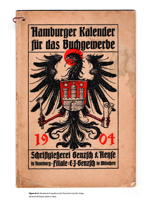
 Dan Reynolds