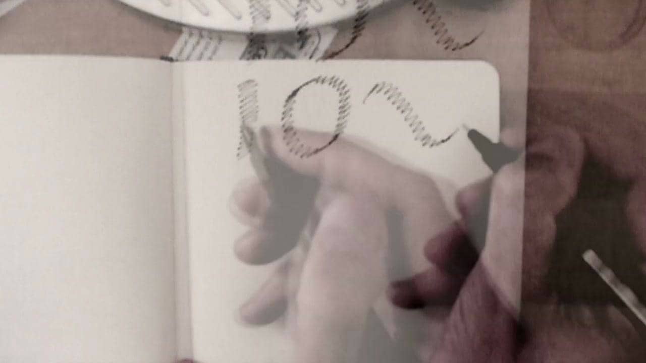
A quick recording of sketching letterforms from the inside out. Postpone drawing the actual outline until you have an idea where it is. Just drawing any line isn't going to make it the right one. Better to ignore drawing the contour altogether and focus on proportion, contrast, weight, the white shapes as well as the black shape.
The pen keeps the same amplitude and direction. Thus it performs similar to a broad nib pen and the contrast follows easily. Modulating the amplitude (shown later on) simulates the expansion of the flexible nib pen.
This is by no means intended as an example of great lettering. These particular letters would benefit from a dab of white paint and perhaps an iteration or two on tracing paper. But it shows how to get started.
Similar to the sketching techniques shown by David Gates in Lettering for Reproduction.