Occasionally people email me a specific question. I thought that if I can answer those questions in a public format like this blog, the responses can be more helpful.
My internet friend Louie Mantia sent this spacing conundrum.
I’m working on a personal project, and I’m only OK at lettering. This is based on an existing rad typeface, but I redrew it completely for this purpose. I have to say, it is *bothering me* how hard this is to kern properly.
The first image was how it was yesterday. The second image is how it appears now. Slightly tighter on “nior” now. Bigger dot on the “i” too. What do you think? Is it too tight on those letters now? The J and u can’t really get tighter, you know? Unless I sacrifice that serif up top. …which I could? I dunno.
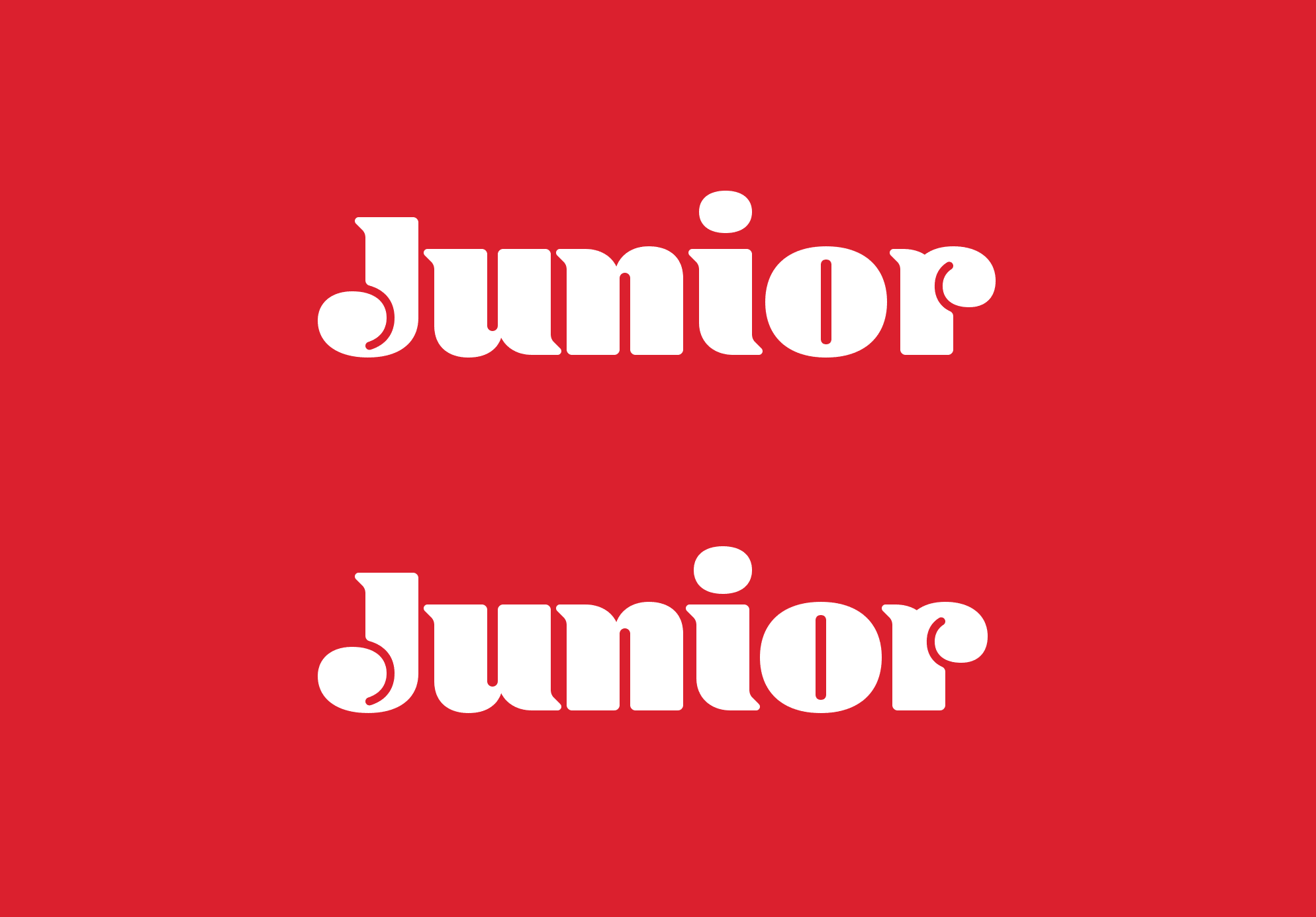
Top: Louie’s first iteration. Bottom: Louie’s tightened adjustments on “nior” and a larger dot of the i.
This is a great question, and I’m thrilled Louie asked. The typeface in question is Blenny, an expressive high contrast serif designed by Spike Spondike at Dalton Maag. Blenny takes some liberties with convention to move the design to somewhere much more playful than most fatfaces. An interesting feature of this design are the uniform channels of negative space for counters. On u and n these channels produce expected results, but in J and r, they give the impression that the letter is overlapping on itself. I would put Blenny in the category of “instant logotype” fonts—designs so unique, that all one must do is set the type with out-of-the-box settings, and you have yourself a passable logotype. This is pretty much what Louie is doing, but like all good designers, he sees room for improvement!
Counterspace equals letterspace
With all due respect to Spike, I think Blenny is spaced too generously. Many typefaces begin with the interior spaces being a reflection of the spaces between letters. When I teach, I refer to this as the first rule of spacing, or “counterspace equals letterspace.”

My most similar design, Ohno Blazeface, uses roughly the same amount of space inside letters, as it does between letters. This rule works especially well on normal letters like u, n, i, and o.
So, in my opinion (and this is all a matter of opinion), you have three options.
- Respace the entire word to be much tighter, letting the letterspacing match the existing counters.
- Enlarge the counters to match the existing letterspace.
- A little bit of both.
Let’s look at all of these in a little more detail.
1. Make it tighter
It would be a challenge to get everything super tight in this design due to the serifs, but, still possible. And wherever necessary, one can shave off serifs in a way that isn’t going to ruffle any feathers.

I am reminded of this brilliant logotype (and custom typeface) by Carvalho Bernau. Can you spot where they have deftly removed a single serif to allow for better spacing? It’s almost completely invisible. Love it!
2. Enlarge the Counters
This is an interesting idea because reworking the counters in this typeface would remove it significantly from its origin. It will immediately look less like Blenny, which is then more ownable for the brand. You have the option to make the counters as they are, or to make them into any shape you want, as long as it is generally the right size.
3. A little bit of both
Tightening up the letters a bit, and making the counters slightly bigger would be a nice strategy, and a good learning opportunity to get up close and personal with positive and negative space. As a type designer, it’s wonderful to see graphic designers treating type not as clip art, but as a raw material. The more opportunities you take to get in there and mess around, the more comfortable you will become, and the more original the result will be.
Spacing is a topic that I can talk about at length, but for those that aren’t constantly fascinated by the play between dark shapes and light, it’s as simple as this: a design decision in service of better spacing is a good decision!
Also, I prefer the larger dot on the i, but that’s more subjective. ✌
Update
Louie actually read all this, and it looks like he implemented solution number one. By consistently tightening everything up, the logotype feels more cohesive and considered. Best of all, it appears effortless, even though we know for a fact it was not!
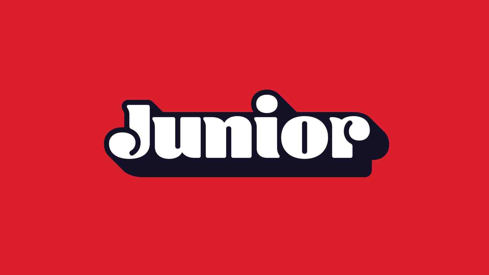
The finished product. Bravo Louie! The spacing looks beautiful.