Occasionally people email me a specific question. I thought that if I can answer those questions in a public format like this blog, the responses can be more helpful. Josh Dunsterville emailed a question I get asked a few times a year.
I want to start exploring type design more intentionally now, but I feel a little lost/overwhelmed on where exactly to start, or where to look. Was wondering if you had any recommendations on resources, books, blogs, etc, or just general advice on where/what I should focus on first?
I do own Glyphs, and started on a simple geometric display typeface a while ago, but didn’t get too far. Anyways, not sure if that matters, but yeah I’d love any advice you’re willing to give.
There’s no wrong way to eat a Reese’s
Let’s hold off on the perfect book, the perfect pen, and the perfect weekend workshop for a moment. There is no magic bullet better than your own enthusiasm. Feeling energetic about practicing, reading, or otherwise learning is the single greatest factor in determining how far you will go. Talent is completely overrated, but what is consistently undervalued is the curiosity that drives exploration and experimentation. Wondering, “What will happen if I do it this way?” is way more powerful than thinking “I am awesome at this!” because the former leads to an action, and the latter leads nowhere.
For that reason, one should be thankful simply to be in the position to want to learn about something. Curiosity is a gift from the heavens, and should be treated as such.
When curiosity runs out
Unfortunately, we can’t always count on our natural inclination towards something—in fact, it is as fleeting as the carbonation in that tangerine La Croix you’re drinking. When our enthusiasm runs low, we must lean on a little discipline to get us through. I love the sort of work I am lucky enough to call a profession, but admittedly there are days when I lack any semblance of a mojo. That’s natural, and a good opportunity to steer your willpower in the direction of more work. Without a doubt, more enthusiasm and curiosity is on the other side. Type design as a job is about 5% creativity, and 95% production work. Both can be enjoyable, but finishing something is infinitely more difficult than starting.
The perfect book
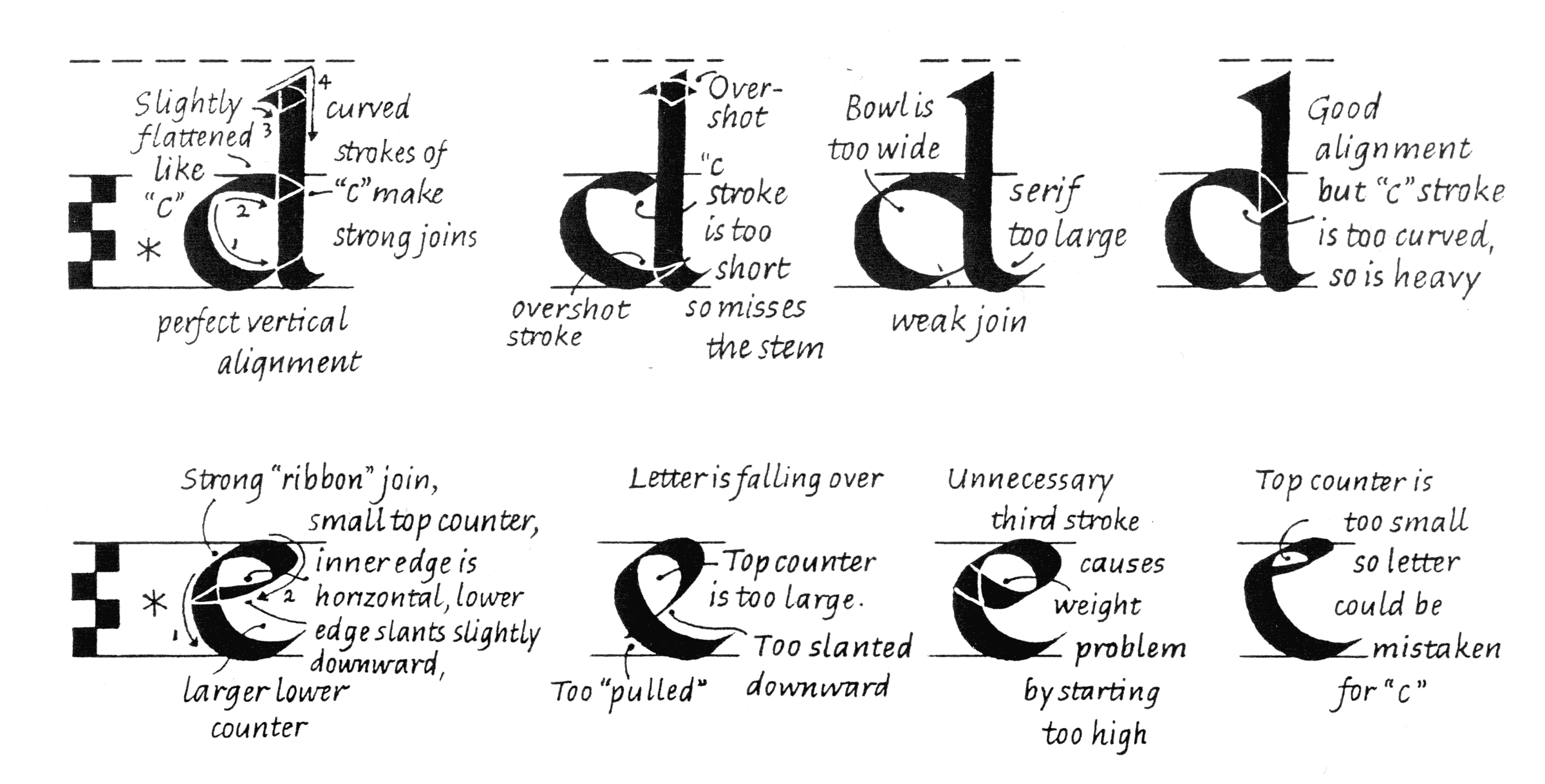
Now that you are appreciating your curiosity, and have mastered self-control, it’s time to read! I recommend beginning with calligraphy. An excellent primer for the foundational hand—a style of calligraphy invented for the purpose of familiarizing students with traditional letterforms—is Sheila Waters’ book Foundations of Calligraphy. I recommend this not for you to become the world’s greatest calligrapher and get millions of followers on Instagram, but for you to gain an understanding of weight, contrast, spacing, and width conventions.

There are many things I love about Foundations of Calligraphy by Sheila Waters, but her diagrams of common problems are especially great. Another bonus: this book features a lay-flat binding that every lettering and calligraphy book should adopt!
The perfect pen(s)
Broad nib pens are a must, as so much of (Latin) type history is informed by the broad nib. Within the last ten years or so, Pilot has started manufacturing the refillable Parallel Pens. These are great for a number of reasons:
- They come in a variety of sizes.
- They have great flow that is generous and consistent.
- Did I mention they’re refillable?
A pointed pen can achieve many different styles, and is useful for filling in drawings. I’m a big fan of the Pentel Fude Touch Sign Pen. Applying more pressure to the side of the nib creates a thick line, and applying gentle pressure to the tip allows it to act as a fine-liner.

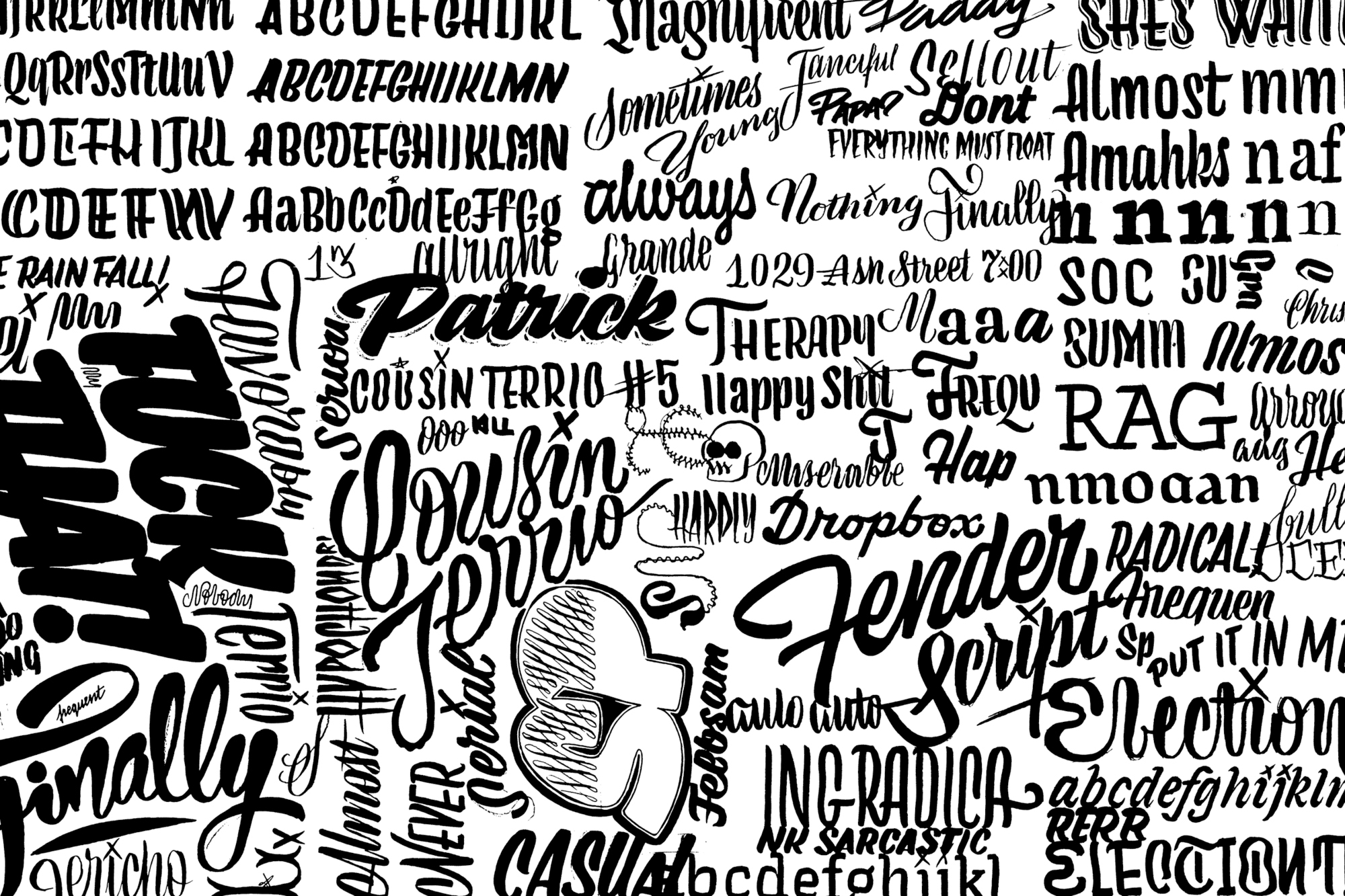
A sample produced entirely with the Pentel Fude Touch Sign Pen (or I may have been using something else at the time, but it was quite similar).
The perfect paper
I’m a huge fan of marker paper for a couple reasons:
- It’s bright white. I don’t really dig tracing paper because you don’t get the same amount of contrast.
- It’s semi-transparent. This allows one to trace without having access to a light table. Tracing is often the fastest way to refine, or iterate on a drawing. It is holy, in the world of sketching techniques.
- It accepts many different types of tools. The aforementioned pens work perfectly on marker paper, as does pencil, and—you guessed it—markers.
- It doesn’t bleed through. Pilot Parallel pens tend to bleed through everything, but not this. Sharpie and the like also doesn’t bleed through.
My favorite manufacturer of marker paper is Canson. It’s a bit spendy, but worth it.
The perfect specimen
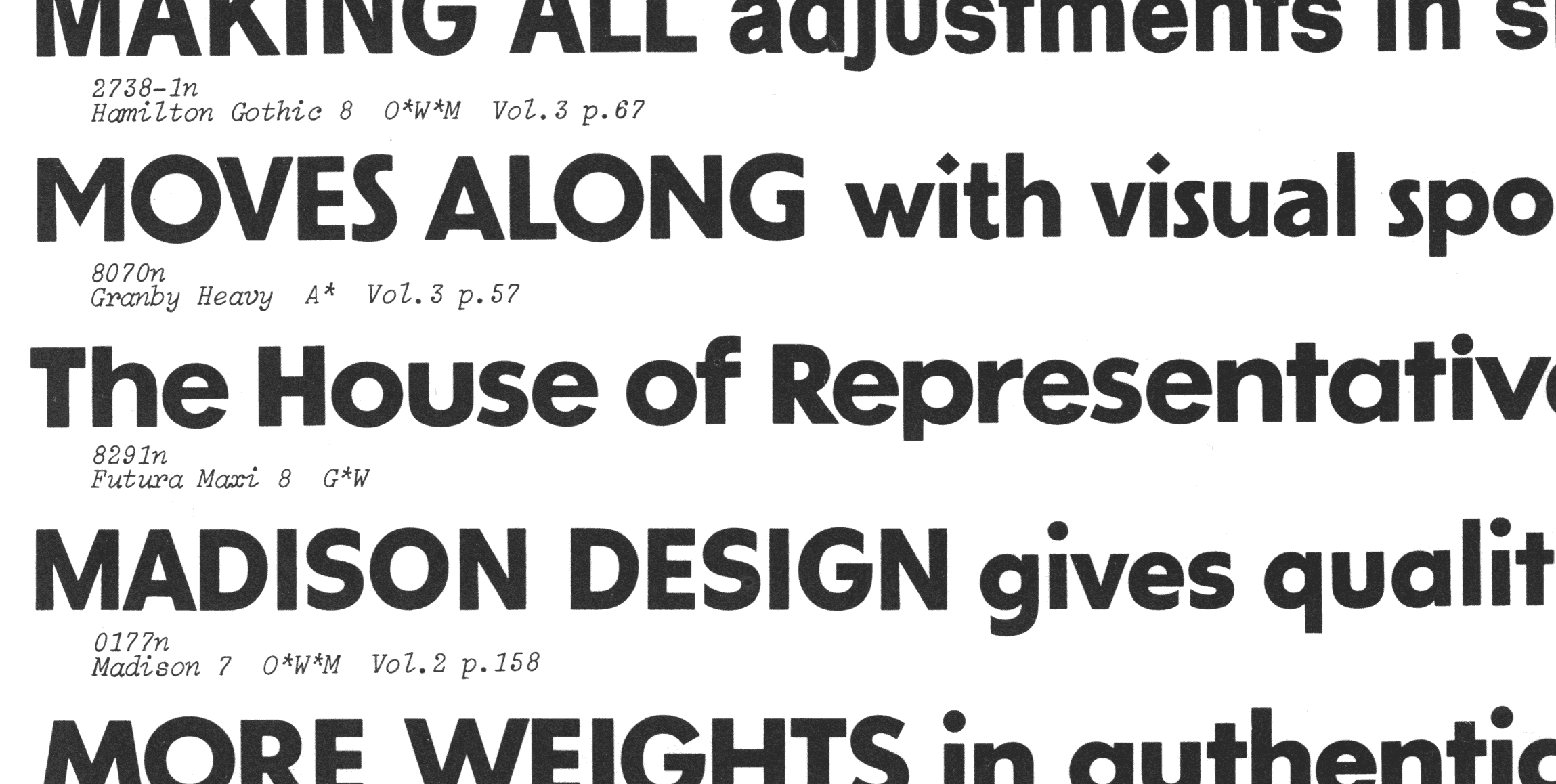
I’m not the guy with an insanely expansive and expensive collection of fine type specimens. I have a few, but my favorite might be the Photo-Lettering One Line Manual of Alphabets. I appreciate it for the sheer number of typefaces displayed within. As stated in the title, it shows one line of each font, and they are magnificently organized.

A tiny slice of the Photo-Lettering One Liner. The is one quarter of one page of a 470 page volume. That is to say, if you can think it up, it’s probably in there!
The perfect software
Two options here. For the programmatically inclined, and those that want control over their preferences in a pretty serious way, RoboFont is the way to go. That’s what I use, and I’ve been very happy with it for a number of years.
For those looking for an all-in-one solution friendly to the new-comer, you might want to look into Glyphs, or perhaps even Glyphs Mini. The documentation is excellent, and you’ll immediately notice how much more accomodating it is to drawing letters than the embarrassingly bad Adobe Illustrator.
Free education
Tobias Frere-Jones has two posts on his blog about Typeface Mechanics. That is some premium quality information.
The foundry from the future, Underware, has a website called Typeworkshop with some beautifully sketched and wonderfully informative visual explanations.
Paid education
If you live in the Bay Area or New York, you are probably tuned into Type West and Type@Cooper. If you are somewhere else, there might be cool stuff around. Sign up for calligraphy group’s mailing lists. Go to TypeCon or ATypI. See what pros and teachers are in your area. I’ve always been a proponent of spending money on education. Classes and workshops can be expensive, but are usually worth it. In the event that your teacher is a real dud and you learn nothing, there is still a great chance you’ll meet chill friends with similar interests, and that’s a lot more valuable anyhow!
I could go on…
There are tons of other great things out there but that’s probably plenty for now. Just a couple quick disclaimers: don’t use the Instagram Explore page as the one-stop-shop for source material. To quote my illustrator buddy Matt Cantrell, “We don’t look at the thousands who have tried. We look at the five or so that did it really well.” Keep your eyes tuned to the greats, and keep your phone in your pocket.
Don’t shit on yourself
It’s really easy to say, “I suck at this. Wow, I’m a real moron, aren’t I? This. Looks. Terrible.” Of course, we all fall victim to such negative self-talk, but remember that as a beginner in anything, you have to suck. For a long long time. The good news is it can be fun to suck! It’s wonderful to be a beginner. Enjoy the process, and approach it with the same patience you’d try to instill in a child learning something new. Be gentle to yourself, and enjoy the progress that comes from practice. Ira Glass has good advice on this topic that everyone has heard.
Welcome!
I remember feeling gross at some graphic design events because they wreaked of self-serving “networking.” It seemed some people more interested in the potential financial benefits of a contact than anything else. This doesn’t happen as much in the type world, probably because there aren’t any potential financial benefits out there! It’s a community of genuine enthusiasts that are often eager to help. Going forward, that community will be what we make it, so I hope that you’ll be of service to someone else when the time comes.
I dare you to
- Be like Nina, and do a TypeCooker every day.
- Read 50 Type Reviews on Typographica.
- Check out the Alphabette’s Mentorship Program. ✌