Cormorant Cyrillic Review

Alexei Vanyashin
Here is a detailed review touching the stylistical questions I mentioned earlier.
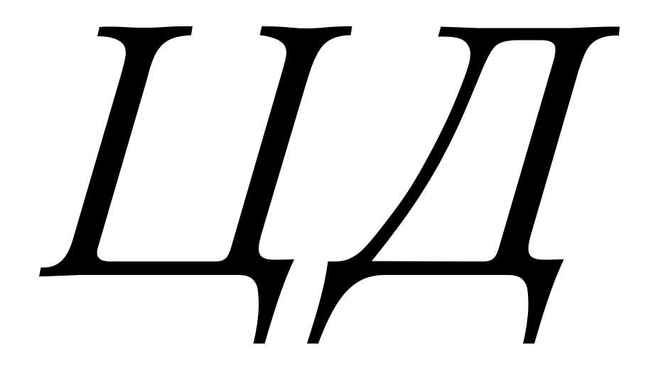
I would suggest reshaping ДЛ to match earlier Cyrillic forms, instead of using modern Didone-style letterforms.

Christian Thalmann
thanks for your insights.
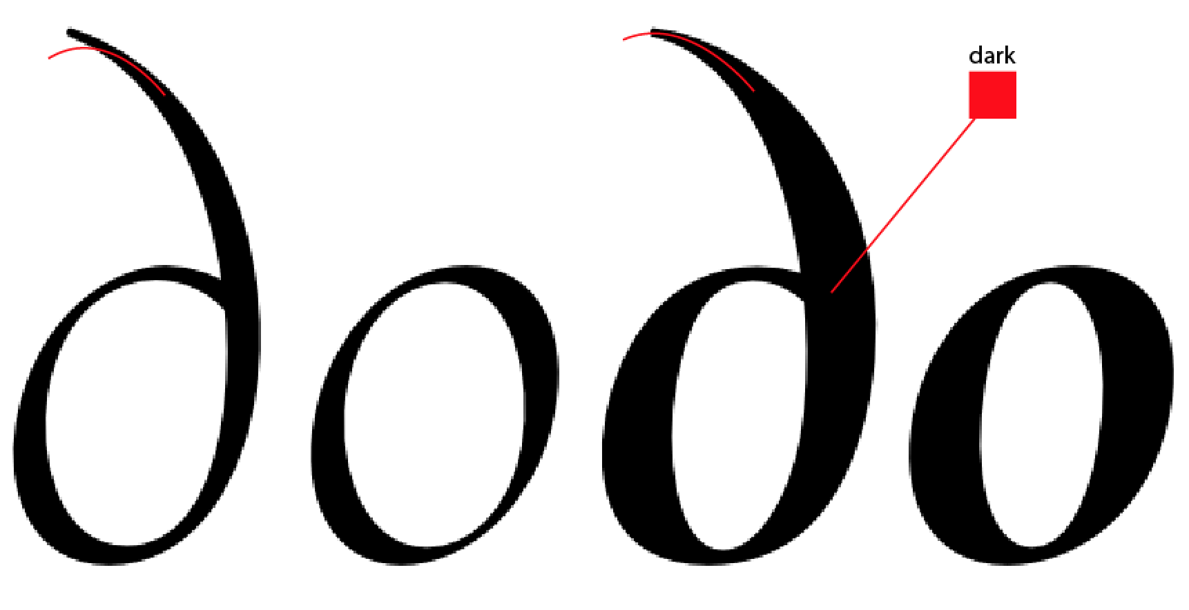
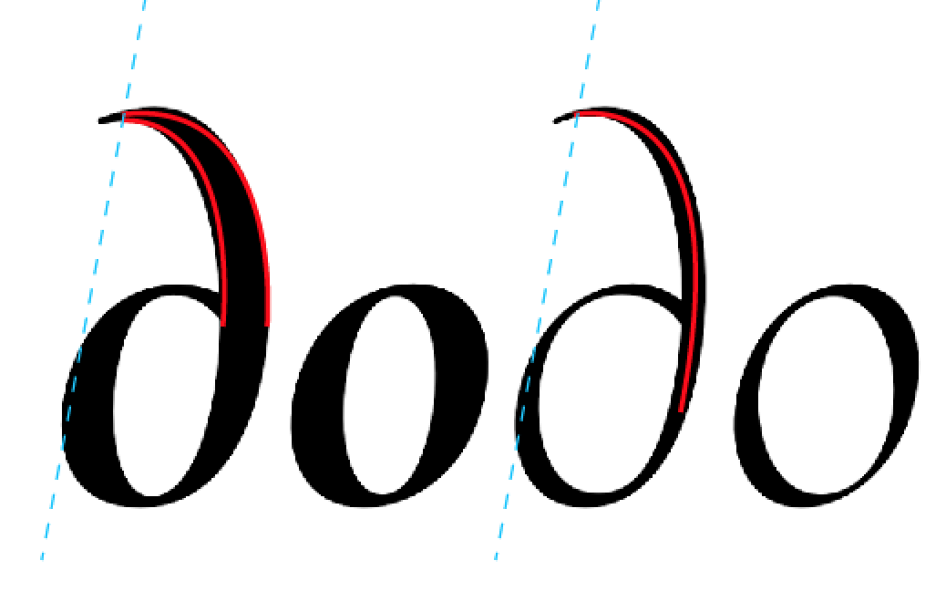
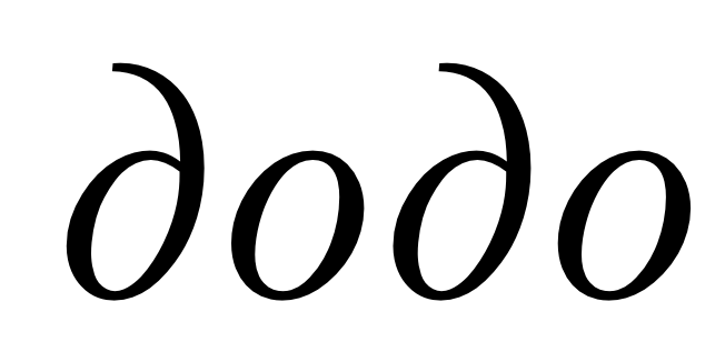
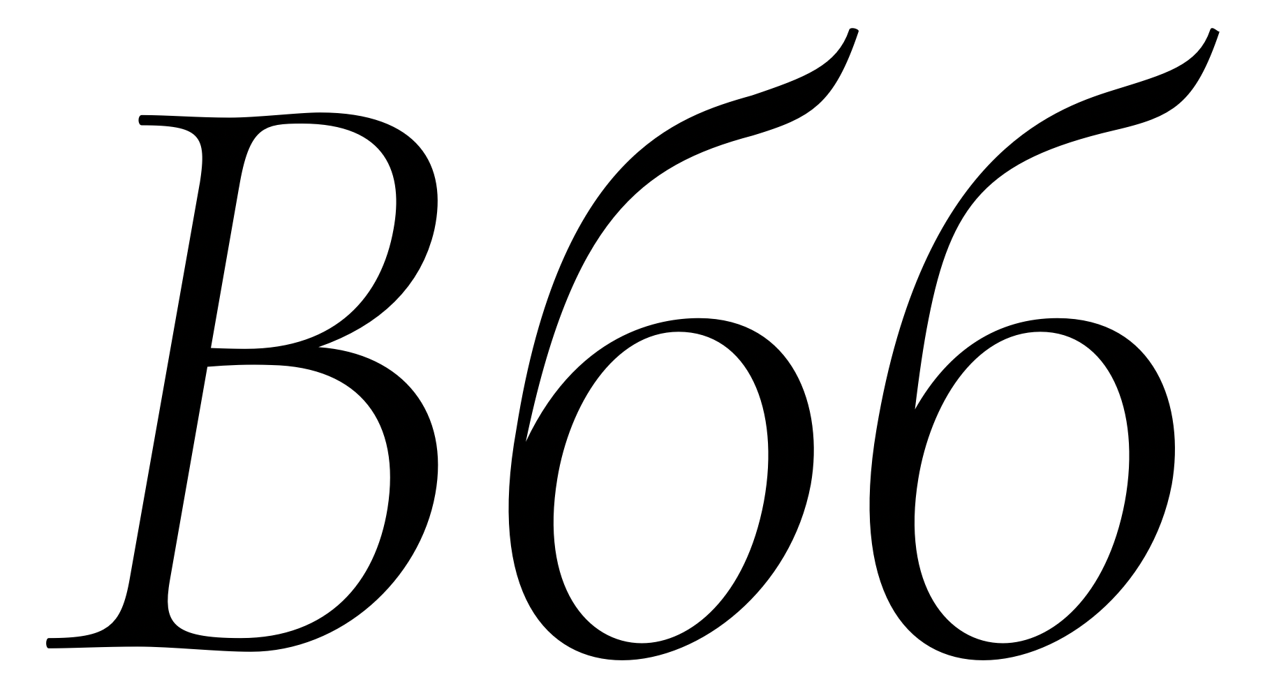
I'm rather surprised at the tear-shaped central descenders. Shouldn't they match the lateral descenders in Ц etc.? This seems to be the case in many other typefaces.
I am not pursuing a historically accurate revival, and I find the historically appropriate trapezoidal forms quite ungainly. I think I'm going to stick to the modern-style architecture for the base cut of Cormorant and to the triangular architecture in the Cormorant Garamond cut (= SS02), which remind me of Trajan in a pleasant way.
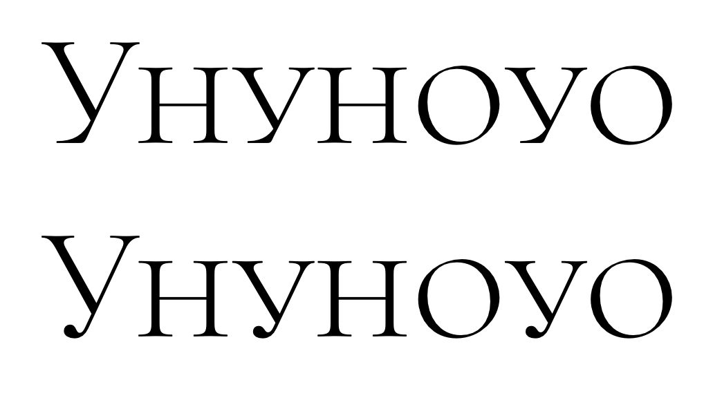
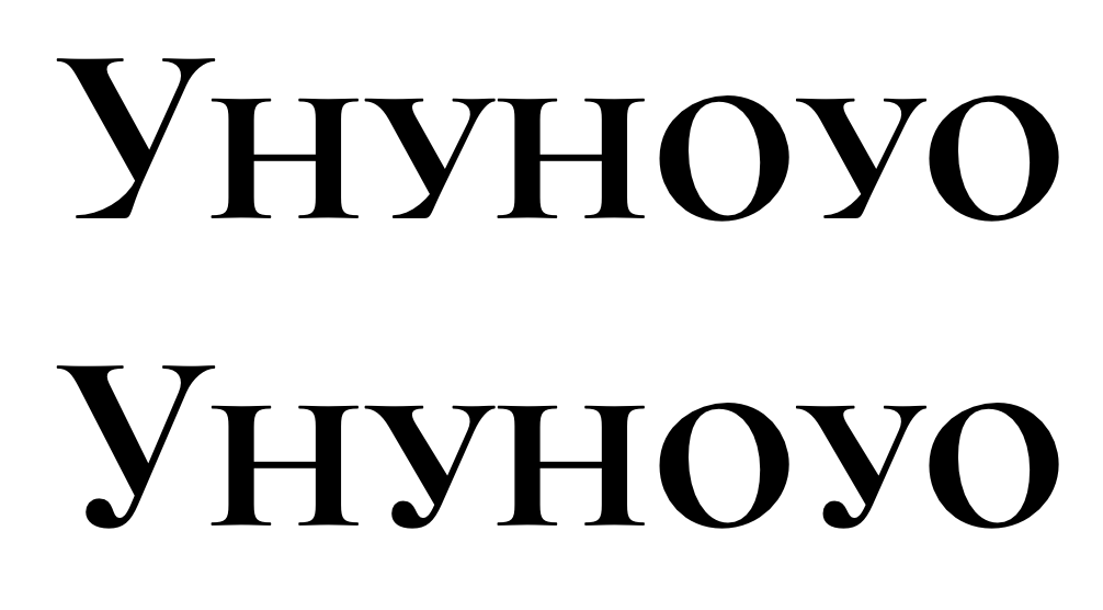
I rather like the flat foot of the current У, in particular because my uppercase is almost entirely devoid of ball terminals in general, and because I find the flat foot more «capital» and grounded than the ball terminal. However, I'm happy to offer a ball-terminal variant — perhaps for the default cut, since it uses more mainstream Cyrillic forms in general?
I can make the counter of Яя more open, but note that it is also almost uncomfortably small in Latin R. Small counters are a defining feature of the typeface.
I don't like the semi-serif version of Ии, and would much prefer to keep the current version, since it fits so well with the Trajan flavor of the Cormorant Garamond cut. I'm happy to remove the non-Bulgarian glyphs from the loclBGR set.
The new Ф looks good!
Cheers, Christian
Christian Thalmann
Christian Thalmann
Once the Roman is finalized, I can start propagating the additions and changes to the Italic.
Alexei Vanyashin
I am not pursuing a historically accurate revival, and I find the historically appropriate trapezoidal forms quite ungainly.

For a classist feel I recommend extending the terminal in У below the baseline.
Here is a sample from Trajan with an extended У.
![]()
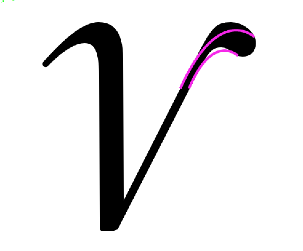
Made a drop-terminal version of У and small-caps у for the default cut. The Garamond cut retains the «stainless steel murderspider» look, as orthoxerox called it.

Another type of terminal in У. May be used in lowercase to match the "murderspider".

Your updated Яя looks good.

I'm rather surprised at the tear-shaped central descenders. Shouldn't they match the lateral descenders in Ц etc.? This seems to be the case in many other typefaces.
No, as you have seem from my examples in the PDF. Since you are not going for historical details, you may leave your current solution. I reckon I have seen it in others fonts.

Alexei Vanyashin

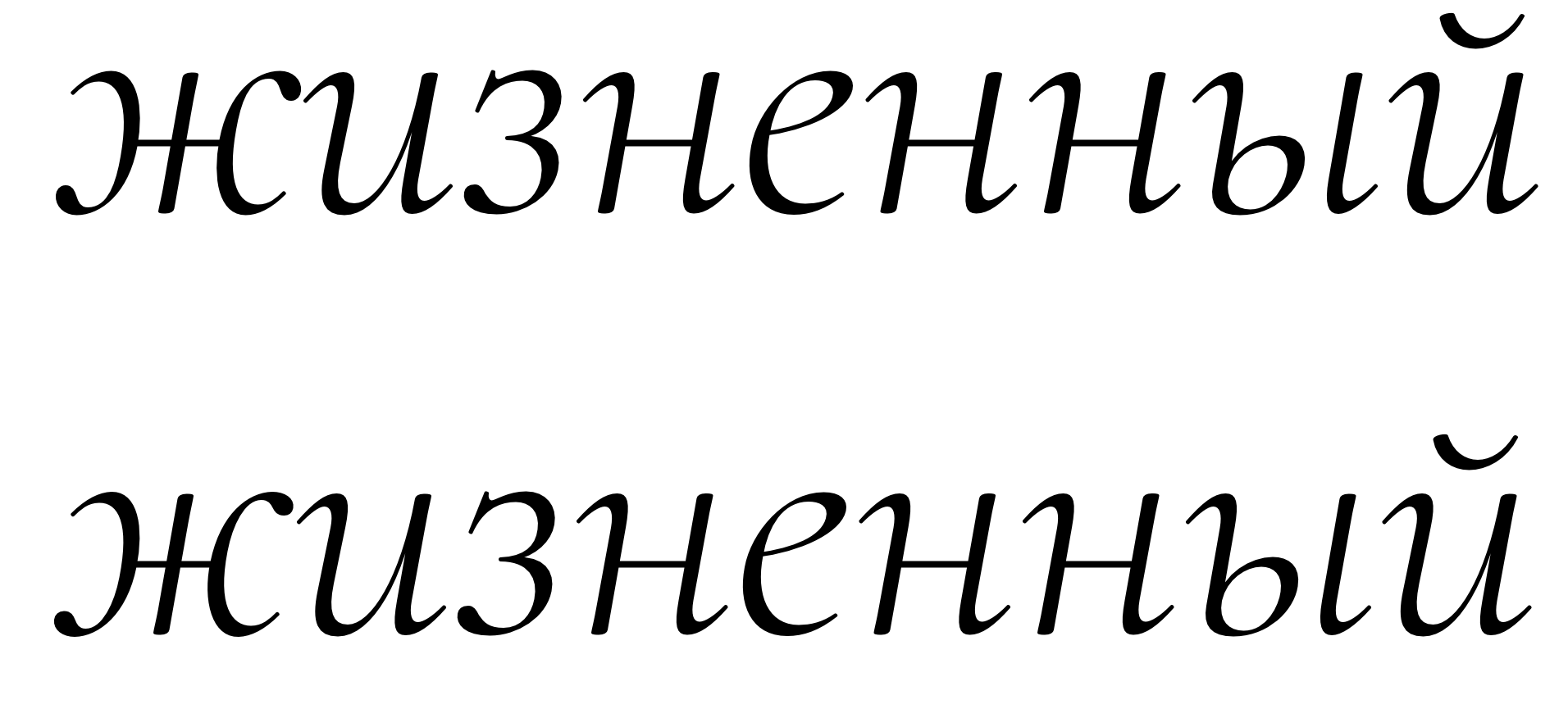
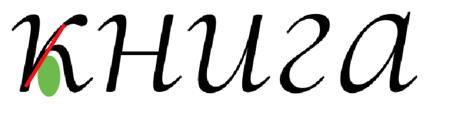
з l.c.— needs a serif in the bottom, similar to э

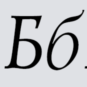
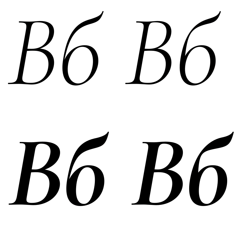
б the middle part of the tail should be more horizontally oriented. Reference:

ДдЛЛУу There are two main conventions. Please choose one (for a single stylistic set). Your current solutions for ЛлДд in the default set feel out of place.
1. Garamond-style / Broad nib Cyrillic


2. Didone-style / Pointed nib Cyrillic


Once again, sorry for the late answer. Let me know if you have more questions to proceed further.
Regards,
-a
Christian Thalmann
It is absolutely fine if you don't pursue a historical revival. The main problem as I see it is that you are mixing in Garamond, Bodoni, and Trajan. In Cyrillic you need to stick to one convention — per stylistic set in your case :)
Well, Trajan ist not exactly traditional or conventional... couldn't Cormorant be innovative in the same way that Trajan Cyrillic is?
In any case, I'm fine with thinking of Cormorant Garamond as a Trajan/Garamond hybrid (Trajan doesn't have lowercase anyway), and going for Bodoni-style convention with default Cormorant.
I like how the new terminals in Уу relate to Лл.The Лл represents a modern Didone shape, while /б is an old-fashioned Garamond.
OK, so I can at least keep the current /б for the Garamond cut and just make a more horizontal one for the Bodoni cut? The main problem I foresee there is that my ascenders are very high, so that horizontal tail will just seem to hover far above in the clouds.
For a classist feel I recommend extending the terminal in У below the baseline.Here is a sample from Trajan with an extended У.
I prefer the look of the baseline-aligned У, especially with the horizontal foot of the murderspider cut. Otherwise, it's the only capital that sticks out like that. I suppose I could offer a descending variant as a stylistic alternate.
This "Trajan-style" У is fine, and requires a different solution for Лл, which you provided.I see a problem with У and у. The lowercase design needs to be adjusted as well.
How about this?
Your updated Яя looks good.
I'm actually not sure whether I changed anything. ;o)
Christian Thalmann
and here the reply to the second part.
з l.c.— needs a serif in the bottom, similar to э
б the middle part of the tail should be more horizontally oriented.
Trying... but I find it's hard to make the knee thin enough to satisfy the contrast and still leave enough of a horizontal flag in the Bold. I've solved this with a non-vertical vertical for the time being; does that work?
ДдЛЛУу There are two main conventions. Please choose one (for a single stylistic set). Your current solutions for ЛлДд in the default set feel out of place.
I really don't understand this issue. As far as I can tell, I'm faithfully adhering to the architecture of the Bodoni approach with my default cut of ЛлДд (thin stem starts vertical and curves out into a ball terminal, proportions match). The only differences I see are the obvious ones due to the different stress and contrast in Cormorant. I certainly can't have hairlines everywhere like Bodoni, or super-curled terminals. I also strongly dislike the boneless diagonals of the traditional Garamond.
Alexei Vanyashin
/з is good.
The lowercase /у does not look good.

The proper way to design it would be to 'chop off' the drop, and make it into a straight.

The left /б is good. The Bold one is falling to the left.

I really don't understand this issue. As far as I can tell, I'm faithfully adhering to the architecture of the Bodoni approach with my default cut of ЛлДд (thin stem starts vertical and curves out into a ball terminal, proportions match). The only differences I see are the obvious ones due to the different stress and contrast in Cormorant. I certainly can't have hairlines everywhere like Bodoni, or super-curled terminals.
To my native eyes a mix of two different conventions looks inappropriate, and distracting. Compare the amount of white in /а and /л. It does not feel right, because it isn't backed up by tradition. The 'boneless diagonals' are called trapeziodal, and are traditional for broad-nib structure. I do advise trying out this solution.
I also strongly dislike the boneless diagonals of the traditional Garamond.
Christian Thalmann
The lowercase /у does not look good.
The proper way to design it would be to 'chop off' the drop, and make it into a straight.
I have tried that, and it looks exceedingly unattractive, not to mention ill-fitting with the typeface. (I have the same feelings toward the sample image you posted for that architecture.)
I made two more alternatives; are any of those better? The one-sided serif maybe?
The left /б is good. The Bold one is falling to the left.
I see what you mean. Better?
By the way, I'm currently using this form for the Bodoni cut and the original form for the Garamond cut. Is this the wrong way around? Looking at your hand-written sample images, it seems to me like the strong-backed design (as shown here) implies a broad nib. Should I switch them around?
I really don't understand this issue. As far as I can tell, I'm faithfully adhering to the architecture of the Bodoni approach with my default cut of ЛлДд (thin stem starts vertical and curves out into a ball terminal, proportions match). The only differences I see are the obvious ones due to the different stress and contrast in Cormorant. I certainly can't have hairlines everywhere like Bodoni, or super-curled terminals.
To my native eyes a mix of two different conventions looks inappropriate, and distracting. Compare the amount of white in /а and /л. It does not feel right, because it isn't backed up by tradition. The 'boneless diagonals' are called trapeziodal, and are traditional for broad-nib structure. I do advise trying out this solution.
Based on your previous suggestions, I chose «Trajan» as the style for Cormorant Garamond and «Bodoni» for Cormorant. In that context, a Bodoni-style shape for /л seems appropriate. Are you now saying that Bodoni-style shapes were never an option because my font is humanist in nature...?
I also strongly dislike the boneless diagonals of the traditional Garamond.You can't dislike them before you try them.
I can certainly dislike the samples taken from professional fonts that you're showing...
Alexei Vanyashin
The new bold /б looks good.
I think this one looks better, but it's terminal is too large.

This would probably work too. I need to check in text.

Based on your previous suggestions, I chose «Trajan» as the style for Cormorant Garamond and «Bodoni» for Cormorant. In that context, a Bodoni-style shape for /л seems appropriate. Are you now saying that Bodoni-style shapes were never an option because my font is humanist in nature...?
I am already confused what you mean by Bodoni-cut, Garamond-cut, etc. I don't think you can mix Bodoni and Garamond in one style and get away with it.
To my eyes /л and /д look wrong. I am used to seeing them much narrower with a trapezoid top.

Compare the amount of white in the counters.

Do you think you can mix an /a from Baskerville into Jenson and make it a feature? Good luck with that....
Christian Thalmann
This would probably work too. I need to check in text.
I could certainly live with that solution!
I am already confused what you mean by Bodoni-cut, Garamond-cut, etc. I don't think you can mix Bodoni and Garamond in one style and get away with it.
I think I'm finally starting to see the problem. I was under the impression that there are a bunch of characters (e.g., ДИЛКУ) that need to be consistent in either Bodoni, Garamond, or Trajan style, whereas the rest of the characters are basically style-agnostic. Thus, I was going to make them Bodoni-like in the default «Cormorant» fonts, and Trajan-like in the «Cormorant Garamond» fonts (Cormorant + SS02). What you're saying now is that the other characters, such as /a, are in fact not style-agnostic, and if I wanted to go Bodoni-style, I'd have to remake all those characters, too. That's out of the question in my opinion (Cormorant is all about that /a!), so I guess Bodoni-style designs are out of the question in general.
I suppose the default Cormorant will have to become Garamond-style, then.
To my eyes /л and /д look wrong. I am used to seeing them much narrower with a trapezoid top.
Compare the amount of white in the counters.
Could I salvage those лд by using the /a/e from .ss02, which have larger apertures? Or are there many more letters in the current Cormorant lowercase that would need to be changed to fit Bodoni-style лд?
Alexei Vanyashin
Christian,
I have adjusted лд to fit the current style. What are your thoughts on this?

The descenders in /ц were too heavy. This size feels more natural to me.

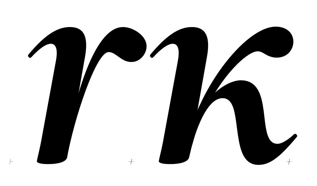
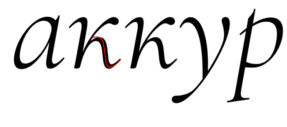
Another stylistical note. I would expect lowercase жк to be drop-shaped in this scenario. They feel like small caps.
If you wish these жк may be kept in a separate stylistical set, and should be matched with л+y with "spider-terminals".
This type of customisation is acceptable, unless you don't alter the letter-skelet.

Example:

Could I salvage those лд by using the /a/e from .ss02, which have larger apertures? Or are there many more letters in the current Cormorant lowercase that would need to be changed to fit Bodoni-style лд?
No. I don't think the minute change is sufficient. They don't work either

Alexei Vanyashin
Christian Thalmann
thanks, your demonstration glyphs look quite convincing, especially in the first few images. In the last image, I sort of vaccilate between the third option and the first. Sometimes my eye appreciates the similarity of spacial frequencies between the narrow trapezoids and the tight counters in the vowels in the third sample, and at other times it finds the first sample more rhythmic and finds the chasm between ад in that last sample really jarring. I suppose I'll stick to it, though.
Judging from the Google Fonts usage stats, Cormorant Garamond seems much more popular on Russian sites than Cormorant, so the triangular bodies really seem to work. Maybe changing the trapezoids in the regular Cormorant will help it catch up. :)
Descenders of ц: I guess that should be propagated to all similar descenders?
Ball terminals: I really don't like ball terminals in кж; they strike me as very Bodoni-like and pompous. I gave them a try on the capitals a while back, and they looked spineless and sad: https://github.com/CatharsisFonts/Cormorant/issues/14#issuecomment-216844150 . In that thread, orthoxerox said that ball terminals required recurved arms to look right, which would bring us firmly into the Bodoni territory that we're trying to leave behind.
Cheers, Christian
Christian Thalmann
Then again, the Ж looks rather weird in the same style. It's an uncomfortable letter for a humanist typeface to begin with, but with ball terminals it looks particularly out of place.
Christian Thalmann
I'm not sure whether the ball-terminal кж work out as well, though:
Christian Thalmann
I'm not sure whether the ball-terminal кж work out as well, though
I suppose that might have been my fault rather than a fault in the fundamental idea. I've tweaked the ball-terminal implementations a bit more, and I'm starting to see their point.
Alexei Vanyashin
Judging from the Google Fonts usage stats, Cormorant Garamond seems much more popular on Russian sites than Cormorant, so the triangular bodies really seem to work. Maybe changing the trapezoids in the regular Cormorant will help it catch up. :)
Descenders of ц: I guess that should be propagated to all similar descenders?

The top bowl of /з should be contracted

Top pennant in б is too long. In Bold the left extrema point on the bowl should be raised up, cutting the extra black from the bowl.

/м is off balance. The apex can be moved to the left

The descenders in uc and lc triangular Д are too long. Need to be contracted.

Christian Thalmann
thanks for the feedback. I agree with all of it, but am a bit worried about the кж. Doesn't a double-bend ball-terminal arm look all too Bodoni?
Changed the other glyphs as well. I'm not sure whether I understand the issue with м; it looked fine to be before.
Cheers
Christian Thalmann
I have propagated the changes (as far as I remembered them) to the Cormorant Italics. Hope it works out!
Cheers, Christian
Alexei Vanyashin

Alexei Vanyashin
Christian Thalmann
Thanks, I'll address those.
> On 16 Oct 2016, at 07:01, Alexei Vanyashin <a...@cyreal.org> wrote:
>
> Are you ready to show me the Italic for a review?
Cheers
Alexei Vanyashin

Schoolbook ґ

Christian Thalmann
— /ustrait-cy: I made the serif on the descender to match /p/q. What would you suggest instead? A horizontal serif? Something else?
— «Slightly bring in the left shoulder.» Not sure what exactly you mean. Should the whole bottom left structure be nudged to the right, making the glyph narrower? Only the descender? Only the sloping thin stem?
— I don't have precedent for the /gheupturn-cy; it just made the most sense to me like that. The curved bottom left instroke doesn't make much sense in humanist pen logic. I guess I'll use a plain sans stem foot, then.
— /ghemiddlehook-cy, /gestrokehook-cy: If I just slant the Roman form, the serifs will look very out of place in the Italics... I'll try to figure something out.
Cheers!
Christian Thalmann
Alexei Vanyashin
On Wednesday, October 26, 2016 at 10:06:35 AM UTC-4, Christian Thalmann wrote:
Hi Alexei, thanks for the feedback! Questions:
— /ustrait-cy: I made the serif on the descender to match /p/q. What would you suggest instead? A horizontal serif? Something else?


— «Slightly bring in the left shoulder.» Not sure what exactly you mean. Should the whole bottom left structure be nudged to the right, making the glyph narrower? Only the descender? Only the sloping thin stem?
— I don't have precedent for the /gheupturn-cy; it just made the most sense to me like that. The curved bottom left instroke doesn't make much sense in humanist pen logic. I guess I'll use a plain sans stem foot, then.
— /ghemiddlehook-cy, /gestrokehook-cy: If I just slant the Roman form, the serifs will look very out of place in the Italics... I'll try to figure something out.
I really hate those slanted /ge derivatives. Any suggestions on how to improve them? Or should I just accept that they're hideous...?

As a reference, Old Standard is a true-italic font. No experimentations here. Just slanting.

Alexei Vanyashin
Thanks! Working on the corrections.
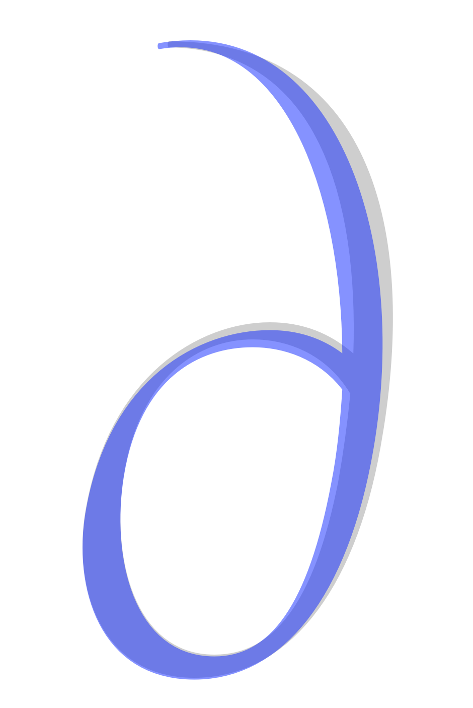
Meanwhile, is this /de-cy better?
--
You received this message because you are subscribed to a topic in the Google Groups "Google Fonts Discussions" group.
To unsubscribe from this topic, visit https://groups.google.com/d/topic/googlefonts-discuss/f3h0HicNGX4/unsubscribe.
To unsubscribe from this group and all its topics, send an email to googlefonts-discuss+unsub...@googlegroups.com.
To post to this group, send email to googlefonts-discuss@googlegroups.com.
Visit this group at https://groups.google.com/group/googlefonts-discuss.
To view this discussion on the web visit https://groups.google.com/d/msgid/googlefonts-discuss/5711d32f-3457-4216-9447-12e220b41129%40googlegroups.com.
Christian Thalmann
What was that about /zhe-cy, though? I don't have a corrected layer to compare to.
Alexei Vanyashin
What was that about /zhe-cy, though? I don't have a corrected layer to compare to.
--
You received this message because you are subscribed to a topic in the Google Groups "Google Fonts Discussions" group.
To unsubscribe from this topic, visit https://groups.google.com/d/topic/googlefonts-discuss/f3h0HicNGX4/unsubscribe.
To unsubscribe from this group and all its topics, send an email to googlefonts-discuss+unsub...@googlegroups.com.
To post to this group, send email to googlefonts-discuss@googlegroups.com.
Visit this group at https://groups.google.com/group/googlefonts-discuss.
To view this discussion on the web visit https://groups.google.com/d/msgid/googlefonts-discuss/36fd7669-f0d6-42f6-9ae8-f2528c4d68bd%40googlegroups.com.
Christian Thalmann
in ж you need to retract the two c-shaped forms 15 units inwards. So the widths of ж and ш become similar.
I did that already. Is it not narrow enough?
Alexei Vanyashin
in ж you need to retract the two c-shaped forms 15 units inwards. So the widths of ж and ш become similar.
I did that already. Is it not narrow enough?
--
You received this message because you are subscribed to a topic in the Google Groups "Google Fonts Discussions" group.
To unsubscribe from this topic, visit https://groups.google.com/d/topic/googlefonts-discuss/f3h0HicNGX4/unsubscribe.
To unsubscribe from this group and all its topics, send an email to googlefonts-discuss+unsub...@googlegroups.com.
To post to this group, send email to googlefonts-discuss@googlegroups.com.
Visit this group at https://groups.google.com/group/googlefonts-discuss.
To view this discussion on the web visit https://groups.google.com/d/msgid/googlefonts-discuss/f6cee541-e151-493c-a95a-01b0e12a3a94%40googlegroups.com.
Alexei Vanyashin
To unsubscribe from this group and all its topics, send an email to googlefonts-discuss+unsubscribe...@googlegroups.com.
To post to this group, send email to googlefonts-discuss@googlegroups.com.
Visit this group at https://groups.google.com/group/googlefonts-discuss.
Alexei Vanyashin
Christian Thalmann
As for the language coding, isn't it safer to keep the loclMKD glyphs so the locl feature can still be generated automatically until the fix is issued...?
I do like the new /de-cy better than the old ones!
Alexei Vanyashin
As for the language coding, isn't it safer to keep the loclMKD glyphs so the locl feature can still be generated automatically until the fix is issued...?
Alexei Vanyashin
Alexei Vanyashin
Hi Alexei,
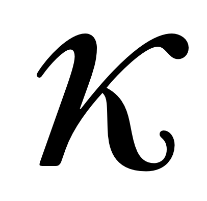
thanks for the corrected version; I've accepted the changed glyphs and propagated them to the Bold. Here's my new /ka-cy.
--
You received this message because you are subscribed to a topic in the Google Groups "Google Fonts Discussions" group.
To unsubscribe from this topic, visit https://groups.google.com/d/topic/googlefonts-discuss/f3h0HicNGX4/unsubscribe.
To unsubscribe from this group and all its topics, send an email to googlefonts-dis...@googlegroups.com.
To post to this group, send email to googlefon...@googlegroups.com.
Visit this group at https://groups.google.com/group/googlefonts-discuss.
To view this discussion on the web visit https://groups.google.com/d/msgid/googlefonts-discuss/3946e289-896d-4eea-901a-77691ed8013c%40googlegroups.com.
Christian Thalmann
Christian Thalmann
I'd like to push for an update of Cormorant on GF soon. Those missing characters in the SC and Unicase cuts are bugging me.
Alexei Vanyashin
Are we done?
I'd like to push for an update of Cormorant on GF soon. Those missing characters in the SC and Unicase cuts are bugging me.
--
Christian Thalmann
thanks! I find these /de-cy exceedingly difficult to get right. If I curve the tips downward to imitate /c, I have to adapt the entire arc shape to make it fit. Does this work now?
Christian Thalmann
On SS02 and SS10: Yes, that's intentional. SS10 mirrors the loclBGR; it needs the Trajan-style diagonals from SS02 («Garamond») to match the triangular /De-cy and /El-cy.
Alexei Vanyashin
New commit is out.
On SS02 and SS10: Yes, that's intentional. SS10 mirrors the loclBGR; it needs the Trajan-style diagonals from SS02 («Garamond») to match the triangular /De-cy and /El-cy.
--
You received this message because you are subscribed to a topic in the Google Groups "Google Fonts Discussions" group.
To unsubscribe from this topic, visit https://groups.google.com/d/topic/googlefonts-discuss/f3h0HicNGX4/unsubscribe.
To unsubscribe from this group and all its topics, send an email to googlefonts-dis...@googlegroups.com.
To post to this group, send email to googlefon...@googlegroups.com.
Visit this group at https://groups.google.com/group/googlefonts-discuss.
To view this discussion on the web visit https://groups.google.com/d/msgid/googlefonts-discuss/f81683d4-7c88-4fe9-821f-234bc0895ffb%40googlegroups.com.
Christian Thalmann
Dave, shall I issue a new release? How quickly can we expect an update on GF?
Alexei Vanyashin
Awesome! :) Thanks for all your work and patience, Alexei!
Dave, shall I issue a new release? How quickly can we expect an update on GF?
--
You received this message because you are subscribed to a topic in the Google Groups "Google Fonts Discussions" group.
To unsubscribe from this topic, visit https://groups.google.com/d/topic/googlefonts-discuss/f3h0HicNGX4/unsubscribe.
To unsubscribe from this group and all its topics, send an email to googlefonts-dis...@googlegroups.com.
To post to this group, send email to googlefon...@googlegroups.com.
Visit this group at https://groups.google.com/group/googlefonts-discuss.
To view this discussion on the web visit https://groups.google.com/d/msgid/googlefonts-discuss/48fbe98d-940b-432d-ace4-e3d825db64a1%40googlegroups.com.
Christian Thalmann
Thank you for your work Christian, well done. I recommend Cormorant Cyrillic among GF best examples.
Christian Thalmann
https://github.com/CatharsisFonts/Cormorant/releases/tag/v3.3
Please update this on Google Fonts as soon as possible...
Christian Thalmann
Алексей Ваняшин
--
You received this message because you are subscribed to a topic in the Google Groups "Google Fonts Discussions" group.
To unsubscribe from this topic, visit https://groups.google.com/d/topic/googlefonts-discuss/f3h0HicNGX4/unsubscribe.
To unsubscribe from this group and all its topics, send an email to googlefonts-dis...@googlegroups.com.
To view this discussion on the web visit https://groups.google.com/d/msgid/googlefonts-discuss/0b943d54-db2a-4f0d-af75-58284b26755fn%40googlegroups.com.
Алексей Ваняшин
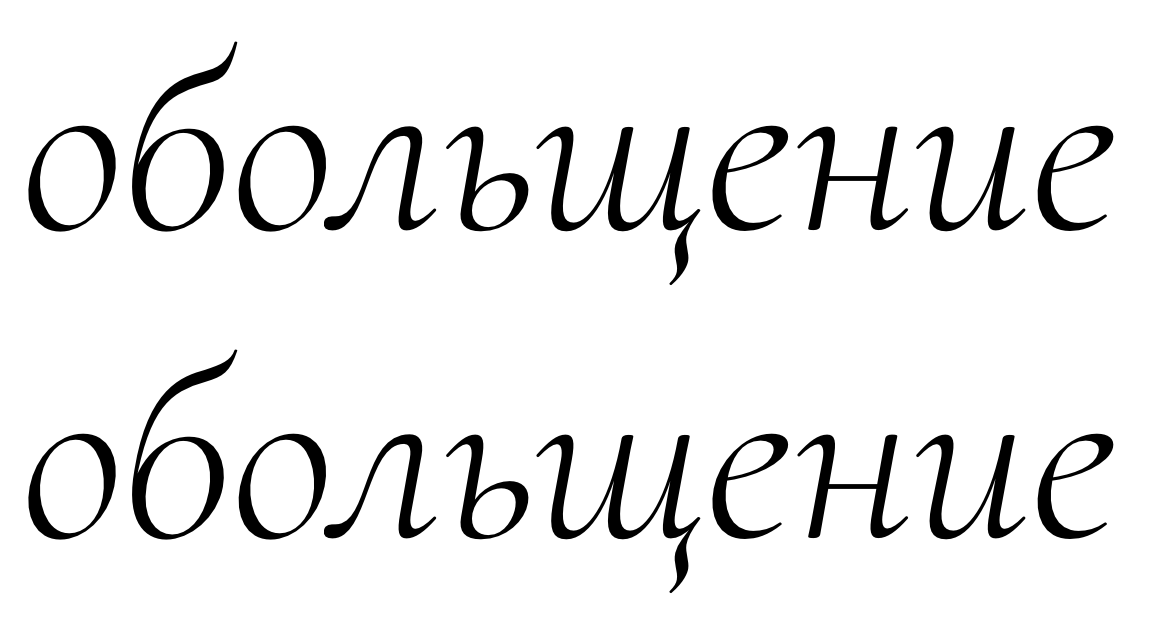
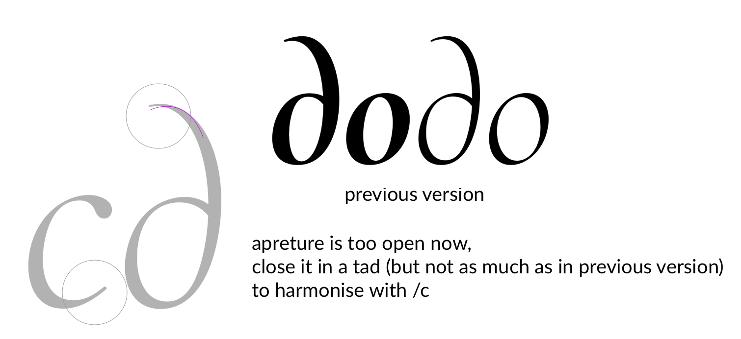
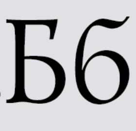
The different form of the б — in Roman, it rather corresponds to didones than to old-style serifs.
For some reason, Garamond’s Cyrillic у has a different descender terminal compared to the Latin y.
That said, in both italics the form of б is the same and complies with the upright б from Roman.


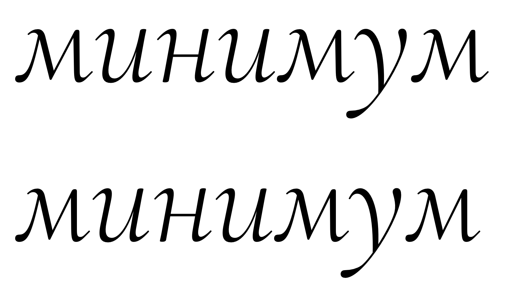
Letters Ии, м in Garamond have a different form, which is rather typical for earlier type styles, reminiscent of capital Latin writing.
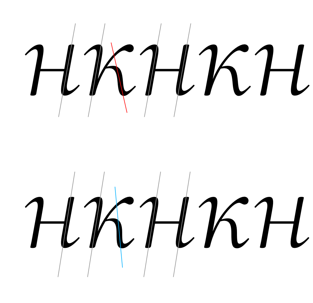
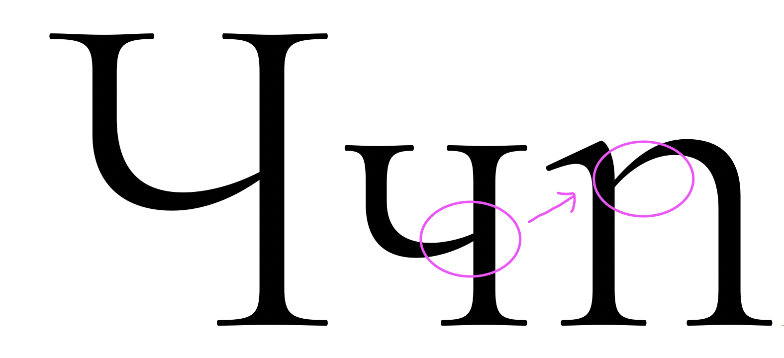
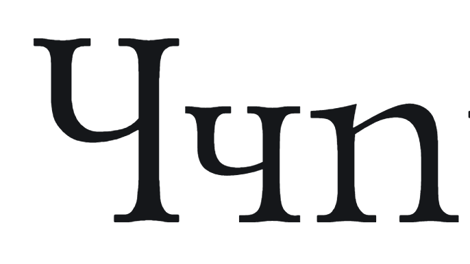
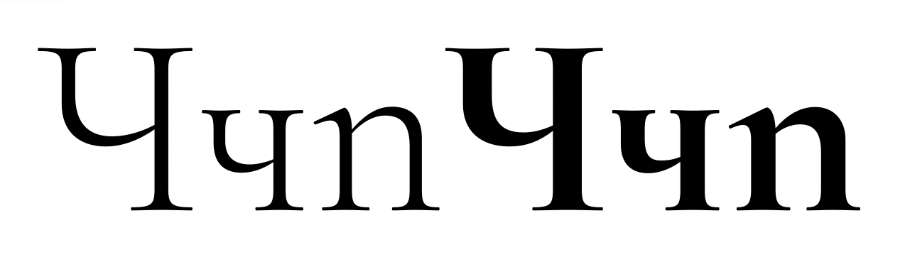
Чч have evidently different character in various cases and styles, the most relevant is the lowercase letter in Roman and Garamond.
In Cormorant Roman, the arc of the uppercase Ч has thickness distribution atypical for an old-style serif.
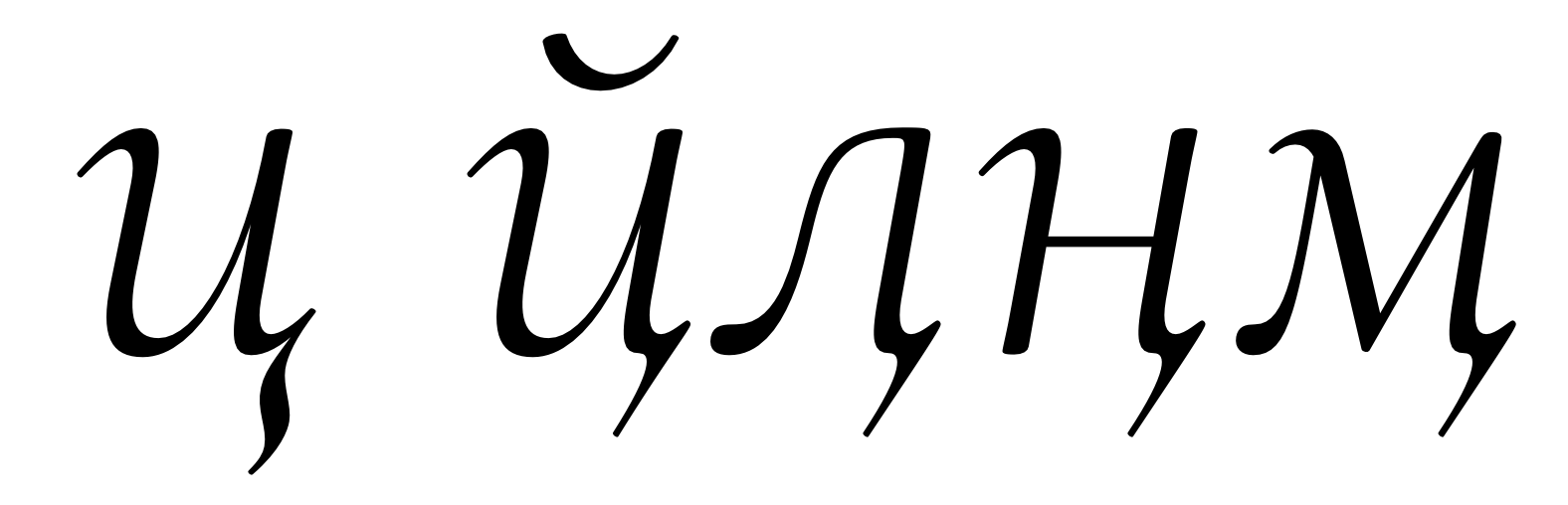
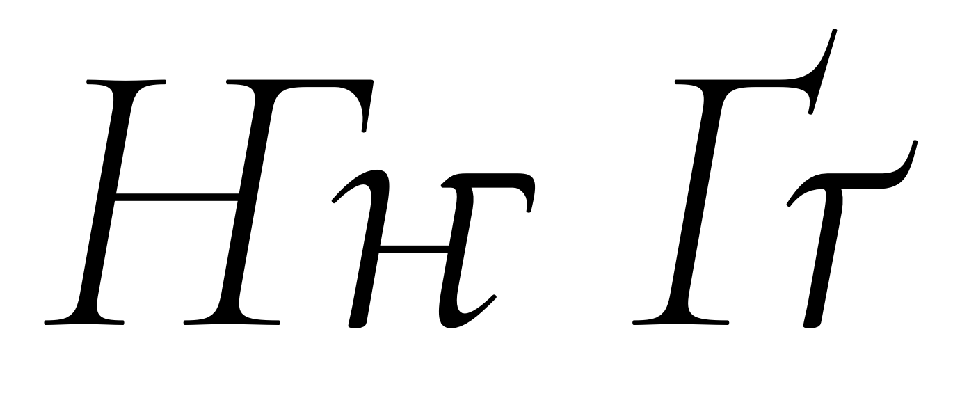
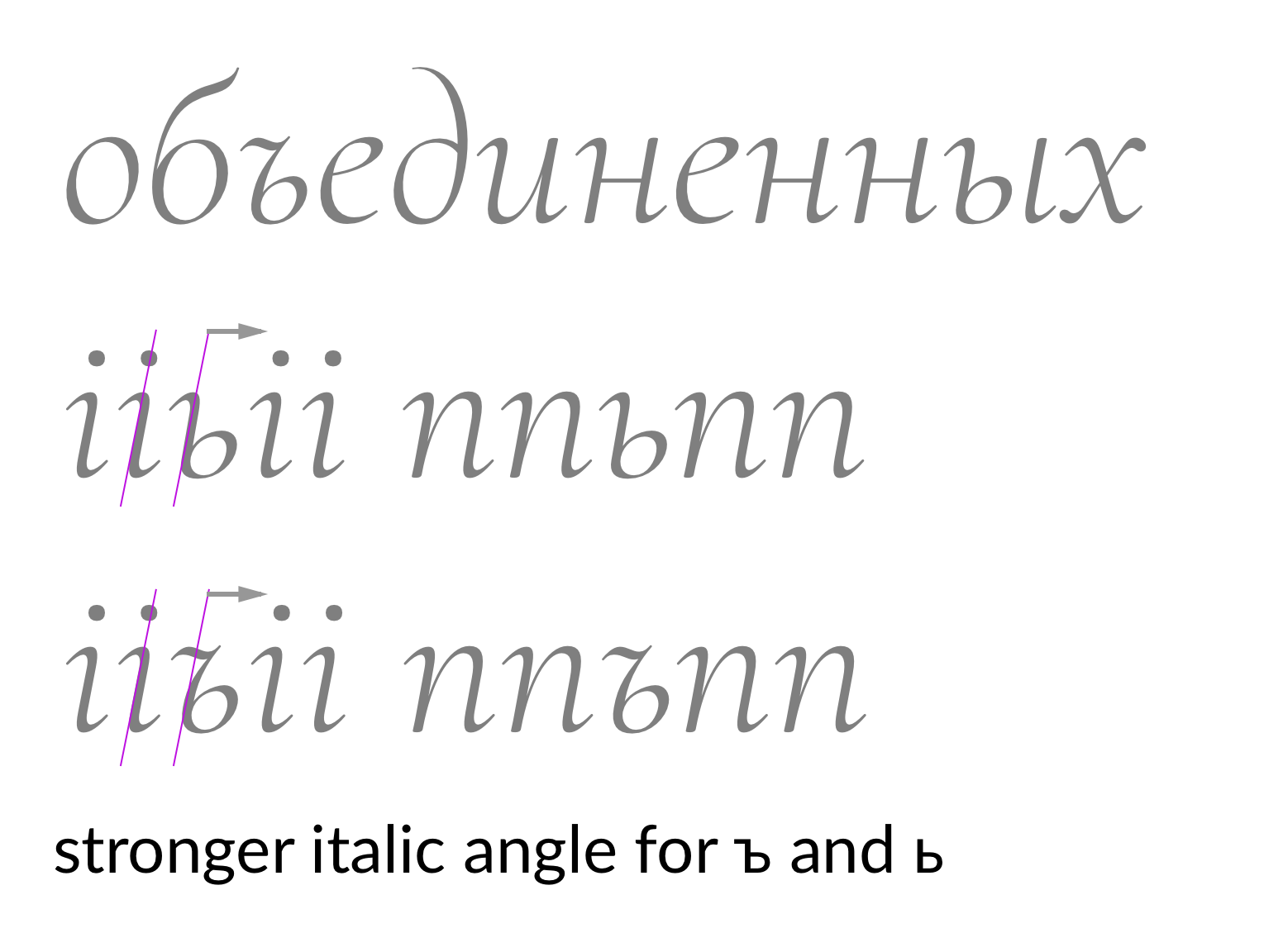
Uppercase and lowercase Тт have different vertical serif forms in both Roman and Garamond. Moreover, vertical serifs are different in lowercase т and ъ.

Christian Thalmann
The different form of the б — in Roman, it rather corresponds to didones than to old-style serifs.— we are mixing styles intentionally, there is no historical accuracy in the brief.
- Default Cormorant makes concessions to the pointed-pen origin of the Cyrillic alphabet, departing from strict old-style tradition to allow for more recognizable and «comfortable» forms for Cyrillic readers.
- Cormorant Garamond, in contrast, leans into the dramatic monumental old-style flavor of Trajan etc. and welcomes triangular counters and elegant pointed apices at the cost of conformity to Cyrillic expectations.
For some reason, Garamond’s Cyrillic у has a different descender terminal compared to the Latin y.— intentional and acceptable
That said, in both italics the form of б is the same and complies with the upright б from Roman.— let's add /be-cy.ss02/ to italic for consistency, the contrast in the top pennant would be similar to this:
Letters Ии, м in Garamond have a different form, which is rather typical for earlier type styles, reminiscent of capital Latin writing.— that would be a feature. Again, historical accuracy isn't intended.
— I am happy with the Чч as long as they relate to the curve in /h

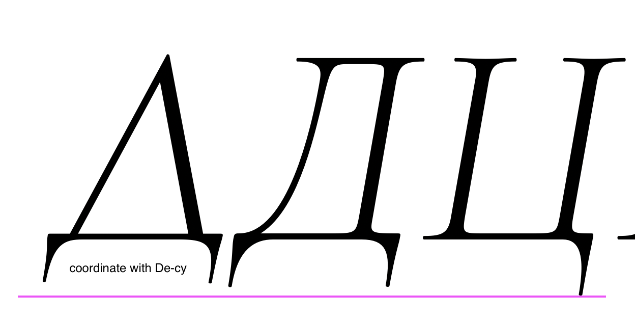
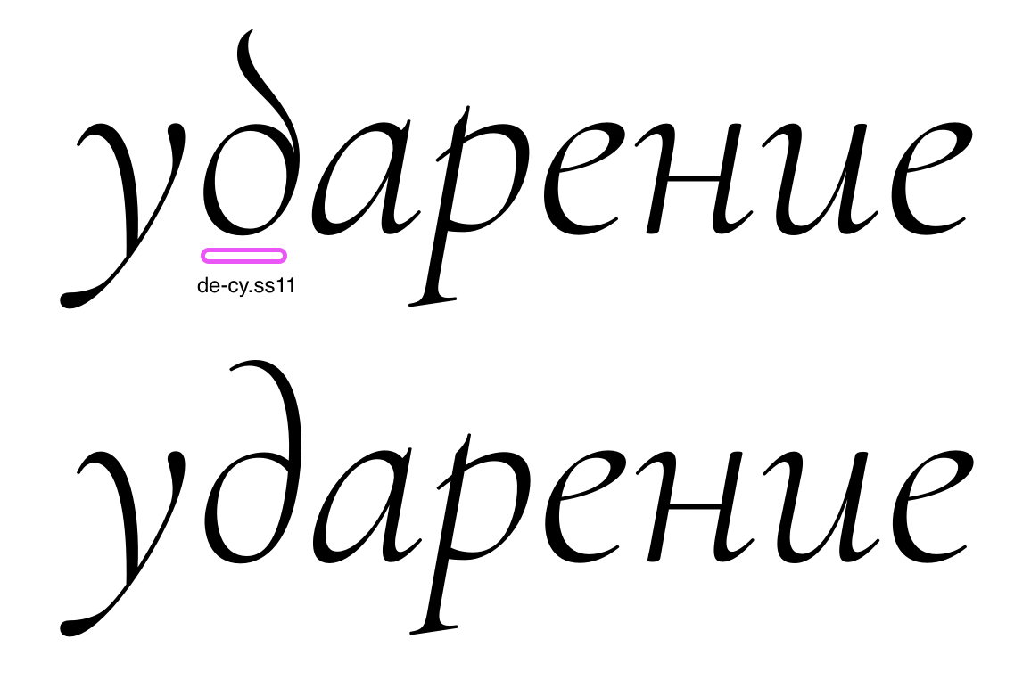
There are more issue I found:de-cy.ss11 feels uncomfortable for this style. What was your intention?
I can understand shorter descenders in Д compared to Ц.But I suggest to make descenders in De-cy.loclBGR the same length as in De-cy
Алексей Ваняшин
New version is up on GitHub. Do these work?On Thursday, September 16, 2021 at 3:59:50 PM UTC+2 Christian Thalmann wrote:Hi Alexei,The different form of the б — in Roman, it rather corresponds to didones than to old-style serifs.— we are mixing styles intentionally, there is no historical accuracy in the brief.«Mixing styles intentionally» sounds unnecessarily much like a haphazard potpourri to me. Instead, we settled on two distinct styles with internally consistent design goals:
- Default Cormorant makes concessions to the pointed-pen origin of the Cyrillic alphabet, departing from strict old-style tradition to allow for more recognizable and «comfortable» forms for Cyrillic readers.
- Cormorant Garamond, in contrast, leans into the dramatic monumental old-style flavor of Trajan etc. and welcomes triangular counters and elegant pointed apices at the cost of conformity to Cyrillic expectations.
In either case, we chose each individual form to best fit our design goals rather than restricting ourselves to pre-packaged historical solutions.
For some reason, Garamond’s Cyrillic у has a different descender terminal compared to the Latin y.— intentional and acceptableAgreed.That said, in both italics the form of б is the same and complies with the upright б from Roman.— let's add /be-cy.ss02/ to italic for consistency, the contrast in the top pennant would be similar to this:OK, I'll look into it.
Letters Ии, м in Garamond have a different form, which is rather typical for earlier type styles, reminiscent of capital Latin writing.— that would be a feature. Again, historical accuracy isn't intended.I would use «conformity» rather than «accuracy», since the latter implies we aimed at historicity and missed...— I am happy with the Чч as long as they relate to the curve in /hShould the joint be thinner in the /che-cy/, then?
There are more issue I found:de-cy.ss11 feels uncomfortable for this style. What was your intention?I kept that form as an alternate because I very much like it, even though everybody tells me it doesn't work for Cyrillic readers. I guess I should finally delete it. :(
I can understand shorter descenders in Д compared to Ц.But I suggest to make descenders in De-cy.loclBGR the same length as in De-cyOK, will do.Cheers, Christian
--
You received this message because you are subscribed to a topic in the Google Groups "Google Fonts Discussions" group.
To unsubscribe from this topic, visit https://groups.google.com/d/topic/googlefonts-discuss/f3h0HicNGX4/unsubscribe.
To unsubscribe from this group and all its topics, send an email to googlefonts-dis...@googlegroups.com.
To view this discussion on the web visit https://groups.google.com/d/msgid/googlefonts-discuss/34ac3d2a-3122-42da-be21-8015a04dcf19n%40googlegroups.com.
Christian Thalmann
Christian Thalmann
Looks like we're ready to ingest, otherwise.
Алексей Ваняшин
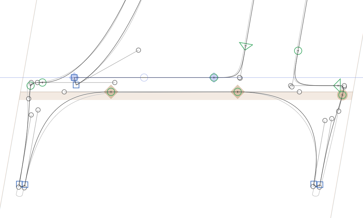
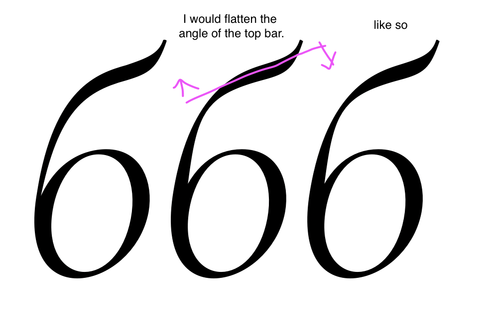
Hi Alexei,I imported your «like so» version into Glyphs to compare to the current version, and I saw almost no change. The flag just seemed to be raised by a few units compared to the previous version... in any case, does that work now?Looks like we're ready to ingest, otherwise.
Christian Thalmann
Christian Thalmann

Alexei Vanyashin
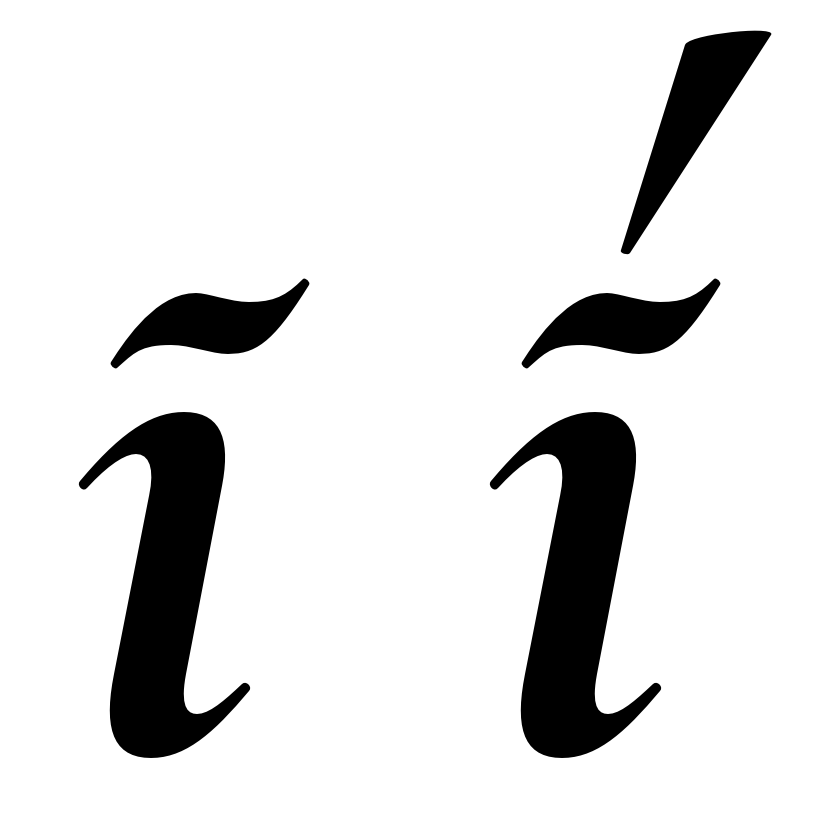
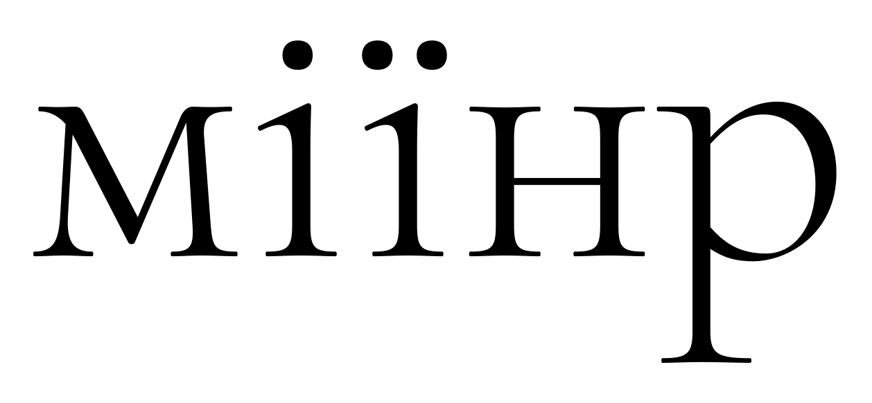
Hi Alexei,I changed the style of /i-cy/ and /yi-cy/ from the Latin /idotless/ to something more like a smallcaps /i/ on the suggestion of someone on TypeDrawers. Now it turns out most typefaces apparently stick to the Latin /idotless/ form... Should I go back to that?
I also equalized the height of the dots in the two letters; I suppose that's a good change in any case.
(The same goes for Ysabeau)Cheers, ChristianOn Tuesday, October 5, 2021 at 10:28:47 PM UTC+2 Christian Thalmann wrote:Fantastic! I've alerted the Google folks. Thanks for your time Alexei! :)On Tuesday, October 5, 2021 at 10:05:29 PM UTC+2 a...@cyreal.org wrote:On Friday, September 24, 2021 at 3:49:51 PM UTC+3 christian....@gmail.com wrote:Hi Alexei,I imported your «like so» version into Glyphs to compare to the current version, and I saw almost no change. The flag just seemed to be raised by a few units compared to the previous version... in any case, does that work now?Looks like we're ready to ingest, otherwise.Yes, this is fine. We are ready for the update.


--
You received this message because you are subscribed to a topic in the Google Groups "Google Fonts Discussions" group.
To unsubscribe from this topic, visit https://groups.google.com/d/topic/googlefonts-discuss/f3h0HicNGX4/unsubscribe.
To unsubscribe from this group and all its topics, send an email to googlefonts-dis...@googlegroups.com.
To view this discussion on the web visit https://groups.google.com/d/msgid/googlefonts-discuss/14195245-1ca4-437d-b8c9-5883dd169ab9n%40googlegroups.com.
Christian Thalmann
Christian Thalmann
Alexei Vanyashin
To view this discussion on the web visit https://groups.google.com/d/msgid/googlefonts-discuss/688b1f6a-e84a-4a97-aac1-ce38136f2b17n%40googlegroups.com.