Ysabeau Cyrillic Review
702 views
Skip to first unread message

Christian Thalmann
Dec 8, 2020, 4:47:56 PM12/8/20
to Google Fonts Discussions
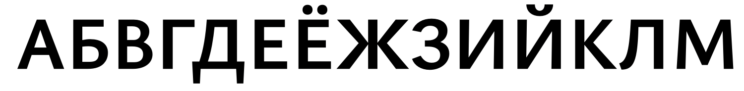
This is a thread for the official review by Alexei Vanyashin of the Cyrillic coverage of the Ysabeau typeface.
Christian Thalmann
Dec 9, 2020, 9:32:57 AM12/9/20
to Google Fonts Discussions
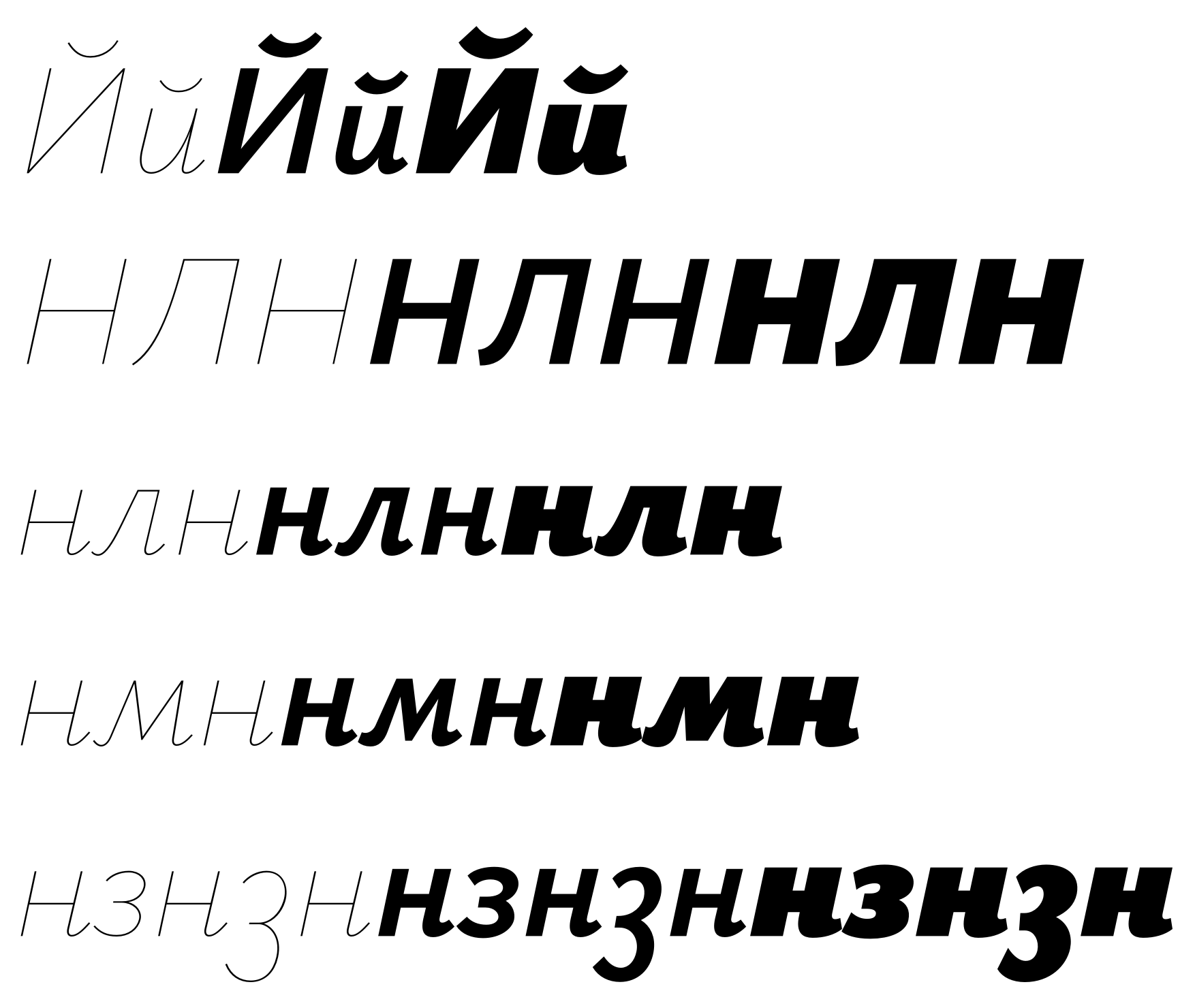
Here's the feedback on the upright Hairline master that I got from Ilya Ruderman via Twitter.
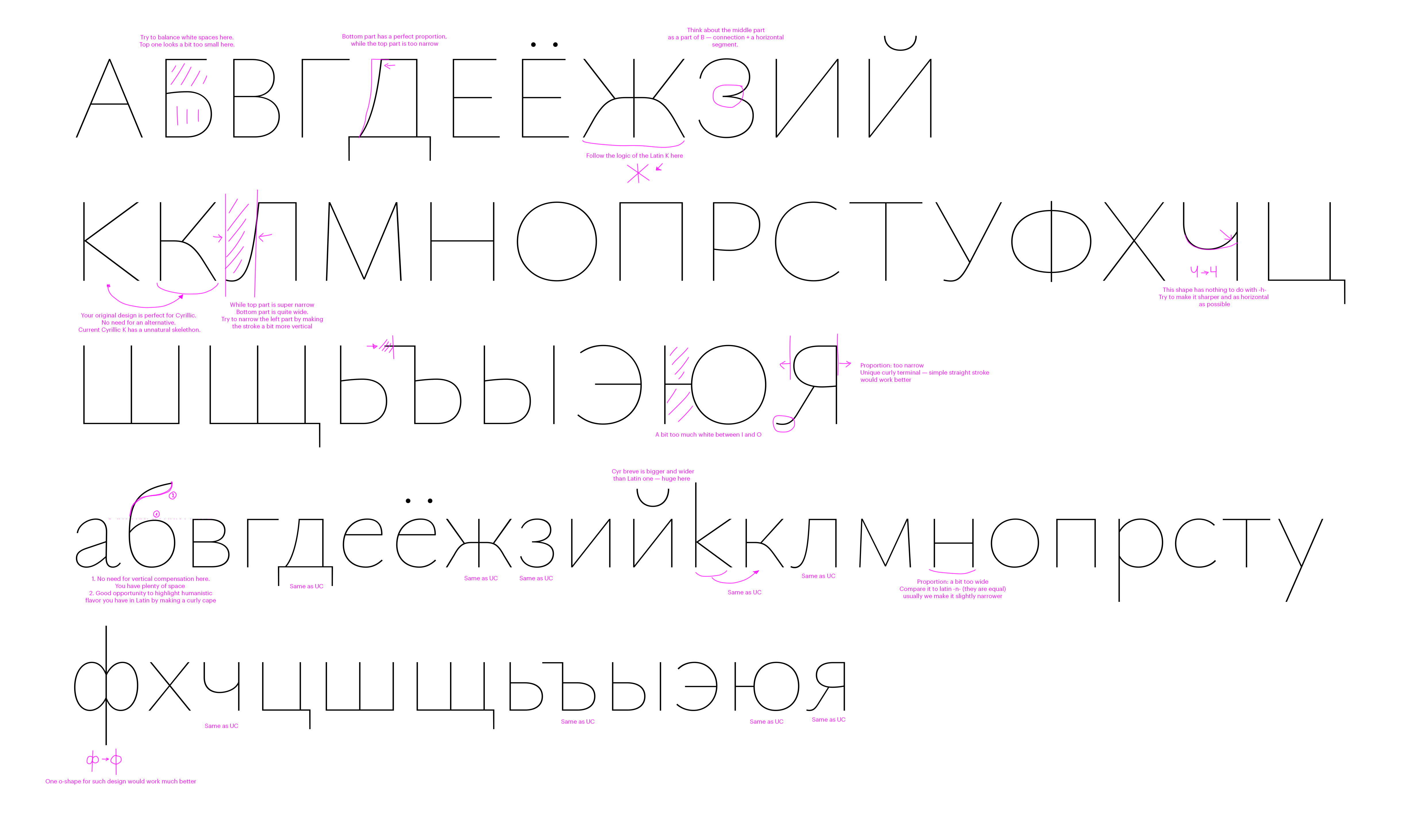
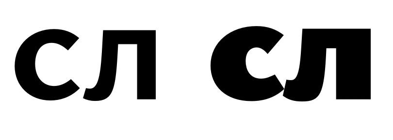
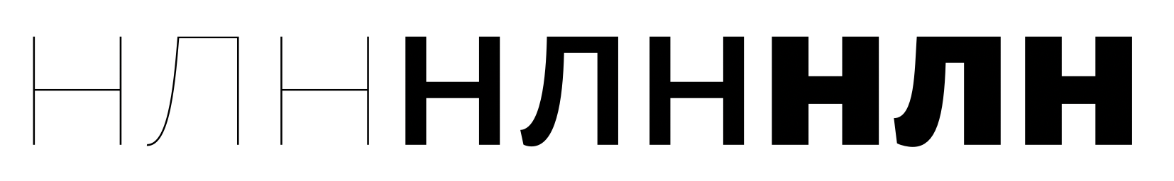
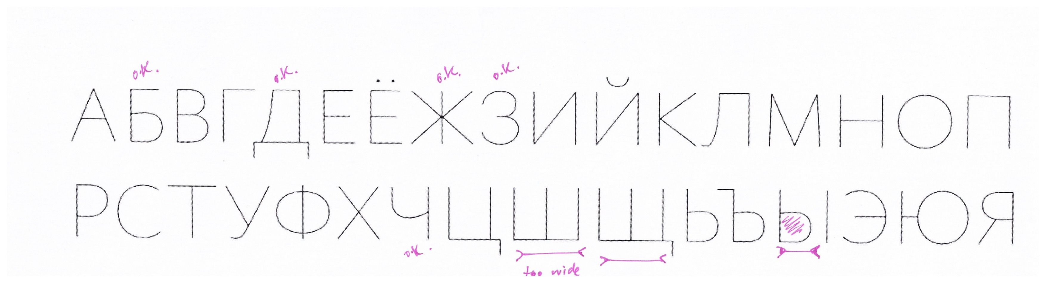
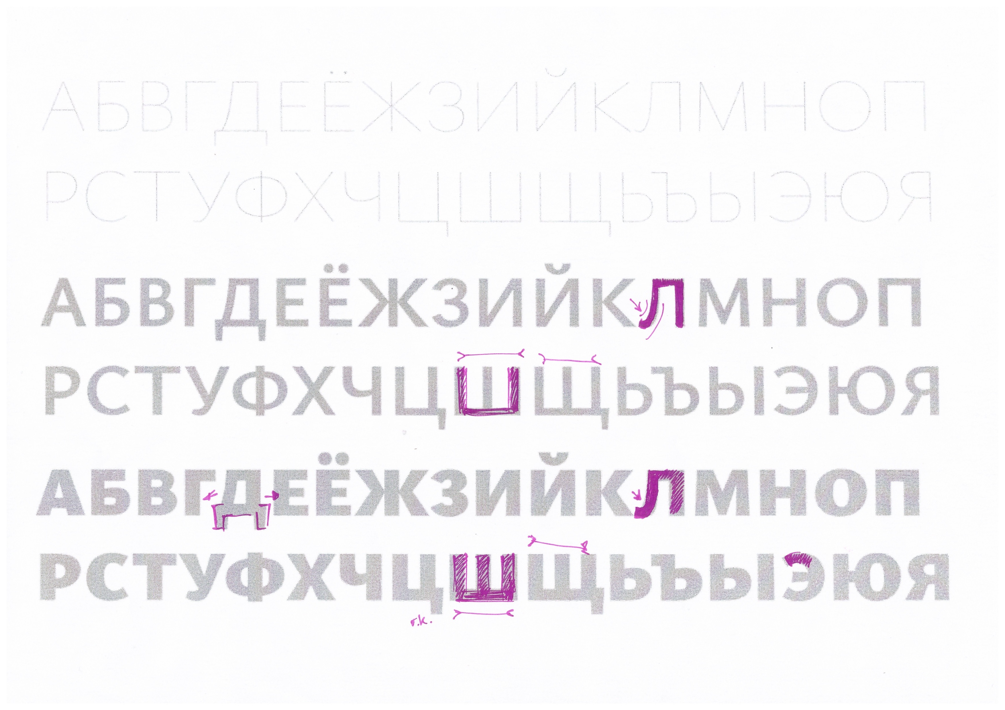
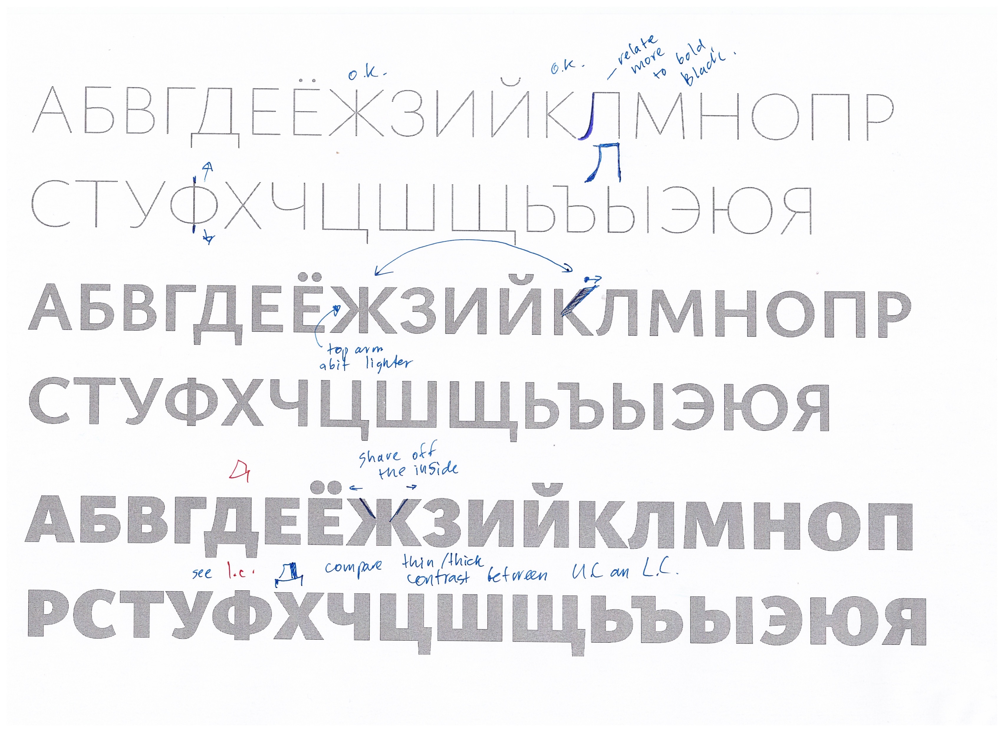
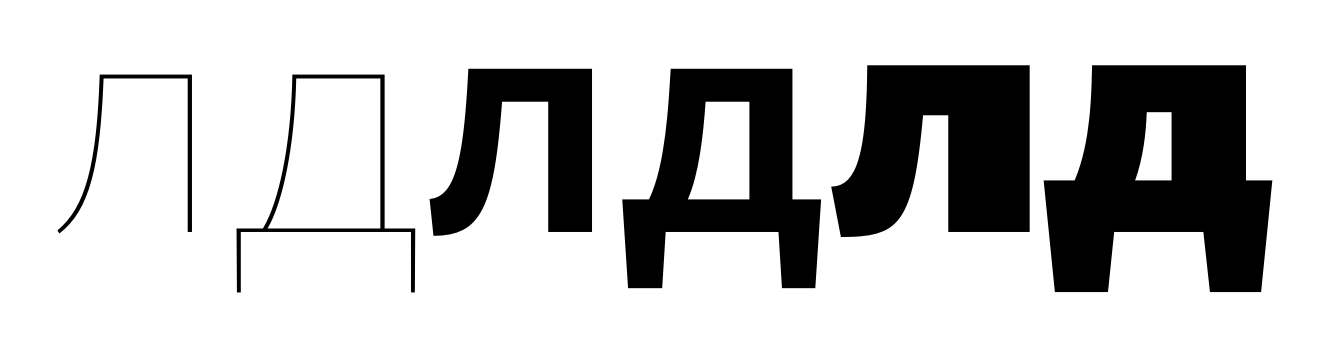
- Alexei, what's your take on the shape of ДЛ? I remember having more rectangular designs in the original Cormorant, but you convinced me to go trapezoidal to fit with the humanist theme. Did I just overdo it here?
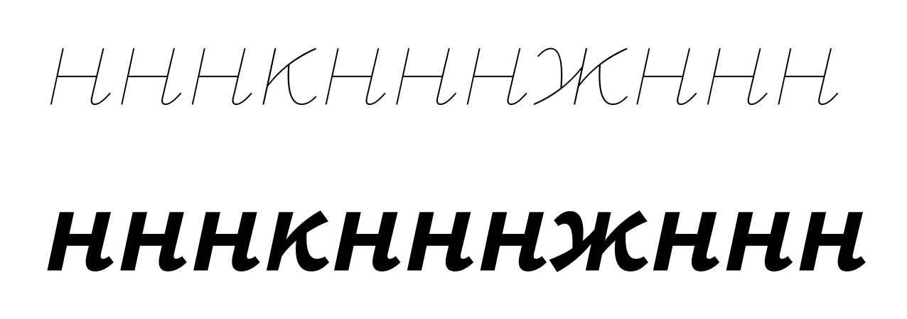
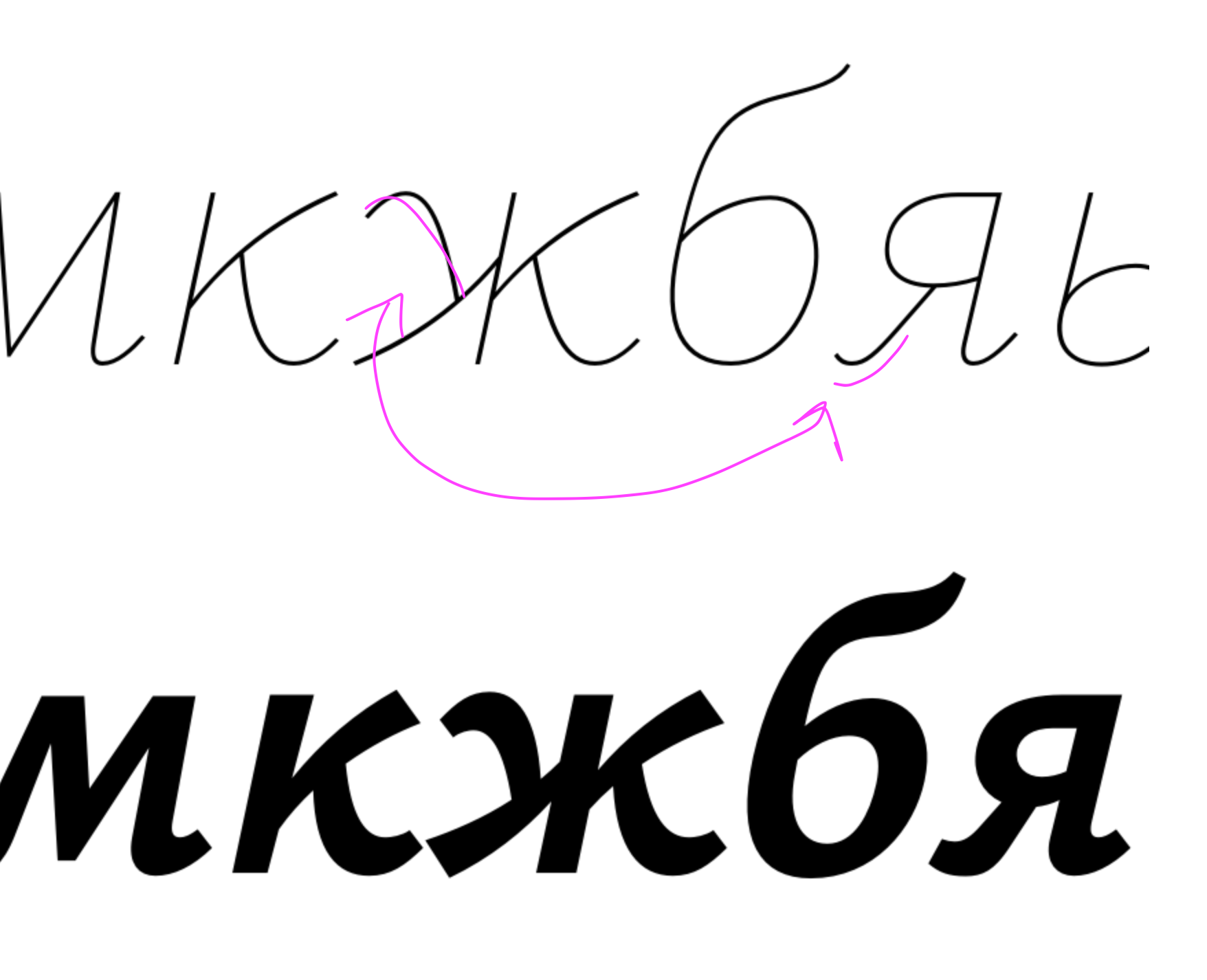
- I thought the K-shaped /Ka-cy/ was problematic because the /Zhe-cy/ would then have an ungainly collision of six strokes in the middle an huge gaps in the sides. Is that still preferable?
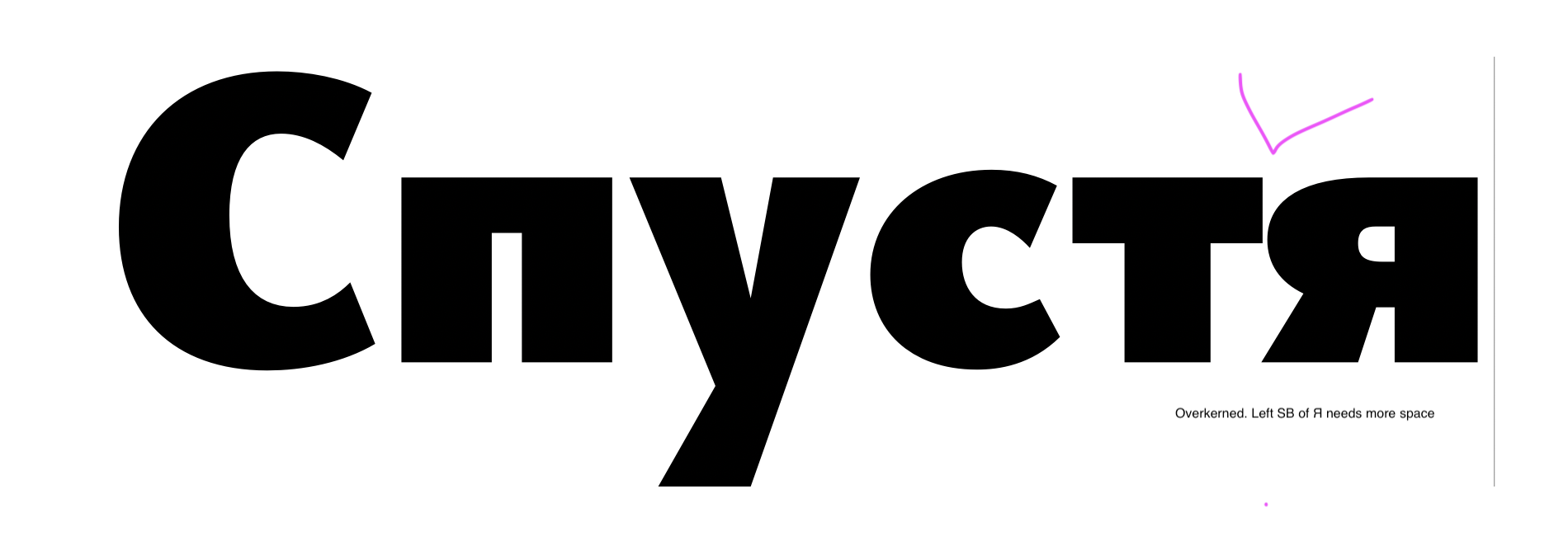
- I made the foot of Я round to fit the Latin R, but Ilya tells me it looks weird and doesn't need to be consistent with Latin R since they never appear together.
- Should I at least keep the double-lobed ф in the Italics?
Christian Thalmann
Dec 9, 2020, 9:37:06 AM12/9/20
to Google Fonts Discussions
One more thing:
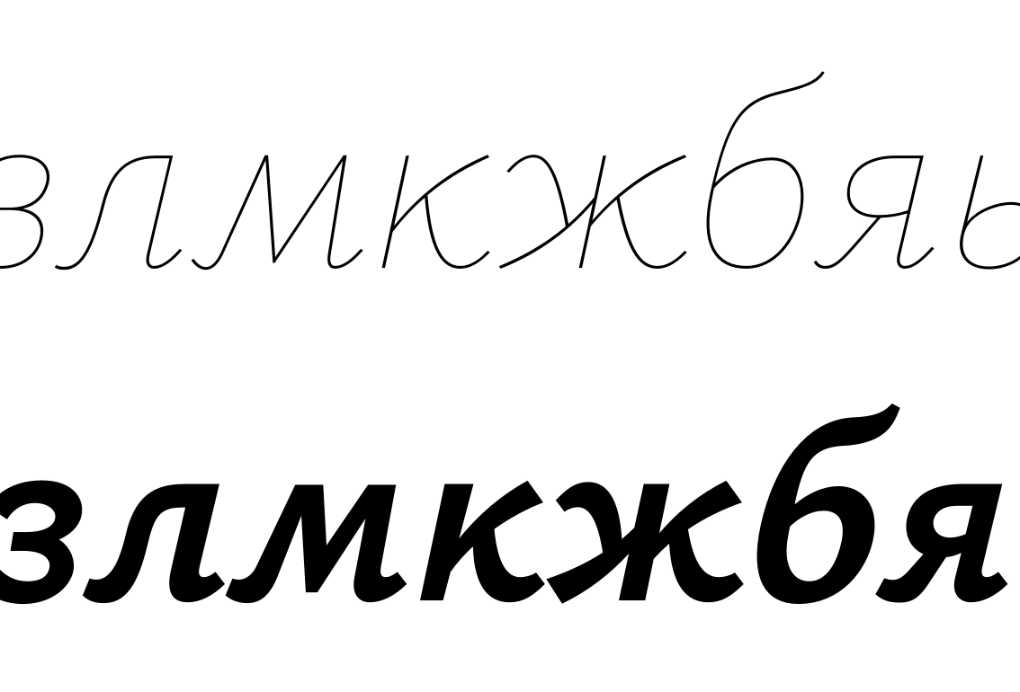
- I'd like to stick to the simple design of б without that inflection point in the ascender if possible.

Алексей Ваняшин
Dec 10, 2020, 4:34:52 AM12/10/20
to Google Fonts Discussions
- Alexei, what's your take on the shape of ДЛ? I remember having more rectangular designs in the original Cormorant, but you convinced me to go trapezoidal to fit with the humanist theme. Did I just overdo it here?
it is a little overboard now.
- I thought the K-shaped /Ka-cy/ was problematic because the /Zhe-cy/ would then have an ungainly collision of six strokes in the middle an huge gaps in the sides. Is that still preferable?
The collision can be easily resolved with compensation or a middle bar. It is more challenging to use a curved garamondish shape.
- I made the foot of Я round to fit the Latin R, but Ilya tells me it looks weird and doesn't need to be consistent with Latin R since they never appear together..
It does look awkward in Light. Maybe it will be more acceptable in Bold. How much of the Garamond skeleton would you like to retain in the shapes?
It is easy to make a generic sans font, but more challenging to mimic Garamondish shapes.
- Should I at least keep the double-lobed ф in the Italics?
yes, you can
- I'd like to stick to the simple design of б without that inflection point in the ascender if possible.
totally possible as a 'simplification', but it will be less Garamondish.
Christian Thalmann
Dec 10, 2020, 8:24:28 AM12/10/20
to googlefon...@googlegroups.com
it is a little overboard now.
Ok, will look into it!
The collision can be easily resolved with compensation or a middle bar. It is more challenging to use a curved garamondish shape.
I hate middle bars... the current design is an attempt to create one without the artificial feel of three straight lines. I’ll try to make do with compensation, then.
It does look awkward in Light. Maybe it will be more acceptable in Bold. How much of the Garamond skeleton would you like to retain in the shapes?
It is easy to make a generic sans font, but more challenging to mimic Garamondish shapes.
Well, Garamond didn’t draw any Cyrillics, so we have some freedom. :)
If possible, I’d like to preserve the humanist feel and reading comfort of Garamond, but I’m willing to deviate from tradition for the sake of functionality and simplicity (like I’ve done for the W, for instance). I’d rather not end up with a generic sans.
- I'd like to stick to the simple design of б without that inflection point in the ascender if possible.
totally possible as a 'simplification', but it will be less Garamondish.
Ok, I’ll run with that, then.
Christian Thalmann
Dec 11, 2020, 6:33:46 AM12/11/20
to Google Fonts Discussions
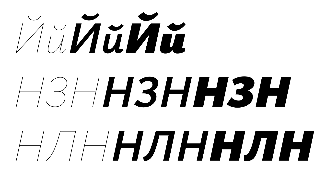
I've finished a first iteration of reacting to Ilya's comments. It's up on GitHub. I had to switch off «Remove Overlap» during export to avoid a Glyphs problem; hope that doesn't degrade the TTFs.
Christian Thalmann
Dec 11, 2020, 6:44:54 AM12/11/20
to Google Fonts Discussions
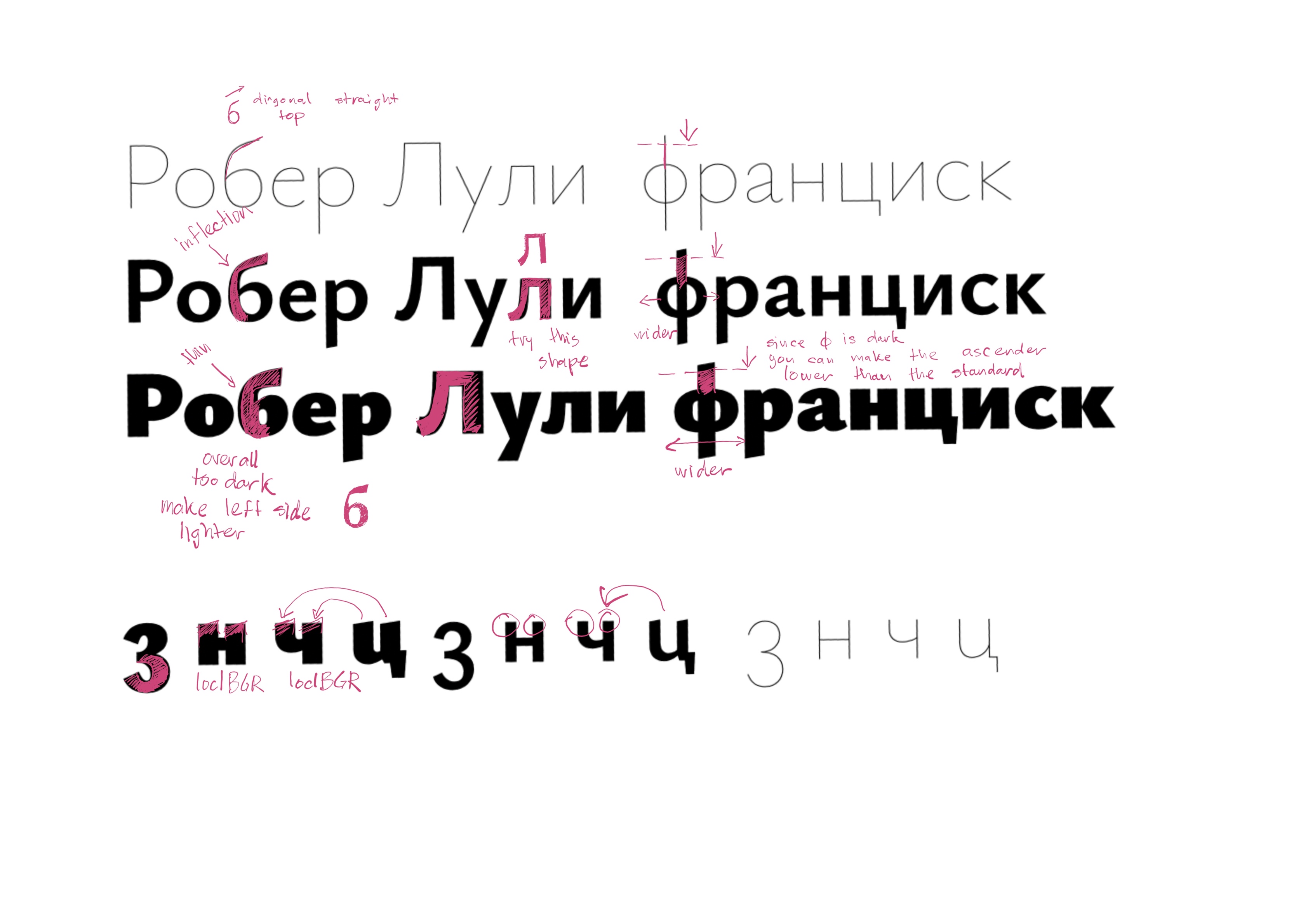
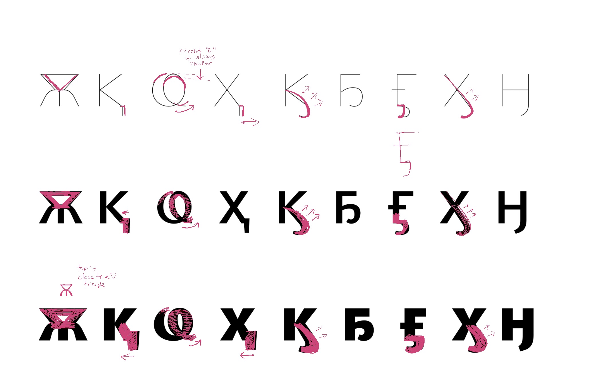
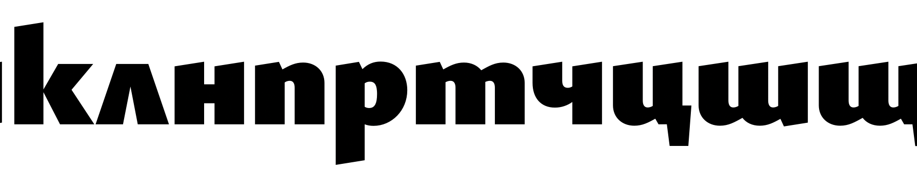
Screencaps:

Christian Thalmann
Dec 25, 2020, 5:23:38 PM12/25/20
to Google Fonts Discussions
Hi Alexei,
thanks for your feedback! Questions:
- Should
the Ь in Ы really be narrower than the free-standing one? And only in
the Hairline master? (Or do you mean to apply that reduction to all
three of ЬЪЫ?) I didn't change it for the time being.
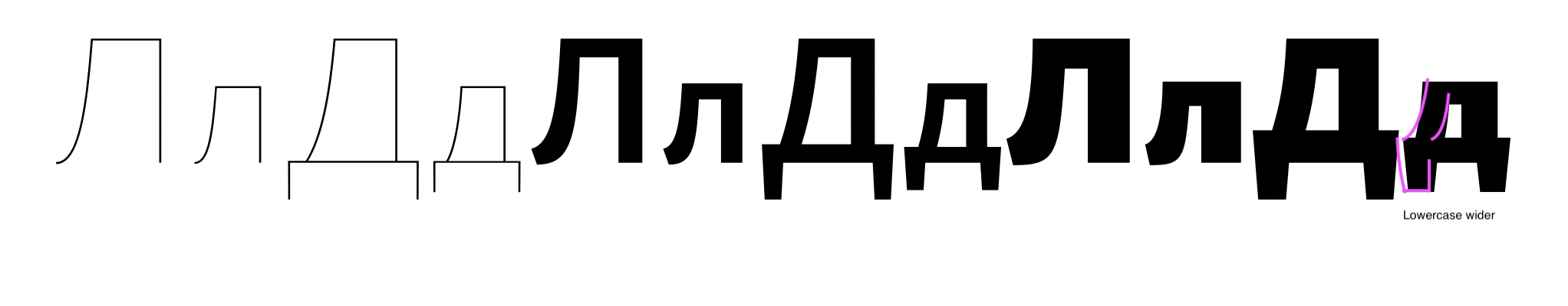
- I've always found the Л difficult, and still do after your proposal... If I read your drawing correctly, the instroke of the tail should be heavy and the upbend light, but the stem should also be light when it joins the roof, but somehow it briefly becomes heavier in between? I made a new version with a heavy instroke, but slightly fewer inflections than yours. Does that work? Otherwise we'll have to look at it more closely.
- Should I post more screenshots of the lowercase and the extended characters, or would you prefer working from the Glyphs file?
Happy holidays, Christian
Christian Thalmann
Dec 27, 2020, 6:54:12 PM12/27/20
to Google Fonts Discussions
I just found out that my Italics don't yet cover the Cyrillic Extended set. I'm working on amending that. Shouldn't take more than a few days, since I have the extended Romans and basic Italics to work from. This shouldn't slow down the review, since we have plenty of other things to look at in the meantime (extended set in Romans, basic set in Italics).
Christian Thalmann
Dec 28, 2020, 7:44:41 PM12/28/20
to Google Fonts Discussions
OK, I've finished a first draft of the Cyrillic Extended in the Italics.
Christian Thalmann
Dec 28, 2020, 7:58:52 PM12/28/20
to Google Fonts Discussions
Hmmm, there seem to be some extra-special Cyrillic letters still missing from the Italics (they're not in the Extended set of Glyphs). I'll add them soon. Need to sleep now.
Алексей Ваняшин
Dec 30, 2020, 3:24:40 PM12/30/20
to Google Fonts Discussions
- Should the Ь in Ы really be narrower than the free-standing one?
Yes, it should in all masters.
- And only in the Hairline master? (Or do you mean to apply that reduction to all three of ЬЪЫ?) I didn't change it for the time being.
There are roughly four groups regarding the widths of the bowls, from widest to narrowest.

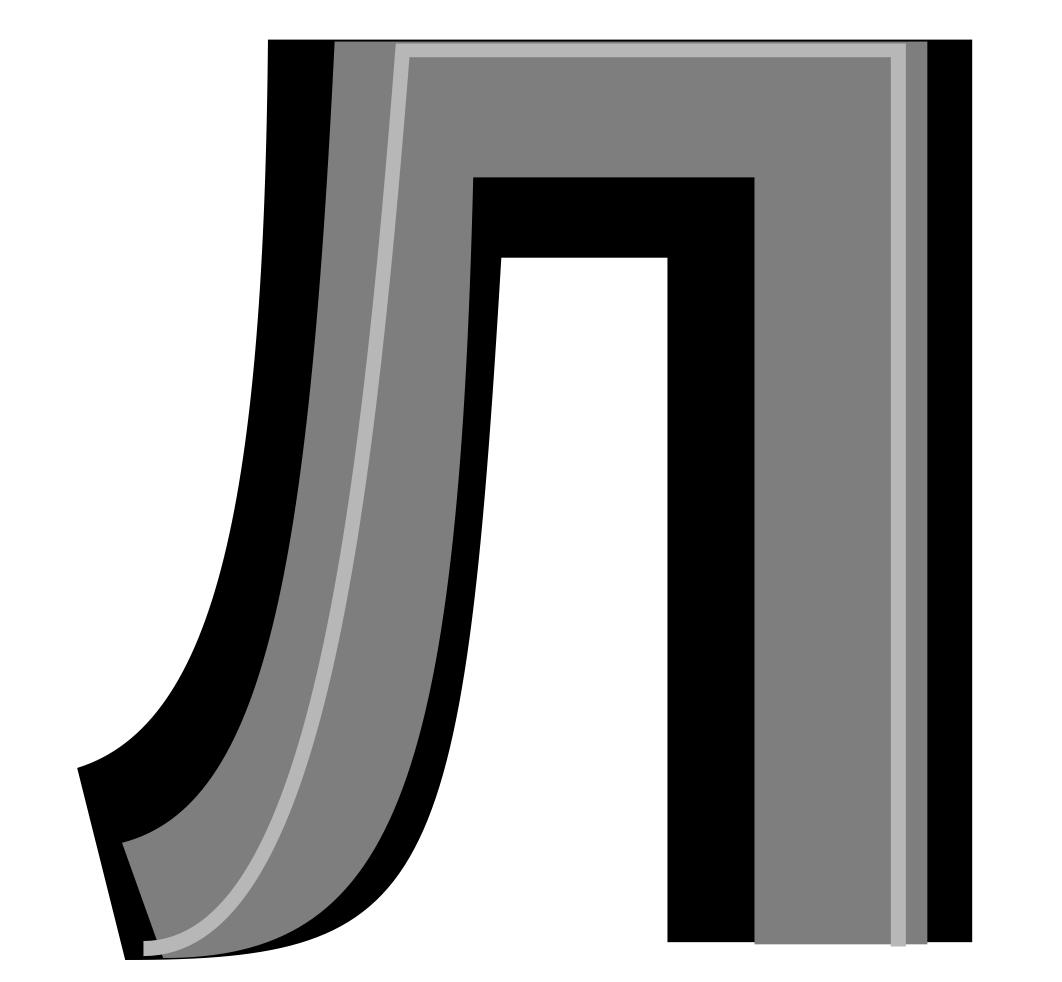
- I've always found the Л difficult, and still do after your proposal... If I read your drawing correctly, the instroke of the tail should be heavy and the upbend light, but the stem should also be light when it joins the roof, but somehow it briefly becomes heavier in between?
- I made a new version with a heavy instroke, but slightly fewer inflections than yours. Does that work? Otherwise we'll have to look at it more closely.
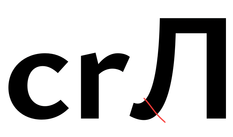
Yes, Л needs a closer look. This part feels heavy. I suggest to coordinate the terminal with c, r.
Also Л is too wide compared to Д. The bend is drawing too much attention, maybe we'll find and alternative solution.
- Should I post more screenshots of the lowercase and the extended characters, or would you prefer working from the Glyphs file?
yes, I like it when you post screenshots — so that I know where to direct my attention. I examine the glyphs files anyway.
Christian Thalmann
Dec 31, 2020, 6:04:52 AM12/31/20
to Google Fonts Discussions
Hi Alexei,
I made the foot of Л heavy because otherwise the entire left side feels too light. But then again, my U has a light right side and it doesn't bother me, so maybe it's just a matter of acclimation...? Hopefully narrowing the glyph will help with that impression.
Does it make sense to coordinate the weight of a capital letter feature with those of lowercase letters? Shouldn't I rather be comparing it to /C/?
I'll narrow the bowls in Ыы.
BTW, the Cyrillic Extended character set is now also completed in the Italics.
Cheers and a happy new year,
Christian
Алексей Ваняшин
Jan 13, 2021, 4:40:04 AM1/13/21
to Google Fonts Discussions
On Thursday, December 31, 2020 at 2:04:52 PM UTC+3 christian....@gmail.com wrote:
Hi Alexei,I made the foot of Л heavy because otherwise the entire left side feels too light. But then again, my U has a light right side and it doesn't bother me, so maybe it's just a matter of acclimation...? Hopefully narrowing the glyph will help with that impression.
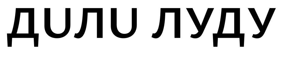
Here is a good reference for contrast between the left and right sides of Л —
The ration between left and right limbs in ЛД is fine as it is:

Does it make sense to coordinate the weight of a capital letter feature with those of lowercase letters? Shouldn't I rather be comparing it to /C/?
Yes, you are right. My logic was /с to /л. Then /л to /Л (with C in mind)
I'll narrow the bowls in Ыы.BTW, the Cyrillic Extended character set is now also completed in the Italics.Cheers and a happy new year,
Have a great start of the year,
Alexei
Christian Thalmann
Jan 26, 2021, 5:28:39 PM1/26/21
to Google Fonts Discussions
Hi Alexei,
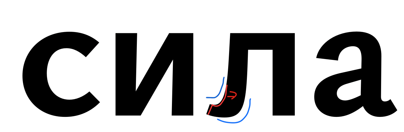
does this work for the lowercase? I made the left foot of /el-cy/ as heavy as the outstroke of the /c/.
Cheers, Christian
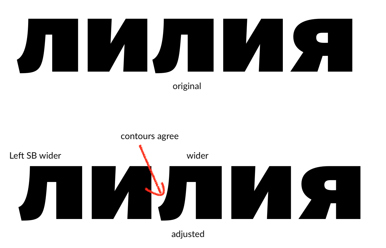
Алексей Ваняшин
Feb 1, 2021, 7:52:17 AM2/1/21
to googlefonts-discuss
Hi Christian,
Yes, I like the Black design of Л. In Bold I would suggest pulling the leg a bit closer, and make sure that both contours(blue) agree where I put the arrow.
--
You received this message because you are subscribed to a topic in the Google Groups "Google Fonts Discussions" group.
To unsubscribe from this topic, visit https://groups.google.com/d/topic/googlefonts-discuss/9qV84-y1fqQ/unsubscribe.
To unsubscribe from this group and all its topics, send an email to googlefonts-dis...@googlegroups.com.
To view this discussion on the web visit https://groups.google.com/d/msgid/googlefonts-discuss/ca945d0f-d747-449e-b143-16ebc91d8d54n%40googlegroups.com.
Christian Thalmann
Feb 1, 2021, 10:48:51 AM2/1/21
to Google Fonts Discussions
Hmmm... this looks like you're using an older version as the basis. I might not have commited to Git?
I
have done so now, in any case (source files only, no export right now).
Here are the /el-cy/ after treating them similarly to the bottom of
/c/:
Алексей Ваняшин
Feb 5, 2021, 2:18:20 AM2/5/21
to googlefonts-discuss
On Mon, Feb 1, 2021 at 6:48 PM Christian Thalmann <christian....@gmail.com> wrote:
Hmmm... this looks like you're using an older version as the basis. I might not have commited to Git?
I now see the update. The Л looks okay, but I think stylistically another design may work better. Can you try the other one?
I have done so now, in any case (source files only, no export right now). Here are the /el-cy/ after treating them similarly to the bottom of /c/:
I have looked into Cyr extended, and basic:
To view this discussion on the web visit https://groups.google.com/d/msgid/googlefonts-discuss/ae28e692-8058-4e93-8e48-f1d0e4dc2967n%40googlegroups.com.
Christian Thalmann
Feb 5, 2021, 4:26:59 AM2/5/21
to Google Fonts Discussions
Thanks for your suggestions, Alexei, I'll look into it.
I'm
a bit confused about the Bulgarian localization, though: I do have
slanted cuts on /en-cy.loclBGR/ and /che-cy.loclBGR/... not sure why
that didn't show up on your side.
Cheers, Christian
Christian Thalmann
Feb 5, 2021, 5:07:57 AM2/5/21
to Google Fonts Discussions
Hmmm, I've tried implementing your suggestions for /be-cy/, but I'm feeling a bit lost. The shape feels strangely organic among the more angular lowercase letters (I guess that's partly unavoidable) and also seems to «wobble» when progressing through the weight spectrum. I think the problem is that the Bold design assumes a humanist stroke where the entire «back» is a single piece from the bottom of the bowl to the inflection, whereas in the Black, the bowl part is thick but the neck part is thin, with a break in between. Your sketch for the Black implies an elliptical counter, but I can't really achieve that with a point distribution that also produces the humanist design in the lighter weights... (unlike I were to employ a bracket layer to switch one design for the other, but that would probably break family consistency).

Christian Thalmann
Feb 5, 2021, 5:29:01 AM2/5/21
to Google Fonts Discussions
Hmm, how's this for /el-cy/?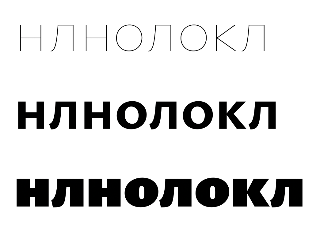
Christian Thalmann
Feb 13, 2021, 7:37:20 PM2/13/21
to Google Fonts Discussions
Is this progressing in the right direction? I find it hard to tell.


Christian Thalmann
Feb 14, 2021, 10:34:38 AM2/14/21
to Google Fonts Discussions
The kahook forms were still stuck in their previous forms in that previous post. Here are the new forms.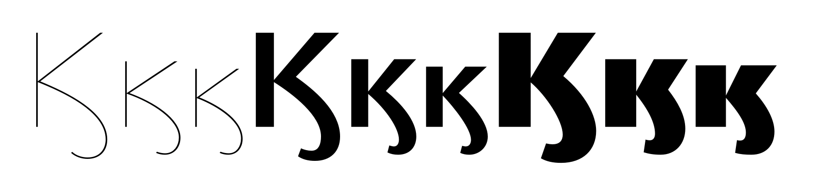
Алексей Ваняшин
Feb 15, 2021, 7:16:24 AM2/15/21
to googlefonts-discuss
Hi Christian,
I like the new changes!
The top of the Yus should be narrower. See this reference.
The Ҩ ҩ is good now.
I like the style of л — it fits much better. Maybe the л - black can be wider. I need to check it in a text setting. I think the bracket layer in б in unnecessary. The interpolation if fine,
I'll get some more feedback after looking at text proofs.
To view this discussion on the web visit https://groups.google.com/d/msgid/googlefonts-discuss/1d85f498-dee0-485b-b28d-23a994956f4bn%40googlegroups.com.
Christian Thalmann
Feb 15, 2021, 8:29:39 AM2/15/21
to googlefon...@googlegroups.com
Ok, I’ll make export some TTFs for you. (The current TTFs are not up to date due to a recent Glyphs bug that prevented successful exporting.)
Cheers, Christian
Cheers, Christian
Sent from my iPhone
On 15 Feb 2021, at 13:16, Алексей Ваняшин <a...@cyreal.org> wrote:
Hi Christian,I like the new changes!
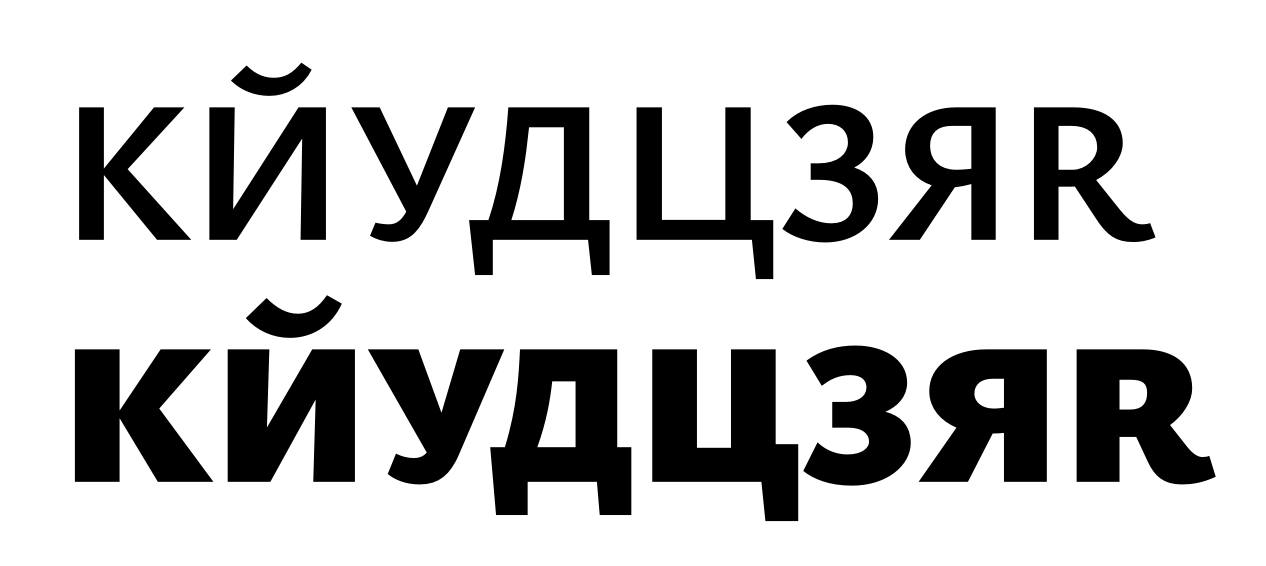
<Screenshot 2021-02-15 at 15.08.30.png>The top of the Yus should be narrower. See this reference.
<Screenshot 2021-02-15 at 15.10.56.png>The Ҩ ҩ is good now.I like the style of л — it fits much better. Maybe the л - black can be wider. I need to check it in a text setting. I think the bracket layer in б in unnecessary. The interpolation if fine,I'll get some more feedback after looking at text proofs.
On Sun, Feb 14, 2021 at 6:34 PM Christian Thalmann <christian....@gmail.com> wrote:
The kahook forms were still stuck in their previous forms in that previous post. Here are the new forms.
To view this discussion on the web visit https://groups.google.com/d/msgid/googlefonts-discuss/CADUrt2GprQah0UvBcvGJw%2BGJk3eoSTdHHub08_whcgtzpF5GkQ%40mail.gmail.com.
<Cyrillic_letter_Big_Yus.svg>
Christian Thalmann
Feb 15, 2021, 5:12:44 PM2/15/21
to Google Fonts Discussions
New exports are out; feel free to use them for text proofs.
Cheers, Christian
Алексей Ваняшин
Feb 16, 2021, 6:46:05 AM2/16/21
to googlefonts-discuss
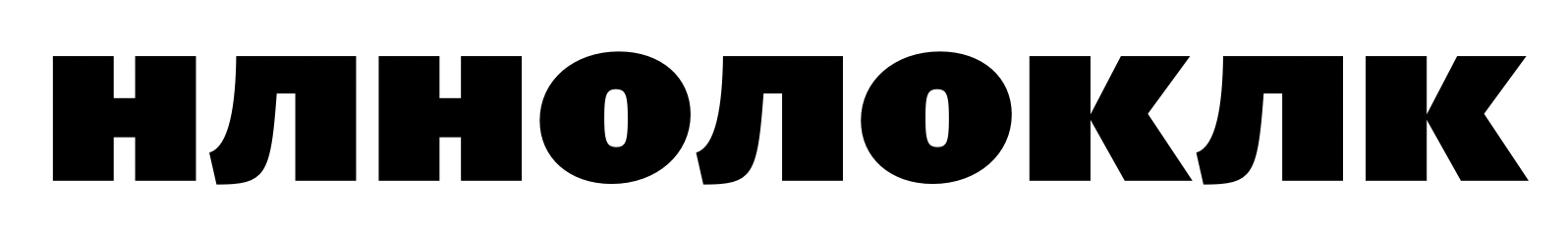
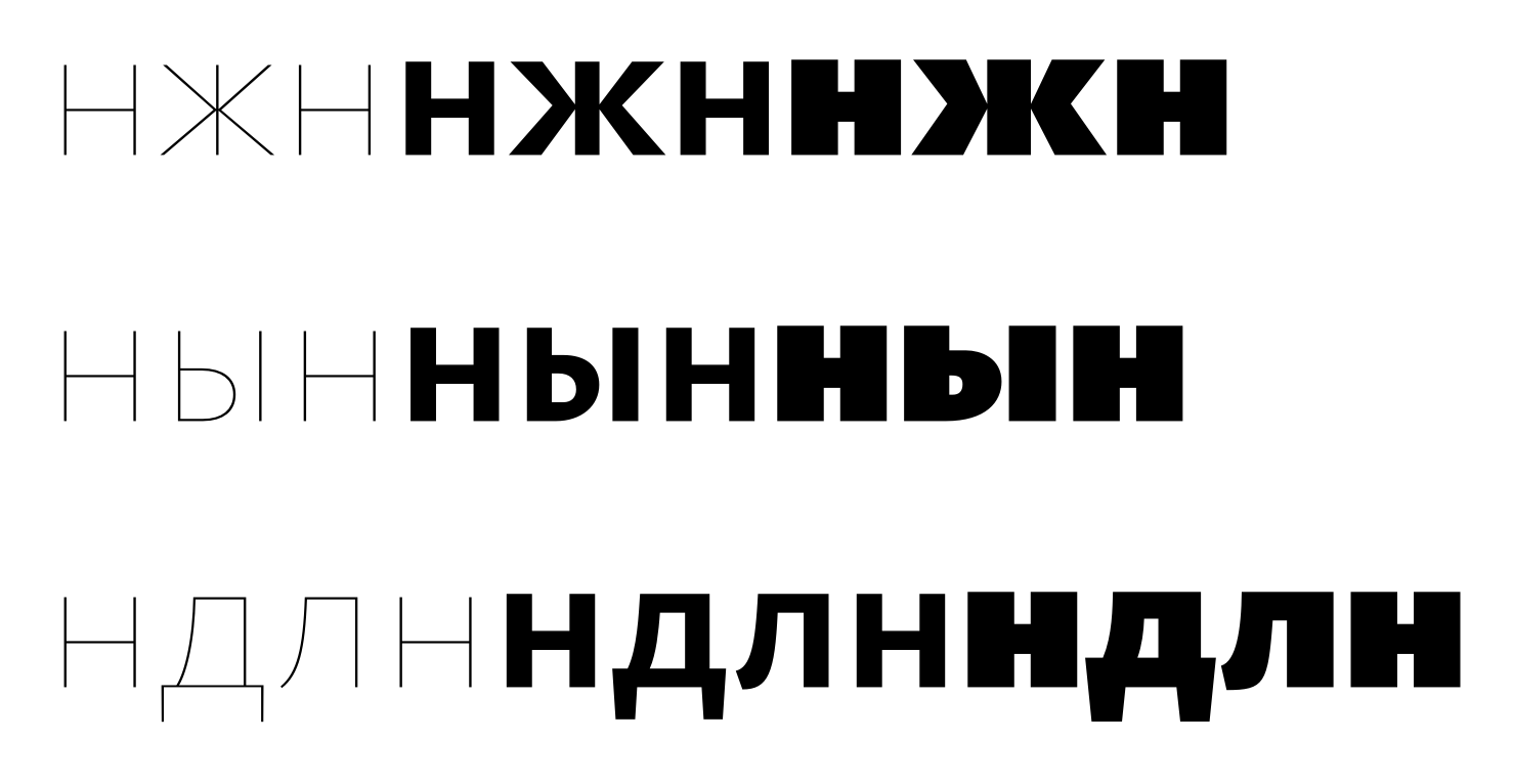
I've looked in closer, here are more comments:
п should be narrower than н,
ц=џ narrower than п
и — more spacey than н


On Tue, Feb 16, 2021 at 1:12 AM Christian Thalmann <christian....@gmail.com> wrote:
New exports are out; feel free to use them for text proofs.Cheers, Christian
--
You received this message because you are subscribed to a topic in the Google Groups "Google Fonts Discussions" group.
To unsubscribe from this topic, visit https://groups.google.com/d/topic/googlefonts-discuss/9qV84-y1fqQ/unsubscribe.
To unsubscribe from this group and all its topics, send an email to googlefonts-dis...@googlegroups.com.
To view this discussion on the web visit https://groups.google.com/d/msgid/googlefonts-discuss/59089b80-ec76-4760-ba09-909f1b08cf29n%40googlegroups.com.
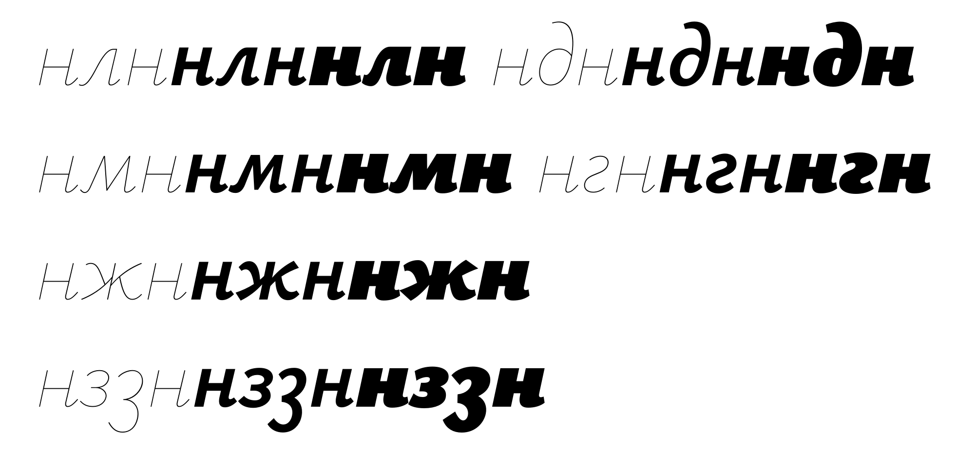
Christian Thalmann
Feb 17, 2021, 7:05:50 PM2/17/21
to Google Fonts Discussions
Hi Alexei,


I belatedly changed Yusbig-cy (it does look better this way!) and the heavy tails of the lowercase «hook» letters. I kept the interpolation layer of /be-cy/ for now; without it, the top connection of the bowl to the stem becomes too light in the not-quite-hairline weights (same problem with /b/ etc.).
I tried to accommodate your requirements on the widths of the lowercase squares... relaxing the /ii-cy/ did make it look more natural. I had trouble shaving off more than a few units from /pe-cy/ and /tse-cy/, though. Don't those look too light in the narrow now?
I just changed /M/ due to a current discussion on TypeDrawers, so /em-cy/ changed along with it:
Made the /te-cy/ wider. Also thanks for catching that missing kerning pair between /Te-cy/ and /ereversed-cy/ (which shares its kerning group with /zhe-cy/)!
As for /el-cy/, does this work? I'm not 100% sure I got what you meant by «contours agree».
And how's this for the capital?
I'll propagate the changes to the smallcaps and derived letters once we agree on the base shape.
New commit coming soon.
Cheers, Christian
Christian Thalmann
Feb 19, 2021, 10:41:46 AM2/19/21
to Google Fonts Discussions
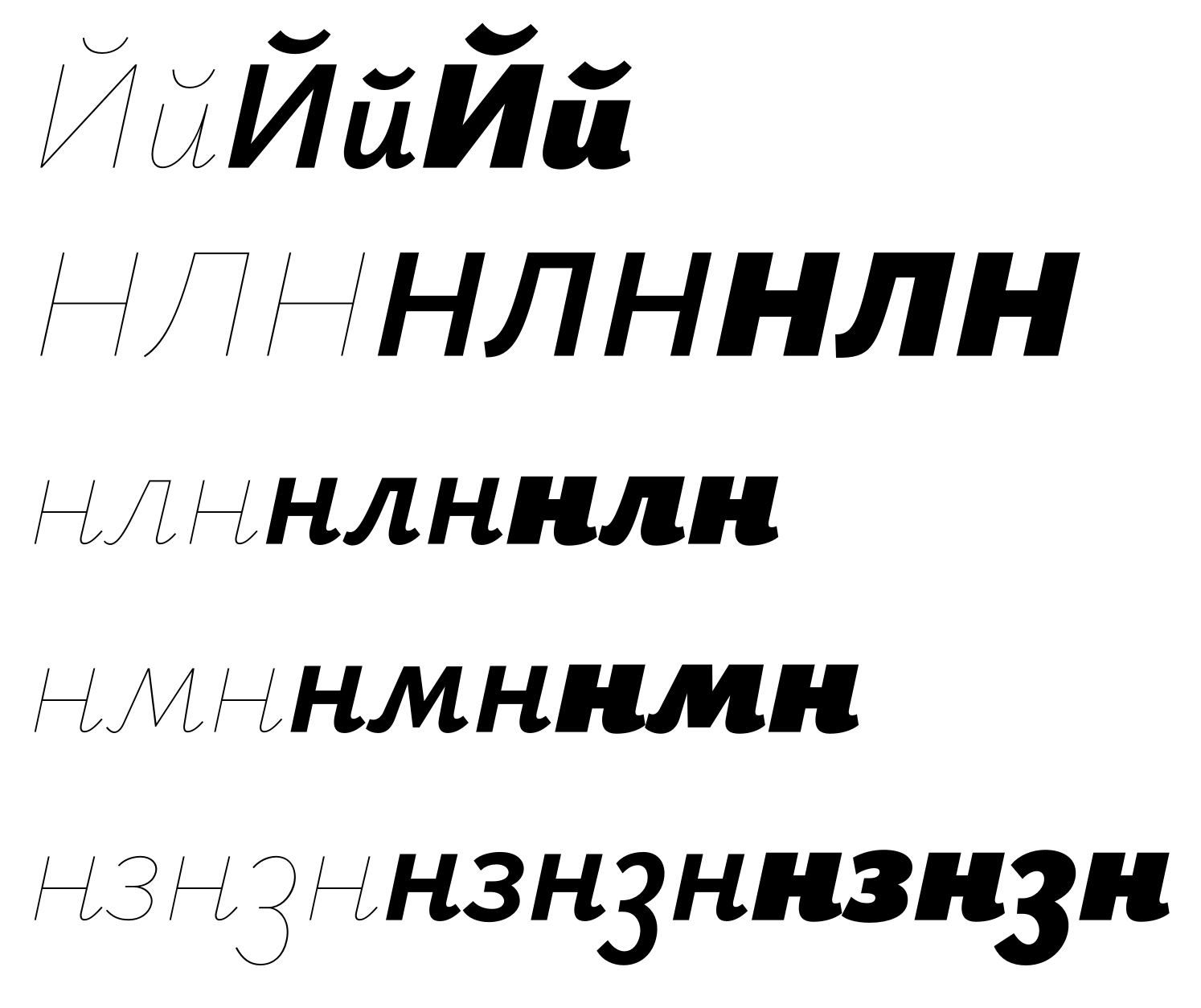
Hmmm, that capital /El-cy/ looked too different from the lowercase, and the Bold looked squashed. Better like this?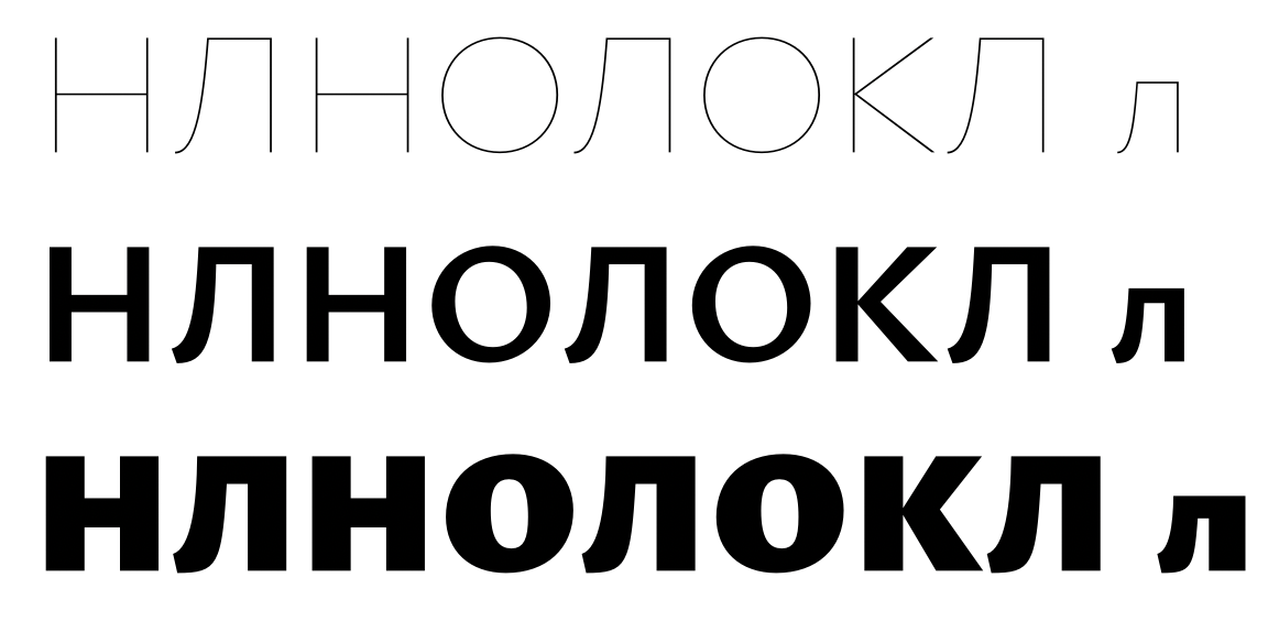
Christian Thalmann
Mar 7, 2021, 11:43:04 AM3/7/21
to Google Fonts Discussions
Actually, looking at it again, that Black /El-cy/ was probably a relapse into my original mistake of making the tail tip too light. Is it better this way?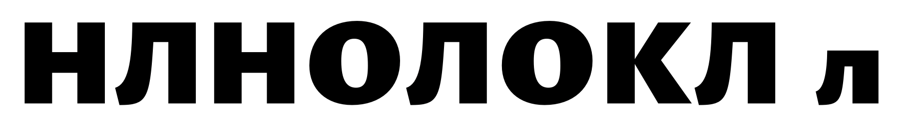
Christian Thalmann
Apr 13, 2021, 3:23:04 PM4/13/21
to Google Fonts Discussions
Hi Alexei,
well, how's that /El-cy/...? :Þ
BTW, I'm currently reviewing the Latin and Greek with two other reviewers (Andreas Stötzner and Irene Vlachou), and there were two developments that might affect Cyrillic.
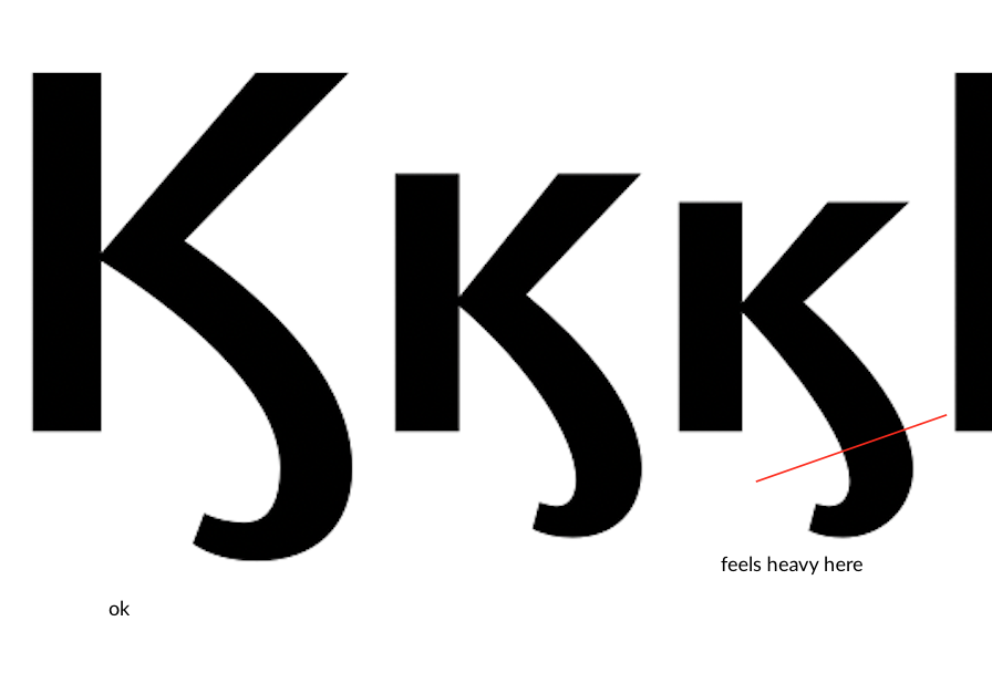
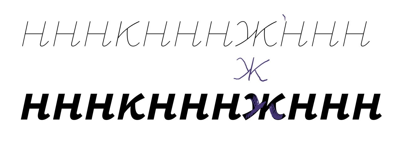
- Andreas recommended major changes to my /K/, making it far narrower and more asymmetric (lighter and shorter upper arm). Does that work for /Ka-cy/, too? And can I keep the /Zhe-cy/ as it is now? I tried propagating the asymmetry from /K/ to /Zhe-cy/, but it looked awful.
- Irene recommended greatly shortening the /Gamma/ from its previous from, which was identical to /Ge-cy/. Should I also shorten /Ge-cy/ (and thereby save myself the trouble of an extra kerning group), or do you prefer it as wide as it is now?
Cheers, Christian
Алексей Ваняшин
Apr 15, 2021, 7:57:56 AM4/15/21
to Google Fonts Discussions
Hi Christian,
The Light Л should be closer to the Bold and Black slopes. I like how Л works in Black and Bold.
- Andreas recommended major changes to my /K/, making it far narrower and more asymmetric (lighter and shorter upper arm). Does that work for /Ka-cy/, too? And can I keep the /Zhe-cy/ as it is now? I tried propagating the asymmetry from /K/ to /Zhe-cy/, but it looked awful.
The new UC Ka-cy does not work well with UC Zhe in the Bold style. Other styles don't seem a big issue.
- Irene recommended greatly shortening the /Gamma/ from its previous from, which was identical to /Ge-cy/. Should I also shorten /Ge-cy/ (and thereby save myself the trouble of an extra kerning group), or do you prefer it as wide as it is now?
I fully agree with Irene. Missed this. Ge-cy is generally a tad narrower than F.
> compare Д vs д in Black. The contrast between thin and thick strokes isn't the same. I would reduce the left stoke in д lowercase.
> sha-cy and em-cy in Black can be reduced in weight (compensated)
Christian Thalmann
Apr 15, 2021, 6:18:03 PM4/15/21
to Google Fonts Discussions
Hi Alexei,
thanks, I'll address those.
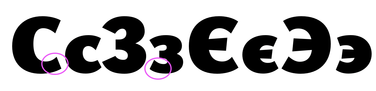
BTW, there's one more thing that changed in the Latin: I made the end cuts of quite a few rounded letters more vertical, e.g. in /C/. I noticed the cuts of /Ze-cy/ are very horizontal in comparison. Would you recommend me to apply that transformation there as well?
(It looks like I already did something like that to /ze-cy/ but not the capital version.)
Cheers, Christian
Christian Thalmann
Jun 22, 2021, 6:25:43 AM6/22/21
to Google Fonts Discussions
Hi Alexei,
shall we continue?
Cheers, Christian
Алексей Ваняшин
Jun 22, 2021, 1:54:08 PM6/22/21
to Google Fonts Discussions
Hi Christian,

I had a fresh look. Here are some more comments.
BTW, there's one more thing that changed in the Latin: I made the end cuts of quite a few rounded letters more vertical, e.g. in /C/. I noticed the cuts of /Ze-cy/ are very horizontal in comparison. Would you recommend me to apply that transformation there as well?
Yes, But in glyphs with middle bars be careful — they may look cluttered. You can keep a flare on one side only (top or bottom).
Let's look at Italics next.
Алексей Ваняшин
Jun 22, 2021, 1:55:11 PM6/22/21
to Google Fonts Discussions
The slope of Лл should look closer to this in Light:
Christian Thalmann
Jun 22, 2021, 7:15:55 PM6/22/21
to Google Fonts Discussions
Thanks Alexei! New version on GitHub.
I fear the italics might need quite a bit of work; there's a lot of work I've done on the Regulars that I haven't ported to the Italics yet (including the Latin).
Cheers, Christian
Christian Thalmann
Jun 26, 2021, 9:39:50 AM6/26/21
to Google Fonts Discussions
Hi Alexei,
what do you think of type.today's recent review of Cormorant's Cyrillic? Should we streamline some of the stylistic variance? For instance, I made the foot of /u-cy/ flat as opposed to the ball terminal in /y/ because I thought it might better suit the capital-like nature of the Cyrillic lowercase, but I'm happy to revert to /y/ if that makes more sense.
Cheers, Christian
Алексей Ваняшин
Jun 29, 2021, 2:17:44 PM6/29/21
to googlefonts-discuss
Regarding the review,
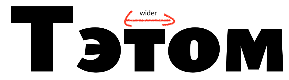
I think your idea was to match the /т with a serifless /м in Garamond.
the lowercase /т needs revisiting in this context. See т ъ г Т Ъ Г

I don't see a problem with а Cyrillic y that doesn't match the Latin y. As long as it harmonizes with Cyrillic well.
There are precedents like that in Tagir Safaev's custom fonts.
If I recall correctly, we discussed that Cormorant isn't strictly tied to a historical source, enabling the freedom of forms.
To view this discussion on the web visit https://groups.google.com/d/msgid/googlefonts-discuss/4ce20d2f-014c-4158-86eb-0e0e75fde367n%40googlegroups.com.
Christian Thalmann
Aug 11, 2021, 3:51:58 PM8/11/21
to Google Fonts Discussions
Hi Alexei,
I'll definitely change the /te-cy/. So should /Ge-cy/ and /ge-cy/ also get the same treatment with an upward spur? Or would that confuse it with /Gheupturn-cy/?
So we'll keep the idiosyncratic /be-cy/ solutions? I'm fine with that. As I recall, the default cut was going to reflect the some of the Modern-based Cyrillic expectations whereas Garamond was going to lean into Trajan-style humanism, so that fits. Keeping /u-cy/ distinct from /u/ is also fine with me, I recall the ball terminal looking out of place among all the flat serifs.
Should I do something about the /Che-cy/, though? I could easily thicken up the inverted arch a bit to better match the lowercase.
I'm working on the Latin Italics now; shall we also look at the Cyrillic Italics?
Cheers, Christian
Christian Thalmann
Aug 11, 2021, 4:30:16 PM8/11/21
to Google Fonts Discussions
I'm working on the Latin Italics now; shall we also look at the Cyrillic Italics?
I meant the Ysabeau Italics there...
Алексей Ваняшин
Aug 13, 2021, 10:19:19 AM8/13/21
to googlefonts-discuss
ср, 11 авг. 2021 г., 22:52 Christian Thalmann <christian....@gmail.com>:
Hi Alexei,I'll definitely change the /te-cy/. So should /Ge-cy/ and /ge-cy/ also get the same treatment with an upward spur?
Yes, that would be a short vertical serif.
Г should follow the logic of F regarding serifs.
Or would that confuse it with /Gheupturn-cy/?
Size matters. The upturn should be as large as a descender in Д.
So we'll keep the idiosyncratic /be-cy/ solutions? I'm fine with that. As I recall, the default cut was going to reflect the some of the Modern-based Cyrillic expectations whereas Garamond was going to lean into Trajan-style humanism, so that fits. Keeping /u-cy/ distinct from /u/ is also fine with me, I recall the ball terminal looking out of place among all the flat serifs.Should I do something about the /Che-cy/, though? I could easily thicken up the inverted arch a bit to better match the lowercase.
I would correlate the contrast dynamic of ч with h, n.
The current two variants relate to pointed and broad nib distribution.
I'm working on the Latin Italics now; shall we also look at the Cyrillic Italics?
I'm on holidays for the next two weeks.
Will get back later.
To view this discussion on the web visit https://groups.google.com/d/msgid/googlefonts-discuss/bab4c994-1cc2-4106-aa48-ed1b06f238d6n%40googlegroups.com.
Christian Thalmann
Aug 13, 2021, 3:31:09 PM8/13/21
to googlefon...@googlegroups.com
I'll definitely change the /te-cy/. So should /Ge-cy/ and /ge-cy/ also get the same treatment with an upward spur?Yes, that would be a short vertical serif.Г should follow the logic of F regarding serifs.
The /F/ doesn‘t have an upward spur, neither in Cormorant nor in EB Garamond. It‘s unique to /T/. So no spur on /Ge-cy/?
Should I do something about the /Che-cy/, though? I could easily thicken up the inverted arch a bit to better match the lowercase.I would correlate the contrast dynamic of ч with h, n.The current two variants relate to pointed and broad nib
It makes sense for the lowercase version of /che-cy/ to match /n/, as it already does. I guess the uppercase version is related to /U/ instead. Should I change that or does it work?
I'm on holidays for the next two weeks.Will get back later.
Ok, enjoy!
Cheers, Christian
Алексей Ваняшин
Aug 18, 2021, 5:38:26 AM8/18/21
to googlefon...@googlegroups.com
Пт, 13 авг. 2021 г. в 23:31, Christian Thalmann <christian....@gmail.com>:
I'll definitely change the /te-cy/. So should /Ge-cy/ and /ge-cy/ also get the same treatment with an upward spur?Yes, that would be a short vertical serif.Г should follow the logic of F regarding serifs.The /F/ doesn‘t have an upward spur, neither in Cormorant nor in EB Garamond. It‘s unique to /T/. So no spur on /Ge-cy/?
Okay then. No spur is fine.
Should I do something about the /Che-cy/, though? I could easily thicken up the inverted arch a bit to better match the lowercase.I would correlate the contrast dynamic of ч with h, n.The current two variants relate to pointed and broad nibIt makes sense for the lowercase version of /che-cy/ to match /n/, as it already does. I guess the uppercase version is related to /U/ instead. Should I change that or does it work?
Upperscase Ч relates to lowercase ч.
Can you send a screenshot?
I'm on holidays for the next two weeks.Will get back later.Ok, enjoy!Cheers, Christian
--
You received this message because you are subscribed to a topic in the Google Groups "Google Fonts Discussions" group.
To unsubscribe from this topic, visit https://groups.google.com/d/topic/googlefonts-discuss/9qV84-y1fqQ/unsubscribe.
To unsubscribe from this group and all its topics, send an email to googlefonts-dis...@googlegroups.com.
To view this discussion on the web visit https://groups.google.com/d/msgid/googlefonts-discuss/30F81A1F-E15D-4CEB-BE70-9DCC3721CFA0%40gmail.com.
Christian Thalmann
Aug 18, 2021, 9:58:42 AM8/18/21
to googlefon...@googlegroups.com
> Upperscase Ч relates to lowercase ч.
> Can you send a screenshot?
I just realized you quoted an image where Ilya proposes another shape for Ч that is in line with humanist expectations and with the lowercase. I suppose the easiest solution would just be to adopt that shape for our Ч.
> Can you send a screenshot?
I’m making headway with the Italics of Ysabeau; they should be ready for review when you return from vacation.
Cheers, Christian
Christian Thalmann
Dec 26, 2021, 4:10:02 PM12/26/21
to Google Fonts Discussions
Hi Alexei,
shall we continue reviewing the Cyrillic of Ysabeau? We haven't touched the Italics yet, and they're ready for review (no Italic Heavy master yet, though).
Cheers, Christian
On Sunday, August 22, 2021 at 12:00:47 AM UTC+2 Christian Thalmann wrote:
Like this?
Alexei Vanyashin
Dec 31, 2021, 4:19:24 AM12/31/21
to googlefonts-discuss
пн, 27 дек. 2021 г., 00:10 Christian Thalmann <christian....@gmail.com>:
Hi Alexei,shall we continue reviewing the Cyrillic of Ysabeau? We haven't touched the Italics yet, and they're ready for review (no Italic Heavy master yet, though).
Hi Christian,
Okay, thank you for the update. I have scheduled this on Jan 15ish after the great Russian winter holidays of 1-10 January.
Season's greetings,
Alexei.
Cheers, ChristianOn Sunday, August 22, 2021 at 12:00:47 AM UTC+2 Christian Thalmann wrote:Like this?
--
You received this message because you are subscribed to a topic in the Google Groups "Google Fonts Discussions" group.
To unsubscribe from this topic, visit https://groups.google.com/d/topic/googlefonts-discuss/9qV84-y1fqQ/unsubscribe.
To unsubscribe from this group and all its topics, send an email to googlefonts-dis...@googlegroups.com.
To view this discussion on the web visit https://groups.google.com/d/msgid/googlefonts-discuss/7fe69864-c5f4-4142-abac-198ee8b79a51n%40googlegroups.com.
Christian Thalmann
Jan 18, 2022, 6:18:24 PM1/18/22
to Google Fonts Discussions
Hi Alexei,
thanks, I'll look into it!
Is your suggested design for /zhe/ really asymmetric in that it's /c/-shaped on the left and /k/-shaped on the right?
Cheers, Christian
Christian Thalmann
Jan 19, 2022, 5:28:28 PM1/19/22
to Google Fonts Discussions
Hi Alexei,
Ysabeau was scheduled for the January upload to Google Fonts, but I suppose the Cyrillic is not ready yet for a first release. Do you think we can finish the review by March in time for the next upload opportunity? Otherwise, another option would be to release Ysabeau without Cyrillics and adding them in the next update.
Cheers, Christian
Alexei Vanyashin
Jan 20, 2022, 4:07:11 AM1/20/22
to googlefonts-discuss
On Thu, Jan 20, 2022 at 1:28 AM Christian Thalmann <christian....@gmail.com> wrote:
Hi Alexei,Ysabeau was scheduled for the January upload to Google Fonts, but I suppose the Cyrillic is not ready yet for a first release.
Yes, it's better to postpone the Cyrillic release in January.
Do you think we can finish the review by March in time for the next upload opportunity?
I think this is possible .
Otherwise, another option would be to release Ysabeau without Cyrillics and adding them in the next update.Cheers, ChristianOn Wednesday, January 19, 2022 at 12:18:24 AM UTC+1 Christian Thalmann wrote:Hi Alexei,thanks, I'll look into it!Is your suggested design for /zhe/ really asymmetric in that it's /c/-shaped on the left and /k/-shaped on the right?
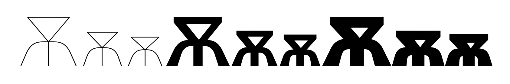
You mean something like this — that's a script solution.
I meant an asymmetric approach
To view this discussion on the web visit https://groups.google.com/d/msgid/googlefonts-discuss/217cd56a-cdb4-4560-a196-19678bb99d57n%40googlegroups.com.
Christian Thalmann
Jan 23, 2022, 7:54:17 PM1/23/22
to Google Fonts Discussions
Hi Alexei,
cool, let's definitely aim to wrap in March, then.
How do these changes work for you? New commit up.
Cheers, Christian
Christian Thalmann
Feb 4, 2022, 7:08:18 PM2/4/22
to Google Fonts Discussions
Alexei?
Christian Thalmann
Feb 5, 2022, 4:18:40 PM2/5/22
to Google Fonts Discussions
Hi Alexei,
I think focusing our attention on the basic Google Cyrillic will do for the moment. We can touch up the others in an update if necessary.
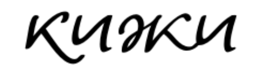
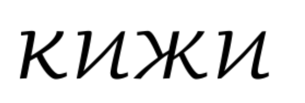
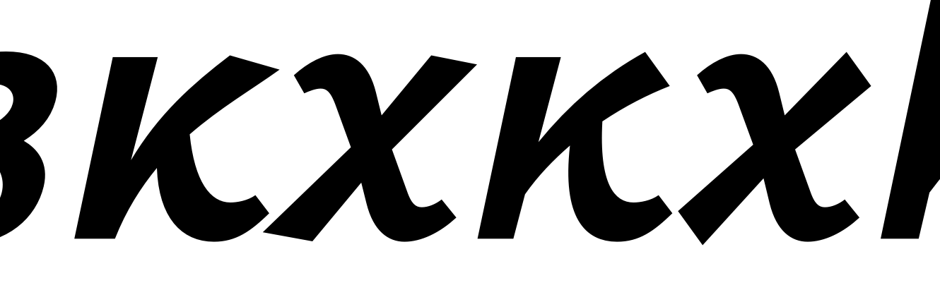
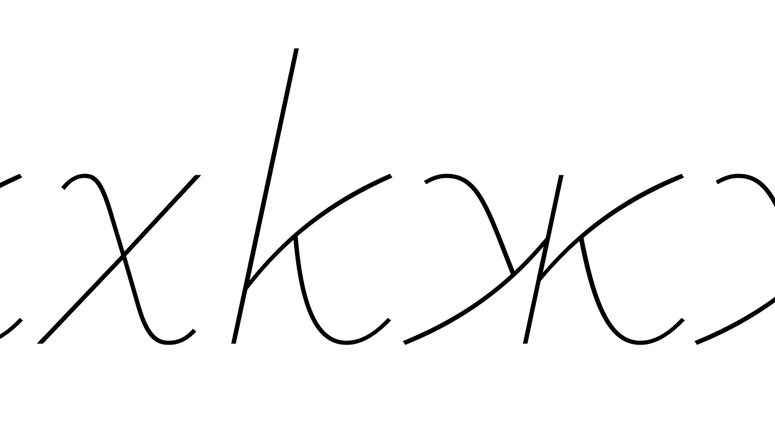
As for the new кж, I'm struggling a bit with the blunter upper right terminal that you requested. The previous sharp angle was consistent with /x/, and trying to migrate the blunt angle to /x/ looks rather silly. Do you think I can get away with blunt кж but sharp x? Also, doesn't the new construction of кж feel a bit «broken» in the middle?
Cheers, Christian
Christian Thalmann
Feb 5, 2022, 6:17:10 PM2/5/22
to Google Fonts Discussions
(Oh, and the new commit is up.)
Christian Thalmann
Feb 10, 2022, 7:11:22 AM2/10/22
to googlefon...@googlegroups.com
Hi Alexei
Thanks! A few questions:
– I take it the structural changes (e.g. the bulge of low bowls) should be propagated to the lighter masters as well?
– Do you really suggest making the trail of У and leg of Я so extremely light? In particular, I don’t understand the box you drew near the latter…
– I made the ж specifically so as to avoid this small-scale structure around the center. Is that really desirable?
Cheers, Christian
To view this discussion on the web visit https://groups.google.com/d/msgid/googlefonts-discuss/b74bcaaf-c8dc-44dd-b95b-8589d0b3b5a2n%40googlegroups.com.
<Untitled 18.pdf><DEA77A1F-786B-44F9-A2FE-02FDE665A6C6.jpeg>
Alexei Vanyashin
Feb 21, 2022, 3:11:01 AM2/21/22
to Google Fonts Discussions
Christian,
Thanks! A few questions:
– I take it the structural changes (e.g. the bulge of low bowls) should be propagated to the lighter masters as well?
Yes.
– Do you really suggest making the trail of У and leg of Я so extremely light? In particular, I don’t understand the box you drew near the latter…
The box indicates that the leg it too dark.
And, no extremely light — that's is a format issues with incorrect export format of the PDF.
Here is a correct PDF attached. Sorry, I was pressed on time, didn't notice this.
– I made the ж specifically so as to avoid this small-scale structure around the center. Is that really desirable?
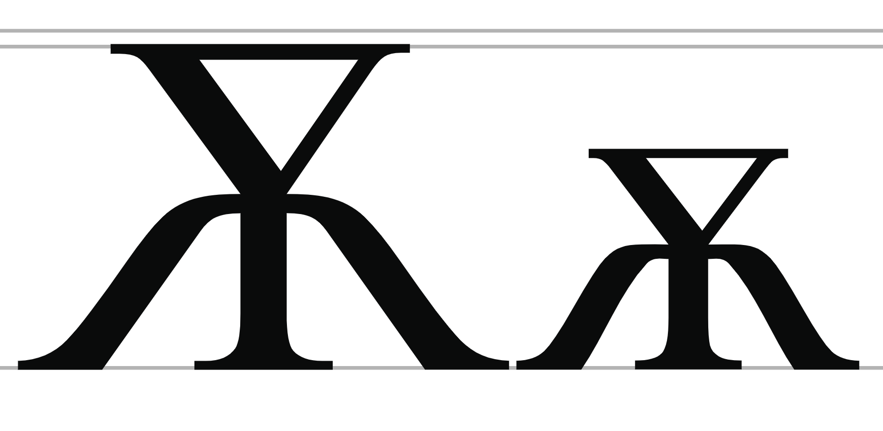
The new ж к is much better.
In Light I would make the left /ж arm less bent. Closer to the leg of /я
Your initial variant was very experimental, non-text font solution, closer to Greek than Cyrillic.
Cheers, Christian
Christian Thalmann
Feb 24, 2022, 7:18:39 AM2/24/22
to Google Fonts Discussions
Hi Alexei,
thanks! Like this? (Isn't the new breve a bit too informal for the Roman?)
Cheers, Christian
Alexei Vanyashin
Mar 2, 2022, 3:11:18 AM3/2/22
to Google Fonts Discussions
Christian,
Ж -
The top arm is good. Why not try to relate the bottom limb too?
Can you show a sample of these two options of ж in a words list?
Breve — there should be a height difference of the two parts.
De — try asymmetrical descenders.
Ze — top part is off balance, move inward. In black styles weight is usually compensated in the whole glyph.
Christian Thalmann
Mar 8, 2022, 5:47:25 PM3/8/22
to Google Fonts Discussions
Hi Alexei,


how about this, then? Isn't the new /Ze-cy/ a bit light?
Cheers, Christian
Alexei Vanyashin
Mar 9, 2022, 5:46:36 AM3/9/22
to googlefonts-discuss
Hi Alexei,how about this, then? Isn't the new /Ze-cy/ a bit light?
You can add a bit more weight. Relate the compensation amount with S.
Д - left diagonal stem is too light, especially on the bottom.
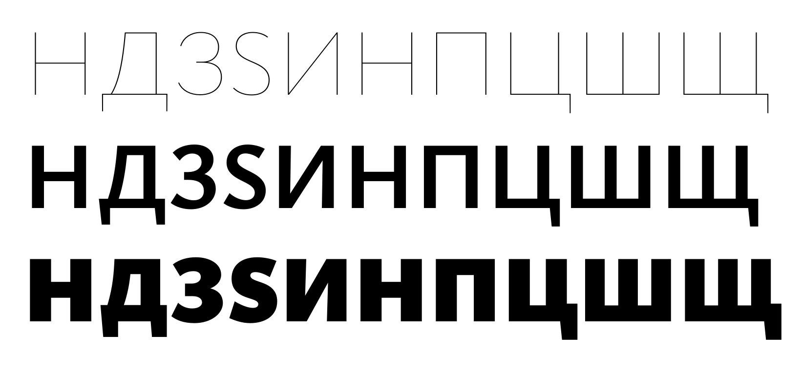
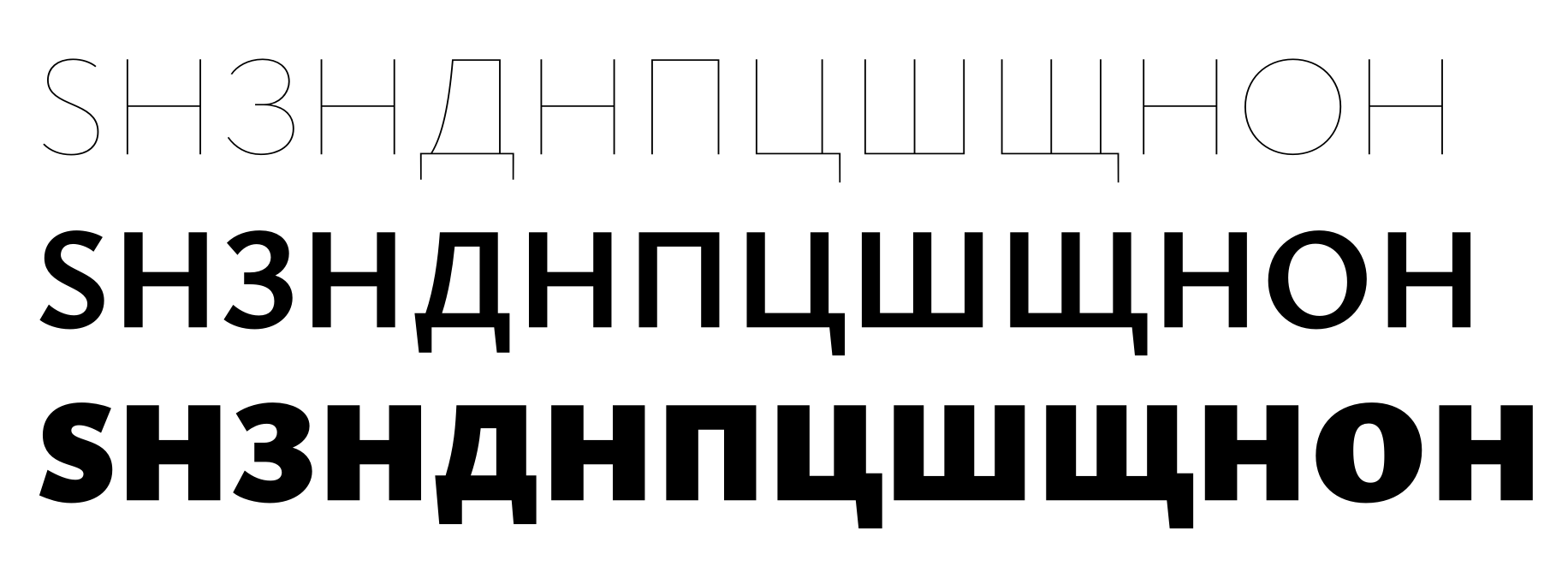
Ц light - too wide. How does it compare to
ИHПЦШЩ?
Cheers, Christian
--
You received this message because you are subscribed to a topic in the Google Groups "Google Fonts Discussions" group.
To unsubscribe from this topic, visit https://groups.google.com/d/topic/googlefonts-discuss/9qV84-y1fqQ/unsubscribe.
To unsubscribe from this group and all its topics, send an email to googlefonts-dis...@googlegroups.com.
To view this discussion on the web visit https://groups.google.com/d/msgid/googlefonts-discuss/b9c2a153-b2e3-4614-869d-db5ae1a3b756n%40googlegroups.com.
Christian Thalmann
Mar 9, 2022, 6:58:23 AM3/9/22
to Google Fonts Discussions
Hi Alexei,
like this?
Cheers, Christian
Christian Thalmann
Mar 17, 2022, 7:32:34 AM3/17/22
to googlefon...@googlegroups.com
Good point! Should Hairline /Ze-cy/ follow the shape of Bold/Black or the other way round? I guess the former is more in line with the typeface (cf. S)?
Cheers, Christian
> On 17 Mar 2022, at 10:41, Alexei Vanyashin <a...@cyreal.org> wrote:
>
> Christian,
Cheers, Christian
> On 17 Mar 2022, at 10:41, Alexei Vanyashin <a...@cyreal.org> wrote:
>
> Christian,
Alexei Vanyashin
Mar 17, 2022, 8:00:53 AM3/17/22
to Google Fonts Discussions
You are the designer — it is your choice.
When I started commenting on hairline, its design was fairly regular, proportional, geometric.
Bold and Black are more humanistic. Is this feature also replicated in Latin and Greek?
Also the contrast in Bold is higher than in Black.
I would make the hairline shapes closer to Bold.
Christian Thalmann
Mar 17, 2022, 8:20:15 AM3/17/22
to Google Fonts Discussions
Yeah, I think this does work better. I opened the /Ze-cy/ in Hairline and increased the contrast in the Black.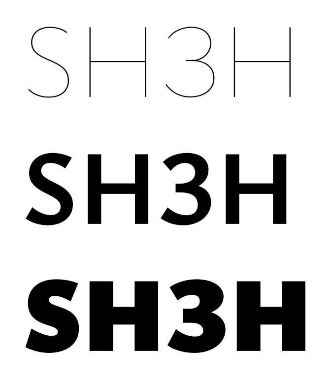
Christian Thalmann
Mar 17, 2022, 8:37:44 AM3/17/22
to Google Fonts Discussions
And now with the box characters:
Alexei Vanyashin
Mar 17, 2022, 9:52:56 AM3/17/22
to Google Fonts Discussions
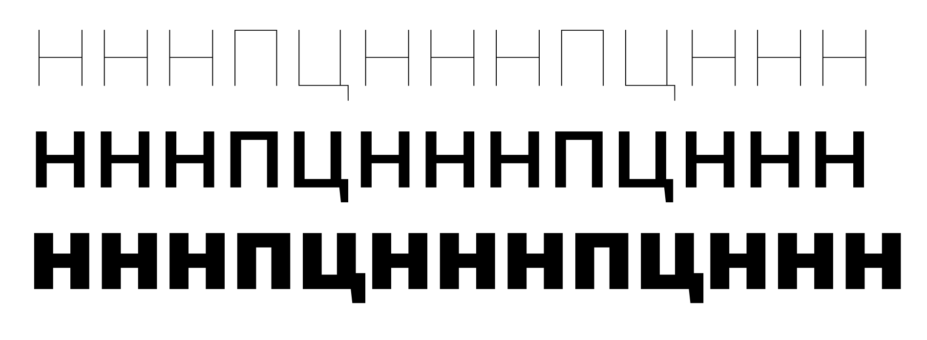
The difference in width of Н and П in light is huge.
I would make H narrower in Light.
How do you embolden your glyphs — 100% inwards 0% outwards, or 70-30%?
Д — Black - the left part can be extended more.
You need to overlap the three masters and coordinate with the Bold master.
Bold Д has the best proportions of all three.
descenders in Bold and Hairline I would nudge inwards a bit.
Christian Thalmann
Mar 17, 2022, 7:13:40 PM3/17/22
to Google Fonts Discussions
The difference in width of Н and П in light is huge.
Well yes, because you had me make the П so incredibly narrow... 😜
I would make H narrower in Light.
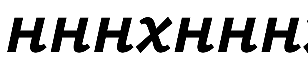
I am loath to change it in Latin, given how I used it as the gold standard to design and space the other capitals... I fear I'd have to rebalance everything afterwards. In any case, Ysabeau has an unconventionally wide stride for a sans, and I think overall the H is well integrated into the Latin caps (see below).
Do you suggest making /En-cy/ narrower than /H/? Is there precedence for that? I suppose it might make sense given that Cyrillic caps are often a bit «heftier» than Latin ones.
How do you embolden your glyphs — 100% inwards 0% outwards, or 70-30%?
Usually something like 75%/25%. I'm admittedly surprised that Hairline H is almost as wide as Bold H. It's been a while, but I assume I started with the very circular Garamond O and built the H to look balanced with it...? As for Black, I find the counter size is often the most stringent constraint on where the weight can go.
You need to overlap the three masters and coordinate with the Bold master.
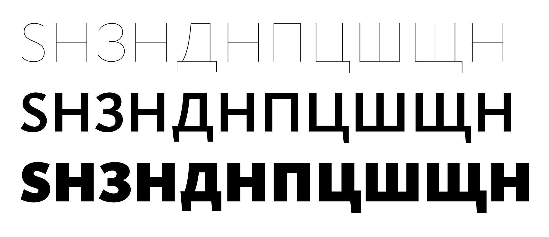
OK, I tried to follow your suggestions. How does the image on the bottom look? I made the /En-cy/ a bit narrower than /H/ here too.
Cheers, Christian
Alexei Vanyashin
Mar 18, 2022, 3:27:39 AM3/18/22
to Google Fonts Discussions
On Friday, March 18, 2022 at 2:13:40 AM UTC+3 christian....@gmail.com wrote:
The difference in width of Н and П in light is huge.Well yes, because you had me make the П so incredibly narrow... 😜
The width difference in НПЦ in Bold is a good reference. I trust you can coordinate
The Hairline style in accordance with Bold, I don’t want to be too directive here.
I would make H narrower in Light.I am loath to change it in Latin, given how I used it as the gold standard to design and space the other capitals... I fear I'd have to rebalance everything afterwards. In any case, Ysabeau has an unconventionally wide stride for a sans, and I think overall the H is well integrated into the Latin caps (see below).Do you suggest making /En-cy/ narrower than /H/?
In this case yes.
Is there precedence for that?
No. Only rare cases where spacing in En-cy is wider than H.
I suppose it might make sense given that Cyrillic caps are often a bit «heftier» than Latin ones.
Cyrillic small caps are usually tracked more open by typographers.
How do you embolden your glyphs — 100% inwards 0% outwards, or 70-30%?Usually something like 75%/25%. I'm admittedly surprised that Hairline H is almost as wide as Bold H. It's been a while, but I assume I started with the very circular Garamond O and built the H to look balanced with it...? As for Black, I find the counter size is often the most stringent constraint on where the weight can go.
The left part of De-cy in hairline does not match the form in Bold.
And please coordinate the lengths of the descenders using De-cy as a token reference.
Christian Thalmann
Mar 22, 2022, 4:38:38 PM3/22/22
to Google Fonts Discussions
Hi Alexei,
The width difference in НПЦ in Bold is a good reference.
OK, I'll try that.
I trust you can coordinateThe Hairline style in accordance with Bold, I don’t want to be too directive here.
I'll give it a try, but I'd rather not drag this out unnecessarily. I'm already finding myself with much less time for type design on my hands right now than I would need, and I simply haven't yet developed the sensibilities to «see» the things you point out by myself. In other words, I wouldn't mind you being directive. ;o)
The left part of De-cy in hairline does not match the form in Bold.And please coordinate the lengths of the descenders using De-cy as a token reference.
OK, will do.
Cheers, Christian
Christian Thalmann
Mar 22, 2022, 5:26:03 PM3/22/22
to Google Fonts Discussions
Actually my Bold, which you recommended as reference, had a wider Tse-cy body than Pe-cy! :Þ In any case, I propagated the width difference from Bold to the others, which made the Tse-cy and Pe-cy significantly wider again.
(BTW, I've decided to make the Hairline H narrower in Latin as well so as to keep things consistent. It did look too wide together with lowercase letters, and I only had to change a few other letters (D, N) to make it fit again.)
Width matching:

Unification of descenders:

Alexei Vanyashin
Mar 25, 2022, 5:41:27 AM3/25/22
to googlefonts-discuss
On Wed, Mar 23, 2022 at 12:26 AM Christian Thalmann <christian....@gmail.com> wrote:
Actually my Bold, which you recommended as reference, had a wider Tse-cy body than Pe-cy! :Þ
It should be vice versa. Tse-cy is typically 5-10 units narrower,
In any case, I propagated the width difference from Bold to the others, which made the Tse-cy and Pe-cy significantly wider again.
(BTW, I've decided to make the Hairline H narrower in Latin as well so as to keep things consistent.
Great, I was hoping you would do that. Sometimes Latin issues are easier to spot in the context of Cyrillic.
It did look too wide together with lowercase letters, and I only had to change a few other letters (D, N) to make it fit again.)Width matching:
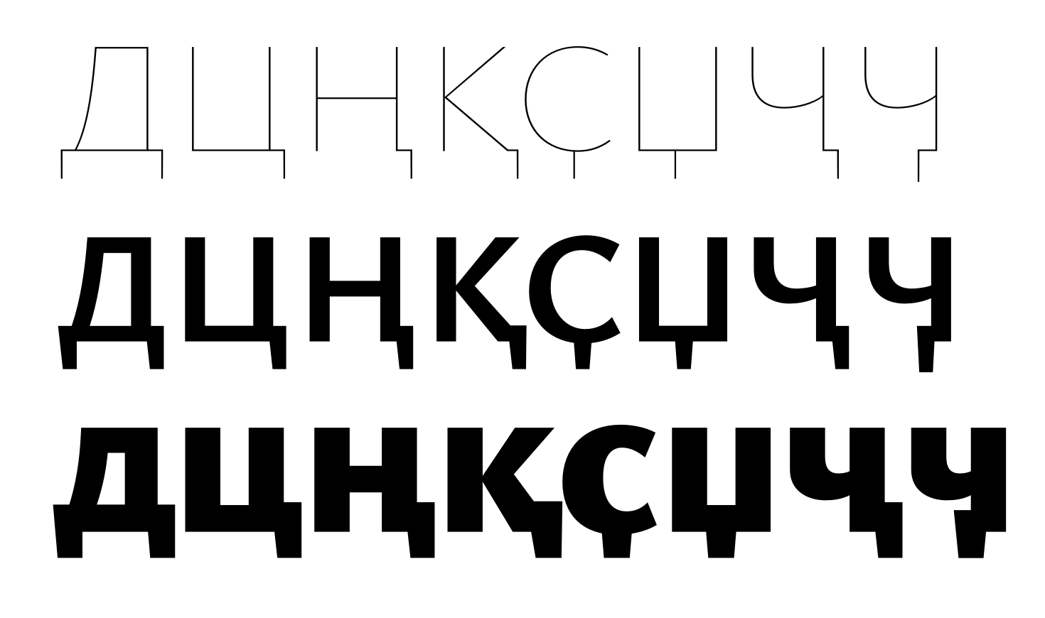
The widths look okay now. Now the Ц descender in Bold feels to short compared to other weights,
also it feels too light. I would add +7 units outwards making it wider.
Unification of descenders:On Tuesday, March 22, 2022 at 9:38:38 PM UTC+1 Christian Thalmann wrote:
Kadescender-cy Black — retract the descender inwards about half the width on the top.
Hi Alexei,The width difference in НПЦ in Bold is a good reference.OK, I'll try that.I trust you can coordinateThe Hairline style in accordance with Bold, I don’t want to be too directive here.I'll give it a try, but I'd rather not drag this out unnecessarily. I'm already finding myself with much less time for type design on my hands right now than I would need, and I simply haven't yet developed the sensibilities to «see» the things you point out by myself. In other words, I wouldn't mind you being directive. ;o)
I don't mind being directive on a single occasion. But when the issues re-appears, I would just explain the problem.
This is also because of my time constraints, and my general review procedure.
The left part of De-cy in hairline does not match the form in Bold.And please coordinate the lengths of the descenders using De-cy as a token reference.OK, will do.Cheers, Christian
--
You received this message because you are subscribed to a topic in the Google Groups "Google Fonts Discussions" group.
To unsubscribe from this topic, visit https://groups.google.com/d/topic/googlefonts-discuss/9qV84-y1fqQ/unsubscribe.
To unsubscribe from this group and all its topics, send an email to googlefonts-dis...@googlegroups.com.
To view this discussion on the web visit https://groups.google.com/d/msgid/googlefonts-discuss/90061ba9-2ced-4fc4-94cb-acee7e6462f4n%40googlegroups.com.
Christian Thalmann
Apr 4, 2022, 3:43:17 PM4/4/22
to Google Fonts Discussions
Hi Alexei,
the end of March has come and gone... are we done? :)
I
was mistaken about Google Fonts only ingesting fonts once every quarter
year (the quarters just seem to be of administrative importance), so we
don't have a strict deadline. However, I'd still like to avoid dragging
the project out indefinitely. Can you give me an estimate of what's
still needed to finish Ysabeau for release?
Cheers, Christian
Alexei Vanyashin
Apr 6, 2022, 12:39:05 PM4/6/22
to Google Fonts Discussions
the length of the descenders should be same:
Can you send me a PDF with the full basic Cyrillic set in all masters?
And PDFs from Words, Caps, Layout from http://cyreal.org/Font-Testing-Page/index-cyrillic.php ?
Christian Thalmann
Apr 8, 2022, 10:48:19 AM4/8/22
to Google Fonts Discussions
Hi Alexei,
makes sense, thanks!
Cheers, Christian
Christian Thalmann
Apr 10, 2022, 6:19:53 AM4/10/22
to Google Fonts Discussions
Hi Alexei,
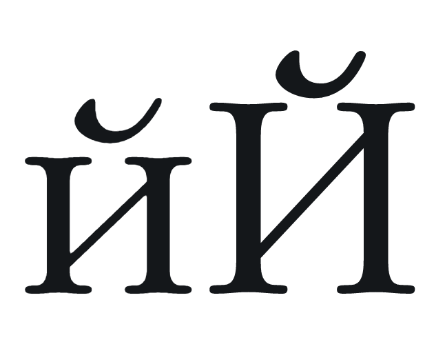
I don't suppose any of these will work as (alternate) yi_yi ligatures...?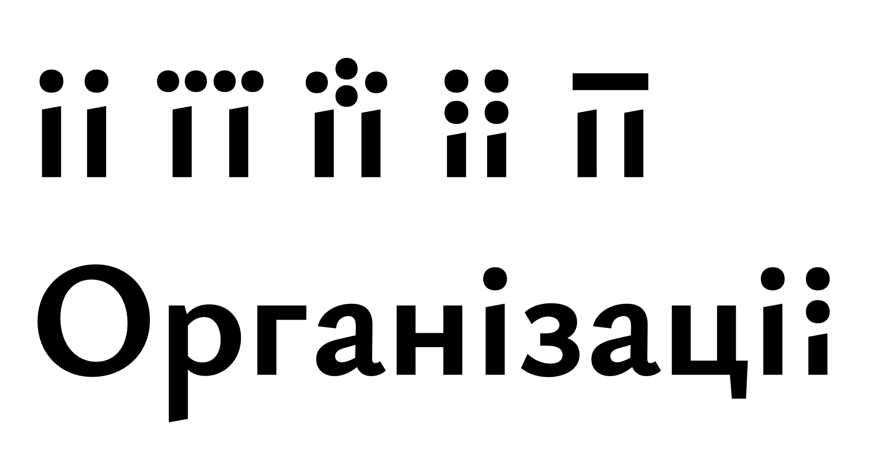
Cheers, Christian
Christian Thalmann
Apr 13, 2022, 5:36:00 PM4/13/22
to Google Fonts Discussions
Hi Alexei,
I ended up making a three-dot ligature for /yi_yi/ on the recommendation of Andriy Konstantynov:
Cheers, Christian
Christian Thalmann
Apr 18, 2022, 7:02:08 PM4/18/22
to Google Fonts Discussions
Hi Alexei,
I'm finished with Ysabeau from my side, so unless you have any last-minute objections, I'm going to submit it for ingestion into Google Fonts now.
Thanks for all your help!
Cheers, Christian
Alexei Vanyashin
Apr 20, 2022, 8:59:13 AM4/20/22
to Google Fonts Discussions
Hi Christian,
Here are my final thoughts in the PDF.
I would pay more attention to the breve. In lowercase it significantly differs from the curvature of the uppercase.
Here is a balanced breve for reference:
I would prefer this kind of limb in ya-cy

On the displaced three-dot yi-yi ligature, too me this would be acceptable.
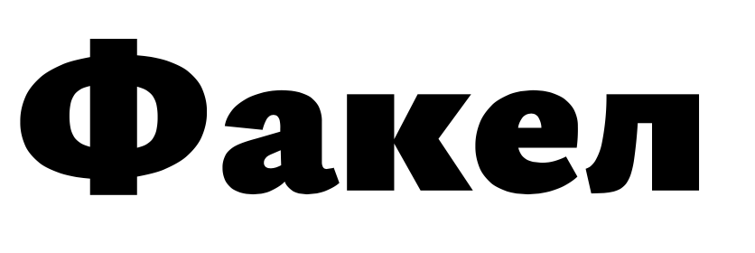
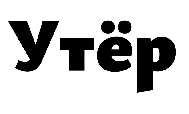
There is missing kerning in Фа Ут
Christian Thalmann
Apr 20, 2022, 9:11:32 AM4/20/22
to Google Fonts Discussions
Hi Alexei,
thanks, I'll look into it!
Could you elaborate on the following points?
- Coordinating ДЛ: I've spent way too much time on these to still have a sense of my own for what they should look like. What should I change to match what?
- Triangular л: Should the apex be fully rounded, round on the left and pointy on the right, or fully pointy?
- Rebalancing м: What's the problem with the current version?
Cheers, Christian
Christian Thalmann
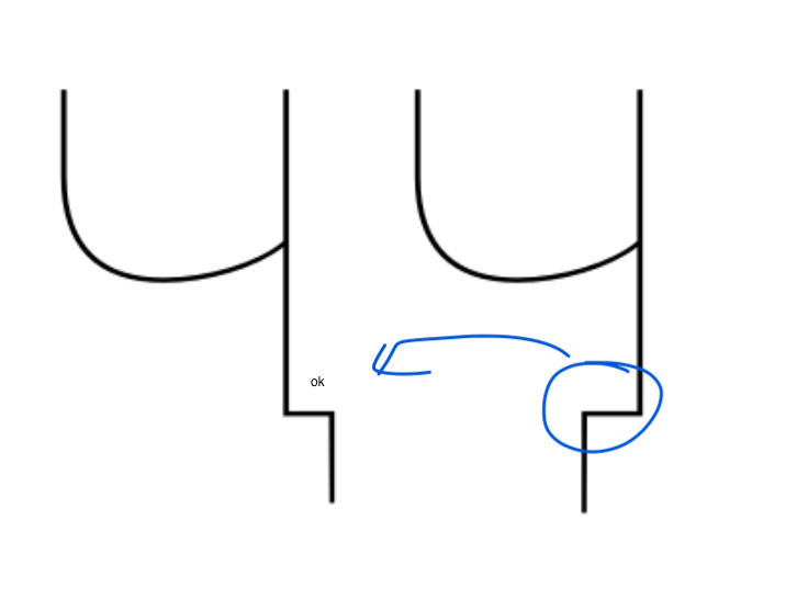
Apr 20, 2022, 4:07:39 PM4/20/22
to Google Fonts Discussions
Hi Alexei,
I tried to solve the problems on my own, not sure if that's what you intended... in particular, I'm not sure about the triangular /el-cy/. Is it supposed to be so narrow? And is it supposed to be restricted to the Infant Cut with triangular capital /El-cy/, or all cuts? In any case, I'll have to revisit its kerning behavior.
I'm still not sure about the Bulgarian /ze-cy/, I just hate that letter, it doesn't interact well with Ysabeau's large descender depth at all...
Cheers, Christian
Alexei Vanyashin
Apr 21, 2022, 5:53:08 AM4/21/22
to Google Fonts Discussions
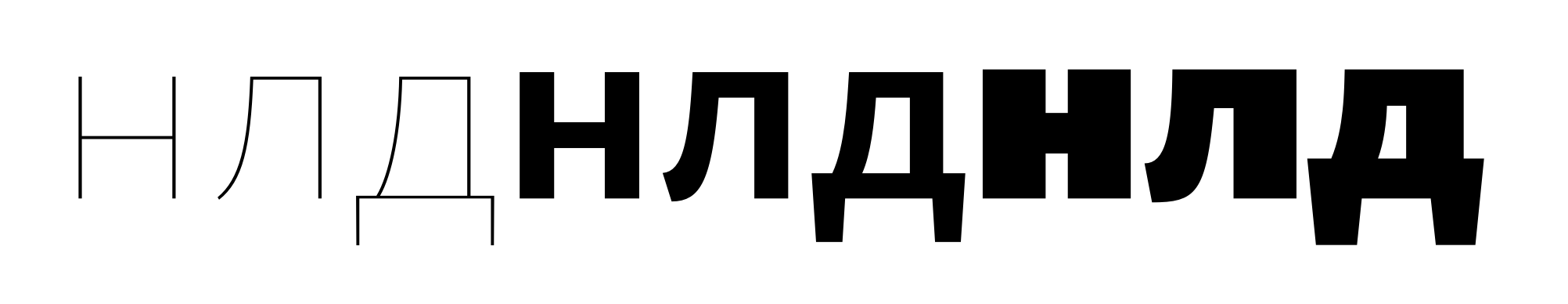
- Coordinating ДЛ: I've spent way too much time on these to still have a sense of my own for what they should look like. What should I change to match what?
in Л the blue arrow is larger than the red arrow. Why?
Relate this hockey-stick shape to /r

Л the left stem should be optically equal to the horizontal bar in H. It feels to light now.
- Triangular л: Should the apex be fully rounded, round on the left and pointy on the right, or fully pointy?
I would prefer pointy
- Rebalancing м: What's the problem with the current version?
see PDF.
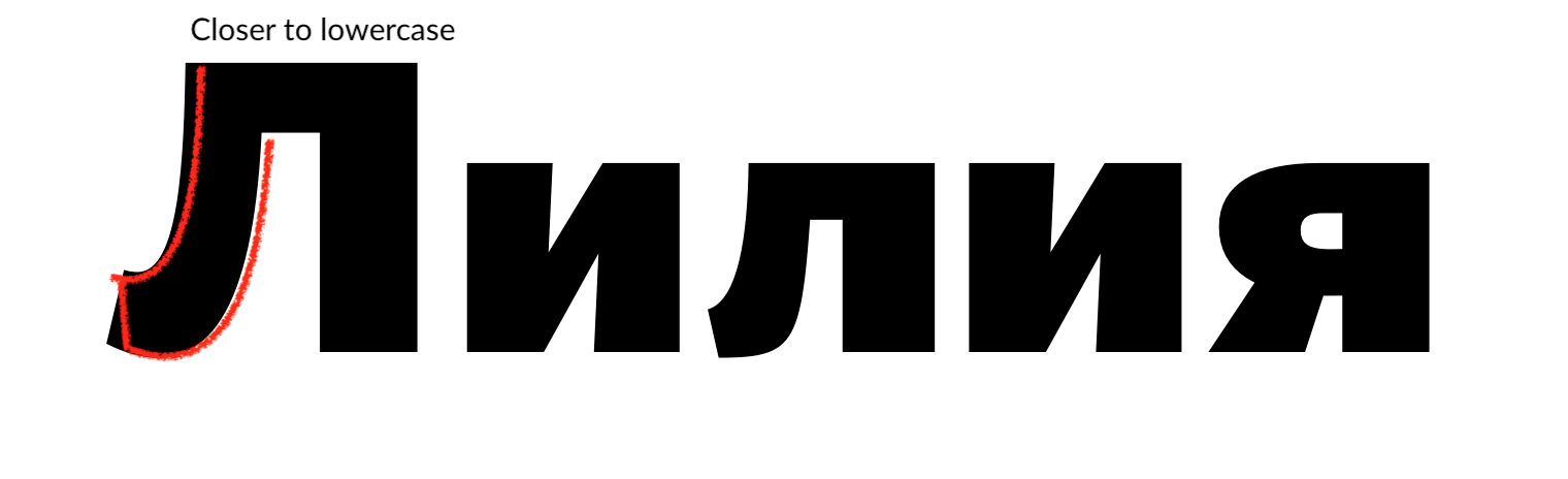
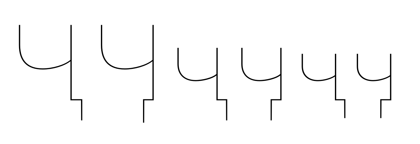
in particular, I'm not sure about the triangular /el-cy/. Is it supposed to be so narrow?
It's top base should be very close to that of Д
And is it supposed to be restricted to the Infant Cut with triangular capital /El-cy/, or all cuts? In any case, I'll have to revisit its kerning behavior.
This lowercase triangular /л form would fit all italic styles.
Is infant the bulgarian cyrillic alternate style?
I'm still not sure about the Bulgarian /ze-cy/, I just hate that letter, it doesn't interact well with Ysabeau's large descender depth at all...
It tries too hard to be humanistic. Simplify it.
Christian Thalmann
Apr 21, 2022, 6:42:33 AM4/21/22
to Google Fonts Discussions
Hi Alexei,
Thanks, that helps! Better like this?
Honestly, the м looks less balanced to me now, with the left wedge counter significantly larger than the right...
Cheers, Christian
Alexei Vanyashin
Apr 22, 2022, 8:02:52 AM4/22/22
to googlefonts-discuss
Much better now.
To view this discussion on the web visit https://groups.google.com/d/msgid/googlefonts-discuss/a05dc180-d92e-4839-aa4c-c7e436011457n%40googlegroups.com.
Christian Thalmann
Apr 23, 2022, 6:46:37 PM4/23/22
to Google Fonts Discussions
Hi Alexei,
great points! Like this?
Cheers, Christian
Alexei Vanyashin
Apr 26, 2022, 3:07:49 PM4/26/22
to googlefonts-discuss
This is okay now. Do you have questions on other glyphs?
To view this discussion on the web visit https://groups.google.com/d/msgid/googlefonts-discuss/c0182e35-57a6-4e9a-8f29-387002207514n%40googlegroups.com.
Christian Thalmann
Apr 27, 2022, 5:39:28 PM4/27/22
to Google Fonts Discussions
Hi Alexei,
phew! That was much more difficult than I expected. :Þ I guess we're ready for upload, then?
Thanks for all your work and patience!
Cheers, Christian
Alexei Vanyashin
Apr 28, 2022, 5:52:24 AM4/28/22
to googlefonts-discuss
I recall there were issues with Uppercase to lowercase kerning in Cyrillic.
If you resolved them as well, then I think you can upload.
I would suggest this list https://localfonts.eu/typography-basics/working-with-texts/cyrillic-kerning-pairs/#Hudson
To view this discussion on the web visit https://groups.google.com/d/msgid/googlefonts-discuss/9e9d7254-0388-4249-99c6-ebad95c3b310n%40googlegroups.com.
Christian Thalmann
Apr 28, 2022, 5:31:24 PM4/28/22
to Google Fonts Discussions
Hi Alexei,
I believe I had addressed the kerning issues you raised a while back. However, looking through your list of kerning words, I did find a few missing kerning pairs. Good call!
Roman:

The /K/o/ already had a kerning pair, but it was too tight for some reason.
Italic:
The final row is currently uncorrected. All cap/lc pairs in that row strike me as a bit wide, but I'm wondering whether I can get away with it. The /X/u/ is problematic to kern because I don't have a /u/ kerning class, it's currently conflated with /n/, so it would be a hassle to start a new class and kern it with everything...
PDF of all kerning words attached.
One more thing... the Regular /el-cy/ looks a bit wimpy to me at some sizes. It might just be a rendering issue, but still... should I add an intermediate layer to beef up the left stem a bit in the light weights?
Cheers, Christian
Christian Thalmann
Apr 28, 2022, 5:33:10 PM4/28/22
to Google Fonts Discussions
Forgot to say: The reason why /K/u/ looks better than /Ж/u/ (despite no kerning in either case) is that the former has a shorter top arm and longer bottom arm compared to the latter. Are you sure I shouldn't apply the same logic to /Ж/...?
Cheers, Christian
It is loading more messages.
0 new messages