

Hinting: PostScript autohinting
Good screen rendering at small sizes needs good hinting. But good hinting is quite a complicated matter. Therefore, you want it to happen as automatically as possible. If you follow a few simple rules, you can reach pretty good results without much work.
What hinting can and cannot do
PostScript Hinting is a technology that makes a CFF-based font appear more consistent and uniform in a low-resolution environment. This is done by inserting ‘hints’ into the vector data: They help the rasteriser (the software that creates the pixel image of our letter shapes) decide whether something is an important stem and must therefore be retained even when only a few pixels are available for displaying the whole glyph.
Some people think that hinting was all about better preserving shapes on the screen. But actually it is the opposite. Hinting is all about distorting your shapes so they better fit onto the pixel grid. Research has shown that legibility increases if the shapes are sharp and consistent, rather than a fuzzy anti-aliasing. And a sharper, more consistent image of the letters on screen is what hinting is all about.
PostScript hinting aims to achieve two goals at low resolutions: firstly, a more consistent appearance of stems, i.e., the same number of pixels for similar stem widths. And secondly, more consistent vertical metrics, i.e., a sharp baseline, x-height, cap height, etc.
PostScript hinting does not normalize glyph widths. So, typing the same letter several times can yield different pixel renderings. Take this n, for example:

This is an enlargement of the same n typed several times. You can see that the first two n’s have a counter of 4 pixels, while the following n’s show a counter of 5 pixels. That is OK, because the overall line width must not be compromised, and if all n’s had a 4-pixel counter, the line would be too short, and if all n’s had a 5-pixel counter, it would be too long.
Do we need and can we have hinting at all?
You have the option to let a piece of software called the ‘autohinter’ analyse your font and insert those hints automatically. Such an autohinter is built into Glyphs.
But, before you go and have your font autohinted, ask yourself: Does your design need more uniformity at low resolutions? Many display and script designs do not. Do not hint fonts that are intentionally inconsistent. Especially when it comes to complex outlines, there is no point in hinting.
Proceed only if you have a type design with consistently reoccurring design features. For instance, a lowercase stem that is the same throughout lowercase letters such as b, d, f, h, i, j, k, l, m, n, p, q, r, t, and u.
And there is more to it. Hinting has special requirements:
- All path directions must be correct, Paths > Correct Path Directions (Cmd-Shift-R) can help.
- Extremum points must be set, at least on stems that are supposed to receive a stem hint; Paths > Add Extremes or Shift-clicking a segment with the Draw Tool (P) adds missing extremes.
- Your outlines must be *non-complex.* Special effects, inlines, zigzags, outlined designs? No hinting, then.
- Your design must sport consistent vertical metrics with consistent overshoots, and relatively consistent stem widths.

Read more about drawing good paths in case you have not already.
Setting up autohinting
Let’s assume you have such a consistent type design. That means we can let the autohinter do its magic. But the autohinter needs a few hints from us. To be more precise, it needs two things: representative standard stem values and representative alignment zones (or briefly, stems and zones). These are sometimes also referred to as font hints or font-wide hinting, as opposed to the glyph-level hinting the autohinter is expected to insert for us.
You can set both stems and zones in File > Font Info > Masters (Cmd-I). Each master has its own stems and zones, because they need to be interpolated:

Standard stems
Follow these steps to set perfect standard stems:
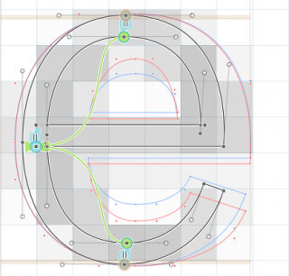
- First, you measure the widths of your vertical and horizontal stems and bowls and enter them in the fields for Vertical Stems and Horizontal Stems, respectively. Horizontal stems are the thicknesses of the crossbars of lowercase e and uppercase A, and the height of the serifs. A vertical stem is the width of the stem of a lowercase n or an uppercase H, or the vertical parts of an uppercase O.
- Take as few values as possible, and merge values that are close to each other into one value. That is, because at very low resolutions, you want similar stems to have the same numbers of pixels. In the end, you should have no more than two H and two V values, if possible only one each. In the very, very worst case, you can have three, if they are very far apart.
- If you enter more than one value, the first stem value you enter is more important, so choose it wisely. In the most cases, that will be your lowercase stem width, but of course, what is most important for your font depends on the design intention.
Repeat this step for every master you have in your font. Make sure the number and order of the stem values is compatible throughout all masters, so that interpolation can take place.
Alignment zones
An alignment zone is an area into which many shapes reach that have a similar-but-not-quite-the-same height (or depth, for that matter). Think straight edges, cupped serifs, and overshoots of round shapes:

At a low resolution, you want all these shapes to stop at the same pixel heights. In other words, you want sharp edges, and the overshoots suppressed. Anything that needs to be flattened (‘aligned’) to a sharp edge must be encompassed by a zone.

A zone has a position and a size. The position is the flat edge, the size should be large enough to include everything that is supposed to be flattened during overshoot suppression. Shapes reach the position or beyond the position by no more than the size of the zone. Note that the size is positive where the overshoot goes above flat edges (e.g., at the x-height, cap, small cap, shoulder or ascender height, or the top of superior and inferior figures), and negative where the overshoot goes below flat edges (e.g., at the baseline and descender, or the bottom of superior and inferior figures).
- Make sure your vertical metrics are set right: ascender, cap height, x-height, descender. The values entered here should ignore overshoots. When in doubt, pick the value closer to the baseline.
- If you have small caps, you may want to add the custom parameter
smallCapHeightand enter their height as parameter value. - For Indic and Arabic fonts, you can add a
shoulderHeightparameter for an additional alignment zone. - Now, press the Update button (the grey circled arrow) next to the Alignment Zones field. Glyphs will try and guess the values based on your vertical metrics and the actual overshoots in your font master. For the overshoots, it will measure a few key glyphs such as the lowercase o, f, g, the uppercase O and smallmcap o.sc. If those are not present, the size will default to 16.
- It’s a good idea to check if Glyphs guessed the zones right. So quickly step through your glyphs and see if there’s an overshoot that misses its zone. If you have the View > Show Metrics (Cmd-Shift-M) option activated, Glyphs will display alignment zones as beige areas, and highlight nodes in zones.
- When you adapt your zones, keep them as small and tight as possible. As a rule of thumb, a zone should not be larger than 25 units.
- You can have up to 6 top zones (positive sizes), and 6 bottom zones including the baseline zone (negative sizes). As soon as you have any zones, one of them must be the baseline zone.
- The obligatory baseline zone must be positioned at zero and have a negative size.
- Zones must never overlap. There must also be at least one unit distance between any two zones. (To be more precise, the distance must be at least 1 + 2 × blueFuzz. See the blueFuzz chapter further below for details.)
Again, repeat these steps for all the masters in your font. Make sure number and order of zones are the same throughout all the masters. Since zones must not overlap, one zone must never ever bypass another in interpolation.
A few tips:
For verifying the consistency of letter heights, consider the ShowTopsAndBottoms plug-in. Install it through Window > Plugin Manager and after an app restart, activate it via View > Show tops and Bottoms. It helps spot letter bounds exceeding zones:

Mark Frömberg (@mark2mark) has written a script for setting all zones at once. Find it in his script repository under Font > Set Size for Alignment Zones.

If you have a File > Font Info > Other Settings > Subdivision setting other than 1 (i.e., if you use decimals in your coordinates), you will have to increase the size of each zone by one unit in both directions. E.g., an x-height zone at position 500, size 15 will have to shift to position 499, size 17. Only the baseline zone must remain at position zero. In the mekkablue scripts repository, you will find the script Hinting > BlueFuzzer that helps you achieve exactly that, in case you need it:

The name of the script stems from the blueFuzz function described further below. In the same repository, you will find more useful scripts in the Hinting submenu.
Apply autohinting
Now that you are all set, you can actually execute the autohinting by enabling it in the File > Export dialog. Of course, since PostScript autohinting is a PostScript technology, it applies to CFF fonts only, and not to TrueType fonts. So, you will want to disable the TTF option as well:

You can also force autohinting on or off, overriding the export dialog setting, with a Autohinting custom parameter in File > Font Info > Instances.
That’s it! Not so bad actually.
Testing hinting
Now, export your font with the Autohint option enabled. You can test your hinting in applications that have a renderer that respects PostScript hints. Mac OS X generally ignores hinting, so you need to resort to Adobe applications. I recommend InDesign.
To get a better view at the pixels, you can use the Mac’s built-in screen zoom: Go to System Preferences > Accessibility > Zoom, and there, turn on the Use scroll gesture option, and turn off Smooth images:

Now you can hold down Ctrl key, or whichever modifier key combination you set in the scroll gesture pop-up, and use the scroll wheel to zoom in and out, effectively magnifying the screen pixels. On a MacBook trackpad, you can scroll by swiping two fingers up and down.
To give you an example, here’s what the Typejockeys’ Henriette looks like in InDesign without hinting:

Same font, same text, same app, but this time with hinting:

Note that the text appears crisper, there is less fuzziness, and the stems as well as the heights of the letters appear more consistent.
blueScale
In File > Font Info > Font, you can add the blueScale custom parameter for controlling the font size until which overshoots are suppressed. More precisely, blueScale controls the PPM size below which zones are flattened. In other words: at which pixel size overshoot suppression stops. At blueScale size and larger, overshoots inside alignment zones are displayed with at least one pixel. The blueScale value is calculated as (PPM size × 72 ÷ 300 − 0.49) ÷ 240. The maximum PPM size possible depends on the size of your alignment zones. It is calculated as follows: (0.49 + 240 ÷ size of largest zone in units) ÷ 72 × 300.
Note: PPM stands for Pixels per em and represents the font size in pixels, meaning the amount of pixels used for displaying one em, hence the name. By default, one em is 1000 font units. However, you can set a different value in File > Font Info > Font > Units per Em. The PPM value is equivalent to the point size at 72 ppi, which happens to be the resolution macOS and Adobe apps assume for non-Retina displays.
Example: Your largest zone is 18 units deep. That means that theoretically, overshoot display can be delayed until a size of (0.49 + 240 ÷ 18) ÷ 72 × 300 = 57 PPM, in other words, overshoots can be suppressed for all sizes up to and including 56 PPM. Let’s say, you want to suppress overshoots until 40 PPM, so that overshoots are visible at all sizes 41 PPM and larger. This size is possible because it is less than the 56/57 PPM we just calculated, i.e., we can suppress overshoots until 56, but only want to do so until 40 PPM. So, all you need to do is set your
blueScaleparameter to blueScale value corresponding to the first pixel size that should display overshoots with at least 1 pixel: (41 × 72 ÷ 300 − 0.49) ÷ 240 = 0.03896.
The mathematical formulas scaring you? No problem, here is a handy chart that helps you find the right blueScale value for your font (instructions below):
| Overshoot display starts at PPM (=point size at 72ppi) | Font size at 96ppi (Windows) | Font size at 144ppi (Retina) | Maximum size for alignment zones | blueScale value in Font Info > Font |
|---|---|---|---|---|
| 20 px | 15 pt | 10 pt | 55 u | 0.01796 |
| 21 px | 16 pt | 10 pt | 52 u | 0.01896 |
| 22 px | 16 pt | 11 pt | 50 u | 0.01996 |
| 23 px | 17 pt | 12 pt | 47 u | 0.02096 |
| 24 px | 18 pt | 12 pt | 45 u | 0.02196 |
| 25 px | 19 pt | 12 pt | 43 u | 0.02296 |
| 26 px | 20 pt | 13 pt | 41 u | 0.02396 |
| 27 px | 20 pt | 14 pt | 40 u | 0.02496 |
| 28 px | 21 pt | 14 pt | 38 u | 0.02596 |
| 29 px | 22 pt | 14 pt | 37 u | 0.02696 |
| 30 px | 22 pt | 15 pt | 35 u | 0.02796 |
| 31 px | 23 pt | 16 pt | 34 u | 0.02896 |
| 32 px | 24 pt | 16 pt | 33 u | 0.02996 |
| 33 px | 25 pt | 16 pt | 32 u | 0.03096 |
| 34 px | 26 pt | 17 pt | 31 u | 0.03196 |
| 35 px | 26 pt | 18 pt | 30 u | 0.03296 |
| 36 px | 27 pt | 18 pt | 29 u | 0.03396 |
| 37 px | 28 pt | 18 pt | 28 u | 0.03496 |
| 38 px | 28 pt | 19 pt | 27 u | 0.03596 |
| 39 px | 29 pt | 20 pt | 27 u | 0.03696 |
| 40 px | 30 pt | 20 pt | 26 u | 0.03796 |
| 41 px | 31 pt | 20 pt | 25 u | 0.03896 |
| 42 px | 32 pt | 21 pt | 25 u | 0.03996 |
| 43 px | 32 pt | 22 pt | 24 u | 0.04096 |
| 44 px | 33 pt | 22 pt | 23 u | 0.04196 |
| 45 px | 34 pt | 22 pt | 23 u | 0.04296 |
| 46 px | 34 pt | 23 pt | 22 u | 0.04396 |
| 47 px | 35 pt | 24 pt | 22 u | 0.04496 |
| 48 px | 36 pt | 24 pt | 21 u | 0.04596 |
| 49 px | 37 pt | 24 pt | 21 u | 0.04696 |
| 50 px | 38 pt | 25 pt | 20 u | 0.04796 |
| 51 px | 38 pt | 26 pt | 20 u | 0.04896 |
| 52 px | 39 pt | 26 pt | 20 u | 0.04996 |
| 53 px | 40 pt | 26 pt | 19 u | 0.05096 |
| 54 px | 40 pt | 27 pt | 19 u | 0.05196 |
| 55 px | 41 pt | 28 pt | 18 u | 0.05296 |
| 56 px | 42 pt | 28 pt | 18 u | 0.05396 |
| 57 px | 43 pt | 28 pt | 18 u | 0.05496 |
| 58 px | 44 pt | 29 pt | 17 u | 0.05596 |
| 59 px | 44 pt | 30 pt | 17 u | 0.05696 |
| 60 px | 45 pt | 30 pt | 17 u | 0.05796 |
| 61 px | 46 pt | 30 pt | 16 u | 0.05896 |
| 62 px | 46 pt | 31 pt | 16 u | 0.05996 |
| 63 px | 47 pt | 32 pt | 16 u | 0.06096 |
| 64 px | 48 pt | 32 pt | 16 u | 0.06196 |
| 65 px | 49 pt | 32 pt | 15 u | 0.06296 |
| 66 px | 50 pt | 33 pt | 15 u | 0.06396 |
| 67 px | 50 pt | 34 pt | 15 u | 0.06496 |
| 68 px | 51 pt | 34 pt | 15 u | 0.06596 |
| 69 px | 52 pt | 34 pt | 14 u | 0.06696 |
| 70 px | 52 pt | 35 pt | 14 u | 0.06796 |
| 71 px | 53 pt | 36 pt | 14 u | 0.06896 |
| 72 px | 54 pt | 36 pt | 14 u | 0.06996 |
| 73 px | 55 pt | 36 pt | 14 u | 0.07096 |
| 74 px | 56 pt | 37 pt | 13 u | 0.07196 |
| 75 px | 56 pt | 38 pt | 13 u | 0.07296 |
| 76 px | 57 pt | 38 pt | 13 u | 0.07396 |
| 77 px | 58 pt | 38 pt | 13 u | 0.07496 |
| 78 px | 58 pt | 39 pt | 13 u | 0.07596 |
| 79 px | 59 pt | 40 pt | 12 u | 0.07696 |
| 80 px | 60 pt | 40 pt | 12 u | 0.07796 |
Instructions: First, you need to know until which pixel size (PPM) you want to suppress overshoots (leftmost column). The PPM size is equivalent to the point size on non-Retina Mac screens or the point size at 100% zoom in Adobe apps on non-Retina screens. For reference, I added columns for font sizes at 96 ppi (Windows apps) and 144 ppi (Mac and Adobe CC on Retina). Then, you need to check if the largest alignment zone in File > Font Info > Masters does not exceed the value in the column for the maximum zone size. If everything checks out, you can use the blueScale value in the rightmost column as a custom parameter in File > Font Info > Font. If, however, your largest alignment zone is bigger than the maximum size in the same row, you have to move up, to the row where your zone size matches the maximum size, and take the blueScale value from there.
Example: You want to suppress overshoots until 39 pt on Windows, and your largest zone in File > Font Info > Masters is 21 units deep. You go look in the second column, font size at 96 ppi, for the row that says 40 pt, because this is the first size where overshoots kick in. We even have two of those in our chart. Either will work. If you go for the one with the larger PPM, it will suppress the overshoot in a pinch, while with the smaller PPM, the overshoot may be visible a little sooner. In this example, I go for 54 pixels because I am cool with a little more overshoot suppression. But alas, the maximum alignment zone possible is 19 units. So we either adapt the design of our font in order to keep overshoots flattened until 39 pt on Windows. Or we compromise, and pick the next possible blueScale that allows 21-unit deep zones. And that would be the row with a PPM of 49 pixels or 37 pt at 96 ppi.
blueShift
blueShift is a parameter for suppressing small overshoots (e.g., on small figures, inferiors or serif cups) beyond the font size indicated by blueScale. It is measured in units, default value is 7. It is considered good practice to enter the depth of your serif cups or small overshoots plus one unit. Anything smaller than blueShift is suppressed longer than other, bigger overshoots.
Or more precisely, at a PPM size beyond the blueScale size, overshoots inside an alignment zone are displayed:
- if they are equal to or larger than
blueShift(normal overshoots), or - if they are smaller than
blueShiftbut larger than half a pixel (small overshoots).
Small overshoots become larger than half a pixel at a PPM size of 500 ÷ (overshoot size in units). Again, a quick chart:
| blueShift (overshoot in units) | Half pixel at PPM (72ppi) | size at 96ppi | size at 144ppi |
|---|---|---|---|
| 1 u | 500 | 375 | 250 |
| 2 u | 250 | 187 | 125 |
| 3 u | 166 | 124 | 83 |
| 4 u | 125 | 93 | 62 |
| 5 u | 100 | 75 | 50 |
| 6 u | 83 | 62 | 41 |
| 7 u | 71 | 53 | 35 |
| 8 u | 62 | 46 | 31 |
| 9 u | 55 | 41 | 27 |
| 10 u | 50 | 37 | 25 |
| 11 u | 45 | 33 | 22 |
| 12 u | 41 | 30 | 20 |
| 13 u | 38 | 28 | 19 |
| 14 u | 35 | 26 | 17 |
| 15 u | 33 | 24 | 16 |
| 16 u | 31 | 23 | 15 |
| 17 u | 29 | 21 | 14 |
| 18 u | 27 | 20 | 13 |
| 19 u | 26 | 19 | 13 |
| 20 u | 25 | 18 | 12 |
Example:
blueScaleis set to suppress overshoots until 32 PPM,blueShiftis 6 units, overshoots are 12 units deep. Some stroke endings are slightly slanted and extend just 5 units below the baseline. So we add a custom parameter calledblueScalein File > Font Info > Font. Between 0 and 32 PPM, the baseline will be kept completely level. Starting at 33 PPM, the overshoots will kick in with one pixel. But the slanted stroke endings will stay flat, because 5 units do not cover half a pixel until 100 PPM.
blueFuzz
In File > Font Info > Font, you can also add a parameter called blueFuzz. What it does is it extends your alignment zones in both directions (upwards and downwards) by the amount of units specified in the parameter value.
Example: Say you have an alignment zone positioned at a height of 500 and with a size of 12 units, so it effectively reaches everything from 500 to 512. A blueFuzz value of 1 would extend that zone by one unit at the bottom and one unit at the top, so it would reach everything from 499 to 513.
Now, why would you do such a thing, and not simply extend the actual values of the zone itself? After all, in the example above, we could simply set the position to 499 and the size to 14, right? Well, the one good reason is to keep the zone from snapping one pixel too low at certain pixel sizes. For instance, at a size where one pixel is as high as 27 units, a zone at 499 would snap to (499 ÷ 27 = 18.48148 ≈) 18 pixels. If we keep it at 500 and use the blueFuzz value of 1 instead, the x-height stays at (500 ÷ 27 = 18.51852 ≈) 19 pixels.
If you think that this kind of nitpicking is a bit over the top, especially for the relatively rare cases where this actually would make a difference, well, no problem, delete the parameter or deliberately set it to zero. After all, your client does probably not pay for it and will probably never even notice. Also, Adobe officially recommends against its use in shipping fonts, and only recommends it for testing purposes, if at all.
However, we have no evidence of a font malfunctioning if it has blueFuzz set to something greater than zero, and perhaps you do come across a situation where you can actually sensibly apply it. In that case, be advised that there is one consequence for your alignment zones: There must be a distance of at least 2 × blueFuzz + 1 between any two zones. So you may end up shifting your zones around, and that is probably not worth it. But the decision is yours, of course.
Family alignment zones
Say, you are all done and all the fonts of your font family look good, all the vertical heights are sharp, all the stems are consistent, everything is great. And then you get the crazy idea to set a waterfall of your Regular in InDesign, and for the fun of it, you set every other in the Bold. If your fonts are style-linked properly, you can toggle between Regular and Bold by pressing Cmd-Shift-B. (Read more about Style Linking in the Naming tutorial.) And then you see something like this:

You see the 8pt line where the bold’s x-height is a pixel higher? Ooh, we don’t want that, do we? What we’d need is alignment zones for the whole font family, not just for each font individually. Turns out, there is such a thing. It is called Family Alignment Zones, and you set it up as a custom parameter in File > Font Info > Font (Cmd-I):

In most cases, it is a good idea to reduplicate the alignment zones of the most important font in your family: usually of the Regular or Book instance. A rasterizer will then try to align all weights if the height difference between the individual weight and the family alignment is less than one pixel.
Pro tip: If you do not have a Regular master (e.g., because your are interpolating from Light to Bold), and want to know what the zones of your Regular would be like, you can deactivate all instances except for the Regular, and run File > Generate Instances. This creates a new Glyphs file with the Regular instance as master. You can then proceed to read out the zones from File > Font Info > Masters.
Now that we added an appropriate Family Alignment Zones parameter, we can export again and test in InDesign. So let’s see if it helped:

Fantastic, the 8pt Bold now snaps to the same x-height as its Regular counterpart! If you are not so lucky, and your fonts do not snap to the same pixel height, consider experimenting with positions, and perhaps also the sizes of the family zones.
Manual hinting as last resort
If some glyphs keep misbehaving, first check if they fulfil all the criteria listed above. And fix your outlines and settings where necessary. Still no dice? You may have to proceed to manually hint some glyphs, because the autohinter simply cannot always produce reliable results in all cases, and then it is you who has to take over. But you only have to do this in the first master of the glyphs that need special attention. And usually, there are only very few of those. If at all.
SAMPLE FONTS: HENRIETTE BY MICHAEL HOCHLEITNER, AND SEPHORA SANS BY MUCCA/SCHRIFTLABOR
Update 2015-3-30: partial rewrite, better screenshots.
Update 2016-02-19: screenshot Glyphs 2.
Update 2016-12-03: added Accessibility System Preferences.
Update 2017-05-27: large rewrite, added custom parameters, plug-ins, scripts, and screenshots.
Update 2018-08-21: added blueScale and blueShift tables, some rewrites around those; added the blueFuzz chapter, minor rephrasings here and there.
Update 2019-03-04: removed wrong columns in blueShift table.
Update 2019-03-28: corrected the number of possible zones, and emphasised the necessity of the baseline zone.
Update 2020-04-03: changed ‘four’ for 4 for a better coherence.
Update 2020-07-31: corrected the word bowls.
Update 2022-07-29: updated title, related articles, minor formatting.