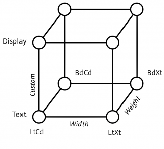


Switching shapes
Sometimes, a shape needs to change when it interpolates from light to bold. Glyphs offers two solutions.
Keeping the full complexity of shapes with many strokes can be hard during interpolation. Typically, you will run into trouble at one point when you interpolate from light to bold, or from wide to narrow. That is because, simply put, you gradually run out of space, and at some point, you will not be able to fit in every part of the glyph anymore. Among the usual suspects, you will find many currency signs, with their strokes, slashes and bars that go across the whole shape. Take the dollar sign as an example:
But it is not only currency signs. You will also sometimes need to change the structure of other glyphs, such as letters, as they grow bolder. In the Latin script, that is often the case for structurally dense letters like a, e, g or w.
In all of these cases, simple linear interpolation will not suffice, and you will have to resort to changing the glyph structurally. In other words, you will make the glyph switch to a different interpolation. In Glyphs, you can achieve this in two ways: either with alternate layers in the same glyph, or with two alternate glyphs. Both ways have their advantages and disadvantages.
1. Alternate layers (‘bracket layers’)
The ‘alternate-layer approach’ involves setting up additional special layers that contain two things: firstly, the outlines for the alternate shapes of course, and secondly, extra information that says where exactly on the design axis the alternate layer shall be used instead of the master layer. Makes sense, doesn’t it.
Setting up alternate layers
This is what our dollar sign looks like now, with View > Show Master Compatibility (Ctl-Opt-Cmd-N) turned on:

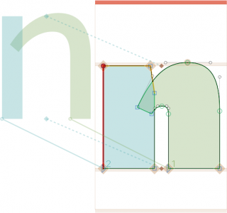
You see, it interpolates just fine. The only problem we have is that the shape clogs up at the bold end of the weight axis. So, in this example, we need to add alternate layers with a ‘broken’ vertical bar, which better fits in bold interpolations.
So let’s go and set up alternate layers for our dollar glyph:
-
For each master, create a duplicate layer: select the master in the Layers palette and click on the plus button in the bottom left of the palette. Layer duplicates with the current time stamp as names.
-
For each of the layer duplicates, right-click the layer name, and pick Alternate from the context menu:

This will officially turn them in alternate layers with an empty pair of square brackets
[]in their names. -
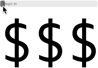
For each alternate layer, define its scope by double-clicking its name and picking the scope in design coordinates. Make sure all corresponding alternate layers have the same scope. E.g., if you want the alternate design to kick in at interpolation value 100, type
100in the minimum scope for the Weight axis of each of the alternate layers:Each axis has its range indicated on the right side of the scope settings. The limits you define here must stay inside the range, of course. In the screenshot above, the Weight axis ranges from 85 to 175, for example.


If we have done everything right, our Layers palette will look something like this:

Each of the master layers will be switched for an alternate layer beyond weight 100. Now, all we need to do is actually make the necessary changes in the outlines. In this case, we can simply use the Knife tool (Shift-E) to make two cuts in the vertical bar, and remove the superfluous middle part by double-clicking it with the Select tool (V) and pressing the Delete key. Of course, we need to keep the alternate layers compatible with each other, otherwise the interpolation will not work. A quick check with View > Show Master Compatibility (Ctrl-Opt-Cmd-N) gives us peace of mind:

On the left half, you can see the interpolation of the master layers with each other, in this case Regular at 85 and Bold at 175. On the right half, however, you can see the alternate layers, which both replace their respective alternate layers at interpolation value 100.
Okay, let’s see if actually works. You can either list all the instances in the Preview area by choosing Show all instances from the pop-up, or export a variable font and use one of the tools around, like Samsa or Font Gauntlet or, what I like to do is to run the mekkablue script Script > mekkablue > Test > Variable Font Test HTML right after export:
High five!
Again: what is important to note is that the values you enter in the alternate-layer UI are design coordinates, the actual interpolation values that correspond to the values you are using for your masters and instances in File > Font Info > Masters and Exports. That is, prior to correction with Axis Position and/or Axis Mappings parameters.
Reverse bracket layers
So far, so good. You have set up your alternate layers, the export works. Everything is fine, and we are happy. Then you switch to Font view (Cmd-Opt-1) and scroll to the dollar sign, still nice. But then, you switch through the masters with Cmd-1, Cmd-2, etc., and it hits you: In the bold masters, the ‘wrong’ dollar sign is shown:

That is because the bold dollar sign with the broken bar is an alternate layer on the second master, not the actual master layer. And in Font view, you will only ever see the master layer displayed. Duh. There are two possible approaches you can take to address this issue.
First, you can follow the ‘who cares’ approach: everything works, you are done, no more work needed, thank you and good bye. If this approach has your name written all over it, you can skip the rest of this chapter.
And then, there are ‘reverse bracket layers’. In that case, you open glyph in Edit view by double clicking it, or selecting it and choosing View > New Tab (Cmd-T). Switch to the bold master. Take a close look at the Layers palette, find the alternate layer with the ‘correct’ drawing on it, right click it, and choose Use as Master from the context menu:

The result: the master layer and the bracket layer switched places. The master layer now has the broken-bar dollar sign and is a bracket layer at the same time. The left-over layer with the full-bar dollar sign turned into a mere backup layer with the current date as its indicator:

That backup layer we need to turn into an alternate layer again. You know the drill: right click it, choose layer type Alternate from the context menu. It will be represented with bold square brackets again:

This time, however, you leave the values blank. Because its logic works the other way around in respect to the other bracket layers, we refer to it as a reverse bracket layer. And… switching masters in our Font view has just gotten a slightly better experience:
You need to decide for yourself if it was worth the effort or not, though.
Feature Variations
Whichever way you set up your alternate layers: what happens under the hood is that Glyphs will analyze your alternate-layer structure, and turn them into so-called ‘Feature Variations’. Those Feature Variations are OpenType substitution rules that substitute some glyphs for alternate versions at certain positions in the design space, or, in other words, at certain slider positions.
By default, those Feature Variations go into an OpenType feature called rlig Required Ligatures. It is a feature that is always on, and typically even works in environments that make it hard for users to access OpenType features, such as Microsoft Word (although we hope that the upcoming version will be much better in that respect).
However, no one says that Feature Variations need to be tied to rlig. If you know what you are doing, you might as well add them to a different OpenType feature. For this purpose, we go to File > Font Info > Font > Custom Parameters and add a new parameter called Feature for Feature Variations, in which we write the four-letter tag for the feature we want the Feature Variations to end up in:

In the screenshot, you can see rclt Required Contextual Alternates being used. It is just a random example, but could make sense if your font is intended for environments that support it.
Again, change the Feature Variations feature only if you really have a good reason, and you really know what you are doing. And do extensive testing on Windows, the Mac, and all kinds of web browsers. You have been warned.
The case with rvrn
You may have heard about rvrn Required Variation Alternates as a better place for Feature Variations. Is it really? Actually not. At first glance, the spec sounds like it is intended for it, but it really is not. You could still argue that it works in most cases, and you’d be right. However, not every app implements the specification properly, and I hate to be the one to tell you that Adobe apps are affected.
Now, what exactly goes wrong if it goes wrong? Well, the rvrn spec is pretty complex, it discusses substitution of ‘default glyphs, and that only default glyphs can be substituted by rvrn. However, the spec also says how (non-default) substituted glyphs are supposed to be processed, but that is where a few apps do not follow the spec, and in effect, Feature Variations will not work for non-default glyphs.
In Glyphs, default glyphs usually have a Unicode value assigned and no period or underscore in their name, e.g., eacute or seen-ar or alpha or soSo-thai. Whereas (non-default) substituted glyphs do not need a Unicode value because an OpenType substitution feature will switch them in. You recognize them at a glance by the period or underscore in their glyph name, e.g., eacute.sc or seen-ar.fina or alpha_alpha or soSo-thai.ss01. In other words, your alternate layers will not work for glyphs that require a substitution feature. They will not work for small caps, positional alternates, ligatures, stylistic sets, etc.
To be fair, fewer and fewer apps are affected by this mis-implementation, but it still remains a problem. So better pick rlig.
2. Alternate glyphs
In this scenario, you keep the two interpolations in two separate glyphs, e.g., dollar and dollar.bold. And you control the switching between the two shapes in File > Font Info > Exports for static fonts, and in File > Font Info > Features for variable fonts.

Setting up alternate glyphs
This is straight-forward. Just duplicate your dollar glyph (Glyph > Duplicate Glyph, Cmd-D) and change the name of the resulting duplicate from dollar.001 to dollar.bold.
It is a good idea to keep the glyph names the same until the suffix dot, and to choose a sensible suffix after the dot. Anything that makes sense to you will be fine. Though, do consider that you may be searching for or filtering out your alternate glyphs at some point, so it may be a good idea to keep the suffixes you use short and consistent. That way, you reduce the risk of typos and you can profit from wildcard expressions in custom parameters (see below).
In any event, once dollar.bold is established as a separate glyph, you can edit it the way you need it. Make sure it is compatible throughout all the masters you have in use.
Setting up static fonts
For each instance in File > Font Info > Exports, we need to:
-
determine if we need to switch in the alternate glyph or not; and if we do, we add a Rename Glyphs parameter with
dollar=dollar.boldin its value, additional renamings go on consecutive lines, -
always prevent the leftover alternate glyph with a Remove Glyphs parameter and
dollar.boldin its value, additional removals go on consecutive lines.

In other words, every instance will have the Remove Glyphs parameter. But only the bold instances have the Rename Glyphs parameter. Keep in mind that you can batch-add and batch-edit parameters for multiple instances at once if you select the respective instances in the sidebar on the left. Also keep in mind that you can add multiple removals or renamings on multiple lines of the same parameter. I.e., you do not need to add five parameters for removing five glyphs, but rather, one parameter with five lines of glyph names suffices.
If you have done everything right, the parameters of a bold instance may look like this:

That’s it. Now your static font exports work already. And their glyph set will be ‘clean’, i.e., no unused stray alternate glyphs in the font. And no puzzled users asking you what these extra cells in the glyph palette are for.
Setting up variable fonts
In a variable font, both the default and the alternate glyphs must be present in the export. So, you do not remove or rename any glyphs in the respective variable font settings in File > Font Info > Exports. An OpenType feature will switch the defaults to the alternates once a slider crosses a threshold value specified by you. In the ‘alternate layers’ approach described further above, Glyphs derived that OpenType feature for you. Now, you will create that feature for your feature variations yourself, by writing feature code.
‘OMG OMG OMG’, I hear you gasp, ‘Coding? Me?’ Don’t worry though, it is very easy and logical.
First, we add a new feature in File > Font Info > Features. Which one? Same choice as further above: usually you will want a feature that is always on, we recommend rlig as the obvious choice. Of course, you can add feature variations to any feature, even to multiple features at the same time. Whatever makes the most sense to you. For this example, I will add an rlig Required Ligatures feature:

In the code, we will start with something called ‘preprocessor code’:
#ifdef VARIABLE

#endif
Anything between these two lines will be reserved for OTVar export, and not affect static exports. Read ifdef VARIABLE as ‘if the font is defined as variable font, then do the following.’ You get the idea.
Let’s go on. Now, we need to substitute dollar for dollar.bold, but only under the condition that the Weight slider is in a certain area. And: surprise, it is pretty easy. See if you can figure it out yourself:
#ifdef VARIABLE

condition 127 < wght < 175;
sub dollar by dollar.bold;

#endif
In plain English, this means that once the slider passes the Weight value 127, all the substitutions below (or until the next condition) will be carried out, in this case only the dollar sign. Again, we will use design coordinates, i.e., the coordinates you use in Glyphs before correction through Axis Mappings and Axis Location parameters. A condition statement needs to mention the axis tag, wght in this case, between two axis values: 127 < wght < 175. If one of them is the actual limit of the axis, in this case 175, you can also leave it out:
#ifdef VARIABLE

condition 127 < wght;
sub dollar by dollar.bold;

#endifIf you need to make the condition dependent on multiple axes, concatenate them with commas. See the second block here:
#ifdef VARIABLE

condition 127 < wght;
sub dollar by dollar.bold;
sub naira by naira.bold;
sub won by won.bold;
sub colonsign by colonsign.bold;

condition 105 < wght, wdth < 90;
sub dollar by dollar.bold;
sub naira by naira.bold;
sub won by won.bold;
sub colonsign by colonsign.bold;

#endif
Like above, the substitutions happen once the Weight slider crosses the value of 127. Just that this time, the first condition block covers more of the usual suspects, currency signs like naira, won or colonsign.
The second condition block says that the substitutions also happen at 105 and above, but only if the Width slider is below 90. This example assumes that a Width value of 100 refers to a ‘normal’ width. Assuming that 75 is the lower width boundary, indicating a condensed width that will produce line lengths approximately three quarters of the ‘normal’ width, the conditional substitutions can be visually presented like this:

See? If you write your own conditional code, you can have more complex setups. To some extent you can recreate this with alternate (bracket) layers, but it will be more of a hassle, and you will hit a limit at one point. That is why the extra control in this approach can be worth gold. In any event, if you have done everything right, your Font Info > Features window may look like this:

Snippets
Oh, and you are in for a treat: snippets! There is a default snippet called ‘OTVAR Feature Variations’, which will add some sample code for your editing pleasure:

Access them through the snippet menu in the bottom right of the window. Of course, you can add your own snippets.
What to choose when: alternate glyphs or layers?
I guess it depends on the kind of type designer that you are. Personally I prefer the approach with alternate glyphs, because I have more control and it is much easier to change the break points for many glyphs at once in the feature code. Imagine having to go into the alternate layers of each glyph… ugh. But on the other hand, alternate layers are easier to set up in the first place.
Well, I guess you can pick your own winner. Here is a summary of pros and cons that may help you along the way:
| Alternate layers | Alternate glyphs | |
|---|---|---|
| Advantages | 💚 quick for simple switches 💚 does not clutter Font view with alternates 💚 works for both static and variable exports | 💚 all variants are visible and easily manageable in Font view 💚 allows more complex switching along multiple axes 💚 more control over feature variations 💚 can change condition thresholds more easily |
| Disadvantages | 😬 more difficult to keep the oversight in Font view 😬 may be too difficult to set up for multi-axis interpolations | 😬 need to manage more glyphs 😬 need to handle instances (for static fonts) and feature code (for variable fonts) separately |
Update 2021-05-26: added Reverse bracket layers; Alternate Layers text corrections.
Update 2021-05-27: replaced user coordinates with design coordinates in all examples, better rvrn explanation.
Update 2021-06-29: corrected misleading wording (‘glyphs’ not ‘layers’), thx Jeff!
Update 2021-07-29: removed space between hashtag and ifdef or endif, thx Craig!
Update 2022-07-23: updated screenshot with condition code (the old one had a typo).