Crazy Otto’s Back In Town album art
![Crazy Otto's Back In Town is an album recorded by German jazz and pop pianist Fritz Schulz-Reichel (1912–1990) aka Crazy Otto, or Der schräge Otto. [More info on Discogs]](https://assets.fontsinuse.com/static/use-media-items/120/119477/upto-700xauto/5f89e4f9/50243365017_c2407d2f1e_4k.jpeg)
Crazy Otto’s Back In Town is an album recorded by German jazz and pop pianist Fritz Schulz-Reichel (1912–1990) aka Crazy Otto, or Der schräge Otto. [More info on Discogs]
This cover design uses an early typeface design by Ed Benguiat. The highly prolific and influential lettering artist and type designer died this week at the age of 92.
The animated face with long triangular serifs and a bouncing baseline is called Benguiat Jumpy Latin. It must have been added to Photo-Lettering’s library some time before 1958, when this album was released. In 1962, Benguiat joined Photo-Lettering, Inc. as typographic design director – a position he held for many decades. Before that, he had already submitted several type designs to the composition studio in New York City.
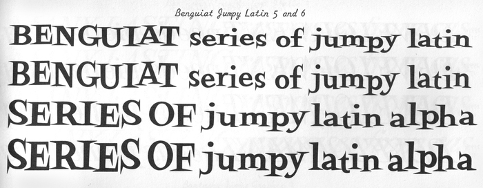
Benguiat Jumpy Latin as shown in Photo-Lettering’s Alphabet Thesaurus Vol. 2 from 1965.
In an interview conducted by Ilene Strizver for TDC’s Type Legends series, Benguiat recounts the beginnings of his career as type designer. One day, Emil Schaedler, his teacher at the Workshop School of Advertising Art, had shown a Spencerian script typeface in class.
I decided to draw one, too. So I drew the first script. It took me about three days – it took [Schaedler] three years of whatever – and I took it to Photo-Lettering and showed it to Ed Rondthaler who was the president of Photo-Lettering, and he said “Beautiful! We’ll take it.” Not realizing they’d take anything … It wouldn’t make any difference. I was so proud that I called it after my wife Norma Script. And the second one after that was … a man at J. Walter Thompson called me up and he said to me: “Would you like to design a font for the Ford Truck Company?” And I said I’d be thrilled, and I named that one after my son called Johnnie. They’re both ugly, they’re both disgustingly ugly. It was really early ugly, and I know from ugly.
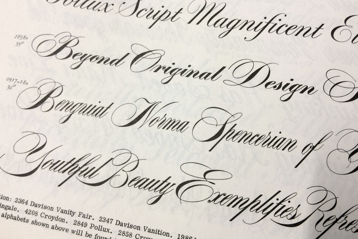
Ed Benguiat’s first typeface design, Benguiat Norma. The line below (“Youthful Beauty”) shows Normalock, a later addition with different capitals.
Many more and many better typefaces followed. Photo-Lettering’s One Line Manual of Style from 1971 lists 60 designs with more than 180 styles. And that’s just those credited to his name. Benguiat also had a hand in many other faces in the PLINC library. For example, he redrew classics like Franklin Gothic, Helvetica, or Futura, greatly expanding the original designs with new weights, widths and other variants.
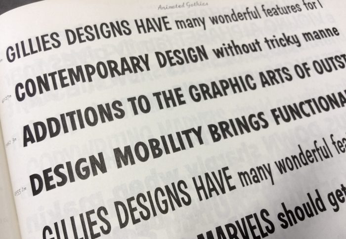
Benguiat Johnnie (“Design mobility brings …”), the second of Ed Benguiat’s numerous designs, as shown in the Animated Gothics section of Alphabet Thesaurus Vol. 2.
Around the same time, the International Typeface Corporation was founded. ITC became the first independent licensing company for type designers, and Ed Benguiat was their vice president. The typefaces he designed for ITC were no longer available only to typesetting customers in New York, but were distributed all over the world, and remain popular to this day. Benguiat’s designs from this era include ITC Souvenir, ITC Korinna, ITC Avant Garde Gothic Condensed, ITC Lubalin Graph, ITC Benguiat, ITC Tiffany, ITC Bauhaus, ITC Bookman, ITC Caslon No. 224, ITC Edwardian Script, ITC Benguiat Gothic, ITC Barcelona, and ITC Modern No. 216, to name just the most successful ones. More recently, he collaborated with House Industries on a series of display fonts known as the Ed Benguiat Font Collection.
Ilene Strizver has dubbed him the Man of a Thousand Faces. Whether this number is accurate or not, the type world certainly has lost a giant. Rest in peace, Ed Benguiat.
See more Uses of typefaces designed by Ed Benguiat on Fonts In Use.
Formats
- Album Art (3439)
Topics
- Music (5197)
Designers/Agencies
- unknown (3287)
Tagged with
- Decca Records (35)
- album records (2182)
- Fritz Schulz-Reichel (1)
- vinyl records (2754)
- 1950s (280)
- bouncing baseline (292)
- dixieland (13)
- ragtime (5)
- vinyl records (2754)
- Ed Benguiat (1)
Artwork location
- United States (8318)
- New York City (2338)













2 Comments on “Crazy Otto’s Back In Town album art”
This is such a good tribute! The Alphabet Thesaurus books are a thrill to look at: the number of little asides and tips dotted around the pages is thrilling; they really communicate the sense that they’re really, really excited by all this.
Thank you! Glad you like it. I agree: Photo-Lettering’s publications are top notch. The only gripe I have with the Alphabet Thesauruses are the endless repetitions of the samples with stretched and slanted variants. I get that this was a unique selling point for phototype and had to be emphasized accordingly. But just imagine how much more compact these tomes could be without that, or how much more other faces and characters they could have shown instead!