Description
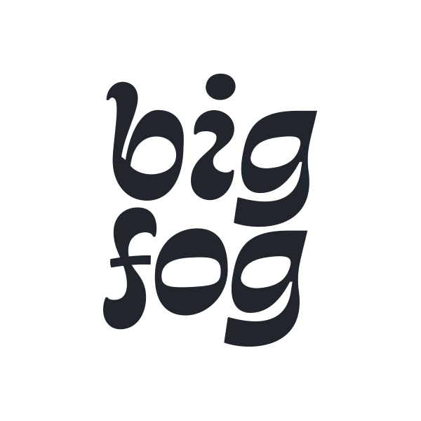
Gayot New is a contemporary interpretation of Jean-Pierre Gayot’s eponymous typeface of the 1970’s. The original Gayot was released as dry-transfer lettering in 1973 by Mecanorma as a winner of their International Type-Style Contest. In addition to revised proportions, this new interpretation sees the addition of uppercase characters, extended Latin character support, and new symbols and punctuation.
Where it deviates from its inspiration, it remains the same in tone; sorta futuristic, sorta retro, a little bit ugly, and a whole lot of fun. Use it big, short, and loud. Gayot New is perfect for logos, call-outs. short headlines, and names on the backs of football jerseys or budget space travel vessels.