


It was said to be the greatest collection of 20th century typography ever assembled. How it wound up in the trash near Bloor Street is a forgotten bit of Toronto history.
Book jackets, record covers, newspapers — “even a Playboy cover,” — all of these beguiling bits of type, painstakingly crafted, came to Toronto from around the world, for the prestigious Typomundus 20 competition.
After the judging, the collection of 10,000 items was stored in a “dingy” Bloor St. East rooming house, and when someone forgot to pay the rent, the items were thrown out by the landlord, who mistook the boxes for junk.
“And the only collection of its scope ever attempted went to the incinerator in a truck marked, “Bill’s Pick Up,” wrote Star reporter Robert Johnstone in 1965.
Hugh Michaelson was home with the flu when the story ran and can still remember the headline: “Oh what a typographical error!”
As the executive director of the competition, he had been fielding calls from the Toronto Telegram, Canadian Press and a German newspaper, asking if the story in the Star — where he worked as the art director — was true.
“Now I’m done for it,” he thought.
TYPOGRAPHY IS so ubiquitous that many of us don’t notice it. You may see a heritage building and read about the architect, but you might not know the history of a commonly used font like Times New Roman, or recognize the Highway Gothic font on Ontario’s road signs, designed for maximum legibility and fast recognition.
Typography, as defined by the Oxford dictionary, is the art or work of designing how text will appear when it is printed.
The “rumblings” of what would become a burgeoning Canadian scene started after the Second World War, says Rod McDonald, who has designed several typefaces but was a “bit too young” to be part of Typomundus 20.
“By the end of the ’50s into the ’60s — it’s a typical Canadian story, of course — we had a huge number of immigrants from both Germany and England who were highly skilled and well trained, and they’re the people that really put typography on the map in Canada,” McDonald says from his home in Nova Scotia.
One of these newcomers, Leslie “Sam” Smart, complained that Canadian printing was “where England was in the 1930s and where Switzerland and Germany were in the 1920s,” in an article in the Globe and Mail.
Smart was one of the designers who created the Society of Typographic Designers of Canada (TDC) in the late 1950s to improve the craft in Canada.
It was a time when corporations were becoming more design-conscious, and when it came to typography, there were only a select few who had the knowledge and access to the very technical process of composing metal blocks of type. It was both an art form and a skill — the strategic use of spacing, type and layout were transformative.
“What we do today seems so easy digitally,” says Errol Saldanha, a Toronto designer. “Any publication in those days was such a manually intensive thing.”
“Types manifest the riches of our souls … During thousands of years, with toil and trouble, forms were developed which rendered our world richer and more beautiful,” typographer Horst Erich Wolter wrote in Typomundus 20. “Typography is not merely the application of types. It requires a clear comprehension of content, which leads to an improved communication of words.”
Pat Gangnon was the first woman to join the TDC after she graduated in the early ’60s. Meetings were fun — they smoked and had a few drinks — it was the sixties, a Mad Men kind of scene.
“I felt honoured to be with all these people who were very good designers. They were really the front bumper of the movement in Canada,” she says. “They were a very determined crew. They were going to improve typography in Canada.”
Saldanha, who researched Canada’s design history, said many industry pioneers told him that Canada came to be considered leading edge in the ’60s.
“European magazines were showcasing what was going on here,” he says
In 1963, Aaron Burns and the New York-based International Center for the Typographic Arts (ICTA) called for entries for Typomundus 20, an exhibition to showcase the greatest typography of the 20th century. The jury consisted of a who’s-who of the design world — people who had designed pavilions for World’s Fairs, art directors for magazines, the director of advertising at CBS.
Judging was supposed to happen in New York, but at the height of the Cold War, U.S. officials refused entry visas for judges behind the Iron Curtain, “despite my pleas in person before State Department officials in Washington, D.C,” writes ICTA cofounder Klaus Schmidt, 86, in an email using Palatino typeface, designed by Typomundus judge Hermann Zapf.
“As a typographer,” Schmidt adds as a friendly aside to the reporter, “I have always preferred a classic, ‘warm’ Roman face. Your Arial is a ‘cold’, modern sans-serif.” (Monotype’s version of the ubiquitous Helvetica). Hermann, a good friend of mine, is now 96 years old!!”
With the Cold War putting an end to the New York venue, the show was moved to Toronto, where a dynamic typography community was keen to help, and Michaelson was put in charge as executive director. (Michaelson on Arial: “Yuck. Terrible.”) 10,000 entries were sent to seven assembly points around the world, and those were later catalogued, crated, and sent to Toronto.
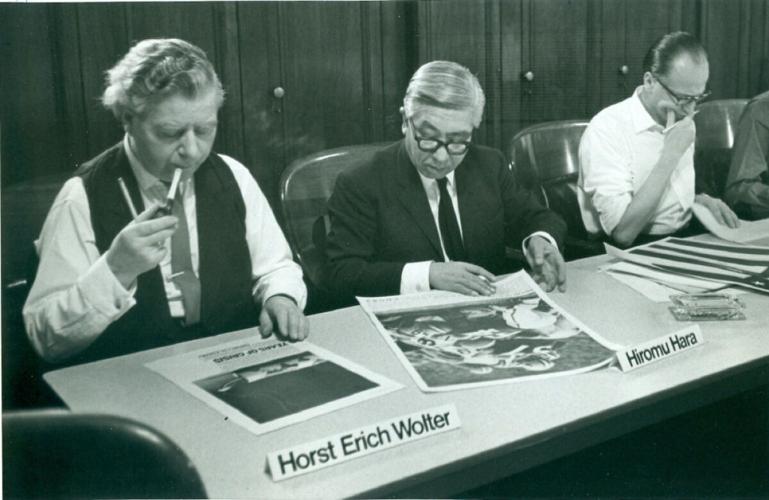
In October 1964, the judges spent 10 days at Toronto’s Board of Education building, cigarettes and pipes in their mouths, plumes of smoke frozen in the camera’s flash — so say the photos preserved at Massey College’s Roberston Davies Library. What they saw before them, they would later say, showed the technological advances of their times, the “cool and documentary” typography of the Swiss, the avant-garde entries from the 1920s, and the more clear and functional designs of their own era.
Gangnon, then in her 20s, was an interpreter for a French judge. She says a few of the judges were a “little haughty,” the kind who might look over your shoulder to see if there was someone more important around — but the majority were very nice.
German judge Anton Stankowski was a “lovely big guy,” who came back from a Toronto shopping trip with a Canada goose carving, saying “Canada Duck,” in his thick German accent. “We had one man from Zurich who had a heart attack during the show; he had to be hospitalized,” she says.
Every day, helpers laid out batches of items on long tables dotted with ashtrays, and the men walked around with handfuls of Smarties in their hands.
“We had a paper cup turned upside down, with a slot cut in it, and we gave these guys Smarties,” Michaelson said, laughing. “That was our voting system: you like it, put a Smartie in the cup.”
The 600 or so exhibits that received a majority vote of seven Smarties were to be included in the book Typomundus 20. Six exhibits out of the 10,000 received a unanimous 12-Smartie nod of excellence.
At his Oshawa home, 80-year-old Michaelson taps the book on his kitchen table, where the words are rendered in a strong, graphic font.
“Pistilli Roman,” he says with the quickness of a game show contestant.
Two of his designs are in the book, and he goes to retrieve the old newsprint from another room. A Toronto Daily Star page for Canada Day: half the page devoted to an illustration of a rose, the other half, a rectangle of text, sparse and elegant. The other winning entry was a piece for the entertainment pages.
“Hugh was a wonderful designer; he did some lovely work for the Star,” says Pat Gangnon, who remembers Michaelson in those days as a “real cowboy.”
“He was just outspoken, and very self assured,” she explains. “Somehow I think of him wearing working boots and taking big steps.”
In his kitchen in blue jeans and a gingham shirt, Michaelson returns to the Typomundus book and stops at a page: “Material not available” it reads, listing 17 books that were lost after the judging.
“There must have been a lot of Germans living there,” he says, veering back toward the disaster.
The committee had to catalogue the winners for the book, and stored all 10,000 entries, including approximately 600 of the winners, at an apartment near Bloor and Sherbourne.
The trouble came when the treasurer got “caught up in Christmas time,” and forgot to mail the rent, Michaelson explains. “A month after the cheque was due, he (the landlord) threw all the stuff out and rented it to a young lady.”
Hartley Robins, a lawyer who handled the rental for the landlord, told the Star in 1965 that the rent was paid until Dec. 12.
“On the 15th the landlord walked in. The door wasn’t even locked, he saw no one there, just some boxes in the room, and he moved them out into the hall and rented the room,” he told the Star in 1965.
Fifty years later, Robins doesn’t really recall the specifics. His father owned the buildings, and there were some tenants who hadn’t paid rent and abandoned their things.
“If they left things and didn’t pick them up, I think we kept them for a while and then threw them out — that’s what would have been the normal case,” he says.
“These beautiful archival copies of newspaper pages, and handmade books, and absolutely beautiful work,” recalls Gangnon, wistfully.
“Certainly nothing in there, if I recall, looked worth keeping,” Robins says.
The fire department ordered the boxes removed, and city garbagemen wouldn’t take them, so a cartage man was called to take them to the city incinerator, the Star reported in 1965.
Michaelson learned all this when Al Sudden, from Massey College, went to the room to pick up the “rejects” for the archives.
“My phone rings. It’s Al saying, ‘What the hell is going on? I go in there with a key to open it up and I walk in there, and it’s now a bedroom and there’s a naked lady asleep on the bed.’”
“The first thing that came out of my mind was probably a four-letter expletive,” Michaelson says of his reaction. “I got up there and I almost felt sick.”
“IT’S BEYOND comprehension how this could happen,” Aaron Burns, the director of the International Centre for Typographic Arts in New York, told the Star in January 1965, “just beyond comprehension ... ”
Michaelson remembers phoning Burns in New York.
“You’re going to have my resignation tomorrow,” he said.
“No we’re not,” Michaelson recalls him saying.
After the stories were published in Europe, there was one “irate contestant,” Michaelson remembers. And then, something unexpected happen.
“We started getting phone calls; the local residents had gone around and looked at all these piles of stuff and picked up what they wanted,” he says.
“A lot of them were accusing each other of taking it,” Gangnon says of the locals. “I went once … we had retrieved a lot of it out of the garbage. A lot of it had totally disappeared; whether it went into the garbage dump or what we don’t know.”
“They had fortunately photographed a lot of it beforehand,” she says.
Michaelson said they were able to rebuild with the material gathered from the locals. In addition, some entrants were able to resubmit copies of their work for the book.
It was finally published in 1966, missing 77 exhibits. A travelling show was exhibited in Canada, USA and many other countries around the world, to high acclaim.
“The ‘accident’ never really became too well known in typographic circles, except for being mentioned in the book and to those who had to submit replacements,” Schmidt writes.
For those who know of Typomundus 20, it is remembered as both a great achievement and an amazing disaster.
The calamity part of the event has become the stuff of lore: with various retellings, including a scramble through the trash, a dumpster dive, and the naked lady telling the Typomundus crew to “get the hell out.”
When asked if he’d like to put out a call for any German books found in the trash around Bloor and Sherbourne in 1965, Michaelson waves his arms back and forth.
“No, no, no,” he says. “I have enough as it is.”


To join the conversation set a first and last name in your user profile.
Sign in or register for free to join the Conversation