The Legend of Eisenhower’s Skinny ‘S’
How typeface designers made room in The New York Times for the general-turned-president’s long last name.
Last Wednesday night, I was hanging around at home when a mysterious tweet crossed the transom. “If anyone knows this it’s you,” the message said, with a link to another tweet that laid out a bit of a mystery: “Rumor says in the 1950s, NYTimes created a special skinny ‘S’ so they could fit ‘EISENHOWER SAYS’ in one-column heds. True...?”
I was immediately intrigued. My Twitter pal had thought to include me not because I’m an expert in typography (I’m not), but because I spend an inordinate amount of time haunting various newspaper archives. (Evidence here, here, here, and here.)
But I’d never heard the legend of the Eisenhower ‘S.’ The rumor, Adam Lisberg told me in a follow-up tweet, came from a now-defunct copyediting newsletter he’d read in 1997, which is somehow (astonishingly) still preserved online. Under the delightful heading, “THE BURNED-OUT NEWSPAPERCREATURES GUILD'S NEWSLETTER,” is this anecdote attributed to Al JaCoby—presumably the longtime San Diego newspaperman who died in 2008.
Here’s the key passage:
Jacoby retells the story of the New York Times, never one to say “Ike”
in a headline. But “EISENHOWER SAYS” was a half-count too long for a single column, even in that tightly condensed stuff they used. So the editors at the Gray Lady in 1952 sent off to Linotype’s foundry to have a custom brass matrix made, half a count shorter, and whenever “EISENHOWER SAYS” was appropriate the operator used it. It got them through two administrations. And not to be catty about later Republicans, that’s longer than they needed AGNEW SAYS.
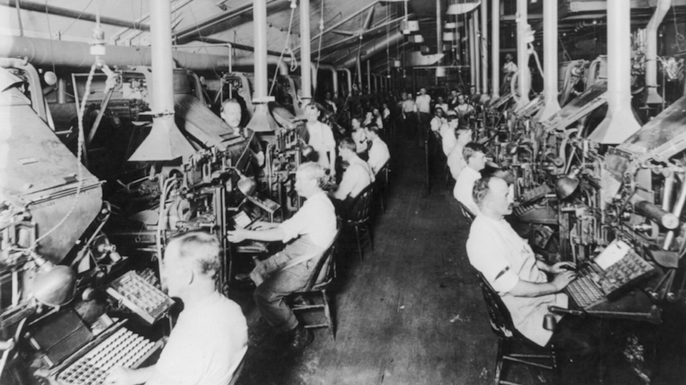
It certainly sounds Timesian to rebuff the use of “Ike.” And, besides that, it’s a great story. So I dug a little deeper. I used TimesMachine, the paper’s fantastic archival search tool, to look for the skinny “S.” But eyeballing old editions, some of which I’ve screenshotted below, didn’t do me much good.
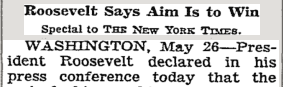
On one hand, the ‘S’ of the Roosevelt era did look fatter than examples I found in the 1950s—but that could have been the result of some other formatting, like size or italicization. It also could have been a fluke.
To find out for sure, I asked the Times for help. Though I hadn’t been able to find any record of this typographical legend in the paper’s archives, it turns out the Times had recorded it for its own employees in a 1952 edition of Times Talk, an internal newsletter.
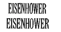
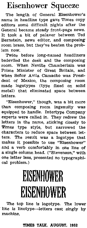
And it turns out that, yes, the rumor of Eisenhower’s Skinny ‘S’ is true. As Eisenhower increasingly made his way into headlines, typecasters redrew the letters in his name to make them narrower, reducing the space between them while still “sticking closely to Times type style,” according to the 1952 account. The result was a logotype—a single piece of type that prints a bunch of letters in one block—that made it possible for “Eisenhower” to fit snugly along one line of a single column. It made quite a difference, as you can see from the comparison between the logotype (above) and linotype (below):
Here’s the full clipping from Times Talk that a spokesman sent me, courtesy of David Dunlap, the newspaper’s resident historian, who has worked at the paper for four decades. (Thank you, David!)
Mystery solved.