Over the past 25 years, Tobias Frere-Jones has created some of the world’s most widely used typefaces. He has taught at the Yale University School of Art since 1996, gives lectures around the world, and has work in the permanent collections of the Victoria and Albert Museum in London and the Museum of Modern Art in New York. Here at The Eye, Frere-Jones shares a post from his blog about the behind-the-scenes mechanics of designing a typeface.
The typeface design process has many counterintuitive moments. One of the earliest pertains to vertical position and size, which we expect to be consistent among letters. We could simply pick a measure and apply it everywhere. But this straightforward and logical plan would fail, thanks to our eyes and brains.
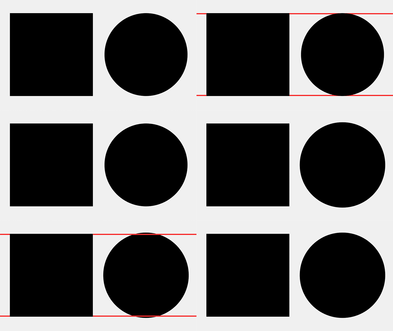
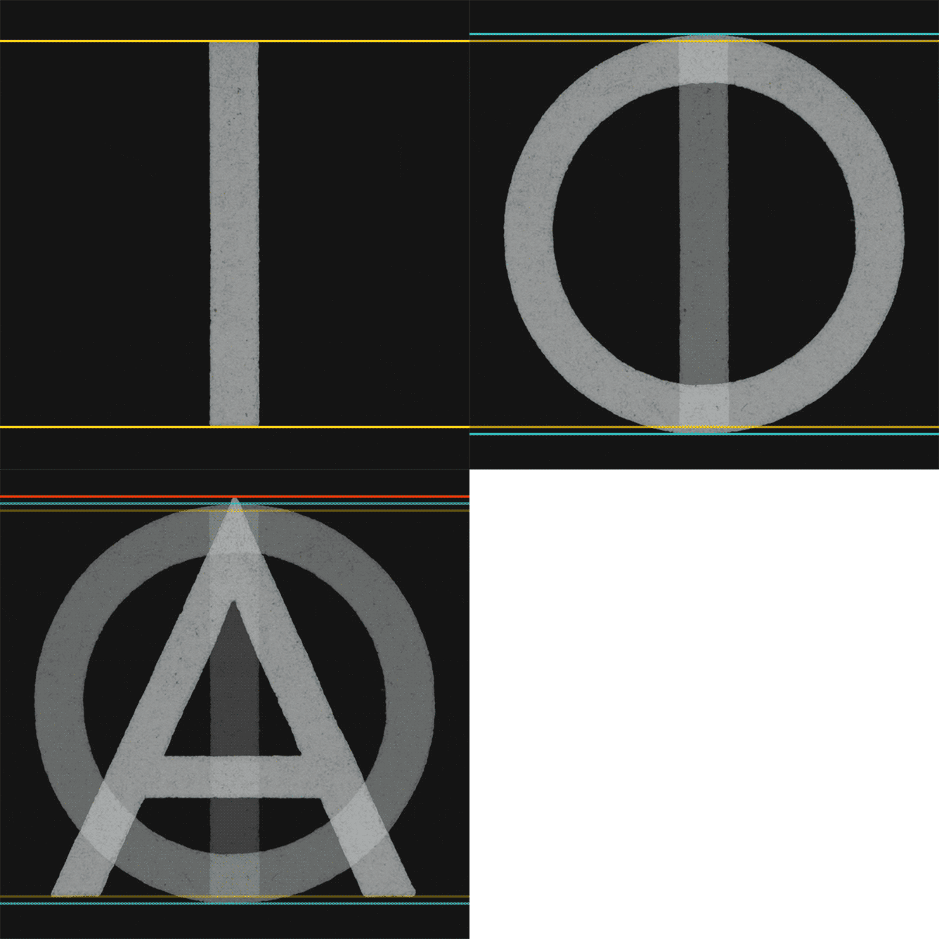
Square shapes like H have simple and stable relationships to baselines and cap heights. Their upper and lower edges coincide with these boundaries and stay put. But only a narrow sliver of an O is the full height, and the rest of the shape falls away. The parts that are too short greatly outnumber the parts that are big enough, so we conclude—wrongly, but very reliably—that the round shape is too small.
If the “correct” height appears inadequate, “too much” will look right. So the O is made taller and deeper than the H, even if the most stringent mathematical reasoning would declare it incorrect. But we read with our eyes, not with rulers, so the eye should win every time. Typefaces from any period will demonstrate this compensation, often called “overshoot.”

Courtesy of Tobias Frere-Jones
If curves need overshoot because they don’t behave like squares, pointed shapes are even less like squares and accordingly get more overshoot. But with enough care, readers won’t notice the multiple sizes and positions. All of it will feel equal.

Courtesy of Tobias Frere-Jones
Courtesy of Tobias Frere-Jones
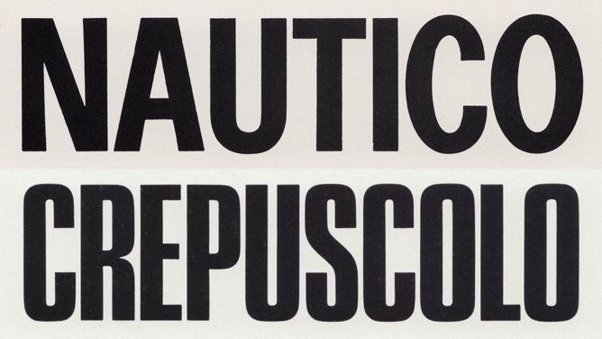
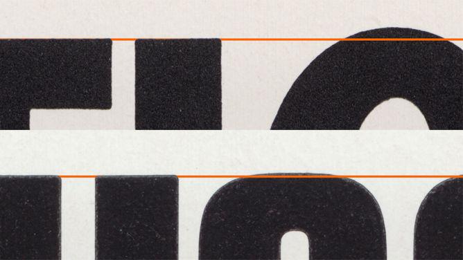
But like many aspects of type mechanics, overshoot comes in degrees. Slow curves behave more like flat shapes, lingering near baselines longer than rounder, sharper curves would. Below are two typefaces from the same designer and foundry, at the same point size and roughly the same proportion. The difference in overshoot is driven by the difference in the curvature: One is fully round (trending toward a diamond, even) while the other is emphatically square.
Courtesy of Tobias Frere-Jones
Courtesy of Tobias Frere-Jones
Even within a single family, variations of weight and width can alter a shape’s exterior and require a recalibration of alignment. For instance, a V might present a sharp exterior point in lighter weights. But accommodating the extra mass of heavier weights could force a blunter apex and change its apparent depth, and therefore require a new alignment.
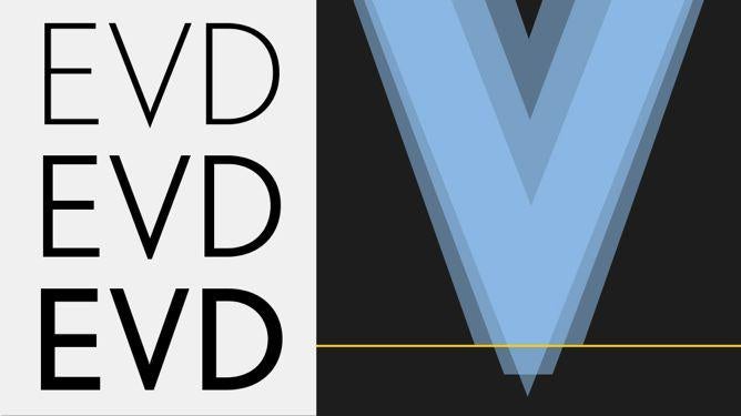
Courtesy of Tobias Frere-Jones
Lowercase alignments are often more difficult to negotiate, because many letters have flat shapes immediately adjacent to round shapes, and both need to be optically correct. A mixed alignment should look “natural” and show no sign of the struggle involved.
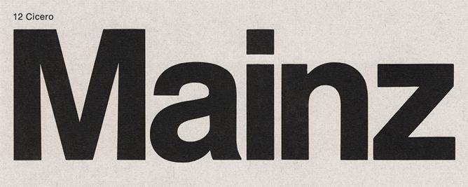
Courtesy of Tobias Frere-Jones
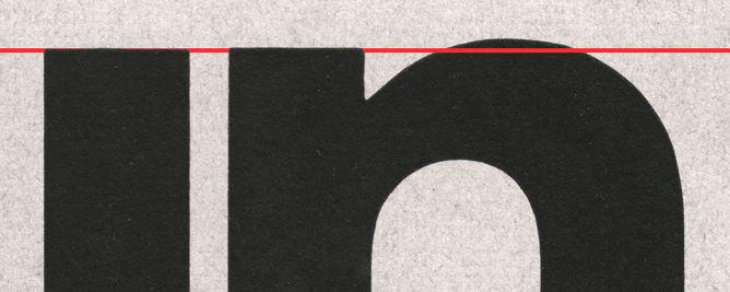
Courtesy of Tobias Frere-Jones
Sloping serifs can make matters harder again. This feature, a hallmark of an old-style lowercase, leaves only a handful of letters with flat shapes on top. In this genre, the literal height of the lowercase appears only once in a while, and the majority of letters—including many of the most common ones—are a mix of fickle curves and angles.
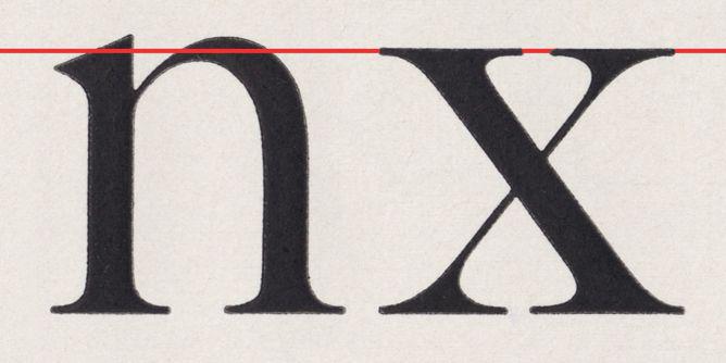
Courtesy of Tobias Frere-Jones
The lowercase x is rare case, in that its exterior doesn’t change much between one style and another. With thick serifs, thin serifs, or no serifs, high-weight contrast or low, vertical or titled axis, the x will very likely have a totally flat top and bottom. With such a reliable benchmark, we use “x-height” to refer to the central zone of the lowercase. (W.A. Dwiggins sometimes used the term “z-height,” but I haven’t found evidence of anyone else using that convention.)
Courtesy of Tobias Frere-Jones
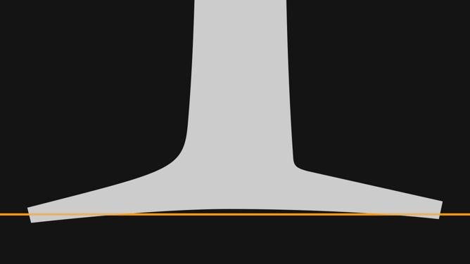
Serifs mark the top and bottom boundaries, but not always precisely. Designs with calligraphic derivations or some other kind of organic quality may have concave serifs, so these numerous “flat” shapes are not actually flat. This conflict is unusually localized, with the center and ends of a serif suggesting different alignments. To broker a visual peace, these cupped serifs often straddle the baselines, rising and falling equally.
Establishing an optically consistent size is just one puzzle among very many. The entanglements of weight, width, and spacing happen at the same time, as do the predicaments inside each letter. (But that’s a subject for another post.)
