Many of you must have marveled at the number of typefaces offered at astonishing introductory discounts these days. A large, well-equipped font family at the price of a single font — that would have sounded like commercial suicide three years ago. It has now proved to be an effective way of promoting fonts, at least for some. MyFonts, your humble distributor, doesn’t decide about promotions. It’s our partners, the foundries, that come up with these ideas. But one thing we’re certainly pleased about is that so many people buy complete font families now. To have many weights to play with, from Thin to Black, can be so much more rewarding than making do with a couple of weights, just because you can’t afford more... And as this newsletter shows, there are still fonts that become popular simply on the strength of a great design.
This month’s Rising Stars
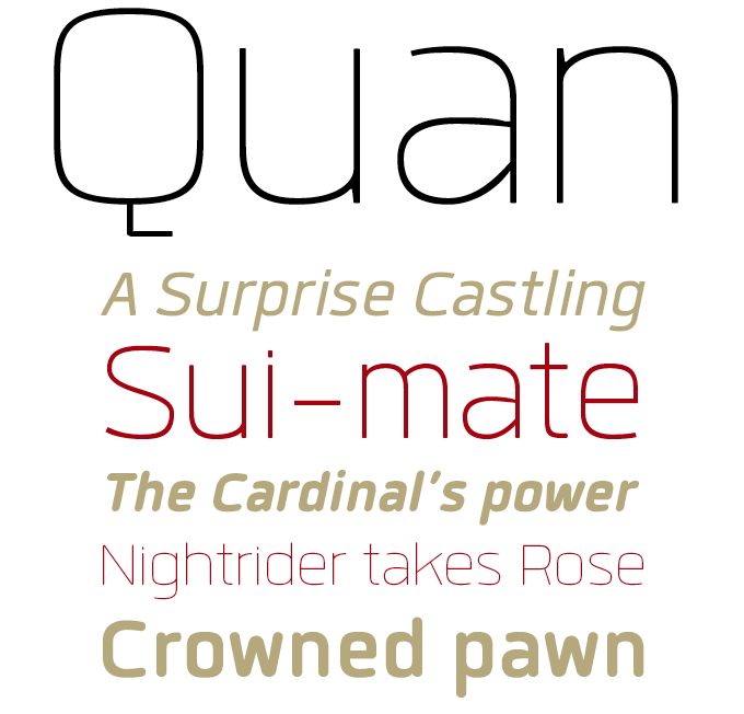
Buying the complete Quan clan at the current crazy introductory discount gives you two families for the price of, well, one single font: a very usable, clean sans, and a rounded sub-family for added tastiness and fun. Chatnarong Jingsuphatada of Bangkok-based Typesketchbook has a knack for taking popular genres and adding unusual stylistic features and quirks to give the font a personal touch. Quan has eight weights with simple obliques, and rounded versions for all of them — 32 fonts in all at the price of a few drinks. Offer ends March 21, 2013.
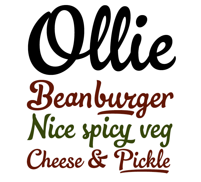
In last month’s Creative Characters newsletter, Dave Rowland of Schizotype told the compelling story of how he went from being an enthusiastic amateur to a skillful type designer in just a few years, guided by his relentless curiosity and determination to improve. The interview coincided with the publication of Ollie, possibly Rowland’s most sophisticated script font to date. Inspired by hand-painted signage lettering, the font oozes a laid-back attitude, but don’t be fooled: it has some muscular OpenType power under the hood. With around 900 glyphs, there’s lots of scope here for creating a convincingly hand-made flow when using software supporting OpenType’s Contextual Alternates feature. Swash characters and ligatures offer even more variety, making this a great font for packaging, branding and logos.
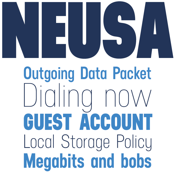
Last year, Jonathan Hill’s Yorkshire-based foundry The Northern Block was joined by Mariya V. Pigoulevskaya, a young designer with Russian roots. Her Neusa is one of the foundry’s most successful fonts to date. A condensed geometric sans serif, Neusa follows similar construction principles to DIN Condensed, but looks smoother and more elegant. Its subtle retro-futurist traits betray another inspiration source: the visual idiom of 1960s space travel, notably the iconic coverage of the Apollo program and moon landing in magazines such as Life. This family comes in eight weights, from Light to Black, and was designed to work well both for display use and in smaller, longer text settings.
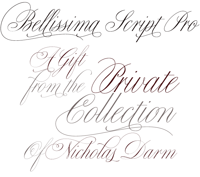
It’s been a while since we saw one of Alejandro Paul’s elaborate script faces on these pages. We loved the joyous Platinus Script Pro — his most recent collaboration with Angel Koziupa — but it became only a modest hit. With the new Bellissima Script Pro, Paul has vaulted back to the fore. No extreme introductory offers needed: Bellissima’s mass appeal is not in the pricing but in the curves — it is simply a gorgeous script face that confidently transfers the virtuosity of past masters to the digital realm. The model for Paul’s font was a copperplate script shown in an 1844 calligraphy manual by by Ramón Stirling. But, as Paul wrote, “Bellissima became its own bird and shaped its own flying patterns. Suddenly there were many ligatures, multiple endings and swashed connections, hundreds of alternates for both uppercase and lowercase.” Ideal for users familiar with OpenType functionality, the Pro version offers a refined calligraphic toolkit with almost 2,000 characters; for those who like it simpler, there’s the affordable Bellissima Script Redux.
Text families of the month
Text typefaces for demanding editorial work need to possess special qualities: excellent readability, a generous range of weights with italics and small caps for all of them, multiple figure sets (lining, oldstyle, table) and ample language coverage. This month we feature three fonts in three distinctive genres: a transitional book face, a sans and a slab serif.
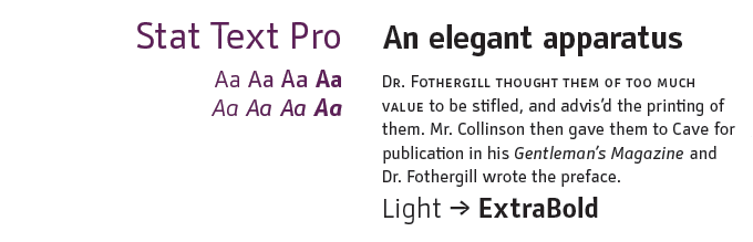
Stat Text Pro from Jure Kožuh was developed as a companion to the designer’s Stat Display Pro. While retaining many characteristics of its parent, its simpler detailing make for enhanced readability and a more even rhythm in body text sizes. Stat Text Pro contains nearly 700 glyphs per style, including ligatures, small caps, old–style figures, arrows and ample language coverage.
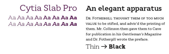
Cytia Slab Pro from Mint Type is the slab serif companion to the successful Cytia Pro. This geometric slab serif face comes in eight weights plus italics with extensive language support including Cyrillic and Greek scripts and rich with OpenType features, including optional upright and real italic forms. This well-equipped text and display face comes at a great introductory price: 50% off the complete family until March 31, 2013. Try out two of the styles for free!
News Round-Up
In this section we pick out interesting news snippets from MyFonts’ own kitchen and from the greater world of fonts, lettering and typography.
India’s Typography Day
 With the increasing global impact of emerging economies in Asia, there is also a growing interest in creating typefaces to represent the many writing systems used across the continent, and MyFonts is well aware of that. So we welcome initiatives such as Typography Day in India, a typographic conference that is hosted by a different city each year. The sixth edition took place last week at the Department of Design at the beautiful campus of the Indian Institute of Technology (IIT) in the city of Guwahati in North-East India. Photos and comments about the event will soon populate the 2013 Typography Day Facebook page.
Typecast — Game Changer of the Year?
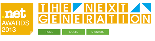
In last month’s newsletter we told you about the new Typecast application, arguably the smartest tool available for creating better typography on the web, and making working with web fonts easier for everyone.
Typecast’s creators are now nominated for two awards in this year’s .Net Awards. Typecast is up for Game Changer of the Year, which gives props to the tools and projects that “really helped the industry and the community move forward.” Director Paul McKeever is nominated as New Entrepreneur of the Year, which recognizes folks who’ve had “a great business idea that has made an impact on the industry.”
The nominations are just the first step. If you want to help Typecast make the next cut, read the details on the Typecast blog and cast your vote for better web typography!
MyFonts Job Openings
MyFonts is growing! Right now we’re looking for a front end developer with expert JavaScript skills. Interested? Check out (and bookmark) our new Job Openings Page.
Sponsored Font: Vox and Vox Round
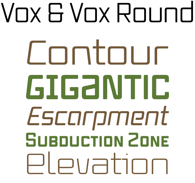
Canada Type’s Vox was designed to be an extensive type family that can be both precise and friendly, yet contains enough interchangeable variants for the user to customize, as it were, the personality of the typeface for each use. The result, a sleek monoline sans that was released in 2007, became an instant hit with interface and packaging designers, sports channels and many more. The new version is the expanded treatment, which is even more dedicated to the original idea of abundant application flexibility. The family was expanded to five weights and two widths with corresponding italics — a total of 20 fonts, plus the same range for the accompanying Round version. Each font contains 1240 glyphs. Localization includes Cyrillic and Greek as well as extended Latin language support. Built-in OpenType features include small caps, four completely interchangeable stylistic alternates sets, automatic fractions, six types of figures — a rare case of typographic malleability and smartness. Vox is 25% off until March 31, 2013.
Webfonts at MyFonts
All of the top four Rising Stars fonts, and usually the sponsored font as well, are available for licensing as webfonts. Visit Webfonts.info for HTML and CSS versions of this month’s Stars, plus lots of articles, resources and a showcase of web typography in the real world.