FS Brabo – An Audacious Undertaking
FS Brabo® – An Audacious Undertaking
Fernando Mello Inspiration
Gobbledygook. Codswallop. Poppycock. It’s not often that a typeface comes along whose way with words can make any old rubbish worth reading. A font that can add poetry to the plainest prose, and tempt us to tackle text in even the most unfamiliar tongue.
FS Brabo® is good with words in any language. It’s little wonder that the designer behind it is a Brazilian working in the UK who was inspired by his studies in Belgium under a Dutchman.
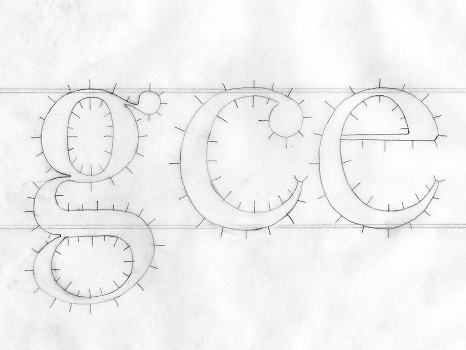
Fernando Mello had been part of the Fontsmith team in London for four years, helping to craft a number of successful commercial fonts and honing his skills as a designer. Then his calling came. ‘All of a sudden, it just felt like it was time for me to design a beautiful, functional, serifed text font for books – something I’d always dreamed of doing, to reflect my admiration for the typefaces such as Galliard and Sabon.’
Originally from São Paulo, Brazil, with a background in architecture and illustration, Fernando came to the UK in 2006 to take up a place on the University of Reading’s MA Typeface Design course. It was while he was studying there that he made the pilgrimage to the hallowed Plantin-Moretus Museum in Antwerp, Belgium – a shrine to book design and typography in the perfectly preserved home and print room of the 16th century printers, Christophe Plantin and his son-in-law, Jan Moretus. The museum, a UNESCO World Heritage Site, houses the two oldest surviving printing presses in the world, and a priceless archive of typographical and artistic material.
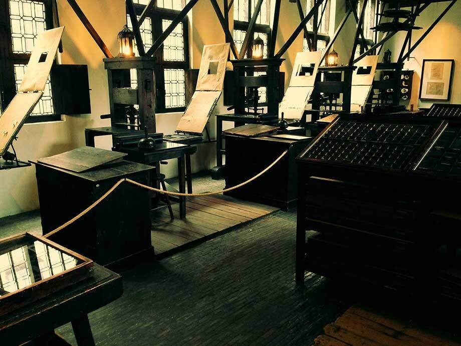
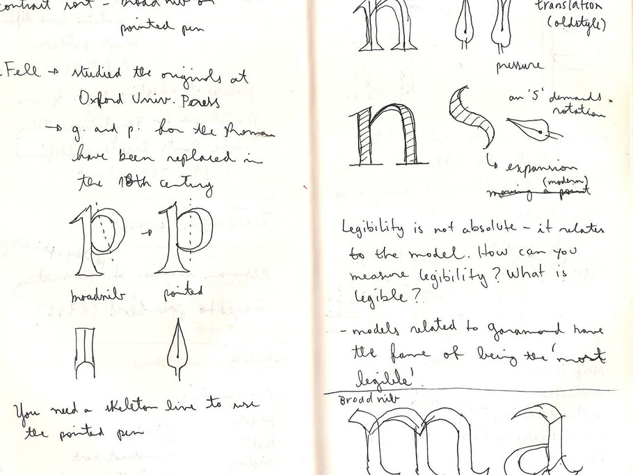
The museum ‘completely fascinated me,’ says Fernando. Several years later, when he came across the chance to study at the museum on the eight-month, part-time Expert-class Type design course run by Frank Blokland by the Plantin Institute for Typography, he jumped at the chance, despite the wearying prospect of making the journey to and from Antwerp for a day of teaching every two or three weeks while remaining on the team at Fontsmith.
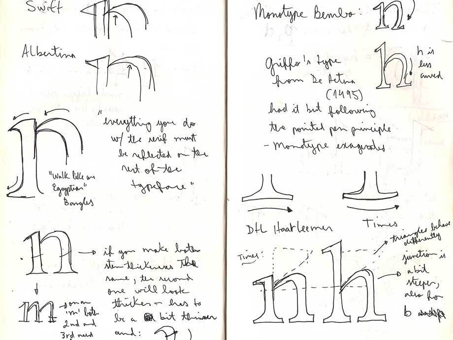
Over those eight months, from October 2012 to April 2013, his classical serifed font began to emerge. It would take another two years for Fernando to complete his work on the typeface, first in the Fontsmith studio and, finally, in Brazil. Its place of origin – and long, taxing resolution – led to the name: Brabo, after the Roman hero of legend who battled for days to liberate Antwerp from the tyranny of the evil giant, Antigoon.
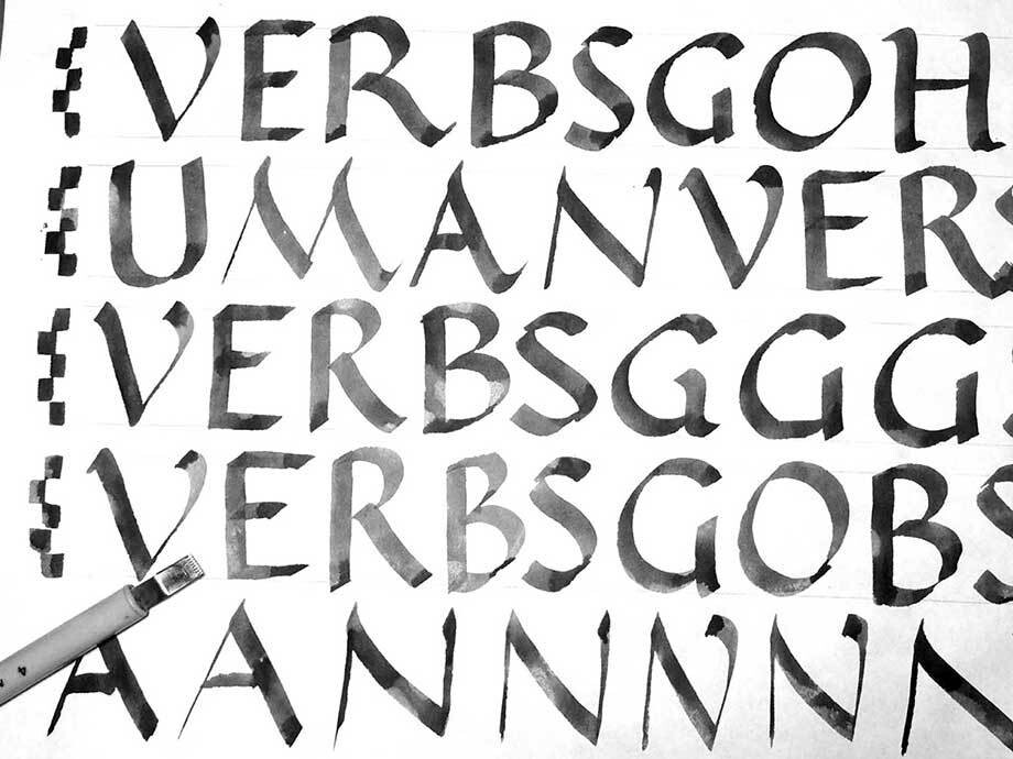
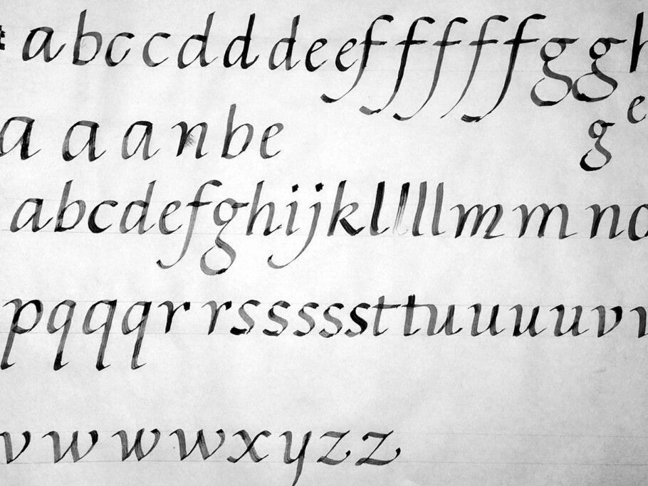
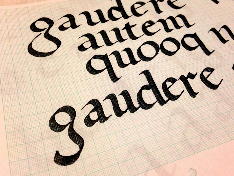
Fernando’s starting point was the genre of 16th century typefaces that he encountered in the Plantin-Moretus Museum, inspired by broad-nibbed calligraphy. Visible in Brabo’s proportions is the influence of punch-cutters such as Claude Garamond, Robert Granjon and others, and the book-oriented class of typefaces known as garaldes (a portmanteau of Garamond and Aldus [Manutius]), which display finer proportions than the earlier humanist faces.
But, as Fernando is keen to stress, this is very much a personal interpretation of a garalde – a contemporary typeface family designed to bring a beautifully bookish personality to hardworking modern applications. ‘It doesn’t intend to be a revival or a mere reproduction of a classic design. It brings some freshness and authenticity to these models – a personal touch and tone of voice, which I like to think of as the “Fontsmith touch”.’
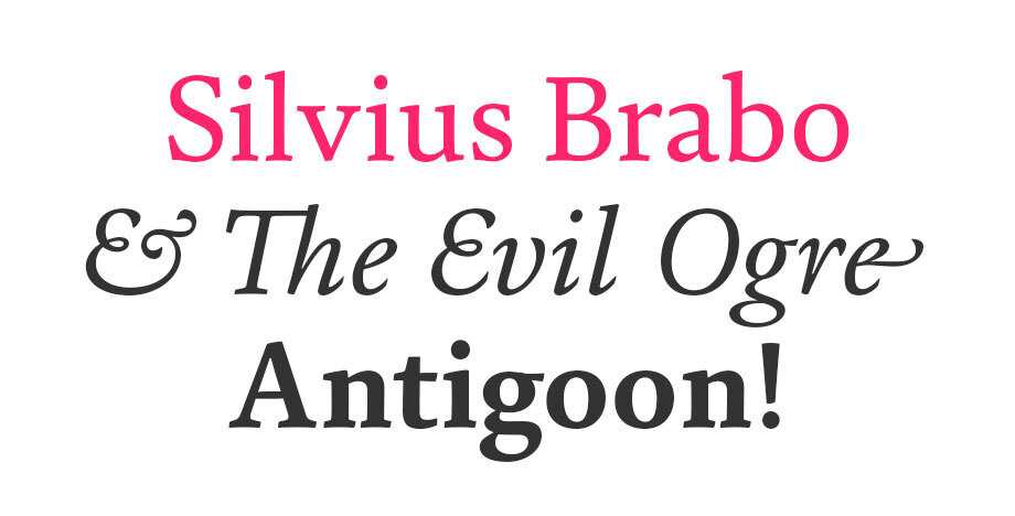
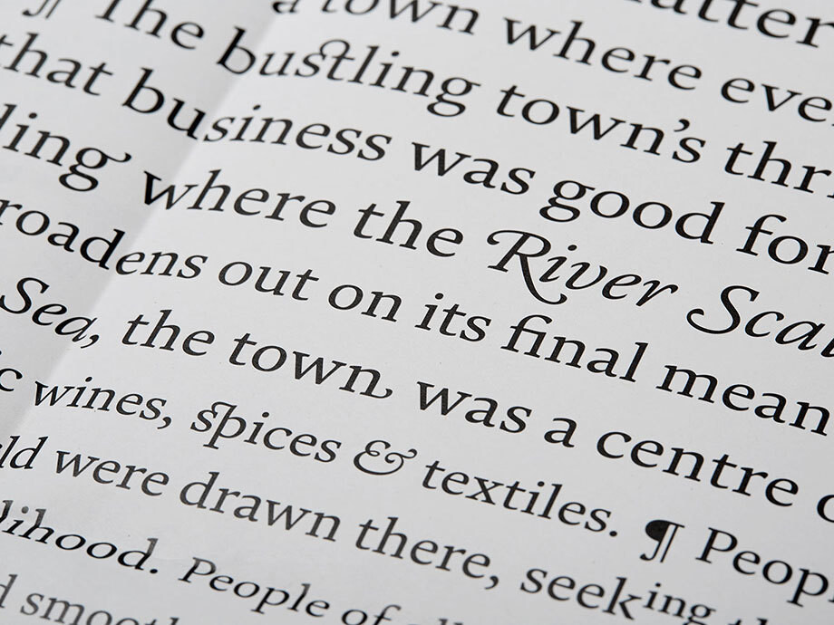
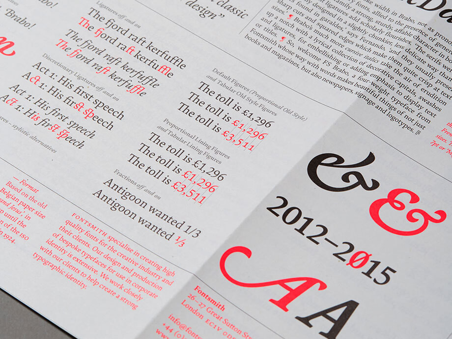
The contrast in stroke width in Brabo, not as pronounced as in typical 16th century fonts, allied to the presence of generous counters, gives the family a strong, sturdy, affable character in body text. Extravagant ligatures add scholarly flourishes. ‘The serifs were also generally designed in a slightly chunkier, less delicate way than the ones found in garaldes,’ says Fernando, ‘and they usually present sharp cuts and squared edges which make them quite crisp at text sizes.’
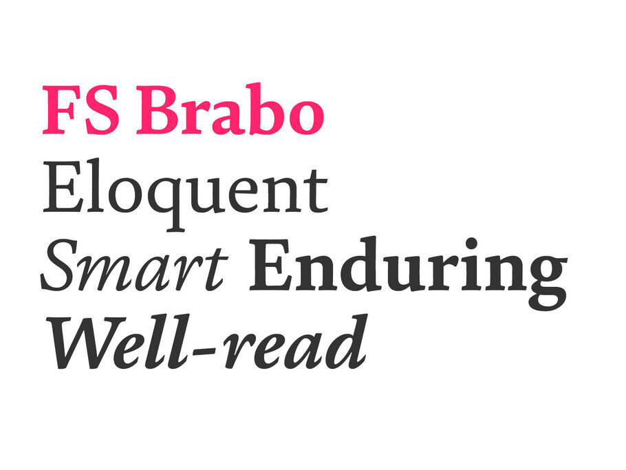
Brabo’s much more cursive italics take the air of erudition up a notch with a lyrical collection of decorative capitals, swashes and ligatures, for embellishing or adding emphasis to display text or titles.
So, welcome Brabo, a four-weight typeface from Fontsmith whose way with words makes beautiful things of not just of books and magazines, but also newspapers, signage and corporate wordmarks.
To see more of FS Brabo®, visit the font library page here.
