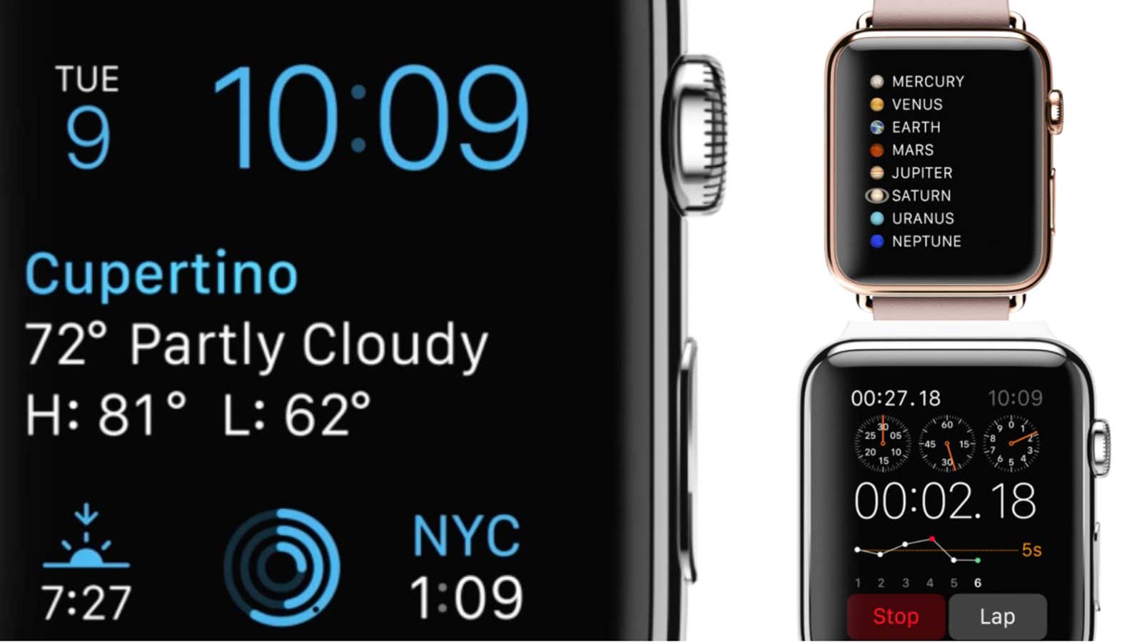
The jury is still out on the Apple Watch, but one small design element may offer a peek into Cupertino’s broader user-interface strategy: the custom typeface.
Although Apple has a history of developing its own fonts, for the last 20 years it has mainly relied on off-the-shelf type, most recently tapping Helvetica for its new iPhone and desktop operating systems. But when the Apple Watch was revealed last week, it boasted a new, unnamed, sans-serif font that was developed in-house.
So why is Apple suddenly developing its own typefaces again? Erik Spiekermann, a type designer and the cofounder of the type-licensing company FontShop, says they’d be fools not to. For one, building a custom typeface is much cheaper for Apple than licensing one. “If you get a complete character set, including Cyrillic and what have you, it’s way, way more expensive to pay licenses,” Spiekermann tells Quartz. “If you’re talking about millions of units at a cent each, that’s a few hundred thousand dollars. You can design a hell of a typeface for that money.
Then there’s the matter of finding the most suitable font for a particular device—a harder task when the font isn’t purpose-built. Apple touted legibility as a reason for adopting Helvetica, but that explanation never made sense. Helvetica is famous for its aura of mid-century modern efficiency; it wasn’t designed for small screens. (Spiekermann calls it “totally useless” at the size and weight Apple has been rendering it.)
The Apple Watch typeface, on the other hand, was made to do one thing: read well on the (tiny) screen it was designed for. It borrows heavily from DIN, a legible and space-efficient typeface introduced in Weimar Germany for road and train signs, but updates the letterforms with rounder shapes that are better suited for a digital setting. (Ironically, it also looks a bit like Google’s own Android system font, Roboto. “Both teams were likely seeking similar functional characteristics and ended up in a similar place,” says Stephen Coles of Typographica.)
Finally, there’s the issue of branding. “That’s been my other criticism about using Helvetica—that’s not their brand,” Spiekermann says. “Anybody can imitate that.” Not so with a custom typeface. Even though it’s not as charmingly distinctive as, say, Chicago, the new font belongs to Apple in a way that Helvetica doesn’t.
There’s a good reason to listen to Spiekermann when he talks about Apple’s typeface plans—Apple listens, too. Spiekermann has known Jony Ive, Apple’s head of design, for years and occasionally fields calls for advice from Cupertino. Spiekermann says he was offered a job at Apple in July, presumably to head a new group of type designers. He turned it down. (“I wouldn’t want to spoil my retirement with work in Cupertino,” he quipped.) But he says Apple is getting serious about building its own typefaces. That could herald better user interfaces down the line for its millions of users. With iOS 8 rolling out today with a poorly chosen typeface, it’s a reminder that Apple can do better.
