Serbian localized forms (Roman)
Cyrillic is the fourth most widespread writing system in the world covering over 1/6 surface of the world. There is a number of languages that use Cyrillic in writing. Some of them, including Serbian, have developed their own localized forms.
Technically Serbian language is supported in most fonts with Cyrillic characters. Although there are quite a few letters that have a special Serbian flavour, dubbed localized variants. Let’s go over them and see what makes them different from the script ‘norm’.
This post explores the features of the roman style. There are far more differences in the italic. We’ll go over them later.
1. Serbian be, ef
This is the most obvious one. A Serbian be can be spotted a mile away. What’s interesting is that Russians use the Serbian shape in day-to-day handwriting, but is it not acceptable in printed forms.
Well-crafted Cyrillic fonts have a special alternate glyph for the Serbian lowercase be which is activated by the OpenType Localized Forms feature.
Here's Adamant BG with a distinctive be by Vedran Eraković. Since this typeface is Serbian manufactured the local Serbian forms are the default characters.

Adamant BG has another feature: a Serbian-flavoured ef having two bowls that are rotated by 180°. The Russian ef is typically mirrored horizontally.
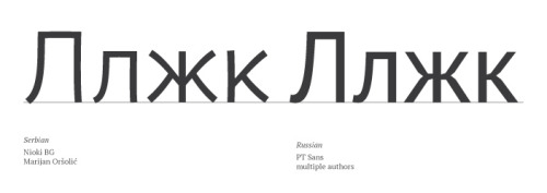
2. Serbian localized form for zhe, ka, el
Technically there is no tradition for these characters to have Serbian alternates. However fonts designed by Serbian authors can have a different stylistic take on the type of shape. Zhe and Ka tend to have a closer-to-Latin approach, while Serbian-style el has more squarish proportions, and a smaller terminal.
Nioki BG is a good example for this one.
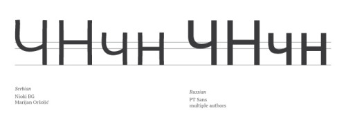
3. Serbian-style cha
Serbian and Bulgarian designers like to keep the shoulder in cha very low. This is one of the subtler differences.
Again, take a look at Nioki BG.
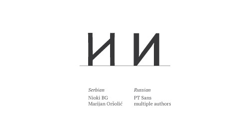
4. Serbian-style ii
Last but not least. The shape on the left is uncommon for Russian sans-serif typefaces. It is typical for Neoclassical serif forms.