
In a recent panel at the New Museum, artist Jacob Ciocci defined technology as “anything that organizes or takes apart reality,” which prompted a realization: gender could be also be understood as a kind of technology unto itself.
The 3rd Istanbul Design Biennial proposes that the ultimate aim of design is a redesign of the species. Under this premise, in an era where hormone molecules are produced in laboratories and distinctions like “female” and “male” are eroding, the “gender hacker” can be seen as a radical innovator in the ongoing design of the human. Hormones, regardless of their origins, flow through our bloodstream distributing “chemical messages”—to borrow a term used by Paul Preciado in Testo Junkie (The Feminist Press, 2013) —just as letterforms distribute words throughout bodies of text.
Language bears the responsibility of communication, and like typography, gender must be understood as an expressive format that evolves with the needs of its user. As a species, we continue to move beyond the constraints of the body. So, too, must the constructs of gender and the vocabulary we use to describe them. One voice in the construction of this language is Esben Esther P. Benestad, a progressive sexologist and one of Norway’s most public trans figures. Hir work as a therapist has flipped the script on gender norms by actively documenting people’s response to the question, “What is your gender?” All responses are equally validated, the subject dictates their own status, and gender is self-determined rather than diagnosed. Through these conversations with real people Benestad has observed seven unique genders: Female, Male, Intersex, Trans, Non-Conforming, Personal, and Eunuch.
Linking Ciocci’s thinking with Benestad’s, Façadomy invited seven graphic designers (Mylinh Trieu Nguyen, Andrew Sloat, Riley Hooker, Ely Kim, Nontsikelelo Mutiti, Ksenya Samaskaya, and Lobregat Balaguer)—each having pushed the limits of the “d” word in their own practice—to reflect on the seven genders through typographic metaphor. Below, each gender definition—created by Façadomy with Benestad—is followed by each designer’s response.
Female
Pronouns: She/Her
A Female is an individual who describes herself as Female and can be considered one of the gender majorities. Femaleness derives most of its conventions from the characteristics attached to individuals that are chromosomally XX: production of ova, milk-producing mammary glands (after childbirth), a higher ratio of fat to body weight than Males, fairer voice, motherhood and caregiving. When an XX individual with the conventional characteristics of Female also perceives herself as Female, this is understood as Cis-Female. Females may have another chromosomal constellation or may not possess any of the traditional characteristics at all.
—
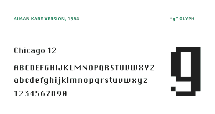
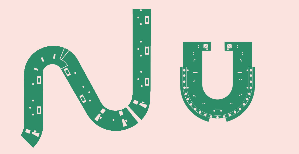
CHICAGO 12PT
By Mylinh Trieu Nguyen
![]()
Lisa had a face of her own, one that you’d recognize almost immediately, even years later. Her curveless figure, tapered edges, and bold stems did not reflect feminine conventions. What made her distinctly female however was the context in which she was born.

A product of the 1980s, she represented the rise of a minority workforce, another advancement in the technology of feminism. Through a complex union of intuition and pragmatism, she grew from an innate desire to communicate, to connect, and to be open. Her existence dislodged generalizations.

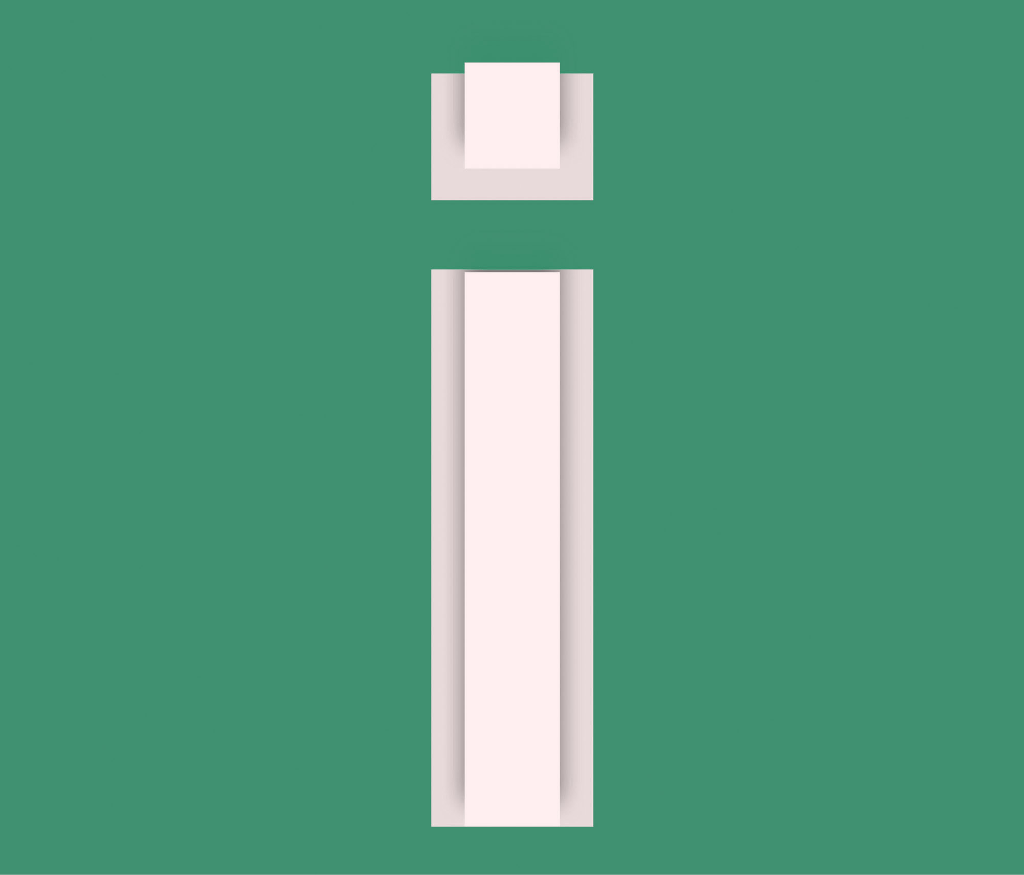
Her bare body, undressed from frivolity, focused on function and iteration; imagining the countless possibilities that her form could actualize. The complexity of her make-up is illuminated at varying distances. From afar, her features are softened, her contours implied.


![]()
In intimacy, she reveals her true construction, from edge to edge. The strength of her face is in her ability to be simultaneously ubiquitous and individual. Her body, in all of its bitmap glory only lives on as a memory of a specific time and place. Edges replaced by semi circles, her image resolved to embracing all of her curvature. The terms of her femininity are not monolithic but always in flux.
 Like Duchamp’s Nude Descending a Staircase, No. 2, she does not submit to the gender definitions of her time. Rather her fractured body and jagged lines come to symbolize a new model and archetype for femininity (constantly) moving forward in the modern world.

Mylinh Trieu Nguyen is principal and creative director of STUDIO LHOOQ and codirector of LORD LUDD, a contemporary art gallery in Philadelphia.
Male
Pronouns: He, Him
A Male is an individual who describes himself as Male and can be considered one of the gender majorities. Maleness derives most of its conventions from characteristics attached to individuals that are chromosomally XY: sperm production, Male sex organs, deepened voice after puberty, a higher ratio of muscle mass to body fat than Females. When an XY individual with the conventional characteristics of a Male also perceives himself as Male, this individual is understood as a Cis-Male. Males may have another chromosomal constellation or may not possess any of the traditional characteristics listed above.
—
STANDARD, ARIAL, HELVETICA, OR WHATEVER
By Andrew Sloat
Unimark, briefly the largest design firm in the world, proposed to tame the raucous diversity of 1960s NYC subway signage by choosing to consolidate it into Helvetica. This turned out to be impossible on the existing machines, so eventually they settled for the available typeface Standard (an American name for Akzidenz Grotesk), with its beefier stance, swingy S, and underbite e. But after the entire graphic system was installed, sign-making technology improved; reverting to the intended Helvetica became too hard to resist. The initially unwanted and slightly-off Akzidenz, which had done the job when no one else could, was slowly and quietly replaced with the more generic option, with its straighter lines and broader shoulders.
Arial was created so that typewriter companies wouldn’t have to pay for Helvetica. It’s mathematically built to replace Helvetica exactly, but with enough details stolen from other typefaces so that it isn’t really the same—and yet only experts can easily differentiate them. The story is convoluted, and ultimately Arial gets lumped in with the rest of the middle-ground sans serifs. To most readers Helvetica and Arial are effectively the same: normal and authoritative.
But some people like to make a big scene over how the subtle adjustments between Standard or Akzidenz or Helvetica or Arial or whatever actually make them totally different. We pay those people more.
Andrew Sloat is a graphic designer and filmmaker who lives in Brooklyn, teaches at RISD, and is currently the creative director at BAM.
Intersex
An individual who describes themselves as Intersex.
Benestad includes Intersex as a gender category, although medically it is understood as a classification of sex, for those born with a variation between Male and Female anatomy and/or genetics. Variations are endlessly diverse. In 2016, nearly 25 percent of the world’s population has access to a legal Intersex identification at birth with India, Pakistan, Nepal, and Bangladesh as major contributors. The remaining 75 percent of the world, including the United States, are only left with the options of Male or Female. Intersex individuals are often surgically and/or hormonally “corrected” (AKA mutilated) at birth or near puberty to fit within the dominant societal sex/gender categories of Male and Female. Because these measures are taken so early on, they often grow to identify with another gender later in life. In this respect, they become, for instance, Male-to-Intersex (MtI) or Female-to-Intersex (FtI).
—
“3L33T” SPEAK
By Riley Hooker
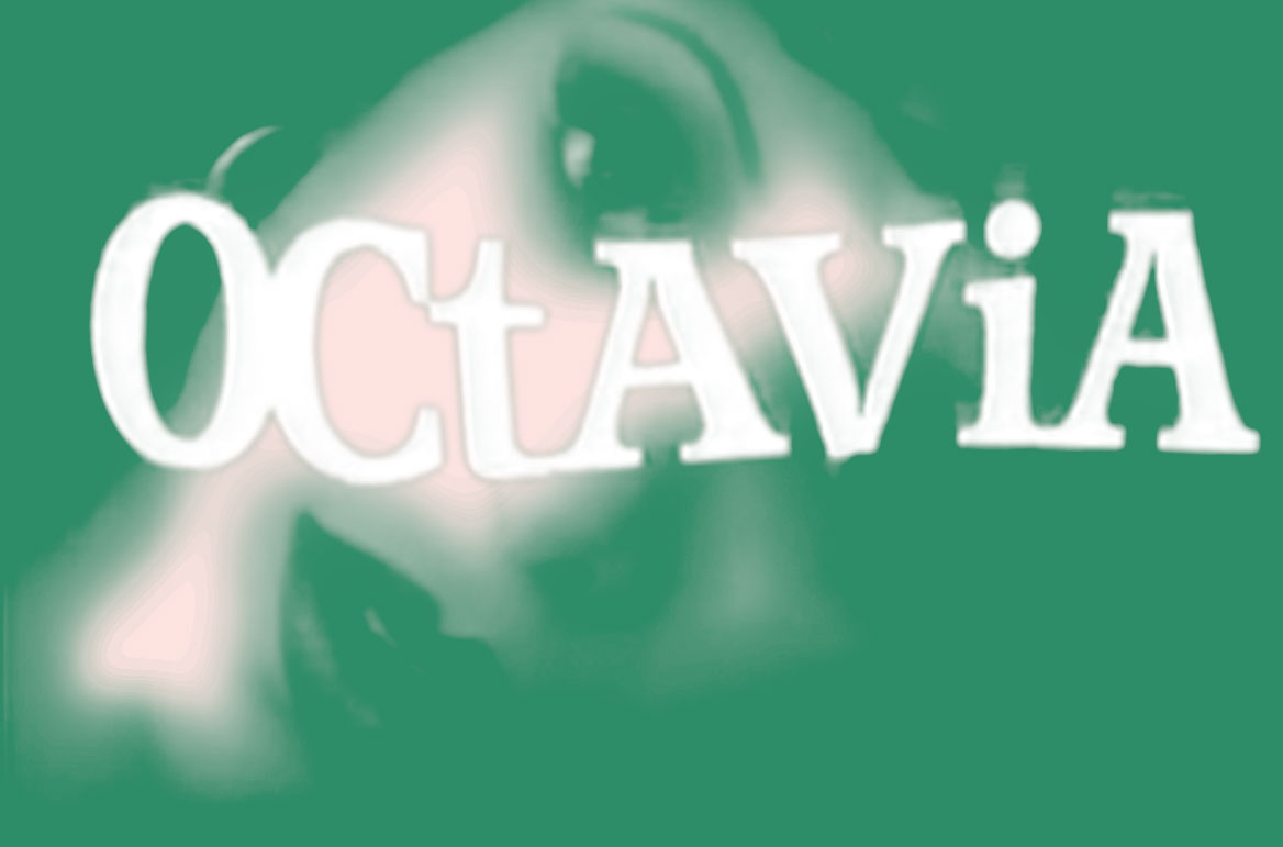
Octavia Saint Laurent (1964–2009) was born out of New York City’s vogue scene in the 1980s and is perhaps best known for her iconic appearance in the 1990 film Paris is Burning. Her proto-queer existence was radical—anticipating an event horizon in the history of sexual difference. No, she is not a woman. No, she is not a man. Neither and both, she is Octavia by design.
Meanwhile in the virtual underbelly of online bulletin boards a symbolic language called “L337 sp34k” was born in resistance to a new regime of online filters. To many it was the death of grammar. To others it was the grammar of death. Death to the privatization of knowledge and power online. A superfluid cipher that could be applied to a multitude of languages. Traces of this rebellion are found in the title treatment to the 1993 documentary, Queen of the Underground, starring Ms. Saint Laurent.
This stylistic hack brings a new logic into the typographic vernacular, effectively bringing an endless variation of forms into a cohesive whole. Intersexness to the gender hacker performs the same feat, exploding the linearity of the Male/Female spectrum to achieve elite status in the third dimension.
Riley Hooker is a graphic designer based in New York and is the editor and designer of Façadomy.
Trans
Pronouns: He/Him, She/Her, Ze/Hir, et al
When an individual’s gender identity does not align with the sex they were assigned at birth, they may be inclined to transition to another point within the vast constellation of gender. A full transition in the subjective sense is to adjust the body as much as is necessary for that individual. Sometimes, the adjustments will go as far as is possible toward the other gender majority, but those whose Transtalents are particularly strong will still identify as Trans. In this sense, Trans-identifying individuals do not succumb to the societal pressure to be passable as either Female or Male. It is not necessary to pick a fixed point. For many, the transition is fluid and ongoing.
—
AVENIR NEXT HEAVY
By Ely Kim
When I was a kid, I had an alphabet book that illustrated each letter as a person. They were dressed in clothes, wore shoes, and carried accessories. Most of them were dressed for a day at the office, and were dressed as either a Male or a Female. A completely arbitrary gender assigned to each letter of the alphabet by the illustrator. Seeing each letter existing as one end of a gender binary gave me a complex. It made me see gender in places that I had not before. Everything became arbitrarily gendered.
As an adult I have a lot of questions…
Why is most of the alphabet male?
Why was the “F” not a female?
Why was every one of the last six letters of the alphabet assigned as female?
Why do these distinctions matter?
It was a similarly puzzling exercise to choose a typeface with any meaningful representation of a trans experience. As arbitrary as an illustrator assigning each letter of the alphabet a gender. To be honest, every typeface I was experimenting with started feeling trans because it’s completely subjective. So I ended up just going with my very first try, Avenir Next Heavy.
Ely Kim is an art director/dancer/healer based in New York.
Non-Conforming
Pronouns: They/Them, Ze/Hir, Other
A gender Nonconformist is an individual who describes themselves as not gendered—maintaining the potential to subscribe but actively refusing to do so. Often these individuals hold strong political beliefs that gender does not exist or that it is a social construct that can be ignored. Many individuals in this category seek to adjust their appearance to reflect their non-gendered status by, for instance, removing their breasts or wearing gender-neutral clothing.
—
UNKNOWN BOOK TYPE
By Nontsikelelo Mutiti
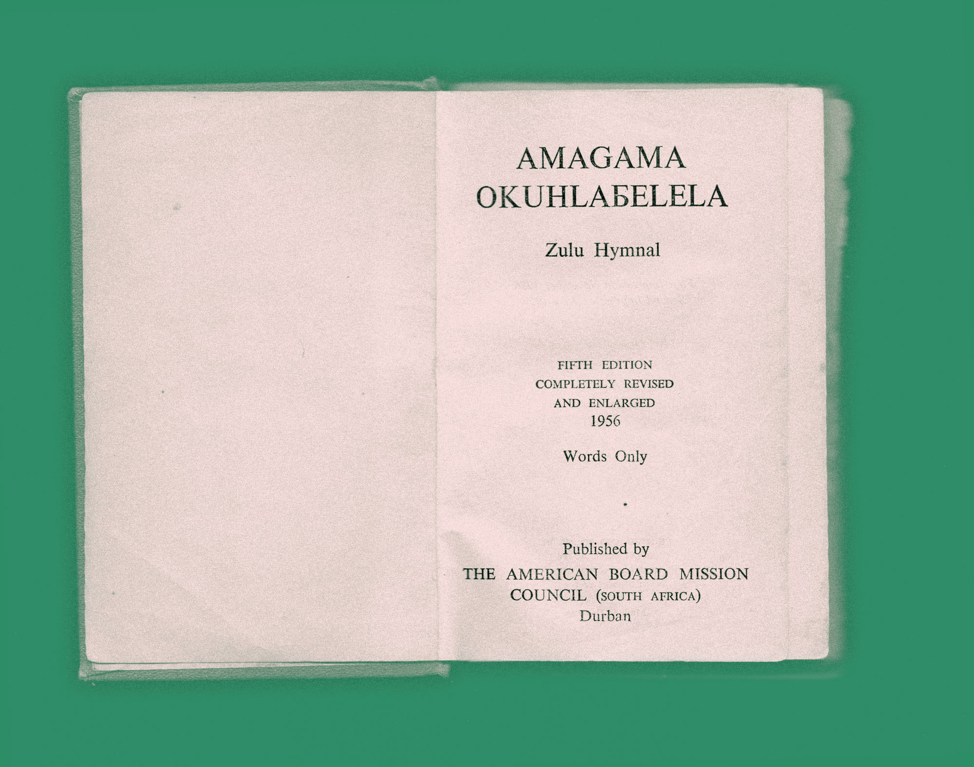
My first type design project was based on the characters I found in 18th- and 19th-century missionary bibles. For my research I requested the Ngoni, Xhosa, and Zulu bibles, along with The Negro English Bible, a translation of the scriptures into a pidgin dialect used at that time between the British and number of tribes in the region of Southern Africa.
As I traced the letterforms, researching approximate typefaces, what I thought would be a lesson in conventions became an exploration of the contradictions in the forms of certain characters. It was these deviations that aided in asserting the identity of the typeface, and distinguished it from the others.
In my mother’s childhood Zulu hymnal printed in 1956 a Ъ represents a specific sound, that melting together of the softest b and w. This interests me less as a design technique or answer but as a question around the gaps between our languages and the capacity for the predetermined set of 26 characters to reconcile them.
As a “born free” Zimbabwean, my expression emerges from the collision between cultural frameworks. Often times I feel most articulate when speaking mispronounced broken vernacular. An exercise that began with a goal to faithfully redraw these colonial typefaces ended as a lesson in transgression, which is perhaps where identity becomes visible.
Nontsikelelo Mutiti is a Zimbabwean visual artist working across geographies and disciplines.
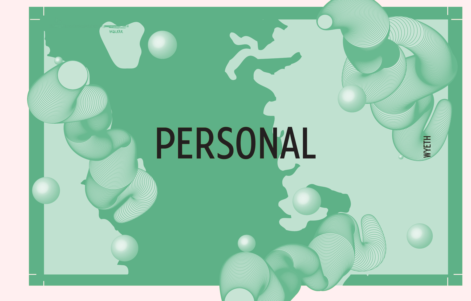
Personal
Pronouns: et al
When Benestad asked Oscar what Oscar’s gender was, Oscar simply responded, “I’m Oscar.” Though fully presenting as a lady (with a visible bulge), Oscar wants to be referred to as “he.” A Personal gendered individual is someone who identifies as Themselves. Oscar engenders himself with his own name (and pronoun of choice). It is not a political statement, but rather one that it requires an introduction because, in order to properly address Oscar, one must first know Oscar’s name. A Personal gendered individual relies only on their self to be validated as such.
—
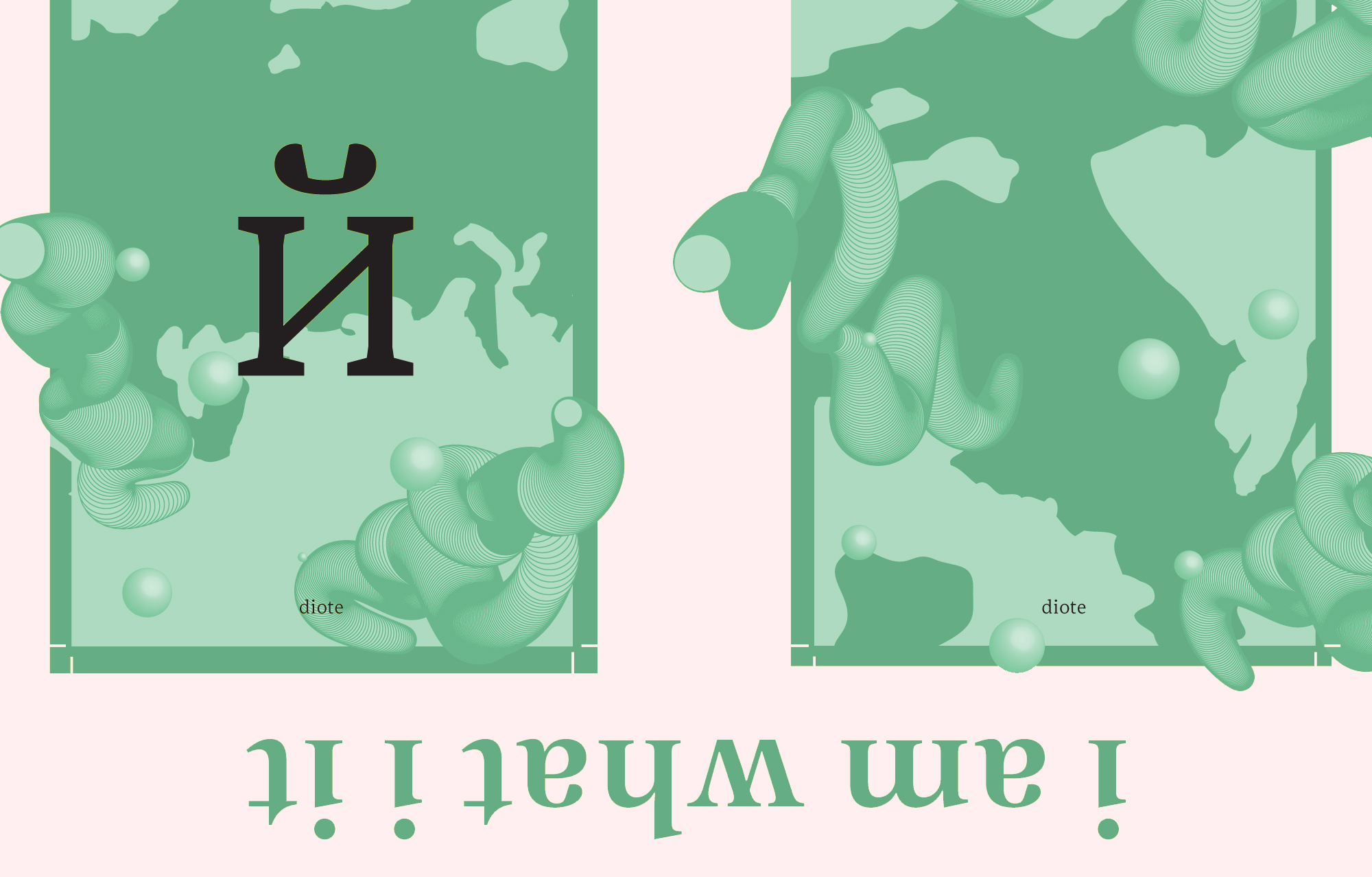
THE SOLONKA TYPE FAMILY
By Ksenya Samarskaya
For as long as I can remember, I’ve been actively discussing, questioning and considering gender. Wherein our recent generational past, it’s been weighted at the male/female poles… I’ve watched it shift, over the course of my heed, beautifully, prismatically towards the scatter-plotted center. Towards the personal. Towards the individual, self-defining, authentic re-mixing of all the codifiers.
As we (Samarskaya & Partners) refine and draw out the character of typeforms, the same divergent synaesthesia comes into play. With type, as well as with gender, I’m most compelled by a well-defined balance and a strong point of view. For example, there’s the graceful lines and unadorned details that form the mainstay for Wyeth. You sense its proper posture, its understated decorum, the worn-in button-up shirt. Or Diote, with its square shoulders and soft curves, an Eighties icon without the teased hair.
While type isn’t (hasn’t/shouldn’t be) inherently associated with gender, each well-developed typeface is full of personality… so if we’re gonna take to anthropomorphizing, I intend to continue drafting type that has the complexity and the versatility of the personal. Not an absence of gender, but an irrelevance that embraces the particular. Embraces function. Embraces idiosyncratic beauty.
Ksenya Samaskaya is creative practitioner, type designer, and board member of the AIGANY.
Eunuch
Pronouns: Et al
Historical accounts of Eunuchs go back almost as far as recorded history. It was a practical solution to an age-old problem, preserving patriarchal bloodlines. And what better way than by castrating the Males charged with protecting royal Females? Today’s Eunuch is a Male that consciously decides to be castrated. With the aid of testosterone injections, they are able to boost their sex drives, receive erections, and even ejaculate. Post-castration, it is often reported that (due to the lack of testosterone) Eunuchs feel patient, clear-headed, and don’t get angry. They also tend to develop more fatty tissue. Some Eunuchs say it is an act of liberation from the societal pressures that masculinity has placed on to them.
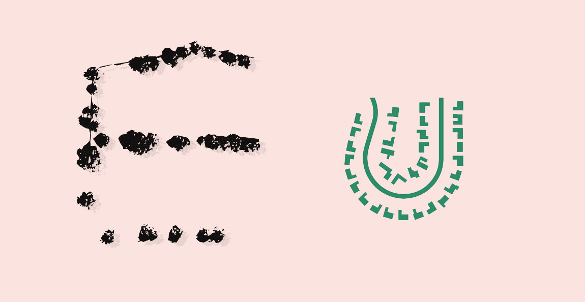
AERIAL BOLD
By Lobregat Balaguer
In design, one type of eunuch could be social architecture. For castration to be achieved, the social architect should be truly immersed within a beneficiary community, committed to putting their input and needs as a priority. Control of the design libido is sacrificed, willingly or under coercive duress. This does not necessarily mean that whatever the amputee produces must be of inferior quality or value. It simply means that traditional standards of what is desirable, beautiful, functional, full of design libido, no longer apply.
If the castration is forced, this is generally a traumatic experience which can later be leveraged towards another identity of enlightenment or redemption—the warrior or priest eunuch. If the castration is sought after as a tool for spiritual gain, it is a liberation from classic, archaic, centralized tenets of what is and is not a design’s strength.
This doesn’t imply a disappearance of the architect’s stamp, a fear native to many designers. It is merely a commitment to putting a beneficiary community’s will on an equal level as the donor’s will, thus reversing the traditional sources of power, which generally flow from north to south; west to east, or Developed to Developing.
Some architects find this reversal of power (sacrifice of male organs) difficult to comprehend as a necessary component in social projects. They are used to practicing within another power struggle almost exclusively: designer vs. client. Some architects take a community’s need or a disaster’s devastation as a tabula rasa opportunity to impose their egos and utopias full force, whether or not the utopia has any congruency to the landscape, social mores and aesthetic traditions of the construction site (colonization of the uterus).These kinds of projects still belong to the realm of social architecture, but cannot be considered a manifestation of the design eunuch. They are but projections of the designer’s archetypal “libido” as a performative monument, thrust into an archaically feminine site or beneficiary.
Aerial Bold: Benedikt Groß & Joey Lee. A type family (and research project) built from aerial photos of buildings and other landscape forms. Aerial Bold is in intellectual essence a eunuch, as it views phallic objects not as singular monuments but as shapes that can be abstracted into further meanings. Still, it is eunuch in that it has socially influenced characteristics. It is a Kickstarted project, which means control of its existence was relinquished first to the support and approval of a social group. The typefaces included in the family—Aerial Bold Buildings, Aerial Bold Suburbia, and Aerial Bold Provence—are referred to as fonts, which indicates that social usage of the term “font” trumps its more precise academic definitions. In other ways, it is more of the same architectural ego born of traditional North-Western technocracy. It uses buildings from developed countries but purports to be a “world” view. In its process of creation, its authors rated the typography on designer-generated scales of beauty. That would be a point against its castration, as the designer retains the agency of creating something they think is beautiful. Rather than serve a social purpose on the outset, this technology was created for its own end, a social purpose to be found later or never. The impact of Aerial Bold on language processing, whether poetic or incidental, is secondary to its initial intent: simply to materialize a “beautiful” idea. Thus, though it resembles a eunuch in some ways, Aerial Bold is perhaps not a true one.
Lobregat Balaguer is a writer, publisher, and graphic designer based in Manila. She runs the Office of Culture & Design, a platform for social practice projects and research, and co-founded the publishing and design “hauz” Hardworking Goodlooking.
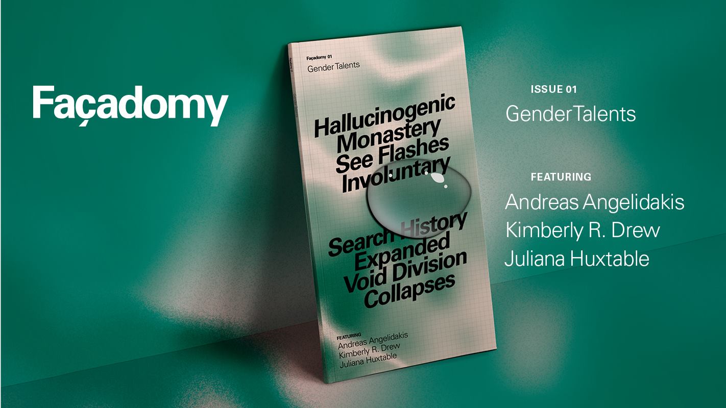
SUPPORT FAÇADOMY!
This post was conceived and created for The Gradient by Façadomy, a new publication that explores contemporary identity through the lenses of art and architecture. The funding campaign for the next edition of their inaugural issue, “Gender Talents,” is currently live on Kickstarter.
Get Walker Reader in your inbox. Sign up to receive first word about our original videos, commissioned essays, curatorial perspectives, and artist interviews.
)
)
)
)
)
)
)
)
)
)