Distinctive features of the Ukrainian Cyrillic script
Answers
-
John Savard said:But the issue with such typefaces, in general, is not any question about their historical legitimacy. Instead, it is that they depart so much from current common practice that they are regarded as only suitable for use as display typefaces. (In fact, some would regard them as only one step below - even if a big step - trying to persuade people to use Glagolitic!)I would say it’s even stranger than that. Ever since the company Paratype (it had a different name back then, but that’s beside the point) released a digital version of the "Izhitsa" typeface, it has been used to print everything imaginable—whether appropriate or entirely inappropriate—across the entire post-Soviet space. It isn’t perceived as "historical" or "Church Slavonic," but simply as a "pretty font" that can be used to decorate anything (though, it must be admitted, the results are often quite unattractive).A separate topic is the legacy of *skoropis*. In my view, it would be fascinating to speculate on how—under different circumstances (for instance, had the Petrine autocracy never come to be)—the graphic forms of these letters might have evolved, and what role they might have played in book typography.0
-
John Savard said:viterzbayraku said:Peter I's typographic reforms of 1708–1710, followed by Russian imperial standardization, established a particular model of Cyrillic across a vast territory. This does not make that model the only historically legitimate one.That is true, and certainly even for Russian, let alone Ukranian, plenty of Cyrillic typefaces of a pre-Petrine character exist.But the issue with such typefaces, in general, is not any question about their historical legitimacy. Instead, it is that they depart so much from current common practice that they are regarded as only suitable for use as display typefaces. (In fact, some would regard them as only one step below - even if a big step - trying to persuade people to use Glagolitic!)This, of course, does not prevent anyone from making use of subtle pre-Petrine influence in a contemporary Cyrillic text typeface.One common misconception is to assume that the typefaces emerging from the reforms of Peter I represent something modern and self-sufficient, while anything predating them—or arising from experimental work—is merely derivative and purely decorative or accidental. In reality, however, you are simply unaware of the full scope of typefaces being created within the Ukrainian typographic community. This is partly because we still lack a single, comprehensive website to showcase them (I'm working on it). However, perhaps that is good ))Returning to the «Zakon» typeface: a common mistake is to evaluate it in isolation from its intended context. It was designed primarily for internal use within the Ukrainian parliament. The fact that its main version is publicly available is merely a side effect, not the goal.2
-
viterzbayraku said:It was designed primarily for internal use within the Ukrainian parliament. The fact that its main version is publicly available is merely a side effect, not the objective.The Ukranian parliament would still profit from being able to write personal names, place names, and quotes from non-Ukrainian countries. I hope someone will fill out at least the basic Latin. (Incidentally, I suspect using the Ukrainian breve as a starting point for unconventional renditions of the acute, grave, tilde, etc. in Latin could be fun...)When you get down to the capital Eszett, ping me, I'd be glad to help!1
-
Current version of this font just public betaChristian Thalmann said:viterzbayraku said:It was designed primarily for internal use within the Ukrainian parliament. The fact that its main version is publicly available is merely a side effect, not the objective.The Ukranian parliament would still profit from being able to write personal names, place names, and quotes from non-Ukrainian countries. I hope someone will fill out at least the basic Latin. (Incidentally, I suspect using the Ukrainian breve as a starting point for unconventional renditions of the acute, grave, tilde, etc. in Latin could be fun...)When you get down to the capital Eszett, ping me, I'd be glad to help!0 -
viterzbayraku said:One common misconception is to assume that the typefaces emerging from the reforms of Peter I represent something modern and self-sufficient, while anything predating them—or arising from experimental work—is merely derivative and purely decorative or accidental. In reality, however, you are simply unaware of the full scope of typefaces being created within the Ukrainian typographic community.I certainly admit that I am not well-informed on Ukrainian type design. I do not, however, share the misconception that "anything preceding" "the reforms of Peter I" "is merely derivative and purely decorative or accidental".Ukrainians, Russians, and for that matter Bulgarians, Serbs, and Belarusians put words on paper before Peter the Great (as he is commonly known in the English-speaking world, without actually implying he has any actual greatness), and they put them on paper to be read as text. So of course the styles of alphabets in those days were genuinely functional and in no sense relegated to being purely decorative.I could still be mistaken about what I do believe. What I believe, which you may correctly show to be mistaken, is only this: that, since the people of Ukraine today are not the same Ukrainian people who lived before Peter I, an authentic and historically-accurate typeface which recreates pre-Petrine typography or calligraphy would still be only suitable for use as a display typeface, as it would be unfamiliar and difficult for normal reading tasks.This isn't because the post-Petrine style is self-sufficient, or inherently superior to what preceded it, but simply because it is what is ubiquitous and familiar - it is not a question of inherent properties of the typeface itself, but where the typeface stands relative to its audience.Oh, wait: you left two other possibilities besides decorative. I would also deny misconcieving such typefaces to be accidental, if you meant that I felt the similarities to pre-Petrine typography were coincidental. But derivative? I hadn't been criticizing anything as accidental or derivative, as I regarded those issues as irrelevant. I would expect, since such typefaces even existed in typefoundries in the English-speaking world, that there was a living, continuous tradition of producing Cyrillic typefaces based on pre-Petrine models for a long time - so, no, I wasn't claiming that current pre-Petrine style typefaces are derived only from directly examining pre-Petrine models without context, without the opportunity to be informed by re-interpretation and modification of these models by typefaces designed through the succeeding ages. If I am understanding you correctly, and this is the charge. (Not that I don't strongly suspect that many typefaces with a pre-Petrine look from ATF and so on aren't "derivative" in that sense, but that there was a living tradition, even in the Soviet Union and the Russian Empire before it, of designing new typefaces on pre-Petrine models, even if I do suspect they were mainly used for decorative purposes to evoke a historical or nationalistic feeling, is something I did not doubt and did not intend to question.)1
-
‘pre-Petrine typography or calligraphy’ in Ukraine includes this (title page, Registry of the Zaporizhzhian Host, 1649):
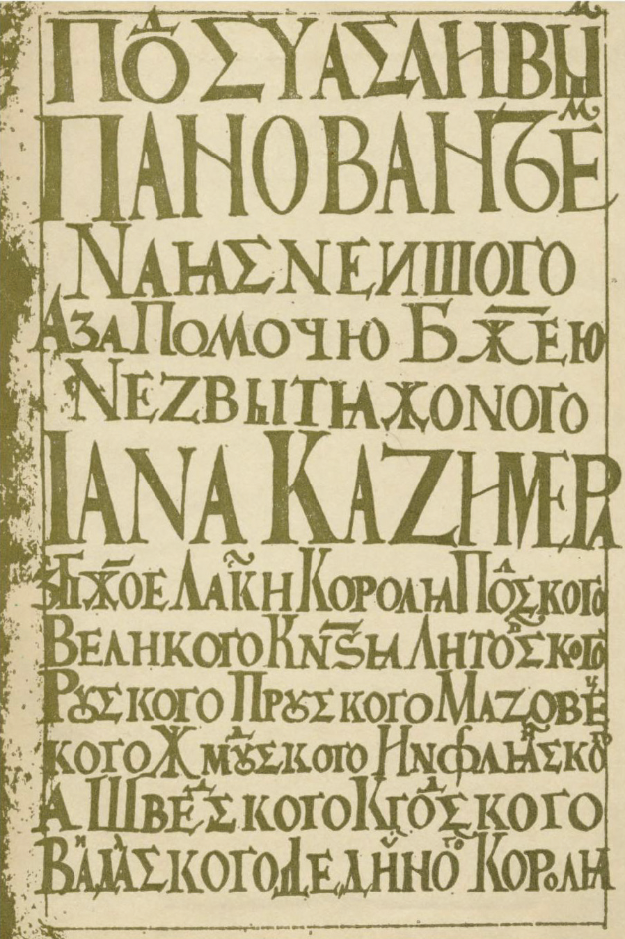 So we’re not just talking about the more familiar and older traditional styles of Old Slavonic lettering. It is a mistake to think that the Petrine model type is the first integration of Latin-influenced forms in Cyrillic, or that such things occurred only in Muscovy.
1 -
John Hudson said:So we’re not just talking about the more familiar and older traditional styles of Old Slavonic lettering. It is a mistake to think that the Petrine model type is the first integration of Latin-influenced forms in Cyrillic, or that such things occurred only in Muscovy.That is very interesting, and a surprise to me. But I should not have been surprised. After all, in addition to Russia/Muscovy, Poland also ruled over Ukraine at times. And the Latin alphabet had been used to write Ukraine, at least in those parts of Ukraine that were predominantly Catholic instead of Orthodox. So the influence of Latin could be said to have been stronger there.And, given that the basic letterforms of Cyrillic came from Greece, writing Cyrillic in styles used for Latin and for Greek capital letters would appear to have been an option from the very beginning - rather than being something unnatural to Cyrillic that Peter I inflicted on it, as one former participant here seemed to feel.
Ah. From this I infer that the absence of letters used for writing Russian, Belarusian, Bulgarian and Serbian is merely temporary. First, the Ukrainian alphabet will be adjusted and brought to perfection, and then ancilliary matters can be dealt with, with the letters for other related scripts being then designed in the same style.viterzbayraku said:Current version of this font just public betaLatin is present, though, so that the typeface, even in this stage, is usable in a Latin-dominated world... but it's no surprise then, that getting the kerning right there is also postponed until later.
0 -
And the Latin alphabet had been used to write [Ukrainian], at least in those parts of Ukraine that were predominantly Catholic instead of Orthodox.That was a fairly limited, much later effort in Galicia (from roughly 1840, fizzling out in the late 1880s), so would not have been a factor in the mid-17th Century. In any case, the Zaporizhzhian Host was located in the south east of Ukraine, beyond the area you refer to, and outside the borders of either Austro-Hungarian Galicia or the earlier Polish-Lithuanian Commonwealth. So I think something more organic in the spread and cross-script influence of texts and lettering styles probably accounts for this example. Without contemporary texts with which to compare, it is impossible to say whether this is part of a regional trend or the idiosyncratic work of an individual scribe. Unfortunately, because of the war and invasion, most archives in Ukraine are currently in underground storage and cannot be accessed. That image was the best quality one the editors and I were able to source for my chapter on Cyrllic in the Bloomsbury global typography book.0
-
George Tulloch said:
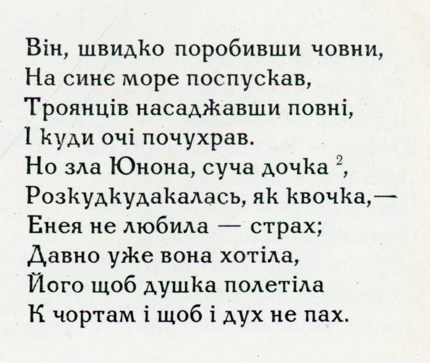 Here’s an extract from an edition of Kotlyarevskyy’s Eneyida published in Kyiv in 1969. The /ka and /zhe with ascenders look very un-Russian.
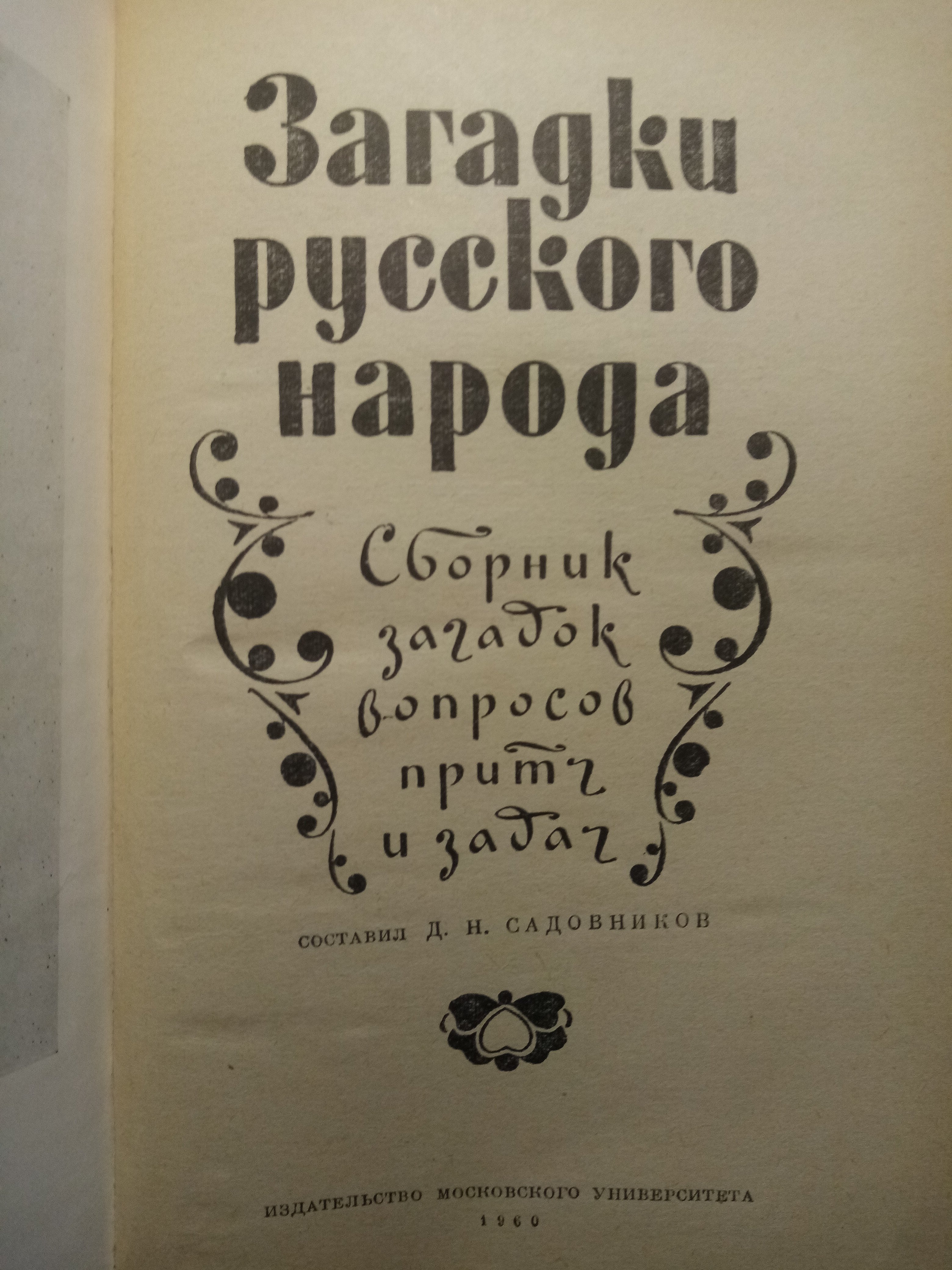
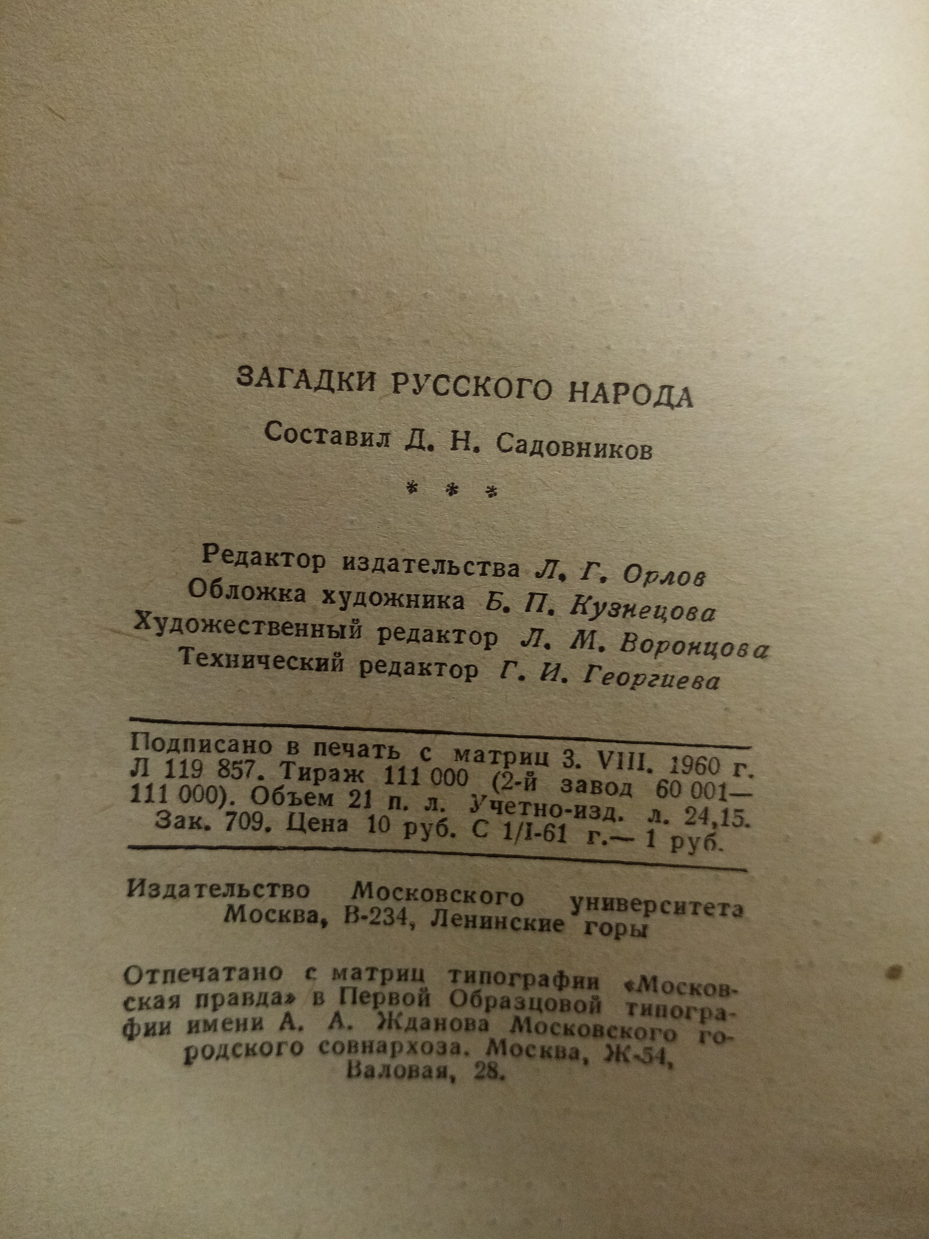 I was sure I'd find a counterargument on my shelf—and here it is.
On the one hand, yes, these are display fonts, not typesetting. On the other hand, the theme itself (parables of the Russian people) suggests that the artist wanted to emphasize "Russianness."
The problem with this solution today, as I see it, is this:
1. In the Latin alphabet, *k* stands alongside *bdlh*, while in Cyrillic it hangs in the air, symbolically supported by *ж*.
2. The Cyrillic already has a Bulgarian variant, and today the high *k* is associated with it.
3. In the 1990s, there were many low-quality Cyrillic versions with a high *k* in circulation, which arose not from the designer's design, but from his laziness, and this aura, as I see it, hasn't completely worn off yet.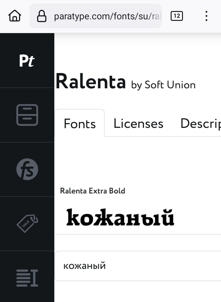 (yes, it's a Cyrillicization of the *Raleigh* font and yes, they still sell it that way)
2 -
I have also found a counterexample, from the book "Decorative Scripts" by Klikushin from 1987:
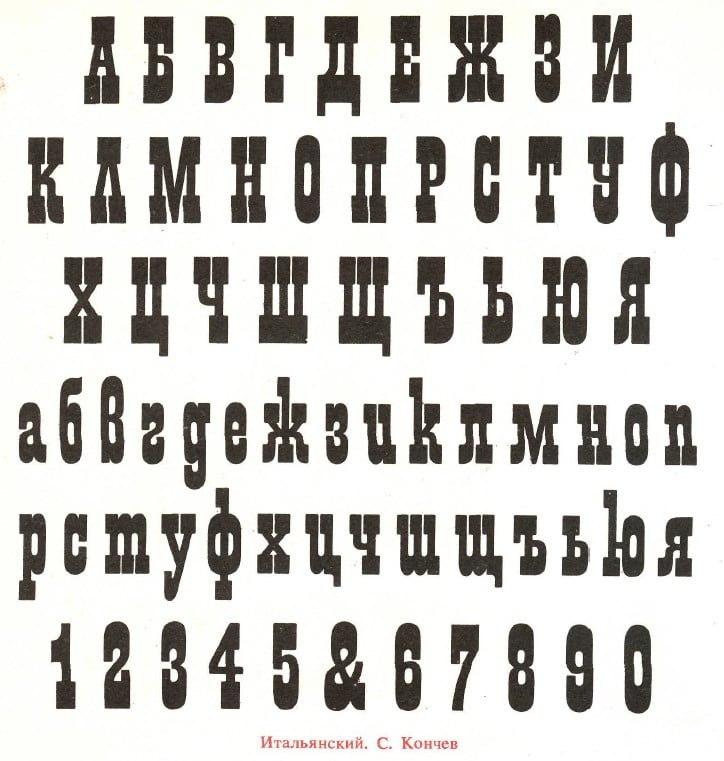 It has the same distinctive features, but they are there to look old-timey, not distinctively Ukrainian.None the less, I still thank George Tulloch for his interesting example.Also, it's certainly possible that Ukrainian tastes have chosen some pre-Petrine features common to Russian and Ukrainian as worthy of retention while Russian tastes rejected them, so features that were historically shared could still acquire a national character over time.1
-
John Savard said:It has the same distinctive features, but they are there to look old-timey, not distinctively Ukrainian.In pre-revolutionary Russian books—though, unfortunately, having moved house several times, I have lost my library and cannot provide specific examples from my own shelves—the use of a tall "k" in title-page typography was far more common than it is today. This was simply because European type foundries, when fulfilling commissions for Cyrillic typefaces, would often add a handful of Cyrillic characters based on their own aesthetic preferences; the letter "k" was not always deemed worthy of a proper redesign. In this sense, I would cautiously characterize this particular form as something that stands apart from the broader Cyrillic typographic tradition.
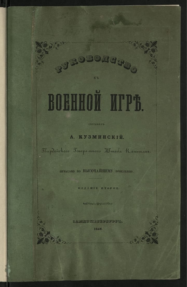 (Note the "k" in the word *Gvardeyskago* [Гвардейскаго].)At the same time, and quite independently, there existed a practice—rooted in handwritten scripts—of extending the tails and flourishes of letters, a stylistic flourish reflecting the scribe’s "dash" or flair. This was not inherently "Russian" or "Ukrainian" in any unique sense; however, if we examine examples of *skoropis*—and not necessarily from the distant past (as late as the early twentieth century, figures like Zvorykin and Remizov were still employing *skoropis* with great virtuosity, each within his own respective field)—we can see this tradition in action.0
-
Thank you for initiating this discussion. It’s a pleasure to read Ukrainian typographers in this thread, and I would like to know more.
Since the subject also includes a comparison with Cyrillic writing systems (in plural) in Russia, I’m interested in the differences between national traditions within Russia itself. It could also help to better distinguish the limits of Muscovite traditions or its historic mythology.
So far I see only Moscow and St Petersburg represented, but how is Cyrillic living in the republics? (BTW, it’s very telling to see references to the Soviet propaganda edition Moskovskaya Pravda [“Moscow Truth”].)
Comparing writing systems in Ukraine and Russia is tricky, since for many nations within Russian Empire, Soviet Union or post-Soviet Russia, the traditional writing system isn’t Cyrillic.
There are also two terms for “Russian”: russkij (ethnic Russian) and rossijskij (Russian in the civic sense, i.e. relating to the Russian Federation and its citizens).
As for the “traditional” references used in Russian cases (in plural), they are sometimes quite random. But even when random, they may be still colonial.
For example, when Korolkova from Paratype designed the typeface for the city of Belgorod (in 2020 or 2021, it’s a city just near the border with Ukraine), her reference was Rome and the Roman Empire. I will write about this in the parallel thread on imitation and tradition.
Or, in this thread, Dsche refers to Cyrillic in Kazakhstan without comparing it to Cyrillic in Tatar, Bashkir, Yakut, Tuvan or other republics with main Turkic-language tradition. There’s no mention at all of Arabic or Latin scripts (such as Yanalif or Arabic writing in Tatarstan until XXth century), or of Mongolic writing systems such as Todo Bichig in the Republic of Kalmykia.
At the same time, Dsche refers to another Soviet edition, published in Minsk (Belarus), as a counter-argument to the claim that the Ukrainian traditions were underrepresented under the Soviet regime, and as an illustration of a supposedly “main” tradition.
Dsche says that “perhaps, in time, we will see a distinct graphic representation of the Ukrainian Cyrillic script”, while many new Cyrillic traditions in Russia are so recent, so there’s no adequate keyboards or enough typefaces that support extended Cyrillic.
So my main point is just to invite you to look at Russia in more pluralistic and decentralized way, taking into account plurality of nations under control of the current federal power.
0 -
Boris Melnichenko said:
At the same time, Dsche refers to another Soviet edition, published in Minsk (Belarus), as a counter-argument to the claim that the Ukrainian traditions were underrepresented under the Soviet regime, and as an illustration of a supposedly “main” tradition.
I am well aware that my arguments—or, more accurately, this "space of arguments"—could be interpreted as colonial rhetoric (especially since most people here cannot identify me behind my username, whether I am Ivanov or Pristupa). Furthermore, I sense that, despite a veneer of politeness, I may have made a few blunt remarks toward my colleagues; if that was the case, I offer them my apologies.The "national typefaces" section in Klikushin’s catalog includes stylized "Armenian" and even "Indian" versions of the Cyrillic script—essentially a way for graphic designers to evoke a quaint, "folk-national" aesthetic for the performances of traditional dance ensembles from the "fraternal republics." Yet, in my view, this material should not be dismissed solely as a "colonial narrative"—not least because it contains a direct reference to Narbut, a figure who genuinely contemplated how to give graphic expression to Ukrainian identity.At the same time, I must admit that I would prefer to live in a world where the suitability of a typeface is determined not by the color of its creator’s passport, but rather by the criteria of "does it fit?" "could something better be found?" or "is it inappropriate?"0 -
The general picture I have formed of particular national, linguistic, and regional ‘dialects’ in Cyrillic script, is that they may favour certain forms, but those forms are seldom unique. Bulgaria has developed the most consistent and widely used distinctive voice in Cyrillic typography, but all the letterforms involved can also be found elsewhere, especially in handwriting. What is distinctive in Bulgaria is that a) these forms have been adapted to both upright and cursive-derived typographic styles, and b) they are favoured to the exclusion of other forms.My impression of Ukrainian typography, as something with distinctive characteristics, is that this involves certain styles of text of local origin, rather than a specific set of letterform preferences. And that’s plenty on which to build a distinct voice. When I travel, I am aware of French typography, and German typography, and Dutch typography, even though they share mostly the same letterforms, and even though the global font market has diminished the cultural specificity of French, German, and Dutch type foundries making type in and for particular places.0





Categories
- All Categories
- 47 Introductions
- 4K Typeface Design
- 505 Type Design Critiques
- 597 Type Design Software
- 1.1K Type Design Technique & Theory
- 679 Type Business
- 912 Font Technology
- 29 Punchcutting
- 545 Typography
- 129 Type Education
- 334 Type History
- 82 Type Resources
- 114 Lettering and Calligraphy
- 33 Lettering Critiques
- 81 Lettering Technique & Theory
- 591 Announcements
- 102 Events
- 118 Job Postings
- 181 Type Releases
- 189 Miscellaneous News
- 270 About TypeDrawers
- 54 TypeDrawers Announcements
- 114 Suggestions and Bug Reports