Movember Font Design Challenge - Morialta

Drawcard
Posts: 83
As part of this year's Movember challenge, I've set myself a goal of designing a mo-numental font within one month, and then releasing it for free for use. I would welcome your feedback on it as it takes shape! I am doing this challenge to help fundraise for men's health and also promote type design as an art form for others to try out.
http://movember.com/m/15543186 for updates - I can only post 90 second videos there, for longer format progress videos you can check my Instagram account: @ fontsbydrawcard
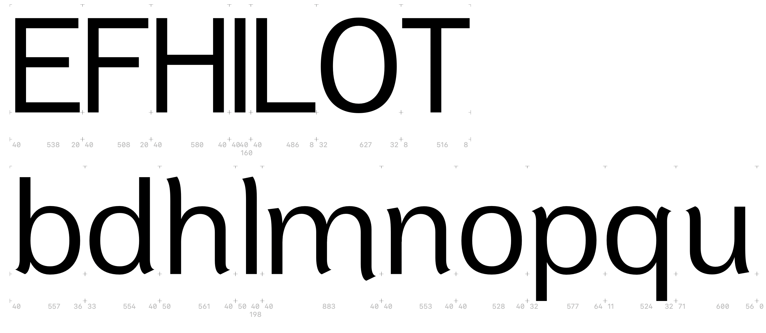
Here are the characters I've done so far in the first 3 days. The /m has an intentional swash on it, somewhat evoking the flourish of a moustache...! The uppercase characters are rough drafts and I'm still deciding what flourishes to introduce on them. No kerning yet, just basic sidebearings set up.
Here are the characters I've done so far in the first 3 days. The /m has an intentional swash on it, somewhat evoking the flourish of a moustache...! The uppercase characters are rough drafts and I'm still deciding what flourishes to introduce on them. No kerning yet, just basic sidebearings set up.
0
Comments
-
I would have a look at a few things:
- Contrast. For example, your O/o is thinner at the top than at the bottom, and I don't see a reason for this in your design (i.e. it's not consistently repeated elsewhere – p/q are thicker at the bottom instead, and much more so at that)
- Stroke endings. Your little flare endings (what are they for?) are inconsistently shaped. Sometimes sharp, sometimes rather blunt, at differing angles. If they are intentionally different, this doesn't show, so it currently looks like a mistake.
- Proportions. Your H is very narrow, your L very wide, you E as well. I would recommend looking at roman capitals (historical proportions) and then looking at more modern reference fonts (e.g. Helvetica, modern proportions) to see how capital proportions work in relation to each other. Currently, they feel a bit all over the place.
- Shape consistency. The stroke joins (in h, m, n) are different. The h is darker at the shoulder than the other two. bdpq exhibit the same issues. Make these work together better.
- Spacing. /l/m is much tighter than m/n, HH is very tight, and so on. Maybe this is not something you've worked on, yet.
I would always ask myself the question: Why (x)?, and then apply that reasoning everywhere (explicitly asking "why not (x)" if you don't apply it – exceptions confirm the rule). I would ask this question about the flares – one answer only. You currently provide several. Same for the proportions. The contrast. And so on.3 -
This is ambitious stuff! I am guessing you are relatively new to type design? Please don’t be discouraged by all the criticism — just trying to give useful feedback. Unfortunately, the USEFUL feedback is mostly negative. I do think the core innovations you are attempting here are fun, even if trying this on a neogrotesque skeleton is especially challenging.
Spacing is a mess. When you have letters with a slight hook in an outer stem, you need to pay more attention to where the main stroke is, in spacing, and not just to your font editor’s sidebearings report — the latter becomes way less helpful in this siutation.
The main vertical on the lowercase el should be a lot closer to centered between the origin and advance width. The same problem affects most of your letters. No kerning should be required for the hl and lm spacing to look relatively even, and also similar to cap HI and IL. The spacing between cap straight-sided letters should be similar to, but a smidge more than, between lowercase straight-sided letters. Instead, because of minor embellishments, the lowercase letters have far more generous spacing. And why is the sidebearing completely different (64 vs 11) between the right side of p and the left side of q?
(Note: I am not saying which general spacing trend is better… in fact, I think the caps are way too tight, unless you mean this to be used primarily at massive sizes.)
The apex and nadir of the outer bowl contour on bdpq are not right. They should NOT be directly above/below the matching apex/nadir on the inner curve. That makes things look lumpy/distorted. Instead they should shift slightly out, away from the vertical stem. Look at some serious professional fonts and see how this is done. The amount of horizontal shift needed depends on the weight. The overall effect is that the outer curvature is far more even, but not the same as the inner.
There are a lot of smaller odd things as well.
I would expect the O to be rotationally symmetrical left to right. It is not — nor mirrored either.
The lower bar on the F should be slightly lower than the middle bar on the E.
1 -
Thank you both for your feedback. I will definitely be taking it on board and incorporating this into the work. Commenting on some specific points:
- The spacing is atrocious for sure
 I usually set some rough sidebearings to help with drawing all the glyphs, and then I'll do a proper kerning & spacing pass (I use Kern On for most of the heavy lifting, with manual tweaks after).
- The end caps are a bit of a nod to moustach-y flourishes & shapes, and I'm going to make cap components to keep them looking consistent. The only variation will be the longer /m extension (I might lengthen that to make this more noticeable). It can be tough to pick the right letters to add personality to the design, too much and the font is unreadable - too little and the visual theme is lost among generic looking letters. If anyone has any thoughts on that, I'm keen to hear them.
- Honest & frank feedback is always welcome and after 20+ years in the design industry I am accustomed to recieving it! I'm glad I'm getting it now before I bake in too many errors with other letters. I have also been re-reading Karen Cheng's Designing Type 2nd Edition to help guide me.
- It definitely is an ambitious project, however I've decided to design just one weight & stick to Latin / West European for the character set, so I have a chance of finishing it by the end of Nov. I think the main use case for this would be for display & headlines. Fun is the name of the game for this one.
- It took me an entire year to finish my last font, but with the help of Typedrawers I got it done. With Altamira, I got too hung up on stuffing that font with features, but for this one I just want to get the core design released, and then add more to it if it becomes popular.
0 - The spacing is atrocious for sure
-
Also, How to Create Typefaces: from sketch to screen is back in print. Everybody should buy a copy!1
-
I think the flourishes are currently much too small. If I squint at the screen, or look from a distance, they disappear.
A good way of balancing such things is to make another version where a feature (like flourishes, or serifs) are too prominent, then you have a range and can dial the feature in between the "definitely too large" and "definitely too small" versions.1 -
What a lovely looking book... I am definitely ordering that for Xmas!Thomas Phinney said:Also, How to Create Typefaces: from sketch to screen is back in print. Everybody should buy a copy!0



Categories
- All Categories
- 47 Introductions
- 4K Typeface Design
- 505 Type Design Critiques
- 596 Type Design Software
- 1.1K Type Design Technique & Theory
- 677 Type Business
- 911 Font Technology
- 29 Punchcutting
- 544 Typography
- 129 Type Education
- 333 Type History
- 82 Type Resources
- 114 Lettering and Calligraphy
- 33 Lettering Critiques
- 81 Lettering Technique & Theory
- 587 Announcements
- 101 Events
- 118 Job Postings
- 179 Type Releases
- 188 Miscellaneous News
- 270 About TypeDrawers
- 54 TypeDrawers Announcements
- 114 Suggestions and Bug Reports