Michelangelus typeface from the Vatican

- There is no variable font version.
- As one would expect from the Vatican, it includes all the crosses specified by Unicode

- The slant of the cursive version seems excessive to me compared to the slant of the letters in the document signed by Michelangelo (though this is likely a matter of taste).
- I would have preferred an open font license.

Comments
-
Fun idea, but not well executed IMHO. It looks like someone’s first attempt at a Roman, and Apple Chancery as the Italic.1
-
michele casanova said:I would have preferred an open font license.Having gone to the link you provided, I see it is available for free download, but it can't be used as a webfont, and the reasons why make it appear that this typeface is now an addition to the fonts that come with your copy of Microsoft Windows. Which presumably means that Macintosh and Chromebook users shouldn't download it.I do find it odd that the Vatican is giving gifts to Microsoft.0
-
.0
-
The press release and slick promotional site consist of everything I hate about press releases and slick promotional sites.6
-
I don’t get it. First of all, they show very few examples of Michelangelo’s handwriting and letters. But from what few I can find, this typeface looks nothing like it. Strikes me as a bunch of baseless hyperbole.6
-
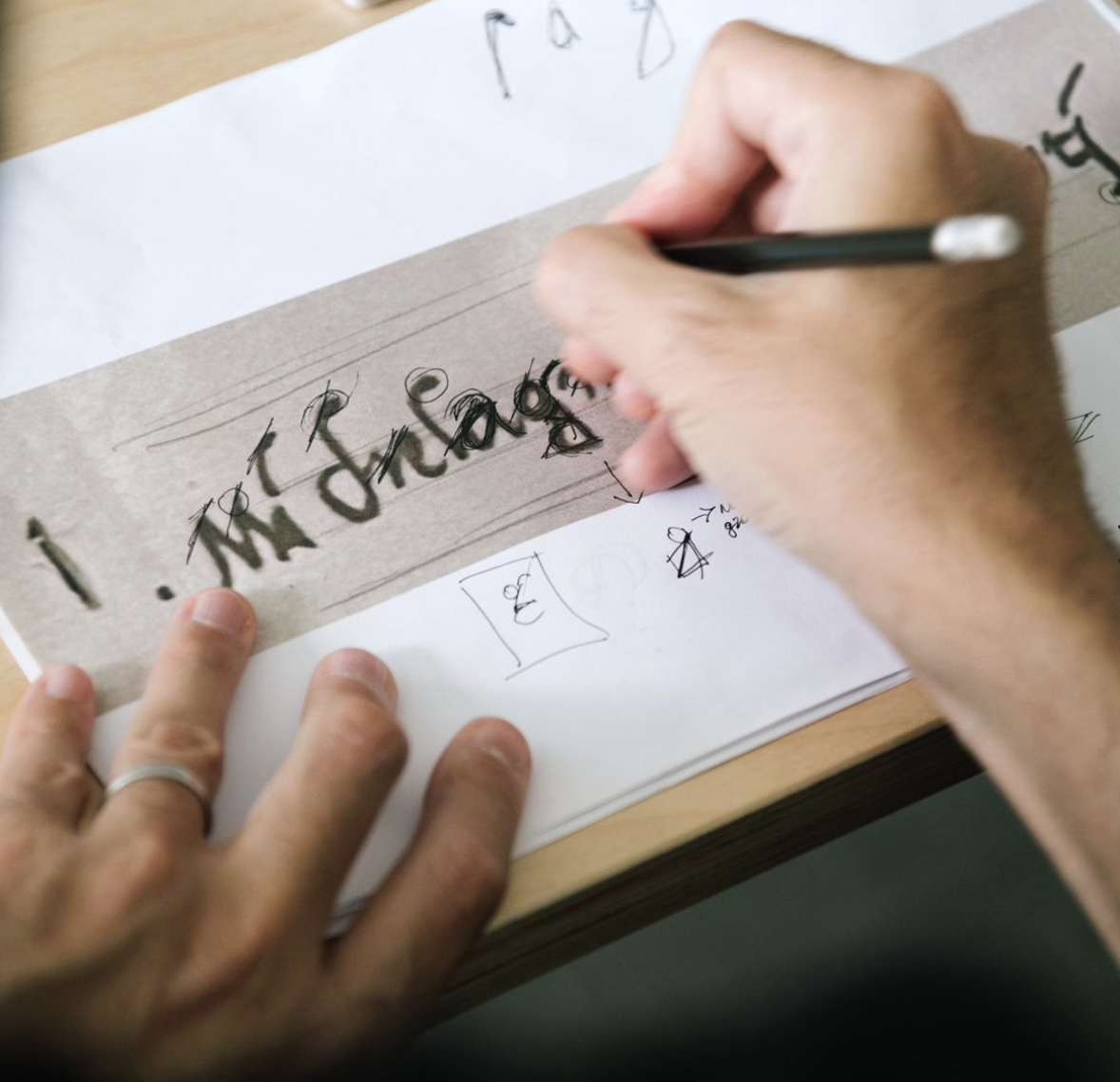
You don’t find this image a convincing depiction of the workflow?

1 -
michele casanova said:
- The slant of the cursive version seems excessive to me compared to the slant of the letters in the document signed by Michelangelo (though this is likely a matter of taste).
The cursive italics of a typeface are intended to convey emphasis; handwriting is simply a means of expressing text. So for the cursive portion of a typeface to be sloped more than the handwriting that inspired it is not necessarily a bad thing.Craig Eliason said:The press release and slick promotional site consist of everything I hate about press releases and slick promotional sites.While I'm not usually inclined to be quite so judgmental... the phrase at the end, "a structure so rigorous that it allows the form to remain free" did strike me as an attempt to appear to say something without meaning anything. I prefer words to communicate meaning in a manner that minimizes the chances of misunderstanding.I mean, I can sort of get the idea that a typeface being well structured is a good thing, and for the curves, the shapes, in the letters to have the freedom of handwriting instead of being laid out with compass and straightedge makes for a better chance of artistic beauty... so this seems to be a statement that this typeface delivers these two good, but seemingly contradictory, things... without giving away a clue about how.We wrote our letters freely by hand, and then we fitted them neatly into boxes only by enlarging or reducing them? Oh, and tastefully adjusting the stroke widths to match. Probably that isn't what they did, but I could see someone trying this approach.EDIT: On reflection, though, I see that I might be quite unfair. Words do not always serve to convey clear, unambiguous, facts or directions. Sometimes they are meant to evoke a feeling.And the Italians have a proverb: "A translator is a traitor".It is quite likely that what was written on that web page was originally written in Italian - and, so, perhaps were I a native speaker of Italian, and read it in the original, I could appreciate the subtle meaning that phrase was intended to convey - a meaning too subtle to be conveyed in the simple literal meanings of words.0 -
Unfortunately, no examples of Jesus’ writing are extant.
Nonetheless, should it not be possible to produce a font based on his hand?
After all, artists have for centuries depicted his likeness, despite the absence of contemporary portraits.
Aramaic, Hebrew and Greek would be appropriate, and Latin could be derived from the Greek.
1 -
That presupposes that Jesus was literate. I judge it as somewhat unlikely that the historical Jesus could read, much less write. That said, I suppose one could base a typeface on the hand typically used in that area of the world in the 1st century, as, if Jesus could write, then it would probably have resembled that.Nick Shinn said:Unfortunately, no examples of Jesus’ writing are extant.
Nonetheless, should it not be possible to produce a font based on his hand?
After all, artists have for centuries depicted his likeness, despite the absence of contemporary portraits.
Aramaic, Hebrew and Greek would be appropriate, and Latin could be derived from the Greek.0 -
Whether or not the historical Jesus could read or write, the Gospel of Luke has him reading from Isaiah, which presumably would have been in Hebrew. In John‘s Gospel, he writes something in the sand, though perhaps it was not something that we would define as written text.3
-
Notably, Cecil B. DeMille consulted the appropriate scholars for the Almighty’s “handwriting” in The Ten Commandments.
But not much use for a paleo-hebrew font today.0 -
Slab seraph?…Nick Shinn said:2 -
Whether or not the historical Jesus could read or write, the Gospel of Luke has him reading from Isaiah, which presumably would have been in Hebrew.Literacy is a continuum of skills, not a single measured achievement. In the context of scripture reading, regularly repeated prayers, etc., there is a often an element of memorisation from oral recitation associated with the text. I can read and understand a lot of common liturgical texts in Latin and Ukrainian, but I wouldn’t call myself literate in either language.Interestingly, that text from Isaiah as it is quoted in Luke’s Gospel is from the Septuagint, so while Christ may have read it in Hebrew, Luke is quoting the recognised Greek text. While it is likely that Christ would have been reading from a Hebrew text in any town in Galilee — possibly with an oral translation into Aramaic for the listeners —, there is evidence that the scriptures were regularly read in Greek in Hellenized parts of Judea and among Jewish communities in e.g. Alexandria. So it isn’t inconceivable that Christ would also have been familiar with Greek texts.1
-
My first reaction to the design was “At least it’s not as bad as Pope Francis’s tomb!” but that’s very faint praise, indeed.
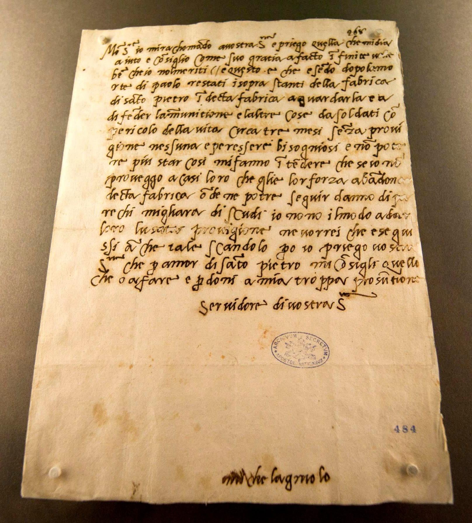
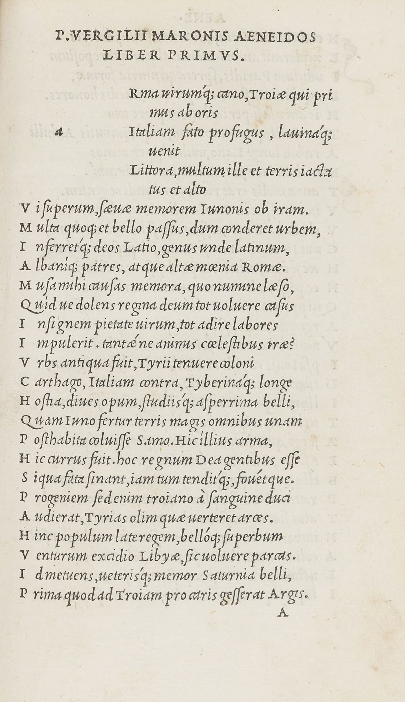
Amateurish, stylistically clueless, wtf? Many (eventually all) of Michelangelo’s letters have been very carefully digitized by the Archivio Buonarotti, in Florence, so one can get a very good idea of his handwriting style. In general, his manuscript strives to be more upright than sloped, with a slant of about 3-5º, at most. His letterforms are somewhat reminiscent of the italic type in Aldus’s 1501 edition of Virgil. (See images below)
In stark contrast, the italic of Michelangelus carries an overall angle, applied with monotonous strictness, reminiscent of P-S, Fournier, though not nearly so graceful, with Fournier's conscious preservations of some irregularities of angle. Not only is it unrelated to Michelangelo’s script, it doesn’t feel at all Italian. Some of the italic caps, such as M, are utterly inept.
The straight-sided roman M is reminiscent of the one in the enormous band of letters at the base of the cupola of St. Peter’s in Rome, which, as a letterform, is an outlier. The lowercase roman is very stiff; it reminds me of Grandjean’s Romain du Roi. That aside, it’s much better executed than the italic.
Both roman and italic have many ligatured cap combinations—none of them convincing. Many of the italic swashes are dreadful.
Why am I so harshly critical about this? These fonts were made for St. Peter’s in Rome, not the Venetian Hotel in Las Vegas, though, then again, the fonts don’t have enough sparkle for Las Vegas.
As for the language(s) spoken by Jesus, I’ll leave the matter to Mel Gibson . . .
 7
7 -
QwerasdI suppose one could base a typeface on the hand typically used in that area of the world in the 1st century, as, if Jesus could write, then it would probably have resembled that.That was my inference.
And at first I thought diligent research would be the way to proceed.
However, as the Vatican typeface looks nothing like Michelangelo’s handwriting, being merely branded with his well-known name, why bother?
Besides, there’s already Chris Costello’s brilliant Papyrus, which was designed with a sincere “early Christian” vibe.
And, more in the line of parody, Phil Grimshaw’s equally wonderful Tempus.
0 -
Michelangelo works in mysterious ways ;-)1






Categories
- All Categories
- 47 Introductions
- 4K Typeface Design
- 499 Type Design Critiques
- 591 Type Design Software
- 1.1K Type Design Technique & Theory
- 674 Type Business
- 907 Font Technology
- 29 Punchcutting
- 544 Typography
- 129 Type Education
- 333 Type History
- 82 Type Resources
- 114 Lettering and Calligraphy
- 33 Lettering Critiques
- 81 Lettering Technique & Theory
- 580 Announcements
- 101 Events
- 116 Job Postings
- 176 Type Releases
- 186 Miscellaneous News
- 270 About TypeDrawers
- 54 TypeDrawers Announcements
- 114 Suggestions and Bug Reports