Positioning of some Modifiers
mauro sacchetto
Posts: 383
A question on a lesser-known topic, on which I haven't been able to find any information: the positioning of some modifier glyphs, such as the Modifier Letter Centered Right Half Ring (U+02D2) and Modifier Letter Centered Left Half Ring (U+02D3) pairs. I should point out that glyphs like these are completely absent in many fonts.
As always, before posting my question here, I checked the settings for some fonts.
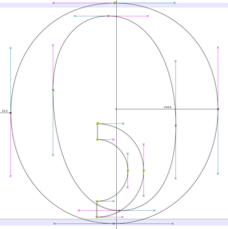
GNU Free Serif places the glyph roughly at 0 height, that is, close to the base of the other glyphs:
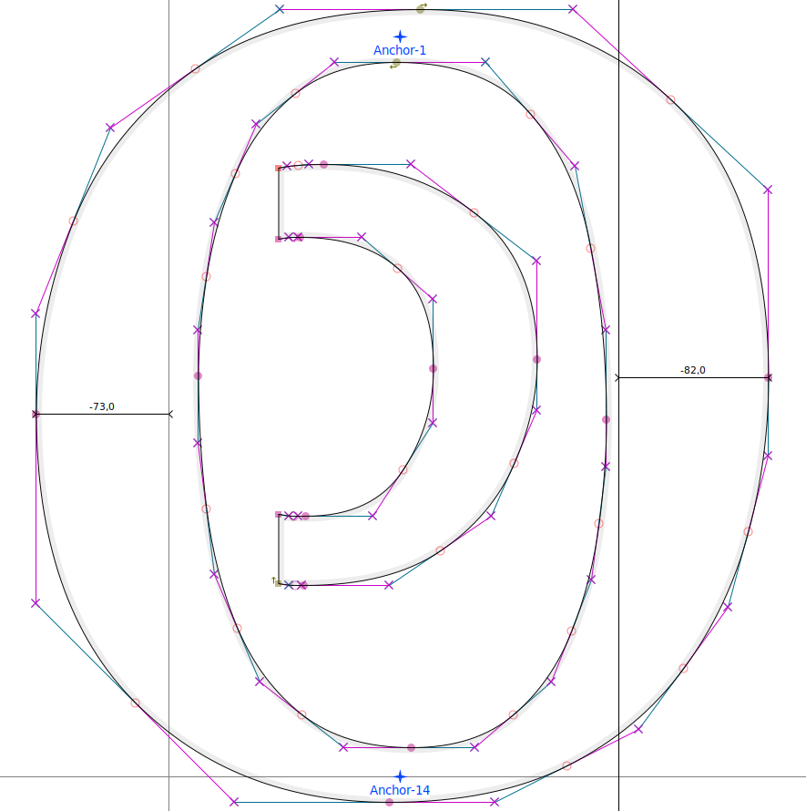
Brill, on the other hand, places it roughly halfway along the x-height:
What's the best solution and the logic behind these cases?
Thanks
m
Tagged:
0
Answers
-
To clarify — I am not sure what your intent was in showing these inside the letters — modifier letters are not combining marks. They are spacing characters, typically smaller raised, lowered, or mid-aligned. This pair are optically mid-aligned to the x-height, hence ‘centered’ (there are also raised half ring modifier letters).This is an example in Brill Roman:
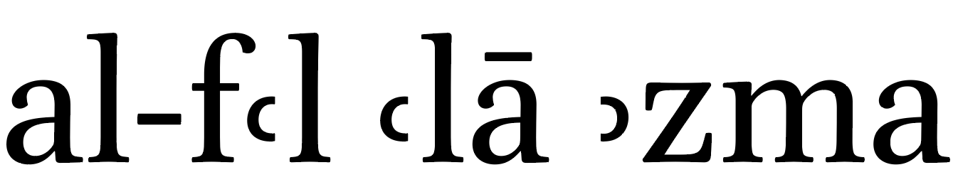 For recent versions, Brill asked me to make the more commonly used raised half ring modifiers larger, and in retrospect I should have increased the side of these mid-aligned ones also.
0 -
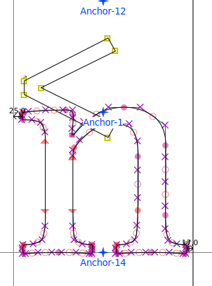
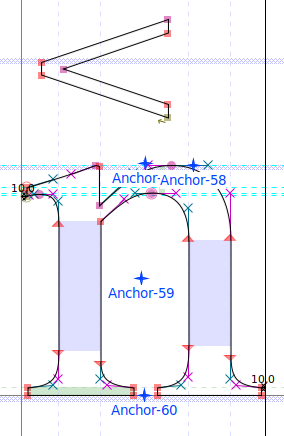
I placed the glyphs inside other letters only to highlight their position relative to the lowercase letters, not because I consider them combining marks.There are other glyphs that have different placements in different fonts, such as Modifier Letter Left Arrowhead (U+02C2) and the similar Modifier Letter Right Arrowhead (U+02C3).Once again, the fonts differ quite significantly.Brill places them at a modest height:
 GNUFree Serif places them much higher:
 If analytical guidance were available online, I would avoid constantly asking questions about such specific issues, but I haven't been able to find any documentation...Thanksm0
 -
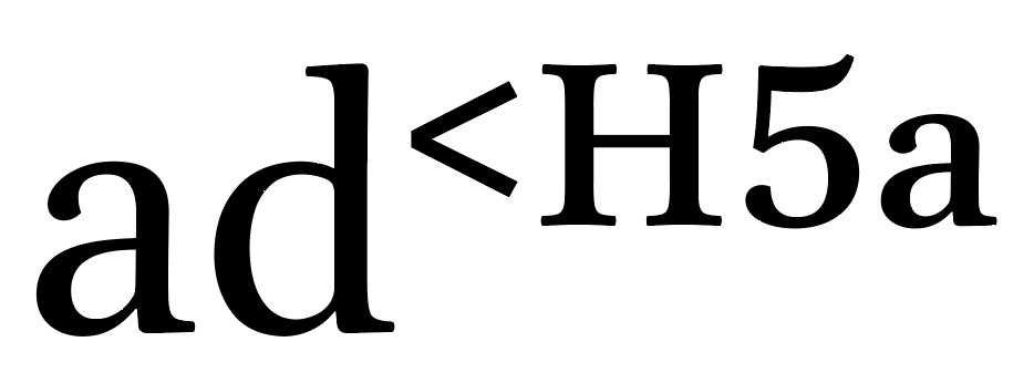
In Brill, they’re related to the height of the superior letters and numerals.This is my general approach to all the raised modifier letters and signs. In complex texts of the kinds that Brill publish, which may include these kinds of modifier characters and also superscript footnote references etc., it looks terrible if the heights of various kinds of raised characters are not optically coordinated.
 4
4 -
A very clear and completely convincing answer.Thank you.0

Categories
- All Categories
- 47 Introductions
- 4K Typeface Design
- 497 Type Design Critiques
- 591 Type Design Software
- 1.1K Type Design Technique & Theory
- 674 Type Business
- 906 Font Technology
- 29 Punchcutting
- 543 Typography
- 128 Type Education
- 333 Type History
- 82 Type Resources
- 114 Lettering and Calligraphy
- 33 Lettering Critiques
- 81 Lettering Technique & Theory
- 579 Announcements
- 101 Events
- 116 Job Postings
- 175 Type Releases
- 186 Miscellaneous News
- 270 About TypeDrawers
- 54 TypeDrawers Announcements
- 114 Suggestions and Bug Reports