Mixfont Update - seeking a designer to help complete an AI-generated font
Comments
-
@ericlu
Your title is clear: "... seeking a designer ..." !
Typedrawers is a designers site composed mostly of professional or hobby type designers, not "mercenaries".
I'm wondering why you don't understand this.
Please proceed with your private correspondents and "users from all around the world".0 -
@Yves Michel
Many of the professional type designers on this site routinely do work for hire. I don’t think the “mercenary” aspect is the problem.
I believe the stumbling blocks are:- the goal to promote AI type design feels like working against both one’s own and the entire industry’s best interests;
- the work of polishing a poorly-crafted font may seem neither fun nor creative for most, and;
- needing $10K of human work to fix an AI font, and then wanting to promote it as the first AI font in Google Fonts… seems like the project is going to end up under false pretences.
10 -
I am curious to see who will step up to claim the $10k bounty on their own soul.1
-
@ericlu happy to do it for $100k. You will see that I'm the google/fonts #1 contributor of all time https://github.com/google/fonts/graphs/contributors?all=1 I'm your guy.0
-
I'm pretty sure Google themselves are working on a generative font project... I hesitate to call these examples "fonts" but I imagine vector based artwork is the next logical step
https://developers.googleblog.com/en/how-its-made-gentype-alphabet-creator/1 -
I am coming out of TypeDrawers retirement for this one...You clearly do not care about this community nor the craft.
Sure, most people couldn't care less about a font, the issue here is that those people don't need to care, they have more important things to worry about... but you are spending a lot of time and resources on an app that is only going to harm the industry. We can tell that an AI generated font is dogshit, because we are the ones working our asses off to make them. Aside from the 100000000 other issues, a considerable issue with publishing AI slop-fonts is the perception to the outside world, that this is what qualifies as a "good font".
Type design is not about making cool shapes or coming up with a prompt, type design is about visualizing language — AI doesn't give a shit about an endangered language in Canada or an Indigenous script in Oklahoma. AI is only good for exploiting the labor of people for profits.
I'm so sick of AI evangelicals preaching this crap, especially to an audience of people who make their livelihood from producing quality fonts.I really hope all these comments help you to see that this is a bad idea.12 -
yeah, it’s all very gauche. these threads about mixfont have read like someone going onto styleforum or superfuture or whatever in the 00s and telling users about their super affordable storefront on zazzle, except worse because typedrawers is mostly a community of makers vs consumers
eventually these models will make fonts that have high technical quality and they will be just as uninteresting. maybe interesting to academia RE technical capabilities, except I dont think any of the methods being used here are particularly novel
honestly, anyone considering using tools like this should just skip the middleman and steal good fonts5 -
jeremy tribby said:[...] steal good fontsI see a major (perhaps the primary) problem in the very word "good."Google Fonts applies a rigorous selection process based on formal criteria; they can—and perhaps rightly do—impose requirements regarding point placement at extrema, adherence to formal metrics, and the mandatory inclusion of characters that no one actually needs. They check for anything and everything—except whether the actual rendering qualifies as "good." That is because "goodness" cannot be formalized; distinguishing it requires experience, a trained eye, and deep immersion in the subject.Recently, someone on Reddit was raving about one of the Google Fonts—this one:
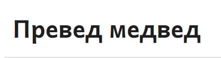 Its Cyrillic is atrocious. Nobody gives a damn.And now, thanks to AI, this is reaching a new level. Without professional feedback, the system could—I won't say it *definitely* will, but it’s a likely scenario—take a batch of bad fonts from Google Fonts and use them to build an even more terrible one. These terrible fonts would then be uploaded to Google Fonts; a new bot would grab a batch of them and create something so bad that it could give you a stroke. And so on, and so on.To be fair, the same thing can happen without the involvement of robots. A novice designer decides to check the best way to construct a particular character, visits Google Fonts, and gets drawn in by a poor example...But a robot will do the same thing faster.1
 -
They check for anything and everything—except whether the actual rendering qualifies as "good."They don't? This is news to me and several others here. There's a big difference between "they don't check for rendering at all", and "they check for rendering but sometimes bad stuff slips through the net". Please be clear about which you're claiming. Also, wanna say which font it is, maybe file an issue, etc?1
-
I think the term "rendering" here isn't used in the sense of screen display performance, but design quality.
Indeed, a huge amount of Google Fonts (even poster boys such as Noto, Roboto Delta...) have very poor design quality and I wonder whether anybody ever flags these internally.3 -
Simon Cozens said:They check for anything and everything—except whether the actual rendering qualifies as "good."They don't? This is news to me and several others here. There's a big difference between "they don't check for rendering at all", and "they check for rendering but sometimes bad stuff slips through the net". Please be clear about which you're claiming. Also, wanna say which font it is, maybe file an issue, etc?Fair enough. That sounded harsh, I admit. I apologize to anyone who might have taken my remark personally. Perhaps I should start a separate thread?For now, let me briefly outline my thoughts regarding Google Fonts.I know nothing about Sanskrit or Arabic script. My knowledge of the Latin and Greek alphabets is clearly insufficient. I do, however, know a thing or two about Cyrillic. Consequently, I evaluate the Google Fonts collection—perhaps in a one-sided or biased way—through that specific lens.Let’s set aside display fonts—where almost anything goes—and focus on text fonts instead. This is, in fact, something I’ve done many times before, and something that has been magically simplified thanks to font.chingru.com (sincere thanks!).Let’s go to font.chingru.com and enter a couple of characters to start: *рд*. Let’s look at how many fonts feature a descender on the *д* that is similar (or even identical!) in size to the descender of the *р*.That isn't how it should be done (again, with the caveat regarding display fonts, where anything goes). Any novice type designer would point out this error.At the same time, I realize that making demands of designers who release their work for free public use is... well, improper.
This!SCarewe said:I think the term "rendering" here isn't used in the sense of screen display performance, but design quality.
Indeed, a huge amount of Google Fonts (even poster boys such as Noto, Roboto Delta...) have very poor design quality and I wonder whether anybody ever flags these internally.
And I think that’s exactly how it happens: an error appears somewhere in the non-Latin characters of a popular font (let’s say Noto, since it was mentioned), and a multitude of designers—unversed in that particular non-Latin script—begin replicating that error.1 -
Let’s look at how many fonts feature a descender on the *д* that is similar (or even identical!) in size to the descender of the *р*.Although the error I see most often in poor Cyrillic designs is that the spikes on д etc. are too short.
2 -
And I think that’s exactly how it happens: an error appears somewhere in the non-Latin characters of a popular font (let’s say Noto, since it was mentioned), and a multitude of designers—unversed in that particular non-Latin script—begin replicating that error.The vast coverage of the Noto fonts means that the design quality varies a lot across the many scripts, but that isn’t going to be recognised by someone unfamiliar with the typographic norms of individual writing systems. To Google’s credit, a bunch of scripts in Noto have gone through complete revisions since their initial versions, in response to expert and user feedback; whether they continue to invest in such improvements remains to be seen, but in the meantime, as you say, the fonts may provide a model for incorrect forms as well as for correct ones.At the same time, I realize that making demands of designers who release their work for free public use is... well, improper.Some free fonts are donated, but quite a lot are funded, i.e. the designer is paid to make and/or release the fonts under a free license. I don’t think making something free to use means that it can’t be criticised, especially if it contains errors that makes it less than useful. Of course, a valid response to criticism of a free and open source font is ‘Go fix it yourself or pay me to fix it.’3
-
That’s true. It is quite possible that this is exactly how the error arises in practice: first, someone draws the letter *д* with very short legs; a colleague points out the flaw, saying something like, "Don't be shy—the letter *д* should look like a nightstand that a cat could crawl under!"—and by the next iteration, the nightstand has turned into a dining table.Although the error I see most often in poor Cyrillic designs is that the spikes on д etc. are too short.0 -
Grok, make me a font! Dont make any mistakes! It needs to make me $10000000 a quarter and look exactly like Inter!3
-
I'll try to share a few responses - there have been many posts so apologies if I didn't respond directly to your commends, but I want to reemphasize that I do want to engage productively with this community and I recognize I do have much to learn.
@SCarewe
I don't quite understand how you can confidently claim that the Mixfont model is "really terrible slop" while you've never actually tried it, or tried to learn about how it works and its strengths and limitations? I do think there are many aspects that need to be improved, but if the criticism is not rooted in evidence, it just feels like an attack.
Creating terrible quality fonts is not my goal. But being part of a new technological change, creating technology that bring positive effects to people all around the world, and seeing new technology enable new workflows are all things that give me purpose.
While I'm not a professional artist, I do practice art and I play multiple instruments. I have a History of Art and Architecture degree from Harvard and I am a classically trained pianist - I played over 10 years in the chamber music program at Sonoma State University.
@Ray Larabie
I think there is a contradiction in your logic. If Mixfont only is creating AI-slop that doesn't [make fonts] reliably, then what licensing is it circumventing exactly? Either the fonts are quality enough to actually infringe on a copyright, or they are different and novel enough to qualify as their own unique creations.
In any case, I would love to be part of a discussion on licensing in the age of AI. I do agree that this is an important issue to discuss more, and it raises many interesting questions. How do we license AI generated fonts? How can we improve licensing for both designers and users?
To be clear, the goal of Mixfont is not to infringe on copyright. Users can only use images that they have rights to - this is in the terms of service. I do agree that novelty and amusement are part of the goals of Mixfont - but ultimately the goal is to help users ideate and explore new ideas faster than before, and perhaps improve enough that the gap between those ideas and a finished, usable font can become smaller over time.
@Thomas Phinney
Thank you for the book recommendation. I've just ordered my copy of How to Create Typefaces. So excited! I'm certainly not an expert now, but I do hope to be in the future.
@Simon Cozens
Calling me dishonest is going too far. This paid partnership with a type designer is exactly a necessary step towards improving the model. By working with a professional designer I will be able to see clear examples of what improvements need to be made to a font like Gothic Gumdrop, and the delta between its current state (100% generated from the model) and what might be necessary for a submission to the Google Font library. This is exactly what I need to get the model to produce even higher quality output in the future.
@Gaspar Muñoz
I "reflect" on my project everyday. I'm constantly examining my work and thinking carefully about how it can be done either better or in a way to help more people. I don't see myself as a victim at all. If you feel like I'm approaching it badly - what specific, tangible ways would you suggest that I change or improve? I would love to hear your feedback.
@Peter Constable
Is the C2PA manifest an industry standard now? I would love to add this to Mixfont generations. I think what's prevented me from doing so is that there doesn't seem to be a clear, standardized way to do so quite yet. Is there? I certainly think it could help with additional transparency.
@Marc Foley
How did you come up with the 100k number? Do you usually charge that much for projects like these?
@Connor Davenport
Ask yourself these questions: why would I develop on an AI model for fonts if I didn't care about fonts? Why would I post in Typedrawers if I didn't care about the community? I am personally very passionate about typography. Though I'm not a professional type designer I've always had a strong interest in fonts and I've always wanted to learn more. Everyone has to start somewhere. As for this being a "bad idea" - I don't think it is, but even if it was, what are you implying? This work will continue even without me. The world is moving in new directions and it can't be stopped by any one person.
The discussion around Google Fonts is interesting to me. Many folks here seem to feel (incorrectly) that Mixfont is contributing to circumventing copyright or not paying designers. I am curious (and I may not know all the backstory) but isn't Google Fonts doing a similar thing perhaps in an even more impactful way? Google Fonts itself is allowing every developer around the world to use fonts for free without having to pay any designers. Not to strawman but I am curious about the feelings of how that is different in your eyes.
I am excited to release an improved version of Gothic Gumdrop. Because of this thread I've received inbound from several designers; all of whom I'm very excited to collaborate with. I think there is a lot to learn and improve, and I think there is something exciting about submitting a font to the GF library that was originally generated from just a single prompt from a model. Of course, it will have significant human contributions as well (which will be clearly disclosed), but the core identity of the letterforms will have been initially created by AI. I will keep everyone posted about the progress.0 -
no.ericlu said:isn't Google Fonts doing a similar thing perhaps in an even more impactful way?
google isn't "allowing" anything. free fonts existed well before google fonts. some people create open source fonts because that's what they want to do, and google is happy to distribute them, if that's what both parties want. also, google does pay designers, as many of the fonts are commissions that would not exist otherwiseGoogle Fonts itself is allowing every developer around the world to use fonts for free without having to pay any designers. Not to strawman but I am curious about the feelings of how that is different in your eyesMany folks here seem to feel (incorrectly) that Mixfont is contributing to circumventing copyright
there may be a legal argument in the US for what you're doing, based on notions of fair use and bad precedent, but there is no reasonable argument. if there were, you would make it, rather than invoke copyright
1 -
...but isn't Google Fonts doing a similar thing perhaps in an even more impactful way? Google Fonts itself is allowing every developer around the world to use fonts for free without having to pay any designers.Fonts released under OFL are exactly like other libre open source software in that most of them have been funded in some way, either by their development being directly paid for or by the designers/publisher being paid to release them under that license. There are some fonts in the Google Fonts library that have been donated, i.e. whose makers have decided to release them under OFL without being paid to do so, but even in those cases the original development may have been funded, or they may be byproducts of projects that were funded (my Castoro types are a good example of the latter).Google Fonts itself funded a lot of font development for a number of years, as well as paying designers and foundries to publish some existing fonts under OFL. During that time, while the annual budgets were maintained, GF was the largest single investor in font development, and I know quite a few designers who made most of their living for a couple of years doing work for GF.This is not to say that I and other font makers — even those of us who received some nice paydays from Google — do not have ambivalent feelings about Google Fonts. I was never convinced that a significant ongoing open source business model existed for fonts in the way that it does for some software, and I didn’t think GF existing as a single-payer in a command economy was sustainable. Their budget has shrunk considerably in the past couple of years, and I doubt if they will ever again be spending the amounts of money on new font development that they used to. In the meantime, they have made widely available a huge collection of fonts, including some very good ones, that provide no-cost options not only to individual users but also to companies that might otherwise have paid for commercial font licenses. So while most of the fonts in the GF library were funded, it isn’t clear that there is a net benefit to the font industry as a whole in having a large collection of libre fonts available.Some font makers are also upset that OFL and other libre and open source font licenses do not prevent ‘AI’ training on fonts, which is something that might have discouraged them from releasing fonts under those licenses if they had anticipated that use.6
-
I really don't think there's a contradiction there. You're treating two different questions as though they're the same one: whether a generated font infringes copyright, and whether it substitutes for a font someone would otherwise have licensed.Okay, so here's a plausible scenario for you. A customer wants to embed Font X in a commercial game. They think the license is expensive, so they ask an AI for alternatives. It points them toward Mixfont and suggests a prompt or reference-image workflow that produces something with roughly the same appearance. The customer generates a font. At first glance it looks close enough, and they're relieved that they don't have to license Font X. In a few test screens it seems fine. Then localization starts. It becomes apparent that the spacing and kerning aren't robust. Accents collide. Punctuation behaves strangely. Maybe there are inconsistent sidebearings, missing combinations, misaligned parentheses, or other problems that weren't obvious from looking at A, Z and a, z. Perhaps they then hire somebody to repair it. Or perhaps they don't, and the game ships with it.In either case, Font X has already lost the sale. That doesn't require the generated font to be a copyright infringement. It only requires it to be an adequate substitute in the eyes of a customer who doesn't know enough about fonts to discover the problems until later.So, when I said that avoiding licensing is one of the services Mixfont provides, I wasn't making a copyright argument. I was talking about customer behavior and substitution. I genuinely don't know where the legal line falls here, and I'm not a lawyer. My own commercial fonts have EULA terms prohibiting their use for training; my CC0 fonts obviously don't have that restriction. If you're complying with the licenses governing your training material, I'm not alleging some separate legal violation. My objection is much more mundane.Sometimes a cheap substitute looks indistinguishable from the expensive thing until you actually live with it...then you discover why it was cheap. That's the AliExpress-surprise version of the problem. And people are often very bad at judging font quality from a specimen. I know this firsthand: I released plenty of bad fonts early in my career. There has never been a shortage of bad fonts.What concerns me here is a system that can generate a superficially convincing approximation of a style, hand it to someone who may not know how to evaluate a font, and explicitly present the result as production-ready. That's a much stronger claim than useful for ideation.Your own description of Gothic Gumdrop seems to demonstrate the distinction. You said it still needed a professional designer to fix spacing and outlines and redesign glyphs before it could meet Google Fonts' quality requirements. That's completely reasonable for an experimental generative tool. But it doesn't sit comfortably beside marketing that says the fonts coming straight out of the generator are production-ready.Production-ready means more than it installs and the alphabet looks okay. It means the font can survive actual production use: real text, punctuation, diacritics, language support, spacing, kerning, troublesome combinations, and all the boring things that customers don't discover from looking at a specimen. So I'm not asking you to stop experimenting with generated fonts. I'm saying that if the output still needs expert inspection to determine whether it will hold together in real-world use, describe it that way. AI-generated font starting points would be defensible. Production-ready fonts in any style is making a promise that, based on your own comments in this thread, Mixfont doesn't yet reliably fulfil.4
-
I am just going to say again: I feel like you aren’t listening. It took me a while to get around to going back over this again.ericlu said:
I have been working on improving these areas (with input from helpful folks here) but it's still difficult for the technology to create fonts that are on level of quality of professionally designed fonts with respect to all the details in one single prompt / pass. I think it's like AI in other areas where it can provide a quick and helpful starting point but still requires review. Hence seeking to partner with a human designer.Thomas Phinney said:Why not put that money/effort into improving Mixfont in the same areas?
There already exist auto-spacing, auto-kerning and especially outline-optimization systems that do better.
You could use off-the-shelf open source code to do the things I mentioned, as post-processing after your initial AI output.
Is your AI is not smart enough to either ingest existing open source code for these purposes, or be shown the results of that code and improve? Alternatively, are you so invested in using only the AI, that you can’t run some automated post-processes on its output? It’s still done by machine.
Then there are other things like the AI not understanding the notion of a baseline. Sure, pay somebody to fix baselines — and then feed the before-and-after results into your AI model.
1 -
To be fair to Eric, he only ever presents Mixfont in a confused and self-contradictory way. Yes, he says the fonts are "commercial ready" and "production ready", but also that they are useful for "early identity systems", "concepts", "mockups" and that Mixfont "can be a starting point that gets more integrated into a designers workflow". And to be further fair to him, he probably didn't write that copy himself anyway. Vibe coding means you don't have to read the output source code; vibe marketing works on the same principle.Ray Larabie said:What concerns me here is a system that can generate a superficially convincing approximation of a style, hand it to someone who may not know how to evaluate a font, and explicitly present the result as production-ready. That's a much stronger claim than useful for ideation.5 -
I have a more general question. What's the endgame here, when Mixfont is 'finished'? What will that mean? Does it then create complete, polished, directly usable fonts?
What happens then? How will this be of benefit to the type designers you are asking here? Would this not simply concentrate all revenue to one single AI model, instead of to a community of type designers you are claiming to serve the interests of?1 -
There are already a bunch of AI font generators available: Mixfont, Creative Fabrica, Simplified, maybe Vondy and Picsart? So there is no way that the outcome might “concentrate all revenue to one single AI model.”
But the rest of your points are entirely reasonable. 0
0 -
It seems redundant to join the army of people ripping OP to pieces here but I just have to comment on this:
” I am personally very passionate about typography. Though I'm not a professional type designer I've always had a strong interest in fonts and I've always wanted to learn more.”
No you’re not. You are interested in being a “disruptor” or a “pioneer” or whatever you view yourself as. Nobody who is passionate about typography makes a DaFont clone factory. You have not “always wanted to learn more”, because if you were, you’d be posting here about 16th century print specimens or setting up niche ligatures in Indic scripts rather than “I’m a good boy who just wants to help the type community with my turd replicator” ad nauseum.
Also this:“I think there is a contradiction in your logic. If Mixfont only is creating AI-slop that doesn't [make fonts] reliably, then what licensing is it circumventing exactly?“
There’s the current reality, which is that mixfont et al churn out nothing but slop. Then there’s the threatened, potential reality (we’ll see) of AI being able to create world-class fonts, which would put a lot of people here out of work. I think some replies in this thread are mixing up their reaction to both realities. The current reality deserves little but scorn, the potential one invokes genuine concern. Neither the current nor threatened reality are wanted by anyone except people who care nothing about the craft, and everything about what might be gained for them in the disruption.11 -
Technology should be pursued for the betterment of society, not technology for technology's sake, because it can be.
1 -
Erik van Blokland On generative AI:Not knowing how to judge the outcome is not an uncomfortable side effect of generative AI use, it is the main attraction.The whole blog post is worth reading.7
-
On the upside, AI has really stimulated my creative process.
(We live in interesting times.)
I’m excited to be exploring how to express myself in an intensely personal manner, antithetical to AI and its slop.
I realize that this will be an ongoing battle, as AI responds to humanizers by appropriating, pardon me, training, on our new “data,” to produce better quality slop, but I’ve been down this highway of technological disruption before—notably when the graphics industry went digital around 1990.
Be that as it may, the final paragraph of Erik’s blog post, mentioned above, is the most pertinent, because it extends the context of AI far beyond mere typedrawing, nailing the staggering malignancy of AI and why it should not be touched with a ten foot barge pole.
“Not mentioned here, but no less important: the AI industry’s energy and water consumption. The appropriation of intellectual property. Billionaires as failures of policy. The active support of fascist politics.”6 -
I logged on today to comment on the influx of AI-designed slop being submitted to Google Fonts. I now see it's some weird space race to be 'the first'.6
-
What David is referring to, in case anybody wants to see:
https://github.com/google/fonts/issues
Just go through the submissions. Most of them declare AI usage in the "design" process. The quality speaks for itself.
Man, this is depressing. I can't imagine what it must be like to moderate these submissions.5 -
Thanks for providing that link, @SCarewe. An interesting peek behind the curtain, for sure!1












Categories
- All Categories
- 47 Introductions
- 4K Typeface Design
- 500 Type Design Critiques
- 591 Type Design Software
- 1.1K Type Design Technique & Theory
- 674 Type Business
- 908 Font Technology
- 29 Punchcutting
- 544 Typography
- 129 Type Education
- 333 Type History
- 82 Type Resources
- 114 Lettering and Calligraphy
- 33 Lettering Critiques
- 81 Lettering Technique & Theory
- 580 Announcements
- 101 Events
- 116 Job Postings
- 176 Type Releases
- 186 Miscellaneous News
- 270 About TypeDrawers
- 54 TypeDrawers Announcements
- 114 Suggestions and Bug Reports