Italify – now available
Comments
-
Try it and see for yourself. Honestly

I don't want to trash-talk the Slanter, but... it's just the old Cursivy algorithm with a few extra knobs to control it more in detail. Nothing more. The results are the same. Have a look at Inter's italics (made with Glyph's Cursivy) and see whether you think that that is a good result.
Then compare other fonts where the obliques were made (at least as a basis) with Italify:
Neurath Mono by René Bieder
Mae Soft by Lettermin
...some others that I can't share (yet). Some people in this thread are apparently working on publishing projects run through Italify.
I have a public pull request for Instrument Sans, with four new italic masters generated with Italify (no manual touch-up): https://github.com/Instrument/instrument-sans/pull/80 -
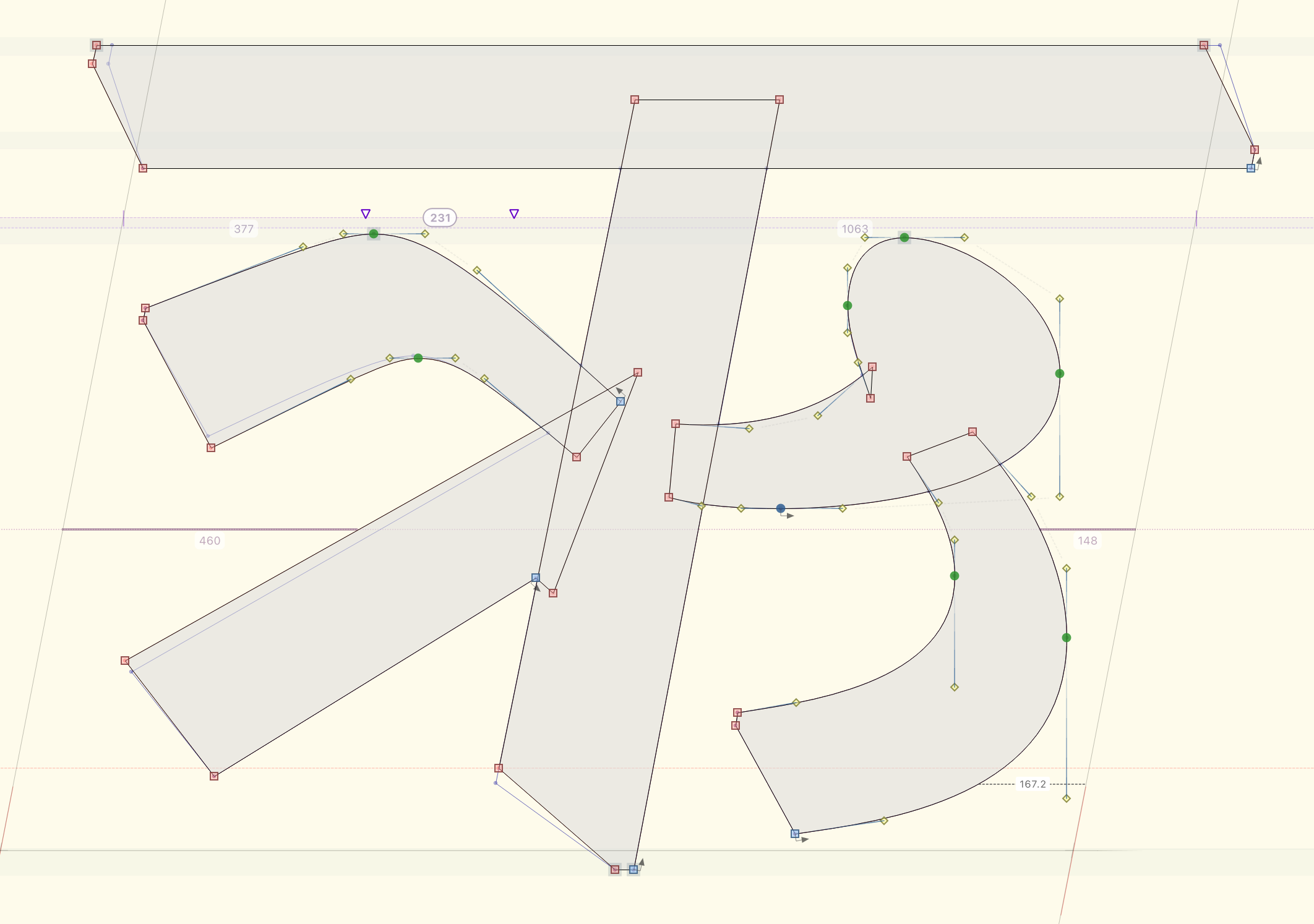
Do you know if anyone is yet using Italify with non-European scripts and with higher contrast styles?I am wondering about things like this slanted Devanagari. The mask layer was produced by our current tool choice, which does a good job managing curves (including nodes at extrema, which is still important for us), but requires manual adjustment of diagonal stroke weight and stroke terminal angles. Do you think Italify might be able to get us closer in terms of diagonals and/or stroke terminals?
0 -
Hi John, please get in touch with me with some sample paths and I can see what Italify delivers.
In general: it doesn't care about script. It only sees curve and line segments, nothing else. You can run it on icons or a script font for all I care – whether it makes sense is up to you.
I tried it on Noto Sinhala: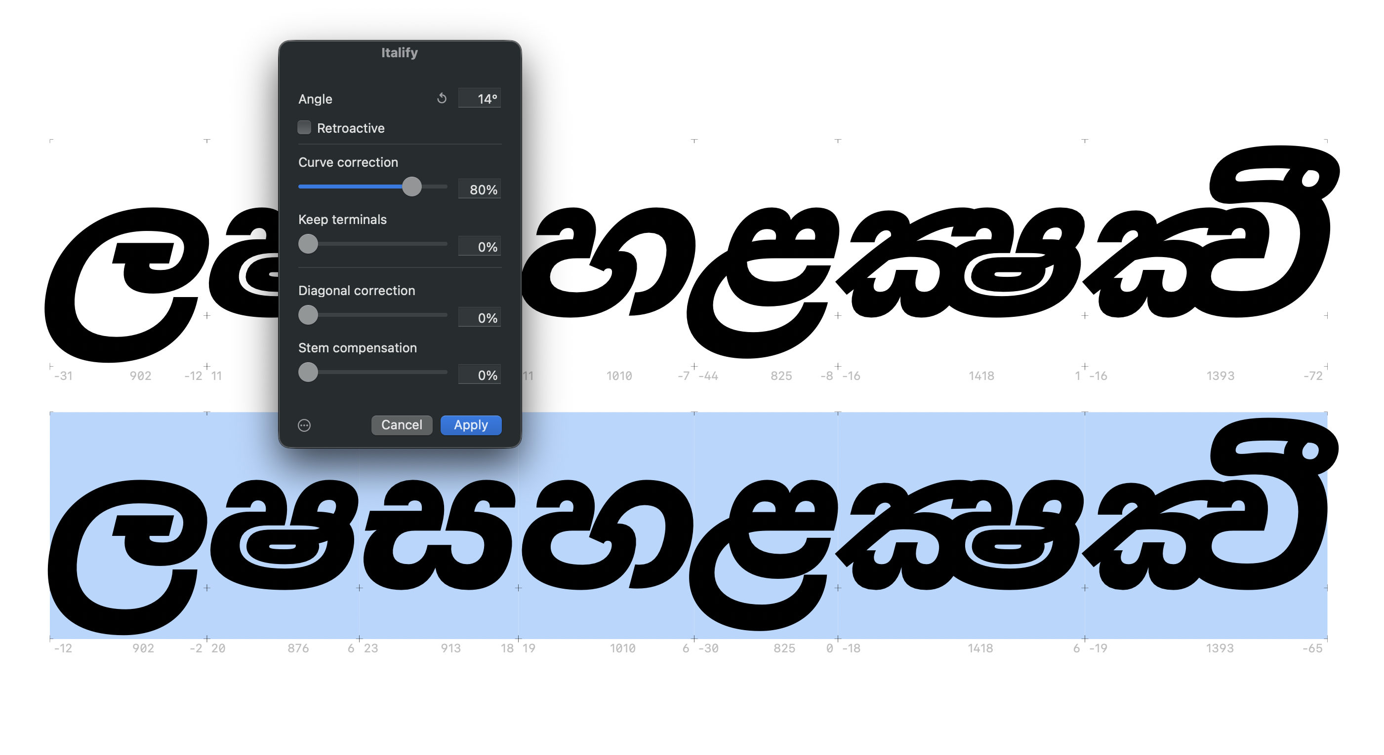
I have also done a high-contrast project. I sadly can't mention it, but it worked very well. There is an example of something similar on the Italify website (the section "Tested on real fonts", one of the last examples).
Nodes on extremes are on my mind. Not foremost, but I'm thinking about it.2 -
Nice!0
-
FWIW, I will add an upvote for nodes on extremes. Solvable with other tools/routines, of course. But if you were able to incorporate it in your curves from the get-go, I suspect results would be slightly better, not to mention the production convenience.4
-
I still disagree that this is a production convenience and results definitely won't be better, but fine. Let's not start that discussion again
Working on it now!-1 -
Like this? Turned out easier than expected
Edit: Released as 0.22.0 and available from the plugin manager.3 -
Triple-post, sorry.
But I hopefully have good news. I published a new pricing page, with:
1. Pricing based on organisation size. Much more affordable for small foundries and independents.
2. Significantly cheaper prices all around. That means: a 50% slash off the original prices, and a month pass.
Please let me know what you think!5 -
I only meant quality of results of the conversion to extrema points during your curve calculation versus post-Italify conversion using Glyphs Add Extremes command. I wasn’t intending to reopen the debate about the value, necessity, or quality of having those extrema. 🙂Just that if one wants them, having your tool calculate as part of it’s routine might have more curve fidelity than a later interpretation. But maybe the math is all the same and it wouldn’t be any different.Thanks for acceding to the request. I don’t have a project for this right now, but I am very interested for future. And personally I am amenable to the per-master pricing now, which I think would fit reasonably with my workflow.0
-
Just that if one wants them, having your tool calculate as part of it’s routine might have more curve fidelity than a later interpretation. But maybe the math is all the same and it wouldn’t be any different.Getting the nodes at the extrema is the easy part of that calculation. Removing the non-extrema nodes while preserving the curve is the tricky part and where font editors tend to run into trouble. Performing this operation within a tool that is already performing curve correction operations definitely seems preferable.5
-
"Performing this operation within a tool that is already performing curve correction operations definitely seems preferable."Exactly, @John!0
-
I have it implemented with a threshold above which a curve is deemed too divergent if the original slanted nodes are discarded, in which case it just keeps those. Let me know if it feels too tight, but most of my tests worked well. Some cases really need manual readjustment if new extrema are wanted.2
-
Hello again, it's been a while, and I hope it's okay if I give a little update. Italify has been in very active development, and I'd like to share some of the main new features:
- parameter saving (font/master/glyph/layer/group levels).
- "Generate from master": Similar to what RMX offers. Extremely useful for quickly updating obliques when things change in the upright source.
- More granular terminal control: position the terminal along the curve, e.g. for a more rotated look.
- Curve extension control: visually adjust how the correction tangent is derived. Very useful for fixing morphing strokes.
- A dedicated preferences panel, for licence management, custom keyboard shortcuts, additional settings. You can also modify the "Keep extremes" tolerance here.
- Tons of smaller improvements, bug fixes and additions, such as an angle lock (always use the current layer's angle), metadata importing, a much expanded Python API, UI improvements...
Italify is available directly in the Glyphs plugin manager and updates automatically. If it doesn't, make sure you have it installed from the plugin manager (remove and reinstall if necessary).
You can try the fully functional free trial for one week, no restrictions.
I'm still very open to feedback, be it feature requests, bugs, or licensing suggestions. I know a one-time licence is still the most demanded thing, but I can't realistically offer that. Happy to talk about other options.
Thanks for all the warm feedback so far!
8 -
Sebastian, the last round of Italify work you did for me was fantastic. I'd prefer to have you do the process. Is that still possible?1
-
Hi Miles! Thanks for the really kind words.
I still offer it as a service, yes, that hasn't changed. Feel free to get in touch again with me by email.
Bonus is now that you get the file with all the Italify metadata, so that you can modify things with the plugin later on, if you like.4 -
Sebastian, I will have to say, it's a realy great tool. I've been testing it this week on a couple ideas and it's really well impressive!1
-
What can I say apart from many, many thanks! I'm very happy that it's so well received. Please don't hesitate to let me know about problems/feature requests.
I'm preparing an update with some minor fixes, as well as a full localisation for German and French.
If anybody wants to do a translation for any other language, I'm happy to share the localisation file (and a master credit as thanks).0 -
It looks really cleverly and well done. A pity that I do not use Glyphs, otherwise I'd have been more curious. 0
-
Understandable. I must say that I am less and less planning to offer this for other font editors such as Robofont and Fontlab, since their scripting API is Python-only. Robofont itself is written in Python, which is simply really slow in comparison to other languages. Italify is written in Swift, which runs 30× faster than its previous Python version. I don't see a port being feasible, sorry.
That being said, there is an extensive Python API, which you can use to process files with Italify without even opening Glyphs. I highly recommend using Glyphs for the UI of Italify for metadata tagging, but apart from that, you don't need to use Glyphs at all.
Some people are already working this way and I would be happy to show you how you can make this work. Of course, this all does assume a macOS setup. Windows is not possible (yet, who knows).2


Categories
- All Categories
- 47 Introductions
- 4K Typeface Design
- 501 Type Design Critiques
- 593 Type Design Software
- 1.1K Type Design Technique & Theory
- 675 Type Business
- 909 Font Technology
- 29 Punchcutting
- 544 Typography
- 129 Type Education
- 333 Type History
- 82 Type Resources
- 114 Lettering and Calligraphy
- 33 Lettering Critiques
- 81 Lettering Technique & Theory
- 580 Announcements
- 101 Events
- 116 Job Postings
- 176 Type Releases
- 186 Miscellaneous News
- 270 About TypeDrawers
- 54 TypeDrawers Announcements
- 114 Suggestions and Bug Reports