Explaining myself and Mixfont, an AI font generation model
Comments
-
Isn't it remarkable how AI is able to solve every issue, except the ones in one's own areas of expertise?John Savard said:Given, though, that AI appears to allow mere ordinary mortals to... bring into existence, if not create... motion pictures of feature film length, something which, when done the Hollywood way, requires immense resources, I'm hesitant to view it as good for nothing. It seems to open up new possibilities of genuine value. 11
11 -
I've tried creating a font on the site, and it does seem to be more geared towards "quick-to-create" fonts. I'm hoping to explore more of the generated results to help speed up my font-making workflow, but there are still many obstacles and need lot of addition for it, as discussed. For example, is it possible to have additional tools for refining outlines or adjusting kerning/spacing?This refining technicality is important because it needed to achieve specific appropriateness of the work, for example in a text font family; How do you adjust vertical metrics and set up hinting? How about consistency between styles? How about optical balance and type color? In minimum level: How to make the generated extended styles not looks like faux bold? Adjusting all these needs seems difficult using prompts; it's still more comfortable to use hands with the font editor feature.There's also concerns about impact of quick-to-create fonts like this site's do: Some people might worry that, not only AI-generated works, but genuine works which is not involving AI, can be "visible" or "labeled" as being AI-generated.In automated writing, its easy to make apparently "smart" writtings, but there are often certain language patterns or diction that strongly suggest they're AI-generated. If we take it raw, without editing, by someone who's not used to write and doesn't have a personal expressive language, it's not hard to guess it was created by AI, especially by someone who used to read.This font generator also produces similar results. On the one hand, it can generate seemingly complex and well-thought-out letterforms or typographic concepts, but on the other hand it's flawed and needed a lot of refining0
-
I should point out that Andrés Torresi is the primary author of the ht Letterspacer project, and he'll present it at the Typographics 2027 TypeLab next week - it's one of those attempts Simon Cozens mentioned.
I also want to say that I think it's nice Eric bothered to engage this forum...
The lack of reckoning with the current and rapidly developing situation at Western type events ha struck me as peculiar. I think it's important that this topic is discussed.
First I should preface that... In https://ethanmarcotte.com/wrote/all-tomorrows-parties/ (the designer famous for cooking and promoting the idea of "responsive web design", iiuc) says that the phrase "what will happen next?" lacks agency, but per "Autonomous Technology: Technics-out-of-Control as a Theme in Political Thought" from Langdon Winner in 1977, it's unclear to me we-human-society have any.
Back to my point... I believe the majority of computer scientists who developed typefaces generators don't bother; I expect their number to increase exponentially upwards as the difficulty of doing this goes exponentially downwards; and I expect those two trends to continue such that the next 10, 100 Eric's won't post here at all.
Impallari appears to have been the first. Eric's become second. I hope there'll be a third.1 -
I just want to point out that AI ethics side, all the AI generated typeface results I've seen so far are totally ass. Sure it can do the easy letters...no kidding! Any fool can extrapolate those in their sleep. Look how it botched up the numerals and other hard glyphs. That kind of problem solving is what typeface design is all about, and AI currently doesn't even come close to handling it. Wake me up when it generates something remotely innovative.4
-
Eric, Simon has said something that is a bit of a mantra for me with typeface design, and a couple examples may help: Objects that also require a bizarrely microscopic level of detail awareness: Eyeglass frames, and Automobile bodies. There are likely many others. Compare the eleventy-something midsize family SUVs available, or the shape of the category of eyeglass frames popular for a long time known as "rectangular" - Or any of the sub-categories. Peruse the literal hundreds of options.
What exactly are the differences? When we try on several pairs, the differences "show up" when combined with a face, but how could one of dozens of similar pairs be so wrong, so awkward, when another pair, seemingly "the same," will pair perfectly with one human's face shape, eye positions, forehead, etc. The answer is the same with tiny, "imperceptible" flaws in typefaces: Your eyes have to be trained to SEE finer and finer differences in shape. The top of the lenses might angle down just slightly in one pair, but be perfectly level in another. The two lenses might be the tiniest bit smaller in the vertical direction but bigger horizontally. The bridge length, the frame thickness, the sharpness of curves, the lens size, every variable you can describe affects the appearance of an eyeglass frame and a typeface. This skill is necessary for those tasks, mentioned above, to be meaningfully and successfully accomplished.
I don't want this to sound exclusionary or elitist. I think people in other fields with this kind of trained perception would agree: if you can't see (or hear) the difference, how would you improve it? Because some type designers have shaky hands (me), or very unreliable motor control, they may not be able to "draw" the exact shapes they envision. Bezier [and other outline] tools have absolutely helped me to get control of shapes to a satisfactory degree. Technology has always been blended into the creative parts of type design or type making, so you can trust that probably nobody on this thread or this forum is threatened by "technology". Having the wonderful assistance of perfectly-smooth bezier shapes allowed me to take the steps of building a character set, adding different weights, italics, and then printing them out.
With a lot of guidance from my mentors, over time, with a lot of testing and looking and refining, I learned to SEE things that are nearly imperceptible. THIS is the most important, consequential skill in type design. The ability to really see finer and finer and finer levels of detail does not happen quickly. It requires a fair amount of training and critique, which I was lucky to get. Success in typeface design is primarily learning to see.3 -
Ultimately, the difference between text commands that create visual images (i.e. gen-AI prompts) and shapes made directly with a pen (whether shaky or not) is that such line-drawing engages more areas of the brain than typing. This was discovered in recent research. Presumably this is the result of the constant, real-time feedback loop of hand-eye co-ordination involved.
However, if that were to result in more sophisticated designs, as one might expect, would they even be appreciated by a populace that was keyboard-centric? At least learning to read and “write” (make visible text) still incorporates hand-writing, putting all readers on the same page, as it were.0 -
@Simon Cozens has written an article on The State of AI Font Generation, and regardless of one’s position on AI in general or AI applied to type design, I think it is essential reading.
6 -
@ericlu
I just wanted to point out that some of the “quality” problems people (including me) have been pointing out… are things that have been solved by non-AI automation ages ago. Adding points at extrema and removing redundant points have been automated functions in desktop font editors forever, now.
I don’t see why you wouldn’t either:
1) Run some such processes as post-op procedures on the generated fonts.
and/or...
2) Do that post-processing, and then feed the before-and-after results into your AI to train it on what it needs to do better.
Same goes for spacing and kerning, I think.
The more general visual curve quality issues are more tricky. Those are the main way that I was able, on my second go at it, to correctly ID 11 out of 12 of your “is it AI?” test cases. I did have to enlarge to the maximum 84 px size, though.0 -
Hi Eric, the Latin font market is already crowded, and AI is putting even more pressure on independent foundries.
I’d suggest using AI where it’s genuinely needed, like developing Hanzi/Chinese fonts, where drawing 5,000+ glyphs is a huge task. That would also be a real challenge since there is less Chinese font data available, so you’d have to figure out more on your own rather than relying on the massive amount of existing Latin font data 😉
Latin fonts have far fewer glyphs, so I think we can still enjoy the process ourselves without AI 😄
3 -
Many Latin fonts that support US English do not have a Rupee currency character, making them less useful in India. So I think as A.I. type design technology becomes perfected, probably first as a proprietary service and then as libre software, Latin fonts will soon have a lot more glyphs as a baseline expectation - and this may be a good thing for users and readers, who character needs have been neglected.Abdurrahman Hanif said:Latin fonts have far fewer glyphs, so I think we can still enjoy the process ourselves without AI 😄
0 -
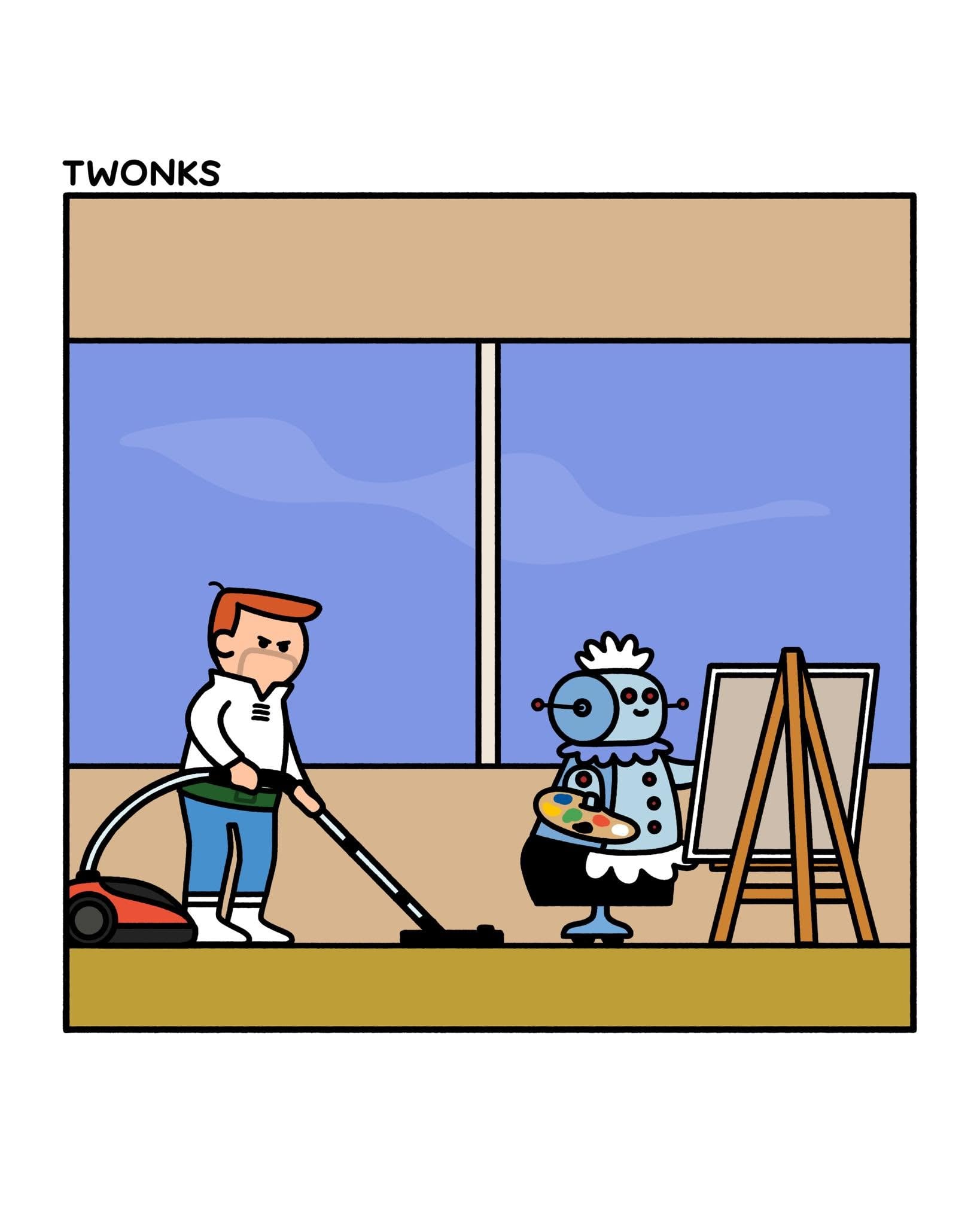
Simon Cozens said:So the model does the fun design part and the human is left with the grunt work. That is the very opposite of reducing tedium.
This by the way is what Cory Doctorow calls a ‘reverse centaur’—the idea is a centerpiece of his critique of LLM GPT models and the subject of his most recent book about AI. An early piece of his on the subject is here.
3 -
Or, to put it more pithily:
4 -
Love it. At risk of verging further off topic, but I think it's a very useful metaphor: I got a robot vacuum cleaner. For a few weeks I was pretty impressed. It was doing grunt work for me! Then it started sending me notifications on my phone: "Robot is stuck." "Robot is lost." "Robot needs repositioning." Then I realised: I'm at this bloody thing's beck and call now. I've become the janitor's janitor.Any push of AI into font design that "won't replace humans!" and "still needs human involvement!" needs to make sure that doesn't mean that humans are cleaning up the robot's crap.5











Categories
- All Categories
- 47 Introductions
- 4K Typeface Design
- 493 Type Design Critiques
- 576 Type Design Software
- 1.1K Type Design Technique & Theory
- 669 Type Business
- 884 Font Technology
- 29 Punchcutting
- 537 Typography
- 124 Type Education
- 332 Type History
- 81 Type Resources
- 113 Lettering and Calligraphy
- 33 Lettering Critiques
- 80 Lettering Technique & Theory
- 569 Announcements
- 100 Events
- 116 Job Postings
- 170 Type Releases
- 182 Miscellaneous News
- 270 About TypeDrawers
- 54 TypeDrawers Announcements
- 114 Suggestions and Bug Reports