Can you tell the difference between AI-generated vs human-made fonts?


In the replies to some of my previous posts about Mixfont, there were folks that were dismissive of the quality of AI-generated fonts. A lot of people dismissed the quality of the one example font I posted (Gothic Gumdrop) and I've also seen some articles shared discussing how high quality AI-generated fonts are still 3-4 years away.
I wanted to challenge these claims as I personally believe that the raster->vector font generation pipeline that's being used in Mixfont today is already good enough for the vast majority of use cases for decorative, display, stylized, etc fonts. While I think that creating a legendary variable font is not quite possible, I do feel that for most projects using AI-generated fonts is already high quality enough for many designers.
To prove out this hypothesis I've put together an AI Font Quiz, where some of these fonts are licensed from real font foundries, while others in this quiz are 100% generated with AI using the Mixfont model. You can try typing and testing out all of the fonts, and when you're ready you can select whether you think the font is AI-generated or human-made.
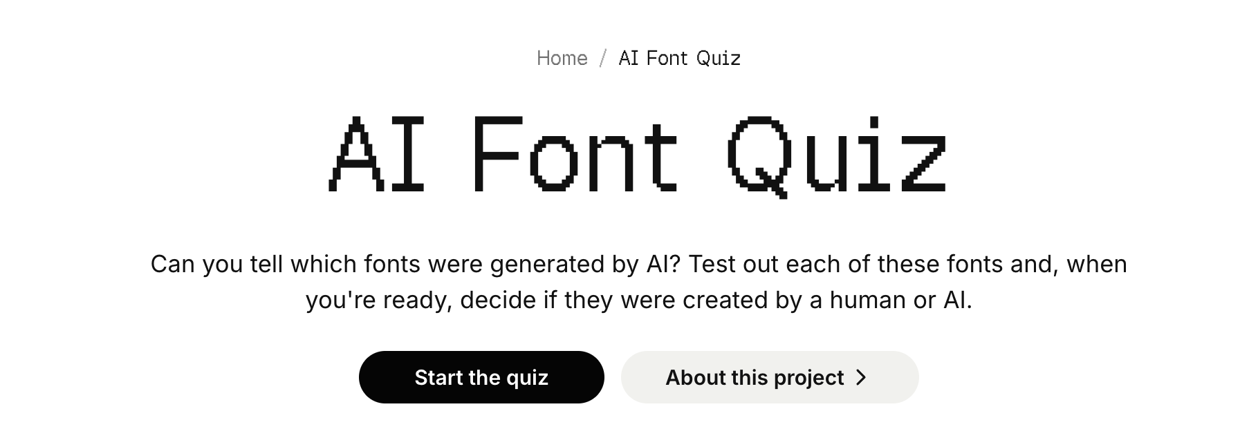
Obviously if you download the TTF and inspect it you'll be able to easily tell the source of the font, but the point of the quiz is to see if you can visually decide whether something is AI-generated or human-made.
I would love for you all to try out taking the quiz and let me know your scores. My thinking is that if this is hard even for professional type designers than it will be a challenge for everyday folks who don't think as much about type. I want to challenge the assumption that font generation is years away because I really think it is here right now and can be used and applied in many new ways.
Respectfully looking forward to your feedback,
Eric
Comments
-
I got most of them wrong. This reinforces my plan to go back to school for a double major in economics and Asian studies. Which will probably also get wiped out, career-wise, by AI but at least it will be a fun way to kill time until I graduate in my mid fifties and find out that all of those have also gone to AI.0
-
The world is burning, and the broligarchy is hyperscaling an invasive technology that consumes prodigious amounts of water and energy.
Typeface “quality” is not the issue.4 -
None of the fonts in the quiz are what I would call good quality fonts.18
-
I got one wrong. If you haven't taken the test yet, use the size tool and change sentences. If you don't rush through, it's really obvious (except for one). Also, you can type your own text in there...the numerals...yikes.2
-
By just selecting "AI" for the fonts with obvious issues with the spacing or glaring curve quality problems, I got 11/12 correct. I misidentified one of the non-AI font as AI because it has a ton of weirdnesses that don't feel intentional to me- strange baseline mis-alignments, lumps and divots in curves that feel arbitrarily placed, and inconsistent logic for the forms.I think it's also worth noting that that false positive is from a designer who only started putting out fonts in 2021 and whose website shows many other fonts with similar issues. I'm not saying they're using AI image generators to generate letter forms then auto tracing them in to fonts to sell, but I'm not not saying that. Even if it's all by hand, they're clearly all very quickly dashed out, as evidenced by their enormous catalogue of work in just 5 years- and the fact that they don't have much regard for quality is evident by the "blog" section of their website which has 3 posts, from January, February, and October of 2025, all of which are a single paragraph of lorem ipsum. Not to mention that the search bar on the blog page has the same "Search font by name.." placeholder text as the font list section of the website. Suffice it to say, the designer of that particular font is at the very least not someone with a keen eye for detail or quality.
I'll say, as well, that I'm relatively new to - and not exceptionally experienced with - type design, and it didn't take me some kind of special knowledge or especially close examination of the fonts in the quiz to recognize the gap in quality between the AI fonts and the human fonts. Like I said, I didn't select based on what I thought "looked AI" but rather simply which of them had glaring flaws that no self-respecting human designer would consider acceptable for an end product.5 -
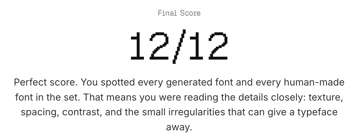 As Mark noted, none of these are good typeface designs, so even if I had been unable to determine which were AI, all that would have been demonstrated is that AI is capable of making fonts as bad as ones made by humans.9
 -
I did very poorly on the test. But that only seems to prove that some humans have designed typefaces that are as ugly as AI-generated ones, not that AI is capable of creating good typefaces. Ah, I see the post before me said the same thing.1
-
ericlu said:
In the replies to some of my previous posts about Mixfont, there were folks that were dismissive of the quality of AI-generated fonts.
I wanted to challenge these claims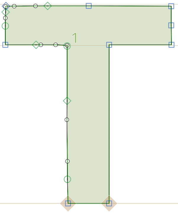 7
7 -
Mark Simonson said:None of the fonts in the quiz are what I would call good quality fonts.
I am curious if it's possible to get even more specific and define what makes a "good quality font". I do agree that some of the selected human-made fonts may not in the echelon of the Helveticas, Inters, Proxima Novas of the world but they are still sold by professional foundries and/or added to selective collections (like Google Fonts).
Is the general consensus here that Google Fonts are not high quality fonts? Or is font quality simply a "I know it when I see it" type of assessment? Speaking as an outsider, I have to admit it feels a bit elitist to opine certain fonts as not high quality, especially when it feels like many font designs are situational and a matter of personal preference.0 -
As the chief curator of the Google Fonts type library, I would offer that the general consensus (and my own view) is that Google Fonts is a very very mixed bag - all blanket statements about the quality of the library as a single unit are flawed, because there are both super high quality fonts and super low quality fonts in there – there's stuff from the absolute top-tier most-elite foundries, and there's stuff from undergraduate graphic design students who made their first font and shared it with the world under the Open Font License. (I should also note that the GF type library includes fonts by Jeremy, John, Mark, Nick, and James.)The essential dilemma I see with the kind of critique that Jeremy offer 2 replies up, which was also a dilemma with the 2011-2012 era fonts published on Google Fonts, particularly those by Vernon Adams R.I.P., is that while type designers can see the differences these few-UPM-unit differences make, I'm not sure that the wider reading public can see, nor the subset of people who are paid to produce documents. Here I'm attempting a sort of descriptivist definition of 'professional designer'; typically non-type-designer visual designers, who went to the UK University of Reading or Yale School of Art or whatnot, can see craft quality in font development. But it seems to me that this is a secondary factor – what people, even people who care for font making craft, primarily value when choosing type is the "atmosphere value," the emotional/cultural associations it bring to their project.
Back in the day, my idea for folks like Vernon was to focus on that as they developed new type for the web (and mostly for US English), because the nature of the GF CSS API is that when a font family is updated in the API, all web pages linking to the API will render with the API's current/latest version only. So we could launch a font family and update it over time, redrawing the design and improving the craft and care in it, add kerning, add more language support, add more family styles... And by putting out a couple dozen type ideas of roughly equal craft and scope, Vernon could then look at the API usage stats and prioritize what to invest expansion effort into. I had some great debates with some of the titans (I think Bruno Maag was probably the most fun for me to argue with who doubted the wisdom of this, since going back to the floppy disk days, once a half-cooked font gets out into the wild hands of the public, the file continues to float around a long time, and they tried to postpone font distribution as long as possible so that any file circulating will be the least-bad version possible.
Anyway, my point is that if when picking type people see these 2 A.I. generated type samples from Eric's quiz,

and their "System 1" mind says "I like it [for my project]", well, maybe their System 2 mind will realize it lacks the glyph repertoire they require or the numerals are too low quality or whatever, but maybe not. If they vibe with it strongly enough, they may be willing to overlook some issues.
Eric, I'm curious if you are logging the test results, as I will be interested to see what the aggregate % result trends towards.3 -
Why would I help train an AI model that will eventually make this beautiful profession obsolete?0
-
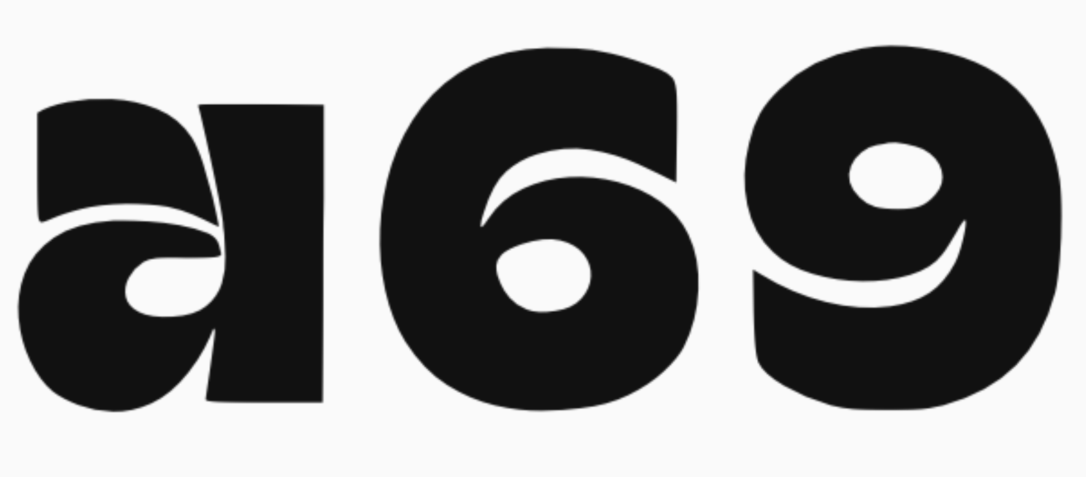
I got 8/12. In three cases, I clicked AI because of shitty curves, blobby terminals etc. and was surprised a human had committed these crimes. I suspect this test doesn't so much show how good AI can be but how bad humans can be.The one case where I attributed an AI font to a human is Obsidian Plush Grotesk, because I thought the architecture of /a/ was really quite original. But I should have taken some more time to study it; the curves are bumpy, the spacing is bad, and the numerals /6/9/ are utterly atrocious (and inconsistent with each other).
 I'm not sure what you're trying to prove here — that AI can make even more DaFont fonts...? «We should generate shitty fonts with AI because the unwashed masses deserve no better» is not a good look for Google, or anyone, for that matter.11
 -
I would expand on this, though: for the time being at least, fonts are software that have to interoperate with other software. fonts have many audiences with varying levels of sensitivity to type, but I think an important category of font users not represented here are the machines - the font renderers, printers, design tooling, etc. even if that /T had all the extra points in places that didnt matter visually, such that, ideally, they would be invisible to the eye, that's still no guarantee that the font would work well for a given use case / environment. well-behaved outlines seem like table stakes, far below the threshold of the kinds of fonts that are implicitly being discussed in this thread (for example). I find this new breed of autotracers really interesting but the output so far seems inadequateDave Crossland said:The essential dilemma I see with the kind of critique that Jeremy offer 2 replies up, which was also a dilemma with the 2011-2012 era fonts published on Google Fonts, particularly those by Vernon Adams R.I.P., is that while type designers can see the differences these few-UPM-unit differences make, I'm not sure that the wider reading public can see, nor the subset of people who are paid to produce documents.3 -
You came with a hypothesis - people can't tell the difference between AI fonts and human designed fonts. It turns out they can. Now you attack us for doing so. You don't actually want feedback. You want validation.ericlu said:
Speaking as an outsider, I have to admit it feels a bit elitist to opine certain fonts as not high quality, especially when it feels like many font designs are situational and a matter of personal preference.
Yes, your fonts are lovely and completely ready for commercial use. Are we done here?13 -
Have you considered at some point listening to what the insiders have to say? Every time they do, you start a new thread and expect a different answer.ericlu said:Speaking as an outsider, ...7 -
Sure, it's on that basis that Eric's first Google Fonts submission was not immediately accepted.jeremy tribby said:
I would expand on this, though: for the time being at least, fonts are software that have to interoperate with other software. fonts have many audiences with varying levels of sensitivity to type, but I think an important category of font users not represented here are the machines - the font renderers, printers, design tooling, etc.
https://github.com/google/fonts/issues/10635
For now the "human in the loop" remains a requirement.0 -
I got 10 out of 12. My main takeaway is that AI-generated fonts can be impossible to distinguish from poorly-drawn human made ones.6
-
The conclusion I have come to with my own experiments with AI — experiments in image and music generation, both things at which AI is substantially better than it is at type —is that AI is boring. It is not a fulfilling way to make things. I may or may not like the immediate results — I am partial to the bluegrass arrangement of Greensleeves and an R&B setting of a WH Auden poem that I ended up with —, but making them did nothing for me intellectually or creatively, and after a couple of weeks playing with the tools I don’t feel any pull to return to them. They are boring in the way that reading algorithmic social media feeds are boring: a suck on time promising something that is never delivered. Actually designing a typeface and making all the hundreds of thousands of decisions required to create a font is difficult, but it is also interesting and engaging, and develops skills in seeing and making.10
-
I am curious if it's possible to get even more specific and define what makes a "good quality font".A good quality font (in my opinion) is one that is not only technically well-made but also one that I can imagine using as an experienced graphic designer in terms of its visual appeal and utility—something I’d be willing to pay for. To equate “experienced professional” with “elitist” just indicates inexperience to me.7
-
A font is a technical implementation of a typeface, which is a coordinated design expressing an idea about letterforms and their systematic arrangement in the making of text. A good quality font must meet a base standard of technical quality, partly defined by the format and partly by the requirements of the individual typeface and the system that typeface requires to be useful in making text. There are more or less well-established canons of what makes a good typeface design for various kinds of use, which lean on craft and scientific understanding readability. Some aspects of these canons are more relaxed for fancy display types than for those intended for running text, but notions around relative proportions of letterforms and their spacing are common to most uses. To develop as a type designer is to gain a feeling for these notions and an eye for well-proportioned and well-spaced type, which may ultimately get you to a point where you can do unusual things and go against convention while understanding what you are doing and why.
A font is an implementation of an idea, and better ideas make better fonts. But the idea isn’t reducible to an AI prompt, because the idea is something that is explored in the process of making, in the many thousands of small decisions made in the crafting of shapes and their arrangement within the system of the typeface.9 -
@ericlu If you want to understand why these AI-generated fonts aren’t useful for much beyond making specimens, try actually using them.
I think I understand roughly how the tool works, and it doesn’t seem to be making fonts in the way fonts need to be made. It looks like it’s trying to draw a complete font, then running it through some kind of autotrace, autospace, anchor-placement process.
If a human made a font that way, it would probably be bad too. Lettering is a drawing. A typeface is a system.How do the glyphs work together in combinations? How do they behave in text? The AI doesn’t seem to care. It knows what a font is supposed to look like and approximates it. It can certainly draw some attractive glyphs, but we’ve already seen that trick from image generators.
Try pasting this string into your quiz. You may see why these fonts fall apart without even needing to look at the alphabet: Aa1234567890%€$&(){}[] ; ' "“ #*«»†‡¶?!朌ÆÐð©®™¥é @ <>Take the parentheses as a simple example. A type designer doesn’t just draw parentheses that look vaguely right. They draw parentheses that suit the style of the typeface, then check how they work with capitals, lowercase, accented letters, numerals, punctuation and real text. What sidebearings are needed to make them sit properly in a sentence? How tall should they be? How heavy? How much contrast? How do they relate to the rest of the system?
The AI doesn’t seem to be thinking about any of that. It looks at a lot of fonts and figures out what parentheses are supposed to look like in the abstract. But in a well-designed typeface, the parentheses are designed specifically for that typeface.
Type designers think this way about every glyph. I’m sure AI will eventually be able to design fonts, but this approach feels like the wrong path; in the same way that drawing an alphabet, scanning it, autotracing it and calling the result a font is the wrong path. You might get something that looks like a font in a specimen, but using it is where the whole thing falls apart.
If a professional were to attempt to use these fonts, they'd quickly discover that they're not viable. In its current state, this tool is only functional as a novelty.14 -
1
-
I have a quiz with one question for you:
1. Are you sure that Mixfont is legal?3 -
Continuing on a philosophical note, mathematics and text do not have a monopoly on expression and signification.
They are tools of great power, but with limitations.
Nowadays, I’m looking to develop typeface shapes that are beyond text prompts, by privileging drawing in the design process.
I don’t necessarily mean pen on paper, but Bezier manipulation—that’s drawing too.
These are shapes I imagine vaguely, that become firmly realized in drawing , as John says, “…the idea is something that is explored in the process of making, in the many thousands of small decisions made in the crafting of shapes and their arrangement within the system of the typeface.”
0 -
@ericlu ... and one more thing ...
I don’t know whether the reaction you’ve gotten here is what you expected from type designers, but I think it’s worth saying that we’re all being pushed into an uncomfortable place: a narrow zone between denial and surrender.
Leaving aside some of what’s happening with Chinese font generation, AI font generation is not good type design yet. Prompt-to-font demos mostly produce glyph-shaped artifacts, not durable type systems. But it’d be kind of foolish to assume the gap is permanent. The useful question is not whether AI can draw letters; it’s when it can understand spacing, families, language support, optical correction, production, licensing, and actual designer (human or otherwise) needs. I don’t think we should treat the current flaws as a security blanket.
That said, this attempt feels different from some earlier experiments. When Pablo Impallari did his Alphabet Magic experiments four years ago, they were at least coming from someone who understood what value fonts have and what their purpose is. Here, it feels more like someone from outside the field trying to rattle the cage without quite understanding what the cage is for.
That doesn’t mean the work should be dismissed. It does mean that type designers are likely to react strongly when the framing suggests that generating font files is the same as solving the type design problem.
10 -
Ray Larabie said:
I don’t think we should treat the current flaws as a security blanket... It does mean that type designers are likely to react strongly when the framing suggests that generating font files is the same as solving the type design problem.
I'd really like to emphasise this. Outline generation is bad but let's face it, it's going to get better. Once we get past the arrogant assholes who think they've already solved it when they haven't, some programmer is going to sit down next to a designer with a serious visual eye and they're going to start getting it right.
We also need to really grasp that some of the other flaws people have pointed out - language support, "fonts as software" compatibility with other parts of the software ecosystem, and so on - are actually the parts of the problem which are most amenable to automation. Fontspector can fix most of the technical production aspects of a font file already. Anchors and OpenType rules? Practically made for automation. Chinese foundries are doing designspace expansion with lightly human-guided AI at the moment. I believe that one day even letterfitting, which seems like an intractable problem right now, will be automatable to a human standard. We're maybe three, four years away from that?
So we are going to have to give very serious consideration to what the human contribution here actually is, what we actually understand the "type design problem" to be. One thing I don't see AI type generation understanding yet is type as system. Sure, a style transfer model can apply the same design concept across different letterforms. In a Chinese design, that's what you want to do. What I don't think it can do yet is understand how the same design concept is expressed differently across different letterforms - the parts we have to make different so the whole looks the same - which is how style is expressed in Latin. Another aspect is clearly the utility of type, the "why" behind the design choices.
But to say "this output currently looks crap so AI is not a threat" is extremely short-sighted.
5 -
I have seen a few people talking about how Chinese type company embracing AI techonology for their font production, maybe it's worth to noticing how bad the economy is in China now and it's been years and how hard to find a job in general. I don't think the fact they (the Chinese type foundries) embracing AI technology normalize how much harm it does to the people and environment, I also don't think it's good thing that they embrace and rely on AI technology so much when there are so many designers could have partcipated and do the jobs instead of letting AI do it, so they can have jobs and live a life with what they love to do. It's very cruel.9
-
The quiz is about whether humans can make squiggles as badly as AI. I got only sample 11 wrong – it’s genuinely surprising that a human being would ever put themselves through drawing that.
Simon, may I ask what’s your perspective on the quantity of high-quality fonts being rather small for training? In other words, to get high-quality output, don’t you need to feed it a lot more high-quality fonts than currently exist? And that’s per style, meaning to create something like a good bold italic Baroque serif it needs to see enough good bold italic Baroque serifs, doesn’t it?Simon Cozens said:But to say "this output currently looks crap so AI is not a threat" is extremely short-sighted.
1 -
The promise of generative AI is that it can learn the underlying meta-structures of the training data, so that it can recompose and extrapolate them in ways that are novel or not represented well in the training data. I say that's the "promise" because in reality you'll find that generative AI actually does a pretty terrible job of producing truly novel outputs- it seems pretty clear to me that state of the art models for language, code, image, video, audio, and music generation are all failing to truly learn the "deep understanding" that data scientists are hoping for, since the moment they're provided with a prompt that strays very far from anything represented in the training data the quality drops enormously.Alex Visi said:In other words, to get high-quality output, don’t you need to feed it a lot more high-quality fonts than currently exist? And that’s per style, meaning to create something like a good bold italic Baroque serif it needs to see enough good bold italic Baroque serifs, doesn’t it?Language models don't understand how to write compelling prose, which is why they rely on cheap clichés and meaningless analogies; coding models don't understand how to solve problems, which is why the moment they're faced with a problem space not represented well in their training data they become next to useless; image and video models don't understand space, anatomy, logical consistency, perspective, etc. etc.; audio models don't understand why people say things the way they do, hence the weird intonations and strange phrasing (as in prosody, not wording); music models don't understand musical composition, which is why everything they generate sounds basically like something in their training data.
This isn't to say that these models can't interpolate between things represented in their training data; that they're quite impressive at- this is basically "style transfer" and they do an excellent job at it. But genAI advocates really want us to believe that they are capable of extrapolation, not just interpolation, and I have seen no evidence that they are.
Perhaps the solution really is just to scale up these models, multiply the size by a factor of 10 and then 10 again, and eventually they'll start being able to extrapolate, but I don't see any reason to believe that's the case. As an analogy: if I fit a polynomial to a section of some curve that isn't a polynomial then it doesn't matter how many terms I add, it will never be able to accurately predict outside of the section I fit it to.
Of course, it would make me feel extremely comfortable to believe this- that my technical expertise can't be automated away because there's something fundamentally different about how the human brain processes things- but I do like to prepare myself mentally for "the worst", so I treat that belief as a cautious guess rather than something to stake my future on.
All this to say- current models don't do a great job extrapolating out of their training area, which fundamentally limits the novelty they can produce, and importantly for this question (I've not forgotten that this post is a reply to something after all), it means that you can't do what you otherwise could to overcome the training data problem: that is, train on a ton of low quality data in order to learn a diversity of styles, in addition to a smaller set of high quality ("good") data to learn the meta-structure of what makes a font "good" as opposed to "bad", so that you could then essentially have the AI extrapolate what it would mean for a style which it hasn't seen a "good" example of to be... good. If (perhaps when) models that can properly do that come along, and are applied to fonts, I don't think training data would be an issue (if the laws haven't caught up yet, that is).7 -
Is lying about the origins of the font not a problem?Dave Crossland said:
Sure, it's on that basis that Eric's first Google Fonts submission was not immediately accepted.jeremy tribby said:
I would expand on this, though: for the time being at least, fonts are software that have to interoperate with other software. fonts have many audiences with varying levels of sensitivity to type, but I think an important category of font users not represented here are the machines - the font renderers, printers, design tooling, etc.
https://github.com/google/fonts/issues/10635
For now the "human in the loop" remains a requirement.
The submission checked this box:- “I am the sole copyright author of the entire project, or all other copyright authors have licensed their work to me under the OFL, and I commit to clearly disclosing if AI tools were used in the creation of this project.”
3













Categories
- All Categories
- 47 Introductions
- 4K Typeface Design
- 493 Type Design Critiques
- 576 Type Design Software
- 1.1K Type Design Technique & Theory
- 669 Type Business
- 884 Font Technology
- 29 Punchcutting
- 537 Typography
- 124 Type Education
- 332 Type History
- 81 Type Resources
- 113 Lettering and Calligraphy
- 33 Lettering Critiques
- 80 Lettering Technique & Theory
- 569 Announcements
- 100 Events
- 116 Job Postings
- 170 Type Releases
- 182 Miscellaneous News
- 270 About TypeDrawers
- 54 TypeDrawers Announcements
- 114 Suggestions and Bug Reports