Feedback for a display sans font
Ahmed01
Posts: 2
Hi to everyone.
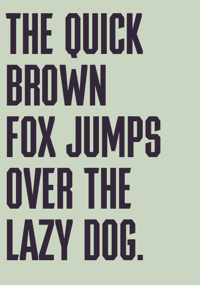
I've been working on a sans display font that I really like, but there’s one thing that keeps bothering me about sans-serif fonts, the diagonal glyphs. No matter what I do, the diagonals always look heavier in color compared to the straight glyphs.
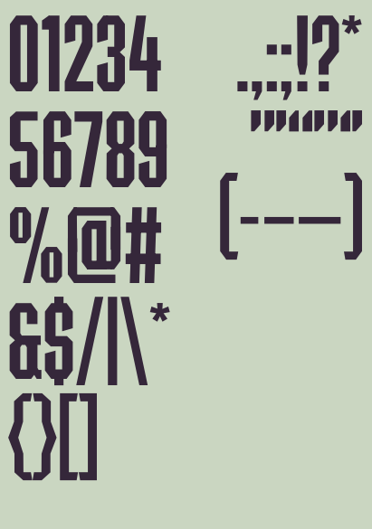
I would truly appreciate any feedback you have about the overall design of the font. This is also my first time designing punctuation, so I’d really appreciate any thoughts or suggestions regarding that as well.
The PDF proof is attached.
Have a good one folks.


0
Answers
-
So much of the design idea seems committed to constraining angles to horizontal, vertical, and 45° that where other angles appear on terminals (/T/E/F/S/L/C/2/3/5/6) it strikes my eye as unfitting.
Are the angles at the top and bottom of /B intentionally different from those of other letters?
Curves in the counters of /eight and /ampersand also seem out of place.
As for the diagonal weights, perhaps you could try to spread the vertices still more (to allow the counters to be taller), but I think the tapering you’ve done looks pretty good. When you have a design this bold and this condensed, those letters are always going to be a challenge.1 -
Thanks a lot for the great feedback, @Craig EliasonAnd no, actually the B is supposed to follow the same angle as the R, but yeah, that’s a mistake I didn’t quite notice.0
Categories
- All Categories
- 46 Introductions
- 3.9K Typeface Design
- 489 Type Design Critiques
- 572 Type Design Software
- 1.1K Type Design Technique & Theory
- 658 Type Business
- 870 Font Technology
- 29 Punchcutting
- 528 Typography
- 121 Type Education
- 327 Type History
- 80 Type Resources
- 111 Lettering and Calligraphy
- 32 Lettering Critiques
- 79 Lettering Technique & Theory
- 560 Announcements
- 95 Events
- 116 Job Postings
- 169 Type Releases
- 179 Miscellaneous News
- 269 About TypeDrawers
- 53 TypeDrawers Announcements
- 114 Suggestions and Bug Reports
