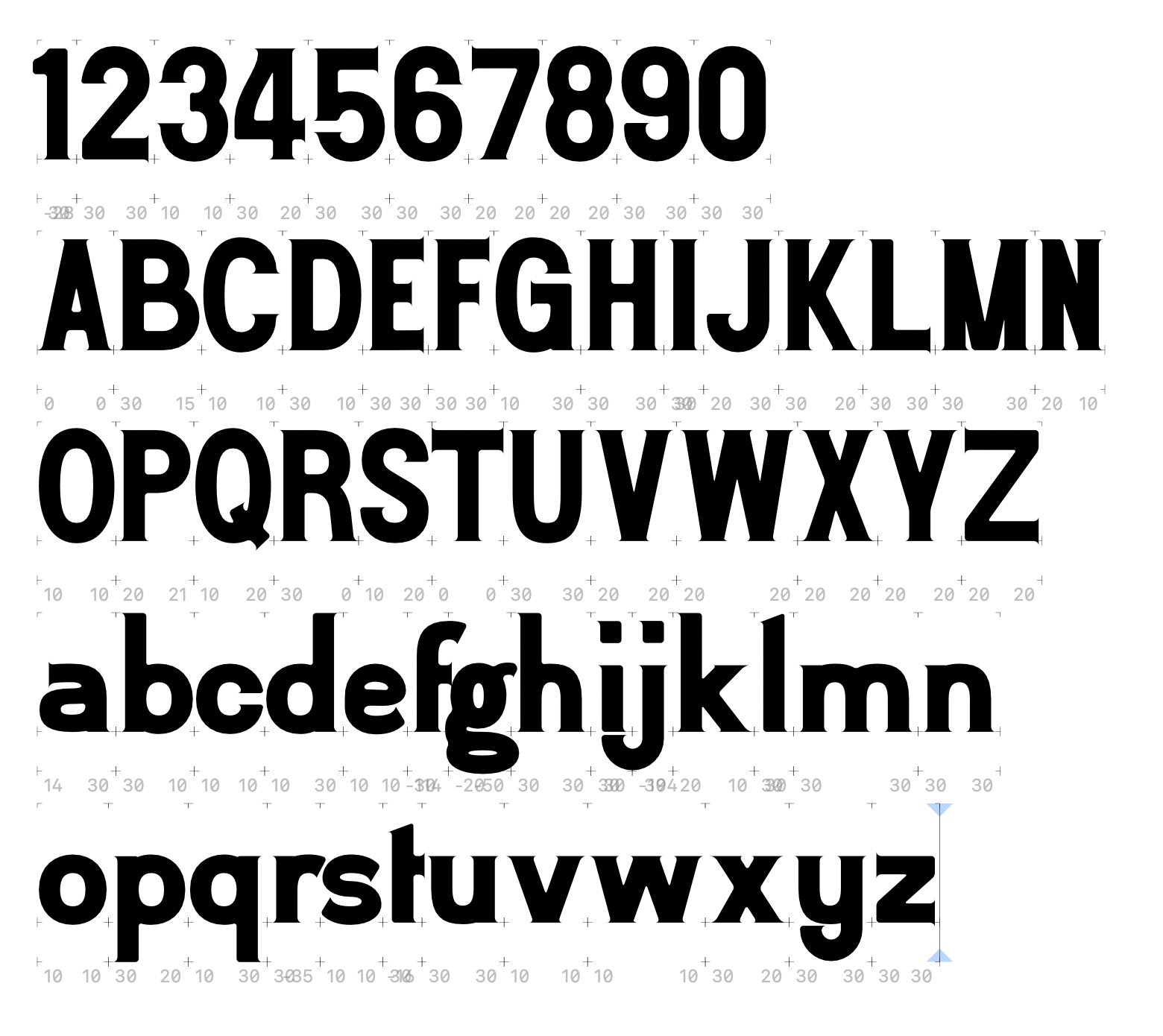
Input on work in progress typeface
Benjamin
Posts: 2
I'm new to the world of type design, but I've been designing watches for some time. I've frequently modified existing fonts to fit well on a watch dial (normally redrawing the 4's, 6's and 9's) and redrawing numerals from historic watches for modern dials.
My latest design involved creating a full set of numerals from scratch. The numerals are inspired by many mid-century watch dials. I like the flat sides and rounded curves of the numbers and the tiny micro serifs like a copperplate.
I felt the combination of sharp and round would translate well into a typeface. So I decided to take the leap and build the rest of the typeface.
As I'm new to this, it'll start as a single-weight display font for marketing, etc. I would like to make a thinner weight eventually, but I need to walk before I can run.
I've been working in Glyphs to build out the font. I've done the alphabet in upper and lowercase. I'm quite happy with the uppercase, but I've struggled to bring the same elegance to the lowercase. In particular, the /a/e/g/f/s/t/ don't feel right, I think I like the /b/d/p/q/ and the /m/n/u/r/.
I've not got all the spacing right yet and haven't started kerning pairs. I'm just focusing on getting the forms right first.
I'd love any criticism or advice on how to proceed.
My latest design involved creating a full set of numerals from scratch. The numerals are inspired by many mid-century watch dials. I like the flat sides and rounded curves of the numbers and the tiny micro serifs like a copperplate.
I felt the combination of sharp and round would translate well into a typeface. So I decided to take the leap and build the rest of the typeface.
As I'm new to this, it'll start as a single-weight display font for marketing, etc. I would like to make a thinner weight eventually, but I need to walk before I can run.
I've been working in Glyphs to build out the font. I've done the alphabet in upper and lowercase. I'm quite happy with the uppercase, but I've struggled to bring the same elegance to the lowercase. In particular, the /a/e/g/f/s/t/ don't feel right, I think I like the /b/d/p/q/ and the /m/n/u/r/.

I've not got all the spacing right yet and haven't started kerning pairs. I'm just focusing on getting the forms right first.
I'd love any criticism or advice on how to proceed.
0
Comments
-
Pay more attention to getting the interior spaces within the letters (the counters) more even. As is, by squinting you can see that the /A is darker than the /B and the /g darker than the /h, not because of big differences in stroke thickness, but due to the variance in white that is there to balance the black.You might find this helpful: https://www.commarts.com/columns/know-if-a-font-sucks1
-
As Craig pointed out, the major problem is the distribution of interior white space in your shapes. While it is of course important to adhere to a base stroke thickness, type design is all about compensation, meaning that you need to adjust your strokes so that they appear the same thickness as all others. This means varying the stroke thickness or applying inktraps where strokes connect. The latter is especially necessary in letters like M, N, V, W, where you have lots of strokes that join at similar angles and thus make the area clog up very heavily.
A good principle is using the concept of bubbles: imagine a bubble (circle) that corresponds to your base stroke thickness. At no point should a bigger bubble fit anywhere in your shape. For example, in all the cases where you are joining strokes, I can easily fit a bubble of almost double the normal size into the black space. Especially in the stroke joins in b, d, h, m, n.1 -
I suspect that the lowercase g will make an odd gap when it's next to a y. Place the g in various scenarios and make adjustments based on how it interacts. That's true of all the letters, but it's especially the case with your g.
Also, don't forget to include a very slightly narrow 2 as an alternate. When I design watch numerals, I do that so the 12 doesn't seem too wide. But it should be subtle.
I think you're doing a good job of capturing the spirit of classic watch faces. The unusual widths of the capitals are spot on. But I think the half-crossbars on the f and t don't fit the look. The 'a' should have a terminal like the s. The serif on the d's ascender should be flipped. The l ascender doesn't seem to match the other ascenders. Try lowering the t ascender.2 -
Thanks, everyone. This is very helpful advice. I've started working on the spacing to better see how the forms work together. I'm also looking at line thickness across both cases. It hadn't really occurred to me that the issue with the problem letters could be a wider problem with optical thickness. I'll report back once I've got things feeling better (or have another problem). Thanks so much.0
-
I am going to give my standard advice for novice type designers: spend more time looking at things than trying to make things. You will learn a lot more about type design from carefully looking at successful typefaces and understanding what makes them work than you will from trying to start with your own design.
8 -
Also, as a general rule, it is better to do a handful of characters and polish them, and then get feedback on them and refine them repeatedly, gradually expanding the character set, than to do a full character set before you get any feedback.
I do not mean in any way to diminish or trivialize the immense work you (and others) have put in to get this far! I am trying to help by giving you a path that involves both less total work and likely a better end result. (My own earliest attempts at type design sucked really badly. It took a while for me to achieve even mediocrity. But if nothing else, I learned a lot of basics really thoroughly.)
In general, the weighting seems off insofar as the horizontals are too similar in weight to the verticals, which makes them look heavier than the verticals. (Yes, I can see you may have done some of this needed optical adjustment. But it needs more. You could thin those horizontals another 5% of their current weight, I would imagine.)
A lot of joins could use some work, mostly some thinning where the curve joins into the straight. I realize this may be a tension between painterly style and typographic, so you could choose to leave them as is, but even some slight adjustment would work better, I think. Looking here at the middle of 5, 6 and 9 for example. Also bottom of the G. Not to mention bdpq and hmn.
The P and R bowls are the same size, which is odd. The P bowl is almost always bigger.
5
Categories
- All Categories
- 46 Introductions
- 3.9K Typeface Design
- 489 Type Design Critiques
- 572 Type Design Software
- 1.1K Type Design Technique & Theory
- 659 Type Business
- 871 Font Technology
- 29 Punchcutting
- 528 Typography
- 121 Type Education
- 327 Type History
- 80 Type Resources
- 111 Lettering and Calligraphy
- 32 Lettering Critiques
- 79 Lettering Technique & Theory
- 560 Announcements
- 95 Events
- 116 Job Postings
- 169 Type Releases
- 179 Miscellaneous News
- 269 About TypeDrawers
- 53 TypeDrawers Announcements
- 114 Suggestions and Bug Reports


