Experimental typography book

Hi everyone,
I’m doing some research starting from The Bald Soprano, composed by Robert Massin, which is one of my all-time favorite typography books.
I’m interested in studying experimental typographic books that use different typefaces to create distinct voices within the narrative. Do you know of other titles, studies, or projects that explore or push the limits of this approach?
For example, in theatrical texts, beyond the different actors’ voices, there are also asides, often set in italics, or the author’s stage directions.
I’d love to hear your thoughts or any suggestions you might have.
Comments
-
House of Leaves by Mark Danielewski doesn’t actually use different typefaces for different characters. But it does have two narratives on the same page typeset very differently. You could also try contacting Todd Klein about comics he did this in.
1 -
Check out The Telephone Book by Avital Ronell (University of Nebraska Press), designed by Richard Eckersley.1
-
Don't overlook: French Fries Written by Dennis Bernstein & Warren Lehrer. Designed by Warren Lehrer. Published 1984 by Visual Studies Workshop Press and EarSay Books. Multiple voices, and yes, modernist chaos.1
-
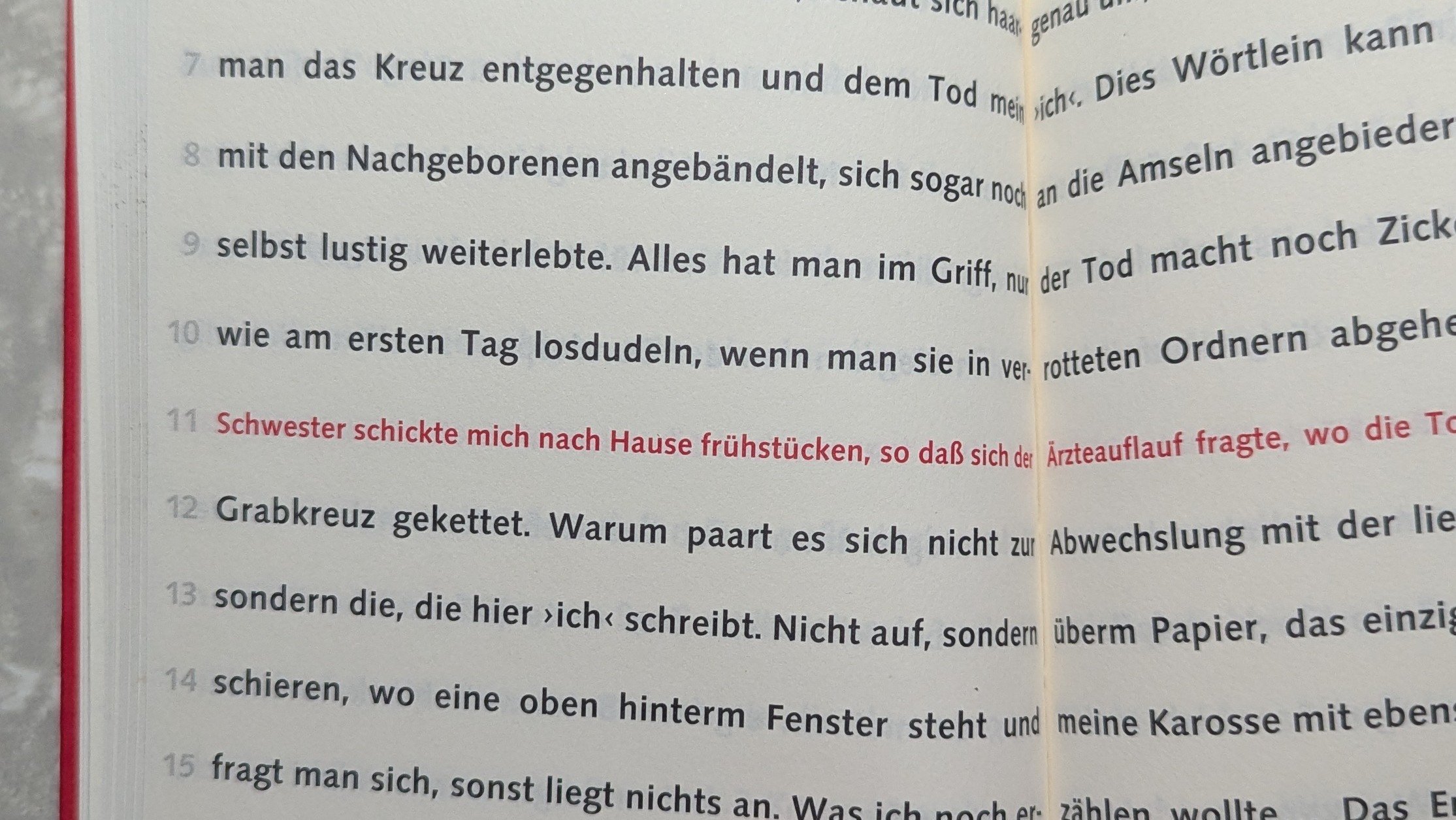
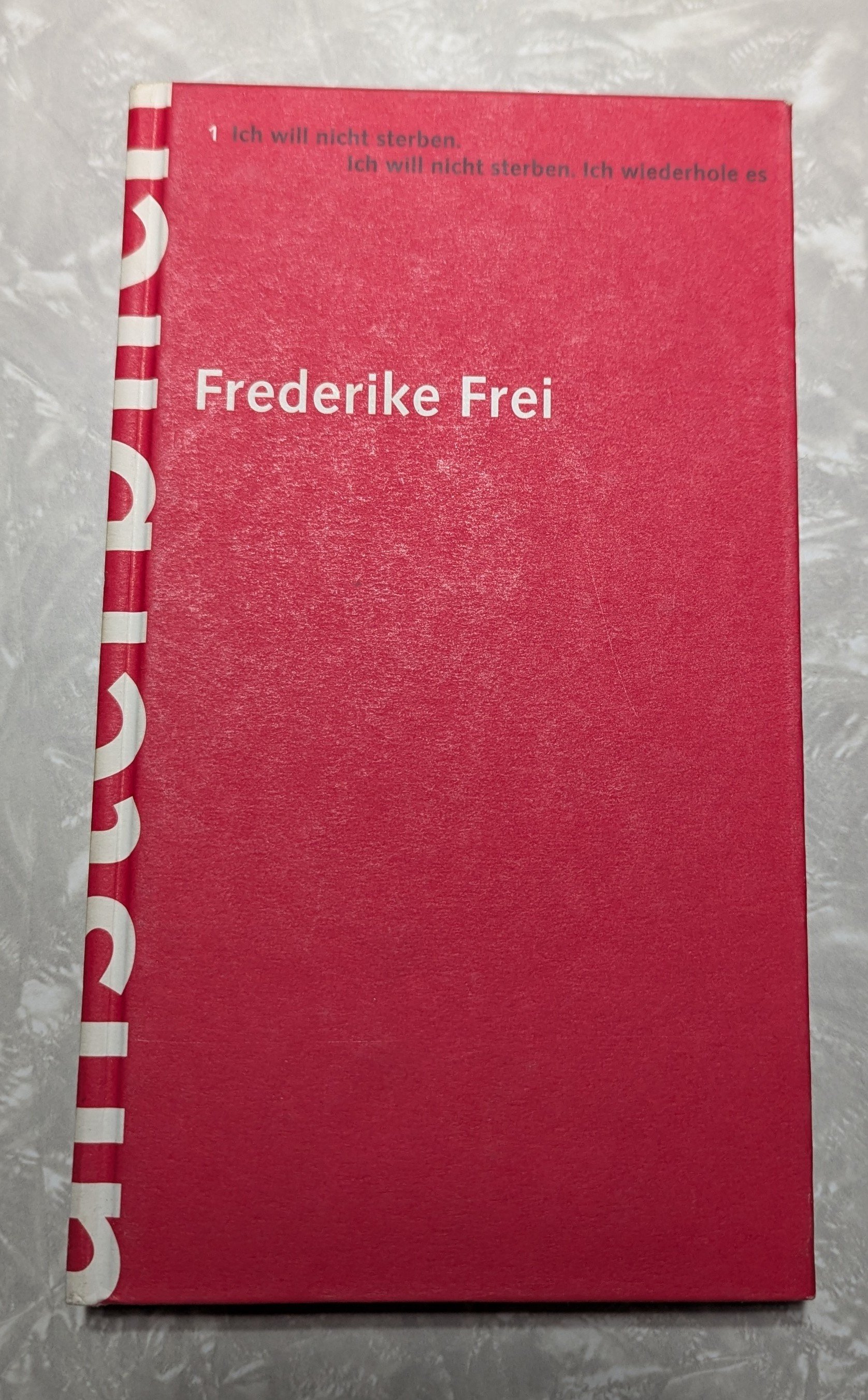
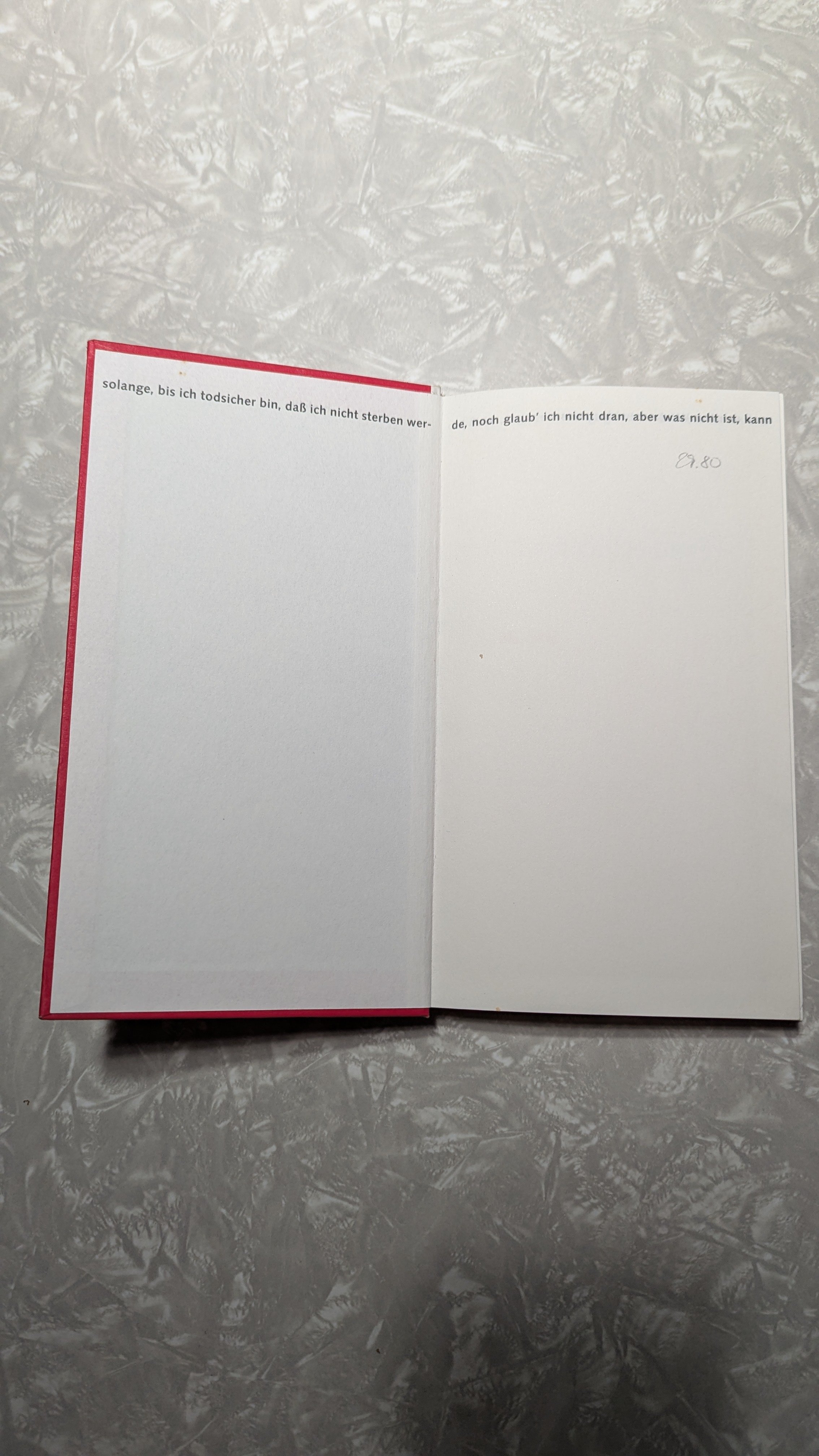
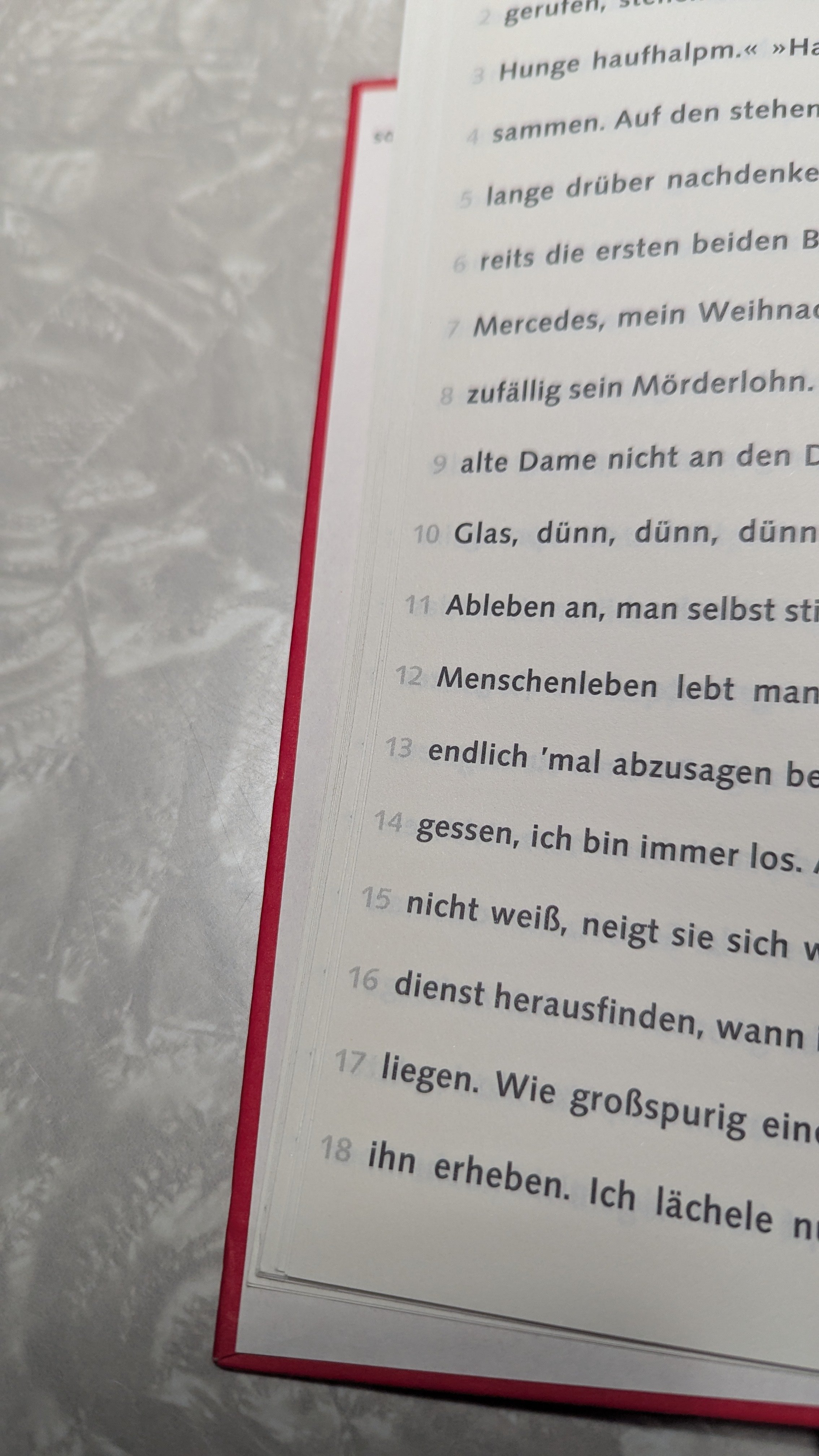
Or Unsterberlich from the German author Frederike Frei.
The first sentence starts on the cover, the chapters are horizontal. You have to flip the page after each sentence. Chapters are marked on the left side of each left page. The last chapter ends on the back of the book.Verlag Dölling und Galitz, Hamburg 1997
Design: Groothuis + Malsy, Florian Fischer
ISBN 3-930802-68-6

 6
6 -
Like Peter, I came to recommend French Fries. The complex multilayer mechanicals for this remarkable book are now in the collection at Letterform Archive.1
-
IIRC (can’t find my copy), this was a feature of Neal Stephenson’s The Diamond Age, in which the words of the protagonist’s AI book were set in a special arrangement at the bottom of the page, in sans serif (Univers?), while the main text was a typical serifed book face.0
-
Robert Bringhurst’s The Blue Roofs of Japan is a ‘score for interpenetrating voices’, and I am aware of a couple of different typographic treatments used to set the overlapping and interleaved texts in different editions. In the 1986 Barbarian Press letterpress edition, some of the text is blind-stamped. This is difficult to capture in photographs, because the readability of the uninked text relies on lighting and being able to move and tilt the page as you read.

As I recall, when it was published as part of a collection of Robert’s work, colour was used.
0 -
These are all fantastic suggestions, thenk you very much!.
@peter French Fries is a bit too expensive for my budget, but @kent Telephone Book went straight into my shopping cart!Since you’ve all been so kind in sharing your recommendations, I’d like to share something I found as well:
https://designreviewed.com/artefacts/typoesie-jerome-peignot-2005/0 -
I’m working on a project for a gamebook where the narrator, the player, and the NPC characters are all set in typefaces from the same family, but with slight differences, so each voice in the book can be clearly distinguished. The idea is to guide the reader better and offer a different kind of typographic experience.
That said, using too many typefaces on the same page can easily become chaotic, both visually and for the reader. In my opinion, the result risks being less readable and more purely experimental.
Do you know of any books that have already taken this kind of approach?
What do you think could be a good design parameter for creating a typeface that changes the look of a font just enough for the reader to notice it, even subconsciously, without making the typography feel messy?
For example, contrast (expansion contrast for the narrator, reverse contrast for the NPCs), or maybe just changes in the skeleton of certain letters.After all, in everyday typography we already mix roman and italic on the same page, and those two styles have quite different structures.
Sorry if I’m sharing this in what might be an off-topic section
 .0
.0 -
@Andrea T. FWIW, I've never had my own copy of French Fries. Sounds like you started from a more exploratory view, but are now hoping to end-up with a possibly less radical (or memorable) direction.0
-
“Reaper Man” by Terry Pratchett deals with the disappearance of Death from the Discworld. Pratchett famously did not use chapters. But the peculiarity of this book (at least in my Gollancz edition) is the two weights of text.
Sections that deal with characters who are alive or undead use a bolder type.
Sections about the dead (Death when sacked) or never alive (the auditors) use a lighter type.While Windle Poons is at his going away party everything is bold. From the time when Death is due to collect him the text is lighter. After he accepts that Death has not turned up and he reoccupies his old body the text is bold again.I don't think I worked this out the first time I read it.0 -
I second Kent’s recommendation of Avital Ronell. I have a hardcover of her 2002 book Stupidity, which I bought only for its use of Trinité. The text itself is a dog’s breakfast of stream-of-consciousness name-dropping, living up to the title, I suppose. Eckersley’s design is the best thing that ever happened to Ronell’s thought.0


Categories
- All Categories
- 46 Introductions
- 3.9K Typeface Design
- 489 Type Design Critiques
- 572 Type Design Software
- 1.1K Type Design Technique & Theory
- 659 Type Business
- 874 Font Technology
- 29 Punchcutting
- 528 Typography
- 121 Type Education
- 327 Type History
- 80 Type Resources
- 111 Lettering and Calligraphy
- 32 Lettering Critiques
- 79 Lettering Technique & Theory
- 560 Announcements
- 95 Events
- 116 Job Postings
- 169 Type Releases
- 179 Miscellaneous News
- 269 About TypeDrawers
- 53 TypeDrawers Announcements
- 114 Suggestions and Bug Reports