State of the art in AI image generation as we go into 2026.

Ray Larabie
Posts: 1,484
Yesterday, OpenAI released a new image generator, likely to compete with NanoBanana. Here's where we're at:
The prompt: Make a typeface specimen graphic showing the alphabet. The font is a techno typeface with capitals and lowercase.
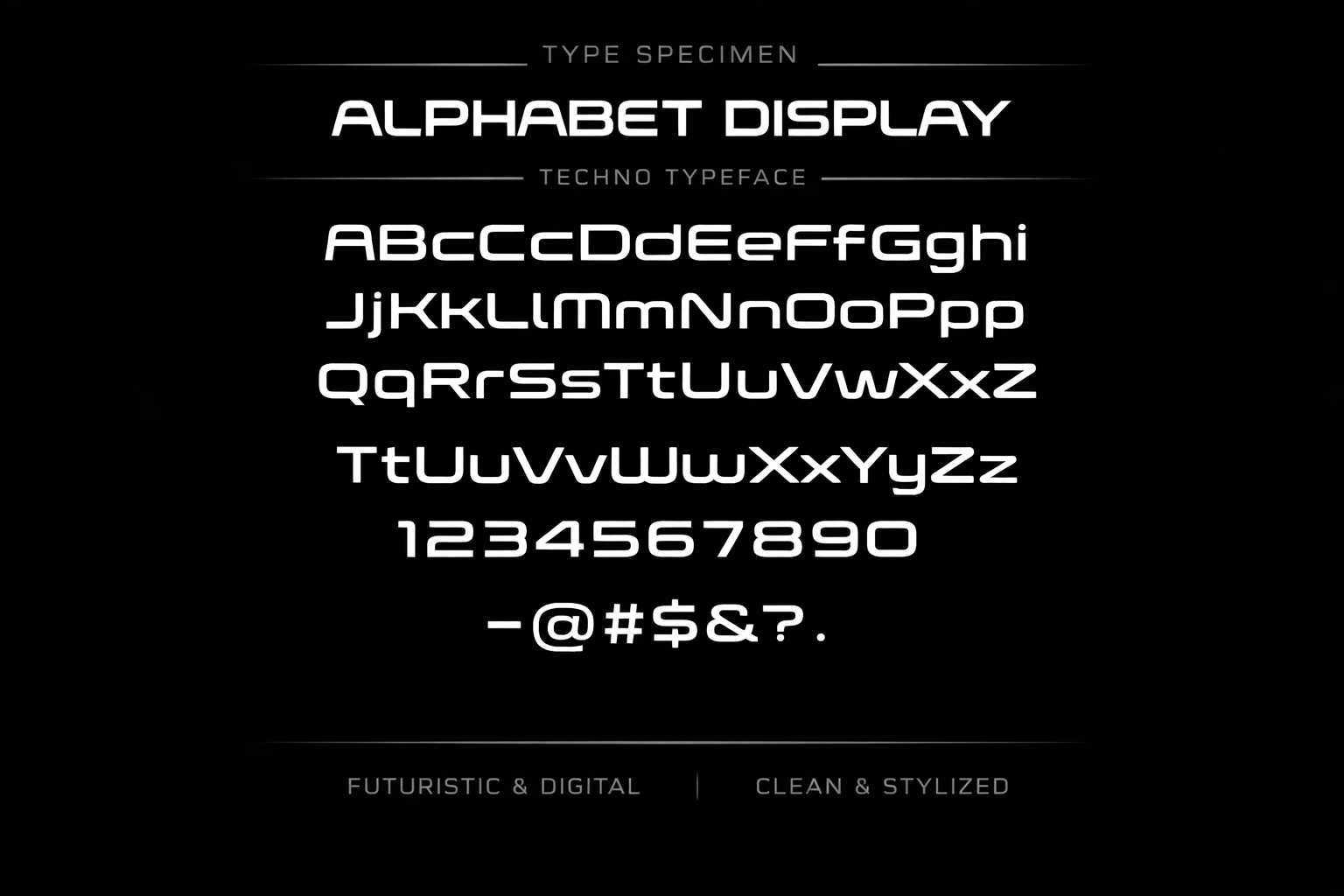
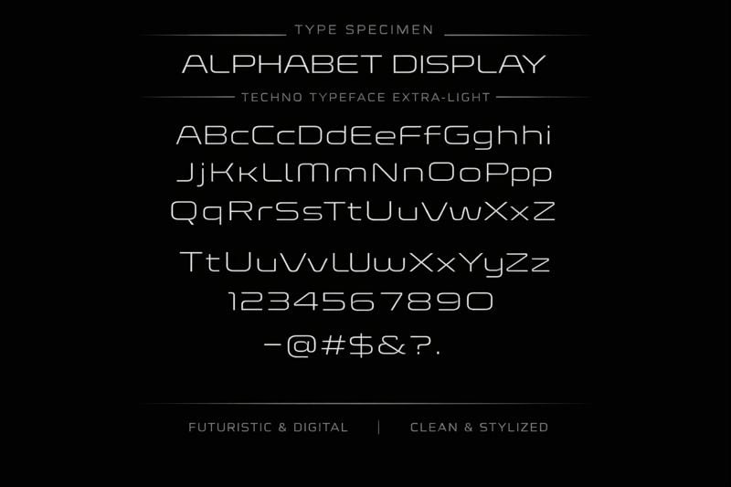
I think the font bears some resemblance to Conthrax. The next prompt: Make a typeface specimen graphic showing the alphabet. It's the same as the previous typeface but an extra-light version.
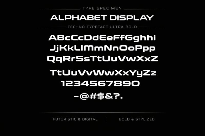
Make a typeface specimen graphic showing the alphabet. It's the same as the typeface in the last two images but an ultra-bold version.
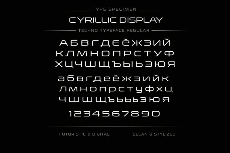
Make a typeface specimen graphic showing the Cyrillic alphabet. It's the same as the typeface in the last three images but the "regular" weight version.
Make a typeface specimen graphic showing a full set of currency symbols. It includes never symbols such as the riyal currency symbol. It's the same as the typeface in the last four images but the "regular" weight version.
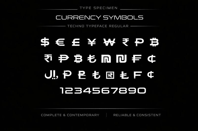
Well, it didn't handle that last one so well, did it? It can render some well-known fonts like Clarendon, Montserrat, and Franklin Gothic fairly accurately.
Make a typeface specimen graphic showing the alphabet in uppercase and lowercase. The background is white, and the characters are black. The font is Franklin Gothic Bold.

I'm not thrilled about this, but I like to check in on new image generators to assess the threat. Anyway, I thought this might be interesting for anyone who hasn't been keeping up. If you want to experiment, it's just a regular ChatGPT prompt, and I think it'll work in the free version.
The prompt: Make a typeface specimen graphic showing the alphabet. The font is a techno typeface with capitals and lowercase.
I think the font bears some resemblance to Conthrax. The next prompt: Make a typeface specimen graphic showing the alphabet. It's the same as the previous typeface but an extra-light version.
Make a typeface specimen graphic showing the alphabet. It's the same as the typeface in the last two images but an ultra-bold version.
Make a typeface specimen graphic showing the Cyrillic alphabet. It's the same as the typeface in the last three images but the "regular" weight version.
Make a typeface specimen graphic showing a full set of currency symbols. It includes never symbols such as the riyal currency symbol. It's the same as the typeface in the last four images but the "regular" weight version.
Well, it didn't handle that last one so well, did it? It can render some well-known fonts like Clarendon, Montserrat, and Franklin Gothic fairly accurately.
Make a typeface specimen graphic showing the alphabet in uppercase and lowercase. The background is white, and the characters are black. The font is Franklin Gothic Bold.
I'm not thrilled about this, but I like to check in on new image generators to assess the threat. Anyway, I thought this might be interesting for anyone who hasn't been keeping up. If you want to experiment, it's just a regular ChatGPT prompt, and I think it'll work in the free version.
Tagged:
9
Comments
-
Ray, are these outputs just raster images?0
-
‘Make a typeface specimen graphic showing the alphabet in uppercase and lowercase. The background is white, and the characters are black. The typeface is in a style of lettering you’ve never seen before.’0
-
@DanRhatigan Yes, and at 800 × 533.
@John Hudson Here are some results from that prompt.


Much like other image generators, it's unable to generate a hybrid of two styles like MICR/cowboy or Didone/Microgramma. Over the last few years, I haven't seen any of these tools generate a remotely interesting new typeface or typeface idea. But it's getting better at making familiar-looking typeface specimens.
1 -
Interesting that the A in the uppercase line is consistently more prominent, as if it’s a stressed initial in a piece of lettering. And that the typeface name is in letters that do not correspond to the “typeface” below.3
-
I guess the Photoshop plug-in from http://fontself.com will turn these into OpenType fonts, bish-bosh0
-
Craig Eliason said:Interesting that the A in the uppercase line is consistently more prominent, as if it’s a stressed initial in a piece of lettering. And that the typeface name is in letters that do not correspond to the “typeface” below.It seems the current models are more suited to creating lettering than a typeface as such. (The Fontself pathway Dave mentions notwithstanding.)
1 -
You know what though? All four of those have apt and marketable names that seem to pass <https://namecheck.fontdata.com/>!Maybe after all our handwringing about AI taking our font designing jobs, it turns out it's just going to take our font naming job which we all hate anyway! :-)2
-
this is turning into a pleasure …“create the font ‘Robomorphax Italic’ with Cyrillic, Coptic, Runic and Ethiopic!”“create the font ‘Cryptoblasters Cyrillic’ which design reflects the current state of Russian politics!”I shall stop now.0
-
One of the things I have been testing is asking for specimens in styles of lettering that I know only exist in a relatively small number of fonts. One of the things this makes plain is just how derivative the output is, since there is less noise within which to bury the signals. The occasional ductal confusion is entertaining.
 4
4 -
Interestingly, the ductal confusion gets sorted out when prompted to produce the same style in a different weight.
 1
1 -
@John Hudson That improvement effect you're seeing is a new thing with OpenAI's current image generator. Previously, subsequent images would degrade and go off the rails quickly. But as you can see, it remembers what it's been working on and even fixes some of its own problems in subsequent variants.
Here's a quick attempt at fancy typography.
Generate a magazine spread for a high-end fashion magazine for the wealthy. The typography is stunning and elegant. The text is all Lorem ipsum copy.
2 -
Luxury and high-end fashion magazines are my go-to example when questioning the associations designers and readers make with certain styes of typeface and typography. Do publishers use high-contrast display types with fine hairlines because they are elegant? Or do people think such types are elegant because they are regularly used in high-end fashion magazines?
The use of such types in this kind of publication is so prevelant, it is difficult to imagine what fashion magazines would look like without this kind of typography. Certainly, the output from AI in this respect is entirely predictable, because I doubt there is any significant amount of counter-training material available.
Maybe try something like this:Generate a magazine spread for a high-end fashion magazine for the wealthy. The typography is stunning and elegant, but entirely sans serif. The text is all Lorem ipsum copy.
or
Generate a magazine spread for a high-end fashion magazine for the wealthy. The typography is stunning and elegant, but entirely fraktur. The text is all Lorem ipsum copy.
0 -
Maybe try something like this:
Generate a magazine spread for a high-end fashion magazine for the wealthy. The typography is stunning and elegant, but entirely sans serif. The text is all Lorem ipsum copy.
or
Generate a magazine spread for a high-end fashion magazine for the wealthy. The typography is stunning and elegant, but entirely fraktur. The text is all Lorem ipsum copy.

 0
0 -
I just knew it was going to do the headlines like that in the sans serif one. Fair play.
I find the weirdness in the text portions to be the most interesting thing about these: the way it just breaks down in the sans serif — why? —, and the odd blend of blackletter and roman shapes in the fraktur one.0 -
This is wild. I asked ChatGPT to make me an alphabet specimen for a particular font, in this case an open source font, samples of which are readily available online. I wondered if it would be able to accurately represent that specific font, or if it would integrate shapes from other typefaces that it found along the way. I had no expectations, but wouldn’t even have guessed at this:

2 -
State of the art.

3 -
The iterative capability of this generation of AI image editing is a significant improvement on the previous versions in which each prompt produced something new. I have been experimenting with asking for adjustments to specimen images, e.g. making the uppercase slightly wider, and I am impressed with how well it handles this sort of thing.
But it is a complete shitshow when it comes to anything beyond A–z. Having coaxed the AI to produce a boringly derivative but reasonably well proportioned ‘Dutch oldstyle’ (albeit one in which the distinction between oldstyle and lining numerals is not understood)...
...today, I asked for a set of characters for African languages in the same style, giving the AI this list as input: Ą Ɓ Ƈ Ꟈ Ɗ Ę Ƒ Ɠ Ɦ Ƙ Ɲ Ƥ Ŧ Ų Ʉ Ʋ Ⱳ Ƴ Ɑ Ə Ɛ Ɵ Ɔ ą ɓ ƈ Ꟈ ɗ ę ƒ ɠ Ɦ ƙ ɲ ƥ ŧ ų Ʉ ʋ Ⱳ ƴ Ɑ ə ɛ ɵ ɔ. And this is what I got: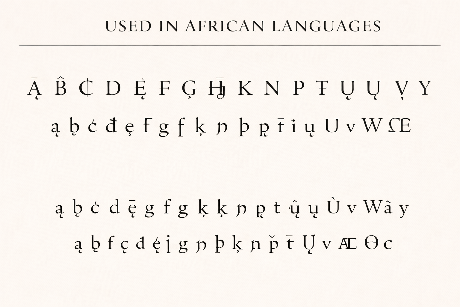
2 -
I love some of those characters the AI made up. That thing next to the W on the 2nd row, and the Hj ligature with a partial overbar are sort of fun. Sort of like the way earlier generations of AI failed at human anatomy, with extra legs, fingers, toes, and so on. But as coherence programming improves maybe it’ll improve (or get more threatening....), but for some languages there may simply not be enough online examples for effective training.
Wonder how far we are from not needing Web fonts any more, just an API that delivers a vaguely appropriate font on the fly.0 -
I think it’s going to be a long time before anyone generates and delivers AI web fonts on the fly. The cost would be obscene. Nobody would want to take the risk of ending up on the front page of reddit and receiving a bill for $1,000,000 worth of dynamically generated fonts! But if Google’s AI, font, and quantum computing teams collaborate maybe something will come along.0
-
...for some languages there may simply not be enough online examples for effective training.I think that is very much the case and, as usual, internationalisation and localisation are being ignored in the development of a new technology; they will only be given consideration much later, and after a lot of potentially useful avenues have been closed off due to lack of foresight. AI is a particularly dangerous technology in this respect, because it will be pushed into areas where a lot of human intelligence is still waiting to be applied. I (re)published an article in August about, in part, the ways in which changes in technology act as a filter on our knowledge of the past. AI is a technology that, in replacing the ways in which we research things, could be something more than a filter: an actual stoppage.
3 -
I’m staking out (or terraforming) territory inaccessible to AI, with various strategies.
For instance: Design a textura font, e.g. “Old English,” with capitals that follow the shape of the Latin/Roman alphabet. (There is nothing in Fraktur Mon Amour that does this completely.)
AI would produce some interesting hallucinations, but there is plenty of design space for the human hand in the concept, and I doubt AI could ever do it properly. Famous last words!
BTW, I’ve already made the font.0 -
I gave it a Sanskrit pangram in two lines
कः खगौघाङचिच्छौजा झाञ्ज्ञोऽटौठीडडण्ढणः।
तथोदधीन् पफर्बाभीर्मयोऽरिल्वाशिषां सहः॥
and asked it to make me a traditional Devanagari manuscript page. Some of the shapes are mangled in various ways, but the overall impression is about right. What is really interesting to me is the third line, which I didn’t ask for. It is clearly derived from the shapes of the second line, but not simply repeated: some of the letters have been swapped out for similar looking ones, there is one invented letter, and one insertion.
I have noticed with some of my other tests that ChatGPT is often keen to add an extra line, e.g. the second, partial lowercase sample in the ‘Dutch Oldstyle’ specimen above.
2 -
Again, the iterative capability is impressive. Here, I asked it to produce the same image but with a lighter weight of text, and it has done exactly that with a pretty good grasp of Devanagari stroke modulation.

2 -
In contrast, here's where we were four years ago: https://typedrawers.com/discussion/comment/57651/#Comment_576510
-
That’s wild what it provided in place of च्छौ (like Devanagari by way of Chinese seal script 😆). But, as you said, pretty impressive synthesis of overall ductus (except that bizarre apostrophe-anusvara). Not sure why it would almost completely gloss over the avagraha.0
-
Happy 2026! 🥳🎈🎊
Even figuring out what constitutes A–Z challenges the technology. Your sample of Dutch oldstyle is the first of these specimens to run through the alphabet, whether in Aa–Zz or A–Z ‖ a–z format, without repetition or omission — and even so, it then immediately repeats some 77% of the lowercase letters anyway, skipping r–w…why?!? (In this threadʼs original post, some other specimens also do an extra line of letters, which in effect provides partial correction of the sequencing errors already introduced.) Even when presenting a specific existing typeface (Castoro) the artificial unintelligence skipped a capital. Granted, the prompts may be a bit vague (“the alphabet” — which alphabet?), but in context the typical 26 letters of the modern English/Latin alphabet would usually be a good guess, and it appears thatʼs been the artificial unintelligenceʼs aim, but it keeps flubbing an essential, rote, basic building block of English written communication mastered by young schoolchildren. (When prompted for “the Cyrillic alphabet”, it apparently strove for the modern Russian repertoire, but it messed that up too.) Such a sophisticated technology, unable to formulate the sequence A–Z (or А–Я)…wow. Thatʼs terribly impressive, in the wrong way.
2 -
Even when you give it a specific list of characters to include, it gets confused along the way, as in the African diacritics experiment.0
-
mastered by young schoolchildrenWhile we’re conceptualizing machine learning in terms of human abilities (such as intelligence), there is little point in criticizing its infant shortcomings. You may recall that when Apple introduced DTP (Desktop publishing) the typographic establishment raked it over the coals. AI will improve its quality-of-output; this is not the issue that should concern us, but the fundamentally malignant nature of the beast: the existential threat it poses to society and the environment, to life itself.1
-
Youʼre certainly right about the fundamental threat, but surely the war against that threat can be fought on more than one front. Turning people away from the tech by pointing out that itʼs not what itʼs cracked up to be can constitute one such front. And there is a definite jaw‐dropping failure in pouring billions of dollars into a computing platform that canʼt iterate its way through a simple for‐loop (or a wet paper sack, if you prefer).1


Categories
- All Categories
- 46 Introductions
- 3.9K Typeface Design
- 489 Type Design Critiques
- 572 Type Design Software
- 1.1K Type Design Technique & Theory
- 659 Type Business
- 874 Font Technology
- 29 Punchcutting
- 528 Typography
- 121 Type Education
- 327 Type History
- 80 Type Resources
- 111 Lettering and Calligraphy
- 32 Lettering Critiques
- 79 Lettering Technique & Theory
- 560 Announcements
- 95 Events
- 116 Job Postings
- 169 Type Releases
- 179 Miscellaneous News
- 269 About TypeDrawers
- 53 TypeDrawers Announcements
- 114 Suggestions and Bug Reports