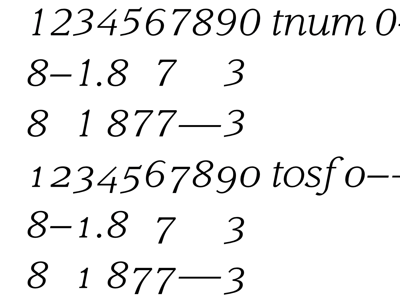
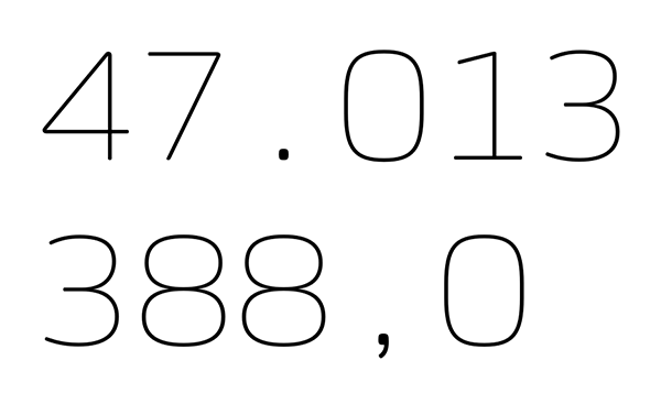
Tabular punctuation - to add or not to add?

Eimantas Paškonis
Posts: 91
If values are aligned by right and have same decimal value, there's no need to tabular period, comma or currency sign. But that's not always the case. Is there a need for tabular punctuation and if yes - which ones?
Tagged:
0
Comments
-
Why would you use tnum outside of the table?0
-
I am bumping this thread with the same question.
Seemingly tabular punctuation (mainly period, comma, colon, semi-colon, space) is rarely found in fonts, and they surely look oddly "empty" in text.
Do people rely on the assumption that tabular entries will have these characters in the same position vertically?
0 -
I do prefer punctuation in tables in the same position vertically, yes. My tabular figures are NOT kerned with anything (and are designed on equal widths). The punctuations are on equal widths, too. Further I include a figure space and a punctuation space. To round up I also include an en-dash (on figure width) and an em-dash (on 2x figure width), for prefered vertical alignment in tables.Igor Petrovic said:I am bumping this thread with the same question.
Seemingly tabular punctuation (mainly period, comma, colon, semi-colon, space) is rarely found in fonts, and they surely look oddly "empty" in text.
Do people rely on the assumption that tabular entries will have these characters in the same position vertically?
1 -
@donat raetzo Thanks for the answer, tabular versions of en and em dashes sound reasonable (and easy to implement).
But when it comes to period, comma, space, colon, and semi-colon, I actually wanted to ask does anyone puts them on the same advance width as figures.
For example that both zero.tf and period.tf have advance width of 650 units. So to keep vertical columns in a table strictly even when the entries have different decimal structure. (like monospaced fonts do).
0 -
Igor Petrovic said:… when it comes to period, comma, space, colon, and semi-colon, I actually wanted to ask does anyone puts them on the same advance width as figures.
No, never. Why would I do this? It looks like a bold mistake and I cannot imagine any functional reason why a period or comma needs the same width as the figures.3 -
I agree, it looks very odd.It looks like a bold mistake and I cannot imagine any functional reason why a period or comma needs the same width as the figures.
But then again, I felt that the purpose of tabular figures could be easily compromised if rows have a different decimal structure.
Actually, I am not sure how often that happens. Seems that happens often, but that type-setting software handles it with tabs centered around punctuation.
Anyway, I got two useful answers. Thank you all!1 -
One solution not mentioned (after only skimming the thread) is putting the period, comma, semicolon and colon on the same advanced width. That way, the figures will align in each row when set like this:
10,203
10.293
10,200
This is also handy considering some European languages swap the dot and the comma as their meaning flips (i.e. $23,00.34 for Western World versus $23.00,34 for some Euro languages).3 -
I think an equal width (but different from the tabular width) for period, comma, colon and semicolon is completely sufficient. Also from a typographic view I would align the decimal position across rows so all periods would be above each other.
If designers are really after having punctuation etc. have the same width as the tabular figures, they would most likely use a monospace anyway.
In my opinion a typeface should not be able to solve any use case possible but a reasonable amount.2
Categories
- All Categories
- 46 Introductions
- 3.9K Typeface Design
- 489 Type Design Critiques
- 571 Type Design Software
- 1.1K Type Design Technique & Theory
- 658 Type Business
- 870 Font Technology
- 29 Punchcutting
- 528 Typography
- 121 Type Education
- 327 Type History
- 80 Type Resources
- 111 Lettering and Calligraphy
- 32 Lettering Critiques
- 79 Lettering Technique & Theory
- 560 Announcements
- 95 Events
- 116 Job Postings
- 169 Type Releases
- 179 Miscellaneous News
- 269 About TypeDrawers
- 53 TypeDrawers Announcements
- 114 Suggestions and Bug Reports


