Sharpness setting for displays alters fonts
jaimes
Posts: 24
For years, I've been having issues with reading on screen. I'm a software developer and spend many hours poring over code.
Programming with monospaced fonts is one thing.
Programming with monospaced fonts is one thing.
Reading news/magazines using seriffed fonts was different, and very often I perceived those fonts to be "spidery".
Years ago I purchased a 2k monitor (1440 lines), and things improved, but I still found many seriffed fonts to appear spidery. Particularly The New Yorker, which uses Adobe Caslon Pro.
This year I bought a 4k monitor, and again, improved, but still the spidery rendering.
I've been going over different settings, and I realized that in fully customizable mode, the monitor has a Sharpness setting that comes factory set to 50%.
On my televisions, the first thing I do is to select Filmmaker mode or equivalent, and set the Sharpness all the way to 0.
So I tried setting the Sharpness to 0 on my monitor, and ... holy shit, it made a noticeable difference. The fonts appear "fuller" with the sharpness off.
And in a way it makes sense. The Sharpness control artificially applies edge enhancement, so it probably messes with the antialiased text, no?
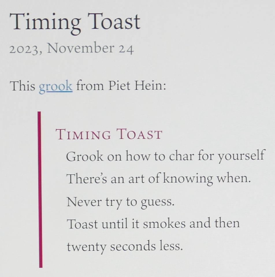
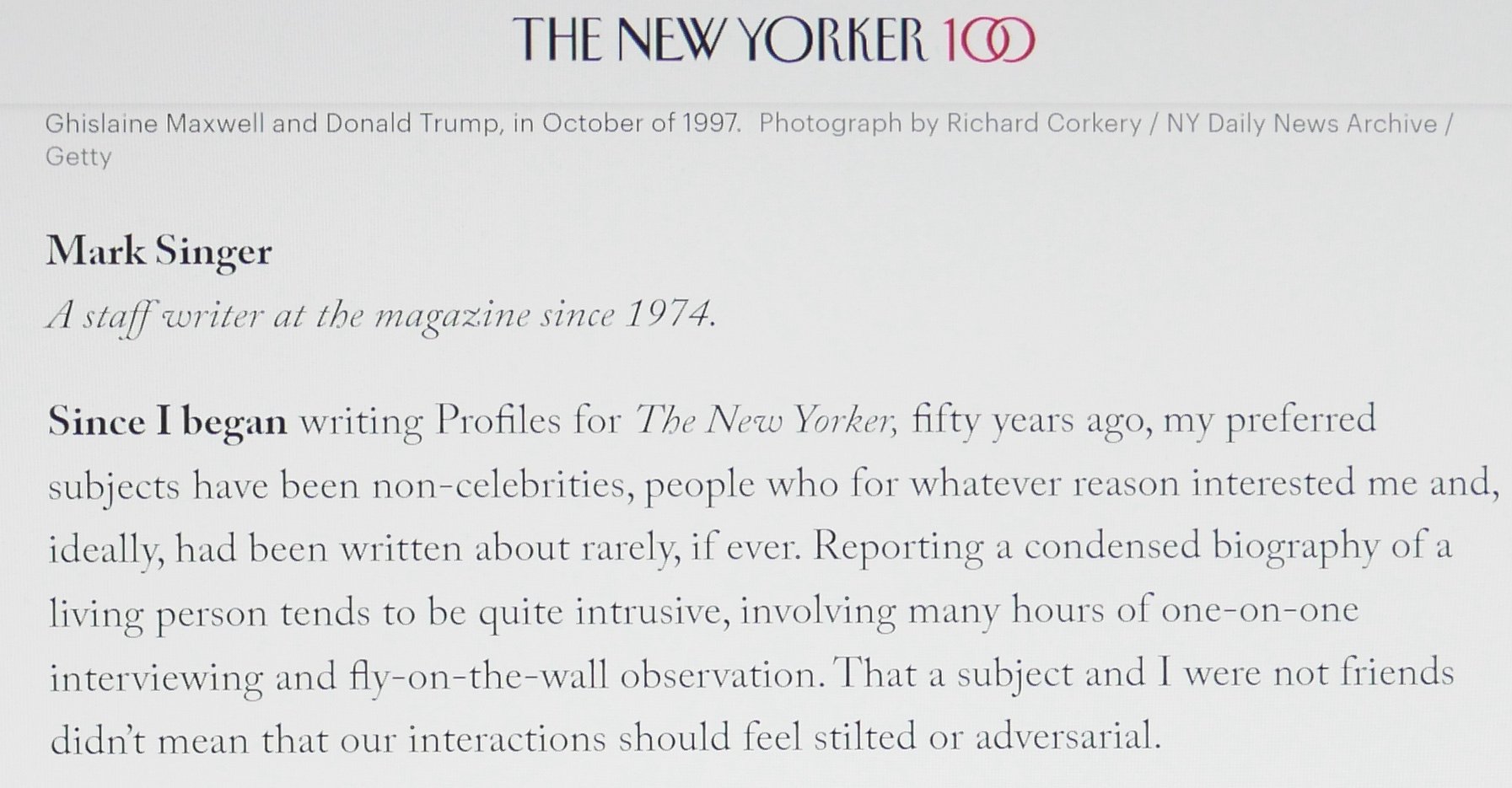
Anyway, I'm adding some images so you know I'm not making this up.
Sorry for the quality of the photos, but I think you can notice differences.
Have others found this too? Is it a well known thing?
With Sharpness set to 0

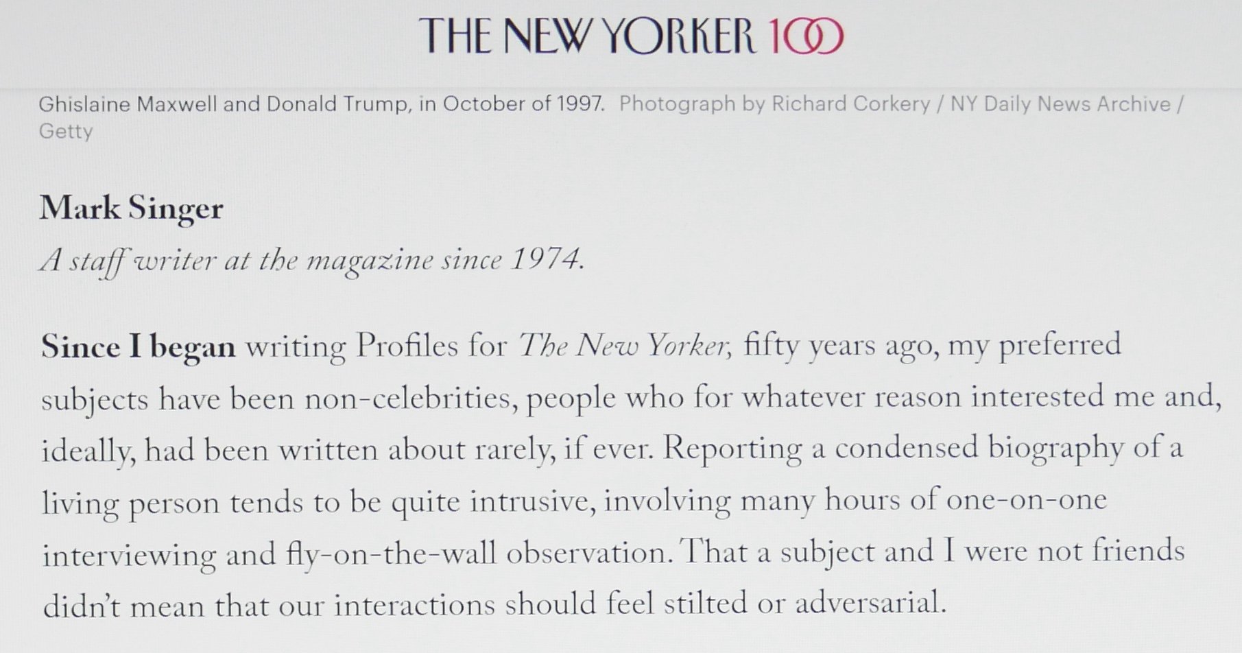
With Sharpness set to 100%
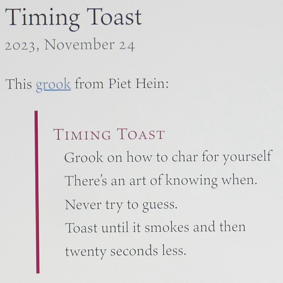

With Sharpness set to 0


With Sharpness set to 100%


Tagged:
1
Comments
-
In a previous Day Job I sold multi-monitor arrays based on whatever LCD monitor models met our criteria combination of cost and features at any given time, and I can tell you we routinely had to turn off all kinds of factory image compubollocks that ship by default, starting with the California-mandated brightness and power limits. I visited a friend’s house a few years ago and watched a Game of Thrones episode with some underwater-looking cinematic motion blurring setting turned on. One day I expect to pick up the glasses I ordered at an eye doctor and get red-blue 3D lenses with built-in pop-up ads. Old Man Yells At Cloud &c.1
-
So much engineering ingenuity spent in fruitless bells and whistles. Sigh0
-
The funny thing is that they put in all the bells and whistles to make the screens look better in stores with harsh lighting and nobody buys monitors that way anymore. People buy them online.0
-
Ah, but people go to the store, check out the monitor... and then order it cheaper online.
Anyhow, back to @jaimes original question: yes this is a known thing. Sharpening screws with the edges of “things” to make them look crisper. But on text, especially body text or smaller, it is bad.
1
Categories
- All Categories
- 46 Introductions
- 3.9K Typeface Design
- 489 Type Design Critiques
- 572 Type Design Software
- 1.1K Type Design Technique & Theory
- 659 Type Business
- 874 Font Technology
- 29 Punchcutting
- 528 Typography
- 121 Type Education
- 327 Type History
- 80 Type Resources
- 111 Lettering and Calligraphy
- 32 Lettering Critiques
- 79 Lettering Technique & Theory
- 560 Announcements
- 95 Events
- 116 Job Postings
- 169 Type Releases
- 179 Miscellaneous News
- 269 About TypeDrawers
- 53 TypeDrawers Announcements
- 114 Suggestions and Bug Reports


