Helvetica Semi-Mono (?)

Evie S.
Posts: 84
Hi! Here to make my random reappearance.
I’m currently coding a web portfolio (as a musician) using MD IO as the heading font. I’ve admired Covik Sans Mono and its use of a three-width system, and wanted to use it as the body font, but I felt it had too strong of a character as a pairing. Since this is a pretty niche category, I thought it would be interesting to take a crack at it using specimens of metal type Helvetica as a base, since I’m pretty bad at designing fonts otherwise. (Side note: I did discover Fragment Mono, but the texture looked unpleasant with the increased x-height in my opinion.)
I just started this yesterday, so any feedback would be much appreciated!

0
Comments
-
Two things jump out at me: the space character feels very narrow, and your diagonals are unbalanced in thickness – v, w, x, y and z are doing different things with weight, as does K. There’s more – bunching in diagonal apexes, spine of S being quite dark – but that’s where I’d focus right now.2
-
I think I would first determine the relationship between x-height, cap height, the monospace width and the widths of the different letters themselves. It helps to limit the design on a bunch of charcteristic key letters so you don't have to design the whole alphabet while figuring it out. Right now some of the uppercase seem too condensed (which is maybe why Fragment Mono lowered the cap height, at least I saw this in other monospace fonts). Same for the lowercase. It seems a bit random right now and some more balance would benefit the design. It might be worth rethinking your system since i and j occupy a narrow space but then r,f and t occupy the normal monospace width despite being narrower letters in the original Helvetica.1
-
Also Semi-Mono as a term might be a bit confusing. IIRC Dynamo used it first as a term for an intermediate style between a monospace and a proportional style which is not really what you're working on.0
-
How many different glyph widths are you going for?
Some later electric typewriters used unit systems for proportional spacing, e.g. the IBM Electronic Typewriter 50 hat a 7 unit system, of which each glyph could occupy 3, 4, 5, 6, or 7 units in width:
The width assigned to each glyph was identical in all fonts:
The IBM Mag Card Executive had 9 units, of which 4, 5, 6, 7, 8, 9 could be used.
You can make use of this by setting your glyph advance width only to e.g. 300, 400, 500, 600, or 700 on a 1000 units per em setting. (Incidentally, if I'm not mistaken, this will also give you the authentic typewriter's font size at 12 points in print).
I have done some experiments with those unitizations, and find that they bring something more unrefined into a typeface, while not being as severely restricted as a true monospaced font.
I've written about the maths behind the IBM Selectric Composer's 9-unit system on my website.
10 -
Another way to approach unitised widths is to imagine rasterisation of the outlines at a particular bitmap size, and then set the advance widths to hit full pixel boundaries (this is easiest if you set the UPM size to be equally divisible by the notional bitmap size).0
-
I feel like I should have clarified more in my original post. I’m using a three-width system in integer units (1 unit, 2 units, 3 units). I felt Covik Sans Mono did a good job with its implementation, and I took heavy inspiration from its system. I also felt like Neue Haas Grotesk Mono did a good job while keeping the x-height the same as its proportional counterpart. However, when I tried Fragment Mono, something was lost. It reminded me of something Kris Sowersby said in his writing about The Future: changing the proportions changes the essence of the typeface. I thinkSo from that, my observations: first, Covik Sans Mono works well with a half-unit space. Perhaps what I’m missing is a looser spacing overall to accommodate that narrow space character. Secondly, Neue Haas Grotesk Mono has narrower characters than the ones I have designed, even in the capitals. That was my compass for how narrow I could push things, but maybe I have to push wider for more comfortable reading.I agree that the drawing, weight, and overall proportions are very inconsistent right now. Early, I tried pushing /f/r/t into the one-unit space and it did not look good:
 I don’t have any updates on the typeface, but from all of your comments it seems I should explore overall width/spacing and explore adding more width classes.0
 -
Covik Sans Mono uses 300, 600, 900 units as widths, i.e. strict multiples of its minimum width. This results in a particular spacing where different letters start in the same horizontal position in consecutive lines:

But even if you want to keep 3 overall widths, you could pick different ones, e.g. 400, 600, 800. The pattern of where in a block of text the letters align will change, but maybe it will be a better match for your typeface.3 -
While still maintaining the rigour of the 3-width system, it would be possible to nuance spacing by contextual alternates, in which glyphs would be placed left, right or centre in their space, depending on the adjacent characters.
For instance,
sub f' f by f_left ;
sub f_left f' by f_right ;
This suggestion would apply to your one-unit /f/r/t system.
0 -
Here’s a quick exploration of a six-width system. For ease of implementation, I used Nimbus Sans as a base, which I would redraw if I want to take this more seriously. The base unit is 150, with glyphs using 300/450/600/750/900.
 1
1 -
Just as an aside, but maybe useful to your project, @Evie S.: David Jonathan Ross recently wrote a lot about width systems for monospaced type design in the notes for his latest Font of the Month, Gimlet Sans Mono. It includes a novel idea (at least to me):
I settled on a shift-kerning approach that leaves the letter shapes and widths as they are, but contextually shifts letters to the left or right in an attempt to balance out some of the unevenness. Essentially, I treat the narrow and wide letters like i and m as magnets that can either attract or repel the letters around them, without affecting the monospace grid. The effect is much more subtle than texture healing (maybe too subtle!), but it affects many more pairs.
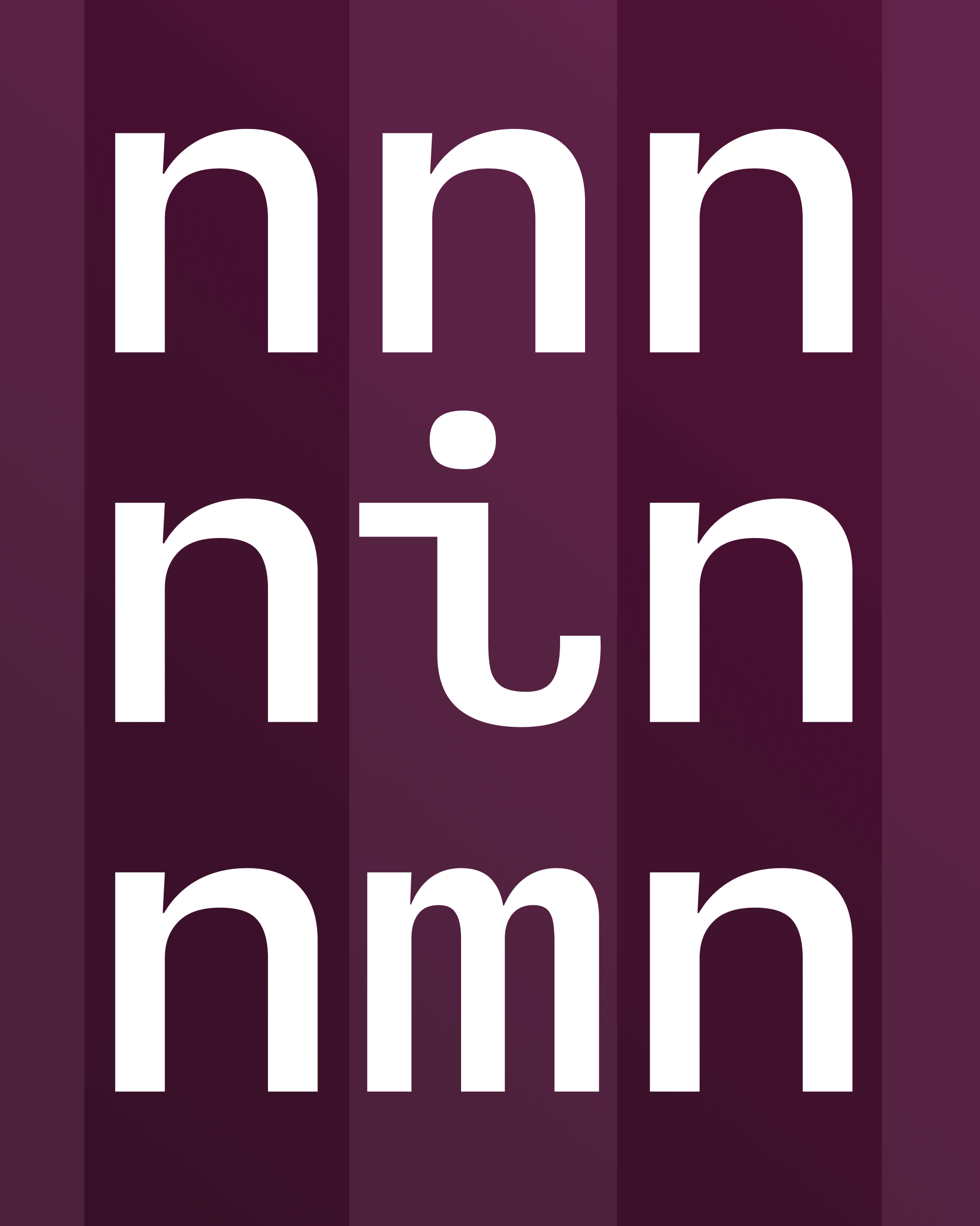 The tradeoff is more even/readable spacing vs. letters that line up vertically between lines.7
 -
Yes, that’s what I mentioned above. It’s especially useful for double-m; it works because you never get three /m’s in a row, and the adjacent letters are usually vowels.2
-
Actually, there is a triple-m word—the interjection “mmm.”
I was recently considering that for a typeface name, but as usual someone else had beaten me to the punch!0 -
Thanks Nick Shinn and Stephen Coles for the advice! I’ll definitely try shift kerning, but I want to make sure the spacing works as is too. I’ve just redrawn the six-width from scratch. I tried to also improve the drawing quality and internal consistency.
 0
0 -
You seem to be doing a pretty good job, but it’s still basically just Helvetica. I am wondering what is the point of this? You are demonstrating some technical skill, but why start with someone else’s design?1
-
As with all my type design endeavors, there is really no point to this. I’m a musician first, graphic design is somewhere down the list, and type design is nothing more than a hobby. A friend commented that my portfolio’s pairing of MD IO and Die Grotesk looked off—I maintain it’s a fine pairing, but it gave me an excuse to explore this avenue of Helvetica with a unit system.And ultimately, this isn’t really an experiment of creating a new typeface, this is an exploration of unit systems. I’m ultimately neutral on Helvetica in general. Overused, yes, often inapt, yes, but it’s still one of the most compelling neo-grotesques in my mind, and certainly one of the most neutral ones.If you want a pretentious answer, I think digital Helvetica always looks a bit stilted with its vestigial width system from phototypesetting. I made this as an experiment that draws more closely off the metal type with tighter spacing while also embracing the unit width system as an exaggerated feature.3
-
I’ve used “shift kerning,” to nuance monospace fonts, very sparingly—because it does tend to contradict the fundamental principle of the genre!
However, Covik Sans Mono posits a clever leveraging of constraints-based design space.
The sample you showed, Evie, of mixing “off the shelf” Helvetica glyphs, both Normal and Condensed, seems to me the most promising aspect of this investigation. Perhaps you could bump together the concepts of a limited number of unitary widths, with a limited number of variable font horizontal scale instances, and see what happens?0 -
To me the /w, the /M, and especially the /W get black spots at the joins, so that their strokes wind up looking tapered in the middle0
-
In that case, it would seem that bold weight is most promising, as it minimizes the obviousness of different stroke widths—Adrian Frutiger, for instance, was not afraid to put narrow strokes in M and W, in the heavier weights of his sans serif designs.0
-
Nick—I have considered making a variable font with width, if only to test various options. I just wonder what the best way to proof changes is. What I really wish I could do is proof with a variable font with changes to a character propagating everywhere. (i.e. every /a in the project gets width 600, every /f 300...) It seems like something that could be scripted, but I’m still on Glyphs 2 and have no intentions of updating.0
-
You may already be familiar with Oracle Triple from ABC Dinamo.1
-
I haven’t seen it before, as I don’t quite keep up with releases from ABC Dinamo. The concept is interesting, and way different than what I ended up on. Thanks for the link!After some deliberation, I’ve compared my version to other ones on the market. I feel the aspect ratio and spacing is close enough to what I’ve observed that I figured it would be worth tweaking the original three-unit design. I haven’t touched the six-unit design, but I took the feedback from that and applied it to here. I have added inktraps as a maybe hacky solution for the black spots, and paid extra close attention to stem widths.
 0
0


Categories
- All Categories
- 46 Introductions
- 3.9K Typeface Design
- 489 Type Design Critiques
- 572 Type Design Software
- 1.1K Type Design Technique & Theory
- 658 Type Business
- 870 Font Technology
- 29 Punchcutting
- 528 Typography
- 121 Type Education
- 327 Type History
- 80 Type Resources
- 111 Lettering and Calligraphy
- 32 Lettering Critiques
- 79 Lettering Technique & Theory
- 560 Announcements
- 95 Events
- 116 Job Postings
- 169 Type Releases
- 179 Miscellaneous News
- 269 About TypeDrawers
- 53 TypeDrawers Announcements
- 114 Suggestions and Bug Reports