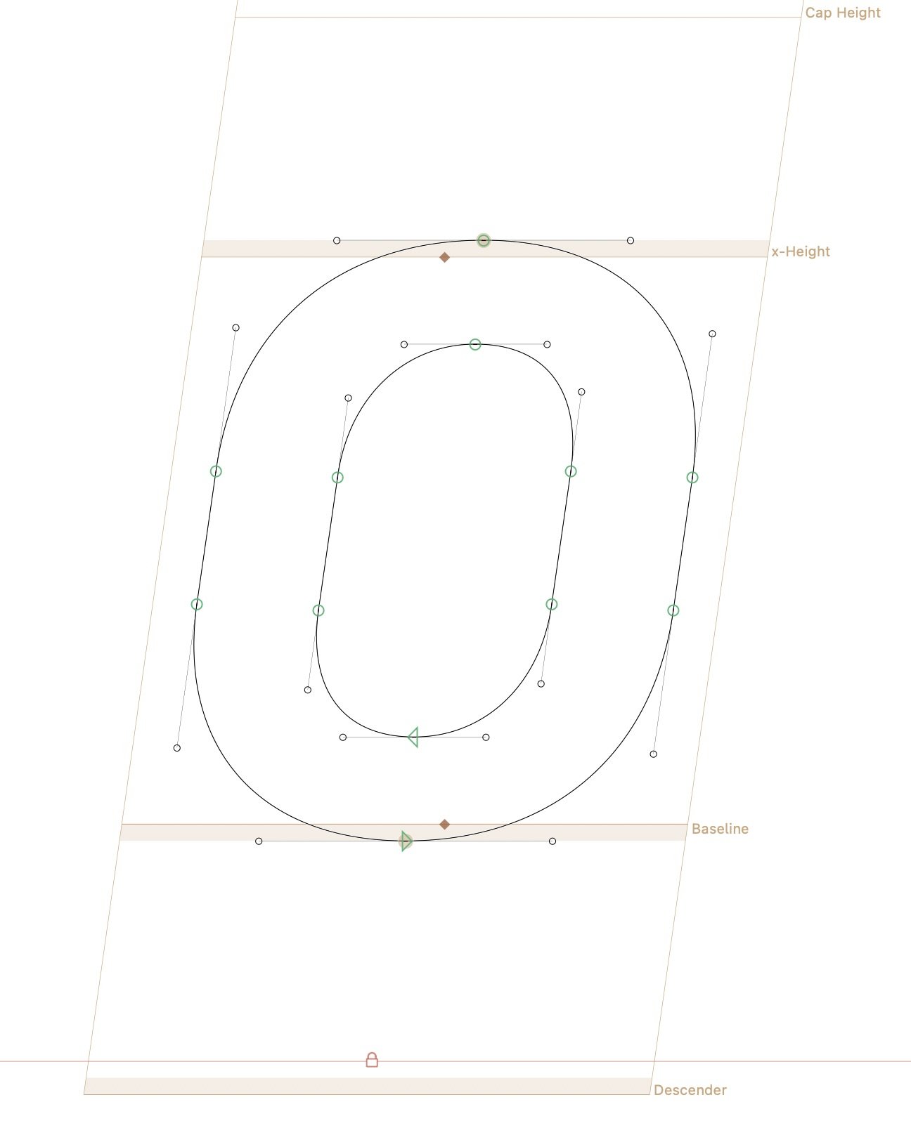
Oblique interpolation and extrema points in DIN-style glyphs.
ok_locksmith_8414
Posts: 7
Many sources suggest that when slanting glyphs for italics or obliques you should add extrema points to the outlines for various reasons. Often, this requires adding extra nodes. However, due to the design of my typeface, I face a couple of challenges.
- My typeface has a DIN like structure, so glyphs such as “O,” “o,” and “0” have flat sides instead of fully rounded curves.
- My typeface contains both upright and italic styles in the same file, with the italics interpolated from the uprights via a slant axis.

How would I approach this?
I'm using Glyphs App by the way.
0
Comments
-
I don't advise adding extreme points in slanted styles. Unless you find it easier to draw and manage shapes (which I highly doubt, given a bit of familiarisation, if necessary), I don't think there is any good reason to add them. Extrema in obliques only add problems: more difficult drawing (in my opinion), incompatibility, outline distortion (in comparison to the original slanted/corrected shape)...
The only objective reason I ever hear about adding extremes in italics is hinting. You can safely disregard this, unless you are doing manual hinting and know exactly why you are doing so. Hinting for italics is virtually impossible (again, unless you do it manually and know exactly what you're doing), and adding extremes would only help for vertical stems, which, by definition, don't exist in italics.
Bear in mind that fonts on Apple devices are hinted on the fly by the system, the font-internal hinting is disregarded. The same applies (to a lesser degree) on Android devices.9 -
Hey I've designed a typeface with exactly these features (see www.rt-dromo.com for reference) and I've tried both. First I had it with extremum points and changed it later. When testing in browsers I didn't notice a difference in quality. The advantage of no extremum points like you show on your image is the compatibility as you said. In case you'd want to make it a variable font this construction would be necessary anyway.0
-
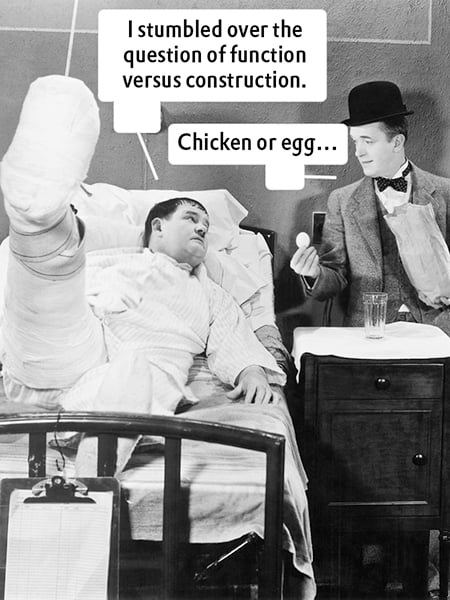
[…] vertical stems, which, by definition, don’t exist in italics.In the context of font styles, this is commonly the case, since Italic usually serves as a container for sloped romans, italics, and true cursives. However, as Gerrit Noordzij noted in The Stroke, the distinction between formal and cursive writing lies not in their inclination but in the continuity of movement. in other words, in construction rather than angle.
From a schoolmaster’s point of view, one could argue that an italic is a formalized cursive, its fluent construction deliberately interrupted for regularity. Slant does not matter as such. For example, José Mendoza y Almeida’s Sully-Jonquières is a purely vertical italic, illustrating that the essence of italics lies in their construction and movement, rather than in their inclination.
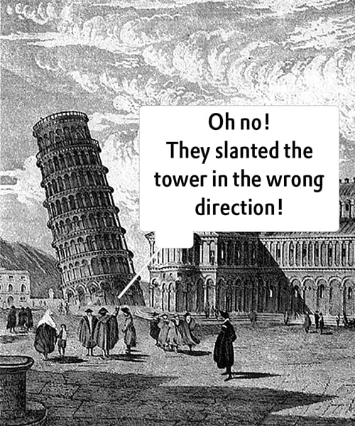
Even in the context of font styles, an italic can theoretically stand upright, demonstrating that slant is not essential to its definition. And, as a small aside: the tower of Pisa is leaning, but not italicized. 1
1 -
I don’t think the italicness of italic can be reduced to a single criterion, either slant or cursive construction. Rather, italic is a set of available letter features collectively arising from being written more quickly than formal, roman letters: cursiveness, slant, compression, abbreviation. Not all italics include all these features, or include them in equal measure, but the way in which they are selected and combined will determine how successful the result is as an italic in a given typographic system. Put another way, italic is determined by use, not by shapes.
José Mendoza y Almeida’s Sully-Jonquières stands alone, without a companion roman, so while we might call it a kind of italic because of its cursive construction and compression, we can’t judge how successful it is as an italic unless we see it used as an italic.
0 -
Hi John, you are right that the success of an italic depends on how it functions alongside the roman: that is about relationship and use. The challenge with the functional view, however, is that it is not easily quantifiable: after all, it relies largely on subjective interpretation and typographic convention, whereas construction can be analyzed more objectively.
What I am trying to get at is the distinction in kind, not in use. The only consistent factor that separates roman and italic is their construction. Everything else, i.e., naming, placement, even intended role, can vary. For example, I could put a sloped roman in the italic slot and use Mendoza’s italic as the roman, or vice versa. That would certainly be unconventional, but it would not change their underlying natures. And both could serve my purpose. However, the constructions would remain what they are.
So, while style labels are flexible, the distinction in construction is fundamental. Function determines whether something works as an italic, but construction determines whether something is an italic. In the end, it is perhaps a matter of perspective: you are addressing italics from a typographic or functional point of view, while I am describing them from a structural one. 0
0 -
Odile Upright, Joos, and Seria Italic (as contrasted to the still apparently unreleased Seria Cursive—did that essentially evolve into Nexus Italic?) also come to mind.0
-
I think we're veering extremely off-topic here, since this was a purely technical question, as much as I (sincerely!) appreciate the wonderful theory and historical input.
Another argument for the use of angled extremes instead of vertical extremes is that of algorithmic correction of curves. I might be rather biased, since I am working on algorithmic oblique correction at the moment, but it is mathematically much, much less headache-inducing to use slanted extremes instead of calculation based on using vertical extremes (which inevitably leads to unsolvable cases).1 -
[Apologies for pursuing the digression once more.]The only consistent factor that separates roman and italic is their construction.Function determines whether something works as an italic, but construction determines whether something is an italic.Except it is possible to employ cursive construction to make letters that are not italic in either form or function, including many models of handwriting that are not counted as italic. So in that respect the term italic is limited to a particular model of writing and type that developed in Italy in the late middle ages, and that also had features of slant and compression.
Trying to reduce the definition of italic to a singular aspect such as construction seems to me pointless, because there are multiple aspects that are available to be mixed and matched to produce designs that function as italics in the ways that those aspects differentiate from roman/formal/upright designs.0 -
For me, the problem is communicating with users. Most users assume any slanted font is Italic. I find it less confusing to just name the font "Italic" even if it is simply oblique or slanted Roman.
As for placement of points, I just do what the curve demands, allowing for technical requirements.0
Categories
- All Categories
- 46 Introductions
- 3.9K Typeface Design
- 489 Type Design Critiques
- 572 Type Design Software
- 1.1K Type Design Technique & Theory
- 659 Type Business
- 871 Font Technology
- 29 Punchcutting
- 528 Typography
- 121 Type Education
- 327 Type History
- 80 Type Resources
- 111 Lettering and Calligraphy
- 32 Lettering Critiques
- 79 Lettering Technique & Theory
- 560 Announcements
- 95 Events
- 116 Job Postings
- 169 Type Releases
- 179 Miscellaneous News
- 269 About TypeDrawers
- 53 TypeDrawers Announcements
- 114 Suggestions and Bug Reports


