Moving type – your favourite examples

KP Mawhood
Posts: 300
Hi everyone! It’s been a while since I was active here, but I’d love your input.
What are some of your favourite examples of moving type: kinetic typography, animated type, or interactive websites using variable-fonts? I’m teaching a module where students create a type specimen for their own glyph set, and several are keen to explore animation for their final project. Thanks so much for your help. 🙂
What are some of your favourite examples of moving type: kinetic typography, animated type, or interactive websites using variable-fonts? I’m teaching a module where students create a type specimen for their own glyph set, and several are keen to explore animation for their final project. Thanks so much for your help. 🙂
Tagged:
0
Comments
-
Welcome back, KP! On the brand identity side, I think Collins does some of the best work (and works with the best foundries) in moving type. See Muse (with Contrast Foundry), SF Symphony (with Dinamo), 605, and Institute of Design (with Ryan Bugden).3
-
Moving type - love it, but most often it is unfortunately
 2
2 -
Grzegorz Luk (gluk) said:Moving type - love it, but most often it is unfortunatelyThat's fair!
 It's not an area I'm familiar with. These are a few I found so far:
https://www.oneclub.org/awards/tdcawards/-award/55636/the-wall-live-house-rebranding/1 -
https://joshschaub.ch/en/
https://somethingsavage.com/
https://www.studiofeixen.ch/
Josh worked a lot for us back when we didn’t have an in-house team, and he’s great. Obviously I think the work we do for our releases (at Grilli Type) is wonderful, too, otherwise we wouldn’t release it. Dan Savage and Feixen are both great in their own ways.2 -
Alien title:
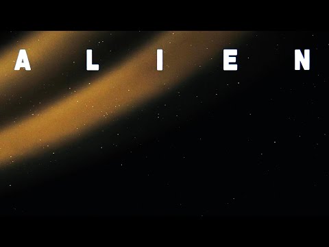 https://www.youtube.com/watch?v=7BYzzast0jw 4
 -
The gradual reveal of the ALIEN title is referenced in the new ALIEN EARTH series:
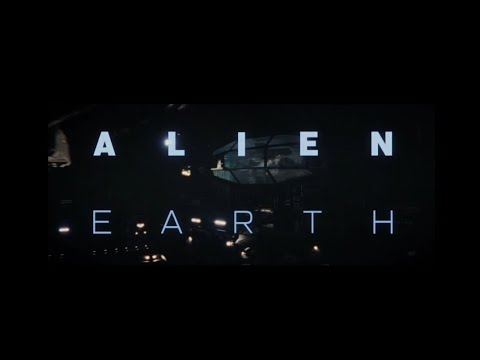 https://youtu.be/5t2NGpDLGco?si=jsW1FjtsNF34pUEE 2
 -
From a pedagogical standpoint, motion design is its own discipline. So you might consider how thoroughly you want your students to explore it, and what key experiences they could get. Syncing sound and animation, longer duration vs. shorter simpler moves, how varied your students prior experience is etc.?Of course:
4 -
The new frontier is voice-to-text captions in social media videos.
How many words to show at one time?
How many lines to arrange them on?
What font, size, colour, and U&lc or caps?
And most pertinently—how to highlight (traditionally the “follow the bouncing ball” effect).
And automating the transliteration; not something that can be done in the typical animation apps, AFAIK.4 -
So, it’s possible to specify “show up to four words at a time, without separating definite and indefinite articles from their noun, and highlight each word as it is spoken, in bold/outline/whatever”?1
-
It's 90% possible, as it's been used for Karaoke production for years. The better question is whether such software is public available and whether it can operate in real time. Karaoke producers most likely have their own in-house software.Nick Shinn said:So, it’s possible to specify [...]?
2 -
Yes, real time is the issue. Otherwise, it is a lot of work to go through a video in Premiere Pro or Capcut and finesse the caption typography phrase by phrase. The typographic arbitrators work for the apps, creating templates.
1 -
Am I the only person here who viscerally hates motion typography synced to a voiceover?1
-
@John Butler no you're not.1
-
Depends. One of my all-time favourite music videos employs a lot of motion typography synced to the voiceover (the lyrics). It's in German, sorry. I find it quite mind-boggling, especially considering it is from 2011.
Samy Deluxe – Poesie Album3 -
@SCarewe just jogged my memory in another thread - there's a collaboration DIA did with squarespace a few years back that I'm very fond of. it really felt very forward for a well established brand like that at the time, surprising even. and it's hard to beat a brand refresh that includes a custom typeface from francois rappo!0
-
Here's something analog that should be of interest:
https://kellianderson.com/books/alphabetinmotion.html
This book will be published next week by Katherine Small Gallery, Greater Boston's only brick & mortar bookstore dedicated to typography and graphic design.
https://ksmallgallery.com/collections/online
0


 https://www.youtube.com/watch?v=XZmGBTVNROQ
 https://www.youtube.com/watch?v=dCk8B7Xr3bE


Categories
- All Categories
- 46 Introductions
- 3.9K Typeface Design
- 489 Type Design Critiques
- 572 Type Design Software
- 1.1K Type Design Technique & Theory
- 659 Type Business
- 874 Font Technology
- 29 Punchcutting
- 528 Typography
- 121 Type Education
- 327 Type History
- 80 Type Resources
- 111 Lettering and Calligraphy
- 32 Lettering Critiques
- 79 Lettering Technique & Theory
- 560 Announcements
- 95 Events
- 116 Job Postings
- 169 Type Releases
- 179 Miscellaneous News
- 269 About TypeDrawers
- 53 TypeDrawers Announcements
- 114 Suggestions and Bug Reports