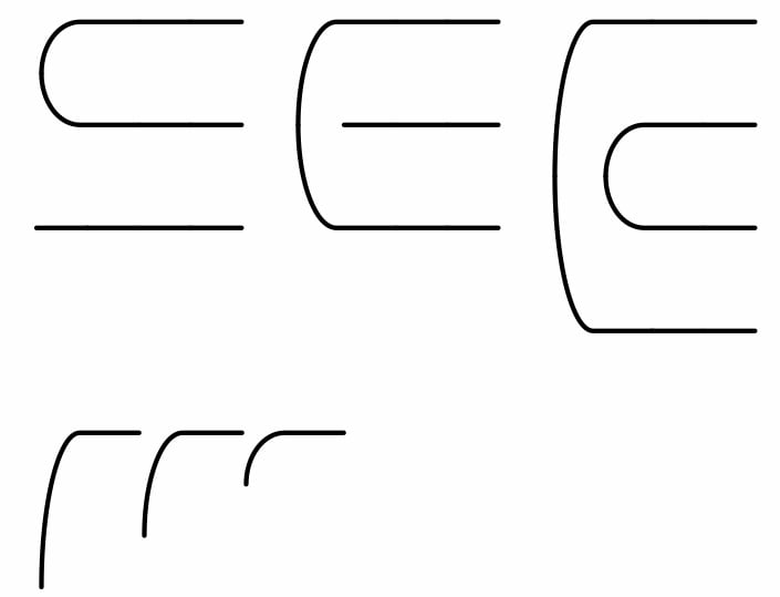
Drawing quires of a manuscript

michele casanova
Posts: 79
I'm doing some testing for a font that might be useful for visualizing the physical structure of manuscripts (something like VCEditor).

Given a manuscript quire, the curve for a folio might need to descend above the baseline (in the image, each horizontal line corresponds to one line of text). I'll also create a vertical element to connect these curves, but I'm interested in whether a vertical position of ±6000 would be a problem (the font has 1000 units per eM).
If I actually create the font, I plan to call it "Squinternato", which in Italian means both lunatic (for people) and broken down into quires (for books or manuscripts)
Tagged:
0
Comments
-
In the unlikely event that anyone is interested in this experiment, the font is available here: https://github.com/m-casanova/SquinternatoThe metrics are compatible with EB Garamond/Garamontio.
1
Categories
- All Categories
- 46 Introductions
- 3.9K Typeface Design
- 489 Type Design Critiques
- 572 Type Design Software
- 1.1K Type Design Technique & Theory
- 660 Type Business
- 875 Font Technology
- 29 Punchcutting
- 529 Typography
- 121 Type Education
- 328 Type History
- 80 Type Resources
- 111 Lettering and Calligraphy
- 32 Lettering Critiques
- 79 Lettering Technique & Theory
- 560 Announcements
- 95 Events
- 116 Job Postings
- 169 Type Releases
- 179 Miscellaneous News
- 269 About TypeDrawers
- 53 TypeDrawers Announcements
- 114 Suggestions and Bug Reports