First Font: Clean Vintage Signage-Inspired Display

jeremy.t.hamann
Posts: 3
Hello there!
I've been having a blast working on my first font, but I would appreciate opinions from some fresh eyes. Overall I'm really happy with it, but it being my first stab at type design, feel free to open my eyes to my inexperience!
A couple of things I'm running into:
Thank you for your time!!
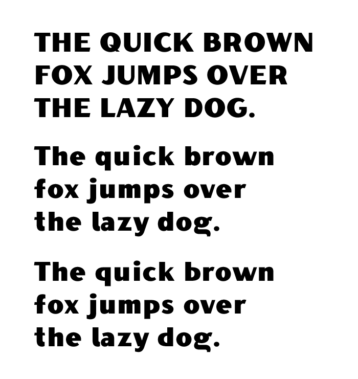
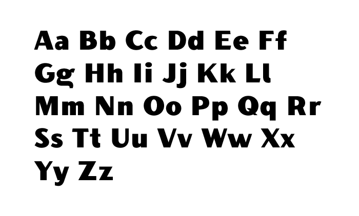
I've been having a blast working on my first font, but I would appreciate opinions from some fresh eyes. Overall I'm really happy with it, but it being my first stab at type design, feel free to open my eyes to my inexperience!
A couple of things I'm running into:
- I've been playing around with two lowercase b/d/p/q versions, part of me wants to go with the lowest quick brown fox version below to connect more to their uppercase counterparts, but in lowercase I feel like those letters just want to be curved with an overshoot... I go back and forth
- I'm also struggling to know what level of optical corrections to make between the uppercase and lowercase glyphs. Sometimes the lowercases feel too bold. Sometimes they feel just fine.
Thank you for your time!!


Tagged:
0
Comments
-
Contrast especially in the uppercase is uneven: Thin strokes of letters like AKMNQUVWXY feel too thin compared to contrast in rounds like OPR.Sidebearings of lowercase are way too wide. Think of the interletter space relating better to the spaces within the letters (e.g. counters). Gaps you have now feel like letters for beginning readers, or for setting at tiny sizes which I assume isn't the intent. Getting that spacing down will also put you in a better position to judge the weight you mentioned.It's tempting I know to play with fun /g forms but for this type style I'm afraid a "one-story" /g feels more suited. (What you have here also reads as too wide.)This thick-and-thin style has a vintage feeling, for which I think the spurred bdpq (upper quick brown fox) feels more suited. Or at least the /d and /p. /b and /q don't have to follow /d and /p (though if they wind up very horizontal they start to look kind of "techno" ish as here).4
-
@Craig Eliason Thank you for the feedback! I'll keep working it and have a moment of silence for my double story g haha.
I'm curious, as I hadn't really considered when a double story g is or isn't appropriate beyond what style a designer wanted to go for, is there a rule of thumb of when to use an single vs. double story g?0 -
There are tendencies (traditional-looking text romans and American Gothic sans romans tend to be two-story; traditional-looking text italics and geometric sans fonts tend to be one-story) but no hard and fast rules.Generally I think simpler or more modern designs ask for one story, while more complicated or more traditional (upright) designs ask for two. It's because your design seems "simpler" to me that I suggested a one-story here. (That, and the fact that your /g tail here bears little relation to any other forms in the typeface.)0
-
I like the theme a lot and for a first typeface, it's a solid start. I do like the wedge shaped terminals in the capitals, which add a bit of character.If you're going for a more handmade / old signage charm, a little more tolerance to visual discrepancies is allowable in my opinion.One thing that catches my eye, and I would fix, is the stroke of the uppercase /S doesn't have enough contrast, and it stands out in the text. Maybe the overshoots are too prominent as well. If you flatten the top and bottom of the /S a couple of units, it might help.Try zooming it out and seeing which glyphs look too dense and 'clogged up', and keep making visual adjustments accordingly.0
-
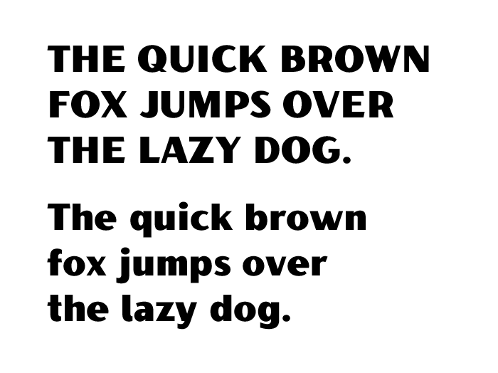
Thanks @Drawcard for the insights as well! I've been working on revisions based on Craig's feedback as well, mostly increasing the contrast all around and tightening up the spacing, especially on the lowercase. Dropping below here. Very helpful, both of you!
0
Categories
- All Categories
- 46 Introductions
- 3.9K Typeface Design
- 489 Type Design Critiques
- 572 Type Design Software
- 1.1K Type Design Technique & Theory
- 658 Type Business
- 870 Font Technology
- 29 Punchcutting
- 528 Typography
- 121 Type Education
- 327 Type History
- 80 Type Resources
- 111 Lettering and Calligraphy
- 32 Lettering Critiques
- 79 Lettering Technique & Theory
- 560 Announcements
- 95 Events
- 116 Job Postings
- 169 Type Releases
- 179 Miscellaneous News
- 269 About TypeDrawers
- 53 TypeDrawers Announcements
- 114 Suggestions and Bug Reports

