Are these enough nodes to draw up an oval with just 2 points? Nothing to do with hinting

AbiRasheed
Posts: 249
I disagree and think it needs a total of 4 here's an image of what I'm talking about https://imgur.com/gallery/JbmJ9HE
Tagged:
0
Comments
-
I can't bring up a good argument to say one does need 4 control points for this to be a good oval except from my experience in drawing vectors. On a different note are ovals or an ellipse or are they both another form of a circle? They're eucledian I know that much.0
-
In what context are you asking the question? If this relates to font making, then I would ask what your two-node oval looks like when converted to quadratic curves? That’s always one of my thoughts when creating font outlines, because even if I am not planning to ship TTFs, plans change and I’d rather not create cubic shapes that may even up unacceptably distorted when converted.5
-
On a different note are ovals or an ellipse or are they both another form of a circle?Ovals and circles are both kinds of ellipse. A circle is an ellipse in which all points along the circumfrence are equal distance from the centre. An oval is an eccentric ellipse in which the distance from the circumfrennce to the centre varies, but is equal on a straight line from any point on the circumfrence through the centre to an opposite point.
2 -
@John Hudson John Hudson said:
Not in the context of font making but just general best practices for cubic curvesIn what context are you asking the question? If this relates to font making, then I would ask what your two-node oval looks like when converted to quadratic curves? That’s always one of my thoughts when creating font outlines, because even if I am not planning to ship TTFs, plans change and I’d rather not create cubic shapes that may even up unacceptably distorted when converted.0 -
For most font purposes, and at least some graphics purposes, I would say that designing an oval that way is “bad.”
But the context matters—a lot. Otherwise we don’t know what might be rendering these curves. Nor do we know how much value is being gained by using half as many points. Is not having points at major extrema a problem? Maybe.
1 -
I've experimented with 2-point ellipses for fonts with decorative dots, going all the way back to Fake Receipt in 1997. But as John pointed out, the quadratic curve conversion is a problem. Try it, and you'll see. It kind of works, but whenever I needed economical not-so-pretty dots, I built them from quadratic curves with four points, and a single control piont on each corner. That way they could usually be converted back and forth with no curve loss.2
-
Not in the context of font making but just general best practices for cubic curvesOn a different note are ovals or an ellipse or are they both another form of a circle?Cubic Bézier curves cannot describe circular and elliptic arcs exactely.
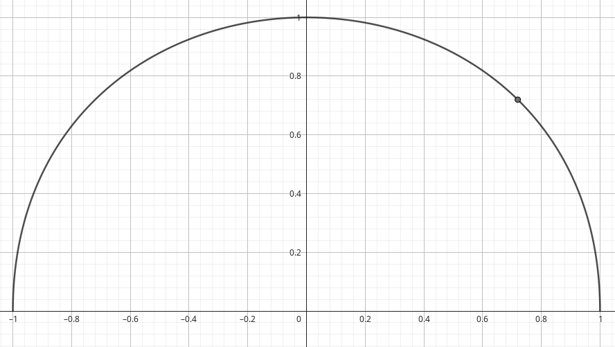
 The semicircle shown, for example, would normally be approximated using the Bézier control points (1, 0), (1, 4/3), (-1, 4/3), and (-1, 0). This ensures that the Bézier curve passes through (1, 0), (0, 1), and (-1, 0) and that the directions at these points are correct. Try it out in GeoGebra with
Curve[(1-t)^3*1 + 3*(1-t)^2*t*1 + 3*(1-t)*t^2*(-1) + t^3*(-1), (1-t)^3*0 + 3*(1-t)^2*t*(4/3) + 3*(1-t)*t^2*(4/3) + t^3*0, t, 0, 1]
At the point at time t = 0.23534171 (intersection of the curve with the line y=x), the radial deviation from a true semicircle is greatest: The distance to the origin is 1.018 instead of 1. However, as soon as the semicircle is approximated by two Bézier curves, the approximation improves.
The same applies to ellipses, since ellipses are the images of affinely transformed circles.5 -
I could have sworn that at one point there was a tool (Ikarus?) that generated circles using eight on-curve cubic Bezier points instead of the usual four, for greater fidelity to perfect circles. Or there was a foundry who handled circles this way.1
Categories
- All Categories
- 46 Introductions
- 3.9K Typeface Design
- 489 Type Design Critiques
- 572 Type Design Software
- 1.1K Type Design Technique & Theory
- 663 Type Business
- 877 Font Technology
- 29 Punchcutting
- 530 Typography
- 121 Type Education
- 328 Type History
- 81 Type Resources
- 111 Lettering and Calligraphy
- 32 Lettering Critiques
- 79 Lettering Technique & Theory
- 561 Announcements
- 96 Events
- 116 Job Postings
- 169 Type Releases
- 179 Miscellaneous News
- 269 About TypeDrawers
- 53 TypeDrawers Announcements
- 114 Suggestions and Bug Reports


