New font testing page

Ofir Shavit
Posts: 404
Hi! I’m developing a font-testing page, primarily to assist with Latin–Hebrew type design and development, and I’ve added a few helpful features I couldn’t find elsewhere.
Drag & drop font files into the top-left drop zone, then browse the display tabs to explore each font and its weights.
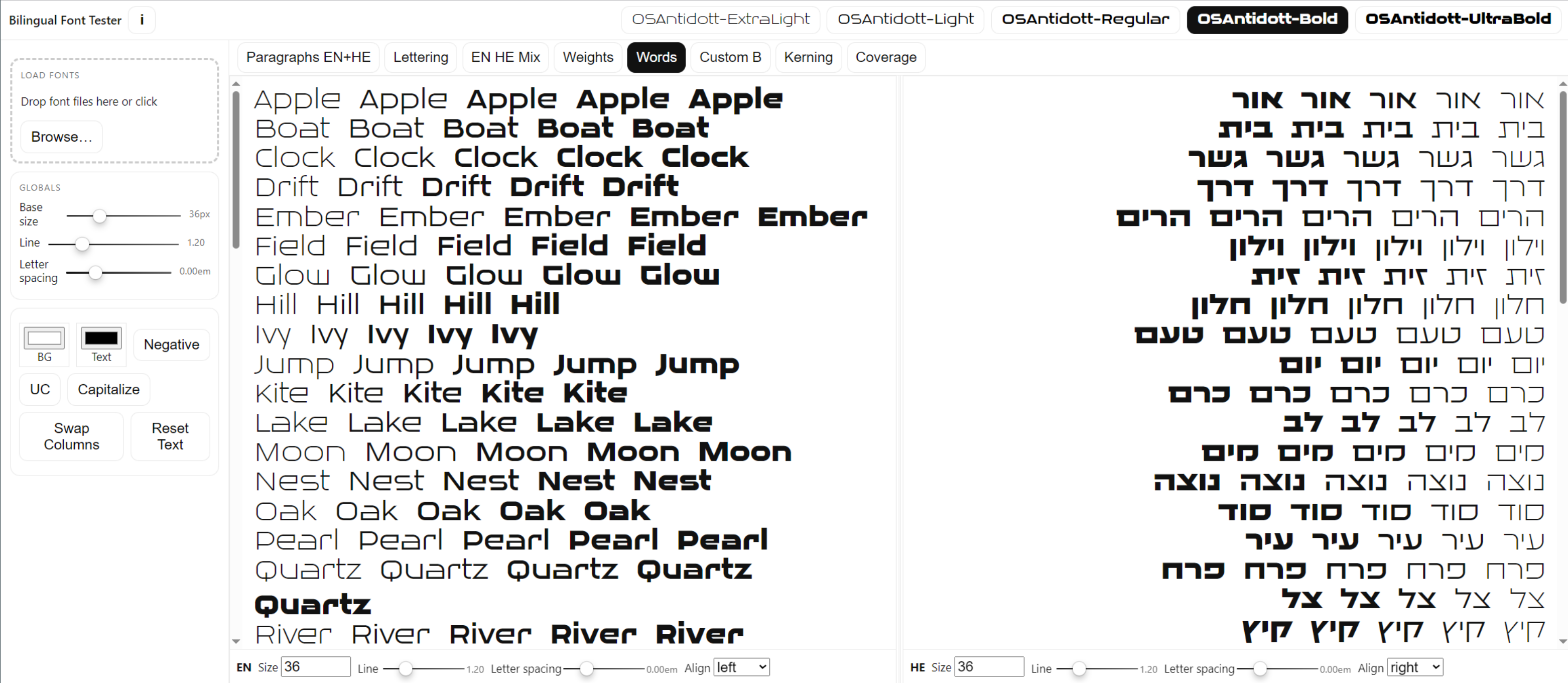
The Weights and Words tabs lay out the family’s weights across letters and words. You can also select any word or passage in the specimen and apply a different weight just to that selection.
It supports Variable Fonts (both axes and named instances).
Privacy: everything runs locally in your browser—no uploads. No personal data is collected; at most, basic anonymous visit counts may be recorded for SEO/analytics.
Feel free to use it,
feedback appreciated.
feedback appreciated.
https://ofirshavit.com/fonttester/

Tagged:
3
Comments
-
That’s pretty cool!
I don’t think I like having the initial text samples on top being letterspaced. But that may just be me.
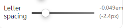
The letter spacing controls seem much too coarse at 0.05 em increments. That’s 50 units in a 1000-unit em square, and of course as it applies to both letters in any pair, they get 100 units closer. So my test font went from “too loose at this size” to “too tight at this size” with one click. Maybe try 0.01 em increments?
If it is specifically intended to compare Latin and Hebrew, maybe consider swapping them, Hebrew on the left and Latin o the right, so the text will generally be closer together, with a consistent margin between them? Seems like that would facilitate closer comparison.0 -
Thanks for the insights Thomas! you're absolutely right about the letter spacing. I'll also cancel the spaces of the initial lettering.
There is a Swap Columns button though, so it's possible to switch them with a click.
1 -
Hi Ofir. Thank you for this useful work. I often add Hebrew script to my fonts. I really need this. Thank you.1
-
Also, although variable fonts are generally supported and most things work, for some reason it seems to dislike the “slnt” axis; it has no effect. At least, not the one in Science Gothic.1
-
You're most welcome @Tural.
I found a conflict with the "ital" and "slnt" axes (ChatGPT did;) which caused the problem, it should be fixed now.
I've also changed the Letter-spacing to px and it's much more reasonable now.
Thanks for the spotting!
0 -
Letter spacing (tracking) in px is weird because it is size-specific. I mean, the effect of 1 px is a lot more at 12 px than 24 px. I really dislike size-specific tracking... I know it well because that is how Microsoft Word does it, also.
0 -
I see. Is it at all necessary in a font testing page? the tracking feature?1
-
Well, it fixed it back to em + px reference.
 0
0 -
Looks pretty good!
If somebody might be putting kind of “the same” content in the two columns, only some Latin and some Hebrew, it might be nice to be able to link them for scrolling purposes? Scroll them together, I mean?0 -
Surprisingly that was one tough behaviour to achieve, but eventually implemented pretty well. The Columns are now scrolled simultaneously with the mouse wheel and independently with by the scroll-bars.0


Categories
- All Categories
- 46 Introductions
- 3.9K Typeface Design
- 489 Type Design Critiques
- 572 Type Design Software
- 1.1K Type Design Technique & Theory
- 658 Type Business
- 870 Font Technology
- 29 Punchcutting
- 528 Typography
- 121 Type Education
- 327 Type History
- 80 Type Resources
- 111 Lettering and Calligraphy
- 32 Lettering Critiques
- 79 Lettering Technique & Theory
- 560 Announcements
- 95 Events
- 116 Job Postings
- 169 Type Releases
- 179 Miscellaneous News
- 269 About TypeDrawers
- 53 TypeDrawers Announcements
- 114 Suggestions and Bug Reports