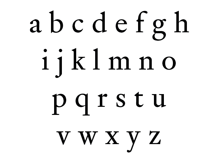
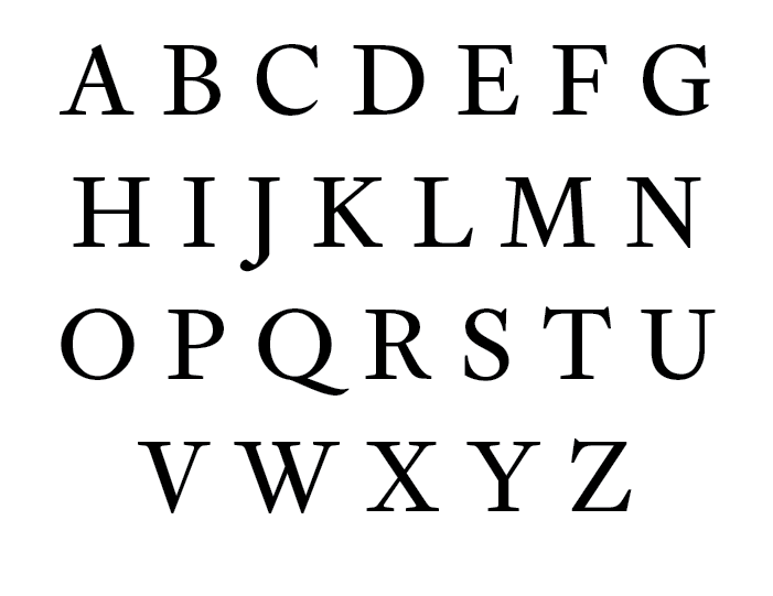
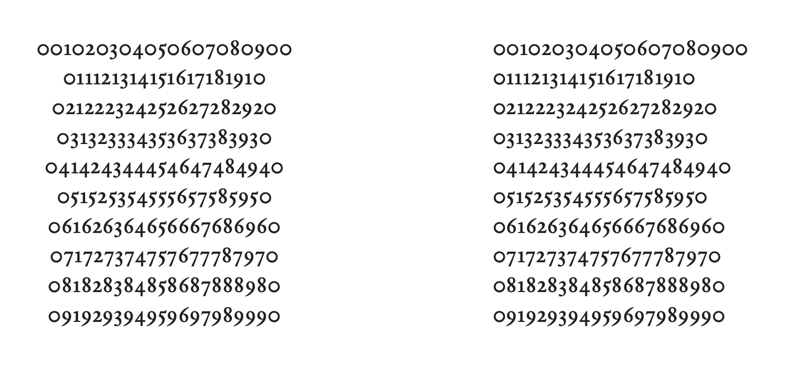
A beginner’s attempt in a text face based on Fell type
Hello everyone! Long time lurker here. As I work on my first typeface I figure I’ll introduce myself a bit and look for some critique on my first typeface.
I’m a 19yo type enthusiast from Hong Kong who got no graphic design background but get into the whole typography thing anyway. After reading quite some books and stuff about typography and type design I’ve decided to give it a go. I know many actually advocate to draw something more interesting at start but let’s say I start the project purely for studying how to draw a standard text face. The goal is to get familiarize the process and get better sense of how the letters relate to each other.
The inspiration of the typeface comes from a novel I read not long ago. You could say it’s an imaginative project in which I draw a book face to re-set the novel (although it turn out to be maybe a bit serious? Still long way to go before I can grasp the sensational aspect of type apparently). Following is a long-ish description of the from concept to execution, in case it help with the critique or some other beginners are interested.


Concept
First I look for reference, something that has the literary quality of old style type but feels more rigor, sharp and self-assured. I look at different Dutch old style type from van den Keere to Caslon and finally settled on Fell type English roman as it fit the qualities that I’m looking for. (Plus there are extra high-res scan available on Kris Sowersby’s Flickr album and let me try my hand on a quasi-revival)
Lowercase
I started with the lowercase. I would say it’s reasonably close to the reference. I want to capture the moderately high contrast and dark appearance of Fell type. It should feel sharp in analogue way rather than digital, with reasonably sharp terminals and joints. I also kept the modulated proportion and closely-packed verticals. The serif is long and sharp as I want the characters to anchor on the line.
- k, v, w, x, y: I like the narrow v and w in the reference so I extend that to other characters. Though they does feel a bit small so I increase the overshoot slightly. I try no to slavishly copy all the quirks of the reference, although give my amateurishness that’s likely the case.
- h, n, m: Also on narrow side. Shoulder ever-so-slightly rounder than the reference, something I pull from other Fell type. There are quite pronounced join height different between h/n/m and b/d/p/q in the reference. I temper it slightly but keep some as feature.
- a, c, f, g, j, r, y: Just a slight bit of sharpness and thrust added to the terminals. I don’t want them to feel inky.
- s: Remove the backslant in the original.
Uppercase
Then I start drawing the uppercase. I didn’t stick to the English roman but also looked at other Fell roman and probably some Kis/Caslon, something less modulated in width. Keeping the uppercase and lowercase coherent is what I found the most challenging. Originally I let the thick, thin strokes and terminals be optically thicker and continue to draw the whole set of caps, only to find the sharpness and the literary quality of lowercase didn’t transfer at all. Then I take reference at other fonts and realize it maybe a valid approach to keep the hairline and terminals almost as sharp as lowercase. (one precedent being Hoefler Text). (This is also the time I realize that I might’ve underestimate the sharpness of many Renaissance typefaces. Typefaces like Galliard and Requiem are laser-sharp, much more than what I’ve drawn. Though I find the pragmatic texture quite likeable so I kept it this way.)
- B, D, P, R: I borrow from Granjon the way the bowl start decending immediately. They give the subtle swashness that match the lowercase (I think).
- C, G: surprisingly difficult to get right. The stress is quite tilted so that the tension feel coherent to the O. The almost overbite and the beak of the G is something I adore from the Fell type French Canon.
- E: I refrained from making the bar modulated as that would be too dynamic. The brackets balance between stately and dynamic.
Numeral
I do admit my knowledge to numeral (especially old style) is close to none. I basically let my intuition guide me. (For example: how spaced out should they be so that it feel like reading them one by one while keeping them coherent; how long should the extenders be compare to lowercase) As I look at them right now they are probably not terrible, but it’s not like I know how to judge.
Spacing
I spent quite some time in spacing by actually using the font in browser (via the amazing Type-X) and smooth out stuffs that creates blobs. Lowercase should be fine (hopefully) but I haven’t been able to make the uppercase very smooth: the classic issue in which HH and HO feel alright but OO on the tight side. (I know many font actually apply positive kerning for OO pairs but I’m not sure if I want to use that for basic spacing. Of course I haven’t kern anything at this stage.)
I’m trying to figure the italic out but if the roman is bad there’s no point for that, so I figure I’ll figure out what problems it got in the roman first. Thanks in advance!
Comments
-
Great work!
The overall weight of the /8 could be made slightly lighter as the row of 8s here looks a little too dark to me.
2 -
I get the feeling the zero is a perfect circle.
The problem is, you want it to LOOK like a perfect circle. And a true perfect circle, in western numerals in a font, looks like the horizontal bits (top and bottom) are heavier than the vertical bits (left and right). You could reshape the inner counter to make it about 1.5% taller and 1.5% narrower.1 -
I saw this on the feed and just wanted to say this is really great work for a first typeface!3
-
I’m indifferent on the necessity for optical adjustment of the zero, but I do think it could be a hair darker.Thomas Phinney said:I get the feeling the zero is a perfect circle.
The problem is, you want it to LOOK like a perfect circle. And a true perfect circle, in western numerals in a font, looks like the horizontal bits (top and bottom) are heavier than the vertical bits (left and right). You could reshape the inner counter to make it about 1.5% taller and 1.5% narrower.0
Categories
- All Categories
- 46 Introductions
- 3.9K Typeface Design
- 489 Type Design Critiques
- 572 Type Design Software
- 1.1K Type Design Technique & Theory
- 659 Type Business
- 871 Font Technology
- 29 Punchcutting
- 528 Typography
- 121 Type Education
- 327 Type History
- 80 Type Resources
- 111 Lettering and Calligraphy
- 32 Lettering Critiques
- 79 Lettering Technique & Theory
- 560 Announcements
- 95 Events
- 116 Job Postings
- 169 Type Releases
- 179 Miscellaneous News
- 269 About TypeDrawers
- 53 TypeDrawers Announcements
- 114 Suggestions and Bug Reports

