A few questions about EB Garamond...
Figaro
Posts: 11
I've just bought a Windows computer with Microsoft Word and I would like the install EB Garamond in ttf format. The problem is that this font can be downloaded from multiple sources:
Georg Mayr-Duffner https://github.com/georgd/EB-Garamond
Octavio Pardo https://github.com/octaviopardo/EBGaramond12
Google Fonts https://fonts.google.com/specimen/EB+Garamond
I suppose each source features a different "flavour" of the typeface. Hence my questions:
1. What is the most recent/complete/tested version of EB Garamond?
2. Can you tell me something about future developments of this beautiful free typeface? Who is the curent lead-designer?
3. What are, in your opinion, its strengths and weaknesses?
2. Can you tell me something about future developments of this beautiful free typeface? Who is the curent lead-designer?
3. What are, in your opinion, its strengths and weaknesses?
Tagged:
0
Comments
-
Georg created it.
Octavio did further work on it, commissioned by Google Fonts.
Google Fonts hosts Octavio’s version.
This Wikipedia article has more details on the development of the typeface: https://en.wikipedia.org/wiki/EB_Garamond0 -
1. What is the most recent/complete/tested version of EB Garamond?I think the most complete is that of Octavio Pardo2. Can you tell me something about future developments of this beautiful free typeface? Who is the curent lead-designer?As you can see on GitHub, Octavio Pardo's repository hasn't been updated since 2021.Between April and May 2023, Georg Mayr-Duffner created a "Todo list for v2", but there have been no further developments since then.Just for fun, I'll also mention my fork on github. This is a layman's experiment to fix some minor issues, and is open to suggestions for improvements.3. What are, in your opinion, its strengths and weaknesses?I think the strengths are quite clear
 As for the weaknesses, I used the issues in the two repositories as a starting point for developing my fork.1
 -
@ michele casanova:
Your fork is a gem! Do you plan to submit Garamontio to Google fonts in the future?
You say that the ultimate version of EB Garamond is the Pardo's version. I know the history of EB Garamond, but I suspect that the version currently abailable from Google Fonts is not identical to the version available from Pardo's repository.0 -
@Figaro I don't think GF is interested in a duplicate of an existing font, and one made by a simple enthusiast
 It's possible that the version on GF is slightly different from the one in Octavio Pardo's repository. It seems to me that the most complete version available in source files on GitHub is Octavio Pardo's.0
 -
I wouldn't be too sure; the metadata file suggests that it is up to date.Figaro said:I suspect that the version currently abailable from Google Fonts is not identical to the version available from Pardo's repository.1 -
Simon Cozens said:
I wouldn't be too sure; the metadata file suggests that it is up to date.Figaro said:I suspect that the version currently abailable from Google Fonts is not identical to the version available from Pardo's repository.
Thanks for the link. Anyway, if I understand correctly, it's possible that Google will make changes to EB Garamond using a different designer than Pardo. In theory Google could also incorporate in EB Garamond the new features of Garamontio...0 -
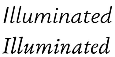
I like the many small additions in Garamontio, but I'm not fond of the de-slanted Italics. They look odd to me (probably just a matter of expectations, but still) and less consistent in the (perceived) degree of slant.0
-
@Christian Thalmann I agree that Garamontio isn't perfect, and @Figaro 's suggestion is probably just to continue the development of EB Garamond.I came up with the idea of changing the slant of the italics to make it more compatible with Ysabeau


1 -
I think it's just a matter of expectations. In fact the italic of Garamontio could be more legible/readable, especially when you use the italic style to cite long passages of books, court opinions etc.Christian Thalmann said:I like the many small additions in Garamontio, but I'm not fond of the de-slanted Italics. They look odd to me (probably just a matter of expectations, but still) and less consistent in the (perceived) degree of slant.1 -
@Figaro I'm glad Garamontio can be useful to someone. It's possible to open issues on GitHub for any desired features, bug fixes, or the addition of specific characters.
0 -
Did you by any chance start by literally taking the existing italic, and skew it (mathematically unslant it) back towards upright a few degrees?
0 -
@Thomas Phinney Yes, that was the first step (I know italics are different from a simple slant) and then I modified several curves to improve the result.As I mentioned above, I know it's not perfect
 0
0 -
I am sorry to say they feel… quite “off” to me. I mean, I shouldn’t have been able to tell that was how you went at it — I could tell in that they seemed manipulated in that particular way. It is not that I am opposed to less-slanted italics in general, or even in theory for your case. I just think they would need to be redrawn.

(And I have no objection to the usual slant of Garamond/Granjon italics, they work well.)
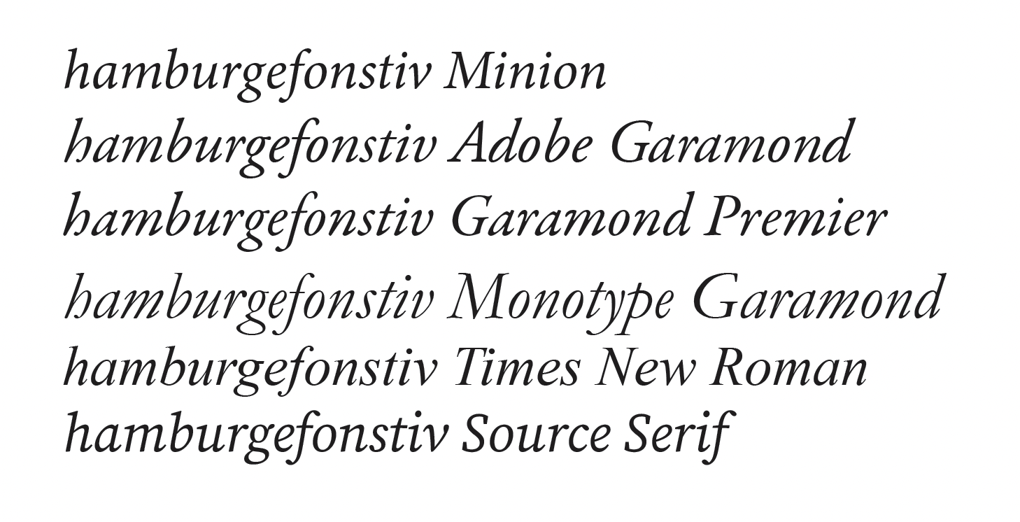
Part of it might be that more-slanted Garamond italics end up with much more compressed counters and are just more condensed. Un-slanting without un-condensing looks odd, perhaps? And that a shape is just bothering me.
Here are italics of some Garamonds, as well as some other typefaces. I deliberately picked three of Slimbach’s designs because I think he spent a ton of time studying Garamond (having done two runs at it, plus Minion), and the different slants are interesting — as is what he did for Minion, where the upright is very Garamond-adjacent but the italic goes further afield while being less slanted and less compressed.
2 -
@Thomas Phinney Thanks, with the release of the next versions I will try to improve the appearance according to these indications
0 -
Thanks for putting that into better words, @Thomas Phinney. I think that's exactly the point. Typical Garamond italics include some pretty extreme shapes in an effort to cope with the extreme slant, and when you de-slant them, they look unnecessarily lumpy. (Honestly, Monotype Garamond already looks freaky to me in its natural form, what with those extreme variations of slant angle...)1
-
As more and more libre font development is happening outside of Google Fonts, and GF is, for those projects, merely a redistributor, I suppose its likely that public demand for redistributing the forked projects will increase, and as the current GF curator, I'm open to discussing it. For example, Fira Mono and Fira Code are both onboarded because there is a community of users do really like, and who really do not like, ligatures in code fonts, so the divergence makes sense to me.Figaro said:
In theory Google could also incorporate in EB Garamond the new features of Garamontio...
That being said, generally I would recommend people exercising their freedoms to remix libre fonts to at least attempt to converge and collaborate with the upstream project people - unless you are making such a remix that the font-using public would recognize your typeface as a different one to the upstream
4
Categories
- All Categories
- 46 Introductions
- 3.9K Typeface Design
- 489 Type Design Critiques
- 572 Type Design Software
- 1.1K Type Design Technique & Theory
- 659 Type Business
- 872 Font Technology
- 29 Punchcutting
- 528 Typography
- 121 Type Education
- 327 Type History
- 80 Type Resources
- 111 Lettering and Calligraphy
- 32 Lettering Critiques
- 79 Lettering Technique & Theory
- 560 Announcements
- 95 Events
- 116 Job Postings
- 169 Type Releases
- 179 Miscellaneous News
- 269 About TypeDrawers
- 53 TypeDrawers Announcements
- 114 Suggestions and Bug Reports


