Blatant rip-off: a story

Jasper de Waard
Posts: 654
Hi people!
I saw a van with a logo that looked like it used my Proza Display. I like it when my typefaces are used. I was happy.
I checked their website and saw that my typeface had been butchered. I emailed the company to ask who designed this. Not so happy.
Designer got back to me. Told me I was mistaken. Told me I could not even recognize my own typeface. He had used an entirely different font called Xillian. Uhoh...
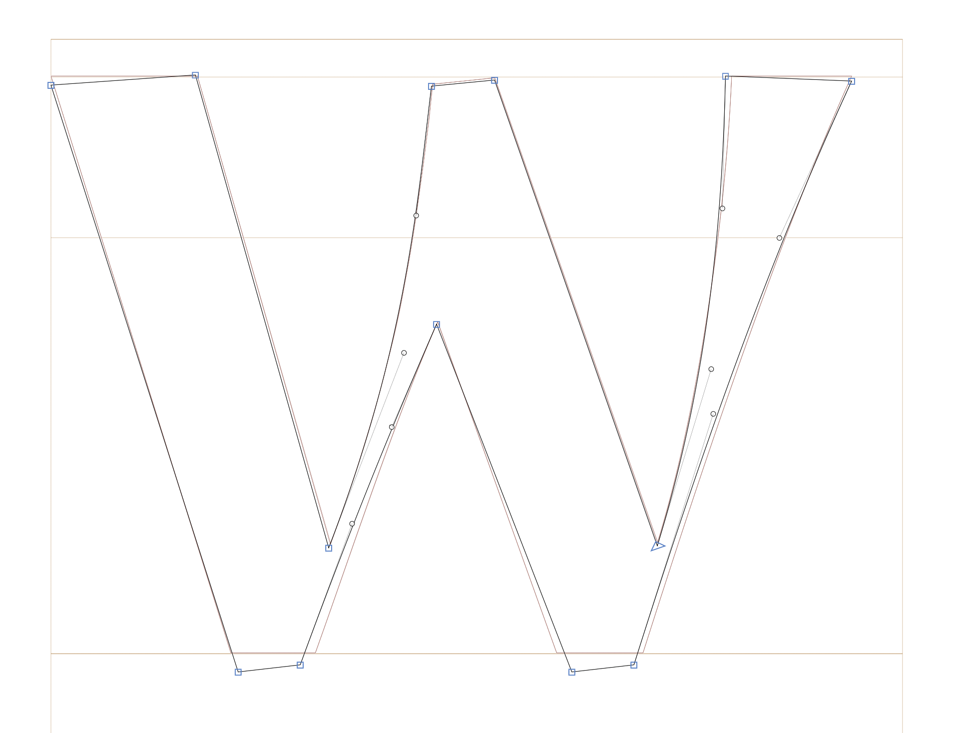
I compared the outlines of Xillian and Proza Display Bold. Some letters perfectly overlapped, some with a few tweaks, and some quite different (e.g. M and N, the most ugly ones). Overall: clear rip-off.
I googled Xillian. Turns out this dude is actually pretending that he made a typeface. And he's even selling the 'full version' (whatever that means) for $50.
It's so ugly. So badly done. So pathetic.
What to do, what to do...
Xillian: https://www.behance.net/gallery/135423081/Xillian-Font-Free-Download
Proza Display: https://bureauroffa.com/about-prozadisplay
5
Comments
-
I commented this at the Behance page
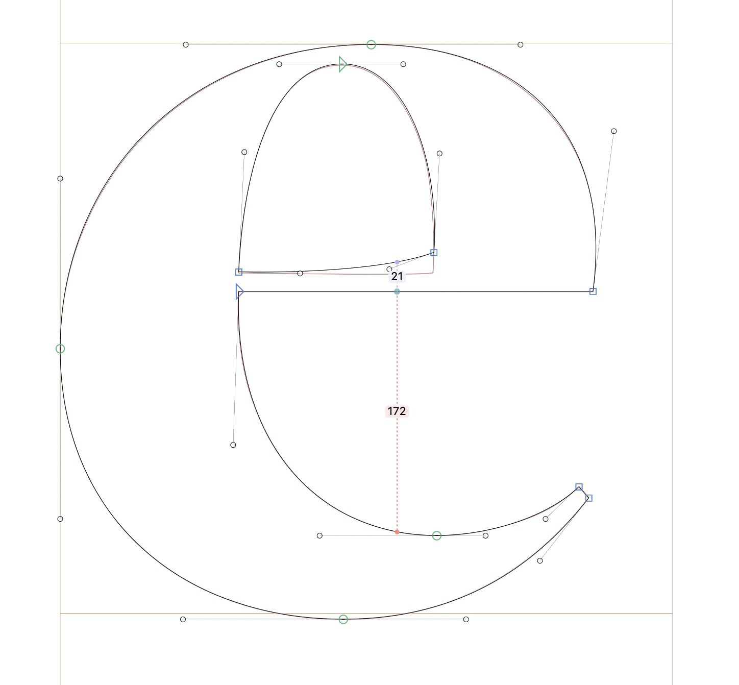
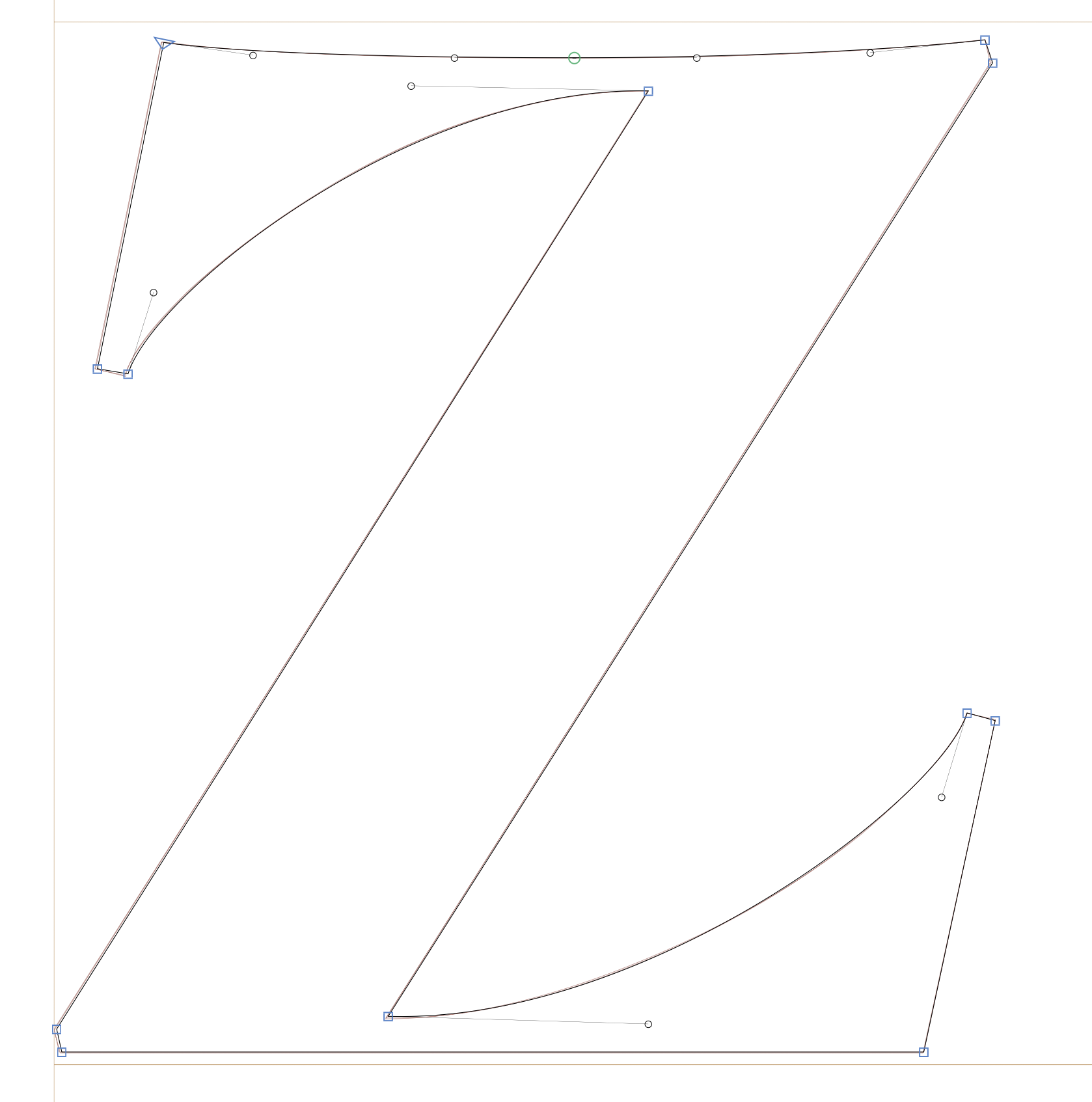
This is a blatant ripoff of Proza Display Bold. Some letters contain small changes (e.g. e, w), some are an exact copy (e.g. z), and some have been butchered into something different (e.g. M). I have spent literally years designing Proza Display. You did not even think to credit me, which indicates to me that you know what you did is illegal and unethical. Please remove this font from your Behance, any other channels that you use, and all the free font websites where it is currently available. Also, don't ever do this again.
So who knows how long the above link will continue to exist. Enjoy it while it lasts!5 -
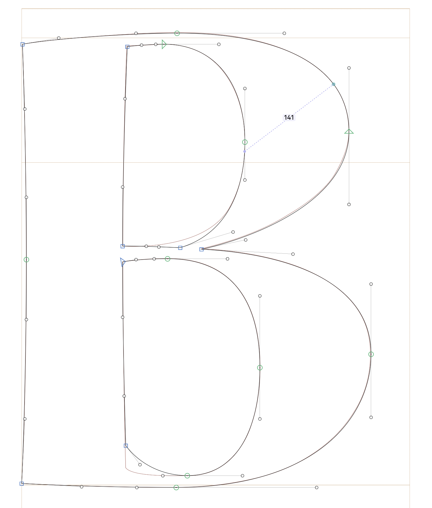
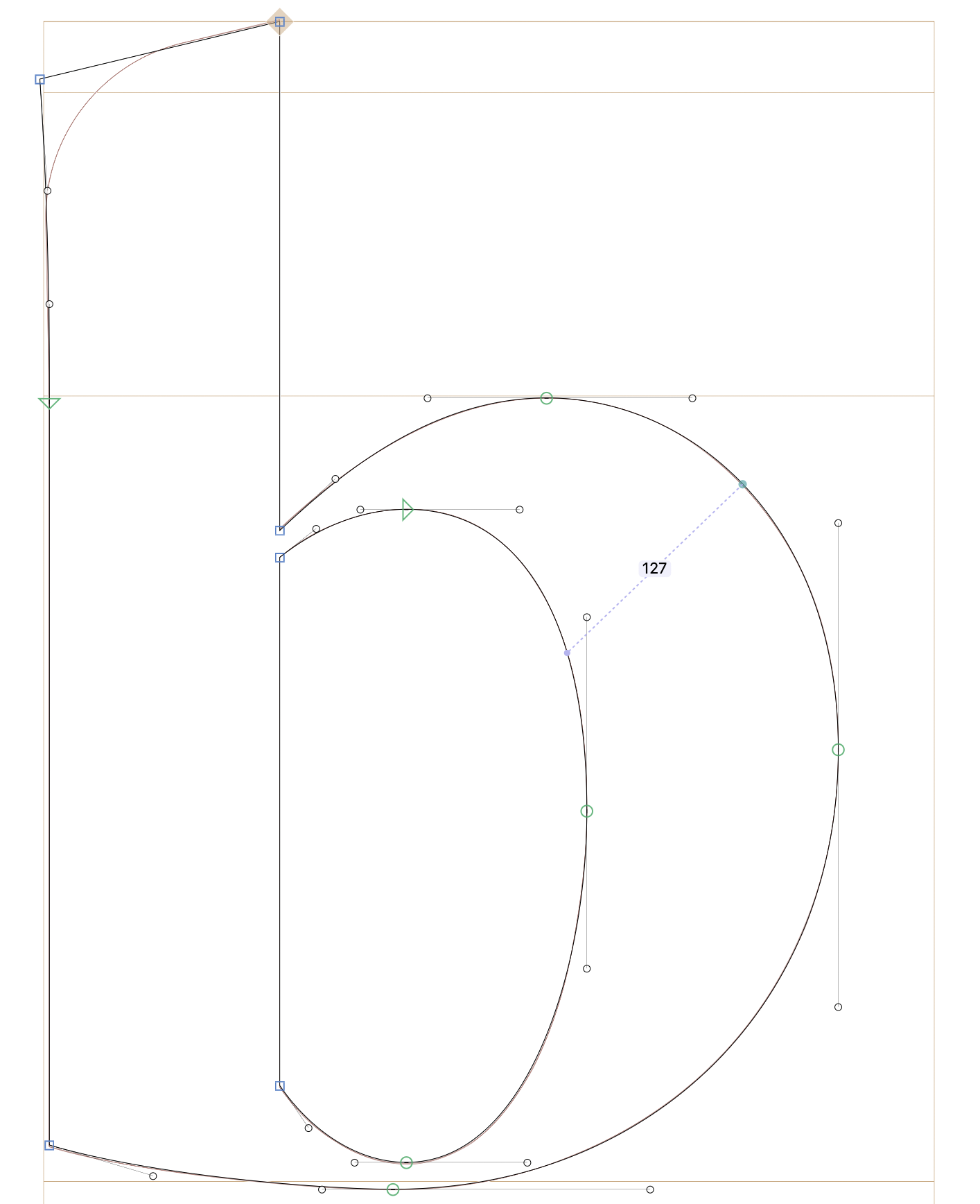
Some examples with Xillian in the background and Proza Display Bold on the foreground. My guess is that the small differences in curvature or node placement are mostly due to rounding and scaling up/down.
5 -
FYI: Couldn't find your Behance comment to counter this (latest at top is from 2024)... does the profile owner have the ability to delete?And he's even selling the 'full version' (whatever that means) for $50.
Regarding above... some of the comments state:
"Beautiful font! Any update on when we can expect puncution? I'm using this for a brand but feeling limited! Thanks for all your work!""Really nice font, thank you for sharing! Is there an available license with german letters (ä ö ü ß...)?"
Perhaps this suggests some of what's been stripped away compared to their for-sale 'full version' of it?0 -
Perhaps this suggests some of what's been stripped away compared to their for-sale 'full version' of it?I wonder if it was ripped from a subset webfont.1
-
Have you tried reporting the Behance project?3
-
Oh wow, you're right. And @Igor Freiberger's comment was also deleted. Let's see how long @Igor Petrovic's comment survives... Anyway, thanks for the support Igors!Adam Ladd said:
FYI: Couldn't find your Behance comment to counter this (latest at top is from 2024)... does the profile owner have the ability to delete?And he's even selling the 'full version' (whatever that means) for $50.
Igor Petrovic said:
I'm super busy at the moment, but when I have the time I'll probably compile some convincing images and report to Behance. Does anyone have experience with that?Have you tried reporting the Behance project?
To be honest, I feel like there is very little to gain for me here. There's a failed designer somewhere who stole my work and did some terrible edits, got a few likes and maybe a few dollars. Maybe if I could ridicule him in a creative way that would bring me some satisfaction. Any ideas?
0 -
You could also leave a comment on his LinkedIn post where he claims the font was "Carved by" him. I don't think he can delete your comment there.2
-
Perhaps a trivial idea: create a short animated gif with the title "Spot the Differences" and compare sentences like "CTRL+C, CTRL+V", "New name. Same DNA.", "Fonts have feelings too".Jasper de Waard said:Maybe if I could ridicule him in a creative way that would bring me some satisfaction. Any ideas?
2 -
For the record, here is where you would report the copyright violation. There's a form for it.4
-
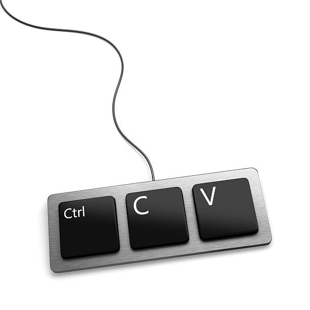
The best hardware to create fonts:
3 -
That graphic uses Macbook aesthetics, but akshually Copy/Paste uses the Command key on the Mac... 🤔
1 -
I have never tried, but I guess it works decently since I do not see much trash on Behance, in general.I'll probably compile some convincing images and report to Behance. Does anyone have experience with that?0 -
Okay I think rather than reporting to Behance, I'll make a little campaign to ridicule Xillian. If I report there's nothing to ridicule anymore.
I'm thinking that it could be an opportunity to educate the more general design public on the dangers of free fonts, and some markers of quality.
If anyone has ever had something similar happen to them, please let me know and maybe we can collaborate
0 -
Mac aesthetics have become mainstream, but the typeface on this keyboard is Microsoft's Segoe UIChristian Thalmann said:That graphic uses Macbook aesthetics, but akshually Copy/Paste uses the Command key on the Mac... 🤔 2
2 -
I would definitely report it, but if you want to make a learning opportunity out of it, make a bunch of screenshots of the offending font on Behance beforehand, and then write up the whole thing somewhere public.4
-
it is a depressing story. But on the other hand, if this may give you some little
consolation, the guy has proven that he is the worm in this case, and you are the master. Someone once said (I forgot who it was): ‘a typeface isn’t a true typeface until it has been pinched’. – Despite all the trouble, feel honoured!
1 -
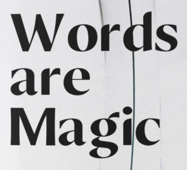
Ugh, this is even sloppier than I thought... the M alone!
 And of course the lack of kerning...
 0
0 -
@John Hudson Yeah I was thinking on Behance. Why do you think I should report?
@Andreas Stötzner Haha thanks, there might be some truth to that.
@Christian Thalmann Nevermind a lack of kerning. The spacing is all over the place!
0 -
Why do you think I should report?It’s important to let platforms know that you’re not okay with this kind of content and that it isn’t okay for it to be allowed to remain. Unfortunately, the nature of a lot of social content platforms means that this puts the onus on reporting, since there is no effective curation of content.
2 -
Yeah, I also think the reporting is more important than the ridicule. (Take care with the latter not to be perceived as the bad guy by superficial readers.)1
-
Yeah you may be onto something with that last remark. To my shock, the designer* who used Xillian and then told me about it was entirely unconvinced by my comparison images (the ones I show above), and seemed content to just keep using Xillian.Christian Thalmann said:Yeah, I also think the reporting is more important than the ridicule. (Take care with the latter not to be perceived as the bad guy by superficial readers.)
*Contrary to our Indian friend, this guy seems to have a thriving business. Mind you, I never asked him to change anything. I Just recommended that he no longer use Xillian because it's poorly made.1 -
Well, it's the designer's own problem if he uses shitty typography. I don't believe the existence of Xillian will hurt your business in any measurable way, but I understand the anger. Best to report him and be done with the story.1
-
So annoying. And he didn't even put the effort to make the characters he replaced consistent.
I left a nice comment on Behance tagging a few of the people that shown interest on the font – sadly you can tag only up to 5 – Not sure how long it'll last, I hope that helps a bit.
1 -
As for any obvious pirating platform, everyone needs to start reporting Piracy to the Hosting companies (not the websites), enough complaints and the Piracy website will all be shut down1
-
Then how come you didn't recognized the ugly ones?0
Categories
- All Categories
- 46 Introductions
- 3.9K Typeface Design
- 489 Type Design Critiques
- 572 Type Design Software
- 1.1K Type Design Technique & Theory
- 659 Type Business
- 874 Font Technology
- 29 Punchcutting
- 528 Typography
- 121 Type Education
- 327 Type History
- 80 Type Resources
- 111 Lettering and Calligraphy
- 32 Lettering Critiques
- 79 Lettering Technique & Theory
- 560 Announcements
- 95 Events
- 116 Job Postings
- 169 Type Releases
- 179 Miscellaneous News
- 269 About TypeDrawers
- 53 TypeDrawers Announcements
- 114 Suggestions and Bug Reports


