How much bigger do you like to make your x-height for Bold?

Adam Ladd
Posts: 288
Just curious others preferences/techniques between your lightest master vs boldest master.
Do you typically like to add to the x-height for the bold, or keep it the same as the light?
Example: Light = 500 units / Bold = 510 units
I've done both.
Does it vary based on the typeface proportions, or do you always default to making it larger for optical reasons (by a little or a lot)?
Do you typically like to add to the x-height for the bold, or keep it the same as the light?
Example: Light = 500 units / Bold = 510 units
I've done both.
Does it vary based on the typeface proportions, or do you always default to making it larger for optical reasons (by a little or a lot)?
0
Comments
-
I usually only do it with lower contrast faces if I do it (I often don’t). Beyond that, it’s fairly subjective how much to do it and the concept of the design.
In Mostra Nuova, it’s pretty extreme, going from 423 in the Thin to 517 in the Black (122 increase). (The cap height and ascender are 685.) This is mainly because I was adding lowercase to a formerly all-caps font that gets extremely bold. I wanted to keep the x-height smaller in the lighter weights, following Koch’s Kabel as a model.
In Viroqua, it’s more subtle, going from 459 to 498 (108% increase). (The cap height and ascender are 681.) In this case, the face had a fair amount of contrast, but I thought it looked better with the adjustment since both the thin and thick strokes get pretty heavy on the extreme end.2 -
I usually add a little height in the bolder weights, the amount depending on the stroke contrast.
More importantly perhaps, I make my italic lowercase slightly shorter than the roman, because the slant makes baseline-to-xheight distance appear longer.
A really tricky thing is coordinating a typical Latin lowercase height with a traditonal Greek, because of the different stroke modulation patterns. As they gain weight, the Greek will start to appear shorter than the Latin because of the verticallt comressed counters. I’ve not found a particularly good solution for this.3 -
I look at a paragraph of U&lc Regular weight text, with a couple of words picked out in Bold.
If the Bold appears to have a smaller x-height than the Regular, I adjust the x-height until they look the same. But not the capitals height.7 -
Robert Slimbach made the caps smaller in the bolder weights instead of increasing their x-height. At least, that was his practice in the early oughts when I was getting feedback on Hypatia Sans (which goes from 100 to 900 weight).
This seemed bizarre to me! We had extensive discussion, but I looked at plenty of other people’s work, and then did the increased x-height instead. This was the only case in which I ever asked his advice and then… simply went against it. (As far as I can recall, anyway! But it is something that sticks in my mind.)6 -
The design of the capital T can be a factor in that determination. There are also practical considerations with the 'f' and 't' crossbars.2
-
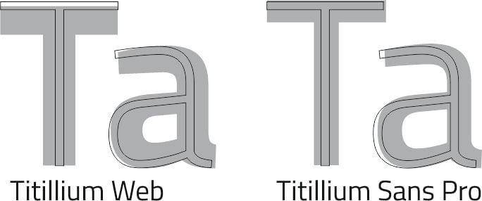
As an example, I'd like to point out the "Titillium Web" font. In a recent redesign (as "Titillium Sans Pro"), the proportions were changed.Thomas Phinney said:Robert Slimbach made the caps smaller in the bolder weights instead of increasing their x-height. 1
1 -
I always make my bolder weights slightly taller x-ht than the lighter weights. How much difference depends on the style (degree of contrast) and scope of weight change. Typical amounts for me are in the 10-20 units range.However, a recent sans-serif in development runs a whole 40 units increase in x-ht from Thin (48 stem) to Black (204 stem), with 24 units x-ht between Regular and Black. But some of that extra increase is more about enabling room to keep counters open while still packing on weight, rather than apparent height.Ultimately, the eye is the arbiter — what appears balanced when weights are set inline with each other. Considering both internal and external spaces.I was taught the received wisdom of italic slightly smaller than roman, but have mostly not abided by it. The few times I tried it, the italic just appeared smaller, contrary to the rationale. Probably because I favor pretty slight italic angles, usually <10° off vertical.
3 -
Some really interesting nuggets and insights here.
In the past, doing some graphic and logo design work, it was hard to not have the heights align (when pairing weights/styles) for graphical/grid reasons. Though I've found I'm leaning more towards the increased height with the type designs (but it's case-by-case).1 -
As with everything else in type design, this is properly considered relative to size. The larger the text, the less need for this kind of adjustment and, indeed, as you observed in logo work it may be undesirable. Conversely, the smaller the text, the more helpful such adjustment can be.5
-
When you think about it, it's actually a little odd that we increase the x-height but not the cap height in bold weights.
In my mind, that is because usually no caps exceed the cap height, and many straight strokes run along it (BDEFPRTZ), such that messing with it would be visible and likely appear like an inconsistency to the casual viewer. The x height is kind of obscured by the many ascenders, and only ftz run along it, such that you can get away with raising it quite a bit without anyone noticing.
To me, much of type design is exactly that. How much can I push this thing, or that thing, to create more space/character/balance without anyone noticing?1 -
When you think about it, it's actually a little odd that we increase the x-height but not the cap height in bold weights.I don’t think so.
a) Most text consists of lowercase letters.
b) The x-height area carries a large amount of information used in reading, including some relatively complex shapes and counters that need to remain legible as they gain weight.
c) The taller cap height area contains relatively simple shapes.
2 -
Is that redesign the one at https://github.com/chialab/titillium_pro_zanichelli ?michele casanova said:
As an example, I'd like to point out the "Titillium Web" font. In a recent redesign (as "Titillium Sans Pro"), the proportions were changed.Thomas Phinney said:Robert Slimbach made the caps smaller in the bolder weights instead of increasing their x-height. 0
0 -
I agree; I also think this messes with the font-size setting, since fixing cap height allows all other proportions to float in relation to that as an anchor, but if you just scale the upper and lowercase along an axis, you are effectively picking apart the internal consistency of the font-size progression. Not sure I am explaining this wellJohn Hudson said:When you think about it, it's actually a little odd that we increase the x-height but not the cap height in bold weights.I don’t think so.
0 -
Dave Crossland said:Is that redesign the one at https://github.com/chialab/titillium_pro_zanichelli ?I used this version: https://github.com/chialab/titillium_pro but they are probably very related (I opened some issues in this repository)Edit: Titillium Pro Zanichelli is a fork of Titillium Pro0
-
Sure, all true, but I think of increasing the x-height primarily as a way to create a visually equal size, not a way to fit more stuff in. Bold shapes tend to appear slightly smaller because their counter space is decreased, and this applies to lowercase as well as uppercase.John Hudson said:When you think about it, it's actually a little odd that we increase the x-height but not the cap height in bold weights.I don’t think so.
a) Most text consists of lowercase letters.
b) The x-height area carries a large amount of information used in reading, including some relatively complex shapes and counters that need to remain legible as they gain weight.
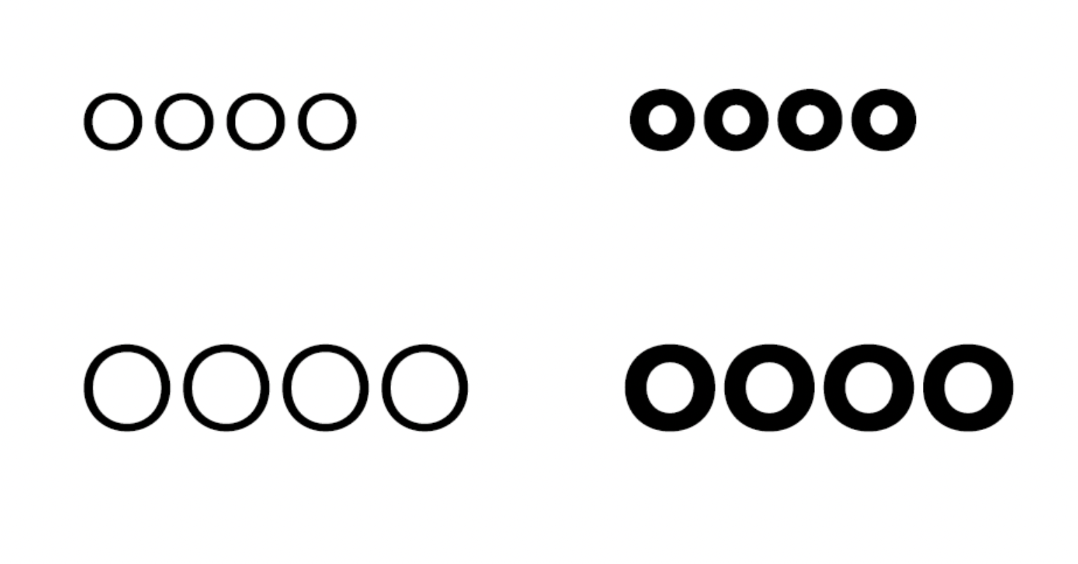
c) The taller cap height area contains relatively simple shapes. This is Avenir Next. The bold o's look like they have the same size as the regular o's (but they are bigger), while the bold O's look smaller than the regular O's (they are the same).
2 -
The bold o's look like they have the same size as the regular o's (but they are bigger), while the bold O's look smaller than the regular O's (they are the same).I understand the theory, but I actually don’t see them that way. The bold lowercase o is obviously slightly larger, and the regular and bold uppercase O align. But I am oddly attuned.

I would include counter size in the ‘more stuff’ to be fitted into the x-height area, especially in a and e.0 -
Sometimes I shorten the descenders in the bold by roughly the same amount I raise the x-height.
I think I’ve seen this approach in some of Luc de Groot’s typefaces, though I could be wrong, maybe @Jens Kutilek can confirm? It seems like a subtle way to keep the vertical proportions feeling stable across weights.6 -
That's what I see, and then I was confused by Jasper's comments, but I resigned myself to him maybe knowing more than me as a much more experienced type designer in practice. I just design slide decks and spreadsheetsJohn Hudson said:The bold o's look like they have the same size as the regular o's (but they are bigger), while the bold O's look smaller than the regular O's (they are the same).I understand the theory, but I actually don’t see them that way. The bold lowercase o is obviously slightly larger, and the regular and bold uppercase O align. But I am oddly attuned.
 0
0 -
No need to sell yourself shortDave Crossland said:
That's what I see, and then I was confused by Jasper's comments, but I resigned myself to him maybe knowing more than me as a much more experienced type designer in practice. I just design slide decks and spreadsheetsJohn Hudson said:The bold o's look like they have the same size as the regular o's (but they are bigger), while the bold O's look smaller than the regular O's (they are the same).I understand the theory, but I actually don’t see them that way. The bold lowercase o is obviously slightly larger, and the regular and bold uppercase O align. But I am oddly attuned.


Maybe my eyes are oddly attuned. Probably all type designer's eyes are oddly attuned in some way.
I feel like I can look in two ways. Option 1: I can draw mental guidelines lines and compare heights. If I do that, the regular O and the bold O align, but also overshoots look like a mistake (in general, not in the above image). Option 2: I just look, more naively or loosely I suppose, and I ask myself whether these Os have the same size. Now the bold O looks smaller than the cap O.
Anyway, none of this matters much. I just think it's interesting.
0 -
This topic makes me wonder: What software makes use of the x-height value for what purpose?0
-
What software makes use of the x-height value for what purpose?CSS font-size-adjust can make use of the x-height metric to equalise the apparent size of fonts in a stack.0
Categories
- All Categories
- 46 Introductions
- 3.9K Typeface Design
- 489 Type Design Critiques
- 572 Type Design Software
- 1.1K Type Design Technique & Theory
- 663 Type Business
- 876 Font Technology
- 29 Punchcutting
- 530 Typography
- 121 Type Education
- 328 Type History
- 81 Type Resources
- 111 Lettering and Calligraphy
- 32 Lettering Critiques
- 79 Lettering Technique & Theory
- 561 Announcements
- 96 Events
- 116 Job Postings
- 169 Type Releases
- 179 Miscellaneous News
- 269 About TypeDrawers
- 53 TypeDrawers Announcements
- 114 Suggestions and Bug Reports


