How to assess what optical size(s) a given type style is intended for?
Comments
-
Let's suppose the 5x1x3 ratio is "ground zero" as the ideal ratio for a given pixel font size, lets say 16px.Please, let’s not refer to px units. The px unit is not a reliable physical measurement, which is what we want when talking about size. The px unit cannot be related directly to opsz values because it is an interpreted unit, the actual physical representation of which differs across operating systems, browsers, and devices.
12pt text on Windows is 16px.
12pt text on Mac is 12px.
The px unit is also defined relative to viewing distance, which means that its relationship to text size notionally changes across distance.1 -
Ok.. so, we need to add another ratio for hairlines and switch to more universal unit that px for size. But aside from that.. what you think the idea of creating some kind of formula to measure how good or bad a given font style is in relationship to what David Berlow always refer to as "horsiness"
So, once we have that we can say something like: This fonts has XXX.XXX horsiness or -XX.XXX horsiness.
Would that be useful for something? I'm not sure about it.. just trowing the idea to the wild hoping someone can improve it.
0 -
‘Horsiness’ is a characteristic of using typefaces designed for text sizes (and smaller) at display sizes. So the term itself might not be relevant, but the idea of being able to define the elements of a design that produce the appearance of horsiness when used at inappropriately large size is sound in identifying types appropriate to smaller sizes.
During the meeting, I mentioned Matthew Carter’s Sitka as a family to examine to get an idea of a good optical size progression. The design does not extend to what I would consider ‘poster’ size in terms of larger optical size, but goes down to a functional 6pt design, by which I mean that it is not merely adjusted for colour/texture, but is actually readable at 6pt.
Sitka was initially developed before variable font technology was added to the OT spec, and the target size ranges of the nominal size designs were carefully determined from review of print-outs with Matthew. This is why some of the ranges involve fractional pt sizes: we identified the precise size at which one design became preferable to another.
So I think there is a lot of useful information about opsz design adjustments to be gleaned from analysing a type family like Sitka.2 -
To determine a relationship between characteristics of a typeface and its intended size, of course one needs a reference.Using a calligraphy textbook as a reference has the advantage that the parameters are made explicit.My inclination would be to make measurements on classic typefaces that were known to have been optically scaled. Say Century Expanded from ATF, and Times Roman from Monotype, for example.But the parameters that generally change with size are: how condensed a typeface is, and how bold a typeface is. These parameters also vary between typefaces. So if you have one sample of a typeface about which you otherwise know nothing, I don't think you can get from its weight and proportions to "this is a 9 point type". Even if you can say that if this were a typeface of average weight and proportions, then this would be the 9 point version of it.One obvious example would be comparing Century Expanded to Century Schoolbook. Expanded is more condensed, and Schoolbook is more bold, so Schoolbook would appear to be designed for a smaller point size compared to Expanded at the same point size.0
-
I've been exploring a bit using LibreClarendon VF as a Parametric Font, using both the typical Parametric tables as proposed by Berlow, and adding my optional Darkness tables...John Hudson said:Not necessarily, because you have three independent factors contributing to your Darkness value, and these can be manipulated to produce e.g. the same Darkness value for designs with different x-height, or different stem thickness.
This is how the tables looks:
The first 7 rows are the typical Berlow tables for Parametric Fonts
The next 3 are the nib-related values needed for calculating Darkness
The final one, is the Darkness value for each style (this may be optional or a virtual table.. not yet sure)

With a single axis family, exploring Darkness is quite easy.. you just move from Thin to Heavy.
With a Multiaxis family (including for example width and weigh, or any other variable) things get more complicated, so I was curious to learn how the darkness will move or jump around multiple axis.
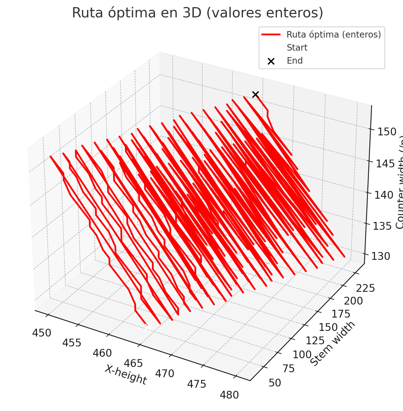
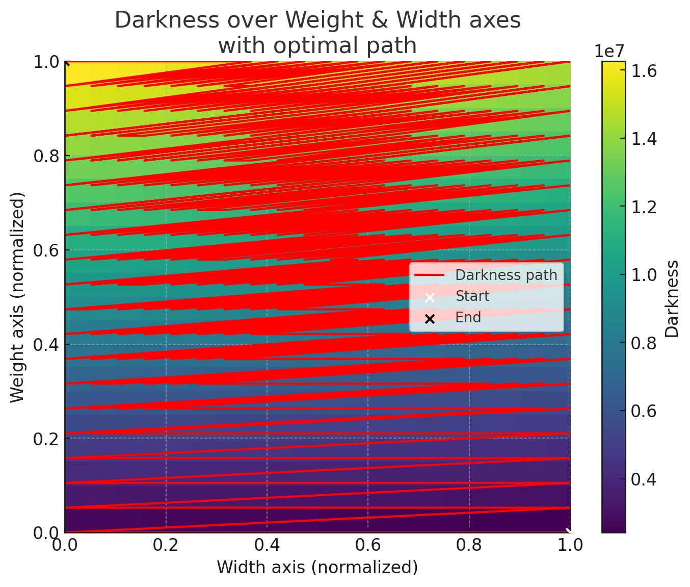
If we calculate all the possible axis variations and compute the darkness value for each one, then we can navigate the darkness axis from lowest to highest, and the result is the following:
Option 1: In 3d, Using the nib values as axis
Option 2: In 2d, using Width and Weight as axis:

These are just 2 options to visualize Darkness, but can be traced using any other combination of axis that may be needed.
Next step will be to have the working fonts ready, to do the same explorations visually, so we can move from theory to practice.
The nice thing about the Darkness tables, is that they can be easily added to typical variable fonts without much extra work.3
Categories
- All Categories
- 46 Introductions
- 3.9K Typeface Design
- 489 Type Design Critiques
- 572 Type Design Software
- 1.1K Type Design Technique & Theory
- 658 Type Business
- 870 Font Technology
- 29 Punchcutting
- 528 Typography
- 121 Type Education
- 327 Type History
- 80 Type Resources
- 111 Lettering and Calligraphy
- 32 Lettering Critiques
- 79 Lettering Technique & Theory
- 560 Announcements
- 95 Events
- 116 Job Postings
- 169 Type Releases
- 179 Miscellaneous News
- 269 About TypeDrawers
- 53 TypeDrawers Announcements
- 114 Suggestions and Bug Reports

