Out of Hundreds:What made the judge choose this typeface?

Each year, the judges are asked to select one work that they absolutely love, and would like to discuss it in the TDC annual, The World’s Best Typography.
This year, the MAHAL Typeface was chosen by judge Omanima Dajani. she was one of the judges for the Typeface Design category. (An independent type designer based in the Netherlands, specializes in Arabic script design, bridging Arabic calligraphy with modern type design.)
Why do you think this typeface was chosen? What distinguishing features do you see in this typeface?
Type Designer: Naser Khadem, More details: NoonFont.com 


The Mahal typeface design focuses on maintaining verticality while preserving calligraphic features and readability. Key challenges included controlling letter spacing, maintaining independent counters and open spaces, regulating vertical line rhythm, and managing letter height and baseline alignment.
With its display feel and playful details, Mahal is ideal for headlines and short texts. It’s particularly suited for social media admins, bloggers, startups, and designers in web, apps, and gaming.
*"يُطلب من الحكام كل عام اختيار عمل واحد يحبونه للغاية، ويرغبون في مناقشته في سنوية TDC، أفضل الطباعة في العالم."
"هذا العام، تم اختيار خط MAHAL من قبل الحكمة امیمه دجاني. كانت واحدة من الحكام في فئة تصميم الخطوط. (مصممة خطوط مستقلة مقيمة في هولندا، متخصصة في تصميم الخطوط العربية، وتجسر بين الخط العربي التقليدي وتصميم الخطوط الحديثة.)"
"لماذا تعتقد أن هذا الخط تم اختياره؟
ما هي السمات المميزة التي تراها في هذا الخط؟"
للمزيد من المعلومات وشراء الخط : NoonFont.com
مصمم ومطور الخطوط : Naser Khadem
Comments
-
The judge chose it. Discussed it in the annual (as is the custom). Done. If and when you get chosen as a judge you can have your pick of the litter. Paul Shaw and I started this competition back in the prehistoric days. Having observed decades of them, I stopped looking for any rhyme or reason for a judge's selection. It is their choice, and that is all.3
-
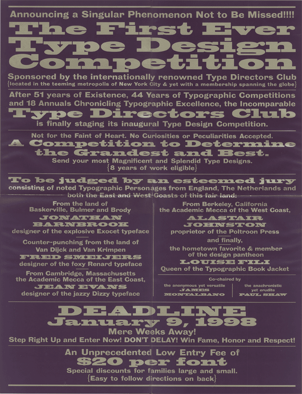
The poster for the inaugural competition:
 7
7 -
James Montalbano Poster In 1998
 , the year when Adobe and Microsoft collaborated to introduce a new standard called opentype.0
 -
I have great respect for the experience and legacy of you and Mr. Paul Shaw, and I appreciate you sharing these points with us.James Montalbano said:The judge chose it. Discussed it in the annual (as is the custom). Done. If and when you get chosen as a judge you can have your pick of the litter. Paul Shaw and I started this competition back in the prehistoric days. Having observed decades of them, I stopped looking for any rhyme or reason for a judge's selection. It is their choice, and that is all.1 -
Not being a native speaker of Urdu, I can't really evaluate the merits of this typeface.However, it appears to have indeed been competently crafted with respect to meeting the demands of the writing system. However, it seems to be a display typeface, suitable, for example, to movie posters, and not for lengthy body text.0
-
1998OpenType was announced in 1996.
 , the year when Adobe and Microsoft collaborated to introduce a new standard called opentype
3 -
Thank you for your comment. You're absolutely right.John Savard said:Not being a native speaker of Urdu, I can't really evaluate the merits of this typeface.However, it appears to have indeed been competently crafted with respect to meeting the demands of the writing system. However, it seems to be a display typeface, suitable, for example, to movie posters, and not for lengthy body text.0 -
Initially I interpreted this thread's subject title as critical one - like, "what is this JUNK?? Whhyyyyyy would anyone pick THIS??" - but then I realized the poster here is the type designer who just won with this typeface, lolJames Montalbano said:The judge chose it. Discussed it in the annual (as is the custom). Done. If and when you get chosen as a judge you can have your pick of the litter.
So, as someone with a very novice idiot eye to arabic type design, my guess is that this is a 'contemporary' design, that doesn't look like traditional designs, and is awarded for bringing something fresh to the genre of arabic type. Well done 1
1 -
Thanks for having such a sharp beginner’s eye 😄 I really hope it brings something fresh to Arabic type — even if it causes mild heart attacks at first!Dave Crossland said:Initially I interpreted this thread's subject title as critical one - like, "what is this JUNK?? Whhyyyyyy would anyone pick THIS??" - but then I realized the poster here is the type designer who just won with this typeface, lol
So, as someone with a very novice idiot eye to arabic type design, my guess is that this is a 'contemporary' design, that doesn't look like traditional designs, and is awarded for bringing something fresh to the genre of arabic type. Well done 1
1
Categories
- All Categories
- 46 Introductions
- 3.9K Typeface Design
- 489 Type Design Critiques
- 571 Type Design Software
- 1.1K Type Design Technique & Theory
- 658 Type Business
- 870 Font Technology
- 29 Punchcutting
- 528 Typography
- 121 Type Education
- 327 Type History
- 80 Type Resources
- 111 Lettering and Calligraphy
- 32 Lettering Critiques
- 79 Lettering Technique & Theory
- 560 Announcements
- 95 Events
- 116 Job Postings
- 169 Type Releases
- 179 Miscellaneous News
- 269 About TypeDrawers
- 53 TypeDrawers Announcements
- 114 Suggestions and Bug Reports

