New: Origin of Type Frameworks (OTF) Course

LeMo aka PatternMan aka Frank E Blokland
Posts: 787
This course offers an online practical and theoretical study of type design and font technology, taught by Dr. Frank E. Blokland and Dr. Jürgen Willrodt. Together they have over 80 years of experience in the type industry.
During the online OTF Course, delivered via Zoom, letter aficionados will delve deeper into what type design and font production actually entails, by evaluating and questioning how to approach the subject theoretically and practically, also from less common points of view. This is done by exploring and analyzing the historical, aesthetic, and technical aspects of type design and typography. The aim is a deep understanding of what exactly this comprises and a quantifiable translation of this knowledge into practical applications.
An important role is reserved for Frank’s dissertation. In On the Origin of Patterning in Movable Latin Type: Renaissance Standardisation, Systematisation, and Unitisation of Textura and Roman Type he argues that Renaissance typographic patterns were partly determined by requirements for the early font production. Hence, today’s typographic conventions are not only the result of optical preferences predating movable type, but at least as much the result of standardization that eased the Renaissance font production.
In short, the OTF Course covers all the usual ingredients of type-design education, such as drawing, spacing, kerning, font formats, (automation of) font production, etc. However, on top of that, there is also a unique and advanced approach, based on almost 40 years of experience in vocational type-design education combined with academic research.

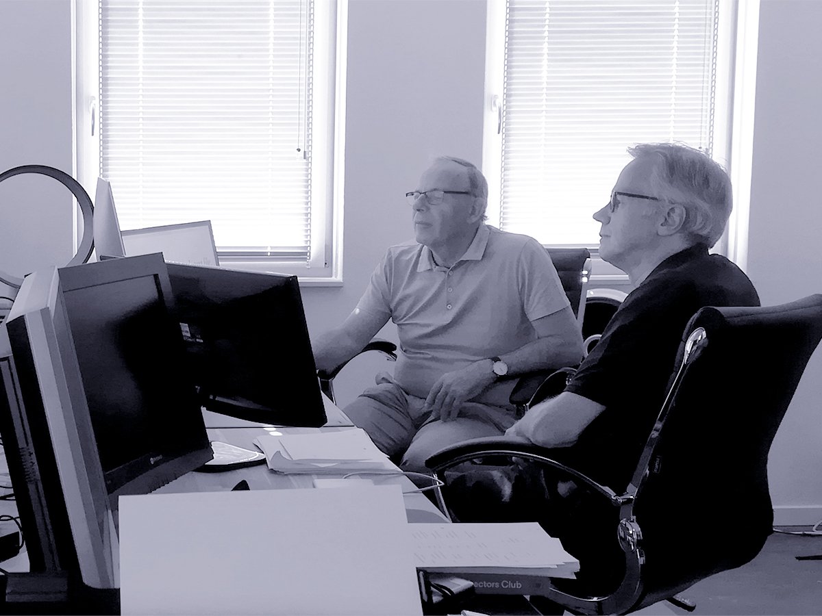
About the teachers: Jürgen (Hamburg, 1952) studied physics and mathematics and obtained a PhD in theoretical particle physics in 1976. As a software engineer, he became the lead developer of the IKARUS system since the early 1980s and developed interpolation, autotracing, and hinting algorithms, as well as special algorithms for Kanji separation. Frank (Leiden, 1959) is a type designer and has been (senior) lecturer in type design at the Royal Academy of Art (KABK) since 1987. From 1995 to 2025 he was senior lecturer and Research Fellow at the Plantin Institute of Typography in Antwerp. Frank founded the Dutch Type Library in 1990 and in October 2016 he successfully defended his PhD dissertation on Renaissance font-production standardization at Leiden University.
More information about the OTF Course can be found here.
More information about the OTF Course can be found here.
7
Comments
-
We have now received the first requests for information and even registrations. I have also added a few lines to the description of the OTF course:
‘As for the font editors applied and discussed, students can use the application of their choice, be it Glyphs, RoboFont, FontLab, FontForge, FoundryMaster, or any other editor. The same goes for the operating system: it can be macOS, Windows, or a Linux distro. After all, while the controls for the font editors may differ, the resulting contour descriptions in cubic and quadratic Bézier curves are technically essentially the same, and so are the generated font formats. […]’ I could have listed FontCreator, Fontra, and Glyphr Studio as well. The more diverse the editors students prefer, the more they will learn from each other. After all, a person’s favorite font editor often plays a significant role in their overall workflow. Once a particular workflow is established, it tends to become the reference point for their evaluation of other font editors and associated workflows. However, this raises an interesting question: to what extent does the choice of tool influence the workflow and the mindset behind it?
The fact that a font editor is a favorite may be the result of factors such as conditioning, price, or general popularity. It is likely not always the outcome of personal preferences regarding functionality; rather, the preferences themselves may be adapted to what the tool offers. Of course, it is possible to personalize the tool to some extent if scripting is supported. However, this personalization still occurs within the technical boundaries of the tool.
I want to emphasize that comparing font editors is not about determining the ‘best’ tool, as such a conclusion would be subjective, if not impossible. Instead, the real question is how to effectively combine the functionalities of various font editors, where applicable.7 -
Font technology plays a central role in the OTF Course. To truly appreciate and understand the technical advancements of today, it sometimes helps to place them within a historical context. Our archive contains several presentations from past decades, including this one delivered by Jürgen at the DTL FontMaster Conference in Hamburg in 2002.
 In anticipation of the OTF Course, Jürgen and I will launch the first of a series of informal online gatherings next month, called Type [Tech] Chats (TTC). These two-hour sessions, basically held every four weeks at 16:00 CET, will cover a wide range of topics including font technology, type business, type-design education, and anything else that comes up.
The TTC sessions are open to everyone, and you are welcome to join at any time. No registration is required, but be sure to bring your own coffee! I will keep you informed.1 -
I'm looking forward for more info on how to sign up for TTC sessions
") 2
2 -
Hi Dave, you’ll be the first to know the date and time!
Regarding the topics we might discuss, such as font technology and business, I want to emphasize that the TTC will just be an exchange of thoughts. For example, in the case of the font business, I can’t offer much more advice than to stubbornly stick to your own path. I reckon DTL is too atypical to serve as a solid example for most. That said, it would be interesting to exchange ideas on business models, and I’d be happy to share the thoughts I had over 35 years ago when I set up my company. It will also be interesting to discuss the future of our profession, especially as AI rapidly transforms the landscape. Of course, no one can predict the future: we can only try to extrapolate the present and make educated guesses.
As for font technology, Jürgen and I can help with any questions about OTM. We can also talk about the still-to-be-released GPOSMaster and FoundryMaster if anyone is interested. Other participants can share and demonstrate their own workflows and (the combination of) favorite font tools.
In short, the TTC is intended to be a relaxed ‘type café’ –so feel free to enjoy a coffee (or any beverage of your choice) while we chat.0 -
This summer, I will be celebrating 38 years of teaching type design. Over the past decades, especially in Antwerp and The Hague, my students have been exploring type design with a strong focus on pattern formation, shifting away from the more traditional approach that typically prioritizes individual letterforms followed by iterative spacing adjustments. Instead, they begin by defining the overall rhythm and texture of the text, i.e., its pattern, and then refine individual elements, like serifs, to fit within that structure. To this foundation, they add a layer of idiomatic detail –a kind of varnish that gives the work its unique voice.
 Pattern formation and the associated standardization are key components of the movable-type paradigm. As I argue in my dissertation, it all began with the intrinsic systematization found in the handwritten source models (think LeMo). These were used by the archetypal punchcutters to organize font production –essentially forming the basis for transferring letterforms to fixed-width rectangles. This structure not only streamlined the entire process from punchcutting to type casting and fynally typesetting, but also ensured consistency and reproducibility. In short, it was fundamental to both design quality and the industrial strength of the final product. Given this, it makes perfect sense to consider archetypal patterning not just for reviving historical models, but also for creating contemporary typefaces.
I tentatively consider the more traditional focus on letterforms a bit of a misconception about what type really is at its core: pattern formation. The reliance on ‘eyeballing’ stems, in my opinion, largely from this traditional approach. And because one starts with details and not with patterns, one has to fix things from the inside, instead of improving ‘aesthetic’ things from the outside. Moreover, it turns something that can be concrete, understandable, and reproducible into something unnecessarily mysterious. For example, as my students have discovered, spacing is parametrically reproducible, for example when using tools that focus on cadencing.
Of course, not everyone will agree with my approach and the text above, and that is to be expected. However, I believe it is essential that our field supports a diversity of perspectives and methodologies. It is encouraging to see that even master’s graduates of prominent type-design programs in Europe are drawn to my program. This is also already true of the new OTF Course. And even if, in the end, one prefers the more traditional approach with its emphasis on letterforms and eyeballing, engaging deeply with pattern-focused methods might well sharpen and strengthen that conviction, I reckon.3 -
Renaissance font technology and its influence on the typefaces we use today plays a central role in the OTF Course. Equally important is the development of digital font technology over the past 50 years, which is also thoroughly discussed. After all, to truly understand where we stand today as type designers and font developers, it is valuable to take a look back and reflect on the path that brought us here.
 One of the demonstrations I enjoy giving is of the UNIX version of IKARUS (see image above), which is still running at DTL on a dozen Macs under X11. Although I was involved in the practical integration of IKARUS into the DTL font tools, I was not part of its original development. Jürgen, on the other hand, was deeply involved. Back in the early 1980s, while I was still a hobbyist programming my first simple tool for vectorizing, modifying, and interpolating outlines on an Acorn Electron home computer (with a 32K RAM expansion via the Plus module) using BBC BASIC (see image below), Jürgen was professionally developing sophisticated algorithms for Kanji separation, porting IKARUS to different platforms, and creating an advanced autotracer –all in C(++).
 That autotracer has been part of the DTL toolset for decades. It was first implemented in TraceMaster and is now integrated into FoundryMaster (bottom image). The story of the autotracer’s origin is quite interesting. A well-known American manufacturer of phototypesetting machines had manually digitized a large body of analog artwork into the IKARUS format for use in their typesetting process. After this data was converted into the required font format, someone decided the original IK files were no longer needed and… deleted them. This turned out to be an unfortunate mistake. To recover the lost data, the most efficient solution was to digitize the output from the typesetter itself into IK format. Jürgen developed an autotracer that processed these images, ensuring the precise placement of the (extreme) points.
 Jürgen is also the mastermind behind our most successful application: DTL OTMaster (we are currently wrapping up version 10, which will support Apple Silicon, but this aside). Given his deep involvement in font technology over the past five decades, he is unquestionably the most qualified person to lead and explain these topics during the OTF Course.3
 -
Time for an update. With three months of enrollment remaining, registrations for the online OTF Course are steadily coming in. This growing interest highlights the value of a program that not only covers the essential components of type-design education (drawing, spacing, kerning, font formats, and [batch] font production), but also offers a distinctive and advanced approach. At the core of this course is the integration of my School of Patterning methodology with Jürgen Willrodt’s extensive expertise in digital font technology. Together, we combine historical insight and technological precision to provide participants with a well-rounded, research-based, and highly practical learning experience.
 The applied methodology is rooted in my research at Leiden University into the origins of patterning in movable Latin type. Unlike the more common educational model, which begins with letterforms and incrementally refines spacing through iteration, the School of Patterning starts with the creation of typographic structures, from which (details of) letterforms naturally crystallize. This mirrors the emergence of the letters-on-rectangles paradigm during the Renaissance, as supported by my academic findings.
Importantly, however, the emphasis on pattern formation does not exclude conventional teaching models. After all, students are encouraged to form their own conclusions, guided by both historical insight and practical experience. The same principle applies to the use of type-design and font-production tools. The key is learning how to make one’s judgments objectively quantifiable and how to integrate the strengths of various tools effectively into a coherent workflow.
In short, the School of Patterning is a unique, research-based method, which is proven through over fifteen years of student success in Antwerp. Combined with Jürgen’s expertise in digital font technology, it offers a comprehensive and forward-looking foundation for contemporary type design.2 -
The Origin of Type Frameworks (OTF) course is organizing an online info session via Zoom on Friday, August 15, 2025, at 15:00 CEST (Amsterdam time). The meeting will be hosted by Jürgen and Frank.
 Those interested can register by email at otf [at] lettermodel [dot] org and will receive a Zoom link for the session shortly.
1 -
Time for a concise update. With nine days to go before the registration period for the OTF Course closes, there are already ten confirmed enrolments and a handful more pending.
What is especially exciting is the strong interest in the course’s distinctive combination of:
— hands-on type design and font technology practice,
— deep historical and theoretical study (for example, how Renaissance patterning and standardization shaped type and its production today), and
— a methodology that begins with rhythm, texture, and pattern rather than with isolated letterforms.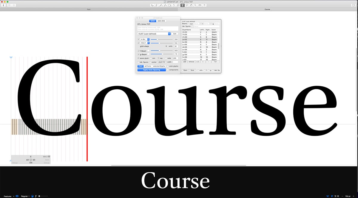 This special blend of practical experience and in-depth research into the historical and technical foundations of type design is considered one of the course’s most attractive aspects –and that strong interest already makes it a success.0
 -
We have just published the detailed description and content of the technical sessions from the OTF Course, presented by Dr. Jürgen Willrodt, as a PDF (64 kB).
 Jürgen (Hamburg, 1952) brings a rare blend of scientific rigor and font-technology mastery. After earning his doctorate in theoretical particle physics in 1976, he joined URW Software & Type GmbH in 1983 as a software engineer. His first major project involved porting the IKARUS font-production system from DEC to Sun Unix. Since then, he has led development on IKARUS and DTL font tools, co-owned URW(++), and now co-owns JPFonts.
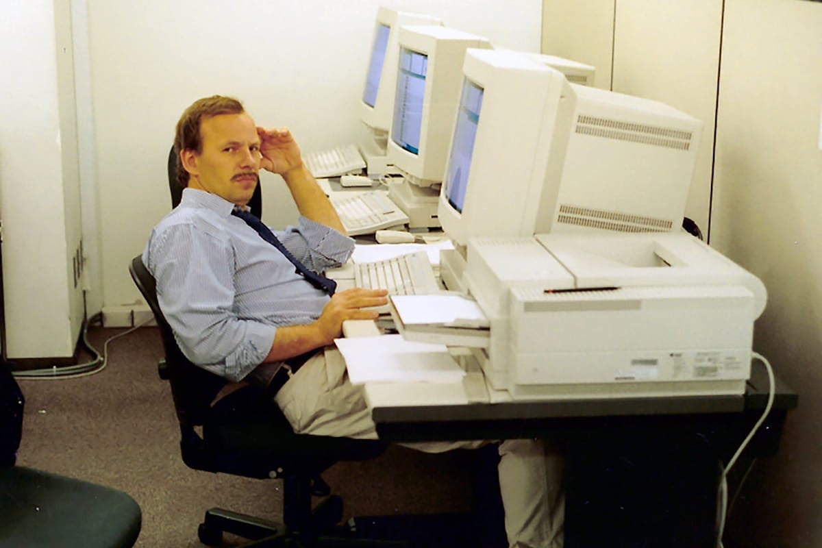
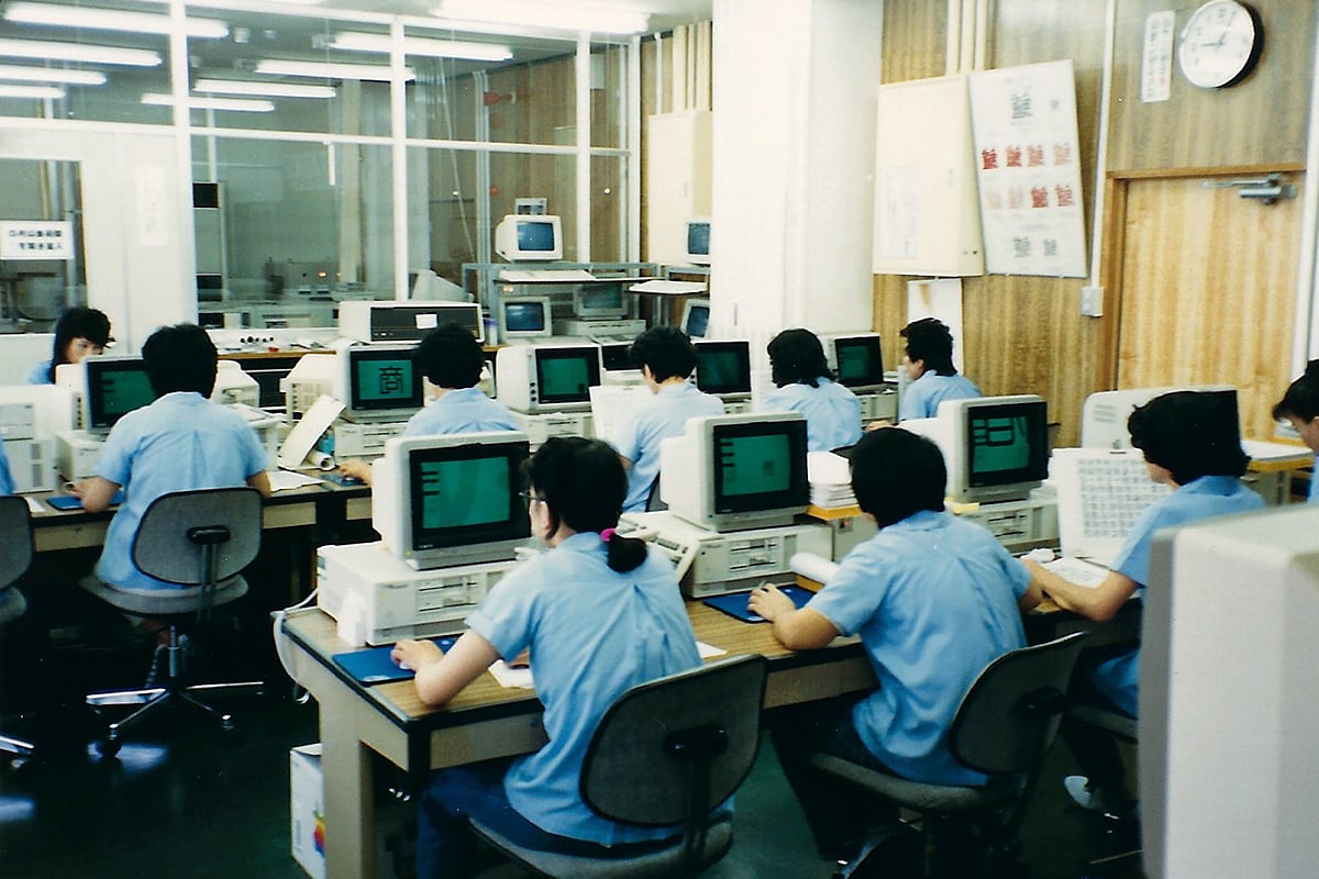 As the developer of specialized algorithms for Kanji separation within the IKARUS system, Jürgen has made numerous trips to the Far East over the past four decades, gathering a wealth of stories and contributing extensively to technical developments in the font industry, much of which he now shares firsthand. The first photo shows him programming at Fujitsu in Japan in 1991. The context of the second photo will be revealed during the technical sessions.
We currently have 14 confirmed registrations for the course, with only two seats remaining.1 -
The School of Patterning has relocated –90 kilometers as the crow flies– from Antwerp to ’s‑Hertogenbosch. Enrollment for the 2025–2026 edition is now officially closed.
This year’s group of 15 students comes from across the globe, each with unique backgrounds and experiences, contributing to a rich and diverse learning environment. It promises to be an exciting period ahead! By the way, registration for the 2026–2027 edition is now open.0
 -
Enrollment for the 2026–2027 edition of the Origin of Type Frameworks (OTF) Course has opened. The first registrations are already in, suggesting strong interest in what could be described as the course’s holistic approach.
The OTFC comprises more than 60 hours of online teaching. So far, seven sessions have taken place online, and the students have already produced an impressive amount of work. Much of this has focused on investigating pattern formation in type. Combined with a growing understanding of both archetypal and contemporary technologies, this research has expanded their view of type and typography and sharpened their sense of what it means to operate as a type designer today. Type design is a craft within industrial design. It is therefore no surprise that education in the field often emphasizes empirical, iterative training: students learn by doing, observing, and repeating. In that process, conventions are passed on and reinforced: conditioning preserves conventions, and conventions shape conditioning.
The market is full of typefaces that prove this approach works. However, at some point, a designer may begin to ask not only how things are done, but why they are done that way. A clear understanding of the underlying structure supports more deliberate and thoughtful design decisions. The foundational argument for the OTFC approach is that intrinsic systematization, derived from handwritten source models was used by archetypal punchcutters to facilitate and control the font-production process. Students build a roman-type model on a Renaissance framework, subsequently adapt the proportions to a grid system, and apply this system to the accompanying capitals and cursives/italics.
 In the digital realm, the advantages of these constraints are clear, particularly when designing text typefaces. Yet, one is only as restricted by them as one chooses to be. The next logical step is therefore to investigate whether adjusting proportions can quantifiably improve type designs. The grid system, however, is not abandoned entirely, as it remains a valuable tool for controlling the framework.0
 -
We regularly receive inquiries about the course, and a number of frequently asked questions are answered at the bottom of this page.
A recurring question is whether the course is suitable for a beginning type designer. I firmly believe it is, as the course addresses the core principles of type and typography in a highly structured way. As formerly in Antwerp, my current group includes both very experienced students, for example, those holding a Master’s degree in type design, and complete novices. This creates an interesting cross-pollination: the experienced students guide the newcomers, while the latter, in turn, encourage the more experienced ones to reconsider what they have previously been taught and to recalibrate their way of thinking.
Participants receive a license for DTL OTMaster, FoundryMaster, GPOSMaster, and CompareMaster. However, they are entirely free to use these tools or to ignore them. That said, one can only properly assess the functioning of a particular tool by comparing it with others, and by placing it within the broader context of the development of font tools over the past fifty years since the invention of the IKARUS system. Moreover, it may well be that one’s preferred tool lacks certain functionality available elsewhere; in such cases, combining tools within a workflow can make good sense.
As with type design itself, conditioning plays an important role. If your type-design teacher uses Glyphs, you have likely been trained to see through your teacher’s eyes and to adopt the associated technical mindset. The tool then automatically becomes the point of reference for assessing other related software. If everything works well, one might argue that there is nothing wrong with this. However, the question remains how exactly to define and quantify ‘working well’, and that, at the very least, requires comparison.1

Categories
- All Categories
- 47 Introductions
- 4K Typeface Design
- 493 Type Design Critiques
- 575 Type Design Software
- 1.1K Type Design Technique & Theory
- 668 Type Business
- 883 Font Technology
- 29 Punchcutting
- 537 Typography
- 124 Type Education
- 332 Type History
- 81 Type Resources
- 112 Lettering and Calligraphy
- 32 Lettering Critiques
- 80 Lettering Technique & Theory
- 565 Announcements
- 98 Events
- 116 Job Postings
- 170 Type Releases
- 180 Miscellaneous News
- 270 About TypeDrawers
- 54 TypeDrawers Announcements
- 114 Suggestions and Bug Reports