How much creative freedom in drawing currency symbols

mitradranirban
Posts: 134
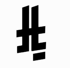
Saudi Riyal is the latest currency to get its own symbol
Surely it will be encoded in Unicode and many typefaces will add it.

My question is, how much creative freedom is accepted in harmonising currency symbols with rest of the letters?
I am planning to add a Rupees symbol ₹ to a blackletter font so I am interested to to know how much change in its design form is allowed without being unacceptable?
I like how $ symbol is modified for the look of the font or how Nabla depicted ₹ symbol to match its style

Surely it will be encoded in Unicode and many typefaces will add it.
My question is, how much creative freedom is accepted in harmonising currency symbols with rest of the letters?
I am planning to add a Rupees symbol ₹ to a blackletter font so I am interested to to know how much change in its design form is allowed without being unacceptable?
I like how $ symbol is modified for the look of the font or how Nabla depicted ₹ symbol to match its style
Tagged:
0
Comments
-
They're usually seen in context with numerals. As long as the symbol can't be misconstrued for another currency symbol: go wild. Consider that new symbols were designed by committee, and they never take practical use in typefaces into account. I think it's our job as typeface designers to improve them and make them harmonize.6
-
It varies a bit, depending on the individual sign. The trick is to figure out the essential aspects of each symbol, and then preserve these within individual typeface styles. I would say it is important for the top bar of the rupee sign to be straight across the top, and not broken as it is in Nabla: I don’t automatically read that glyph as ₹.
The Saudi riyal sign is interesting, because it is a geometrically stylised representation of the word riyal in Arabic script. So it will be interesting to see if designers consider the geometric aspect to be essential, or only the relationshio of the strokes.4 -
I seem to recall that when the Euro was first introduced, there was a detailed blueprint with geometric proportions and measurements that were expected to be followed. Designers, of course, quickly ignored that and started adapting the Euro to fit the context, as Ray said.On the other side of the spectrum is the estimated symbol, which mostly seems to get drawn consistently in accordance with the blueprint specification for that, regardless of type style.Not sure why the difference in deference.2
-
Indeed, I was just looking this up earlier:

The problem is that these blueprints don't tend to take font weight into account. Hence:While the European Commission created a design specification for the euro currency symbol, Microsoft and other vendors have chosen to make glyphs for the symbol to be font and style specific—so the design of the symbol takes on the characteristics of the font in which it resides.
(https://learn.microsoft.com/en-us/typography/develop/euro)I'm pretty sure something similar will happen with the rial sign.
0 -
On the other side of the spectrum is the estimated symbol, which mostly seems to get drawn consistently in accordance with the blueprint specification for that, regardless of type style.
Not sure why the difference in deference.My understanding is that the form and use of the estimated symbol is defined in legislation for trade standards, like weights and measures. It has to be used in European packaging in some situations, and has to look a particular way.0 -
My understanding is that the form and use of the estimated symbol is defined in legislation for trade standards
Just found out the directive. It certainly specifies the form of ℮, but it states too that it must be accompanied by some letters and figures that… well, they are far from optimal , and that I am afraid I have not seen ever in products using ℮. (Do you?) So I am wondering if the same lack of skill and interest in type can be assumed for the author of ℮, and therefore if we are allowed to treat ℮ as we treat € for the sake of good type design.
If we do, is the people who use a modified ℮ in real risk of being sued, or the products who use the modified ℮ in risk of being retired from the market? Just wondering.


0 -
I have only ever seen the estimated symbol used with preceding or following quantities and units, never with letters and numbers within the shape as shown here. I don’t recall seeing documentation with those funky letters before, so it is possible that the estimated symbol is referenced in more than one directive or regulation.
I think this class of symbol is akin to things like the recycling emblem or the nuclear radiation symbol: it is the sort of thing that has a regulated form because it is important that it isn’t mistaken for anything else.1 -
I assumed there was some such strict regulatory relationship, but never investigated. I don’t know that the recycling emblem has the same strict regimentation. I’ve seen plenty of versions in use.BTW, Cristóbal, I have seen the ℮ on plenty of European packaging (not so much US-centric products). Always conforming to the shape in the spec, no stylistic variations. But never with the interior figures you show.
2 -
Everybody wants their own monetary symbol, as a point of nationalistic pride, just like Britain and the USA.
Meanwhile, I recently received a quote from someone in the UK, in which the price was listed in “GBP,” with nary a £ in sight!0 -
If you need precision, the three-letter currency codes are way better than symbols. The $ sign is used for at least a dozen different currencies.
I suspect the Saudi riyal sign will get its own Unicode codepoint, but there is a reasonable argument to be made—and doubtless will be made—that it is a glyph variant of the existing U+FDFC RIAL SIGN.1 -
I interpret the directive to pertain to common provisions for both measuring instruments and methods of metrological control, not as the Estimated mark. The bold type here is part of the header of the directive.The mark is being used for more than one purpose.0
-
 Wikipedia showed Indian paisa also has a sign which is not encoded in Unicode. I have never seen it is use.
0 -
If you can find more documentation of that paisa sign in use, especially in print, you could write up a proposal for Unicode.0
-
It was proposed in http://www.idc.iitb.ac.in/events/Indian_Rupee_Symbol.pdf but probably finally not accepted and hence not forwarded to Unicode by Govt of India0
-
I think that Saudis will be accepting of variety in the Riyal sign. Calligraphy is a huge part of Arab visual culture, and there are lots of ways to write Arabic, so there will be lots of acceptable ways to draw a Riyal. What is needed is experienced Arabic type designers to design exemplars in different styles to match different styles of type in other writing systems so that the rest of us can understand how to be creative without designing something that’s just wrong.2
-
Not sure about that, James. The exemplar Saudi symbol is heavily abstracted, so may be a deliberate move away from something like the existing rial character in Unicode, which is a kind of word ligature adaptable to a range of styles. If the Saudis want a symbol that is definitively a currency sign, they might be leaning towards a more limited range of variation.0
-
Personally I’m taking the liberty to adjust the Rial symbol to my font’s design. The provided SVG (small at top) hardly fits most existing designs. My favourite is the top-right that keeps the suggested stroke instead of the two individual dots but otherwise aligns the يا and ل with my font’s design and draws inspiration for the wavy ر from Naskh, which my font is based on.
I intend to place this design on the existing FDFC codepoint and provide an alternative for the Iranian Rial through the locl feature only once people start complaining. Once a new codepoint is found, I’d ship both encoded variants. But given that I’ve seen variants of the “new” Saudi design around for decades, I’m currently not expecting trouble with shipping just this design.
Any Iranis to comment on that? Would this be acceptable for your currency?
2 -
What is needed is experienced Arabic type designers to design exemplars in different styles to match different styles of type in other writing systems so that the rest of us can understand how to be creative without designing something that’s just wrong.
Whenever new currency symbols were introduced, I looked for real-world examples of how they were written in everyday situations—like by grocers and shopkeepers—to understand their natural, practical forms. While I can usually guess how a symbol might be abstracted, I feel better if I can find a real-world example. The most obvious examples are double stroke to single stroke, like the dollar, euro, yen, Philippine peso, won, etc.
1 -
I can’t answer how people write it on shop signs, but a Google image search reveals that both Saudi and Iranian Rial are mostly the fully written/typed-out word ريال in whatever font/calligraphy style you have, while a search for Iranian Rial in particular shows the occasional variation that’s akin to the “newly” proposed design by the Saudis (top row, center, in red), which makes me believe that no additional Unicode codepoint will be desired and both parties (+ Yemen, Oman) will use the formalized design.

But yes, a handwritten sign would almost always contain a single stroke instead of the two individual dots, so the Saudi proposal, while looking very technocratic, already follows handwriting thruthfully.0 -
yanone said:
Any Iranis to comment on that? Would this be acceptable for your currency?According to Unicode core spec:U+FDFC RIAL SIGN is a currency symbol used in Iran. Unlike the AFGHANI SIGN, U+FDFC RIAL SIGN is considered a compatibility character, encoded for compatibility with Iranian standards. Ordinarily in Persian “rial” is simply spelled out as the sequence of letters, <0631, 06CC, 0627, 0644>.So it appears that the existing Rial symbol is not actually in use. In most fonts it is just the word ريال written in the same style of the font (some get more creative like the one highlighted in red in the comment above, but I doubt it was based on input from Iranian users which don’t seem to use this symbol).1 -
I have confirmed with an Iranian Unicode expert that the special ligature form of the rial character—which I first encountered when Tim Holloway drew it this way for Adobe Arabic—is not Iranian in origin.

Since this occurs in at least two of Tim’s designs, I wonder if it is something that came into typography via Linotype. I’ll ask Fiona is she remembers anything about it.2 -
The Unicode character U+FDFC RIAL SIGN was encoded for use in Iran, based on a proposal submitted by the High Council of Informatics of Iran. That proposal did not show any examples of ligated glyphs, however.1
-
I'll post this in a separate topic for better discoverability, but will repeat here: the character currently encoded in Unicode, U+FDFC RIAL SIGN, is not the same character as the new Saudi riyal currency sign, and font vendors should not create fonts that map U+FDFC to the Saudi riyal sign (in any design adaptations). A new character for the Saudi riyal sign will be encoded in the next version of Unicode.2
-
Has anyone started adding the Saudi Riyal glyph to their typefaces?
0 -
I have posted originally, and I have already added it in version 2.4 of Samaano, even before it was officially adopted
0 -
Note that the new codepoint is U+20C1
It was made official in September 2025, in Unicode 17.
(The other topic mentioned above is here: https://typedrawers.com/discussion/5287/regarding-the-new-saudi-riyal-currency-symbol)0 -
By the way is any code point alloted by UTC for UAE Dirham0
-
Not yet.
Originally, they said the symbol is only to be used like a logo by the central bank. At least, that is what Peter Constable said back in May.
But by June there was a proposal. Still very confused and muddled, they don’t understand the difference between a logo and a currency symbol that goes in fonts.
https://typedrawers.com/discussion/comment/69924
https://www.unicode.org/L2/L2025/25159-uae-dirham-symbol.pdf0 -
For authoritarian states coming up with their own currency symbols, in my open source fonts I tend to just slap in the official drawings without any adjustments.

7 -
What I think I said is that they had created a coloured version of the dirham symbol that was intended to be used as a logo. This was in addition to a monochrome version to be used as a typical currency symbol.Thomas Phinney said:Originally, they said the symbol is only to be used like a logo by the central bank. At least, that is what Peter Constable said back in May.2


Categories
- All Categories
- 46 Introductions
- 3.9K Typeface Design
- 489 Type Design Critiques
- 572 Type Design Software
- 1.1K Type Design Technique & Theory
- 660 Type Business
- 875 Font Technology
- 29 Punchcutting
- 529 Typography
- 121 Type Education
- 328 Type History
- 80 Type Resources
- 111 Lettering and Calligraphy
- 32 Lettering Critiques
- 79 Lettering Technique & Theory
- 560 Announcements
- 95 Events
- 116 Job Postings
- 169 Type Releases
- 179 Miscellaneous News
- 269 About TypeDrawers
- 53 TypeDrawers Announcements
- 114 Suggestions and Bug Reports