Letterform Innovation?

I realized recently that unlike many other types of creative endeavors (music, painting, content creation), type design has seen very little huge innovation in a long time. I don’t mean in term of technology, but rather in terms of the basic shapes of letters.
Besides serif and sans serif, most letters are instantly recognize able as themselves. I know that it isn’t a very good idea to make an unreadable font, but type design is a creative work as any other. Does anyone know of anything that would directly refute my thoughts are have any other thoughts on it?
Comments
-
Working with outlines is a subtle and complex thing that requires a knowledge and experience. If you don't notice changes in letterforms, it doesn't mean there aren't any. Type design is a rather subjective matter. It's just that "regular" fonts are more common because they are more in demand and easier to read. But that doesn't mean there isn't room for experimentation and innovation.
1 -
Basic shapes of letters are as much a linguistic/political thing as a type design thing.
In recent centuries they have been dictated by rulers or government standards bodies.
Sometimes type designers have rebelled against this. The most notable case in recent history was when the EU failed to understand how currency symbols work and tried to define the euro symbol as a logo (that wouldn’t vary between typefaces) rather than as a currency symbol. Type designers laughed, said “that is idiotic” and largely ignored the dictate from on high, taking it as broad general guidance only, of what the euro might look like in a wide geometric sans serif typeface.2 -
I think Monotape has more power in that regard, if we're talking about now.Thomas Phinney said:In recent centuries they have been dictated by rulers or government standards bodies.
Unfortunately I don't know how it used to be, I only heard a story about the ruble sign, some important designers agreed to use this sign in fonts and the government just accepted it.
Maybe I just don't understand what this topic is.
It's just hard to even imagine what could change and why.
For what it's worth, if the government adopts something the type designers don't like anyway, they'll just coordinate among themselves and use what they see fit in their fonts and there's nothing the government can do about it.
I remember how long ago they talked about the shapes of Cyrillic letters, that they are not as rhythmic as Latin, but I do not even remember any alternative designs of letters, I think at a serious level no one even thought about it, just speculated, no more.
But I am sure that the Cyrillic alphabet is still waiting for changes, in fact, the current design of the Cyrillic alphabet is just something that will be developed and improved, if there will be persistent initiators.
I still think that I somehow misunderstood everything, but my English does not allow me to fully grasp the context, but I don't mind to speculate, so that's it
0 -
Typofactory said:Besides serif and sans serif, most letters are instantly recognize able as themselves. I know that it isn’t a very good idea to make an unreadable font,Well, there you are, then. If letters weren't immediately recognizable, a typeface would be far less readable.Of course, there are some display typefaces of which this is not true.1
-
Historically, innovation in styles of text have tended to be driven by scribes rather than by type makers, simply due to the relative freedom and low cost of development that someone writing with a pen has compared to the technical constraints and high manufacturing costs of making type. In the 19th Century, this was augmented, especially in the area of display lettering, but sign painters and gilders, again working with relative freedom. Type tends towards conformity and conservatism, except at moments of technological change when new formats seem relatively easy and cheap to develop for, so inspire experimentation, e.g. the grunge fonts of the mid-1990s. But such technological changes also tend to introduce new overheads, e.g. broader language support and larger character sets in OpenType compared to PS Type 1 fonts, which over time influence a reversion to conformity as the amount of work involved becomes apparent. Simply put, devoting a large amount of time and effort to make a family of fonts in an innovative style that might not be popular remains a gamble that few are willing to take.6
-
type design is a creative work as any otherThis is a misconception, in my view. Typography is a high craft—a métier—not an art, and is therefore governed by deeply embedded traditions. That's not to say that there isn’t room for creativity, great stylistic differences, and personal vision—though all within cultural limitations and the psycho-physiological limitations of readability.
In regard to “creative” letterforms, one may cite as an example Wim Crouwel’s New Alphabet, released in 1967. It was the subject much publicity, though even its creator later admitted, in 2009, "The New Alphabet was over-the-top and never meant to be really used. It was unreadable." When the type was used for the album cover of Joy Division's "Substance," the designer had to misspell the name to make it readable ("substance" became "subst1mce"). On the other hand, I can think of one example of creative letterform that was a great success: the Seven-Segment Display used for the electronic display of figures, invented in the first decade of the 20th century. Related to that are the OCR fonts, but all of these are very limited in use. (Once, when I was a guest critic at a design school I will not name, one student set an entire small book in an OCR font. I was admonished for laughing out loud!)
All I can say is good luck! Maybe you'll be the one who succeeds . . .2 -
Scott-Martin Kosofsky said:type design is a creative work as any otherThis is a misconception, in my view. Typography is a high craft—a métier—not an art, and is therefore governed by deeply embedded traditions.This is a very common view. And, indeed, it is true of type design as commonly practiced. (The term typography is most commonly used to refer to the use of typefaces in page design and layout, or typesetting, rather than type design, although it can also be defined so as to include type design as well.)But I think that I am going to take issue with this statement to a certain extent.One can say that type design should be approached and practiced as a craft, because it is most successful when this is done; a typeface is something for practical use in reading and publication, not merely a thing of beauty to be passively admired like a painting, a sculpture, or a symphony.But to say that type design is a craft rather than an art... somewhat oversimplifies the situation. Display typefaces exist in addition to text typefaces, and their designers have the room to give free rein to their creative impulses. Or, at least, they seem to have this room, compared to the people who, say, designed Corona and the other legibility typefaces for newspapers at Linotype. They are still constrained by the need to make at least somewhat recognizable letters, of course.So my point is that the statement "type design is a craft, not an art" may be good enough for purposes of ordinary discussion, it's not really an absolute truth; type design is an activity usually best approached as a craft, but it is also possible to practice type design as an art form, and a few people have done so.This could be related to a more general question, that of whether the art/craft distinction should properly be applied to how an activity is practiced, rather than to the activity itself. However, given that despite the idea having at least been considered in print, as far as I know, no one ever succeeded in practicing musical composition as an exercise in industrial design, rather than art - composing a musical piece with the end in view of making it useful as background music to stimulate shoppers - and instead, background music vendors have had to content themselves with the choice of arrangements of works chosen from pieces created as art. So activities do have intrinsic strong tendencies to be preferably approached as arts or crafts depending on their nature.
0 -
‘In my craft or sullen art...’0
-
Outside of the scope of the Latin alphabet, there is ample innovation. There are e.g. sometimes new writing systems springing up in Africa. People invent ligatures all the time. There are fonts with quaint glyphs like superscript word endings for ordinal numerals, like '1st', '2nd' etc. There is also probably much innovation in Asian scripts, especially hanzi, that flies completely under the radar. And there's the interrobang. It might not have caught up, but *magical quotes* are a thing now due to the Internet. There are probably fonts that mix internet jargon into the set, like an emoji or an artistic 'LOL' ligature. Script fonts alone, with the many possibilities for ligatures and alternates, are an universe unto themselves. There is much innovation in adapting historical forms to modern sentiments, like glyphs used in medieval Latin or Old Church Slavonic.
1 -
One big innovation in the Latin alphabet was the adoption of the single-story ‘g’ as a roman (upright) character. This occurred at first in a few grotesque typefaces in the late 19th century, but became widespread in the early 20th century, in geometric sans serif typefaces.
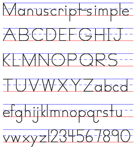
At that time, the single storey ‘a’ also became accepted as a basic roman character, and both these single-storey letter forms were promoted in early-learning primers.
These changes were additions, not replacements, but nonetheless “huge innovation” to the basic shapes, and occurred within the last 100 years.3 -
I think we have different definitions of ‘big’ and ‘huge’, Nick.
Also, those might have been innovations in the area of roman typefaces, but the letterforms already existed in writing for several centuries, and they were promoted in early-learning primers precisely because they were the forms that were being taught in writing. [Research has since shown that children have no trouble recognising conventional roman letters even though these differ from what they are taught to write.]1 -
All right then John, the huge change that occurred was the disconnection and straightening up of the single-story, handwritten forms of “a” and “g”, and their incorporation into Latin alphabet typography in the era of mass literacy, and the feedback of these typographic forms from geometric sans typefaces into early writing instruction.

Palmer Method, a simplified Spencerian script taught in U.S. schools from the late 1890s.
**
Beginning in the 1940s, simple “geometric” printing replaced basic Palmer penmanship instruction in many U.S. schools. And now, we are witnessing the demise of cursive instruction in schools, as the emphasis switches to keyboarding.
2 -
I wouldn't be surprised if this geometric model for handwriting instruction was influenced by by—if not modeled after—German faces like Futura.
A lot (if not most) of the typefaces with single-story a and g in the early 20th century came from German type foundries and designers, presumably influenced by more-familiar-to-them German blackletter, which typically has one-story a and g. Or perhaps these forms would make the faces look less "foreign" to the local market. The "schoolbook" y seems to come from this as well.2 -
On the "ball and stick" form of handwriting instruction, it exists before Futura, but not before the 19th century types mentioned previously.
3 -
If such minor fiddling with existing letterforms is huge, what adjectives do you reserve for the development of wholly new ways of writing, as e.g. developed in the Low Countries in the 17th Century?

0 -
froofy
1 -
I would describe that “new way of writing” as inspirational, as I’ve done some work based on it, which I will take this opportunity to display, with apologies for being way off topic.
However, the 17th century was long ago, and the OP was asking after huge innovation in recent times, and I was attempting to come up with something.
So, nothing really huge in the Latin alphabet, since we kicked out the long “s” c.1800?
1 -
How about the recent innovation of the capital Eszett?(I love that Dutch sample up there, it's so... Civilité?)
1 -
The big top line of the Dutch sample (Jan van de Velde) looks like a Kanzlei, and the body looks like a Civilité. I think the initial is called a “cadel.”
(Edit: cadels typically use broad nibs, not flexible nibs, as I now recall.)1 -
Yes, the body text is a civilité style, and I chose it as an example of letterform innovation because the development of civilité typefaces based on the style seems to represent the last time that type founders followed scribes into the expansive textual space opened by the invention of a new style of writing.1
-
The "modern calligraphy" movement (usage?) seems to have led to acceptance of poorly differentiated b's and f's and other effects in writing first, then typography. Innovation by stepping backwards or simple ignorance?
0 -
I imagine it'd be interesting to put the simplified writing forms (and their echoes in type) in the context of the drive for universal public education in the late 19th/early 20th centuries.1
-
Beginning in the 1940s, simple “geometric” printing replaced basic Palmer penmanship instruction in many U.S. schools.
This is not true. The advent of geometric “block printing,” as it was called, was intended as a precursor —a first stage—to the teaching of Palmer Method script, not as a replacement for it. I remember how, circa 1959-60, we were asked to “print” our names at the top of assignments that we continued in script, lest the script be illegible. Another essential use for “print” was—and still is—in the filling out of official forms. Some cultures, Russia’s for one, do not have a block print form.
Here is a fascinating a disturbing article from 2022 by the historian Drew Gilpin Faust, the former president of Harvard University, in which she explains how the lack of skills reading and writing script have prevented some of her students from reading primary source materials. https://www.theatlantic.com/magazine/archive/2022/10/gen-z-handwriting-teaching-cursive-history/671246/
2 -
I can concur about learning "block" printing followed by cursive in the school I attended in Wisconsin in the early sixties. We weren't taught the Palmer Method script though. I know my mother learned it—I have her instruction books. The one I learned was similar in some ways to Palmer, but not as elegant.0
-
I attended an Episcopal primary school in the late 70s (we were Catholic, and I guess my parents figured they’d explain the whole Pope thing later) and we started with Futuraesque upright block letter alphabets with the curled-out lowercase q and then moved to a Palmeresque cursive—whatever the Scholastic school supplies cartel was selling at the time. I was fascinated by it and demanded to learn it instead of the block letters. It was the first thing in school that I had any spontaneous enthusiasm for.
Chiromarxists might call the devolved Scholastic cursive “late-stage copperplate.”
1 -
-
Structure, not applied style.
Here are a few systemic inventions and reforms to writing systems/alphabets:
1. Hangul 1443
2. Petrine reform of Cyrillic 1708
3. Masonic cypher (18th century)
4. Cherokee 1828 by Sequoya (George Gist)
5. Gregg shorthand 1888 (the most popular version of stenography)
Restructuring an existing typographic system:
1. Clarendon (1845, the introduction of a related Bold)
2. Monowidth (1873, first commercial typewriter)
3. Cheltenham/Akzidenz (The idea that a typeface “family” may have design axes)
3a. Clearface Gothic 1910: related serif + sans “superfamily”.
4. Unicase (Thompson, 1950): a systemic model of a previously ad hoc practice.
5. Disambiguation of I, l, 1: 1938 Bell Gothic.
6. TheMix 1994 (semiserif).
Also this from the 1930s, Stylistic Sets:
4 -
Oof, those neo-German ligatures are atrocious. How would you even write those things by hand?
0 -
How would you even write those things by hand?I’m not saying they are without issues, but Stamm does provide handwritten examples, see the bottom right of the last image.Stamm’s phonograms have precursors in Modernism, see the proposals by Porstmann and Tschichold in this post by Bianca Berning.
0 -
6. TheMix 1994 (semiserif).
Rotis (1988) pioneered the concept of a semiserif that sits between a sans and a serif a few years before.
from the 1930s, Stylistic SetsWoellmer’s Consul is an example for stylistic sets from 1903. Not necessarily the first of its kind. 6
6


Categories
- All Categories
- 46 Introductions
- 3.9K Typeface Design
- 489 Type Design Critiques
- 572 Type Design Software
- 1.1K Type Design Technique & Theory
- 665 Type Business
- 877 Font Technology
- 29 Punchcutting
- 530 Typography
- 121 Type Education
- 328 Type History
- 81 Type Resources
- 111 Lettering and Calligraphy
- 32 Lettering Critiques
- 79 Lettering Technique & Theory
- 563 Announcements
- 97 Events
- 116 Job Postings
- 169 Type Releases
- 180 Miscellaneous News
- 269 About TypeDrawers
- 53 TypeDrawers Announcements
- 114 Suggestions and Bug Reports