Chess Diagram Characters
Comments
-
The thought occurred to me that October 3, 1932 was an important day in the history of typography, but although I stumbled on the Times' archive online, when they had articles about Chess at that time, they didn't seem to include diagrams.
0 -
I was just looking into this, and came across this from ATF's ubiquitous '23 book.
 seems like it was pretty uncommon to have more than a single set per foundry? and I imagine emoji is what's keeping them back in present day. but I think I may add a set to a font I'm working on just for fun. it would be fun to try to pair with the letterforms.1
 -
All these chess designs are elaborate and Staunton-based, “serif-y”, if you will.
Are there alternative, modernist, “sans” designs?
Man Ray and Marcel Duchamp with the Ray set.
(Famously, Duchamp played at Master level.)1 -
It’s probably telling that, while the Ray set probably does well in the MoMA shop, most people still actually play with sets with the antique fuddy-duddy shapes.0
-
Jeremy, On February 11 and 18 I published a post about these ATF chess diagrams .
1 -
Craig, the Staunton set is the international standard.
People at my chess club prefer to play with it, although once in a while I break out something different from my collection, but they are reluctant to play with those, thinking my familiarity with the pieces gives me an unfair advantage. Philistines!0 -
I tinker with such things. Sometimes I entertain the idea of making full-featured chess fonts with a host of variant pieces, but I don't know who would actually use them.
 0
0 -
K Pease, now there are more than 100 chess ttf fonts (some free, some paid), but to make chess books only a few are used, the easiest way to put the diagrams in the books is to create the text with programs such as ChessBase or ChessAssistant, hence practically only fonts compatible with those programs are used. And these fonts used are copies of figurines from 100 years ago or more in some cases. It is sad to think that there is less variety of diagram types now than 100 years ago.
I see that you have put the image of the "Cerulea" font, but the second type (I think this is elegant and usable) does not identify it. What Truetype font is it?
In https://ajedreztipografia.wordpress.com/ (in Spanish) I have a blog about chess typography.
0 -
Thanks; the second I designed for "Anachrony", which is not yet released.
0 -
Hi Kevin, I am gathering historical information about chess fonts (those available in old books, foundry specimens and now truetype repositories), about designers, foundries, etc. I see that you must also be the creator of "Cerulea". Please let us know when Anachrony is released.
")
0 -
Neat. Do you provide glyphs of each also against a "black" square like the metal predecessors?K Pease said:I tinker with such things. Sometimes I entertain the idea of making full-featured chess fonts with a host of variant pieces, but I don't know who would actually use them.0 -
No-Staunton diagrams
Nick, referring to "2D" chess sets (printed on paper in order to show a position) which is what should be discussed here, most are based on Staunton piece design (1849 by Jacques of London), although the design of Staunton pieces were copied (surely) by Nathaniel Cook from paper diagrams (books like "Philidor: Studies of Chess (1810)" already have their bishop differentiated, although the modern "prototype" type is from the Caslon foundry, with examples in" Walker: Chess made Easy (1836)" )
There are many "no-Staunton" diagrams, here I put some "Truetype" and book examples.As you have quoted Duchamp, the first one I put is[1] the diagram used in the book "Naumann & Bailey & Shahade - -1 Marcel Duchamp: The Art of Chess" although it should be considered a variant of the cubist Staunton type ... [2] XPawnShop, by Robert Schenk 1994 (ttf)
 [3] Diagrams tipe "Regence" of the Debeny Foundry used in nineteenth century French books
 [4] Model from the manuscript Pacioli & Leonardo Da Vinci: Ludo Scacorum (1500); There are more examples of "incunabula" books (Ars Oratoria 1482, Lucena 1497, Damiano 1515, Köbel 1520 ..) that I will not put here, I have put this one as a tribute to Leonardo.
 [5] Chess Alfonso-X, ttf font by Armando Marroquín 1998
 [6] Chess Line, ttf font by Armando Marroquín 1999
 [7] Chess Millennial-L, ttf font by Armando Marroquín 1998
 [8] Diagram used in the book "van Zuylen van Nyevel: Het ShaakSpel (1792)"
 [9] Diagram used in Orelli's 1840 book
 [10] "Geometric" diagrams Books "Kieseritzky: Cinquante parties jouées au cercle des echecs et au cafe de la Regence 1846", Schmidt: Schacheröffnungen (1895), publication "MonoSchaak" (1950?)
 [11] Diagram used in the book "Бронштейн, Д: Самоучитл шахматнои игра", Moscow 1981
 [12] Letter Diagrams, there are several examples, at the beginning of the XIX century they were used a lot overprinting an empty board (usually in color), here the example of "Montigny: Stratagemes" (1802)
 [13] Humanized diagrams, for example "Philidor – Análisis.." (1846)
 On diagrams without "Bishop" (which are therefore not 100% Staunton, see my Post at https://ajedreztipografia.wordpress.com/2021/02/12/la-distintas-personalidades-del-alfil-en-los-tipos-caslon
[14] Then, here in another post they put the diagram of the book "Pohlman: Chess Rendered Familiar" (1819)
2 -
Astounding!
0 -
Craig Eliason said:
Neat. Do you provide glyphs of each also against a "black" square like the metal predecessors?
At present, these are just the Unicode glyphs included in text faces, but I have experimented with what it would take to make setting a diagram with the correct shading very easy with opentype features. By implementing the dark squares both as ligatures and contextual alternates, one can insert a "shader" (here a comma) into a typewriter diagram like so:(just imagine it in monospace because the forum's "code" markup is broken)R,NBQKBNR,PPPPPPPP.,.......,.........,...p...,........p,ppp.ppp,rnbqkbnret voila, the rest of each rank follows: 1
1 -
The solution used by ChessBase diagrams (for example DiagramTTFritz by Monika Berger 1999) is to use glyps of width 0 for shading the pieces, so "K" is the white king (on white square), and "mK" is white king on black square.
1 -
0
-
 And this one)))
Requires 'calt' support to work.
The font makes it easier for the layout designer to type chess diagrams.
The font automatically recognizes the color of the cells and substitutes the appropriate symbol.Now instead of 12 keys, you can use only 6. Regards///
3 -
Florian Pircher said:
Curious font very useful for heterodox chess and problems, style 1Echecs from Christian POISSON, but I don't recognize it. What font is it? Are you the author? (I like all the pieces except the Knight, which is really ugly!)
0 -
Denis, I think they are novel and elegant chess pieces, Eastern style, I have to try them, but one may wonder what are the predominant chess fonts in modern publications they are the ones that come with the ChessBase (Germany) and ChessAssistan (Russia) programs, already that automatically generate the diagrams (and the text of the game and comments) with their fonts. The downside is that this implies little variety of diagram types in chess books. It is a pity that this font cannot be used (due to the character mapping) with these programs, they will have more diffusion.Denis A Serikov said:And this one)))
Requires 'calt' support to work.
The font makes it easier for the layout designer to type chess diagrams.
The font automatically recognizes the color of the cells and substitutes the appropriate symbol.Now instead of 12 keys, you can use only 6. Regards///
0 -
Zerdeja, thanks for the comment!
This font I made for work in the InDesign program for use by layout designers. They can use several popular chess fonts in Russia, such as Chess7 or ChessAlpha. But fonts were made long ago and in old font editors. I tried to make a newer one using modern OpenType features.
I think there will be minimal compatibility with the fonts that come with ChessBase and ChessAssistan. I will try to fix this in the next version. Thanks again for the tip.
I have prepared a live example of how the font works in .woff2 format. Content can be edited in the browser.
Sorry for my English.
1 -
For those who are interested in chess typography, I have published a new entry on my blog:
https://ajedreztipografia.wordpress.com/2021/12/07/los-diagramas-de-ajedrez-en-las-publicaciones-de-la-revista-ocho-x-ocho-zugarto/
(in Spanish)
1 -
I can start a new thread if it would be more appropriate, but I was wondering if anyone here had any similar insight/resources for card game typography.The ATF book includes samples of card suits and other indicators, Zapf's Dingbats are/were ubiquitous for french suits, and various playing card pips are present in the likes of Noto Symbols and San Francisco, etc.0
-
Related, a very useful bug report I received about Noto's mahjong tiles.0
-
I’m making a series of documentaries, starting with an exploration of an idea which emerged in this thread, concerning the relationship between chess type and chess pieces. Also included, some observations about the founding of The Illustrated London News.5
-
Awesome as always Nick!
I just subscribed to your channel, can't wait to see the next episodes
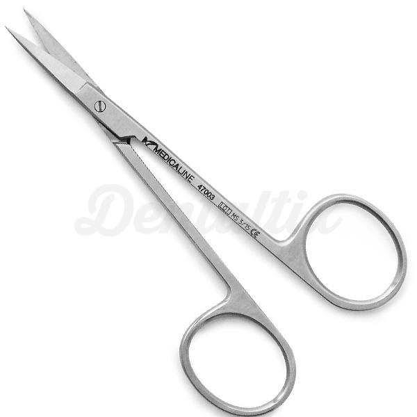
On a unrelated note (this is a bit off topic, but since it's related to proportions and design too, I think I will write it anyway, please excuse)
I once stole a surgeon scissors from my dad's medical attache, and fell in love with it to keep my beard neat on the hard-to-manage external contour.
The scissors's long-ascenders/short-descenders ratio allows for super easy handle and precise cuts, which are impossible to do with normal scissors (that's what it was designed for, isn't it).
I love it so much that can't help myself from recommending it to all the beard lovers men. I think of it as the RMXHarmonizer for my bear's contours 1
1 -
Thank you for Episode 1: The Staunton Effect. I am looking forward to more treasures. The talking Nick Shinn looks much less intimidating than the fellow in the flat cap!
0


Categories
- All Categories
- 46 Introductions
- 3.9K Typeface Design
- 489 Type Design Critiques
- 572 Type Design Software
- 1.1K Type Design Technique & Theory
- 658 Type Business
- 870 Font Technology
- 29 Punchcutting
- 528 Typography
- 121 Type Education
- 327 Type History
- 80 Type Resources
- 111 Lettering and Calligraphy
- 32 Lettering Critiques
- 79 Lettering Technique & Theory
- 560 Announcements
- 95 Events
- 116 Job Postings
- 169 Type Releases
- 179 Miscellaneous News
- 269 About TypeDrawers
- 53 TypeDrawers Announcements
- 114 Suggestions and Bug Reports